
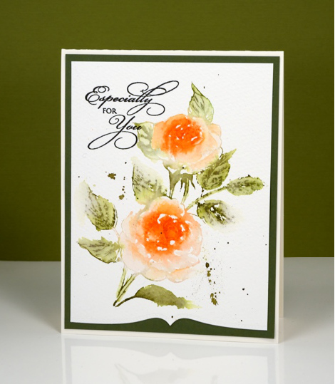
Lilacs video tutorial
Posted: February 19, 2018 Filed under: lilacs, Tutorial | Tags: Penny Black stamps, Ranger Distress stains, video 12 Comments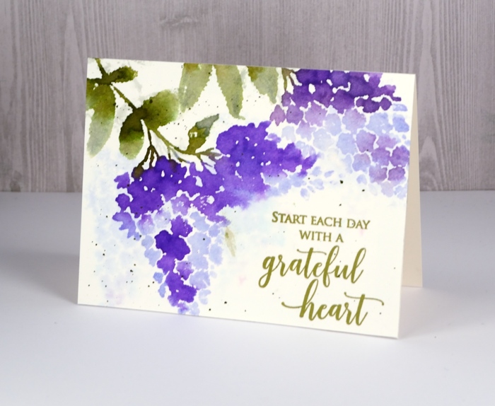
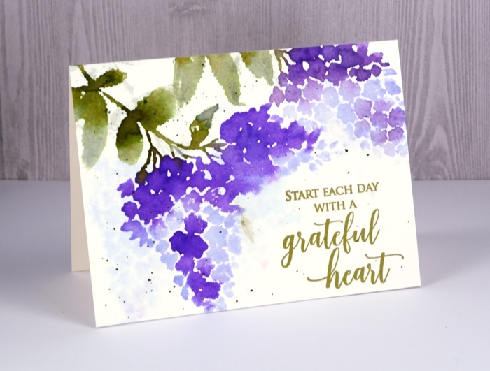
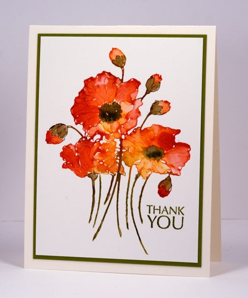
I am excited to share not only these pretty new stamps today but a video tutorial as well! I know, it is hard to believe.
I created this card using a technique I love to use with brushstroke stamps: watercolour with distress stains. I generally use the dauber topped distress stains but as they are being discontinued I thought I would try applying stain with a paint brush. It adds another step in application but the end result is just as pretty.
I filmed this video and a couple more with my son’s new camera which I am still getting used to so there are some focusing issues where the camera chooses to focus on my hand instead of the panel. I didn’t think it was enough of a problem to start again so I hope it isn’t too annoying. You get to see me drop my paintbrush with stain on it in the middle of the panel and come up with a quick fix too. I hope you enjoy the video and get to do some creating of your own.
Thanks for dropping by.
Supplies
Stamps: lilacs, grateful heart


Distress stains: shaded lilacs, wilted violet, bundled sage, peeled paint


Inks: Spanish moss versafine ink
Paper: hot pressed watercolour, neenah natural white


Tools: MISTI

A night of woodland beauty
Posted: August 29, 2016 Filed under: Prancers, Stamped Landscapes, Tutorial, Watercolour, Woodland Beauty | Tags: Dr Ph Martin Hydrus watercolor paints, Fabriano Watercolour Paper, Penny Black stamps, Tsukineko Versafine inks, Tutorial, video 18 Comments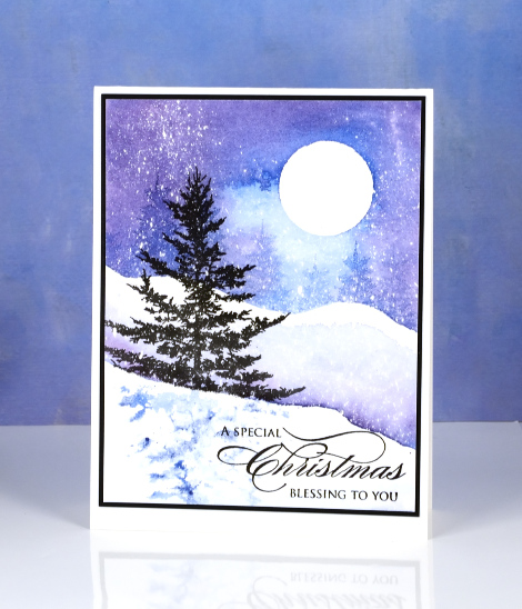
This week I am sharing my top three tree stamps from Penny Black’s new ‘Magic of the Season’ release. You know I love tree stamps so you wont be surprised that they were the first image I looked for when the new release arrived. The pretty spruce silhouette stamp immediately caught my eye and I knew it would be in my top three tree stamps. I have four stamped landscape cards to share this week and this little tree stamp features twice, today in a night time snowscape and tomorrow in a day time scene.
You will probably recognise another favourite tree stamp of mine in the background of this scene, it’s the little tree from the ‘Prancers’ set. I created a video to show you how I made this scene which features some watercolour effects along side some pigment ink stamping. I chose to pair pigment inks, which are waterproof, with watercolour painting so I could have pretty blends in the sky and snow but sharp tree images in the foreground and background.

Supplies
https://linkdeli.com/widget.js?1552642647875
Limberlost Journal page & video
Posted: July 6, 2016 Filed under: Art Journal, Butterfly trio, Muse, Script, Tutorial, Verdure | Tags: Art Journal, color burst, Dr Ph Martin Hydrus watercolor paints, Faber-Castell Albrecht Durer Watercolour pencils, Penny Black stamps, Tsukineko Versafine inks, Tutorial, video 21 Comments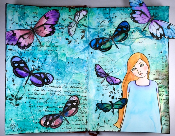
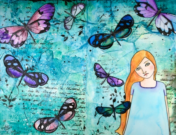
It is over a year ago since I completed a page in my art journal so it was a good thing when I was asked to create an art journal video for the Penny Black blog. The latest release from PB, Artistic Endeavors includes some beautiful stamps designed with journaling in mind. The page I created last year was a Narnia page so I decided to stick with the literary theme and make another book inspired page. My inspiration this time is ‘A Girl of the Limberlost’ by Gene Stratton-Porter. I read the book quite a few years ago but really enjoyed it and could see the butterfly and figure stamp working well on such a page.
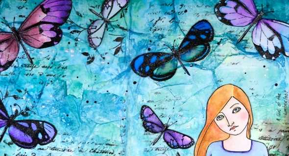
The main character, Elnora, catches moths to sell to collectors in order to support herself through high school. She lives on the edge of the Limberlost, a forested and swampy region where she finds the moths she later sells. I know these stamps depict butterflies but I chose to exercise some artistic license.
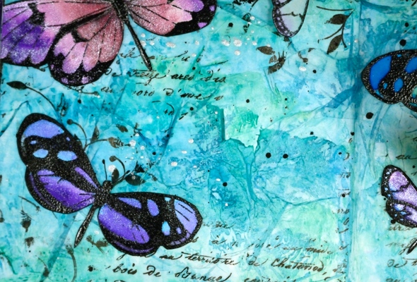
Because I wanted to watercolour both the butterflies and the girl I stamped them on watercolour paper, painted them, then cut them out so I could attach them to the page.
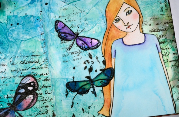
To add texture to the background I glued torn strips of tissue paper all over it then did partial stamping with a script stamp and a leafy stamp.
Journal pages take me a long time so despite the fact that I sped up just about all the footage, it is still on the lengthy side. I hope you enjoy it and, maybe like me, get inspired to pull out a neglected art journal. Or perhaps you’ll go and check the book out of the library…
Edited to add: In the video I mentioned learning a lot from Vicky Papaioannou; her videos are here:https://www.youtube.com/user/vickypgr
Supplies:
Stamps: Muse, Script, Verdure, Butterfly trio (PB)
Art Journal: Fabriano 24cm x 15.5cm
Art supplies: Faber-Castell gel medium , Tsukineko Versafine Onyx Black ink , clear embossing powder, Ken Oliver Colorburst powders (merlot, violet, ultramarine blue), Ken Oliver liquid metals (platinum, verdi gris, ultramarine blue), Faber-Castell Stampers big brush pen, lead pencil, Pigma 0.3 micron pen, Faber-Castell Albrecht Durer watercolour pencils (medium flesh, brown ochre, juniper green, ochre, burnt ochre, venetian red, delft blue, warm grey 3), tissue paper, Dr Ph Martin Hydrus liquid watercolours (Hansa yellow light, phthalo blue, phthalo green, carbon black) Art glitter designer dries clear adhesive, Ranger distress micro glaze.
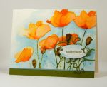
Lilac Roses – a tutorial
Posted: May 19, 2016 Filed under: Scented Beauty, Tutorial | Tags: Penny Black creative dies, Penny Black stamps, Ranger Distress inks, Ranger Distress stains, Tombow dual brush pens, Tutorial, video 20 Comments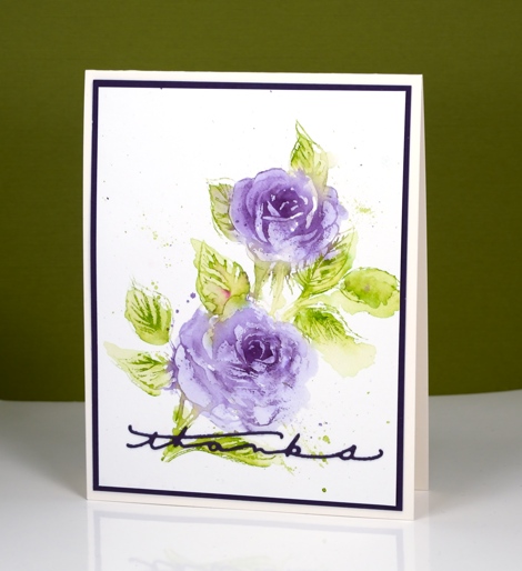
The new scented beauty rose stamp from PB is such a pretty stamp. I have tried a variety of mediums and styles with it so far and will share a few different cards at the end of this post. First let’s talk about this card. Can you believe this is my second video this month? I’m hoping to continue this pattern, but I know I’ve said that before.
I am fairly new to tombow dual brush pens; I bought a few for lettering but recently I added to my collection and started using them for stamping as well. They blend nicely with each other and with water on watercolour paper. For this card I only used two colours but managed to vary the intensity of colour by diluting with water. As is often my habit I didn’t think about the sentiment until the end and felt that a stamped sentiment messed up the balance of the design too much. Instead I settled on one of the thinnest die-cut sentiments I have which stretched across the base of the card keeping things balanced left to right but maybe a little bottom heavy!
I used tombow dual brush pens in the video but you could use stamp pads or distress markers for similar results.
Supplies:
Stamps: Scented Beauty (PB)
Dies: Many Thanks
Inks: Light Olive-126, Dark Plum-679 Dual Brush pens (Tombow)
Cardstock: Fabriano 100% cotton hot pressed watercolour paper, olive green cardstock
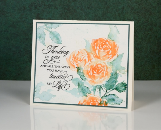
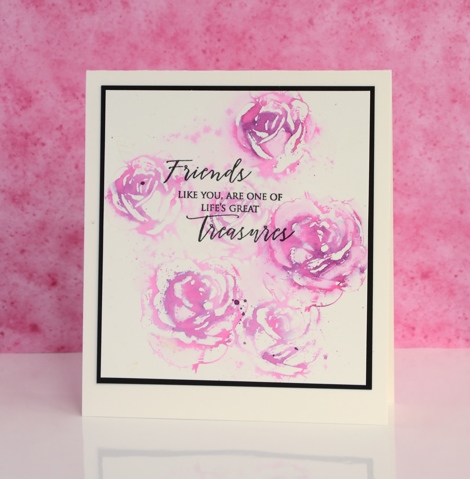
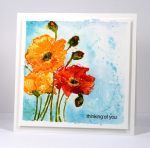
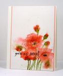
Below are a few more cards featuring ‘Scented Beauty’. The technique is similar to that shown in the video but with different mediums. I varied the amount of water added and did not always ink the whole stamp.
Supplies:
Stamps: Scented Beauty, Treasured Sentiments (PB)
Inks: Dried Marigold, Pine Needles distress stain (Ranger)
Cardstock: Fabriano 100% cotton cold pressed watercolour paper,green cardstock
Supplies:
Stamps: Scented Beauty, Treasured Sentiments (PB)
Inks: Picked raspberry distress marker (Ranger) Versafine onyx black (Tsukineko)
Cardstock: Fabriano 100% cotton cold pressed watercolour paper, black cardstock
Supplies:
Stamps: Scented Beauty, Treasured Sentiments (PB)
Inks: Mowed Lawn, Ripe Persimmon, Spiced Marmalade, Forest Moss, Spun Sugar, Weathered wood distress stains (Ranger)
Cardstock: Fabriano 100% cotton cold pressed watercolour paper, purple cardstock
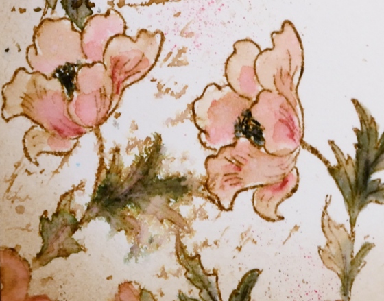
Vintage Watercolour tutorial
Posted: May 4, 2016 Filed under: Fly High, Playful, Tutorial | Tags: Faber-Castell Albrecht Durer Watercolour pencils, Penny Black stamps, Ranger Distress inks, Speedball elegant writer, Tutorial, video 31 Comments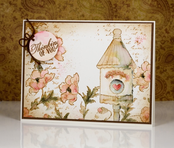
I have a tutorial for you today (gasp) which I made for SplitcoastStampers. In it I show my technique for creating a vintage style watercolour. By vintage style I am referring to muted sepia tones in this case with some blurred script and watermarks to give it an even more aged look.
I chose a birdhouse from the Fly High set and paired it with the Playful stamp using masks to stamp all my elements before I started watercolouring.
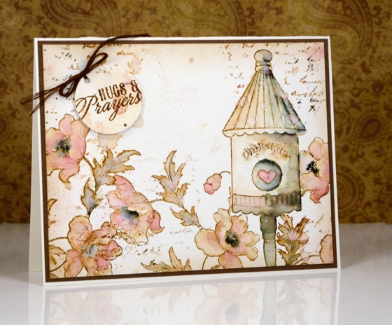
The two examples above are fairly similar; I changed the sentiment and naturally the watercolouring is not exactly the same. If you visit Splitcoaststampers you can see the stepped out photo tutorial or you can watch my video tutorial below.
This video came together quite smoothly (with the help of my son and my husband) so here’s to more!
Thank you for being so kind in your comments. You really are such an encouragement to me. I hope you try some vintage style stamping; all you need is some brown ink and a few watercolour pencils. The fun of the elegant writer pen is entirely optional.
Supplies:
Stamps: Playful, Fly High, Soar (PB)
Inks: Vintage Photo distress ink (Ranger)
Cardstock: Hot pressed Fabriano watercolour paper, brown cardstock
Also: elegant writer (Speedball) Albrecht Durer watercolor pencils 142, 180 (Faber-Castell)
Butterflies Die Photo Tutorial
Posted: May 26, 2015 Filed under: Butterflies, Tutorial, Watercolour | Tags: Kuretake Gansai Tambi watercolour paints, Penny Black creative dies, Tutorial 9 Comments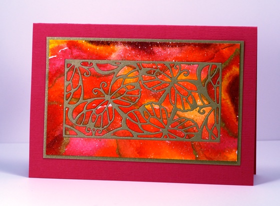
There are three new dies in the new Sunshine and Smiles. release all set in rectangular frames, which makes them a nice choice for the inlaid die technique. I used the Butterflies die to create the card above. Below is a photo tutorial with instructions below each photo describing my process.
Spritz or paint water onto a piece of cold pressed watercolour paper then add watercolour paint ( I used Kuretake Gansai Tambi on Fabriano cold pressed) in three or four colours. Let it blend, tilt the paper, move it around with a paintbrush if it is not going where you want it to. Let it dry.
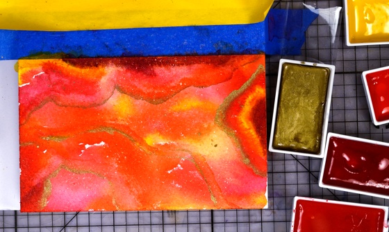
Add more paint to deepen the colours which will have dried paler than when you painted them. Add some metallic gold paint and some splatters. Let panel dry, then trim to desired size.
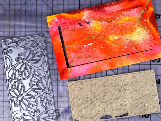
With the ‘Butterflies’ die cut a panel from your watercoloured piece and from a piece of metallic gold cardstock. Press both panels onto some ‘Cling film-Press & Seal’ to keep all the pieces together. I know it looks like I already lost some pieces but don’t worry they were there somewhere!

Attach a piece of double sided adhesive sheet (I used ‘stick it’) to a piece of cardstock larger than your die-cut panel.
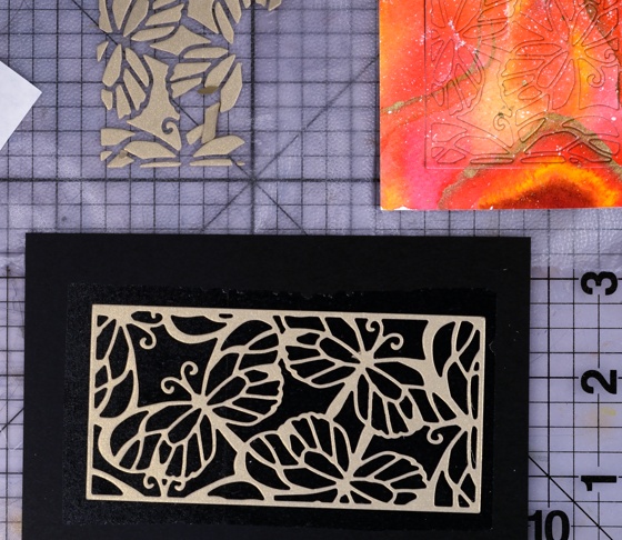
Remove the liner paper from the adhesive and press the gold ‘frame’ part of the butterflies die onto the adhesive covered cardstock.

Transfer the ‘inside’ pieces from the die-cut watercoloured panel into the gold frame pressing each one firmly onto the adhesive backing.
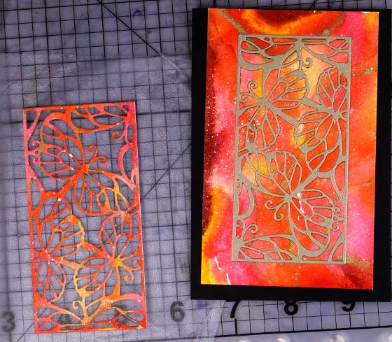
Attach the remaining border piece of watercoloured cardstock around the inlaid die-cut panel. Trim excess cardstock from the completed inlaid die cut panel. Mat with gold card then attach to co-ordinating card base.
Supplies
Creative Dies: Butterflies (PB)
Cardstock: Fabriano 100% cotton hot pressed watercolour paper, Pink and gold cardstock
Also: Kuretake Gansai Tambi watercolour paints, Stick it adhesive sheet
Collage of Wishes Watercolour Video Tutorial
Posted: May 25, 2015 Filed under: Collage of Wishes, Tutorial, Watercolour | Tags: Kuretake Gansai Tambi watercolour paints, Penny Black creative dies, Penny Black stamps, Tutorial, video 14 Comments
I hope you visited the Penny Black blog last week to enjoy a week of inspiration from our talented designer Jill Foster. This week I hope to inspire you with my projects featuring products from the new collection Sunshine and Smiles. Today’s project comes with a video tutorial. I know, unprecedented for me to have a video for you two weeks in a row! Last week I shared my technique for watercolouring with distress stains. Today I have a more traditional ‘keep within the lines’ approach using watercolour paints. The video is long so perhaps you should get a cup of coffee or tea and settle in. I have used the new slapstick cling set ‘Collage of Wishes’ and the pretty flourish die.
Supplies
Stamps: Collage of Wishes (PB)
Creative Dies: Flourish (PB)
Inks: Versafine Smokey Gray (Tsukineko)
Cardstock: Fabriano 100% cotton hot pressed watercolour paper, Kazazz cardstock discontinued
Also: Kuretake Gansai Tambi watercolour paints, Faber-Castell Polychromos pencils, Stick it adhesive sheet
Watercolour with Distress Stain Video Tutorial
Posted: May 20, 2015 Filed under: Fresh, Tutorial | Tags: Fabriano Watercolour Paper, Penny Black stamps, Ranger Distress stains, Tutorial, video 29 Comments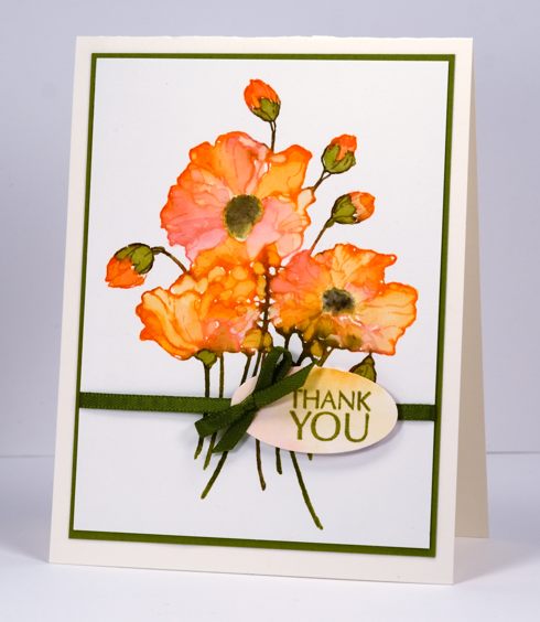
I created a tutorial for Splitcoaststampers showing how I use distress stains to do watercolouring with outline stamps. There is both a photo tutorial and video on the Splitcoast website and I have included the video below. I used the same technique to create two cards, the one above is the star of the video, the one below is featured in the photo tutorial.
Supplies:
Stamps: Fresh , Flower Sparks (PB)
Inks: Peeled Paint, Barn Door, Spiced Marmalade, Scattered Straw, distress stains & Forest Moss, Black soot distress markers(Ranger), Versafine Spanish Moss ink (Imagine Craft/Tsukineko)
Cardstock: Fabriano 100% cotton hot pressed watercolour paper, Neenah Natural White cardstock
This is a favourite technique of mine; I used it for the following cards.
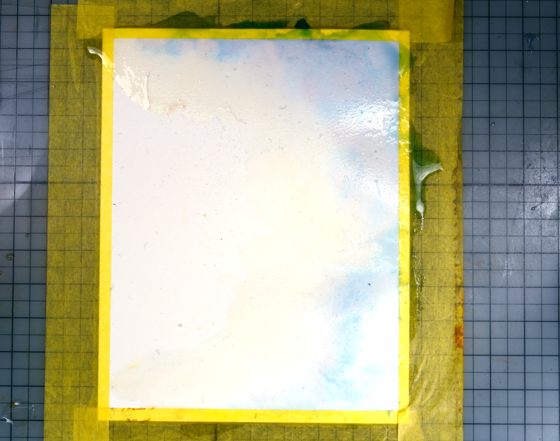
The Sweetest Sound
Posted: February 2, 2015 Filed under: The Sweetest Sound, Tutorial, Watercolour 13 Comments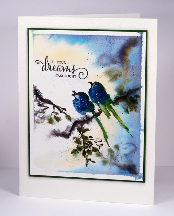
Now that the new Penny Black release, Bring on the Happy, has been revealed, the design team is sharing projects and tutorials featuring all the wonderful new products. I am kicking things off with a photo tutorial using ‘the sweetest sound’ brushstroke stamp. Brushstroke stamps will be featured all this week on the PB blog.
To create the card above I started with a panel of my favourite watercolour paper from Fabriano. I splattered a fine mist of masking fluid over it and let that dry before taping it down on all sides. Next I painted water onto the right hand side of panel. I pressed Memento Nautical Blue and Cantaloupe inks onto an acrylic block as a palette then picked up some ink with a paintbrush and dropped it onto the wet paper. I kept adding ink with a large brush until I was happy with the background colour.
While the paper was still wet I inked only part of a branch on ‘the sweetest sound’ stamp with espresso truffle and olive grove memento markers. I stamped it in the top right and bottom right corners of panel and let the inks bleed into the wet background.
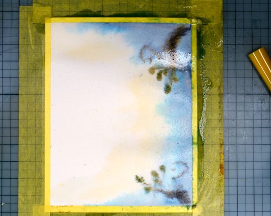

I spritzed the inked stamp with water then stamped onto the watercolour panel.

Using a water brush I blended the colour on the birds and added detail to the eyes with the espresso truffle marker. I then covered the birds with my hand and spritzed water over the branches to make the image bleed.
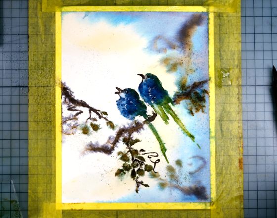
To finish I splattered olive grove and nautical blue ink around the panel. I added a little more definition to the branches with the fine tip of the memento markers. When the panel was dry I removed the masking tape and rubbed off the masking fluid before adding the sentiment from ‘snippets’ set.

I completed the card by matting the panel in a green then popping up the panel on a cold pressed (textured) watercolour paper card base.
Thanks for dropping by. I hope you are enjoying the new release; I will be sharing more projects with brushstroke stamps later this week.
The new One Layer Simplicity Challenge is up on the blog and is hosted by Susan this month. Pop over and check it out.

Supplies:
Stamps: the sweetest sound, snippets(PB)
Inks: Nautical Blue, Cantaloupe, Olive Grove, Espresso Truffle, Bamboo Leaves Memento ink (Imagine Craft/Tsukineko)
Cardstock: Fabriano hot pressed watercolour paper, Strathmore cold pressed watercolour paper, green cardstock
Also: Winsor & Newton masking fluid
Falling Snow Video Tutorial
Posted: November 26, 2014 Filed under: Prancers, Stamped Landscapes, Tutorial | Tags: Fabriano Watercolour Paper, Penny Black stamps, Tsukineko Memento inks, Tutorial 16 Comments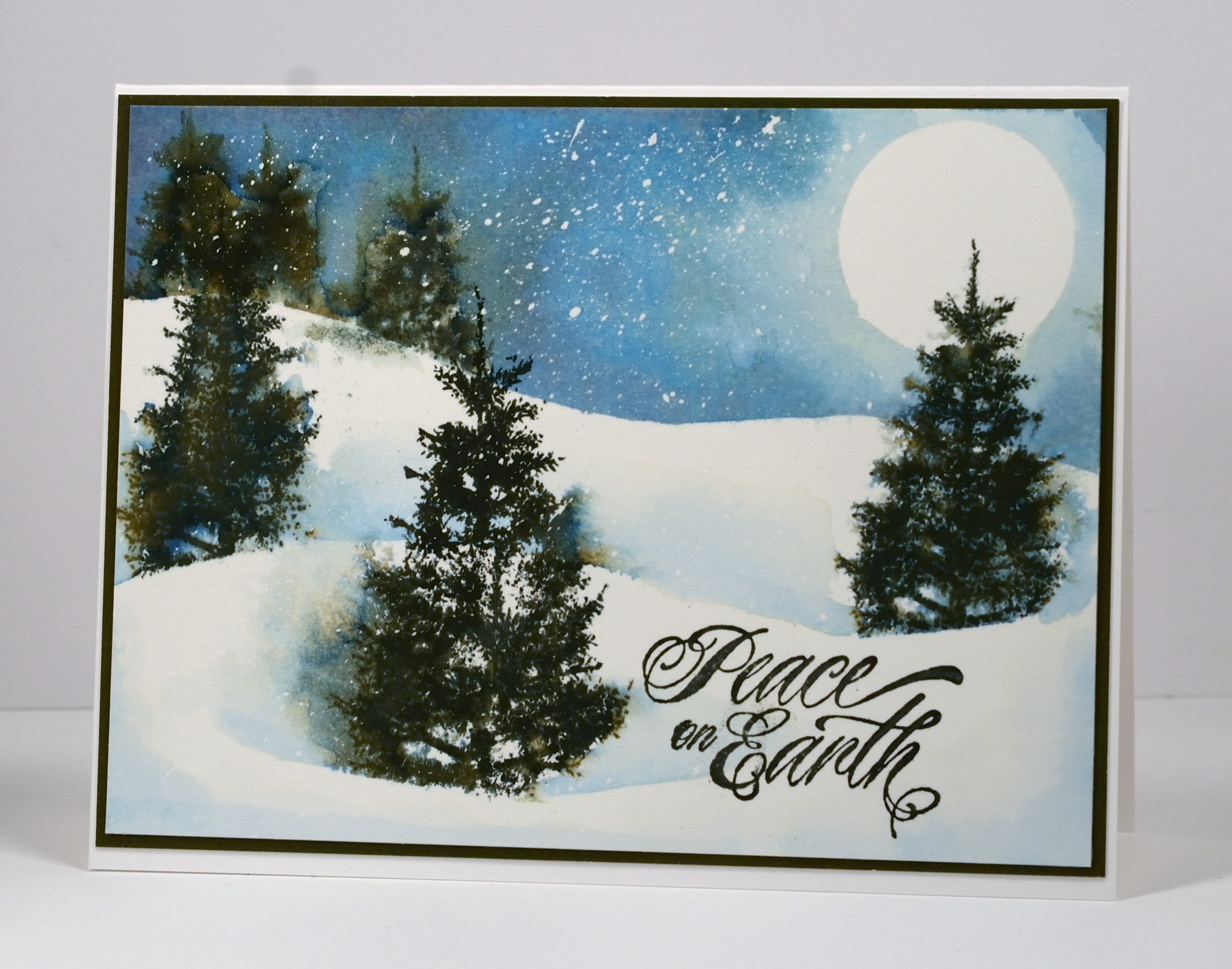
Today’s tutorial is one I created for Splitcoast Stampers. Splitcoast posts a new technique tutorial every Wednesday and in today’s I show how to create the look of falling snow on a watercolour card. I created both a photo and video tutorial for Splitcoast.
The video took me a few attempts so I have four slightly different versions of the card which supports my claim that watercolour techniques never give you the same result twice. The picture above is the first one I created and the one featured in the photo tutorial. It has quite a bit of masking fluid snow in the sky; the one in the video ended up with a lot less. I mention in the video that I have stopped using post-it notes to mask when I do watercolour scenes. I now use frisket film, a reusable, repositionable plastic film which doesn’t disintegrate when it gets wet. It is called Grafix Extra Tack Prepared Frisket Film.
I have another video showing in detail how to apply and remove the masking fluid here.
Supplies:
Stamps: Prancers, Hello Winter(PB)
Inks: Memento Nautical Blue, Bahama Blue, Northern Pine inks (Imagine Craft/Tsukineko)
Cardstock: Fabriano 100% cotton hot pressed watercolour paper, Neenah Solar White 110lb cardstock, Olive Green cardstock
Also: Winsor & Newton masking fluid, Kemper Spatter brush


