Birds on Birches
Posted: December 9, 2025 Filed under: beneath the birches, Dies, Penny Black, sennelier watercolours, winter trees | Tags: Fabriano Watercolour Paper, Penny Black creative dies, Penny Black stamps, sennelier watercolours 3 Comments
In case you were wondering I have done some watercolouring for Christmas cards this year; it’s not all napkin art. I created a batch of cards for a friend which included either watercolour skies or watercolour trees.
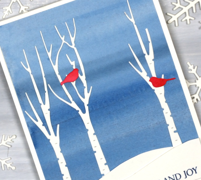
I painted a blended sky with a couple of different blues then added hand-cut snowbanks and die-cut trees and birds from the Penny Black sets, ‘beneath the birches‘ and ‘winter trees‘.
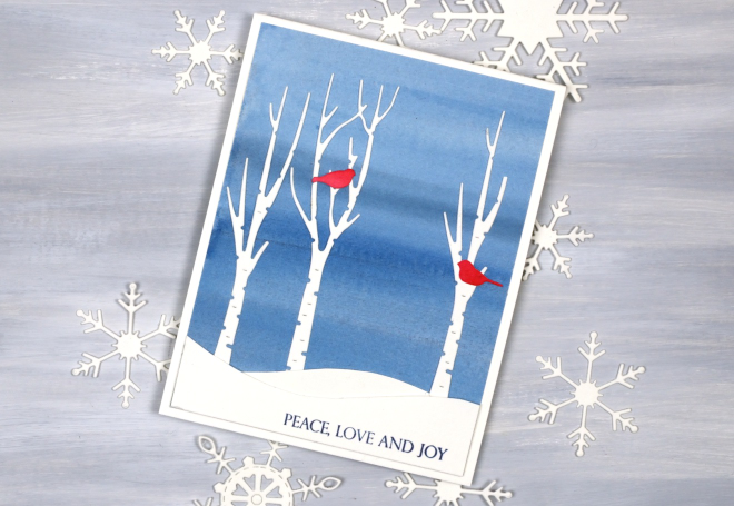
This would be a simple card to make in multiples by painting a large sheet of watercolour paper to divide into sky panels then add the white and red elements. The greeting is from the PB ‘Christmas sentiments‘ set. How is your Christmas card sending going? I sat in a waiting room yesterday and wrote about eight cards instead of reading a book or scrolling so that advanced me through my list a little.
Eucalyptus & gold
Posted: December 3, 2025 Filed under: Airy, Dies, Penny Black, stocking stuffers | Tags: Penny Black creative dies, Penny Black stamps 5 Comments
I thought this would be my last napkin/serviette related post for now but I forgot about a pack of dinner napkins I bought in the summer. So maybe one more!?
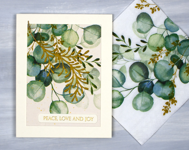
But onto today’s cards; you can see in the photo above that the eucalyptus themed napkins are printed on a white base but my cards are all cream tones. When I adhered the single layer of the napkin to cream cardstock, the background transformed into cream not white.
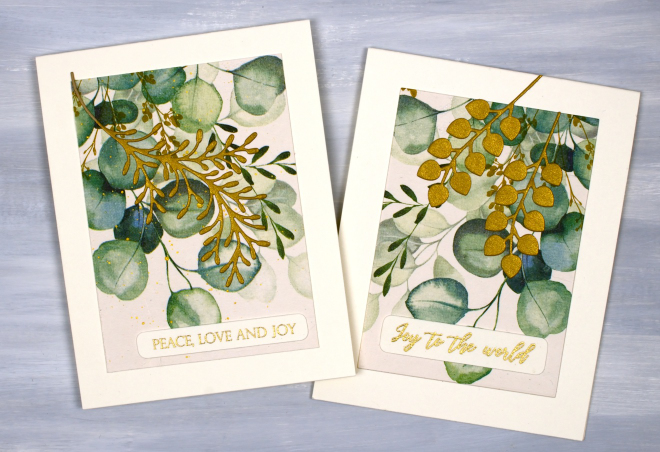
The napkins are not Christmas themed themselves but I chose to add gold foliage die-cuts, gold embossed greetings and even some gold splatter on the one below to turn them into Christmassy cards. I used the Penny Black dies, ‘stocking stuffers‘ and ‘airy’.
Let heaven and nature sing
Posted: November 27, 2025 Filed under: Penny Black, Spellbinders | Tags: Penny Black stamps, Spellbinders 8 Comments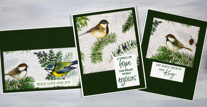
This is the second collection of napkin/serviette Christmas cards I’ve made, this time with sweet birds and foliage featured. As I mentioned in an earlier post I have had success with a glue stick or double sided adhesive to adhere the single layer of napkin to cardstock, but there are other methods which several of you were kind enough to share with me.
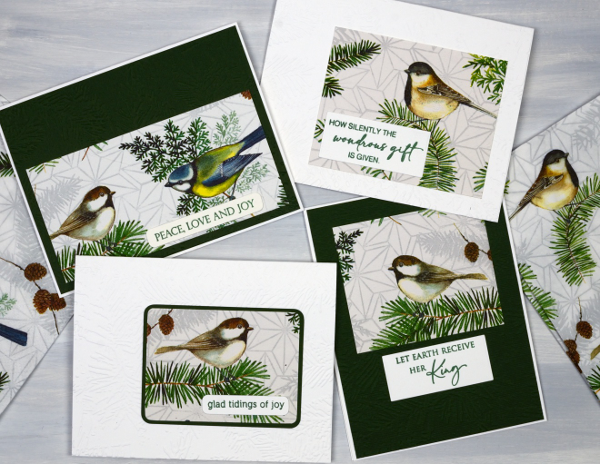
Thank you to everyone who got in touch to let me know about the following options: spray adhesive, modpodge, freezer wrap adhered with a hot dry iron and a full sheet of Avery sticker paper. Some involve wet adhesive, some dry and the freezer wrap uses the melted wax in the paper so I imagine each method produces a slightly different thickness and flexibility. I will report back again if I try some of these approaches.
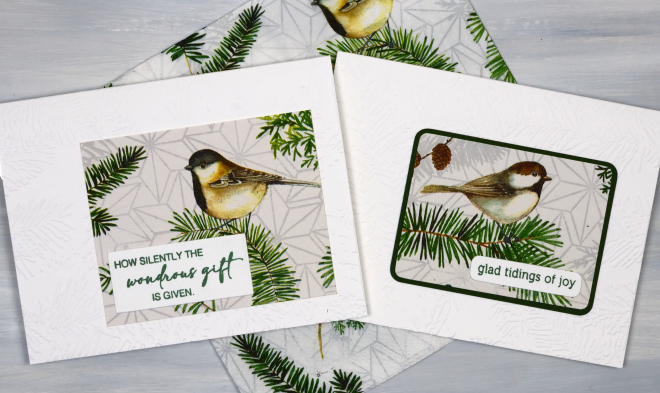
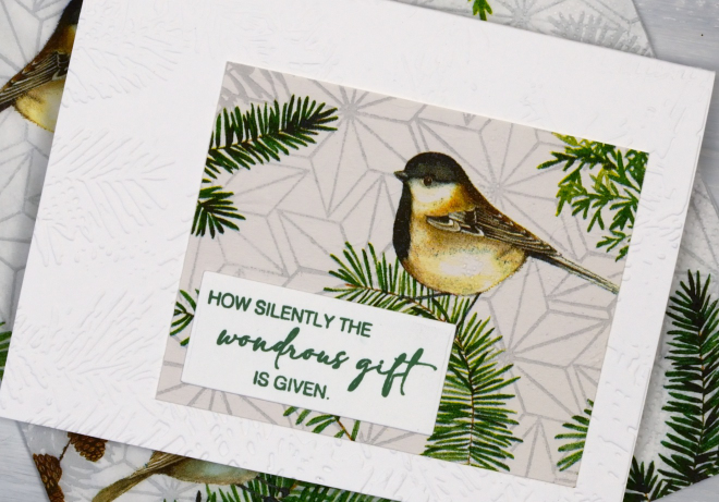
As is often the case it is hard to see the texture in the background panels and card bases. I have used the Spellbinders ‘in the pines’ embossing folder on both the white and the dark green panels and it does look nice and co-ordinates with the pine sprigs on the napkins.

The sentiments are a mix of Penny Black sentiments, the favourites I pull out every year.
2 for 1 cards
Posted: November 24, 2025 Filed under: Penny Black, Taylored Expressions | Tags: Penny Black creative dies, Penny Black stamps, Taylored Expressions 6 Comments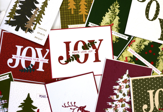
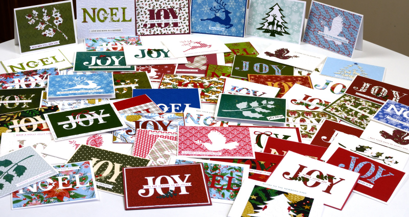
Here are some of the ‘2 for 1’ cards a group from our church made on Saturday. I had a couple of friends help with prep and running the event and it was a fun creative time. Of course there were snacks, laughter and plenty of conversation.
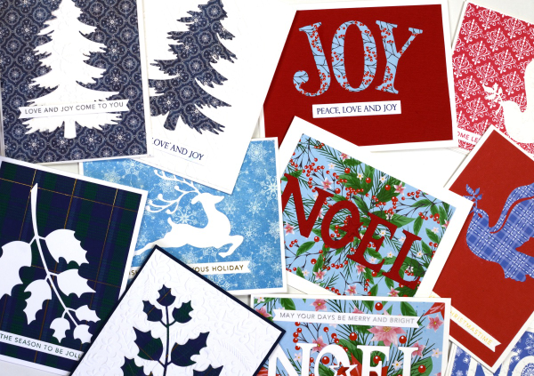
The ‘2 for 1 technique’ in this case required the maker to cut an image or word out of patterned paper and turn the positive and the negative piece into two separate cards. To add some texture and pattern we had coloured and embossed backgrounds to choose from.
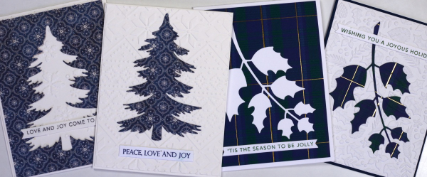
I have run this event before and there is always some creative free styling when participants see the supplies available. I get inspired watching everyone create. I wanted one photo of all the cards but my kitchen table was crowded with just half so I divided them into landscape and portrait orientation.
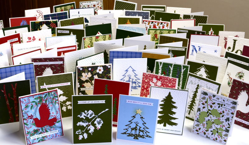
Thank you to the twenty three people who participated before and during the event. I hope the residents at the nursing home will enjoy the pretty cards and message.
Christmas Greenery
Posted: November 21, 2025 Filed under: Christmas inchies, Darkroom Door, Elizabeth Craft Designs, Gina K, global postmarks, Penny Black, postage stamps | Tags: Darkroom Door stamps, Elizabeth Craft Designs, Penny Black creative dies, Penny Black stamps 7 Comments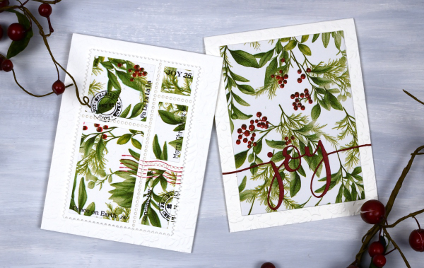
Yes, finally a Christmas card post. I have been playing around with paper napkins for some of my Christmas cards. All the designs in today’s post use panels from a greenery + berries design. I peel off the printed layer from the three layer napkins or serviettes (depending where you’re from) and glue it to cardstock. I’ve used both double sided adhesive (pricey) and glue sticks (slightly curls the cardstock). Either option works I just need to take some time to flatten the glued panels.
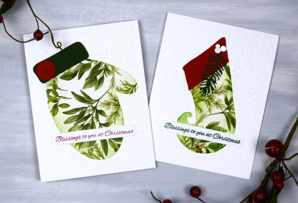
Sometimes when attaching the fragile napkin layer to the cardstock you get some creases; I think they add interest and texture so I don’t let them worry me. I used my cricut and the Echidna Studio stocking design and mitten designs to cut out large features to add to an embossied background.
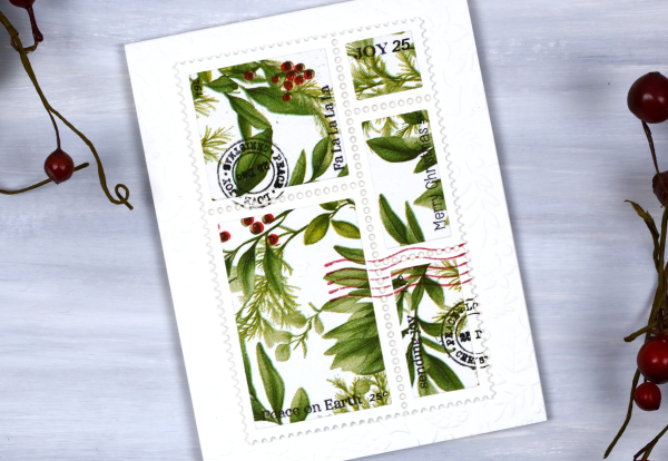
I also used the lovely postage dies from Elizabeth Craft and the Darkroom Door Global Postage and Christmas Inchies stamps to add postmarks along with small sentiment stamps from Penny Black to add words. For the card below I simply cut the word joy using a PB die and added it to a large panel. You could definitely make all these cards with patterned papers or your own painted or printed papers. I just get tempted by the beautiful paper serviettes out there and end up buying them for craft and dinner!

I am packed up ready to do Christmas card making with some friends from church tomorrow. We are making 2-for-1 cards to give to the residents in a local nursing home. I’ll try and share a few of the designs next week. Have a lovely weekend.
The Magic of Brusho
Posted: November 4, 2025 Filed under: Background Stamps, Brusho, contemporary, cricut, Penny Black | Tags: Brusho, brutus monroe embossing powder, cricut, Fabriano Watercolour Paper, Penny Black stamps 5 Comments
I’ve said it before but here is more evidence, Brusho watercolour paint powders make magic! I embossed the ‘contemporary‘ background stamp from Penny Black in a copper colour (I think it was ‘Penny‘ from Brutus Monroe) on hot pressed watercolour paper.
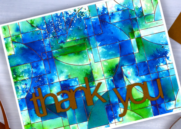
You can see the pattern in the background stamp is made up of curved and straight edged shapes. The embossing creates enclosed spaces on the panel and the the brusho powders get trapped in the spaces.

There are a couple of ways to trap brusho in an embossed design, you can spritz the embossed panel with water then sprinkle some brusho over the top, or you can sprinkle the brusho first then spritz. I often end up doing a bit of both. For this panel I think I spritzed some water first then sprinkled both blue and green brusho over the wet areas. My aim was to keep some sections blue, some green and others a mix of the two colours. I also wanted some areas to look speckled and other sections to look softly blended. Less water keeps things speckled; more water gives the paint more time to dissolve and blend.
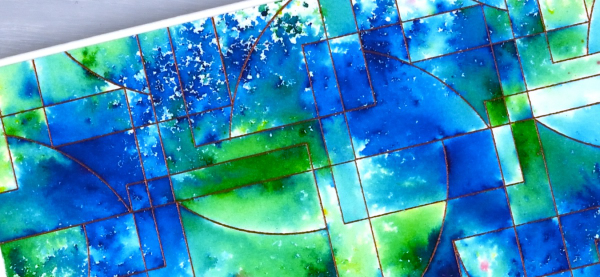
I had some bronze shimmery cardstock which matched the embossing powder so I cut the ‘thank’ and ‘you’ on the cricut. I stacked two layers so the words would stand out from the busy background.
The happy cut-out
Posted: October 22, 2025 Filed under: cricut, Dies, Penny Black | Tags: cricut, Penny Black creative dies Leave a comment
Today’s card is very similar to yesterday’s. I used the cricut to cut the letters H, A, P, P &Y from a cream panel which reveals the patterned paper layered below it. Because the patterned paper is the same size as the card front there is a border revealed by the smaller blank panel.
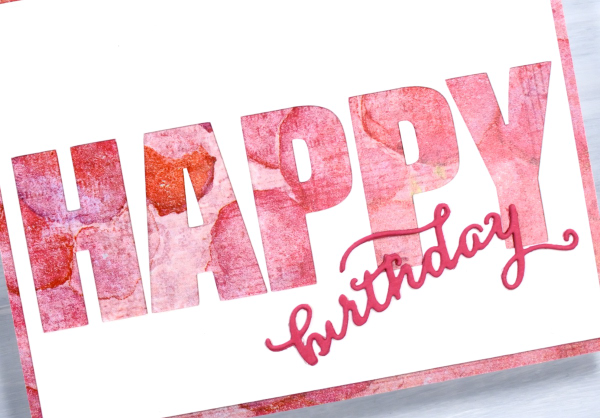
I’m know there are various ways to get the same effect but in some way it is easier to let the cricut cut the large letters in a straight line rather than expect myself to glue the cut-out letters in a perfect row! I used a Penny Black die to cut the little birthday word from pink cardstock. The patterned paper is one of the bonus pages you sometimes get in paper-crafting magazines. I think it’s the first time I’ve used one but I have a little stash which I will continue to put to use.

Shimmery Foliage
Posted: October 14, 2025 Filed under: Airy, Dies, Finetec paints, Leaflets, Leaves, Penny Black, Taylored Expressions | Tags: Fabriano Watercolour Paper, Finetec artist mica watercolour paint, Penny Black creative dies, Taylored Expressions 2 Comments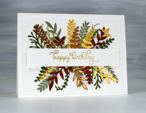
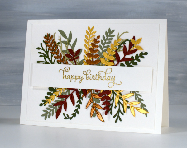
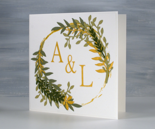
Recently a friend and I got together and worked on wreath style wedding cards. Mine is featured further down in this post. After my friend left I used some of the die-cut foliage leftovers to make her a birthday card. You can see a few matte green leafy branches plus more cut from gold, bronze and reddish shimmer cardstock. I arranged it all either side of a stamped and embossed banner. This sort of a card takes a while to arrange in a balanced way so once I had it looking good I took a photo so I would be able to glue it all down again in the same way.
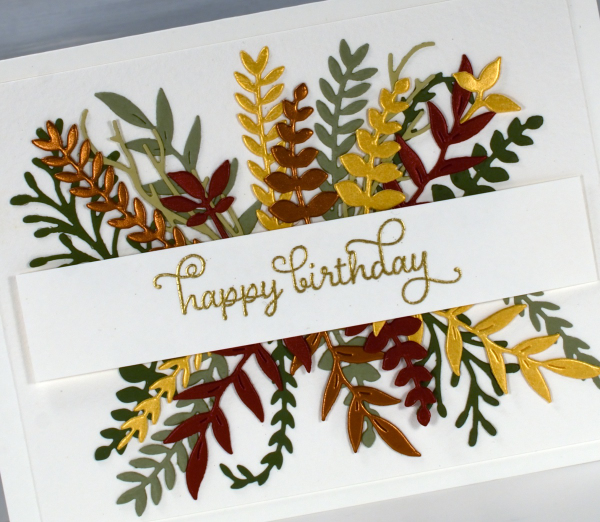
All the die-cutting was done with Penny Black foliage dies from a variety of sets. The curly twirly birthday sentiment is from the Taylored Expressions set, ‘In & Out Birthday’ embossed in gold powder
To make the wreath card I began by stamping a rough circle using gold watercolour paint on a jar lid. It was the lid of the lentil jar so yes, I had to wash it carefully before it was returned to the jar.
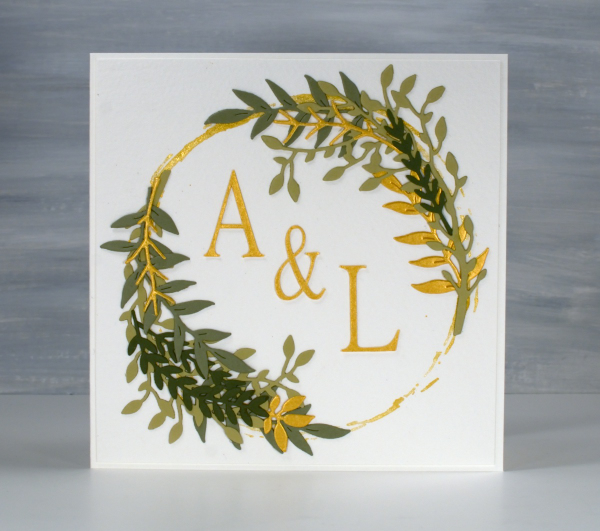
I arranged die-cut foliage around the gold circle not with perfect symmetry but I aimed for balance.
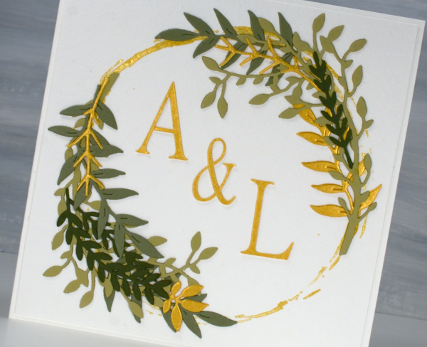
I cut the A, & and L on the cricut using the Linux Libertine Display G font. Both cards were made on cold pressed watercolour paper which has a nice creamy colour and soft texture.
Some New Paint
Posted: May 19, 2025 Filed under: Effulgence, Penny Black, Rockwell art, Tim Holtz | Tags: Fabriano Watercolour Paper, Penny Black stamps, Rockwell art, Tim Holtz 4 Comments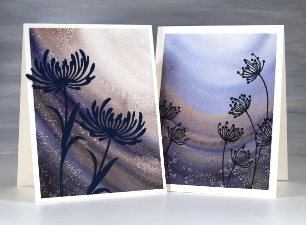
Recently a friend introduced me to some new watercolour paints. It was during a class and she introduced us all to the new paints both by using them in her projects and by saying how much she loved them. Now it just so happened that my birthday fell soon after that class and suprise, surprise I received some new paints for my birthday! (And by ‘received’ I mean I asked my husband if he would like me to order myself some new paints as a gift from him. Of course he did!)
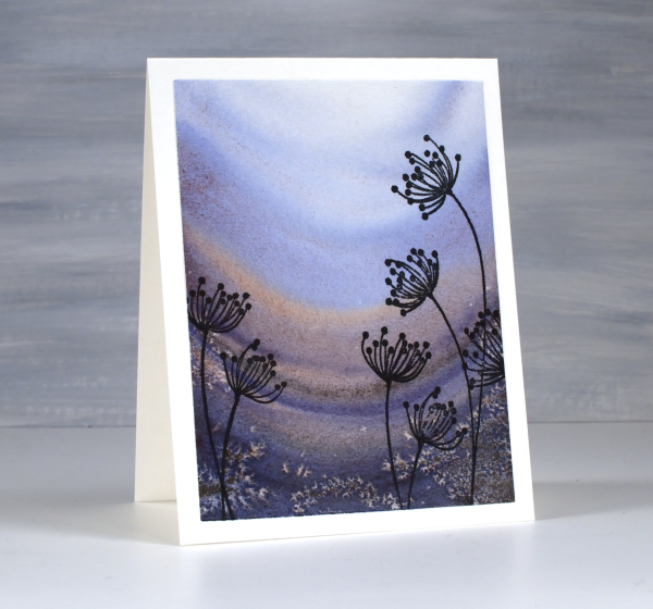
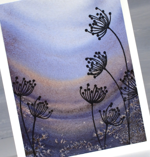
The new paints are from Rockwell Art, a Canadian company. They have a range of watercolour paints including a line they call ‘self evolving’ mineral pigments. The pigments granulate and break into different colours as you add water and the water moves the paint. Both cards featured today were painted with just one paint colour, ‘deep soul’. As I added water the paint separated into blues and burgandy-browns.
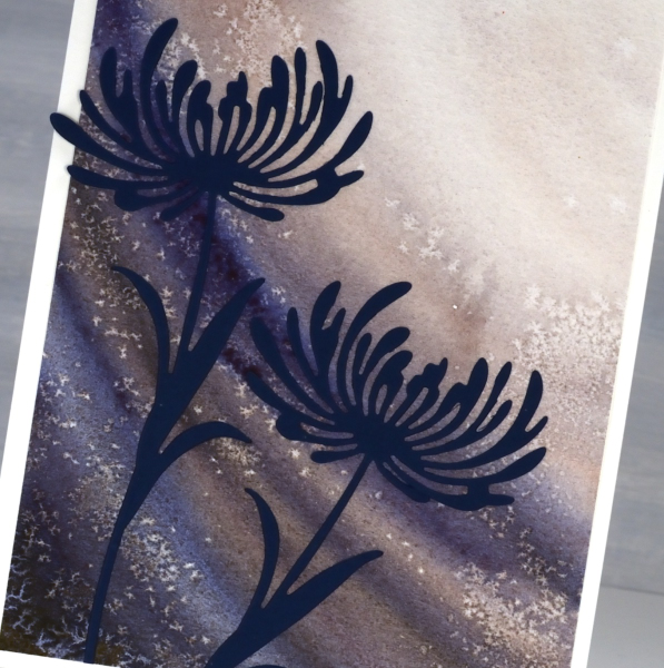
I applied the paint in curved stripes and sprinkled salt here and there while the paint was still wet to get the speckled effect.
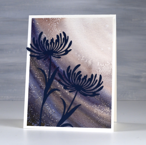
Because I had worked from dark to light it seemed appropriate to add flowers looking towards the light. The die-cut flowers are from Tim Holtz ‘wildflower’ set and the stamped flowers below are the Penny Black ‘effulgence‘ cling stamps.
Delicate florals on Watercolour
Posted: May 9, 2025 Filed under: Delicate Florals, Penny Black, Watercolour | Tags: Fabriano Watercolour Paper, Penny Black stamps, sennelier watercolours, Tsukineko Versafine inks 3 Comments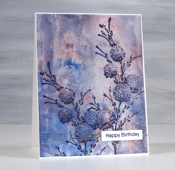
I have another floral stamp over a watercolour background; I don’t think I will ever tire of the combination. This background was created using a very different method to the previous card posted. Whereas the last one required careful blending of paint colours this one was definitely abstract and unpredictable. I randomly painted watercolours on a piece of clear acetate then smooshed it onto a piece of watercolour paper.

It took a few smooshings to start to build up pattern and depth of colour but eventually I had something I liked. Along the way I spritzed water to help the paint move and tilted the panel this way and that to spread it from one area to another. I didn’t like it when I first began but after several repetitions with the smooshing I could see it working as a pretty background.

Once again I chose a Penny Black stamp, ‘delicate florals’ as the focal point over the background, this time choosing dark blue ink because I love the matchy-matchy! If you compare with the previous card you can see I added visual interested once again with a horizontal line down low on the card. It doesn’t get in the way but it leads the eye from left to right. While I was away I enjoyed the roses still blooming in my Dad’s garden. The tallest bush gave some foreground interest to yet another sunset photo.