Holly Days
Posted: August 16, 2022 Filed under: Dies, holly-days, jumbo bauble, Penny Black, Spellbinders, stocking stuffers | Tags: Penny Black creative dies, Penny Black stamps 3 Comments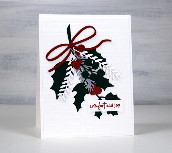
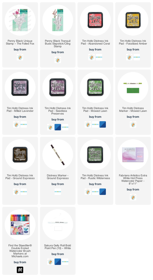
Today’s simple fresh card showcases some new dies from Penny Black. I chose solid colour cardstock, some shimmery, to create this little garland but I know I will use these dies again with gel prints or patterned papers.
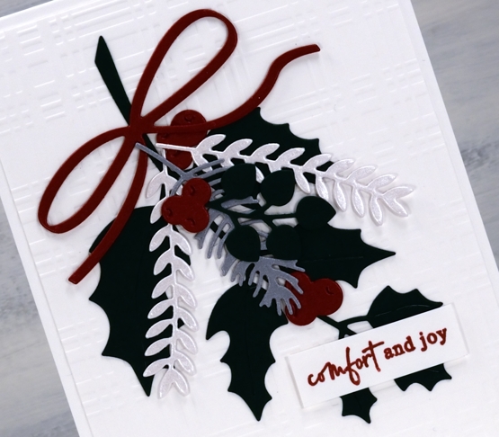
It is a little hard to tell in the photo but I have red shimmer, quartz shimmer and silver shimmer cardstock along with matte green for the leaves. The dies are from three new PB sets, holly-days, stocking stuffers and jumbo bauble. The card design is clean and simple but I added texture to the background with a spellbinders plaid embossing folder.
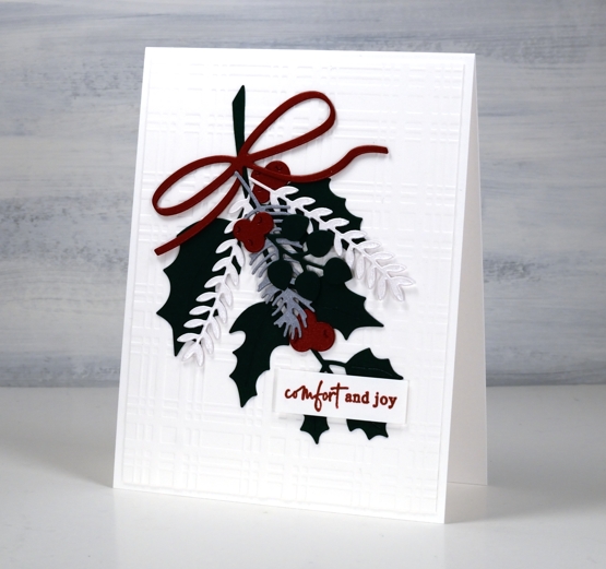
I finished off the card with one of the new little sentiments from the PB ‘jolly sentiments’ set. I think I have mentioned before how much I like little sentiments so a whole new set of them is exciting.
(Compensated affiliate links from Foiled Fox, Scrap n Stamp and Ecstasy Crafts)
Amaryllis Bundle
Posted: August 10, 2022 Filed under: amaryllis bundle, Penny Black | Tags: Fabriano Watercolour Paper, Penny Black stamps 3 Comments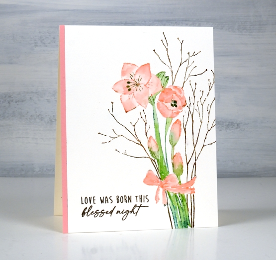
This sweet amaryllis bundle is another new stamp from Penny Black. I kept things simple using the same technique used on the pinecone poetry card.
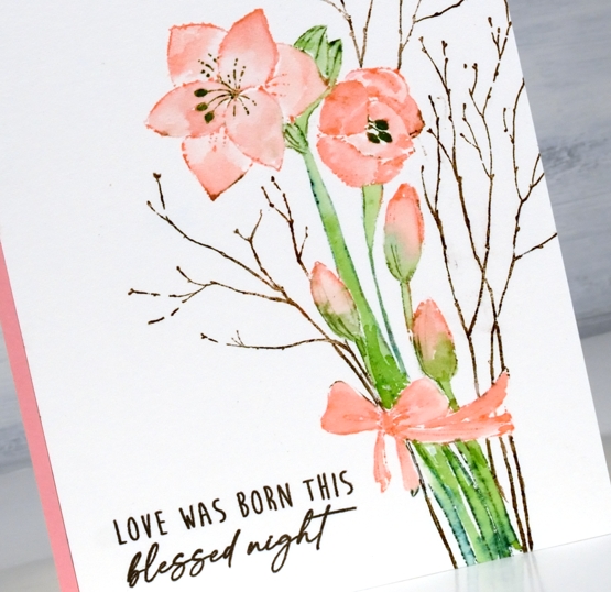
Keeping the stamp and watercolour panel in the stamp positioner I inked the stamp with a mix of distress inks and distress markers to colour the petals, stems and twigs. I worked one colour at a time so I could wipe ink off the stamp where I didn’t want it before stamping. The petals and bow are stamped and painted with saltwater taffy ink. The stems are a mix of mowed lawn and pine needles and the twigs are vintage photo and gathered twigs.
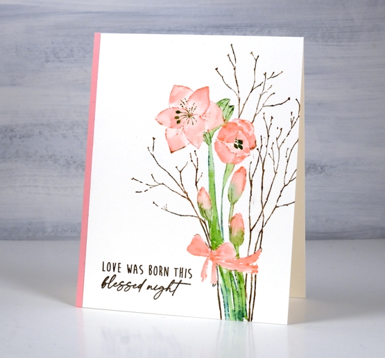
The panel was very clean and bright when I finished it so I decided to balance the amaryllis blooms with a strip of matching cardstock on the other side and stamp the sentiment to match the twigs.
Have you ever grown amaryllis? I have received them as Christmas presents twice and I could not believe how beautiful and big they were when fully open. One appeared to have shimmery petals. One also became too top heavy to hold itself up which was a sad discovery one morning.
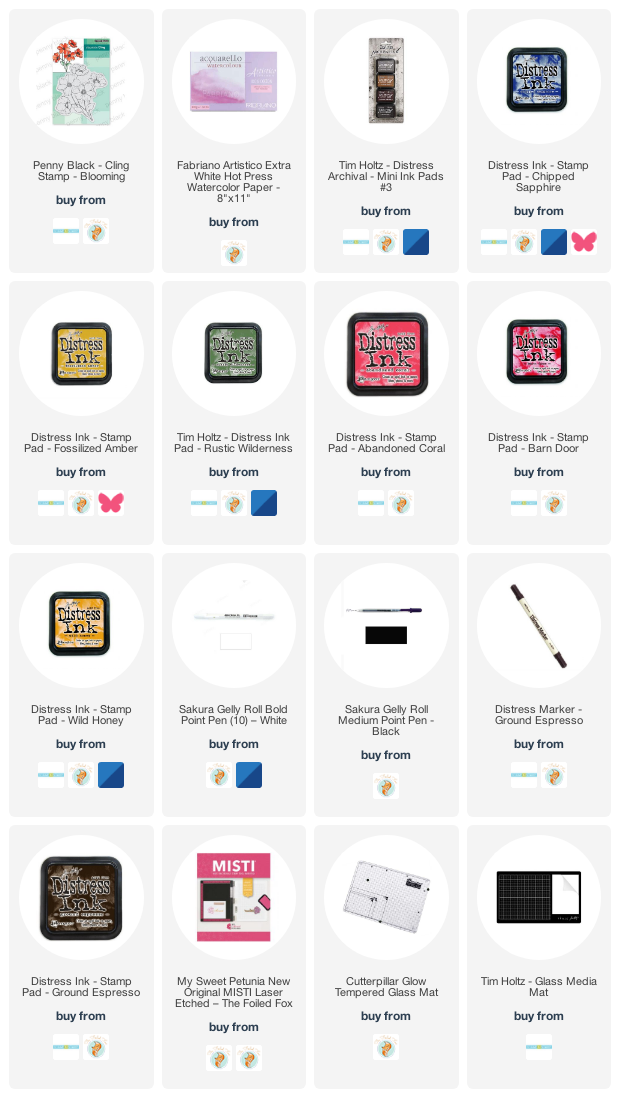
Supplies
(Compensated affiliate links used when possible)
Pinecone Poetry
Posted: August 8, 2022 Filed under: Finetec paints, pinecone poetry | Tags: Finetec artist mica watercolour paint, Penny Black stamps 11 Comments
Yes it’s the height of summer round here so must be time for some Christmas stamping! I am a seasonal stamper as you know but when the first Christmas release comes from Penny Black I try them out straight away. It gets me started on my Christmas cards and shows you the new beauties that are available.

This large stamp is called ‘pinecone poetry’ and I have stamped and painted it with distress inks. The technique is one I have talked about many times and is made easier with the use of a stamp positioner. I worked on hot pressed watercolour paper inking the pine fronds and leaves with a mix of mowed lawn, pine needles and rustic wilderness distress inks. When it was time to paint the leaves I pulled ink from the stamping and picked up smooshed ink from my glass mat.
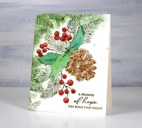
I used the same method for the pine cone inking with three different browns to vary the tones in the finished image. The berries are candied apple (I think) with a second addition of ink to give shadow to each berry. To complete the layout I stamped extra pine fronds and blended some green around the top left corner. I splattered gold paint over the design and added a sentiment in archival vintage photo ink.
Supplies
(Compensated affiliate links used when possible)
Dancing on gel prints
Posted: July 21, 2022 Filed under: butterfly dance, Dies, Paper Rose, Penny Black, shall we dance | Tags: gel press, gel printing, Penny Black creative dies, Penny Black stamps 8 Comments
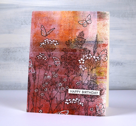
I have a couple more cards incorporating gel prints today. This first one is made with a clean up sheet; maybe you can recognise the criss cross of brayer marks on the paper. When I stamped the PB ‘butterfly garden’ stamp over the background it was a bit too delicate to show up well. Highlighting petals and wings with a white gel pen worked to keep the design subtle but still noticeable.
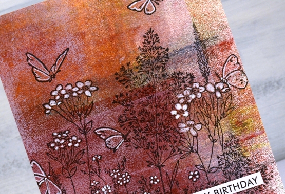
I cut the gel print to fill the card front and added a sentiment from the Paper Rose Studio ‘so extra’ sentiment strips.
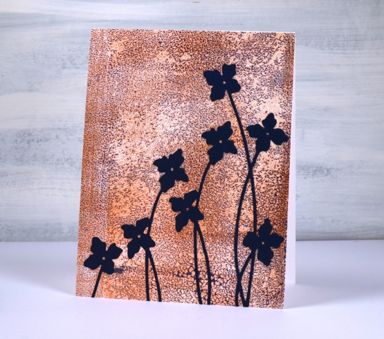
The gel print below has a delicate blue pattern over bronze made when the paint separates on the gel plate before you get a chance to take a print. I used a bronze print to pull the blue paint which had separated evenly over the whole plate. You can’t tell from the photo but the bronze has a metallic sheen to it.
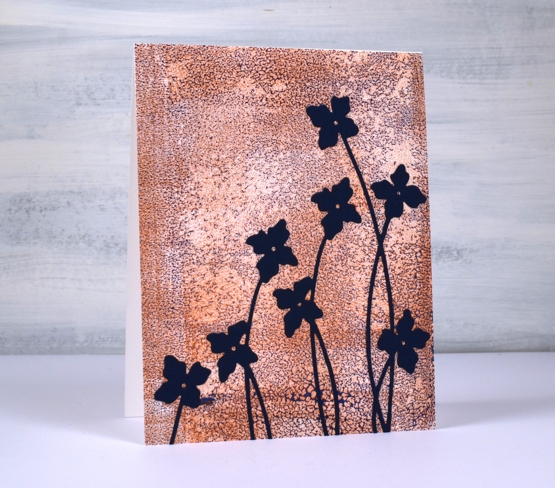
I cut flowers from navy cardstock using the Penny Black ‘shall we dance’ die to complete a card I can use for any occasion.
The Penny Black sale continues at The Foiled Fox so if you have a wish list, take a look.

Supplies
(Compensated affiliate links used when possible)
Die-cut gel print florals
Posted: July 20, 2022 Filed under: gel press, Penny Black, splendid, Taylored Expressions | Tags: gel press, Penny Black creative dies, Penny Black stamps, Taylored Expressions 5 Comments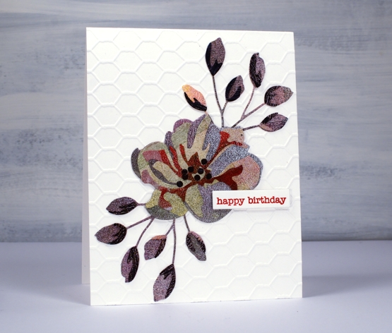
If you are thinking that’s an unusual choice of colours, patterns and textures, you’re right, but it actually makes me quite happy. This is the only layered flower die cut I have of the this type; I don’t generally do layered die cuts. It’s from Penny Black and it appealed to me because of the little buds rather than the complex flower. I know the idea of these dies is to layer in shades of the same colour going from light to dark in the layers. Instead I grabbed one of my gel printing clean up sheets which was covered in black, blue, green, pink, red and purple sections. The texture is from the brayer which I clean off on a thick sheet of paper when I’m gel printing.
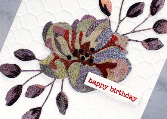
In keeping with the combination of colours and texture I decided to go for an unusual background also and attached the flower and buds to a card-base embossed with the a Taylored Expressions chicken wire pattern. I won’t be surprised if you find it a bit odd but I just can’t help reaching for gel prints and this odd scrappy combo makes me smile. By the way, those little black dots in the centre, I added them myself; they aren’t part of the original die.
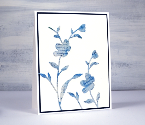
This second card has a bit more elegance. I used the PB ‘whisper’ die to cut flowers from a gel printed text transfer. The text is from a recipe page in a magazine so you might be able to pick out the word cinnamon if you look closely. The dark mat looks black but is actually dark blue to co-ordinate with the gel print. I’ve used the same die to cut both blooms but used only a portion on the right hand side.
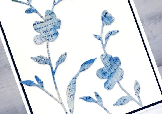
Do you use layered dies? Do you blend the cardstock with inks or pick co-ordinating cardstock? Or perhaps you go for random colour combos like I did!
By the way, Foiled Fox is having a Penny Black sale, so pop over and have a browse.
Supplies
(Compensated affiliate links used when possible)
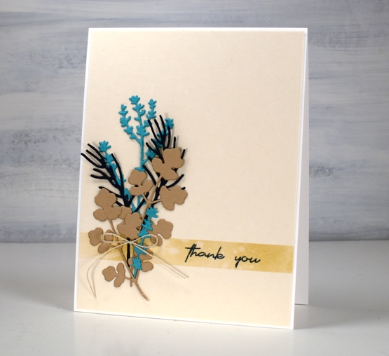
Herbal Thank yous
Posted: July 11, 2022 Filed under: coriander, Footnotes, Penny Black, Simply Graphic, thyme & rosemary | Tags: Penny Black stamps, Simply Graphic 5 Comments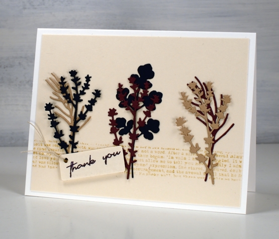
I have teamed up with the Foiled Fox again to bring you some sweet herbal die-cuts. The little stems are from Simply Graphic. The coriander stem is a single die; the thyme and the rosemary are in a pack together.
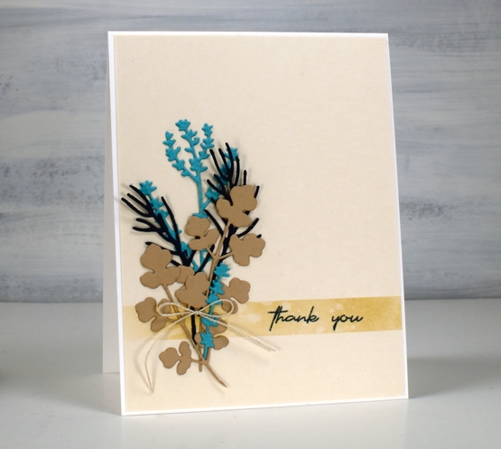
Both cards have a fairly neutral colour scheme with the contrast coming from the turquoise cardstock and the mulberry (which looks brighter in real life)
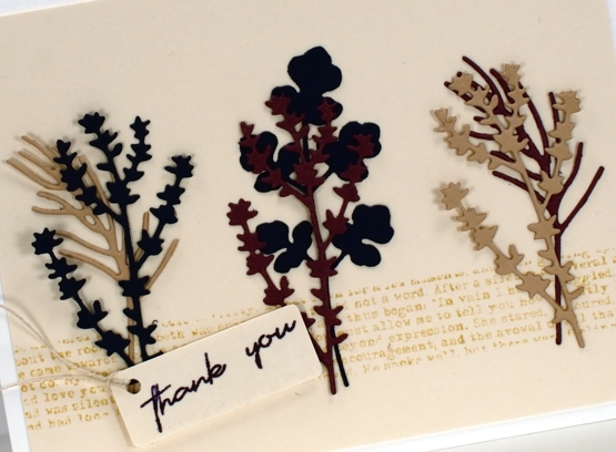
I used ink and stamping to create a ‘ribbon’ across the base of the beige panels. I masked the area then blended ink on one card and stamped text on the other.
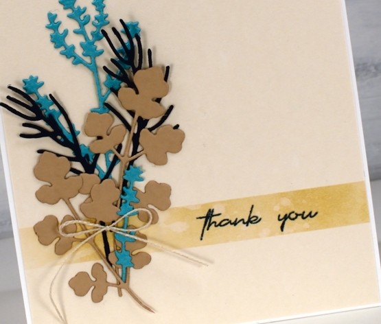
The twine details continue the neutral theme and the panels are attached to white cardbases.
There are more details on the Foiled Fox blog and more lovely nature dies from Simply Graphic in their store. I hope you pop over and enjoy a browse in both blog and store.
Now a post including two herb themed cards would not be complete without some chit chat about my herb pots would it? I have three large galvanized tubs for my herbs and the crop is growing very well. Despite the slow start to summer I have had oodles of basil along with oregano, rosemary, parsley, lavender, sage, mint and Thai basil. I picked enough basil for a homemade pesto the other night and was very proud of myself!
Let me know if you make any favourite recipes with homegrown herbs.
Supplies
(Compensated affiliate links used when possible)
Blooming Blue Again
Posted: July 6, 2022 Filed under: blooming, Dies, how sweet, Penny Black, Tagged | Tags: Penny Black creative dies, Penny Black stamps, Ranger archival inks, Ranger Distress inks 11 Comments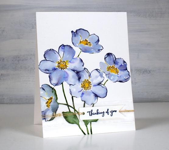
I’m still having fun with PB ‘blooming’ stamp. Once again I used blue inks but this time the combo was chipped sapphire and blueprint sketch. When blended I got blues and purples but not the pinks that seedless preserves provided. If you read my last post you might remember I unintentionally ended up with brown centres. This time I made sure I inked with fossilized amber and wild honey to create yellow centres.
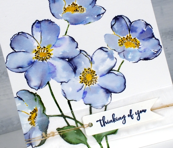
I worked in the stamp positioner to make this panel and did all the green and blue inking and stamping first. I left the centres un-inked so I could add them after the petals were stamped, blended and dry. I don’t mind some blending but I didn’t want the blue and yellow to get too close and blendy because that would mean green centres. Once the yellow centres dried I used a black gel pen to add stamen.
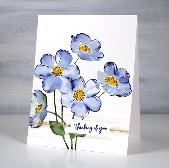
I wanted to gussy this one up a little but still keep the clean look so I used a small piece of organza ribbon across the base of the panel then stamped on a banner die cut and tied it on with twine.
Supplies
(Compensated affiliate links used when possible)
Blooming Blue
Posted: July 4, 2022 Filed under: blooming, Penny Black | Tags: Penny Black stamps, Ranger archival inks, Ranger Distress inks 9 Comments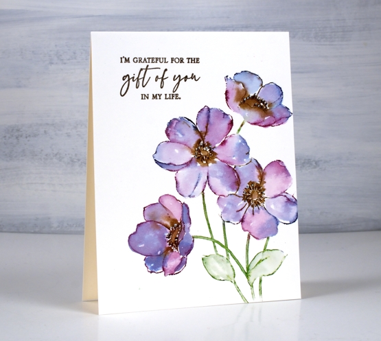
Here is another take on the PB stamp ‘Blooming’. Last week I posted a card with a blended background, brown outline stamping and painted petals. For today’s card I stamped with distress inks which I then blended into the petals.
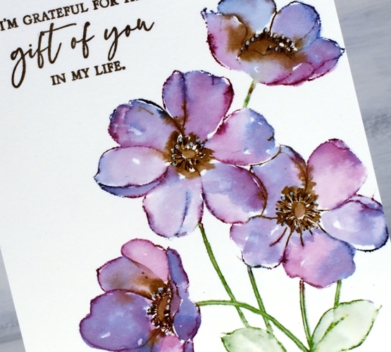
My original plan was to have yellow centres not brown; I guess I got distracted. After inking the petals randomly with chipped sapphire and seedless preserves I added some ground espresso ink to the centres, spritzed the stamp and stamped on hot pressed watercolour paper. With the spritz of water the inks blend a little; with a paint brush I do the rest of the blending adding more ink if needed. That top flower got more brown than I would have liked but I was still happy with the overall blends.
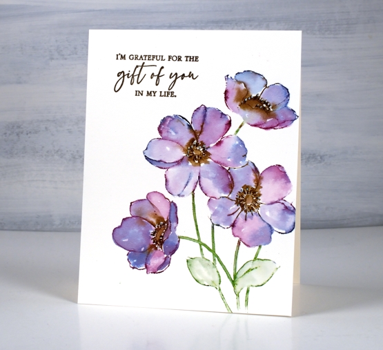
Finishing touches include defining the centres with the bullet tip of the distress marker and adding white dots with a gel pen. The sentiment is from the PB set ‘so thankful’. I have a few more in this little series of watercolours with PB’s large outline floral stamps so I’ll see you back here soon.
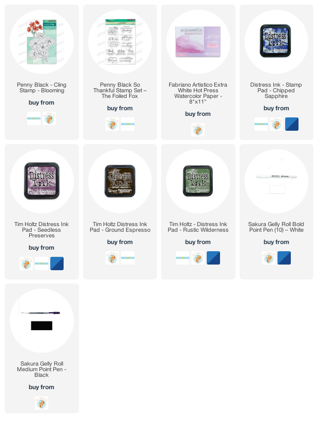
Supplies
(Compensated affiliate links used when possible)
Blooming Big
Posted: June 29, 2022 Filed under: blooming, Penny Black | Tags: Penny Black stamps, Ranger archival inks, Ranger Distress inks 7 Comments
As the title hints, the stamp is called ‘blooming’ and it’s a big one. I mentioned in my previous post how much I enjoy working with the large floral outline stamps from Penny Black. I stamped ‘blooming’ twice side by side in a landscape orientation. The stamp is almost as wide as it is high but I haven’t included all the stems on this card.

Before I stamped I smooshed distress inks on a glass mat, diluted them and swiped my watercolour panel through the ink to create a soft blurry background. Once the panel dried I stamped in archival ground espresso ink then painted the flowers with the same inks I had used in the background, abandoned coral and fossilized amber. To make the flowers bolder so they would stand out from the background I painted another layer of ink then added deeper colours to part of each petal. All the inks are listed and linked below.

I painted the centres in ground espresso distress ink then used brown and black markers to go over the flower centre details and add more veins to the petals. I added highlights with a white gel pen and once again decided against a sentiment for now.
The techniques used in today’s and Monday’s card are featured in my online class Floral Faves.
And in other news, filming has begun for my next online class. I am excited to share more about it soon!
Unique
Posted: June 27, 2022 Filed under: Penny Black, tranquil buds, unique | Tags: Penny Black stamps, Ranger Distress inks 15 Comments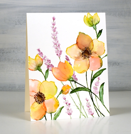
I’ve just spent some time watercolouring Penny Black outline stamps from their most recent release. I am a fan of the large floral stamps as there is plenty of space for blending colour inside the petals. There are also fewer tiny bits to paint which is important for someone who doesn’t quite have the eyesight I used to!)
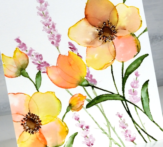
I worked on hot pressed watercolour paper in a stamp positioner with distress ink pads and markers. The large image is the new ‘unique’ stamp from PB paired with an older PB stamp ‘tranquil buds’. I randomly inked the petals of the large flowers with abandoned coral and fossilized amber, the leaves with rustic wilderness and the flower centres with ground espresso. I stamped the large flowers twice to span across the panel.
After stamping I used water and a brush to blend the stamped ink to fill the petals, stems and leaves. Once the petals were almost dry I blended the centres of the flowers. I dried the whole panel before adding the tall flowers. I did have to do some masking to make sure the ‘tranquil buds’ appeared behind the larger flowers. I think they look like lavender so I used milled lavender and seedless preserves distress inks. Once the whole panel was dry I used a dark brown marker to add detail to the flower centres and a white gel pen for little dotty highlights.
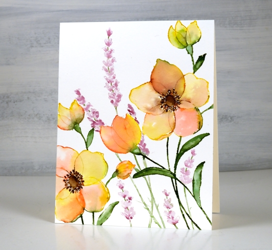
As often happens I decided against a sentiment which means I can use it for any occasion or add one later when I know who I’m sending it to.
Supplies
(Compensated affiliate links used when possible)