
The garden book
Posted: October 7, 2025 Filed under: Handmade book | Tags: Handmade book 8 Comments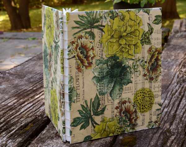
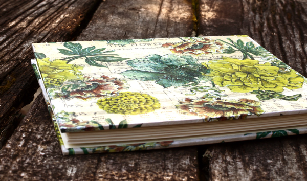
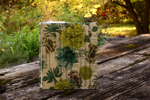
Back at the end of winter my daughter asked if I would like to make her a garden book, as in a book to record what’s in our garden, what is planted where and when it blooms. She wanted to record what is happening in our garden from month to month. I really enjoy making books so I said yes.
Ideally I would have provided the book at the beginning of spring. Fast forward two seasons to the end of summer and I finally finished the book!
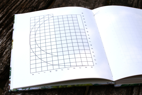
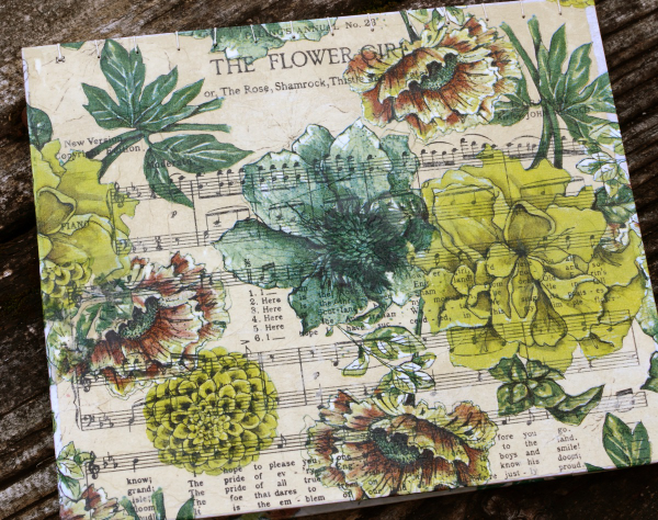
She created a scale plan of our two tier flower garden and printed it several times to be included in the first signature of the garden book. The pages are drawing paper, the covers are heavy cardboard covered in vintage song pages and floral napkins. The vintage song pages came from the Paling’s Annual No 23 of National and Patriotic Songs. The price on the front is 1/6 and it was published in 1914.
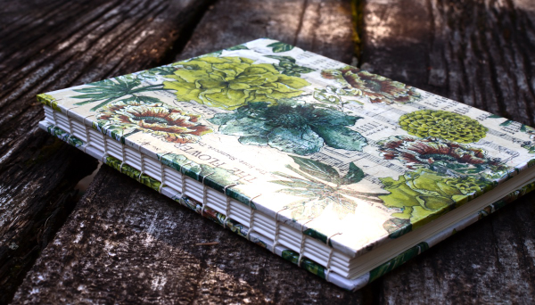
Naturally I chose a couple of pages featuring flower related songs. I used the coptic binding method I learned in an online workshop taught by Ali Manning. I wholeheartedly recommend Ali’s workshops; I have completed a few and will be doing more!
Even though I took a long time to deliver the requested book my daughter has been taking photos and notes during the spring and summer. You can see a glimpse of the garden in the final photo below.
A New Handmade Book
Posted: February 7, 2025 Filed under: Finetec paints, Hand painted, Handmade book, sennelier watercolours | Tags: Fabriano art journal, Fabriano Watercolour Paper, Handmade book, sennelier watercolours 6 Comments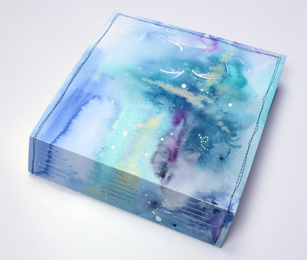
I’ve completed another challenge with Ali Manning in her Handmade Book Club. I have written before about Ali’s wonderful teaching. The most recent class was no exception. It was called ‘Valentine Palooza’ as a nod to the February timing and the cute heart binding on the spine of the book. The Handmade Book Club offers some free classes, some short challenges open to non-members (I have now done four of these) and a monthly or yearly membership ( something I would like to join at some point).
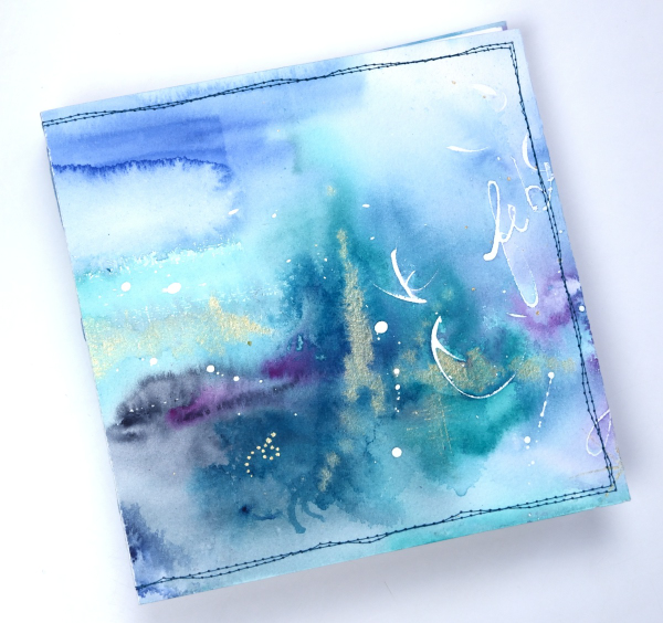
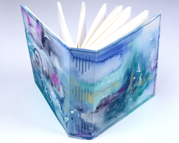
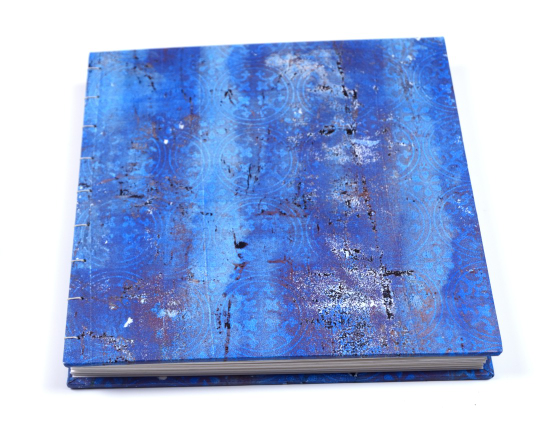
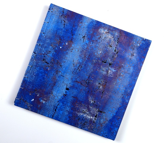
For this most recent challenge I chose to use cold pressed watercolour paper for the cover and hot pressed watercolour paper for the signatures. I watercoloured the cover in a loose abstract style over the top of some masking fluid words and squiggles. As I write this I realise I didn’t take any photos of the inside cover. Both the back and front covers fold over to make the cover more sturdy so my watercolour patterns continue inside.
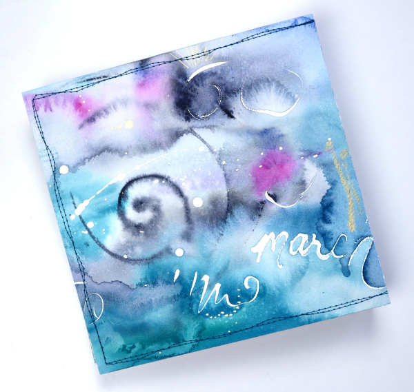
This cover was inspired by Tiffany Sharpe’s lovely stitched and watercoloured cover. I made my book 7″x7″ which was different to the rectangular examples in the workshop but all the steps are the same once you work out your dimensions. I have now made three 7×7 watercolour journals and like the page size for art journalling.
I’m playing with watercolour techniques a lot at present in preparation for my upcoming in person class on Watercolour Techniques. You will see some of the technique samples turned into cards eventually and some will be the base for future journal pages. You can see the other books I have made here: Mixed Media Journal, Coptic Journal, a second Coptic Journal, and Scrappy Journal.
Ocean Collage in Art Journal
Posted: May 2, 2024 Filed under: Art Journal, gel press, Handmade book | Tags: Art Journal, collage, gel printing 3 Comments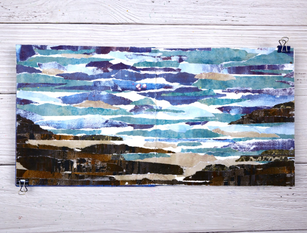
I guess the title gives it away but I hope you can see the ocean, the rocks and the shore in this art journal spread. As with many recent blog posts I used gel prints to create this scene in my 7”x7“ journal.

I created this double page scene after seeing a torn paper landscape a friend had created. I tore strips of paper from several blue prints and brown prints. As I laid them out I realized that the order in which I glued them would affect the end result. I had intentionally ripped the paper to have white edges that looked like the surf.
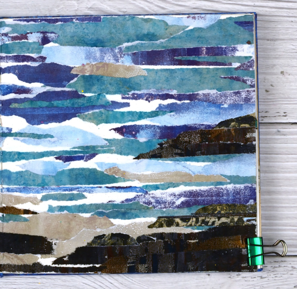
Rather than try and plan the whole design I just started gluing and some how it worked. It is a technique I will try again to see if I can settle on some general instructions.
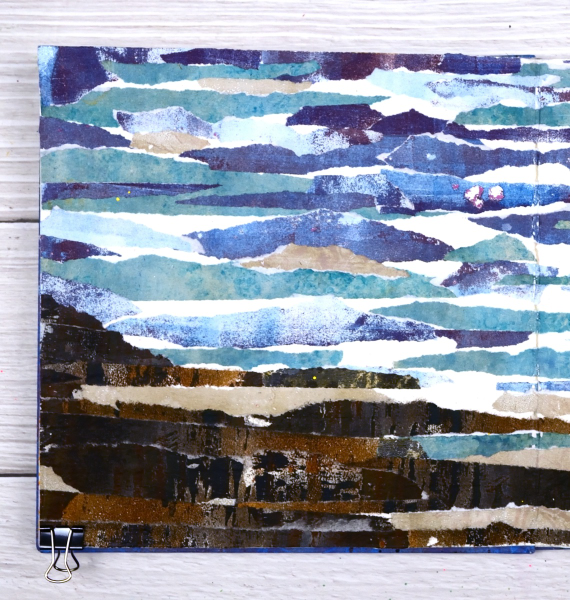
You can see there are some patches of white here and there where I didn’t cover the journal page at all. I felt those patches acted as white caps and surf or sand.

As I sit and write this I can see the ocean out the window and a couple of hours ago I was walking on a beach which looks a bit like these pages. Although the inspiration for this page came out of my memory it seemed like a good day to share an ocean view.
Butterfly Journal Page
Posted: April 22, 2024 Filed under: gel press, grafix, Handmade book, perspective butterfly die, Tim Holtz | Tags: gel press, gel printing, grafix, Handmade book, Tim Holtz 6 Comments
It’s been ages since I posted a journal page here. I think some catching up is in order. This double spread is in my handmade 7″x 7″ journal. I did not sit down with an open journal and a plan for this page. After a productive gel printing session I had a butterfly print and a stripe and stencil print made with the same paint colours. To use them on cards I would have had to cut them up and I really didn’t want to.

When gel printing I will often print with the same handful of paint colours for a while before switching them. It makes it easier to keep printing as I have a few paint tubes on hand but more importantly I end up with a stack of prints which co-ordinate with each other because the colours and sometimes patterns are repeated.

I used the Tim Holtz ‘perspective butterfly‘ die to create a reusable duralar mask for gel printing. The circle patterns were made with the Carabelle Studio ‘accumulation de ronds’ stencil. The ‘corduroy’ looking pattern on both the butterfly and the circle page was made with a piece of textured wall paper. I completed this page quite a while ago but didn’t know if it was finished as I hadn’t added any words anywhere. Maybe that will change one day but I love it just the way it is. What you can’t see is the warm gold shimmer from the gold acrylic paint used to pull the prints.
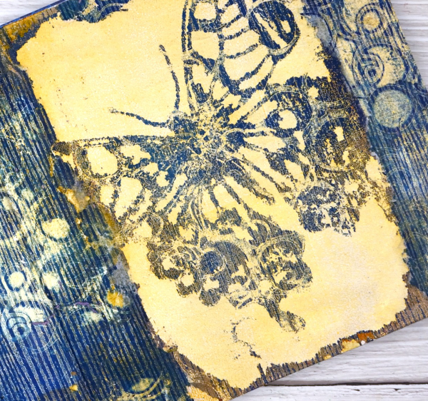
The butterfly print was on paper but the circle and stripe print was on tissue and was fairly fragile. I was able to glue most of it down successfully with gel medium but I don’t mind the ragged edges where it tore. This post includes affiliate links from Foiled Fox and Scrap’n’Stamp . If you buy through these links I receive a small commission at no extra cost to you.
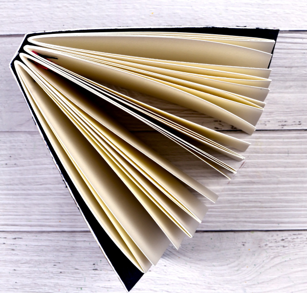
Scrappy Journal Challenge
Posted: March 18, 2024 Filed under: Darkroom Door, gel press, global postmarks, Handmade book | Tags: Darkroom Door stamps, gel press, gel printing, Handmade book 6 Comments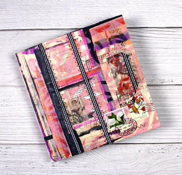
I’ve mentioned the Handmade Book Club before because I enjoy the 5 Day Challenges they offer. The most recent challenge was held last week and was called the ‘Scrappy Journal Challenge‘. The designer and teacher of the challenges, Ali Manning, came up with a tall narrow design which was very attractive. I changed the shape for mine because I will soon need a new art journal and the challenge was the perfect opportunity to get one made. The zig-zag sewing of the signatures was initially tricky but I soon got into a satisfying rhythm and finished them with only one early unpicking incident.
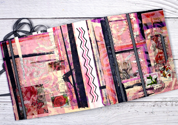
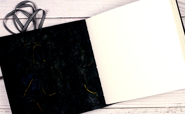
Other than the size of the book and the type of paper in the pages, I followed all the instruction from Ali. She is one of the best teachers I have had the privilege to learn from. I used watercolour paper for my pages and a heavy watercolour paper for the cover. I collaged the cover with vintage papers, then gel printed tissue, fabric washi tape and used postage stamps. The last details added were the gingham ribbon sewn onto the cover with a sewing machine.

The first photo in this post shows the front cover, next the full cover and spine, above is the back cover and below you can see the top view and four signatures.
After sewing the ribbon onto the cover there were random lines of stitching on the inside of the cover so I glued black mulberry paper with gold thread in it over the complete inside cover. After I’d taken the photos I decided to add gingham ribbon ties to both the front and back covers to tie the book closed.
This is the third challenge I have completed with the Handmade Book Club. Here are the links to the other books I’ve made. Mixed Media Journal, Small Coptic Journal, 7×7 Coptic Journal
The World is a Garden
Posted: April 28, 2023 Filed under: Art Journal, daisy delight, Darkroom Door, eyes, Handmade book, sketched alphabet | Tags: Art Journal, Darkroom Door stamps, Fabriano Watercolour Paper, Ranger Distress inks 4 Comments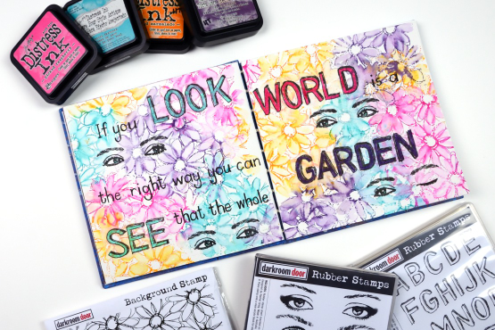
Do you recognise this set? It is the Darkroom Door ‘Eyes’ set I featured on a journal page a couple of weeks back. For this journal page I used a smaller pair of eyes and also one eye from the closed eye stamp so I could create a ‘wink’!
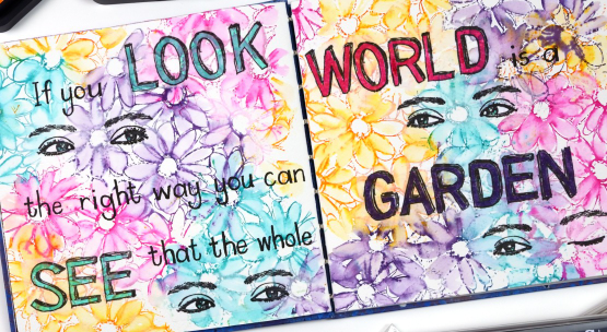
The background is stamped loosely with four bright distress inks and the DD ‘daisy delight’. When I say stamped loosely I was not looking for complete images so I inked sections of the stamp with a couple of inks then stamped on the journal page. I did the same again with a different pair of inks until I had filled both pages. Because distress inks react so well with water and my pages are cold pressed watercolour paper it was easy to blend the petals with a wet paintbrush. Where the inks overlapped I got some nice blends; there were a few muddy blends but overall look is of a garden bed of daisies which is what I wanted.
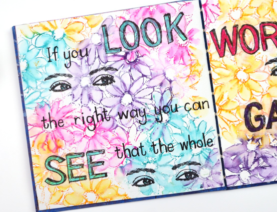
No surprise that I did not have the whole design planned out from the beginning so I had to work out the best way to add the eyes without disturbing the very dilutable flowers I had already watercoloured. I ended up stamping them on tissue paper and gluing them down with a gluestick so as to not add more liquid to the background. I also stamped the large letters for the quote on tissue paper using the DD ‘sketched alphabet’ stamp set. Having the eyes and the words stamped on tissue made it easy to play with the arrangement until I was happy with it. The smaller words making up the quote I wrote by hand with a black marker.

The quote is from ‘The Secret Garden’ by Frances Hodgson Burnett, a book I enjoyed reading as a child and a parent.
Just a quick question for you, did you try reading the quote straight across the two pages or did you see it went down the left then up to the right? Just wondering because I didn’t even think of both options when I was laying it out.
(Compensated affiliate links from Foiled Fox & Scrap n Stamp)
Darkroom Door Eyes
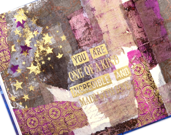
Posted: April 14, 2023 Filed under: Art Journal, Darkroom Door, eyes, Flower garden, French Script, gel press, Handmade book, made for you, spanish tiles, starry night, Stencils, you are everything | Tags: Art Journal, Darkroom Door stamps, Darkroom Door stencils, gel press, gel printing 4 Comments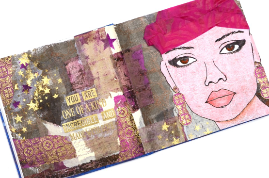
Are you surprised to see a face on one of my projects? This journal page spread was definitely outside my comfort zone but I am very happy I persevered and brought it to completion. The page began with the new ‘Eyes’ stamp set from Darkroom Door and a pile of gel prints. There are eight pairs of eyes in the set in a couple of different sizes. I chose to stamp the eyes on a pale gel print done with oxide inks and the DD background stamp ‘flower garden’. To help me draw the rest of the face around the eyes I found a magazine face with similar size eyes and that gave me the right scale and placement as I completed the head and features.
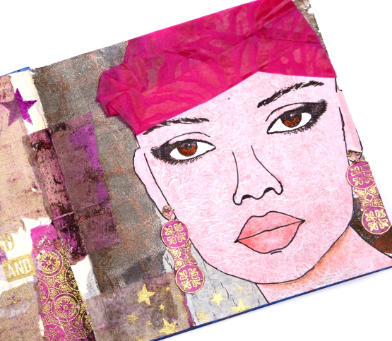
Although I like the idea of adding hair I decided to do that on a future project and used some textured wrapping from a bunch of flowers instead. The bright pink helped me choose other gel prints to complete the background collage. You might not see them all but DD background stamps and stencils are featured on most of the torn collage pieces.
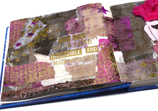
I embossed the Spanish tiles background stamp on a bright pink gel print, tore it up for collage and attached a strip to cardstock so I could cut earrings. I also used gold embossing when adding the words. I alternated phrases from the DD ‘you are everything’ set with the new DD ‘made for you’ set.
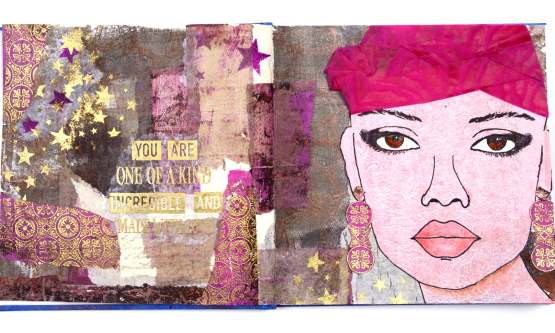
I worked in my new handmade journal which is 7″x7″. Once I had the facial features pencilled in I went over them with marker then added shading with coloured pencils. I also stenciled some stars over the collage and embossed in gold to give the whole spread more unity. The pink turban was a bit of a challenge which ended up looking a bit more like a swim cap than a turban but you get the general idea don’t you?
I will be using the eyes again both to practice drawing faces and as elements in future journal pages. I hope you are enjoying seeing the new stamps from Darkroom Door; they are always full of the artistic magic and clever ideas of Rachel Greig.
(Compensated affiliate links from Foiled Fox & Scrap n Stamp)
Lighthouse Journal Page
Posted: April 6, 2023 Filed under: Art Journal, Darkroom Door, global postmarks, Handmade book, this way, word labels, World Map | Tags: Art Journal, Coliro paints, Darkroom Door stamps, Fabriano Watercolour Paper, Handmade book, Ranger Distress inks 5 Comments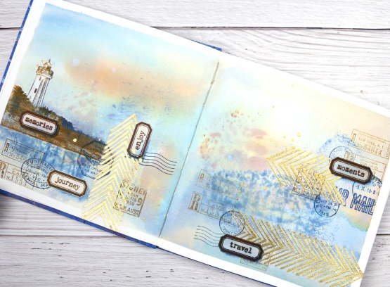
This journal spread was a joy to make. It combines so many of my favourite things. A few weeks back I posted about a new handmade art journal. This is it and these are the first pages I’ve completed. I didn’t work on the very first page; I leave that for later, so this is a few pages in. The pages are cold pressed watercolour paper so I taped the edges and created a watery blended background with distress inks smooshed on a piece of acetate then pressed onto my pages. I added more ink with a paintbrush and stamped the Darkroom Door world map stamp into the wet ink. I wasn’t trying to create sky or land or anything in particular I was just working randomly with blues and browns.
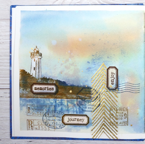
Once the background dried I used stamps from another favourite, the DD ‘global postmarks’ set, again stamped in blue and brown but archival ink, not distress, so it wouldn’t dilute and blur.
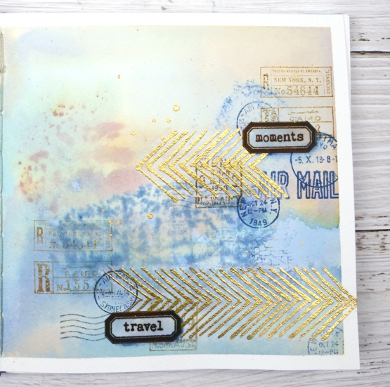
On an extra scrap of watercolour paper I picked up some smooshed and diluted ink then dried it before stamping the new ‘word labels’ stamps so I could cut them out and arrange them over the page.
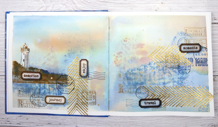
If you have been visiting my blog for a while you will have seen the lighthouse stamp before. The lighthouse is in Norah Head, on the central coast of NSW, not far from where my father lives and the Darkroom Door premises. I have visited there several times and climbed the lighthouse with my dad. You can probably see now why I chose the word labels I did. The lighthouse and the ‘this way’ arrows are stamped on tissue paper. This allowed me to move them around to work out exactly where I wanted them. The blurry world map stamping worked as a ‘reflection for the lighthouse image so that’s where it ended up.
When I am adding stamped tissue to a page I gently tear around the edges with the help of a damp paintbrush. For the lighthouse I cut carefully around the walls and light then painted white paint on the back of the tissue so it would not be transparent. Of course I splattered some water and some gold paint to complete the page.
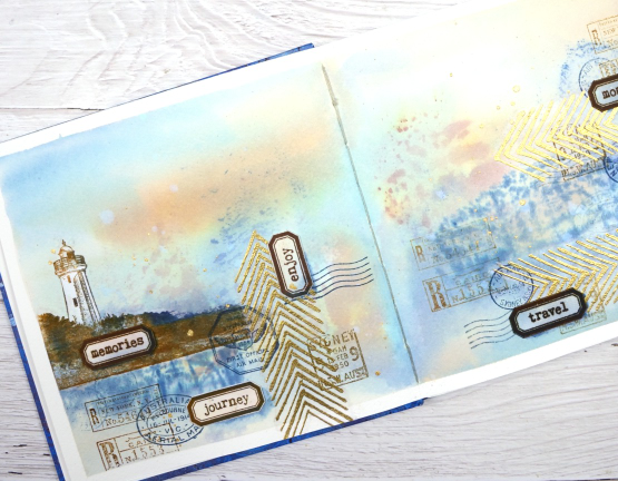
As this was the first time I had used my new journal I was interested to see how the cold pressed watercolour paper worked. Nothing soaked through the paper to the other side and I took care to dab up liquid from the centre seam so there was not much bleed through there either. The 7″ x 7″ size gave me a little more room than the 6 x 6 journals I have been working in but wasn’t so large as to be overwhelming.
(Compensated affiliate links from Foiled Fox, Scrap n Stamp & Ecstasy Crafts)
Handmade Art Journal
Posted: March 9, 2023 Filed under: gel press, Handmade book | Tags: Fabriano Watercolour Paper, gel press, gel printing, Handmade book 15 Comments
A couple of weeks ago I posted photos and description of the handmade book with Coptic binding which I made as a participant in the November 5-Day challenge from the Handmade Book Club. I really like the construction and binding of this particular book so I made another one, this time with cold pressed watercolour pages and a gel printed cover.
The pages in this book are seven inches square so the covers are a little larger. When I went through my very large stash of gel prints I didn’t have two pieces large enough and matchy-matchy enough for my liking. Hard to believe I know, because my gel print collection now inhabits two large boxes. Knowing that I needed at least 9″ x 9″ prints I made a couple on rice paper especially for this journal. The pretty circle/tile pattern in the print is from a piece of embossed cardstock I have been holding onto for a very long time ‘just in case I needed it!’
I make my covers from the thick cardstock backs of watercolour paper pads. You can buy bookboard, but my stash of thick cardstock pieces is large and easily sturdy enough. I printed the cover patterns on rice paper which folds beautifully over the thick cardboard.
As you might have noticed from recent art journal posts, I’ve been creating in a 6″ x 6″ journal for my classes and at home. This one is just that little big bigger so I’m excited to get started in it.
Stay tuned to see what I put in this journal. I think it is safe to say some of the prints from those two big boxes will end up in here! Hope your day includes a book, in some shape or form.
Deep Rabbit Holes (another handmade book)
Posted: February 17, 2023 Filed under: Handmade book | Tags: Handmade book 12 Comments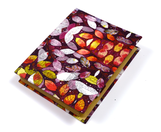
I have a friend who I met through art journalling and we like to share with each other the artsy craftsy rabbit holes we have gone down. I have been interested in handmade books for a while but only in recent years have I joined online classes to make some. It is a rabbit hole I intend to keep tunneling into! My first hand made book I shared in November 2021. I love how that first book turned out but as yet haven’t put it to use.
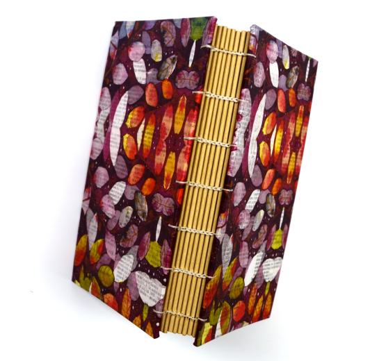
In November 2022 I started another one taught once again by the incredibly talented Ali Manning. Ali runs a bookmaking monthly membership program which is a luxury I can’t afford right now but she also offers 5 day book making classes three times a year. The book you see here was started during the Nov 2022 Coptic Journal challenge but not finished until late December because…life.
The beauty of the 5 day challenges is there is an instructional video every day, a live Q & A session and a team of people answering questions. And it only costs $10. This isn’t a sponsored post or anything like that; I just want to say that I love the timeframe and level of commitment with these 5 day challenges. I am looking forward to seeing what is offered in March. Anyway enough of the how, let’s talk about what!
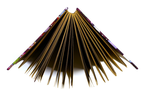
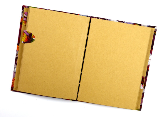
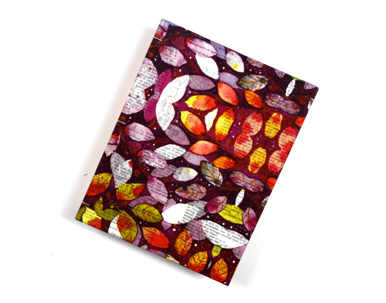
The name of the book comes from the binding which you can see in the second photo. I used kraft paper for my pages, table napkins and dictionary pages to decorate my covers, heavy card from watercolour paper pads for my covers and bookbinding thread.
The size is 6″ x 4.75″ and some of the pages have tabs on them to divide up the book. The binding allows the book to sit flat when open which is nice. I am using it to practice drawing simple line drawings in black and white.
Since finishing this little book I have made another one following the same video instructions (once the five day challenge is over I still have access to the content so I can make more books). I was going to share the second one in this post but I will save it for another day.
Are you a bookmaker? What styles and techniques have you used. Would you buy a handmade book? Just wondering…


