
Christmas Critters blog hop
Posted: December 1, 2023 Filed under: Penny Black, robin's christmas | Tags: Penny Black stamps, Ranger Distress inks 17 Comments
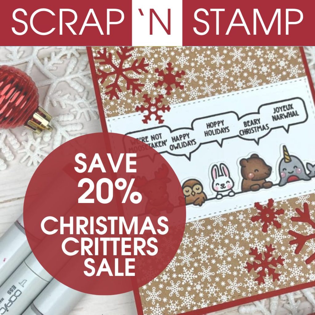
I am happy to be participating in Scrap’N’Stamp Christmas Critters Inspiration Hop today. You will be able to find oodles of critter inspiration on the blogs included in this hop. With eleven different stops on the hop there is sure to be something for everyone. Be sure to leave comments at each stop along the way- a winner will be randomly selected from those comments to win a $50 gift certificate to the SNS online store & announced on the SNS blog December 26. If you are looking for critters of any kind make sure you check out the 20% off Critters Sale.
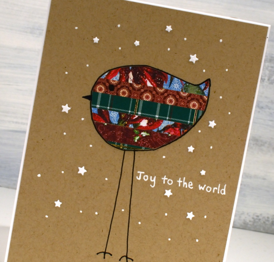
When invited to a Critters themed hop I knew I would be stamping a bird and this sweet Penny Black robin was just the thing. The stamp is called Robin’s Christmas and you get the whole scene in one lovely stamp. Kind of similar to a one a one pot meal – always a winner in my book!
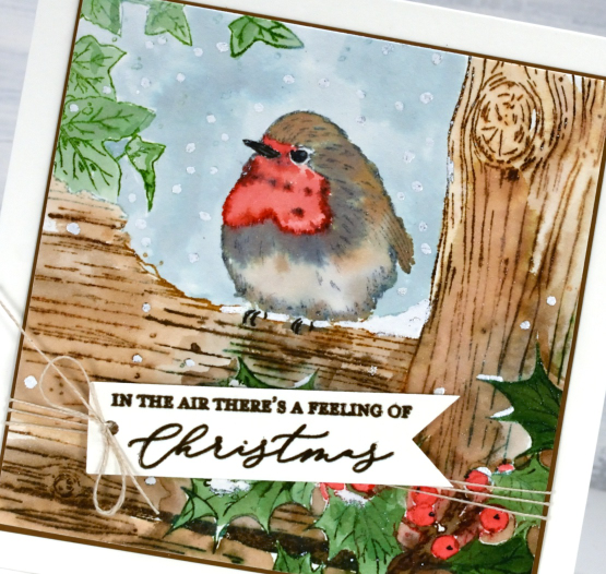
I stamped the bird on hot press watercolour paper first with speckled egg distress ink which is a nice pale blue which I could easily stamp over with darker colours. With the outline image stamped I used speckled egg ink from a re-inker to paint the sky behind the bird. Once that was dry I continued to work in a stamp positioner with one or two ink colours at a time stamping all the other elements. I used evergreen bough and rustic wilderness for the leaves, tea dye and walnut stain for the wood, candied apple for the berries and feathers and weathered wood and tea dye for the bird’s feathers.
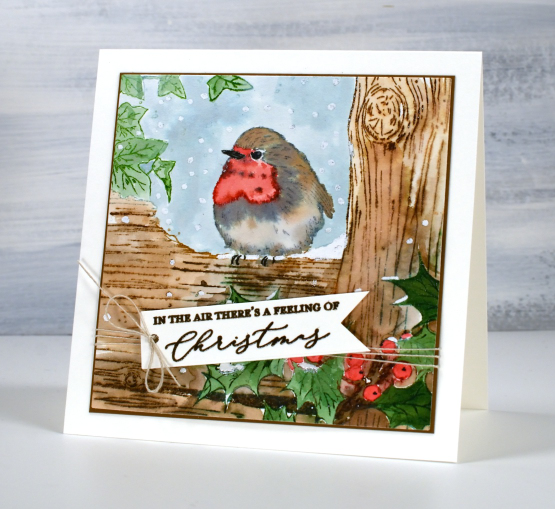
The sentiment is from the PB set ‘feeling of Christmas‘. To finish the scene I used an embossing pen and white embossing powder to add snow here and there.
Thanks for visiting my stop on the hop. If you want to start from the beginning click over to the Scrap’N’Stamp blog. If you are looking for the next stop after me click over to the incredibly talented Dina Kowal.
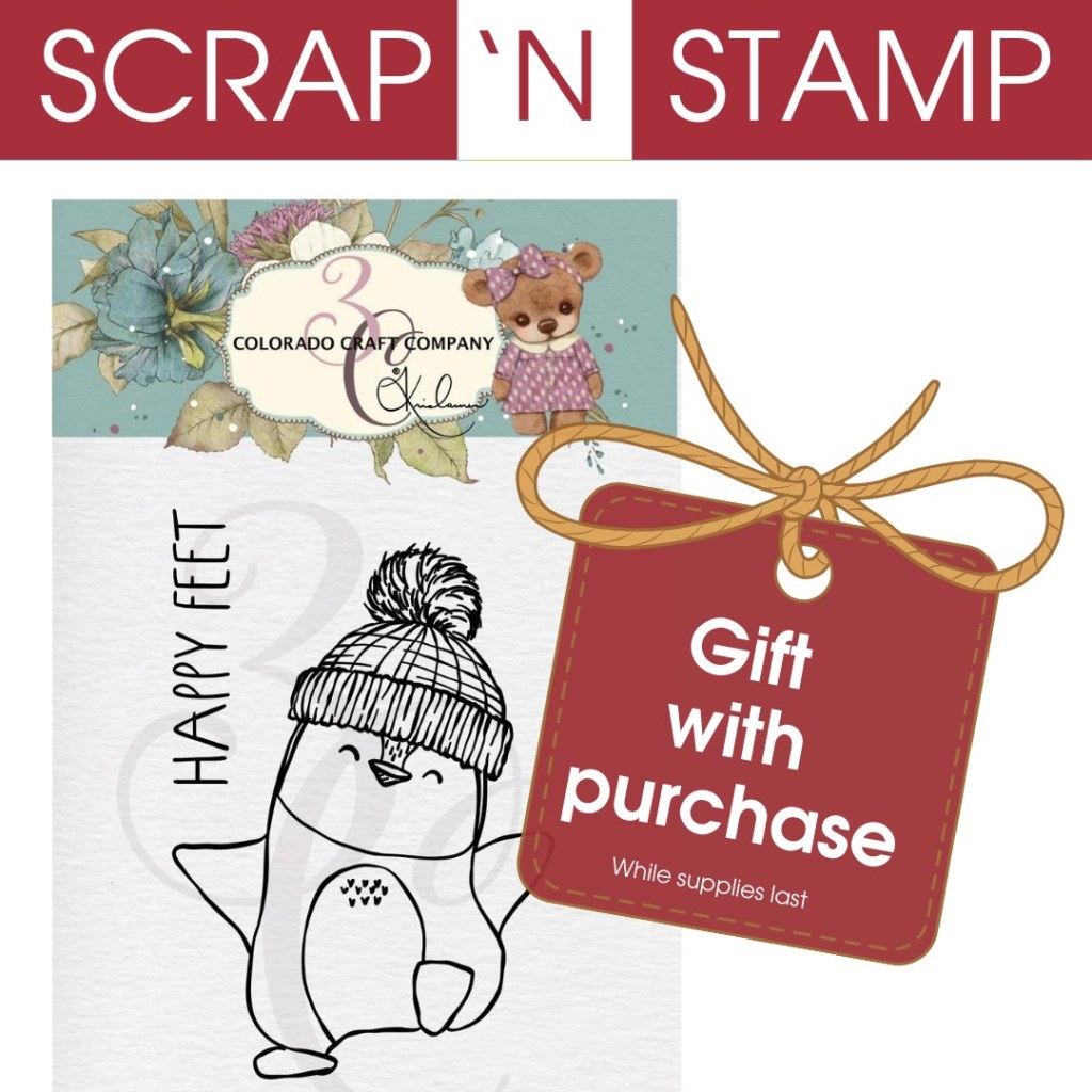
Of course there’s also a SALE 20% off Critters until December 7, so have fun shopping after you hop! As a bonus, while supplies last you can get a Christmas Critter stamp for FREE with any purchase over $50! Just look for this cute penguin stamp and add it to your shopping cart!
Today’s post features affiliate links to Scrap’n’Stamp. If you buy through these links I receive a small commission at no extra cost to you.
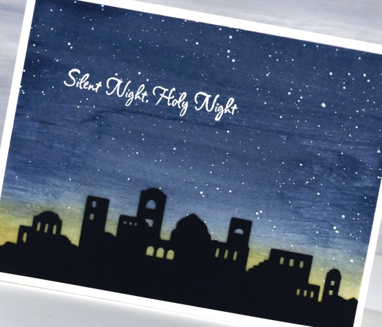
Bethlehem Skyline
Posted: November 30, 2023 Filed under: Bethlehem skyline, cricut, Echidna Studios, Penny Black, Silent Night | Tags: cricut, Echidna Studios, Minc, Penny Black stamps, sennelier watercolours 9 Comments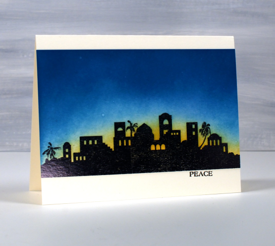
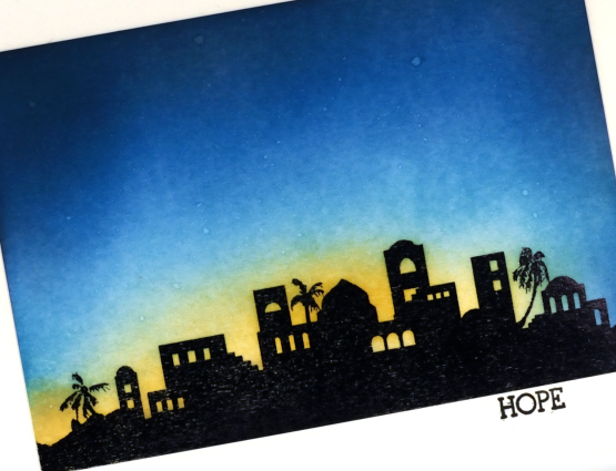
Today’s post is another long one full of photos. I hope you enjoy seeing the different styles and techniques applied to the new Echidna Studios digital set ‘Bethlehem Skyline‘. I requested this image and I think my daughter did a beautiful job with her design. The set includes a black silhouette and an outline image featured further down this blog post.
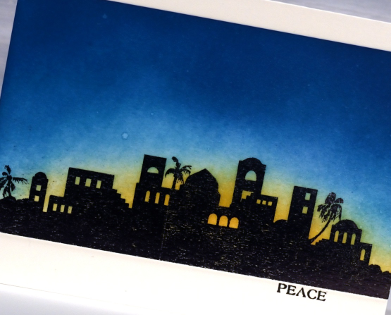
To create these first two cards I printed the silhouette image on white cardstock then foiled over the top with black foil. Using blending brushes I blended first scattered straw distress ink then broken china, and finally uncharted mariner for the deep blue sky. I wanted the colours to blend into each other but I didn’t want too much green where the blue and yellow met so I went carefully in that area.
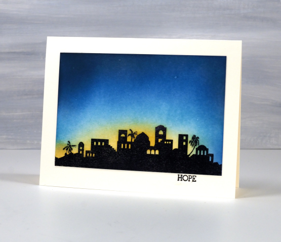
The sky was dark but I wanted a bit darker so blended just a bit of black soot ink around the edges and top of the panel. You might have noticed the image is the same but a different size in each card; that’s the beauty of a scalable digital image. To add stars to the blended sky I spritzed a fine spray of water on the panel and then dabbed it dry with a paper towel. The stars are subtle but they are there. The words Hope and Peace are once again from the PB ‘holiday snippets’ set.
The next style of card features a cut out of the Bethlehem skyline once again using the digital svg file but cut from black cardstock with the cricut. After cutting the silhouette a couple of times we realised the trees were too small for a card sized cut out so added a tree-less image to the set.
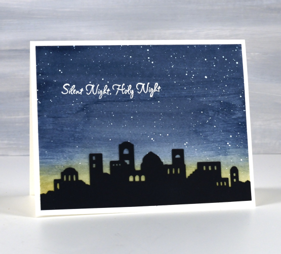
I painted a blue and yellow sky with Sennelier watercolour paints then, once dry splattered white acrylic ink over the blue area. When that was dry I attached the black silhouette and embossed a sentiment from the PB set, ‘silent night’.
When cutting the silhouette from black cardstock I also cut a larger one which I have wrapped around cylindrical glass vase. I put a candle inside the vase and lit it but I am not sure whether the candle is bright enough. I am going to keep experimenting and if I can get a good photo I will share it here on the blog. I think the image would look great cut from vinyl and attached to a wooden panel as a nativity sign. Oh the possibilities!
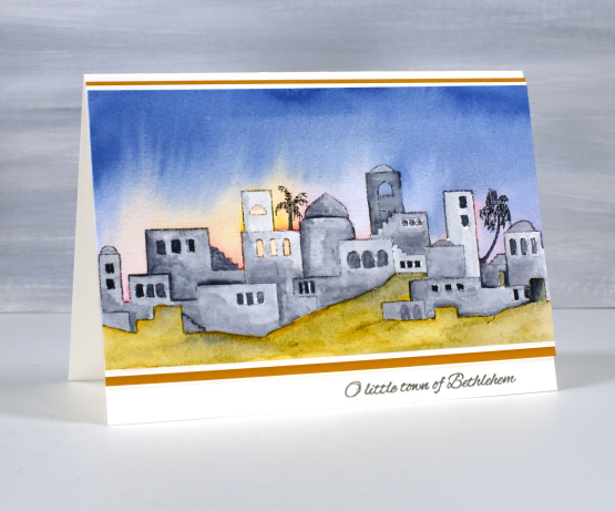
The final card features the other image in the set, an outline of the Bethlehem skyline. I printed it on hot pressed watercolour paper then painted over the buildings with liquid frisket to mask them. The masking made it possible to paint the sky with wet watercolour layers of blue, pink and yellow while preserving the town to paint after the sky dried. To get the soft bleed of pink and yellow into blue I set the panel upside down on the top edge to dry so gravity helped me get the glowing light effect.
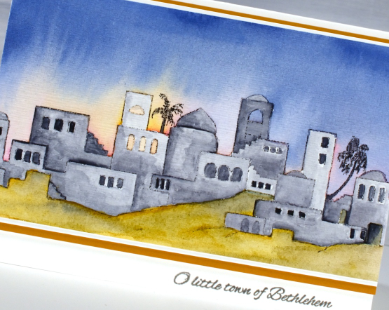
I used a mustard yellow to paint the foreground but it was too bright so I added some of the same blue from the sky to give it some shadow. With both the sky and ground completed I removed the liquid frisket(masking fluid) and painted the buildings with Payne’s grey.
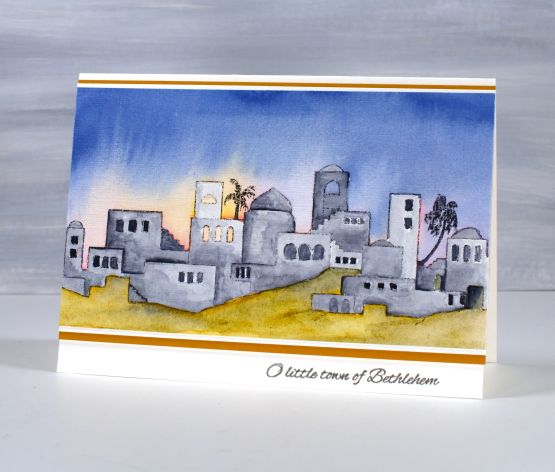
I finished the card with a mat of white then a mat of mustard brown and a little PB sentiment in versafine clair ‘morning mist‘ ink. Thanks for reading this far. I hope you enjoyed my different techniques with this lovely image. I think you’ll be seeing it again; its a new fave!
Today’s post features affiliate links to the following companies. If you buy through these links I receive a small commission at no extra cost to you. The Foiled Fox & Scrap’n’Stamp
Trees from strips and scraps
Posted: November 29, 2023 Filed under: Darkroom Door, Dies, Music Background, Penny Black, sheet music, starry night | Tags: Darkroom Door stamps, Penny Black creative dies, Penny Black stamps 5 Comments
I have a few more cards made from leftovers today; I love leftovers, especially the ones in the fridge but the paper ones are nice too! The card above is my favourite of the mix and it is so simple, just strips and stars. I stamped one of those strips with a music background stamp but the rest are just patterned or gold shimmer cardstock.
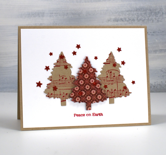
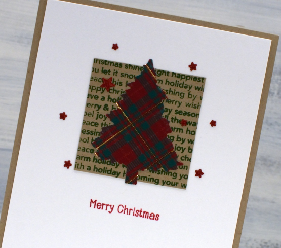
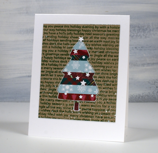
I made use of one tree die for the rest of today’s cards, it’s from Penny Black’s ‘evergreen tree‘ die set. The trees above are cut from stamped and patterned paper. The tree below I cut from a piece of kraft that I had coloured my own plaid pattern on with coloured pencils and a gel pen. It was fun but not necessary if you want to be quick. The pretty music stamp featured below is from Darkroom Door and the larger one above from Penny Black.

The final card shows another tree cut with the same die but from printed plaid paper attached to a panel stamped with an old holiday word stamp. The little stars I cut with the PB ‘starry night die’ and used small sentiments from the PB holiday snippets set. It is an old set now but I use it all the time on Christmas cards.
Today’s post features affiliate links to The Foiled Fox. If you buy through these links I receive a small commission at no extra cost to you.
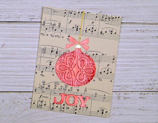
Foiled and Embossed ornaments – video
Posted: November 27, 2023 Filed under: grafix | Tags: grafix, Penny Black creative dies 5 Comments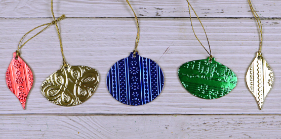
Recently I made a video for Grafix which involved some experimenting with their Metallic Foil board. I created some sweet little foiled and embossed ornaments and a card. I was very impressed with the way the foil board embossed. You can see the whole process in the video below.
The double tack mounting film worked very well also adhering the foil board to the chipboard. It made for some simple but very shiny, eye-catching ornaments. If you don’t have dies that cut chipboard you could always die-cut several baubles from cardstock and stack them to make a firm base for the foiled layers.

I added a single layer embossed bauble to a card front too and the shine of the foil board looks lovely on the very neutral vintage music paper. The ornaments and bow were all cut using the Sizzix ‘retro ornaments’ Bigz die and the word ‘joy’ was cut with the Penny Black ‘joyful winter’ die.
Christmas Filigree
Posted: November 23, 2023 Filed under: Christmas filigree, Dies, Echidna Studios, joy of giving, Penny Black, Taylored Expressions | Tags: digital stamps, Echidna Studios, Penny Black creative dies, Penny Black stamps, Taylored Expressions 2 Comments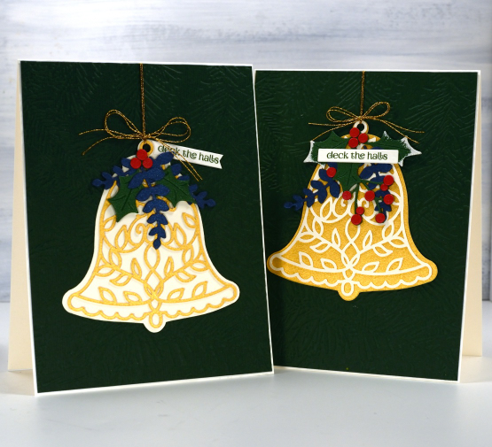
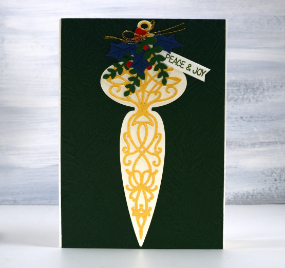
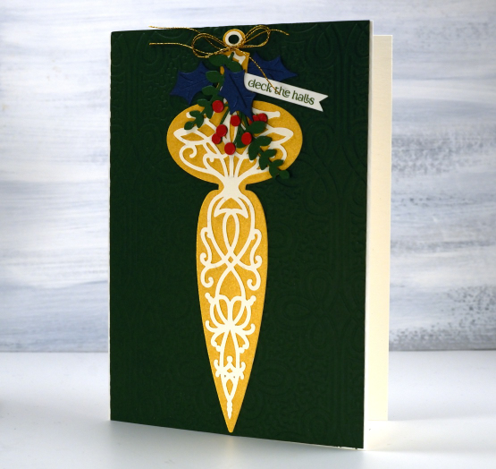
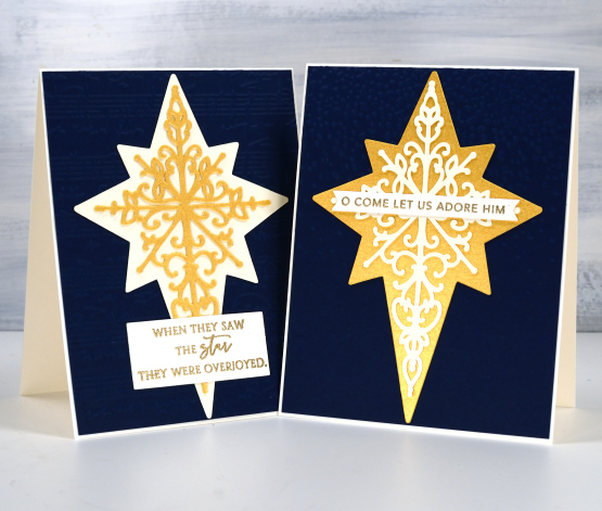
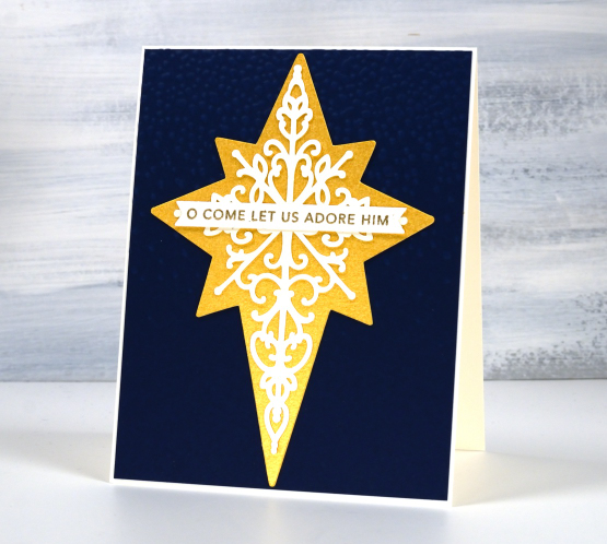
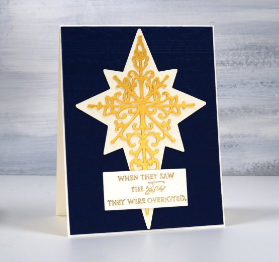
I am pretty excited about these new images. I think filigree patterns are very pretty and once I got the gist of it had a lovely time designing a bell, a star and a finial ornament. I thought it made sense to have a solid background to show off the filigree and, tada, the Christmas filigree digital stamp and cut file set came to be! This set is now in the Echidna Studios store along with three more new sets and some updated Christmas sets from last year. It’s beginning to look more like Christmas every day.
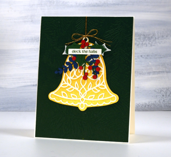
I think the bell is my favourite of the three images and will come in handy making wedding cards as well as Christmas. I wanted to show off the designs on dark backgrounds but when in comes to photographing shimmery gold, embossing on dark green or navy and the high contrast of cream cardstock as well, I can’t always nail it.
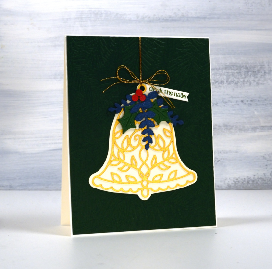
So let me tell you the bells are sitting on dark green panels embossed with Spellbinders ‘forever green’ folder. The green panel on the left below is also embossed with that folder but the one on the right is embossed with the Anna Griffin ‘regal braid’ folder. The star cards at the end of this very long post are on navy blue backgrounds and it is again a little tricky to see one base is embossed with the ‘speckles/snowfall‘ folder and the other with the Taylored Expressions ‘sheet music‘ folder.
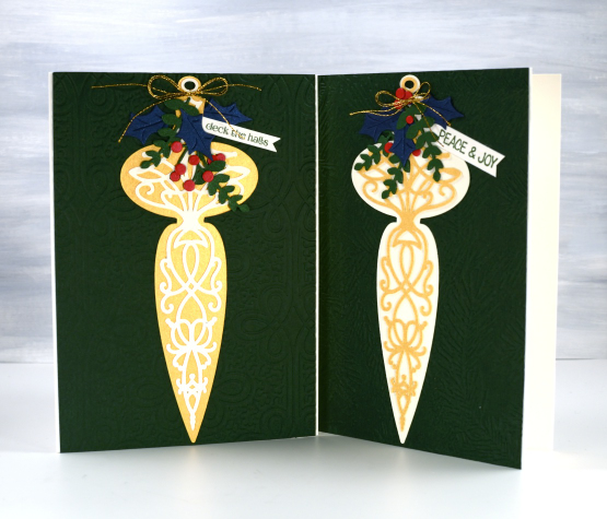
I decorated the finials and bells with a mix of die cut foliage from Penny Black including the ‘joy of giving‘ set.
As the finial is such a long thin shape I made the card a little larger than usual, around 6″x4.5″.
I created the star cards without foliage but found suitable sentiment from PB and Taylored Expressions.
I think all three designs would make lovely tree ornaments either stacked to give them extra stability or cut from thick acrylic or thin board on a laser cutter. I don’t have a laser cutter but it is possible to book time on one at the library; if get some cut I will definitely show them here on the blog.
Thanks for scrolling all the way through this long post; I really appreciate you visiting the blog. Have a great day!
Today’s post features affiliate links to Scrap’n’Stamp. If you buy through these links I receive a small commission at no extra cost to you.
Cones and Berries
Posted: November 21, 2023 Filed under: Cones & berries, Penny Black, Uncategorized | Tags: distress markers, Penny Black stamps, Ranger Distress inks, Stampin Up 5 Comments
More variations on a theme in today’s post. As mailing deadlines get closer I am creating some ‘same but different’ cards to swell my stack. I have never been one to create more than about five of the same card and even when I do there are usually variations. I used the Penny Black cones and berries stamp facing downwards and upwards. I also did first and second generation stamping for a dark and a light version.

Some of the images I cropped closely as shown above and others I gave more space as in the splattered example below. The texture of the SU embossing folder ‘timber’ gave some subtle texture to the woodsy image. You can also see I did extra blending on the card above and deeper colours on the one below.

Even with the variations this was not a time consuming card to make. I worked in a stamp positioner and inked the pinecone and sticks with distress inks, the berries and leaves with distress markers or other waterbased brush markers before stamping on hot pressed watercolour paper. With the stamp in the positioner I was able to spritz it again to create my second generation image and at one stage I was stamping either end of a larger piece of watercolour paper so I could just flip the orientation between impressions. The joy to the world sentiment is from PB Christmas sentiments set and the other sentiment is also PB, it’s red rubber and I cannot find a name for the set. Speaking of mailing deadlines, my cards to Australia were posted yesterday! Having a sprained ankle is keeping me at home right now so this year I might just be a little ahead of my usual ‘just made it’ schedule.
Today’s post features affiliate links to The Foiled Fox. If you buy through these links I receive a small commission at no extra cost to you.
Stripes and strips
Posted: November 14, 2023 Filed under: Christmas background, Dies, Hand drawn, Hand lettered, My Favorite Things, Penny Black, starry night | Tags: collage, My Favorite Things, Penny Black creative dies 8 Comments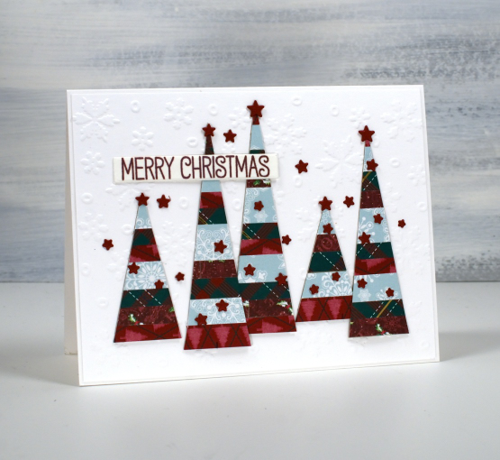
If you have scraps of patterned or solid coloured paper today’s post is for you. I made a panel of striped cardstock by cutting thin strips of patterned paper and gluing them to a piece of light cardstock. From my homemade ‘striped cardstock’ I cut a hand drawn tree, a hand drawn bird and some simple triangle trees. You could use dies for all the elements I was just playing with ideas and decided to sketch and cut myself.
I used an embossed snowflake background for the card at the top of the page, a stamped kraft background for the tree above and then plain kraft for the bird. The little stars that decorate each card I did not hand cut of course! They are cut with the PB ‘starry night die’ and applied with the help of one of those sticky ended tools. Little embellishments have a high fiddliness factor which I don’t appreciate but these tiny stars were necessary!

I added outlines to both the bird and the tree with white or black gel pen along with some dots and a handwritten sentiment.
Cutting my own shapes was fun and put some of the many paper scraps to good use!
Old favourites
Posted: November 10, 2023 Filed under: Berry kissed, Penny Black, Uncategorized | Tags: Fabriano Watercolour Paper, Penny Black stamps, Tsukineko Memento inks 6 Comments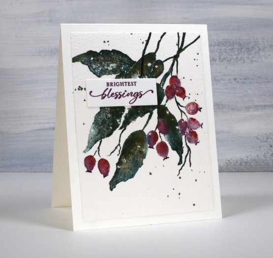
When I say old favourites I am talking in crafting years not harking back to my grandmother’s time. The PB stamp featured on today’s card is definitely a favourite, it’s called ‘berry kissed‘ and it’s been around a few years.
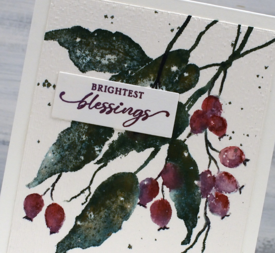
Another old favourite on this card is my often used technique of splattering masking fluid on my hot pressed watercolour paper before stamping or painting. After all the ink is added and dried I remove the masking fluid to reveal little white dots here and there which look like snow.
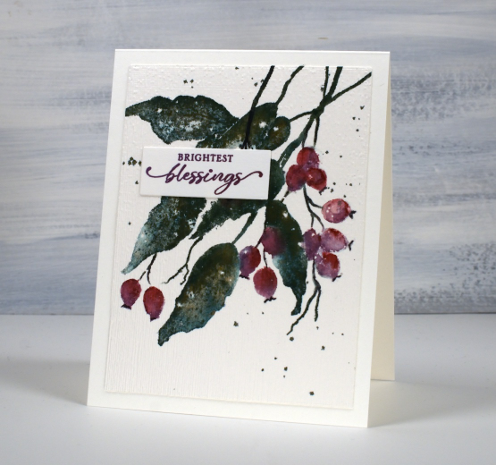
The final old favourite worth mentioning on this card is the ‘magic’ ink, memento northern pine. It is a dark green dye ink and when it is wet it bleeds into greens, blues and browns. I stamped the leaves with this ink then blended over them with a paintbrush and you can see all the different tones, especially in the close up photo. And yes, the placement of the sentiment does cover a few blotchy berries!
Today’s post features affiliate links to the following companies. If you buy through these links I receive a small commission at no extra cost to you. The Foiled Fox & Scrap’n’Stamp
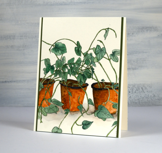
Seedling Pots
Posted: November 8, 2023 Filed under: Echidna Studios, seedlings 4 Comments
I’m featuring the seedlings digital stamp from Echidna Studios today. You might remember seeing these little pots before but they were sized differently last time to show the whole digital stamp. To create today’s card I printed the image larger on hot press watercolour paper and once again used watercolour paints to add colour.
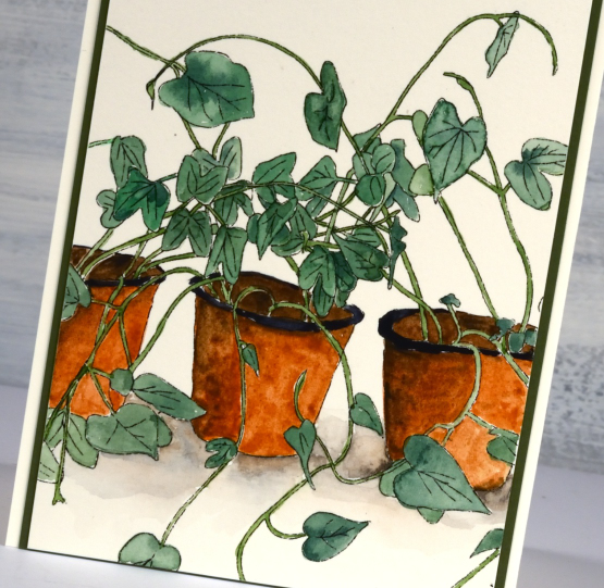
As the image has quite a few leaves and stems it was less fiddly to paint it on a larger scale. I kept my colour palette minimal using a green I mixed myself along with two browns and a black for the pots.
The Echidna Studios etsy store is my daughter’s store and is filled with a mix of digital images, most are her original artwork but there are some of my designs also. We are continuing to add to the store regularly and are working on some videos to introduce you to the world of digital stamps and cutting files. I print on a basic laser printer but my daughter tested some of the images on an inkjet printer recently and they worked very well. I cut the svg cutting files on my Cricut but a Silhouette or a ScanNCut would also work.
Thanks for dropping by today.
Tree Canopy
Posted: November 7, 2023 Filed under: Alcohol Ink, gel press, The Crafters Workshop, tree canopy | Tags: Alcohol Ink, gel press, gel printing, The Crafter's Workshop 8 Comments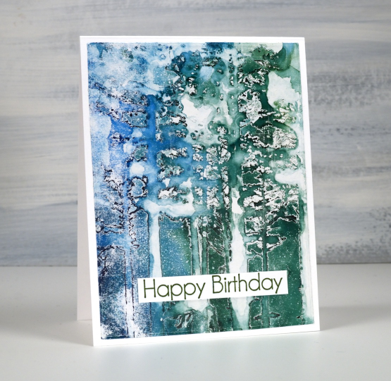
Some might say this print didn’t work and I admit, that was my first thought when I looked at it. On later inspection I decided I really liked its imperfection and incomplete nature. The technique is alcohol ink through a stencil on a gel plate. Once the alcohol ink dries I pull the print with acrylic paint. (I have several videos on my youtube channel showing the technique)

When applying alcohol ink through a stencil onto a gel plate I have had the most success when using stencils full of fine lines not large solid spaces. The tree canopy stencil from The Crafter’s Workshop has some very fine lines but quite a lot of solid tree trunks also. The alcohol ink pools under the expanse of stencil plastic and takes quite a while to dry. If you move the stencil before the ink dries it starts moving again. I don’t believe I waited long enough for the ink to dry so I have some distinctly tree-ish bits in my print and some very abstract blobby bits. Despite the indistinct image I love the atmosphere of the print which I pulled with white acrylic paint. The stencil is 6″x6″ and so is the gel plate I used so I chose the best part of the print to make my 4.25″x5.5″ card. The sentiment is from Taylored Expressions ‘In & Out birthday’ set.
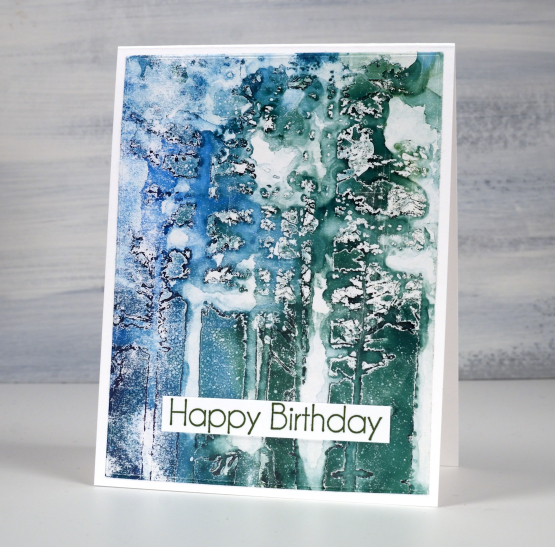
So let me know, is this too abstract for you or do you see a bit of whimsical forest atmosphere in there?
Today’s post features affiliate links to the following companies. If you buy through these links I receive a small commission at no extra cost to you. The Foiled Fox & Scrap’n’Stamp


