
Mini Mittens
Posted: November 21, 2024 Filed under: cricut, Echidna Studios, mittens, my designs, ski lodge embossing folder, Spellbinders | Tags: cricut, Echidna Studios, Penny Black stamps, Spellbinders 9 Comments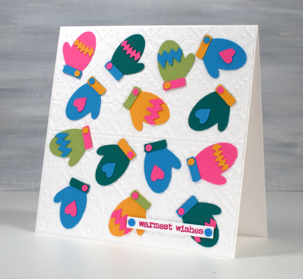
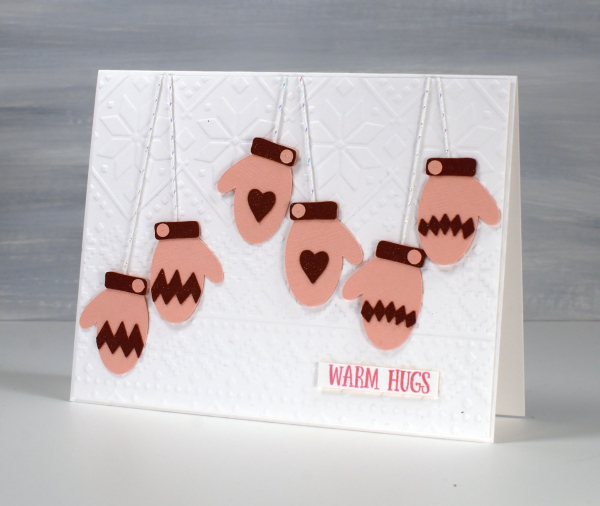
I do like an alliterative title but I restrained myself from calling this post Many Mini Mittens! I designed these mittens and accessories as cutting files for the cricut and I’m having so much fun with them. The Mittens digital stamp & cut-file set is available in the Echidna Studios etsy store. When I taught my bookish Christmas card class recently I had a cool stocking to cut from vintage papers but no mittens. To begin with I just designed the mitt and the cuff but I couldn’t stop so now the digital set has a heart, a poinsettia, diamond pattern, a zig-zag pattern, a snowflake, two cuffs and a little button. The buttons are too sweet.
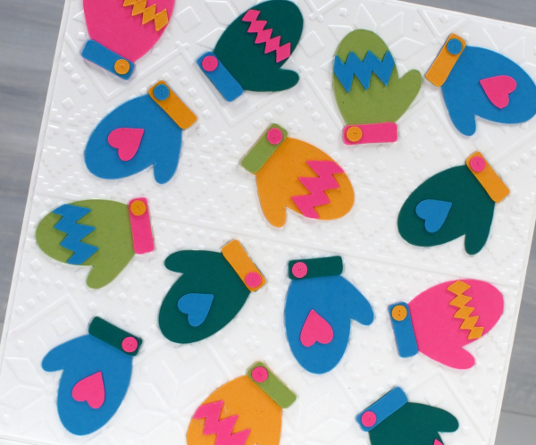
This colourful card started as an experiment to see how small the cricut would cut the mitts without tearing them. These little mitts are 1¼” in length; everything else is obviously smaller and cut just fine.
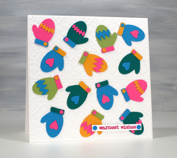
I had fun arranging the elements on the mittens so there wasn’t too much of one colour or repetition of the same coloured patterns. I did create them in pairs because who wants a whole bunch of unmatched mitts? I’ve experienced that in our own mitt basket – why so many right mitts and no left mitts?!
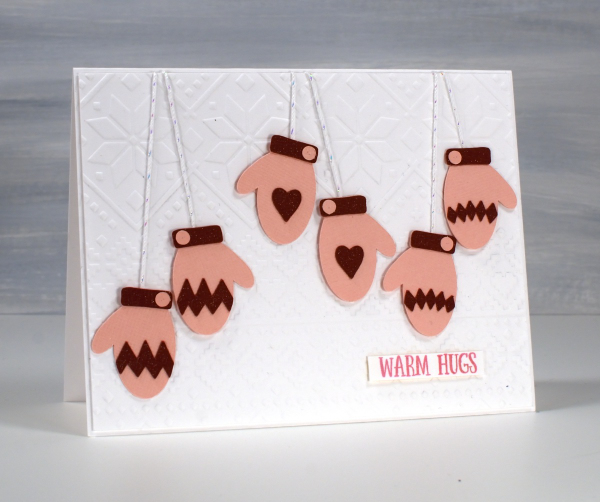
And because I couldn’t stop I cut some matching pairs the same size but using linen textured pink and burgandy cardstocks. I used a clear wink of stella brush pen to make all the burgandy bits sparkle but as I write this I see it didn’t show in the photo. Trust me it adds to the cuteness. ( I had forgotten about my wink of stella pens)
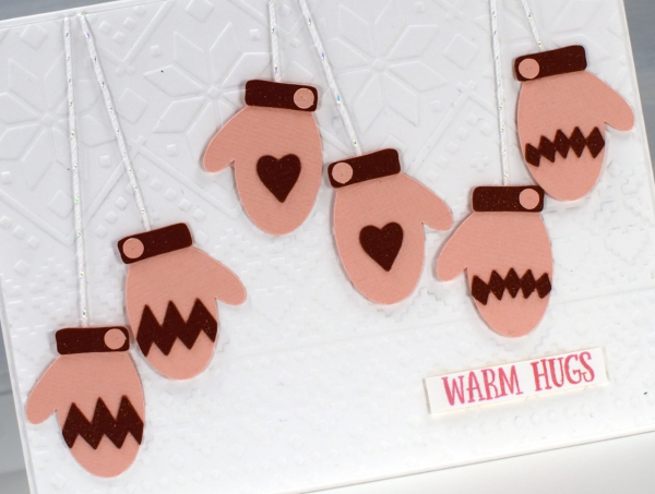
For both cards I used Spellbinders ‘ski lodge’ embossing folder to make a background because ❄! I found suitable Penny Black sentiments from the ‘Merry Up‘ set. Come back tomorrow and I will share the larger, knitted mitten cards I also made with this digital set.
2 for 1 with Delicate Pines
Posted: November 20, 2024 Filed under: delicate pines, Finetec paints, Penny Black | Tags: Fabriano Watercolour Paper, Finetec artist mica watercolour paint, Penny Black stamps, Ranger Distress inks 4 Comments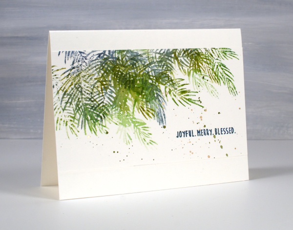
Although I don’t tend to make exactly the same card in large numbers I do like a quick and simple way to make a few similar cards at the same time. To create these pine needle cards I started with a watercolour panel larger than an A4 card. It was about 5¾” x 6″ and I placed it in the stamp positioner with the long side tucked right against the long side of the positioner.
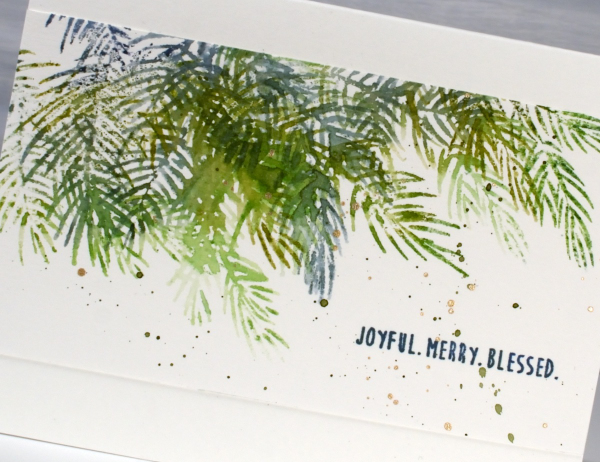
Using the two of the three Penny Black ‘delicate pines‘ stamps positioned to stamp along the top edge of the panel I inked them with a few green and blue distress inks. Before stamping I spritzed the stamp lightly so the different greens would blend on the stamp and then on the paper. I then moved the stamps around so I could use the third stamp and get some overlapping branches. Without moving the stamps I turned the watercolour panel 180° and repeated the stamping steps. The panel ended up with a border of pine branches on each side. I cut the panel in half and trimmed the sides so I had two 5½” x 3″ panels to add to card bases.

I finished off both panels with a sentiment from the PB ‘jolly snippets‘ set and some green and gold splatter. Simple yet pretty. Today’s post features affiliate links to The Foiled Fox. If you buy through these links I receive a small commission at no extra cost to you.
Sketching over Scarlet Majesty
Posted: November 13, 2024 Filed under: Penny Black, Scarlet Majesty | Tags: Fabriano Watercolour Paper, Penny Black stamps, Ranger Distress inks 4 Comments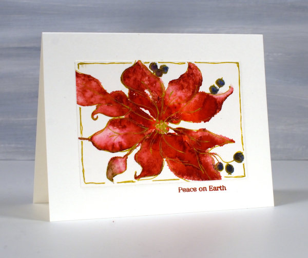
When I posted cards made with the scarlet majesty stamp last week I mentioned a technique I had used to define the petals a little more. Today’s cards feature the sketched outlines I added after stamping. As with my previous cards I inked the stamp with distress inks or other water-based dye ink. I spritzed the stamp before stamping which creates a loose watercolour look on the image. I like the loose image but admit that some of the definition of the petals is lost. With the image on the stamp (and packaging) as my guide and some artistic license I drew around petals, berries and leaves with a gold gel pen. I didn’t try to stay exactly on the edge of the stamping but close. For the red poinsettia I also drew a rough frame around the image.
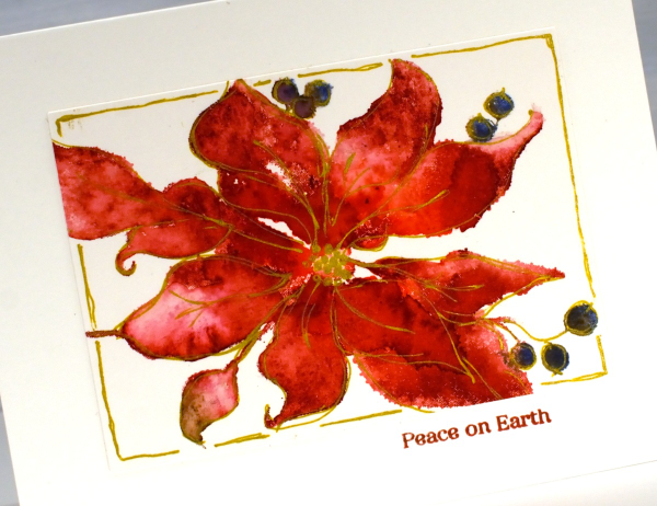
I added a small sentiment below the panel in a matching ink. On the red panel above I didn’t try to keep leaves green and petals red; everything is red. On the pink poinsettia below I used a few more distress inks in my initial loose watery impression.
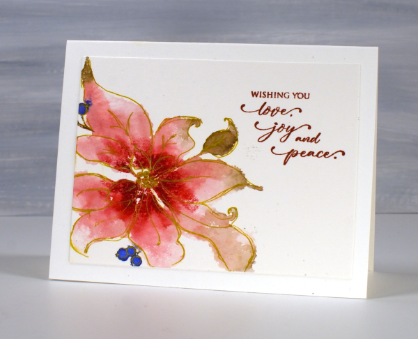
Once again I stamped on hot press watercolour paper inking the stamp with small distress ink cubes and markers. Once the image was dry I used the gold gel pen to sketch the outline. If you look too closely you will see blobs and ink outside the lines but I quite like the overall gold edged effect.
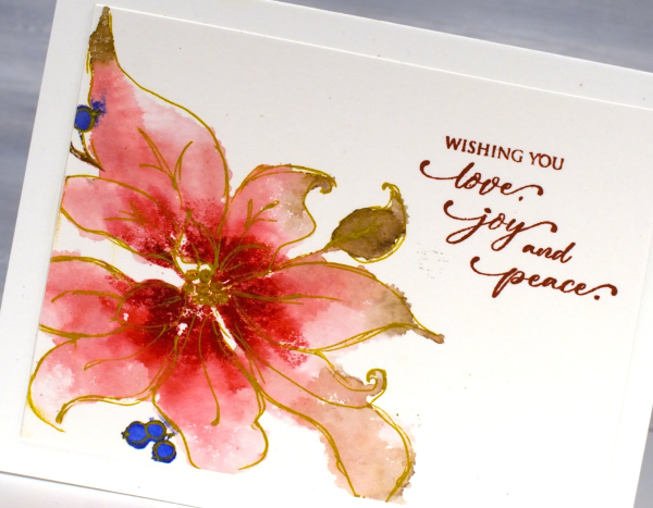
One tip if you try this technique but find yourself trying to be too precise. Hold the gel pen further down the barrel than you normally would and move faster than usual drawing your lines. That way you should achieve a loose sketchy style that pulls the very watery stamped image into better focus.
Hope you’re having a great day. I now need to write some international Christmas cards; it is time to put them in the mail!
Berry Full & Split
Posted: November 12, 2024 Filed under: Berry kissed, Penny Black | Tags: Fabriano Watercolour Paper, Penny Black stamps, Ranger Distress inks 5 Comments
I posted a card made with this Penny Black ‘berry kissed‘ stamp last year under the title old favourites. Here it is again, still a favourite! In the hope of swelling my Christmas card stash in a timely manner I’ve made some cards out of half a stamped image. It doesn’t work with all stamps but I thought I could make it work with this one.
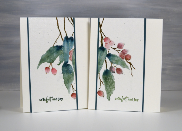
Once I had stamped the berry kissed stamp using a stamp positioner, hot pressed watercolour paper and a mix of blue, green, pink and brown dye inks I placed a ruler down the middle so I could see what would fill each side if the panel was divided. The right hand side of the image contained plenty of soft pink berries and three leaves. The left hand side looked a bit sparse with three leaves but only one full berry and a couple of partially covered ones.
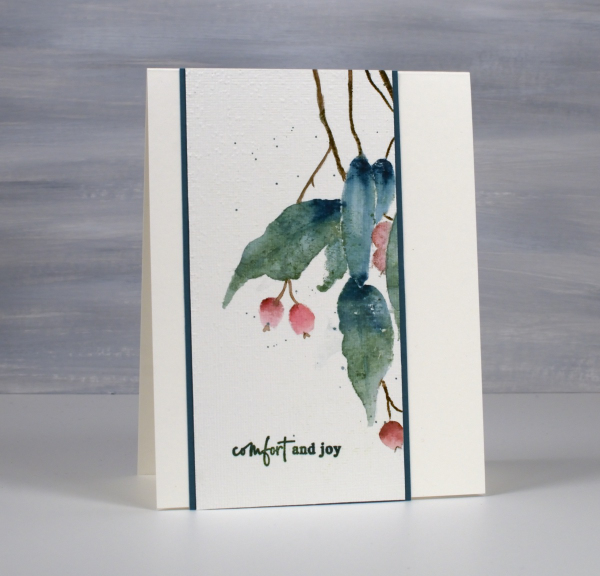
To make the left hand side a bit fuller and more interesting I inked and added two more berries. Both sides got the splatter treatment, a teal mat and a simple sentiment from the PB set, ‘jolly snippets’
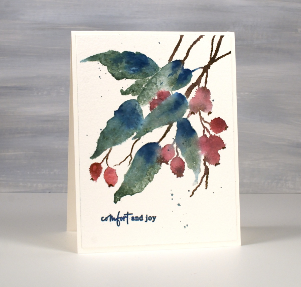
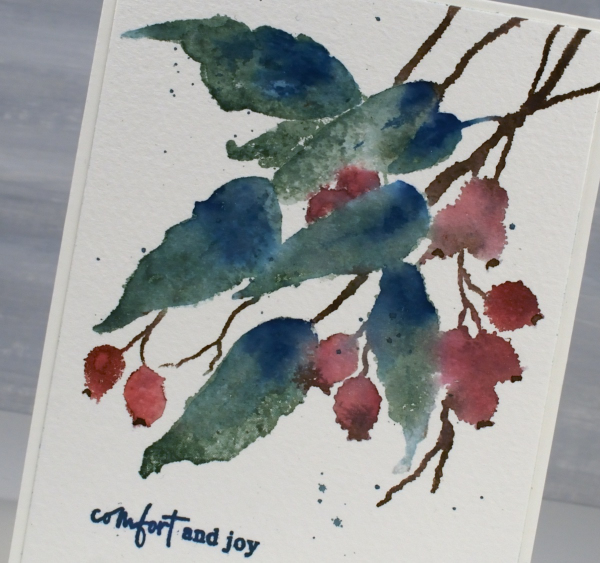
I also completed a panel which I didn’t slice in half. Because I used cold pressed watercolour some of the edges of the images are not as smooth. It all depends on how much water I spritz on the stamp after inking, a bit too much can result in the wiggly edged berries you see below.
Today’s post features affiliate links to The Foiled Fox. If you buy through these links I receive a small commission at no extra cost to you.
Pink Majesty
Posted: November 4, 2024 Filed under: Finetec paints, Penny Black, Scarlet Majesty, Stampin Up, subtle | Tags: distress markers, Fabriano Watercolour Paper, Finetec artist mica watercolour paint, Papertrey ink, Penny Black stamps, Ranger Distress inks 10 Comments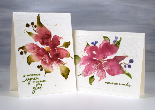
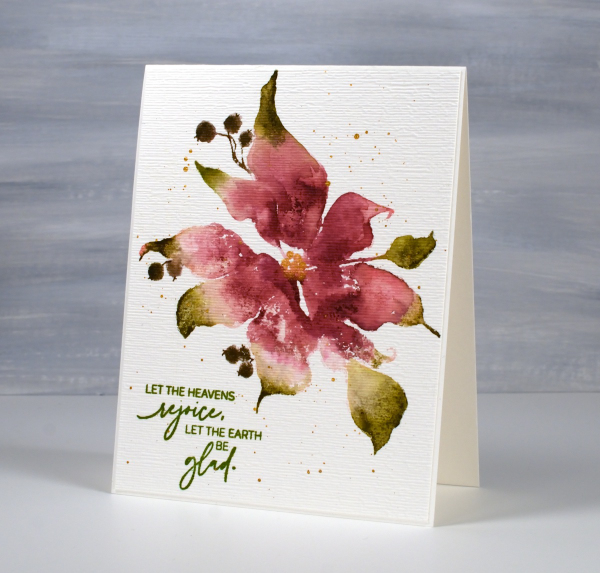
Today’s cards feature the beautiful Penny Black stamp, ‘scarlet majesty‘ but as the title suggests, I have chosen pinks over scarlet for the ink colours. I worked on Fabriano hot pressed watercolour paper in my stamp positioner.
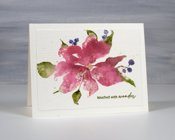
I inked most of the petals with a pink ink then added darker ink with more of a burgandy such as aged mahogany. I use a mix of small cube ink pads and markers to ink the stamp. The leaves were inked with peeled paint and the berries a purply blue such as chipped sapphire. Before stamping I spritz the stamp so the inks can move a little. I stamp the first impression then decide whether more ink is needed, more water or often some blending with a paintbrush and water.
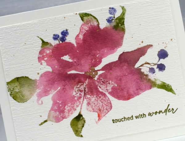
I don’t remember fiddling much with this panel as I liked the watery blends and the paler veins showing through here and there. I painted the centre of the poinsettia with gold finetec paint and of course added some splatter.
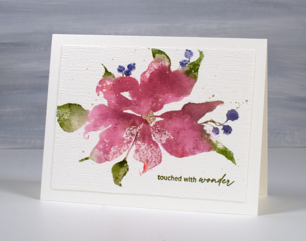
The sentiment is from PB ‘jolly snippets‘ and the texture from the retired SU ‘subtle’ embossing folder.
I used the same technique on this second card but used darker inks for leaves, petals and berries. My guess is aged mahogany, forest moss and a dark brown which was possibly made by mixing the first two. (I don’t always take note of my ink colours)
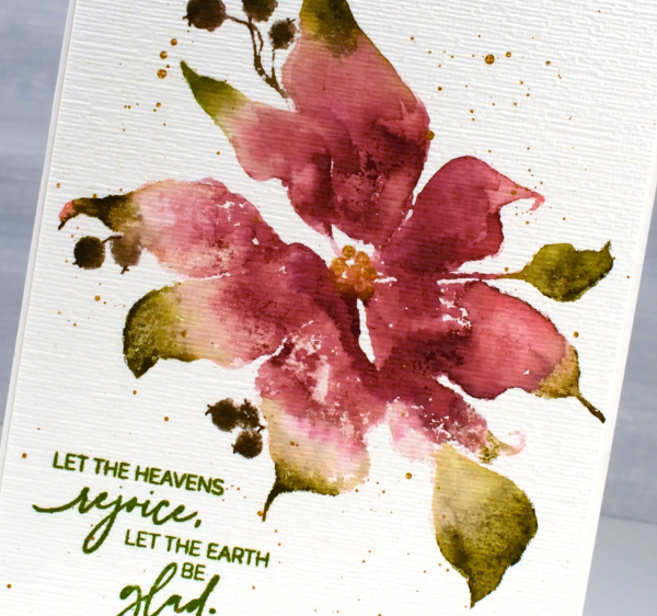
I think ‘scarlet majesty’ is a stunning stamp; I like the curl at the ends of the petals. Here are a few more cards made with it. I will admit that it is tricky to ink because you can’t always see where to try and define edges. I have another post coming up where I handle this issue by adding lines after stamping. I’ll share that soon. The sentiment this time came from the PB set, ‘promise of hope’.

Today’s post features affiliate links to The Foiled Fox. If you buy through these links I receive a small commission at no extra cost to you.
Leaf Print Sympathy cards
Posted: August 6, 2024 Filed under: gel press, Penny Black | Tags: gel press, gel printing, Penny Black stamps 10 Comments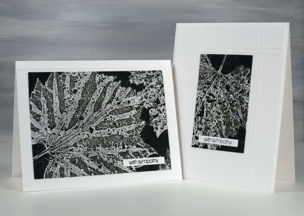
I’ve been collecting leaves, flowers and grasses over recent weeks for botanical gelprinting and thought I would try some damaged leaves eaten by beetles. The holes in the leaves leave a lacy pattern on the print which is delicate alongside the leaf veins.
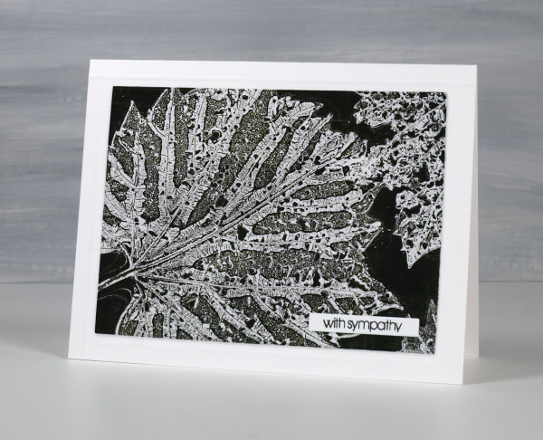
I applied black and green paint to a 5″x7″ gel plate and lay the leaves vein-side down in the paint. I used printer paper for this print and pressed it down on top of the leaves.
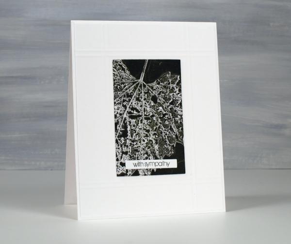
After pressing the paper firmly over the whole surface I lifted one corner to remove a leaf then pressed it down again and repeated on other corners to remove all three leaves. By lifting just a corner at the time the paper stayed in the same place to pick up the texture print left by the leaf on the plate. You can see the process in the short video below.
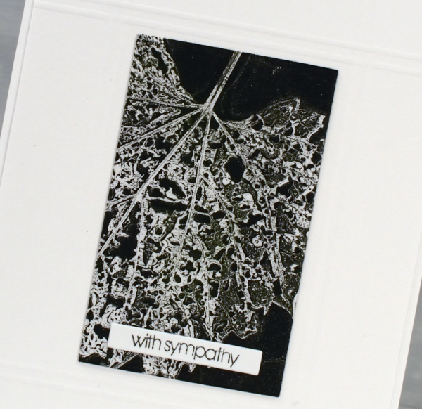
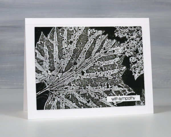
I decided to make a couple of sympathy cards using a small Penny Black sentiment. To add a bit of interest around the gel prints I scored criss-crossing lines on the background panel using my scor-pal. So don’t bypass those imperfect leaves when looking for gel printing elements; the intricate patterns are quite beautiful. This post includes affiliate links from Scrap’n’Stamp . If you buy through these links I receive a small commission at no extra cost to you.
Totally Dotty
Posted: July 15, 2024 Filed under: AALL & Create, Foiled Fox store, nesting squares, Penny Black, The Foiled Fox, totally dotty stencil, Waffle Flower | Tags: AALL & Create, Penny Black stamps, Ranger Distress inks, Waffle Flower dies Leave a comment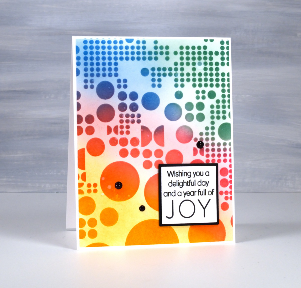
Yes, the stencil used for this card is called ‘Totally Dotty’! I mean what else would you call it? It is a large stencil from AALL & Create sent to me by the Foiled Fox so I could do totally dotty things with it. I blended inks through it for this card but I have also blended paint through it on gel prints and will no doubt use it with alcohol inks and art journals as well.
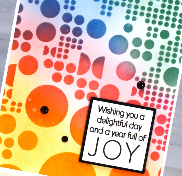
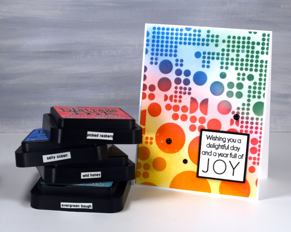
I blended wild honey, picked raspberry, salty ocean and evergreen bough distress inks through the stencil with blending brushes then, when I lifted it, blended more ink to soften the stark white background. This is a technique I’ve seen the blending wizards use.
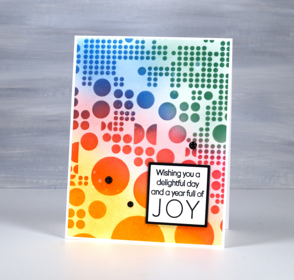
Such a colourful background called for a contrasting sentiment so I stamped in black on white then matted in black using Waffle Flower square nesting dies. Nesting dies definitely cut down on the mistakes I make in creating very slim mats for panels. Did you see I added enamel dots; not a common embellishment for me but the water splatter just didn’t make enough impact so shiny black dots to the rescue. Make sure you pop over to the Foiled Fox blog and online store to be inspired and delighted. (Yes, there are affiliate links used in this post, no extra cost for you but a bonus to me!)
Florals on Black
Posted: May 21, 2024 Filed under: Concord & 9th, fine line florals, meadow blossoms, online class, Penny Black, radiant | Tags: Concord & 9th, Finetec artist mica watercolour paint, online class, Penny Black stamps 6 Comments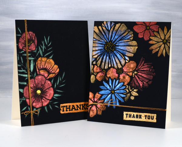
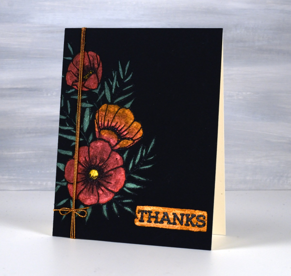
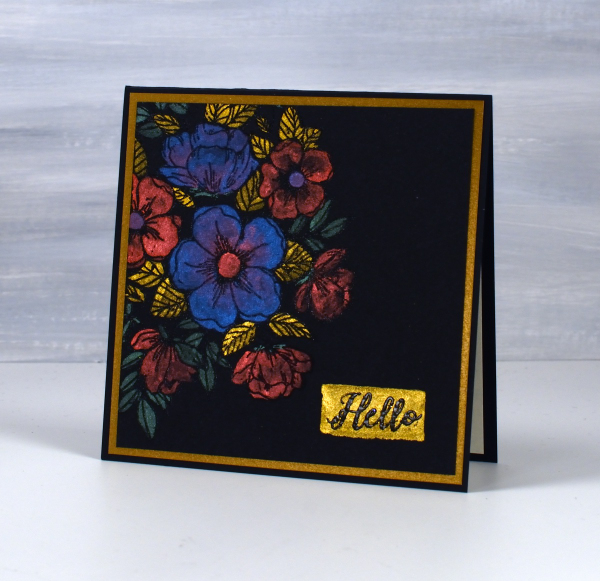
I haven’t used this eye catching technique in a while but I really should try it more often. These two cards were made as part of my Floral Faves online class, a lesson about using metallic watercolours on black watercolour paper. Maybe black watercolour paper has been around for a long time but when I first found it several years ago I was very keen to try it.
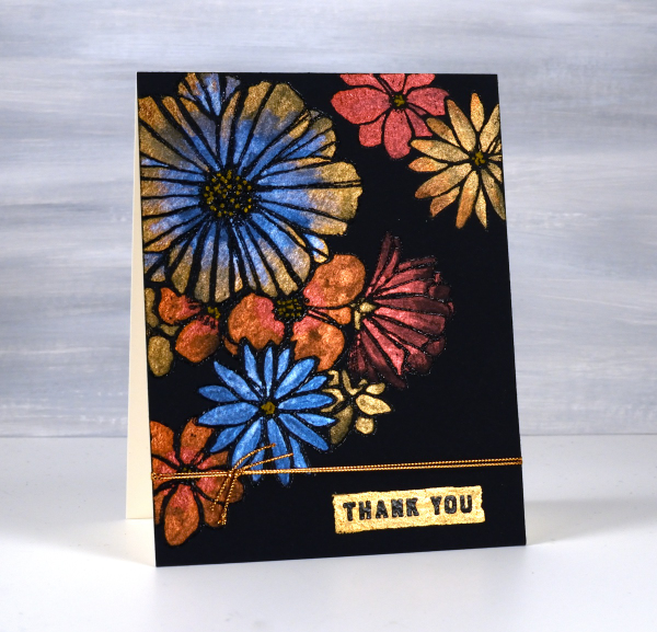
As you can imagine the paints need to be somewhat opaque to show up on black. I use Coliro and Finetec metallic watercolours (two names but all made by Finetec). I have also been given some Beam metallic watercolours which I will try out soon. I used Stonehenge Black watercolour paper for these cards and it worked well. It is very soft so I am careful if using tape on the edges as it lifts the surface off. I just work on a piece slightly larger than I need so I can trim it down to size after painting. I recently bought some of the Van Gogh brand so I will report back once I have tried it.
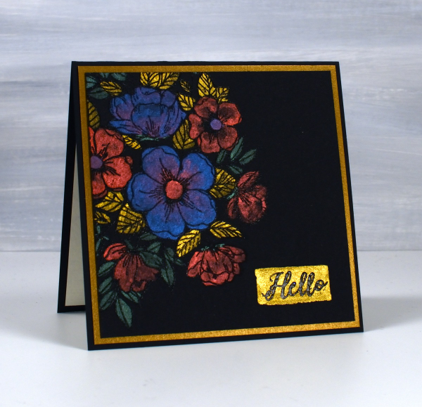
All these designs were made with embossed outlines making it easier to stay inside the lines. One feature of these cards that I quite like and need to remember to incorporate is the little painted strip where I embossed a sentiment over the top. It’s a trick that doesn’t have to be used only on a black background; I could paint a strip on any colour then emboss on top of it. For the cards featured today I used Penny Black ‘radiant’ set and Concord & 9th ‘fine line florals’ and ‘meadow blossoms’
If you have metallic watercolours let me know in the comments your favourite ways to use them.
Tiles
Posted: April 26, 2024 Filed under: Collage cards, gel press, Tim Holtz, vault wildflowers | Tags: gel press, gel printing, Penny Black stamps, Tim Holtz 5 Comments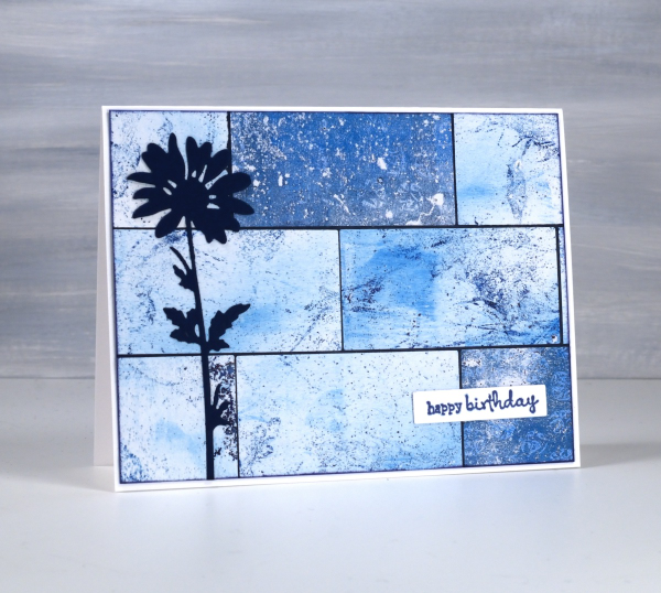
Do you have more gel prints than you know what to do with? Are some of them not very interesting or only partial prints? I definitely answer yes to both those questions. I keep finding though, that the grungy prints make really nice backgrounds for journal pages and cards.

I have many of my gel prints sorted by colour so I pulled several 6 x 6 prints from the blue folder and used them on a few different cards. I also had green, yellow and gold toned prints on hand to make some multicoloured cards; I’ll share them another day. To create this card I cut the blue gel prints with a rectangle die then arranged them like tiles over a navy background before trimming end to fit.
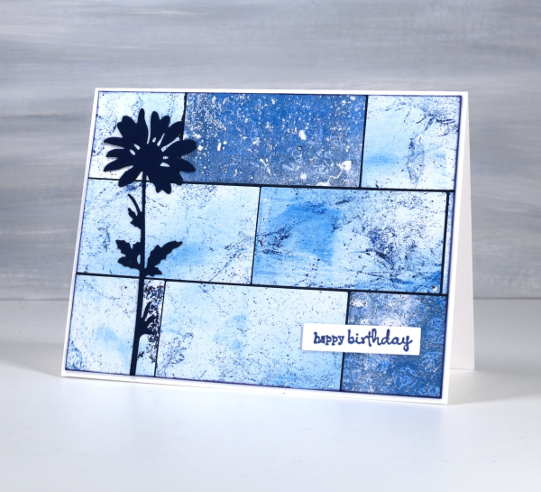
I added a die-cut flower from the Tim Holtz vault wildflowers set and a little Penny Black sentiment. If you like blue then maybe this multi-print collage will please you as much as it did me! This post includes affiliate links from Foiled Fox. If you buy through these links I receive a small commission at no extra cost to you.
Dancing Pink Daisies
Posted: April 24, 2024 Filed under: dancing daisies, Penny Black | Tags: Fabriano Watercolour Paper, Papertrey ink, Penny Black stamps 4 Comments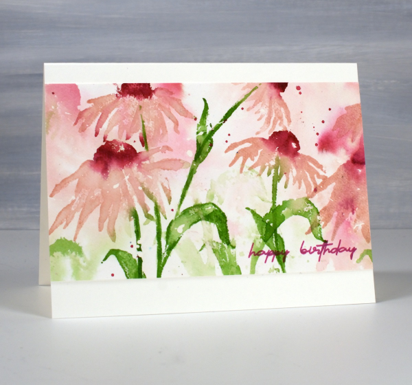
April showers bring May flowers I’ve heard so the showers we’re having today should only help bring some colour to the garden in the coming weeks. The dancing daisies stamp from Penny Black is such a beauty and I love to create a sense of movement with layered stamping.
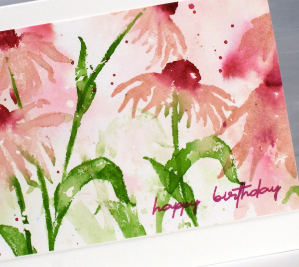
I created this panel on hot pressed watercolour paper a few years back as added inspiration for my Floral Faves online class but it was sitting in a folder not being enjoyed. I recently trimmed the ends off, turned it into a card and it is on it’s way to a friend for her birthday.
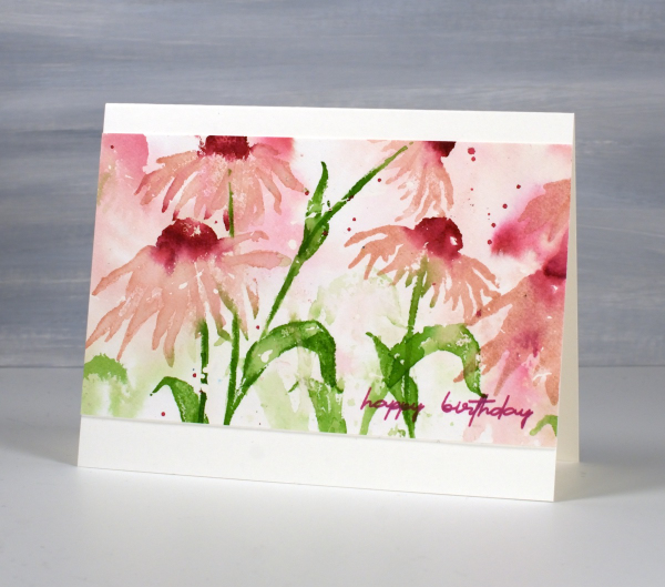
I only used three ink colours and relied on water to dilute their intensity along with second generation stamping for paler background hues. I used sweet blush, scarlet jewel and new leaf inks from Papertrey ink but you could do something similar with any watersoluble inks you have. This post includes affiliate links from Foiled Fox. If you buy through these links I receive a small commission at no extra cost to you.












