Christmas Greenery
Posted: November 21, 2025 Filed under: Christmas inchies, Darkroom Door, Elizabeth Craft Designs, Gina K, global postmarks, Penny Black, postage stamps | Tags: Darkroom Door stamps, Elizabeth Craft Designs, Penny Black creative dies, Penny Black stamps 7 Comments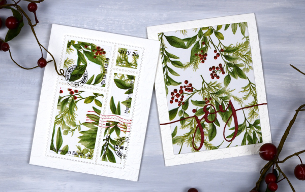
Yes, finally a Christmas card post. I have been playing around with paper napkins for some of my Christmas cards. All the designs in today’s post use panels from a greenery + berries design. I peel off the printed layer from the three layer napkins or serviettes (depending where you’re from) and glue it to cardstock. I’ve used both double sided adhesive (pricey) and glue sticks (slightly curls the cardstock). Either option works I just need to take some time to flatten the glued panels.
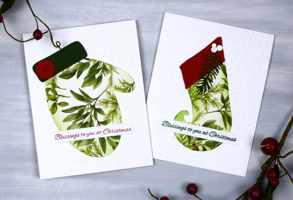
Sometimes when attaching the fragile napkin layer to the cardstock you get some creases; I think they add interest and texture so I don’t let them worry me. I used my cricut and the Echidna Studio stocking design and mitten designs to cut out large features to add to an embossied background.
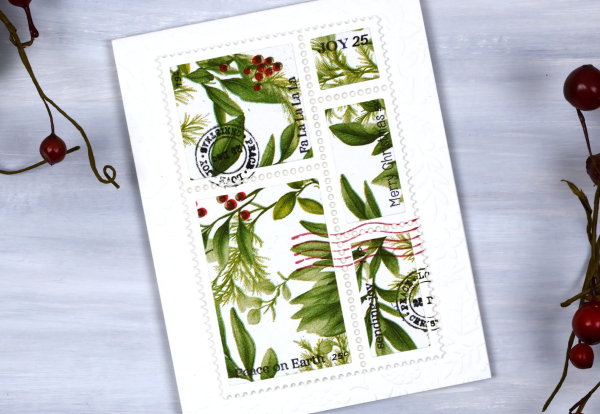
I also used the lovely postage dies from Elizabeth Craft and the Darkroom Door Global Postage and Christmas Inchies stamps to add postmarks along with small sentiment stamps from Penny Black to add words. For the card below I simply cut the word joy using a PB die and added it to a large panel. You could definitely make all these cards with patterned papers or your own painted or printed papers. I just get tempted by the beautiful paper serviettes out there and end up buying them for craft and dinner!

I am packed up ready to do Christmas card making with some friends from church tomorrow. We are making 2-for-1 cards to give to the residents in a local nursing home. I’ll try and share a few of the designs next week. Have a lovely weekend.
The Magic of Brusho
Posted: November 4, 2025 Filed under: Background Stamps, Brusho, contemporary, cricut, Penny Black | Tags: Brusho, brutus monroe embossing powder, cricut, Fabriano Watercolour Paper, Penny Black stamps 5 Comments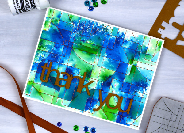
I’ve said it before but here is more evidence, Brusho watercolour paint powders make magic! I embossed the ‘contemporary‘ background stamp from Penny Black in a copper colour (I think it was ‘Penny‘ from Brutus Monroe) on hot pressed watercolour paper.
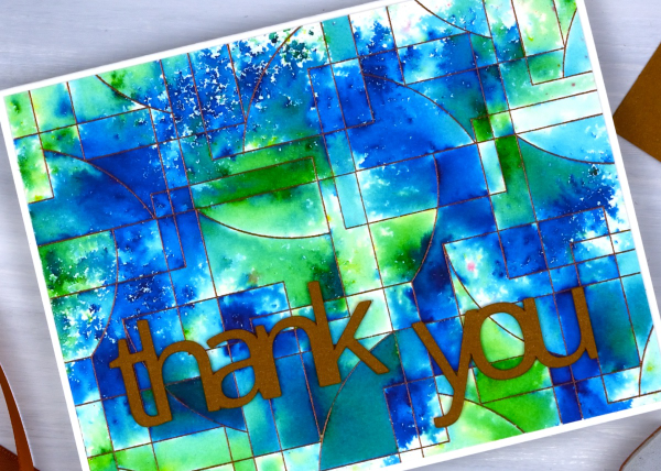
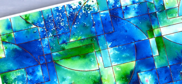
You can see the pattern in the background stamp is made up of curved and straight edged shapes. The embossing creates enclosed spaces on the panel and the the brusho powders get trapped in the spaces.
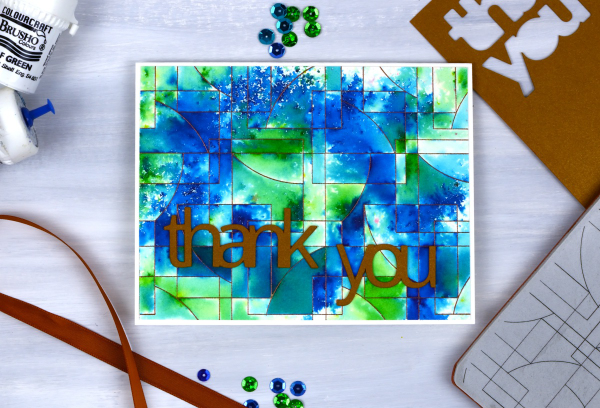
There are a couple of ways to trap brusho in an embossed design, you can spritz the embossed panel with water then sprinkle some brusho over the top, or you can sprinkle the brusho first then spritz. I often end up doing a bit of both. For this panel I think I spritzed some water first then sprinkled both blue and green brusho over the wet areas. My aim was to keep some sections blue, some green and others a mix of the two colours. I also wanted some areas to look speckled and other sections to look softly blended. Less water keeps things speckled; more water gives the paint more time to dissolve and blend.
I had some bronze shimmery cardstock which matched the embossing powder so I cut the ‘thank’ and ‘you’ on the cricut. I stacked two layers so the words would stand out from the busy background.
Some New Paint
Posted: May 19, 2025 Filed under: Effulgence, Penny Black, Rockwell art, Tim Holtz | Tags: Fabriano Watercolour Paper, Penny Black stamps, Rockwell art, Tim Holtz 4 Comments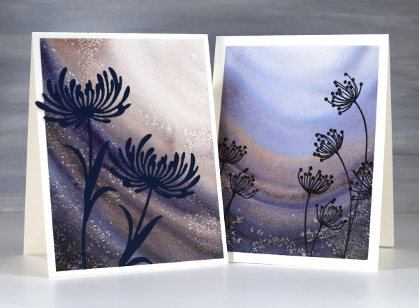
Recently a friend introduced me to some new watercolour paints. It was during a class and she introduced us all to the new paints both by using them in her projects and by saying how much she loved them. Now it just so happened that my birthday fell soon after that class and suprise, surprise I received some new paints for my birthday! (And by ‘received’ I mean I asked my husband if he would like me to order myself some new paints as a gift from him. Of course he did!)
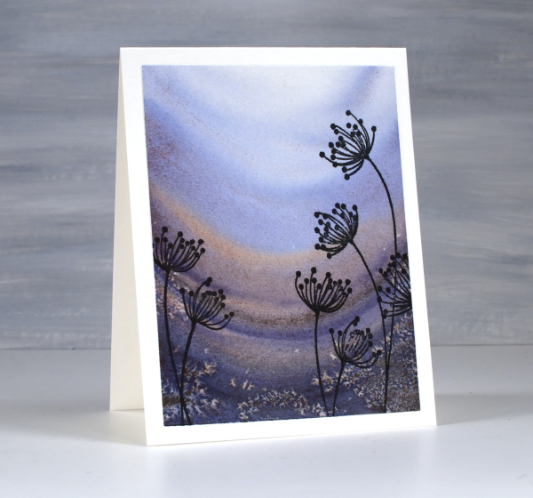
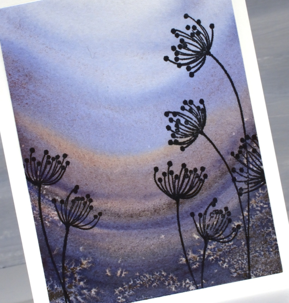
The new paints are from Rockwell Art, a Canadian company. They have a range of watercolour paints including a line they call ‘self evolving’ mineral pigments. The pigments granulate and break into different colours as you add water and the water moves the paint. Both cards featured today were painted with just one paint colour, ‘deep soul’. As I added water the paint separated into blues and burgandy-browns.
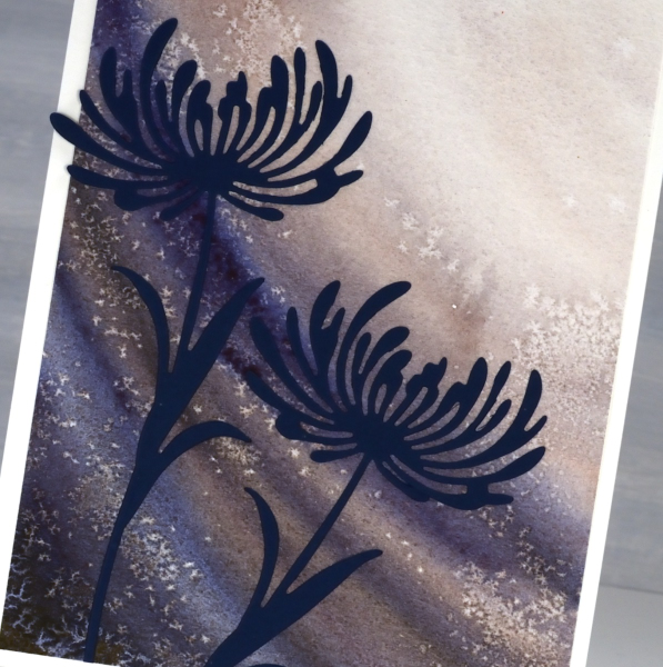
I applied the paint in curved stripes and sprinkled salt here and there while the paint was still wet to get the speckled effect.
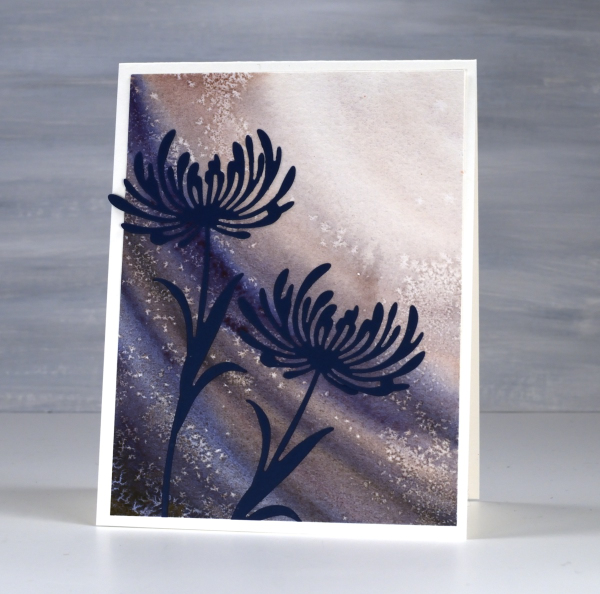
Because I had worked from dark to light it seemed appropriate to add flowers looking towards the light. The die-cut flowers are from Tim Holtz ‘wildflower’ set and the stamped flowers below are the Penny Black ‘effulgence‘ cling stamps.
Delicate florals on Watercolour
Posted: May 9, 2025 Filed under: Delicate Florals, Penny Black, Watercolour | Tags: Fabriano Watercolour Paper, Penny Black stamps, sennelier watercolours, Tsukineko Versafine inks 3 Comments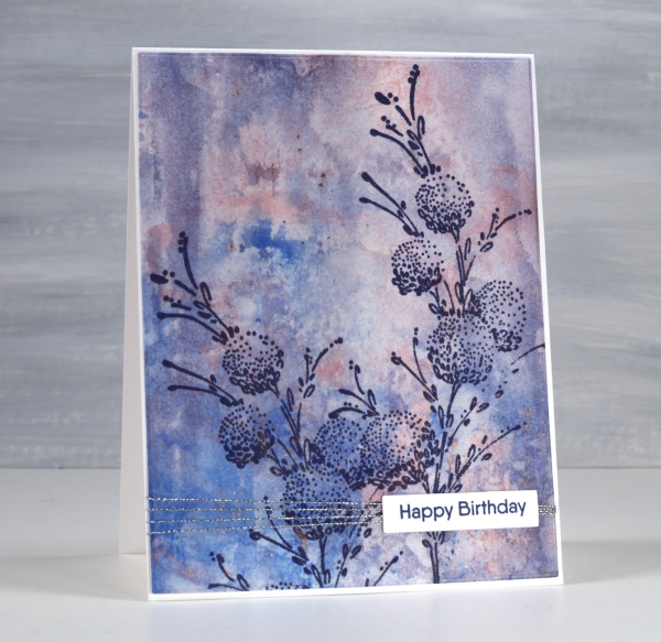
I have another floral stamp over a watercolour background; I don’t think I will ever tire of the combination. This background was created using a very different method to the previous card posted. Whereas the last one required careful blending of paint colours this one was definitely abstract and unpredictable. I randomly painted watercolours on a piece of clear acetate then smooshed it onto a piece of watercolour paper.

It took a few smooshings to start to build up pattern and depth of colour but eventually I had something I liked. Along the way I spritzed water to help the paint move and tilted the panel this way and that to spread it from one area to another. I didn’t like it when I first began but after several repetitions with the smooshing I could see it working as a pretty background.

Once again I chose a Penny Black stamp, ‘delicate florals’ as the focal point over the background, this time choosing dark blue ink because I love the matchy-matchy! If you compare with the previous card you can see I added visual interested once again with a horizontal line down low on the card. It doesn’t get in the way but it leads the eye from left to right. While I was away I enjoyed the roses still blooming in my Dad’s garden. The tallest bush gave some foreground interest to yet another sunset photo.

Sunset Grasses
Posted: May 7, 2025 Filed under: Nature's Paintbrushes, Penny Black, sennelier watercolours | Tags: Fabriano Watercolour Paper, Penny Black stamps, sennelier watercolours 5 Comments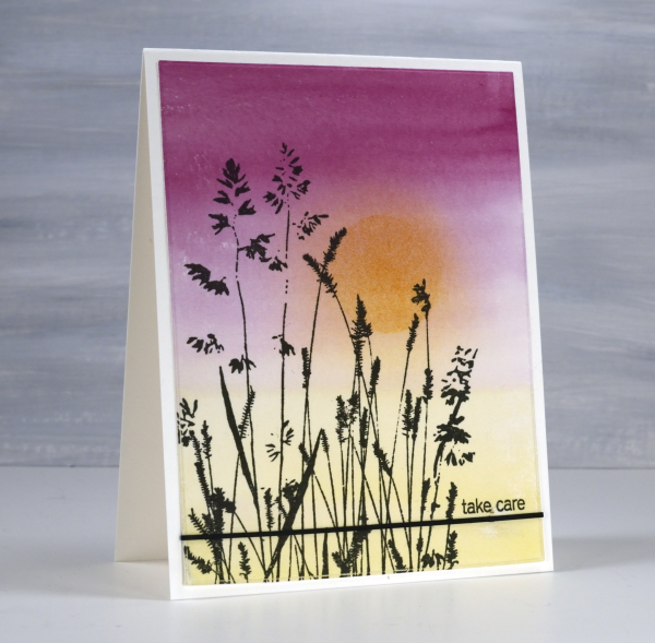
I have been away from my workroom, paints, stamps, papers and computer. I thought I might have shared a few blog posts while I was away but instead I took in the beauty of my surroundings snapping oodles of sunset photos along with other lovely scenery and dear faces. Now that I am back at home I will share some cards interspersed with occasional photos taken while away.
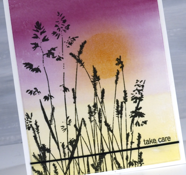
It’s been over a month since my last post which included snowflakes but before that one I was sharing cards made from watercolour panels. I ended last year and began this year wrapped up in colour mixing. I am still doing it and the result is quite the pile of panels ready to be stamped, die-cut or collaged into cards. This panel is an example of a gradation from one colour to another. I painted yellow from one end, deep pink from the other and blended them only slightly in the middle. When I picked the panel out of the pile I blended some darker yellow ink over the top through a circle post-it stencil then blended the edges once the stencil was removed.
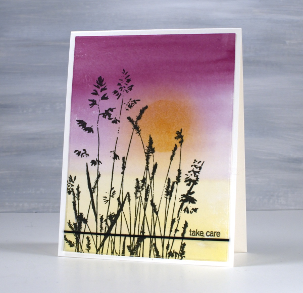
The lovely Penny Black ‘nature’s paintbrushes’ was a simple addition along with a thin strip of cardstock and a tiny sentiment from the PB ‘snippets’ stamp set. Thanks for dropping by despite how quiet it’s been her lately!

Strips & Stripes
Posted: March 5, 2025 Filed under: border collection, Hand painted | Tags: Hand painted, Penny Black creative dies, Penny Black stamps 1 Comment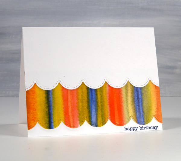
Amongst my recent watercolour panels there are quite a few with stripes. I was colour mixing and playing with wet into wet technique as I painted stripe over stripe to fill the panels.
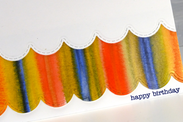
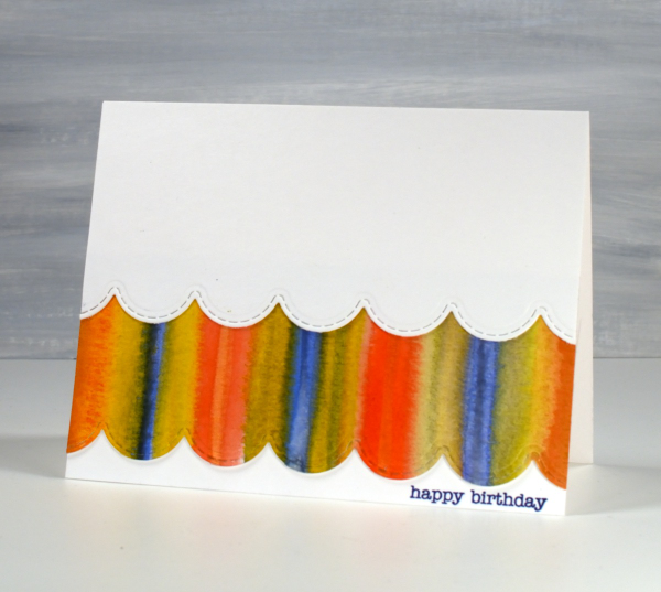
I could have die cut a scalloped strip to add on top of the card front but I liked the layered look which reminds be a bit of carnival tents so I added first the painted strip, then over the top a scalloped piece of white. The scallop die is from the Penny Black set, ‘border collection’ and the sentiment from the ever faithful PB ‘snippets’ set.
The heart themed card below is the same layout with a couple of variations. As you can see I still used a striped panel but die cut some hearts from it and lined them up to span the card front.
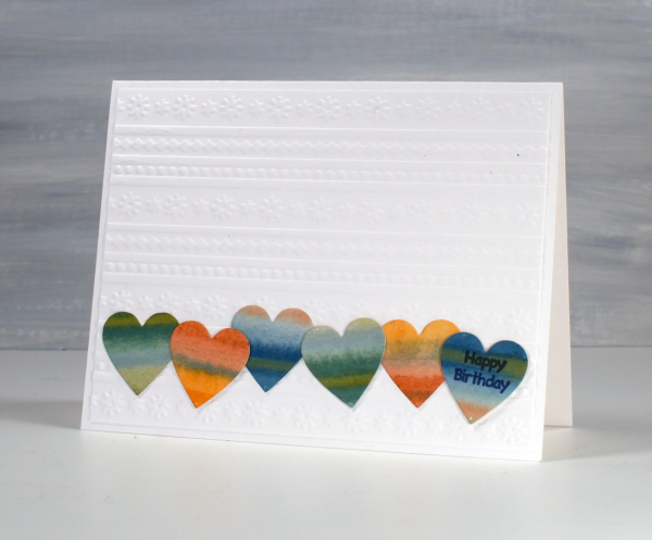
Although the hearts looked cute in a row, the white card front looked too plain so I added an embossed panel as the background to add texture and interest without adding more colour.
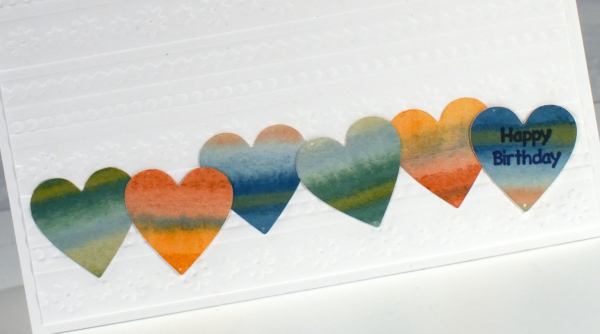
The little happy birthday is from Darkroom Door, once again I used a small sentiment; I do have a soft spot for tiny text.
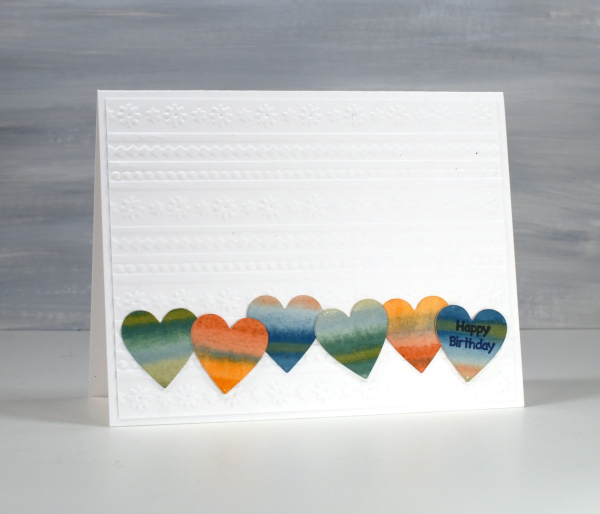
These two are examples made for my upcoming in-person card design class which still has a few available spots in it.
City Buildings gel print
Posted: January 10, 2025 Filed under: city buildings, gel press, The Crafters Workshop | Tags: gel press, gel printing, Penny Black stamps, The Crafter's Workshop 3 Comments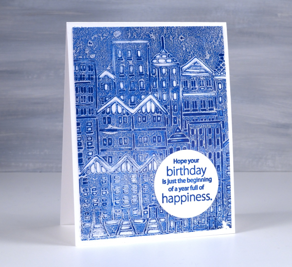
Quite a simple gel printed card but the freshness of blue and white seems to lend a brightness to it. I used the TCW ‘city buildings’ stencil on a gel plate with blue paint.
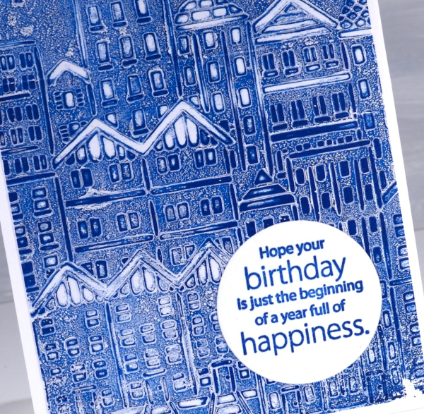
My most used technique with stencils on the gel plate is to lay the stencil on the paint covered plate, remove paint from the spaces in the stencil with tissue paper then pull the print with another layer of paint.
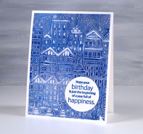
When I looked through my tray of sentiments I found this one already stamped in blue on a circle. The colour is a perfect match so I was pretty happy. The circle is a nice contrast to all those angles and lines. The sentiment comes from the Penny Black ‘better with age‘ sentiment set. This post includes affiliate links from Foiled Fox. If you buy through these links I receive a small commission at no extra cost to you.
Winter Wedding cards
Posted: January 6, 2025 Filed under: cricut, Gilding Flakes, Penny Black, Skyward | Tags: cricut, Gilding, Penny Black stamps 6 Comments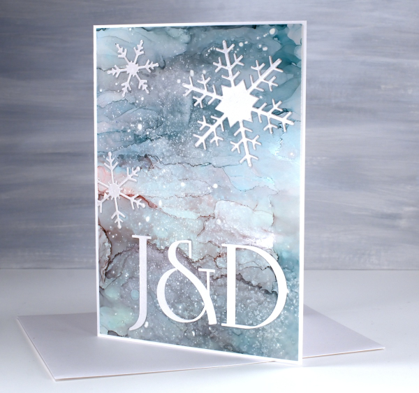
We attended a New Year’s Eve wedding last week and a couple of days before I realised I had no wedding cards on hand. I went to the ‘pile of possibility’ which is a shoebox full of panels yet to be made into cards. There are watercolour, alcohol ink, collage and stamped panels in the box.
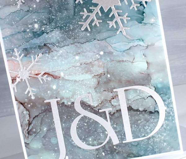
The galaxy style alcohol ink panel above caught my eye along with what I think is a stamped and gilded panel which you’ll see below. Both seemed fancy enough for wedding cards…but how to use them?
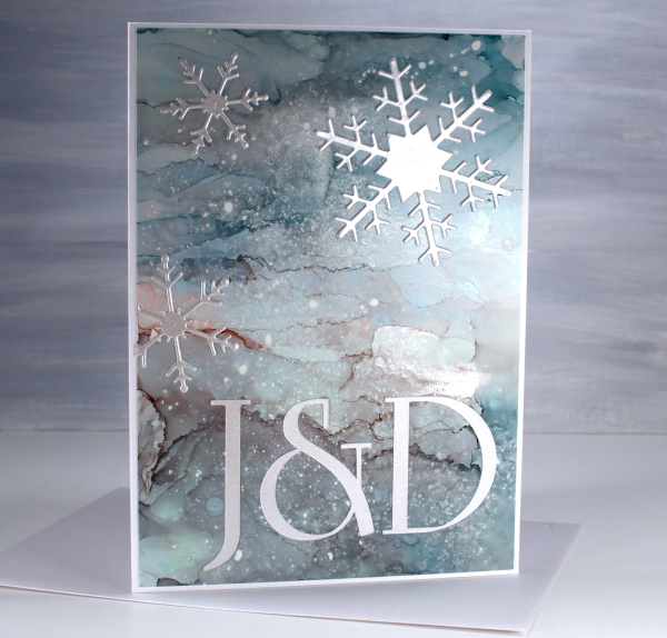
The gilded panel below was very pretty alone so I didn’t want to add much to it. The alcohol ink panel was also pretty but worked well with die-cut silver snowflakes.
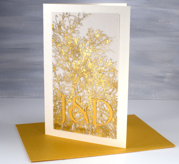
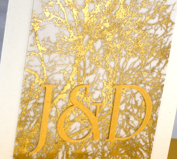
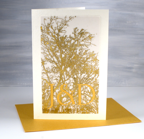
The panel on the card above features the Penny Black stamp ‘skyward‘ stamped on vellum with sticky glue ink and gilded either with foil or gilding flakes( sorry I can’t remember which.) It looked quite magical so I might just have to try and gild a stamped image again to see what happens. I hunted for a font that was similar to the one featured on the wedding stationery then cut initials using the cricut. The font I chose (which is not an exact match) is Linotype Rowena Pro Medium. I had a gold envelope which matched and a pearly silver one for the other card.
The wedding was lovely, ceremony at the church in the morning, party to ring in the new year at night!
Although it would have been good to have wedding cards on hand already I enjoyed customising these two for the bride and groom. And speaking of weddings, it is my wedding anniversary today. My husband and I were married on a summer’s day 35 years ago in Canberra. We looked a bit older and colder at last week’s wedding!

This post includes affiliate links from Foiled Fox. If you buy through these links I receive a small commission at no extra cost to you.
Feathered Edges
Posted: December 23, 2024 Filed under: holly berry branch, Penny Black, poinsettia poem | Tags: brutus monroe embossing powder, Penny Black stamps, Ranger Distress inks, Staedtler watercolour brush pens 2 Comments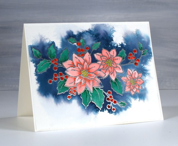
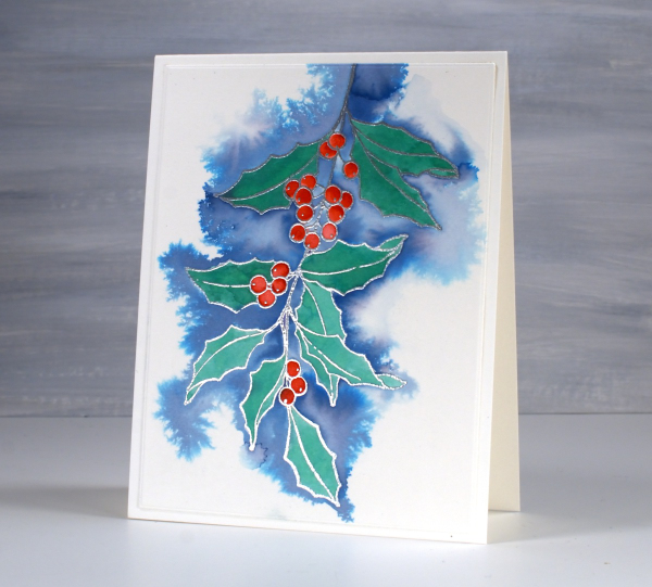
I had fun recently experimenting with a feathering technique to add background to embossed line images. This pretty stamp from Penny Black is poinsettia poem embossed in silver powder on Fabriano hot pressed watercolour paper.
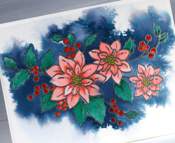
Before adding any colour I spritzed the embossed panel with water. I then picked up chipped sapphire distress ink from a mat where I had smooshed the ink pad. Carefully I touched the tip of the inky brush to the area outside the embossing; the ink spread wherever there was water around the image.

I let the whole panel dry before moving on to painting the flowers, berries and leaves using watersoluble brush tip markers.
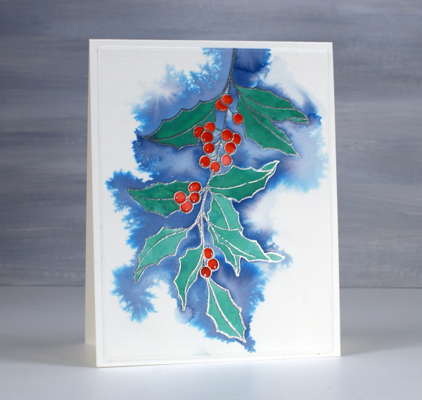
Above and below is another image that worked well with this technique; it’s holly berry branch from Penny Black. This time I used faded jeans ink for the background which is a lighter, less purply blue resulting in paler blues overall.
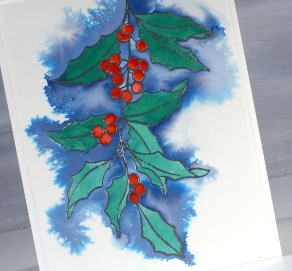
This is definitely a technique I will continue to experiment with; the feathery patterns that appear when ink flows across the wet paper are my kind of watercolour!
This post includes affiliate links from Foiled Fox and Scrap’n’Stamp . If you buy through these links I receive a small commission at no extra cost to you.
Cozy Knitted Mittens
Posted: November 22, 2024 Filed under: cricut, Echidna Studios, mittens, my designs | Tags: cricut, Echidna Studios, Penny Black stamps 1 Comment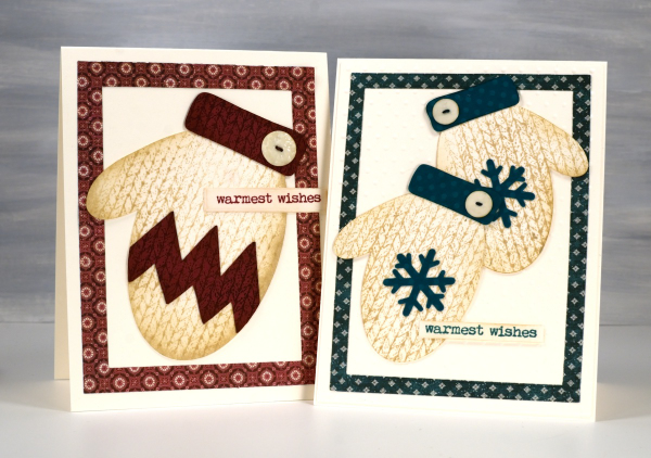
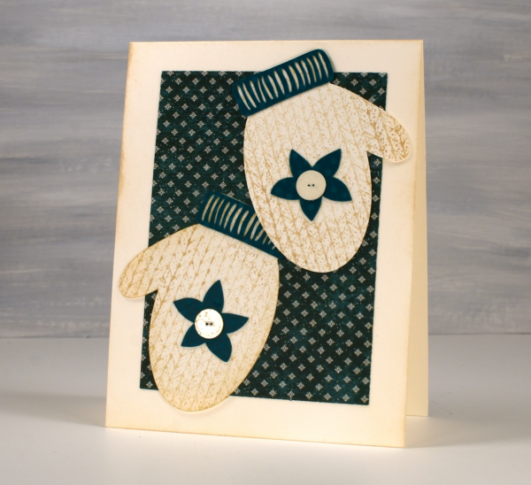
More mittens! To see mini mittens click over to yesterday’s post. I cut the mittens for today’s cards using the ‘Mittens’ digital stamp & cut-file set I designed for Echidna Studios etsy store. It’s the same set I featured yesterday but with a digital file I can cut whatever size I like. The large mitt is 4″ long and the two green mitts are 3″ long.
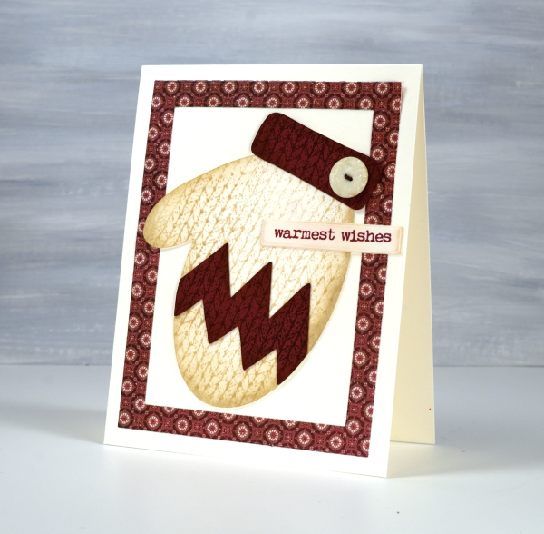
I cut them all from Neenah natural white cardstock along with some buttons. I cut the cuff and Charlie Brown style zig-zag from burgandy cardstock.
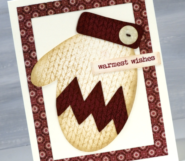
To get the knitted look I stamped the mitts in antique linen distress ink using the Darkroom Door ‘knitting’ background stamp and the cuff and zig-zag in aged mahogany ink. For some depth I blended ink around the edges.
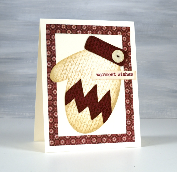
The little buttons continue to delight me so I embossed them with clear embossing powder then coloured some thread with distress markers and threaded it through the little holes.
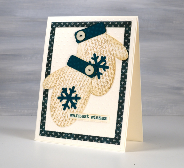
I found Christmas patterned paper from a Graphic45 pad and cut frames using the Waffle flower A2 layer dies. For the green cuffs and snowflakes on the pair of mitts below I used some textured polka dotted cardstock along with an embossed dotted background.
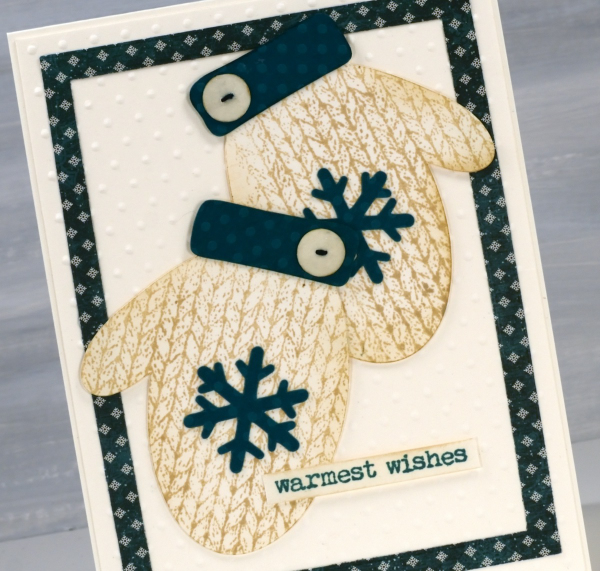
Once again the ‘warmest wishes’ sentiment from ‘Merry Up‘ seemed the best choice and could work any season mitts are worn!
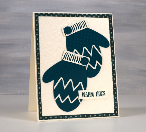
As you can see I am struggling to move on from making mitten cards. Thanks for dropping by.