
Feathered Edges
Posted: December 23, 2024 Filed under: holly berry branch, Penny Black, poinsettia poem | Tags: brutus monroe embossing powder, Penny Black stamps, Ranger Distress inks, Staedtler watercolour brush pens 2 Comments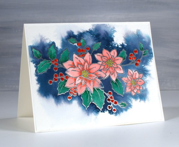
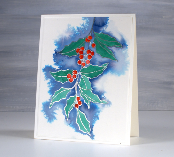
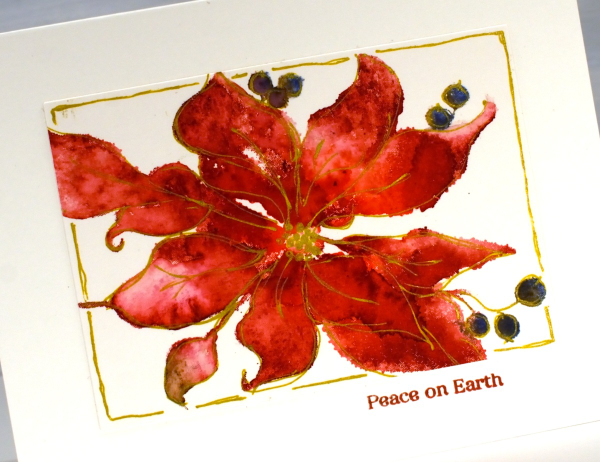
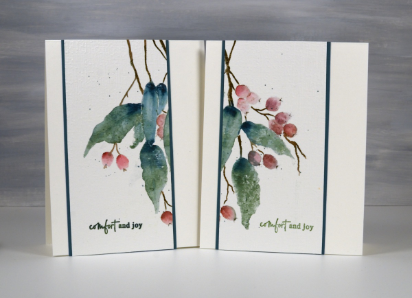
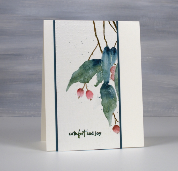
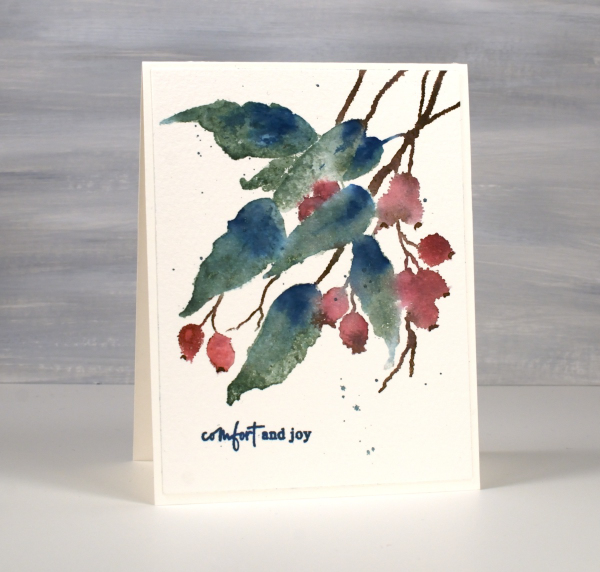
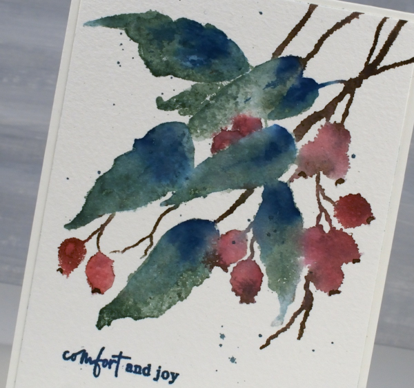
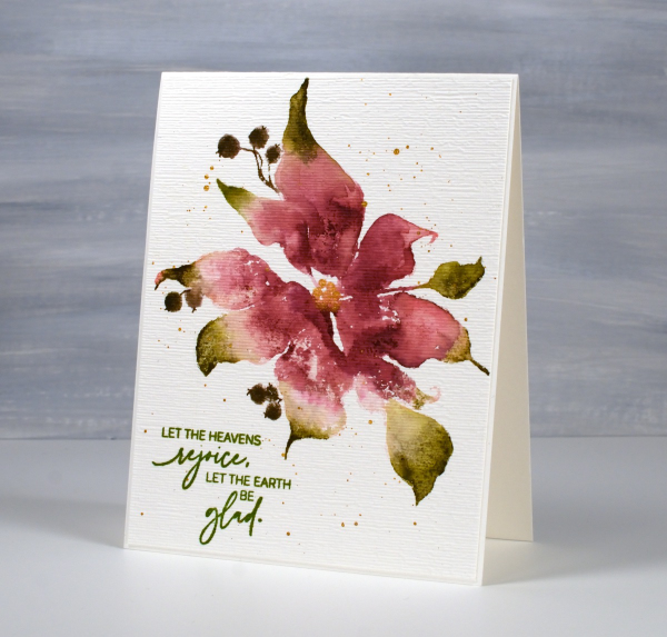
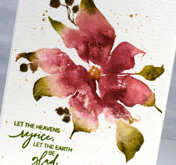
I had fun recently experimenting with a feathering technique to add background to embossed line images. This pretty stamp from Penny Black is poinsettia poem embossed in silver powder on Fabriano hot pressed watercolour paper.
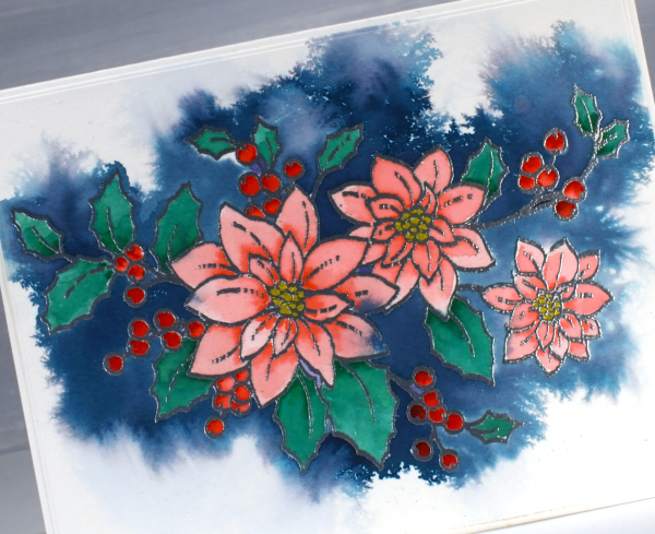
Before adding any colour I spritzed the embossed panel with water. I then picked up chipped sapphire distress ink from a mat where I had smooshed the ink pad. Carefully I touched the tip of the inky brush to the area outside the embossing; the ink spread wherever there was water around the image.

I let the whole panel dry before moving on to painting the flowers, berries and leaves using watersoluble brush tip markers.
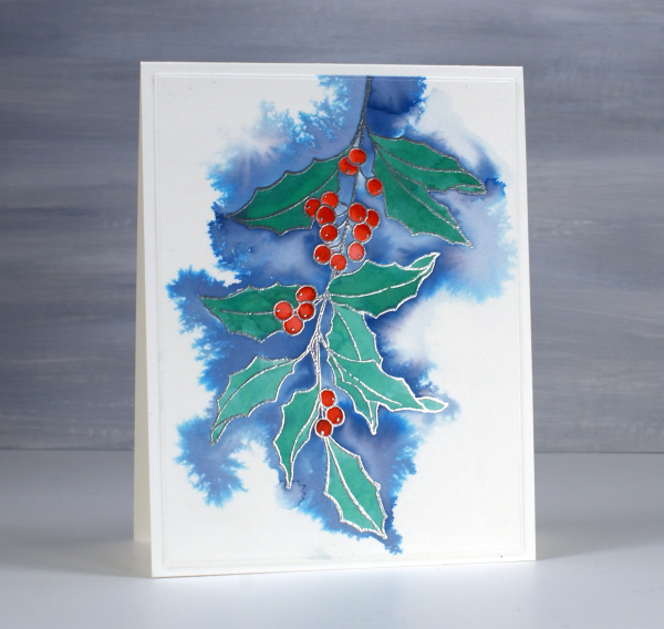
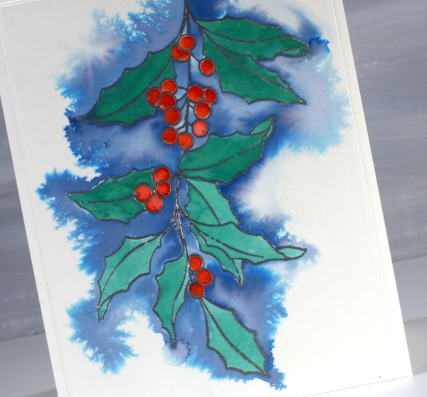
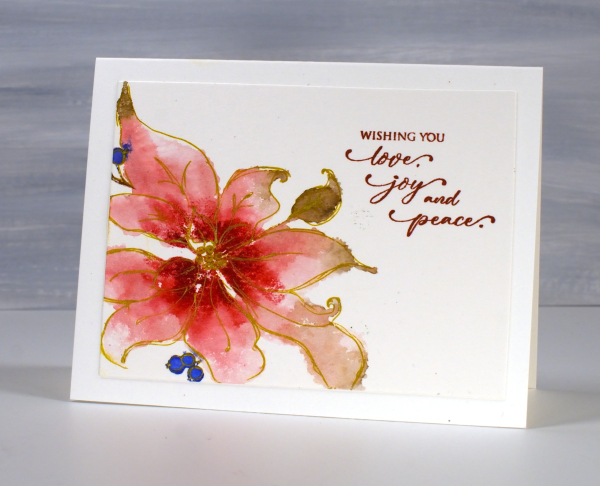
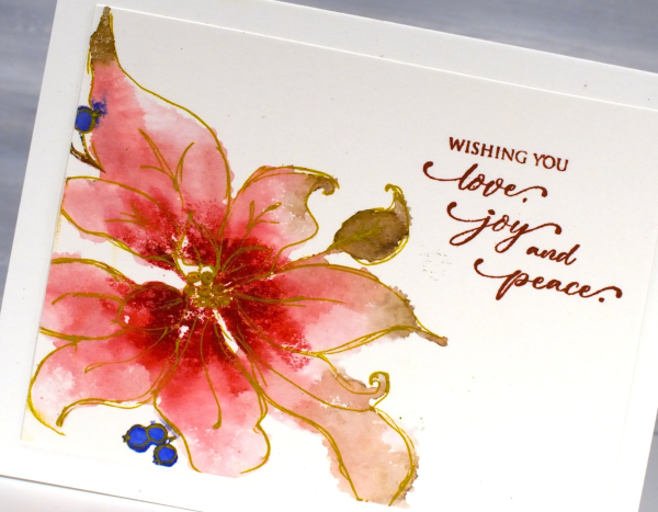
Above and below is another image that worked well with this technique; it’s holly berry branch from Penny Black. This time I used faded jeans ink for the background which is a lighter, less purply blue resulting in paler blues overall.
This is definitely a technique I will continue to experiment with; the feathery patterns that appear when ink flows across the wet paper are my kind of watercolour!
This post includes affiliate links from Foiled Fox and Scrap’n’Stamp . If you buy through these links I receive a small commission at no extra cost to you.
Gingerbread Set
Posted: December 10, 2024 Filed under: cricut, Echidna Studios, gingerbread set | Tags: cricut, Echidna Studios, Ranger Distress inks 3 Comments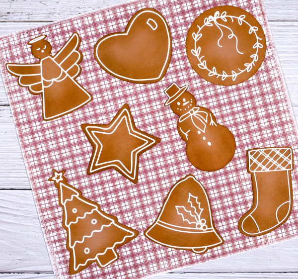
So far I have baked two batches of gingerbread for eating and cut one cardstock batch for card-making! The gingerbread set is a digital stamp and cut-file set from Echidna Studios and I have had a delightful time baking/making these samples.

I used the cricut to cut all the gingerbread shapes from a light brown cardstock which wasn’t gingerbread coloured. It was just for a test run. As it turned out when I blended rusty hinge distress ink over most of the cookies and vintage photo over just the edges the colour was very much like my real gingerbread!
I cut all the ‘icing bits’ on the cricut from white cardstock. I added double sided adhesive to the back before cutting so I wouldn’t have to use liquid glue for all that icing!

I don’t need nine gingerbread themed cards right now so I arranged eight of the cookies on cute check patterned paper for a photo and made the gingerbread man into a card.

I glued two more gingerbread men to the back of the decorated one for more dimension and added him to my card. The festive striped paper is from Simple Stories ‘Simple Vintage Yuletide’ paper pad. To tone down the vibrancy a bit I layered a piece of vellum on top cut with scallop scissors which I still have from long ago. The sentiment is from the PB ‘holiday snippets’ set.

I might make a few more cards or perhaps use some of the ‘cookies’ as gift tags. For now I just think they look very cute on that check paper.

2 for 1 with Delicate Pines
Posted: November 20, 2024 Filed under: delicate pines, Finetec paints, Penny Black | Tags: Fabriano Watercolour Paper, Finetec artist mica watercolour paint, Penny Black stamps, Ranger Distress inks 4 Comments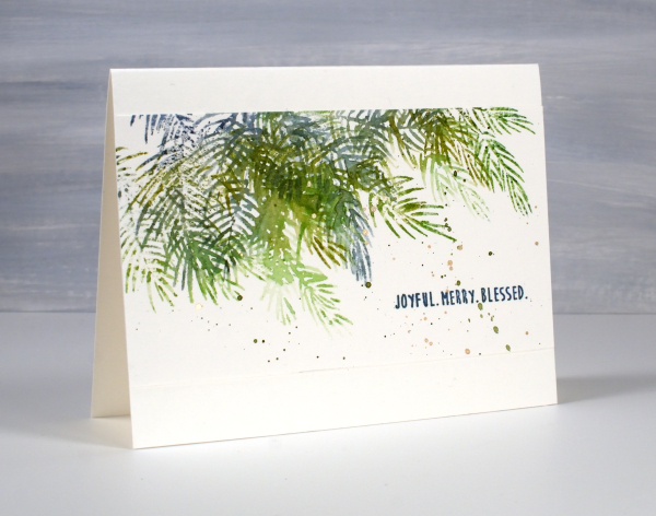
Although I don’t tend to make exactly the same card in large numbers I do like a quick and simple way to make a few similar cards at the same time. To create these pine needle cards I started with a watercolour panel larger than an A4 card. It was about 5¾” x 6″ and I placed it in the stamp positioner with the long side tucked right against the long side of the positioner.
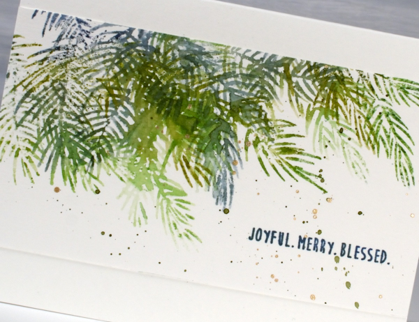
Using the two of the three Penny Black ‘delicate pines‘ stamps positioned to stamp along the top edge of the panel I inked them with a few green and blue distress inks. Before stamping I spritzed the stamp lightly so the different greens would blend on the stamp and then on the paper. I then moved the stamps around so I could use the third stamp and get some overlapping branches. Without moving the stamps I turned the watercolour panel 180° and repeated the stamping steps. The panel ended up with a border of pine branches on each side. I cut the panel in half and trimmed the sides so I had two 5½” x 3″ panels to add to card bases.

I finished off both panels with a sentiment from the PB ‘jolly snippets‘ set and some green and gold splatter. Simple yet pretty. Today’s post features affiliate links to The Foiled Fox. If you buy through these links I receive a small commission at no extra cost to you.
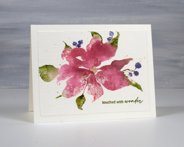
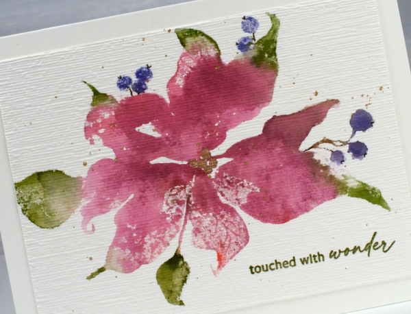
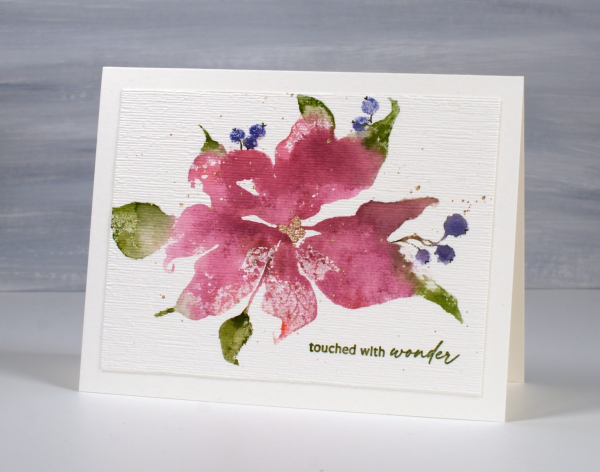
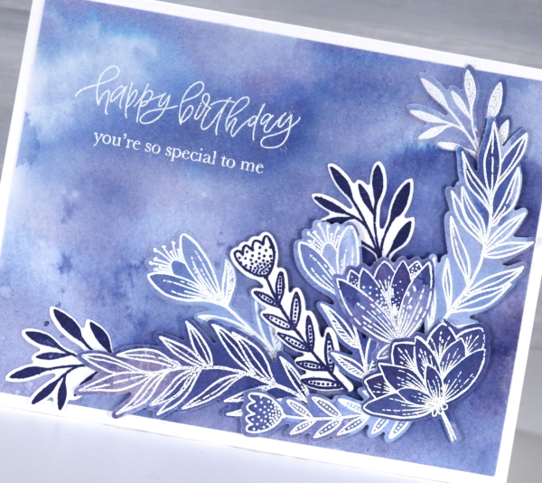
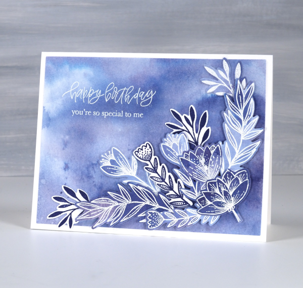
Sketching over Scarlet Majesty
Posted: November 13, 2024 Filed under: Penny Black, Scarlet Majesty | Tags: Fabriano Watercolour Paper, Penny Black stamps, Ranger Distress inks 4 Comments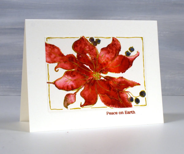
When I posted cards made with the scarlet majesty stamp last week I mentioned a technique I had used to define the petals a little more. Today’s cards feature the sketched outlines I added after stamping. As with my previous cards I inked the stamp with distress inks or other water-based dye ink. I spritzed the stamp before stamping which creates a loose watercolour look on the image. I like the loose image but admit that some of the definition of the petals is lost. With the image on the stamp (and packaging) as my guide and some artistic license I drew around petals, berries and leaves with a gold gel pen. I didn’t try to stay exactly on the edge of the stamping but close. For the red poinsettia I also drew a rough frame around the image.
I added a small sentiment below the panel in a matching ink. On the red panel above I didn’t try to keep leaves green and petals red; everything is red. On the pink poinsettia below I used a few more distress inks in my initial loose watery impression.
Once again I stamped on hot press watercolour paper inking the stamp with small distress ink cubes and markers. Once the image was dry I used the gold gel pen to sketch the outline. If you look too closely you will see blobs and ink outside the lines but I quite like the overall gold edged effect.
One tip if you try this technique but find yourself trying to be too precise. Hold the gel pen further down the barrel than you normally would and move faster than usual drawing your lines. That way you should achieve a loose sketchy style that pulls the very watery stamped image into better focus.
Hope you’re having a great day. I now need to write some international Christmas cards; it is time to put them in the mail!
Berry Full & Split
Posted: November 12, 2024 Filed under: Berry kissed, Penny Black | Tags: Fabriano Watercolour Paper, Penny Black stamps, Ranger Distress inks 5 Comments
I posted a card made with this Penny Black ‘berry kissed‘ stamp last year under the title old favourites. Here it is again, still a favourite! In the hope of swelling my Christmas card stash in a timely manner I’ve made some cards out of half a stamped image. It doesn’t work with all stamps but I thought I could make it work with this one.
Once I had stamped the berry kissed stamp using a stamp positioner, hot pressed watercolour paper and a mix of blue, green, pink and brown dye inks I placed a ruler down the middle so I could see what would fill each side if the panel was divided. The right hand side of the image contained plenty of soft pink berries and three leaves. The left hand side looked a bit sparse with three leaves but only one full berry and a couple of partially covered ones.
To make the left hand side a bit fuller and more interesting I inked and added two more berries. Both sides got the splatter treatment, a teal mat and a simple sentiment from the PB set, ‘jolly snippets’
I also completed a panel which I didn’t slice in half. Because I used cold pressed watercolour some of the edges of the images are not as smooth. It all depends on how much water I spritz on the stamp after inking, a bit too much can result in the wiggly edged berries you see below.
Today’s post features affiliate links to The Foiled Fox. If you buy through these links I receive a small commission at no extra cost to you.
Pink Majesty
Posted: November 4, 2024 Filed under: Finetec paints, Penny Black, Scarlet Majesty, Stampin Up, subtle | Tags: distress markers, Fabriano Watercolour Paper, Finetec artist mica watercolour paint, Papertrey ink, Penny Black stamps, Ranger Distress inks 10 Comments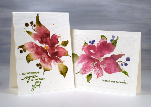
Today’s cards feature the beautiful Penny Black stamp, ‘scarlet majesty‘ but as the title suggests, I have chosen pinks over scarlet for the ink colours. I worked on Fabriano hot pressed watercolour paper in my stamp positioner.
I inked most of the petals with a pink ink then added darker ink with more of a burgandy such as aged mahogany. I use a mix of small cube ink pads and markers to ink the stamp. The leaves were inked with peeled paint and the berries a purply blue such as chipped sapphire. Before stamping I spritz the stamp so the inks can move a little. I stamp the first impression then decide whether more ink is needed, more water or often some blending with a paintbrush and water.
I don’t remember fiddling much with this panel as I liked the watery blends and the paler veins showing through here and there. I painted the centre of the poinsettia with gold finetec paint and of course added some splatter.
The sentiment is from PB ‘jolly snippets‘ and the texture from the retired SU ‘subtle’ embossing folder.
I used the same technique on this second card but used darker inks for leaves, petals and berries. My guess is aged mahogany, forest moss and a dark brown which was possibly made by mixing the first two. (I don’t always take note of my ink colours)
I think ‘scarlet majesty’ is a stunning stamp; I like the curl at the ends of the petals. Here are a few more cards made with it. I will admit that it is tricky to ink because you can’t always see where to try and define edges. I have another post coming up where I handle this issue by adding lines after stamping. I’ll share that soon. The sentiment this time came from the PB set, ‘promise of hope’.

Today’s post features affiliate links to The Foiled Fox. If you buy through these links I receive a small commission at no extra cost to you.
Masked & Blended Leaves
Posted: October 24, 2024 Filed under: Echidna Studios, grafix, Leaves digital stamps and cut files, Spellbinders | Tags: Echidna Studios, Fabriano Watercolour Paper, grafix, Ranger Distress inks, Spellbinders 5 Comments
It’s been a couple of weeks since I posted, sorry about the blog neglect. In my last post (which also featured leaves) I mentioned I had just started to see some reds and oranges along with the earlier yellow leaves. This week the colours have been stunning! So many deep reds contrasting with the remaining greens and still more yellows and oranges. Even crawling in traffic has had its upside as I gaze at the autumn leaves.
About a month ago I posted a video showing how I created a watercolour painting of leaves using masking (more leaves). Today’s card featured the same process using a maple leaf design from the Echidna Studios Leaves digital stamp set. Instead of painting the final dark layer over the masks, as shown in the video, this time I blended chipped sapphire ink using a blending brush. I think the navy edge around the leaves shows them off beautifully but because I didn’t blended too heavily you can still see the watercolour underneath. I finished this card off with a layered sentiment from the Spellbinders ‘serenade sentiments etched dies set‘
This post includes affiliate links from Foiled Fox. If you buy through these links I receive a small commission at no extra cost to you.
Totally Dotty
Posted: July 15, 2024 Filed under: AALL & Create, Foiled Fox store, nesting squares, Penny Black, The Foiled Fox, totally dotty stencil, Waffle Flower | Tags: AALL & Create, Penny Black stamps, Ranger Distress inks, Waffle Flower dies Leave a comment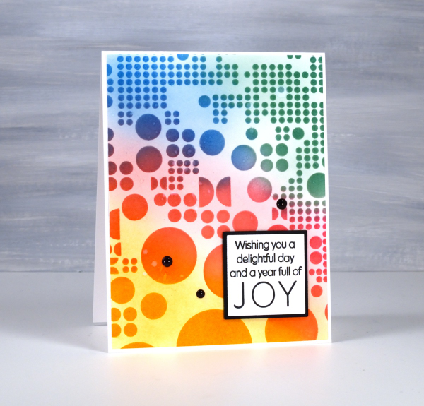
Yes, the stencil used for this card is called ‘Totally Dotty’! I mean what else would you call it? It is a large stencil from AALL & Create sent to me by the Foiled Fox so I could do totally dotty things with it. I blended inks through it for this card but I have also blended paint through it on gel prints and will no doubt use it with alcohol inks and art journals as well.
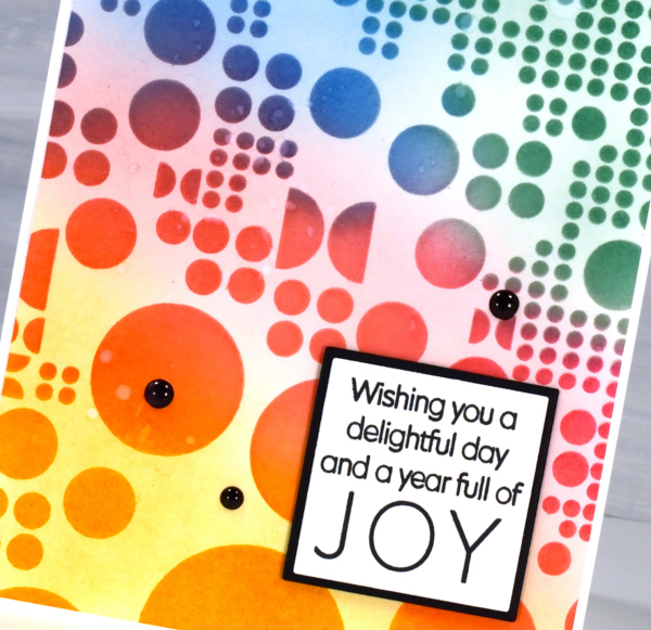
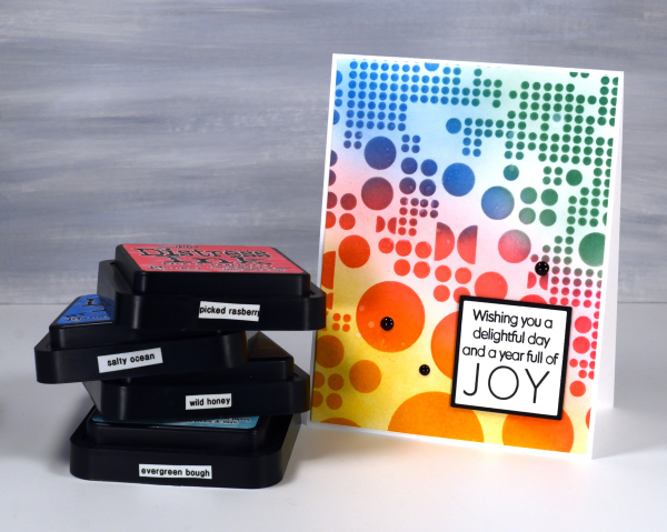
I blended wild honey, picked raspberry, salty ocean and evergreen bough distress inks through the stencil with blending brushes then, when I lifted it, blended more ink to soften the stark white background. This is a technique I’ve seen the blending wizards use.

Such a colourful background called for a contrasting sentiment so I stamped in black on white then matted in black using Waffle Flower square nesting dies. Nesting dies definitely cut down on the mistakes I make in creating very slim mats for panels. Did you see I added enamel dots; not a common embellishment for me but the water splatter just didn’t make enough impact so shiny black dots to the rescue. Make sure you pop over to the Foiled Fox blog and online store to be inspired and delighted. (Yes, there are affiliate links used in this post, no extra cost for you but a bonus to me!)
Cornflowers
Posted: June 20, 2024 Filed under: AALL & Create, cornflower, Foiled Fox store, The Foiled Fox | Tags: AALL & Create, Fabriano Watercolour Paper, Ranger Distress inks 7 Comments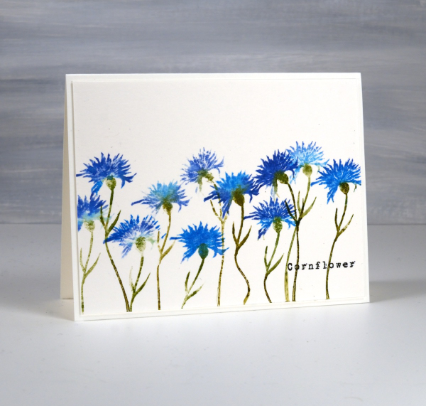
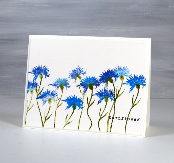
I have cornflowers growing in my garden but they are still quite small seedlings so no signs of flowers at this stage. I am hoping they will bloom some time this summer. Meanwhile I’ve been stamping some, in blue of course. I had blue cornflowers in my wedding bouquet and flower crown so they are quite special to me.
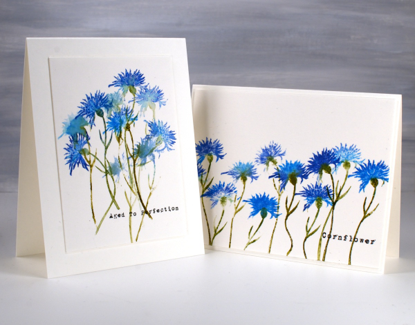
I’ve teamed up with the Foiled Fox to bring you this post and it is wonderful to be collaborating with them again. The stamps featured on today’s cards are from AALL & Create; the set is called ‘Cornflower‘ and includes two flower stamps and two sentiments.
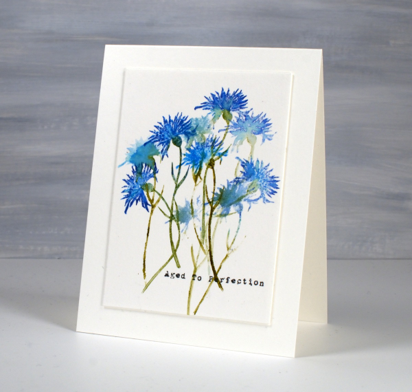
I’ve stamped the solid cornflower stamp repeatedly to create these two cards using a couple of techniques to make the flowers look different. The stem on the stamp is thin and bendable so I was able to make the flowers lean left or right and even have a wiggle in the stem! I inked the petals with both prize ribbon and salty ocean distress inks, spritzing the stamp before pressing it on the hot pressed watercolour panel so the inks blended. I also did some second generation stamping to get paler impressions of the flowers.
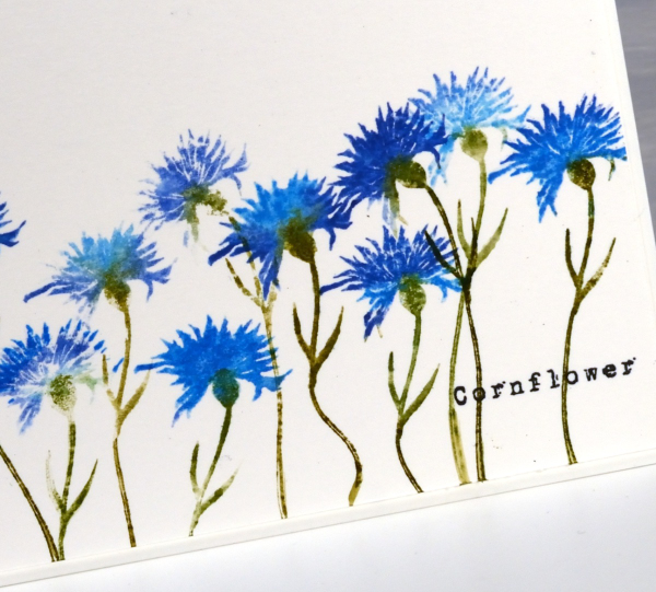
You might know that I love typewriter font so I was very happy to see a couple of word stamps in a slightly distressed typewriter font. I added them with versafine clair nocturne ink because it is such a crisp reliable ink. Thanks for dropping in; I hope you will go and check out the wealth of inspiration on the Foiled Fox blog and have a browse around their lovely online store while you’re there. (Naturally this post includes affiliate links, feel free to use them.)
Blue Birthday
Posted: March 26, 2024 Filed under: banner blooms, banner blooms cut out dies, Dies, exquisite envelope, online class, Penny Black | Tags: online class, Penny Black creative dies, Penny Black stamps, Ranger Distress inks 6 Comments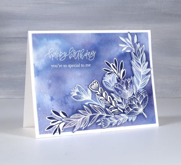
Blue is my favourite colour and the different hues seen on this card are examples of why it appeals to me so much. I tend to prefer the blues that are a little bit purply but I like the teal blues as well.
All the blues on the card are made from one ink, chipped sapphire distress ink. If you watercolour with your dye inks you have probably noticed that some inks separate into different hues when diluted. I thought I would share this card today because it features in one of the lessons in my Colour Clues online course. Colour Clues is a card making course which covers colour blending, contrast, separation and mixing. I created a 40% discount for all my online courses back on February 29, mentioned it in a blog post then forgot about it! That’s why I’ve been featuring it more this week. The discount code LEAPYEAR40 is active until the end of March 28 which is now two days away.
I chose the Penny Black sets Banner Blooms and Exquisite Envelope for this card because there were plenty of enclosed petals and leaves to trap colour. Banner Blooms just happens to have a co-ordinating die set which sped up the layering of blooms and leaves. This post includes affiliate links from Foiled Fox . If you buy through these links I receive a small commission at no extra cost to you.
Do you have a favourite colour. Does it turn up often in your crafting or perhaps in your wardrobe? I definitely wear a lot of blue!


