
Sweet perfume
Posted: May 2, 2017 Filed under: Sweet Perfume | Tags: Faber-Castell Albrecht Durer Watercolour pencils, Penny Black stamps, WOW embossing powders 19 Comments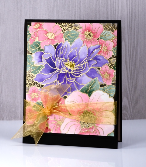
This panel is another I coloured while away in Toronto. I took my watercolour pencils, some brushes and several stamped panels, some embossed others just stamped in light colours to paint over. I did a ton of walking and exploring while there but also met up with my daughter in coffee shops during the day as she was working on a thesis most of the time. She sat at her laptop, I painted for a while, drunk some tea then headed out exploring again.
I have already posted a card featuring this image stamped on black cardstock. This one was not stamped on black; it was embossed on hot pressed watercolour paper. I did all the painting with my watercolour pencils filling the flowers with pinks and purples and the leaves with a few shades of green. When I had finished there were a few spaces between flowers with no colour at all. I decided to paint them black. It really did not look very good but I packed it away and moved onto something else. When I came home and took some time to turn my panels into cards I trimmed this one back so the flowers were cropped on all sides then tried several coloured mats to frame it. The black card base ended up being the best option. Those few little black sections on the coloured panel tied in with the card base nicely. I also tried a few sentiments but ended up going without. On the inside I have glued a pale pink panel to write on.

Thanks for dropping by; I’ll be back with my next distress oxide trial tomorrow, I think it is my favourite so far.
Supplies:
Stamps: Sweet Perfume (PB)
Pencils: Albrecht Durer watercolour pencils (Faber Castell)
Ink: Versamark ink
Paper: hot pressed watercolour paper, Neenah Epic black cardstock
Also: gold embossing powders, gold organza ribbon
Distress oxide trials – brushstroke floral
Posted: April 30, 2017 Filed under: Bejeweled | Tags: distress oxide inks, Penny Black stamps 14 Comments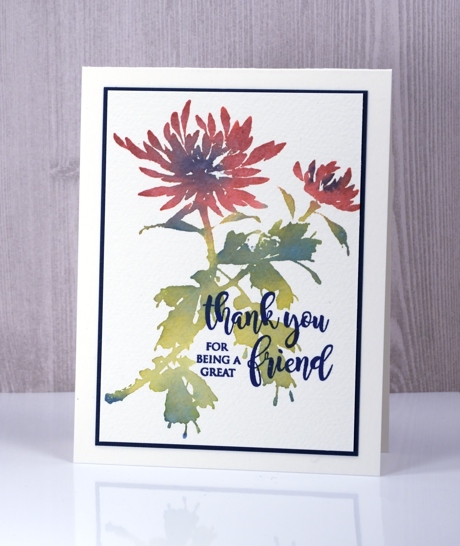
The distress oxide trials continue with some brushstroke floral stamps. I generally use distress stains or markers with these stamps because I love to blend the colours either on the paper or the stamp to create the look of a watercolour painting. I was happy with the solid, but blended colour I achieved with the three oxide inks, quite different but muted and pretty.
As with earlier experiments the blending is lovely and smooth. I was able to blend blue into both the red petals and the green leaves by using my MISTI to apply one colour at a time. I inked and stamped the petals first in fired brick, wiping off any stray ink from the leaves with a wet wipe before stamping. I inked and stamped the leaves and stems in peeled paint next. I wanted some blended accents on the both flowers and leaves so I dabbed the faded jeans ink in a few places, spritzed to soften sharp edges then stamped again. The chalky look is quite different from the original distress inks but the blending is just as smooth. I used cold pressed watercolour paper so there is some nice texture showing through the solid ink.
I probably could have stamped the sentiment in faded jeans oxide ink but I my ink of choice for sentiments continues to be versafine. The majestic blue co-ordinated beautifully and I was able to find the same colour for my mat also.
Thank you for your responses to my first distress oxide post; I am interested to hear what other people are trying and happy to prove any insights as I experiment. I know some people are wondering whether it is worth getting the distress oxides if you have the original distress inks. I will give some feedback as I post my experiments and then give a wrap up when I’ve tried a range of techniques.
Flower embrace
Posted: April 29, 2017 Filed under: Flower embrace | Tags: Faber-Castell Albrecht Durer Watercolour pencils, Kuretake Zig clean color real brush markers, Penny Black stamps, WOW embossing powders 13 Comments
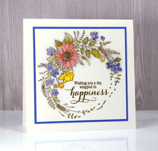
I embossed this pretty new stamp from Penny Black so I could do some pencil colouring while I was away in Toronto a few weeks ago. The photo below is a little washed out on the gold embossing but I included it so you could see how the shiny gold contrasts with the pencil colouring. I used watercolour pencils as tiny palettes which is my usual method. I hold the pencil in one hand and a water brush in the other to pick up colour from the pencil lead.
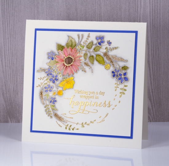
My watercolour pencils are Faber Castell’s Albrecht Dürer. I’ve had a set of 36 since art school and recently I bought a bunch of colours I didn’t have. The floral wreath is embossed in gold powder after stamping in versamark.
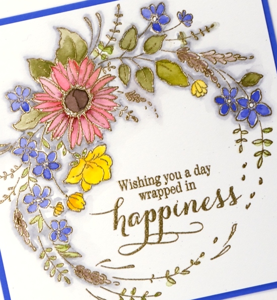
The only other detail I added was a shadow of grey around all the embossing. I used a zig cleancolour brush marker then blended it with some water. Enjoy your day.
Supplies
Stamps: flower embrace, sprinkles and smiles (PB)
Pencils: Faber Castell Albrecht Dürer watercolour pencils 172, 168, 176, 108, 126, 225, 144
Ink: versamark
Also: WOW gold metallic rich fine embossing powder, gray zig cleancolor brush pen
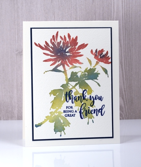
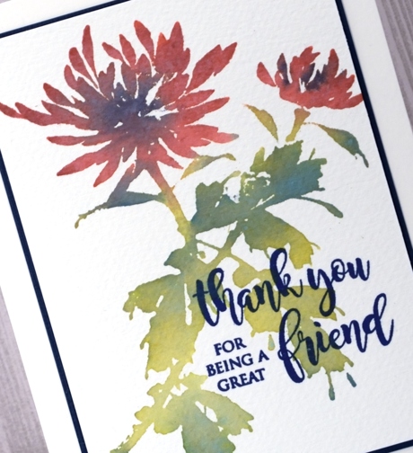
The distress oxide trials
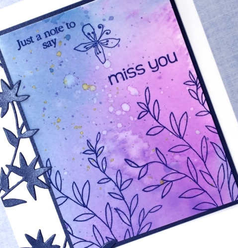
Posted: April 28, 2017 Filed under: Flower Frolic, Penny Black, stitched flowers, Tagged | Tags: distress oxide inks, Penny Black creative dies, Penny Black stamps, Tsukineko Versafine inks 14 Comments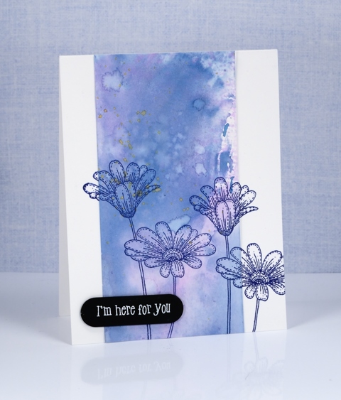
The trials have begun. Shauna at The Foiled Fox sent me some distress oxide inks to try. I have been intrigued by the videos and projects I’ve seen around the place so was keen to play with them myself. I started by mixing some diluted ink on a craft mat then swiped different papers through it. I chose bristol cardstock, hot pressed watercolour paper and neenah solar white 110lb cardstock.
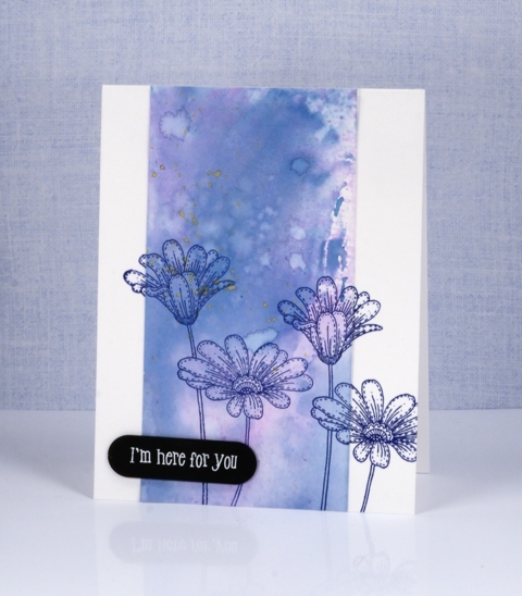
The card above features the bristol cardstock. It picked up the colour well, the inks blended and the watermarks from splattering made nice light patches with dark edges. I used two main colours, a pink and a blue (what a surprise!) then I splattered a little yellow at the end of my experimenting.
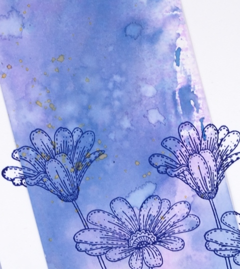
The panel below is made from the hot pressed watercolour piece. The results were very similar but the blending was even smoother between the colours.
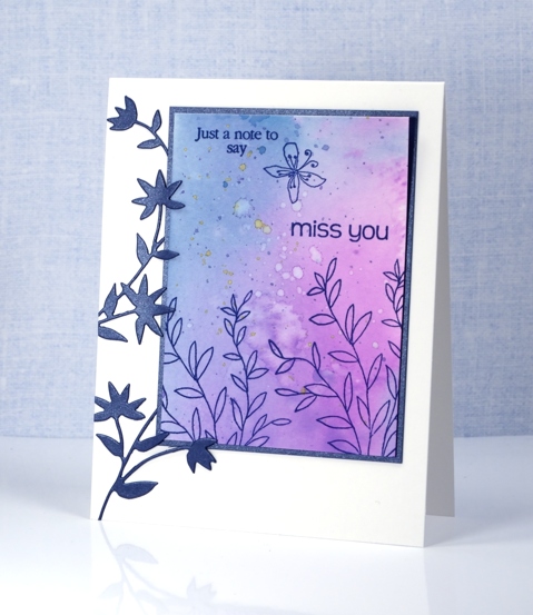
I chose not to make a card from the sample on neenah solar white. It worked but the colours did not blend or spread as nicely in my opinion. These are just the beginning of my experiments of course and only three colours but there is more to come. The inks blended just as beautifully as the original distress inks but dry opaque or semi opaque, perfect for a solid background.
Supplies:
Stamps: delicate flowers, stitched flowers, happy snippets
Dies: flower frolic, tagged
Inks: faded jeans, worn lipstick, fossilized amber distress oxide inks (Ranger) versafine majestic blue (Tsukineko)
Papers: hot pressed watercolour paper, bristol paper, stardream blue cardstock, black cardstock
Feathers
Posted: April 25, 2017 Filed under: Brusho, light as a feather, Skyward | Tags: Brusho, Penny Black creative dies, Penny Black stamps 4 Comments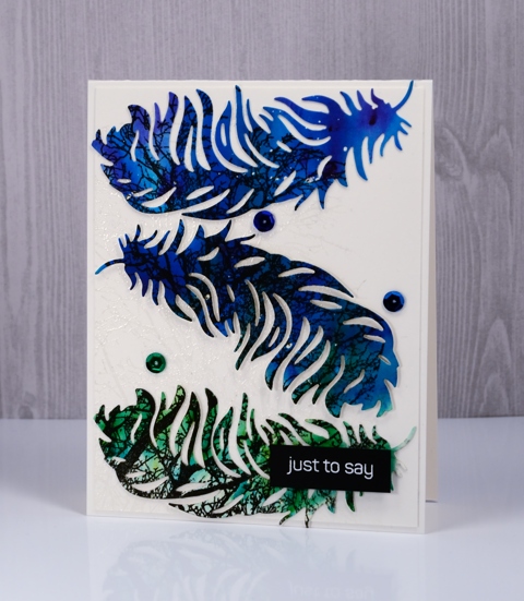
I’ve been wanting to make a feather card for ages and finally got round to it for today’s guest post on the Foiled Fox blog. I have told you before, but just in case you’re new here, I want you to know what a delightful place The Foiled Fox blog and store is. The blog features all sorts of lovely projects and the online store is full of fabulous art and craft supplies and they are always adding new products.
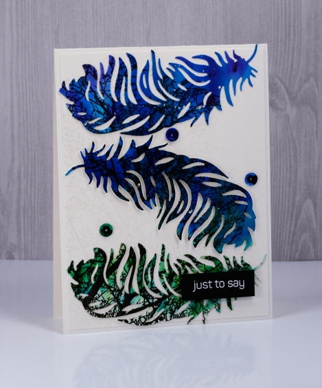
To create my feather card I worked on hot pressed watercolour paper and did all the painting and stamping before any of the die-cutting. I splattered masking fluid over the panel first then sprinkled three colours of brusho, spritzed that and watched it react and spread over the panel. I wanted the violet to blend into the blue, then the blue into the green so I tilted the panel and let the wet paint move. Once the panel dried I stamped the Penny Black ‘skyward’ stamp in black versafine ink.
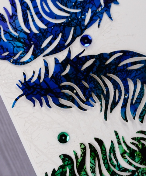
The background is also stamped with the skyward stamp and embossed in clear powder to create a subtle pattern. I popped the feathers up on the background panel, added some co-ordinating sequins and a little embossed sentiment.
Thank you, thank you to the crew at the Foiled Fox for having me on their blog again today. You can find links to the products used on today’s project listed below.
Supplies
Stamps: skyward, happy snippets
Dies: light as a feather
Inks: versamark, versafine onyx black
Paper: hot pressed watercolour paper, white cardstock
Paint: brusho violet, cobalt blue, leaf green
Also: white & clear embossing powder, masking fluid, sequins
Happy Birthday, Dad
Posted: April 24, 2017 Filed under: CAS, Homestead 11 Comments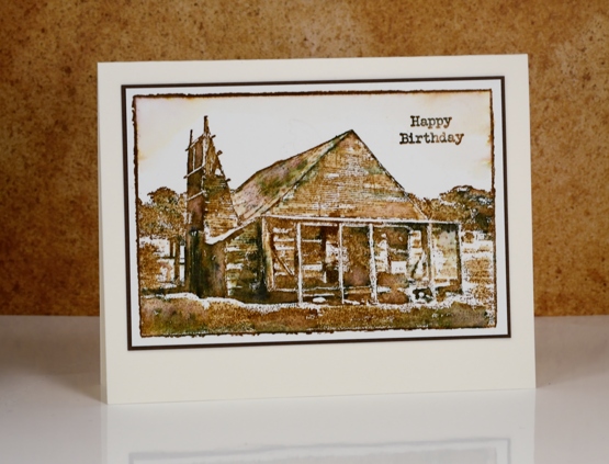
I waited to hear from my dad before I posted this card on the blog. It was mailed to him a few weeks back but the postal service is an unpredictable animal so I had no idea when it would arrive in Australia. On the same day I mailed a package of cards to my mother for her to use. I intentionally did not put my dad’s birthday card in as I was sure a package would arrive later than a single card. Not so. A birthday present posted in the other direction from my parents to me was sent airmail but arrived almost 2 months later. As my mum would say, ‘You just never know!” A large and precious parcel arrived for my family on Friday sent by my father the previous Tuesday. Three days! So it is possible.
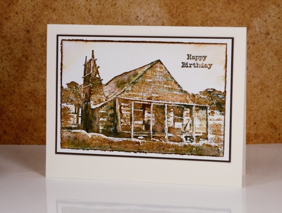
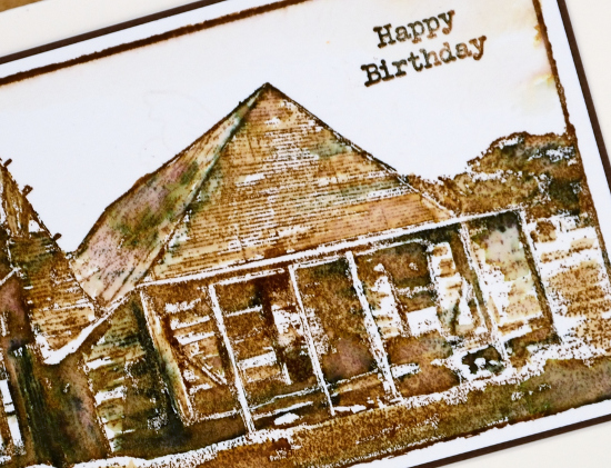
But enough about the postal service. This rustic homestead card is made with a stamp from Darkroom Door. When I was in Australia late last year I visited Rachel Greig and Stewart Yule, founders and owners of Darkroom Door and was treated to a behind the scenes tour of the stamp making process. I spent a wonderful morning talking with Rachel about a range of creative topics including my introduction of classes using Darkroom Door stamps to my teaching schedule. I am so grateful for Rachel’s support of my classes, as are my students!
When my dad came to pick me up he browsed some of the stamps on display in the studio. Two in particular caught his eye, the one in his hand above featuring the Norah Head lighthouse that he and I toured the following week and the one on this birthday card. This homestead is representative of older farm buildings that dot the Australian country side. The corrugated iron on the roof is something I rarely see in Canada but common in Australia. I chose to stick to a vintage colour scheme stamping in vintage photo distress ink and black elegant writer pen. I blended parts of the stamped image with water to bring out the shadows.
This card seems all the more appropriate this week as the precious parcel I mentioned earlier contained my father’s memoir written over the last few years about his and my mother’s life experiences and organised into chapters by ‘homesteads’.
Supplies
Stamps: Homestead, Happy Birthday (Darkroom Door)
Inks: vintage photo distress(Ranger), elegant writer pen(Speedball)
Paper: hot pressed watercolour paper, brown cardstock
Classes update
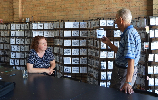
Posted: April 21, 2017 Filed under: Classes, Darkroom Door, Penny Black | Tags: Classes, Darkroom Door stamps, Penny Black stamps 7 CommentsI’ve been busy with classes lately including one in Toronto where I had a wonderful time with some delightful artists and crafters making watercolour cards. I’m hoping to head back there to teach before too long.
Here in Ottawa I am in the middle of Brushstroke Blooms classes using some gorgeous Penny Black stamps. There are spaces in tomorrow’s Saturday morning class and Monday’s afternoon class. If you are interested go to my Classes page.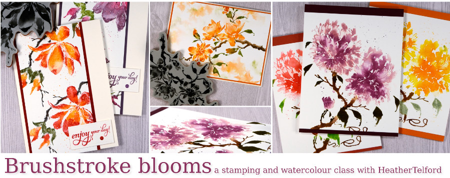
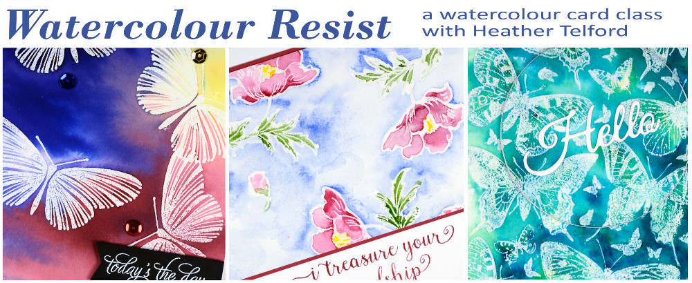
On May 6th, at Aunty Em’s Scrapbooking store in Cornwall I will be teaching the Brushstroke Blooms class pictured above and the Watercolour Resist class shown below. Contact the store for more details.
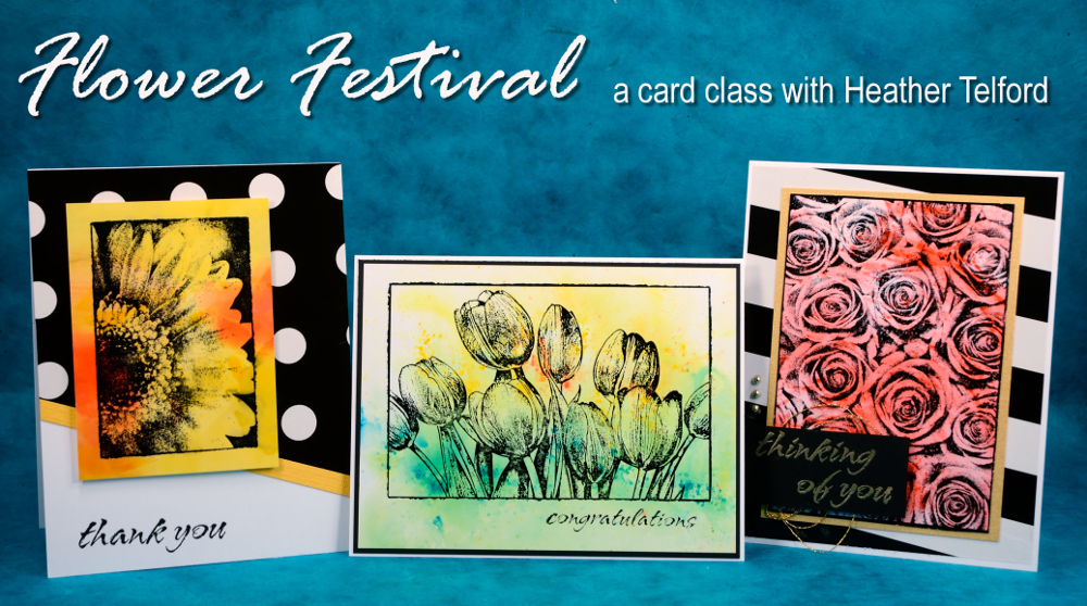
On May 11th & 12th at Crop A While store in Orleans and May 13th & 15th at Riverside United Church in Ottawa I will be teaching the Floral Festival class pictured below featuring Darkroom Door stamps. Contact Crop A While to sign up there or click over to my Classes page to sign up for a Riverside class.
Thank you to all of you who support my classes, I love meeting you and creating with you. To those who are waiting patiently for online classes, do not give up hope! I want to supply some as soon as I can.
Bamboo
Posted: April 20, 2017 Filed under: Alcohol Ink, bamboo cut out | Tags: Penny Black creative dies, Ranger Alcohol Ink, Yupo Paper 6 Comments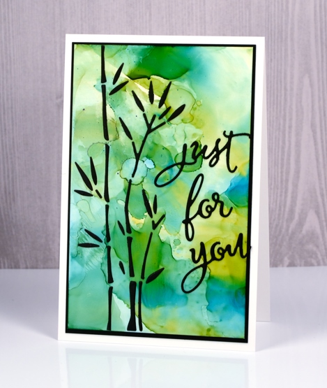
I have combined a new die, ‘bamboo cut out’ with an alcohol ink background to create this simple design. As the name of the die suggests, the die cuts out all the little pieces to make up some stalks of bamboo. The easiest way to make this card would have been to cut the bamboo out of the alcohol ink panel to reveal the black background behind and I would suggest using that method. For some strange reason however, I chose to cut the bamboo out of black cardstock and attach all the little pieces to the alcohol ink panel.
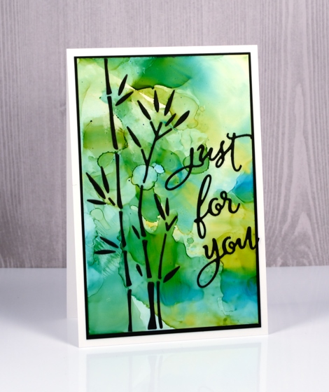
I put double sided adhesive on the back of the black cardstock before die cutting then held all the pieces together with a sheet of ‘press & seal’ so I could attach them to the alcohol ink panel but it was a tad fiddly!
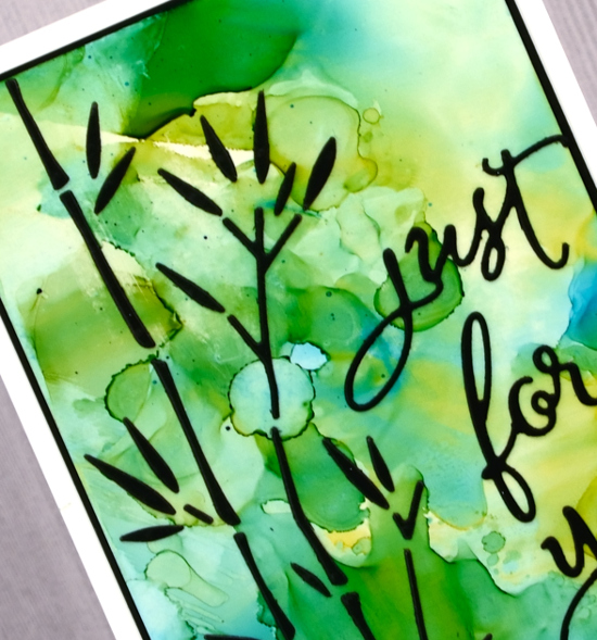
I made the alcohol ink panel on white yupo paper. I dropped some blue and yellow alcohol inks on a craft sheet, added some rubbing alcohol then swiped the yupo through it to pick up the blended coloured patterns. The colours reminded me of light through a forest so I chose the bamboo to be my feature image.
Supplies
Dies: bamboo cut out, for you
Inks: honeycomb & stream alcohol inks (Ranger)
Paper: white yupo paper, black cardstock
Also: stick it adhesive, rubbing alcohol
Felicity
Posted: April 19, 2017 Filed under: birds and banners, Felicity | Tags: Brusho, Penny Black creative dies, Penny Black stamps, WOW embossing powders 17 Comments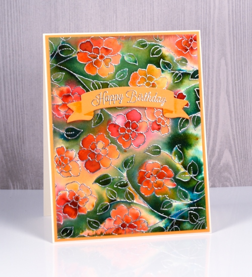
Today’s card looks like it was created with a background stamp, which is practically the case, but not quite. I used the new slapstick cling stamp, ‘Felicity’ and stamped it twice to more than fill a card front. The stamp is actually longer than my average card but a bit narrower. The organic arrangement of the flowers made it easy to stamp it twice and make it look like one big image. I stamped in versamark ink then embossed in silver powder on hot pressed watercolour paper. I taped it down then spritzed all over the panel with water. It wasn’t soaking wet but it was wet enough that the brusho I sprinkled on next started reacting straight away. I picked up some more brusho colours the other day to expand my collection and three out of four on this card are new to me. I sprinkled orange, sandstone and rose red over the flowers, spritzed again, tilted the panel to move the water and waited to see if I needed more. I did this a few times then switched over to sprinkling the olive green brusho over the rest of the panel. The olive green was more intense and the leaves on the panel are small so some areas got very dark, very quickly. I used a folded paper towel to remove liquid and colour where there was too much. I also tilted the panel so colour would flow down towards the closest embossed barrier which makes for nice dark contrasting areas next to some of the silver embossing.
I let the panel dry naturally then trimmed it and matted with orange cardstock. I cut a curved banner from the new set ‘birds & banners‘ and embossed one of the co-ordinating stamps from the ‘banner sentiments‘ set in silver. The die cut banner looks folded so I used a marker to add a little shadow to the areas which appear to be behind the main section. I cut the same banner from orange fun foam so I could pop my sentiment up on the floral panel.
When I looked up the name of this new stamp, I was delighted to see it is called ‘Felicity’. I have a dear cousin called Felicity who I haven’t seen in many long years but I have fond memories of. I am going to try hard to actually send a ‘felicity’ stamped card to her, maybe this one.
Supplies
Stamps: Felicity, banner sentiments (PB)
Dies: birds and banners (PB)
Inks: versamark
Papers: hot pressed watercolour
Paints: orange, sandstone, rose red, olive green brusho
Added extras: Zing silver embossing powder
Flower medley
Posted: April 18, 2017 Filed under: birds and banners, flower medley | Tags: Nuvo crystal drops, Peerless Transparent Watercolors, Penny Black creative dies, Penny Black stamps, Tsukineko Versafine inks, WOW embossing powders 4 Comments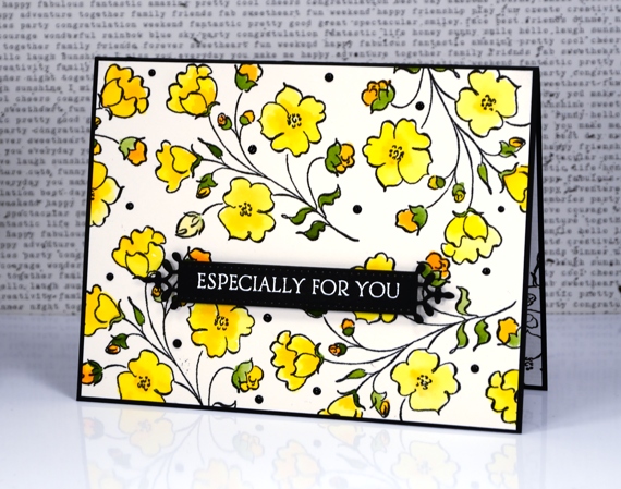
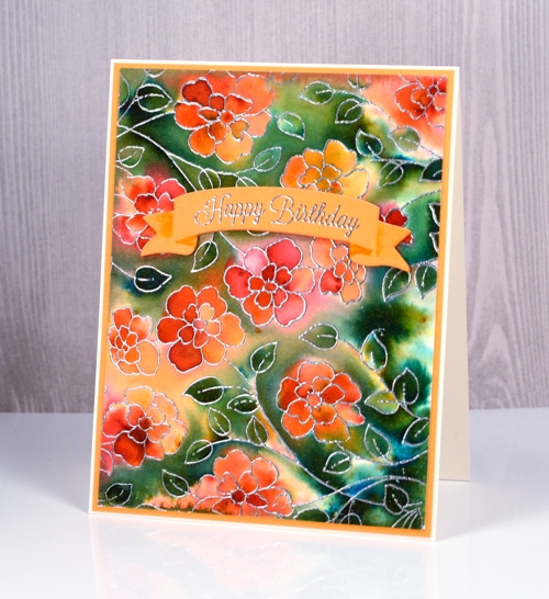
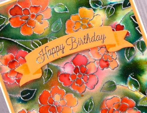
I’m sharing another card today made with products from the new Penny Black release ‘Celebrate.’ The flowers featured on today’s card were made with just one of the stamps from the new transparent set ‘flower medley’. I stamped it all over a piece of watercolour paper with black versafine ink then embossed in clear powder. I used my peerless watercolours to fill in all the flowers, buds and leaves.
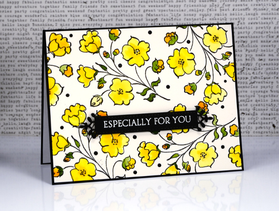
The fancy little banner you see is a diecut from the new set, ‘birds & banners’ which has a co-ordinating stamp set of nineteen sentiments. I embossed one in white on the banner then popped it up over the floral panel.
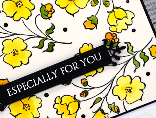
When I had put the card together on the black card base I decided it needed little dots of black ebony nuvo crystal drops to fill in a few spaces and look cute!
Supplies
Stamps: flower medley, banner sentiments
Dies: birds and banners
Paper: hot pressed watercolour paper, epic black neenah cardstock
Inks: onyx black versafine, versamark (Tsukineko)
Paints: peerless transparent watercolours
Also: ebony nuvo crystal drops, clear embossing powder, white embossing powder


