
Stockings were hung
Posted: November 3, 2016 Filed under: Brick wall, Christmas stockings, Diamond pattern, Textures, Winter lantern | Tags: Penny Black creative dies, Penny Black stamps, Ranger Distress inks, Speedball elegant writer 8 Comments
…by the chimney with care. This is the last of my Winter Warmth series and the one that almost didn’t make the cut because I misjudged the size of the stocking! I created the whole background panel then pulled out the die to add the stocking only to find it was a tad larger than I’d remembered. My children assured me some stockings are so large they cover half the fireplace so I continued with the design.
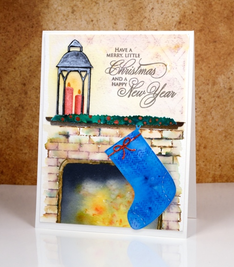
I created the background by stamping on cold pressed watercolour paper with distress inks. I first masked a space where the fireplace would be and a positioned a post-it across the panel where the mantel would end up. I stamped the brick wall stamp in brown and added darker tones with an elegant writer before blending with water. Above the mantel I stamped ‘diamond pattern and softened it with water. When I removed the post-it from the fireplace I used yellow, orange and black brusho to paint my ‘fire’. The lantern was done in two pieces just like I did on the ‘lakeside card‘ and yellow ink was added on the panel behind to make it glow.
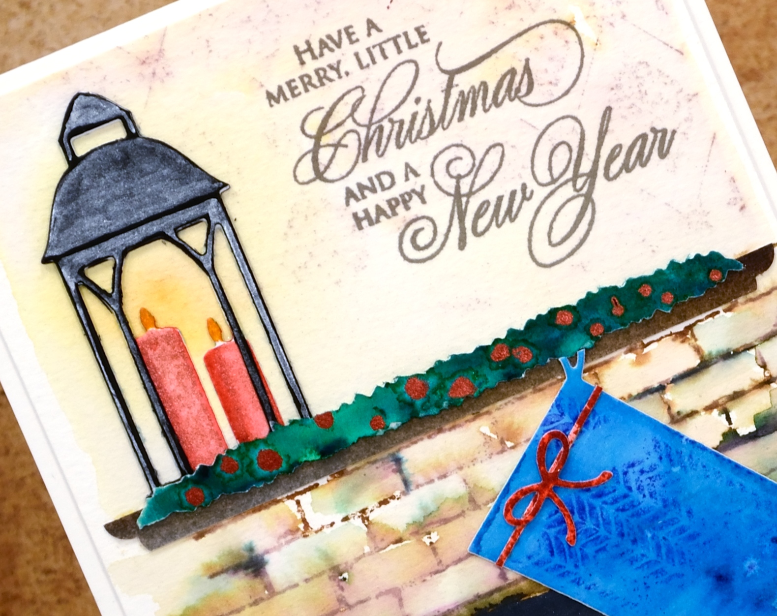
The swag over the mantel is a strip of watercolour paper painted with green brusho then dotted with siren smooches ink. I attached it over a strip of painted brown paper cut to look like a mantelpiece. The stocking was cut with one of the ‘Christmas Stocking’ dies then stamped with a texture stamp so it looked like fabric. This one had a higher fiddliness factor than most of my cards which increased my respect for those of you who create far more intricate die-cut cards on a regular basis.
Thanks for visiting this week as I shared my Winter Warmth cards. I’ll be back next week with some more snowscapes.
Supplies
Stamps: brick wall, textures, diamond pattern, season’s gifts (PB)
Dies: winter lantern, Christmas stockings, little ornaments (PB)
Ink: vintage photo, fired brick, blueprint sketch, scattered straw, spiced marmalade distress inks (Ranger)
Paper: hot pressed watercolour paper, cold pressed watercolour paper, black cardstock
Paint: scarlet, ost blue, yellow, gamboge, black, dark brown, emerald green brusho powder, Finetec Artist Mica watercolour paint
Also: elegant writer pen, siren smooches ink
Baby, it’s cold outside
Posted: November 2, 2016 Filed under: Frosty day, What's in your cup | Tags: Fabriano Watercolour Paper, Penny Black creative dies, Penny Black stamps, Ranger Distress inks, WOW embossing powders 7 Comments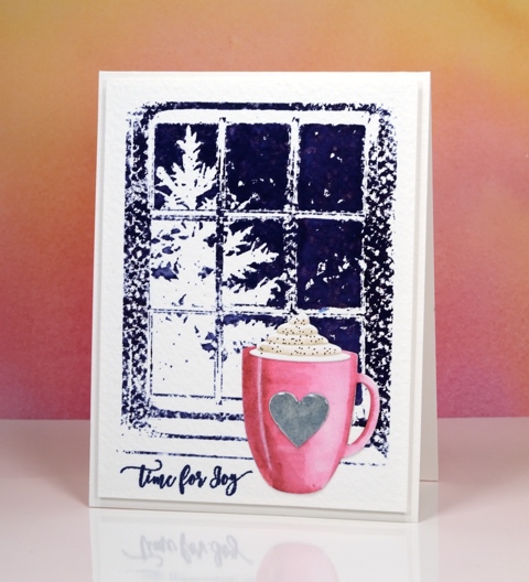
I’m continuing my ‘Winter Warmth’ feature with a cup of hot chocolate and a steaming cup of tea. I had fun creating a couple more scenes with simple watercolour backgrounds and die cut focal images in the foreground. On today’s cards the background is rough watercolour paper so the ‘frosty day’ stamped images were speckled all over until I used a wet paintbrush to blend the ink over the sky area.
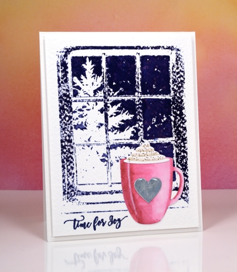
I die-cut the cup using the ‘what’s in your cup?’ die set. This set comes with the cup, cream, steam, teabag plus more detail pieces. I cut the pieces out of hot pressed watercolour paper, coloured them with distress markers and blended the colour with water.
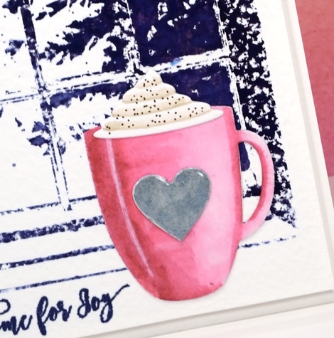
I added a silver heart, cream and cinnamon to the pink cup then attached them all to the background panel. Because the die set comes with all the cute little extras I decided to make a second card this time with a cup of tea.
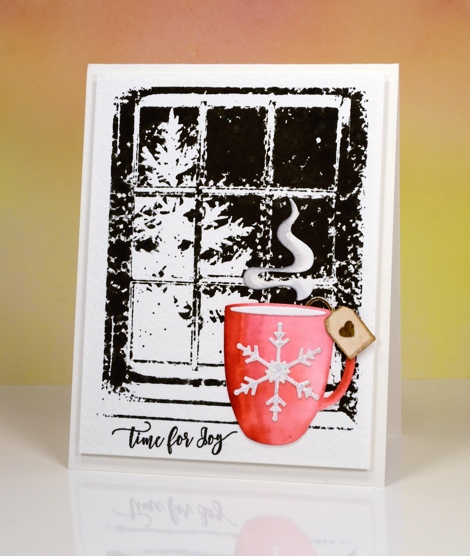
I stamped the background in black soot distress ink for this card and once again blended the sky area but left the rest textured.
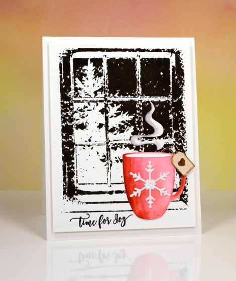
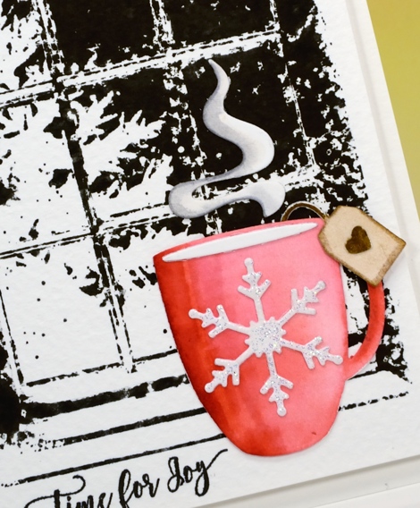
I coloured the cup with red distress inks then added a sparkly embossed snowflake, a teabag tag and some rising steam.
I have one more ‘winter warmth’ card to share tomorrow.
Supplies
Stamps: frosty day, festive snippets
Dies: what’s in your cup?
Ink: Chipped sapphire, black soot, festive berries, old paper, gathered twigs, picked raspberry, vintage photo, hickory smoke distress inks/markers (Ranger) Versamark, versafine majestic blue, imperial purple & onyx black (Tsukineko)
Paper: hot pressed watercolour paper, rough watercolour paper
Paint: Finetec Artist Mica watercolour paint
Also: Clear gloss embossing powder, Clear sparkle embossing powder
Light a candle
Posted: November 1, 2016 Filed under: On the lake, Winter lantern 9 Comments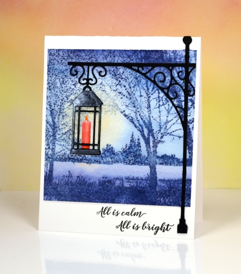
The second in my ‘Winter Warmth’ series again features a simple watercolour background with watercoloured die-cut images in the foreground. For yesterday’s card I stamped the background image on cold pressed watercolour paper so there would be a bit of texture showing through. It is even more evident in today’s card; stamping a solid image on cold pressed paper results in the speckled look of the lakeside scene. I inked the stamp in stormy sky distress ink all over and on a second stamping added chipped sapphire across both top and bottom. After stamping I used a wet brush to paint over the whole panel. This technique softens the scene and pulls colour from the stamped areas into the blank areas. While it was still wet I dabbed colour out of one area over the water so I could add a little yellow ink.
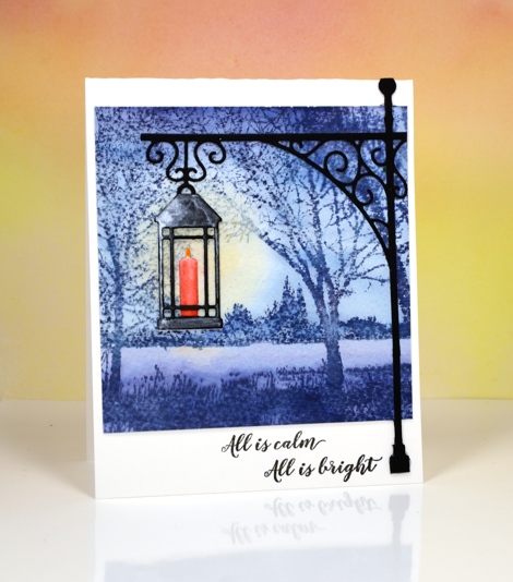
I used two separate die sets to create the lantern in the foreground. I cut the lantern using a die from the new set ‘winter lanterns’. I cut one from watercolour paper and one from black cardstock. The black one I painted with a thin coat of silver watercolour paint and clipped out the candle. The lantern cut from watercolour paper I coloured with distress markers then blended with water. I attached the black lantern over the watercoloured one so the candle appeared behind the black frame. I cut the lamp post from black cardstock using a die from ‘the gathering’ die set then trimmed it to fit the card base and overlap my painted background. Once again I used sentiments from ‘festive snippets’.
Thanks for dropping by.
Supplies
Stamps: on the lake, festive snippets
Dies: winter lantern, the gathering
Inks: Chipped Sapphire, Stormy Sky, Spiced Marmalade, Festive Berries distress inks (Ranger)
Paints:Finetec Artist Mica watercolour paint
Cardstock: hot and cold pressed watercolour papers, neenah epic black
Let it snow
Posted: October 31, 2016 Filed under: Skis 'n' sled, Woodland Beauty | Tags: Penny Black creative dies, Penny Black stamps, Ranger Distress inks, Tsukineko Memento inks 11 Comments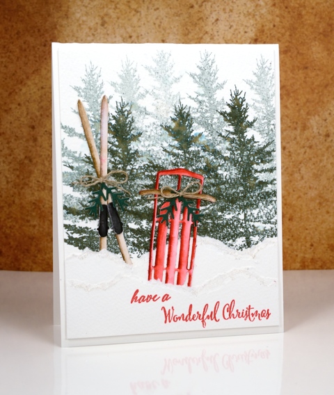
I am writing this post from sunny warm Australia while my Ottawa family is sending me photos of the snow that has already fallen. I have a series of ‘Winter Warmth’ posts this week featuring dies and stamps from the latest Penny Black releases. I chose to pair watercoloured die-cuts with watercoloured backgrounds to make some indoor and outdoor winter scenes. You might think that sledding or skiing is not a particularly ‘warm’ activity but consider the trudge up the hill with the sled or the energy expended cross-country skiing; you can end up quite heated!
I created my background forest on cold pressed watercolour paper by doing first and second generation stamping with memento northern pine ink. I then tore a few snow banks from the same paper and layered them in front of the trees.
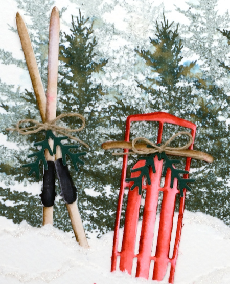
I die-cut the sled and skis from hot pressed watercolour paper then coloured them with distress markers, blending with water to get shadows and dimension. I added some die-cut greenery and a little twine bow to both the skis and the sled then tucked them in behind the torn paper snow banks. I added some clear wink of stella to the torn edges to make the snow banks glisten a little.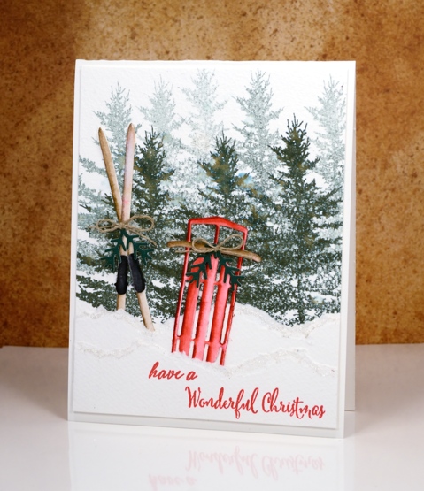
Supplies
Stamps: woodland beauty, festive snippets
Dies: Sled ‘n’ skies, winter lantern
Inks: memento northern pine, tuxedo black (Tsukineko), festive berries, gathered twigs distress markers (Ranger)
Paper: hot and cold pressed watercolour papers (Fabriano), green cardstock
Also: clear wink of stella, linen twine
Peerless skies
Posted: October 11, 2016 Filed under: Chapels, Woodland Beauty | Tags: Peerless Transparent Watercolors, Penny Black creative dies, Penny Black stamps, WOW embossing powders 8 Comments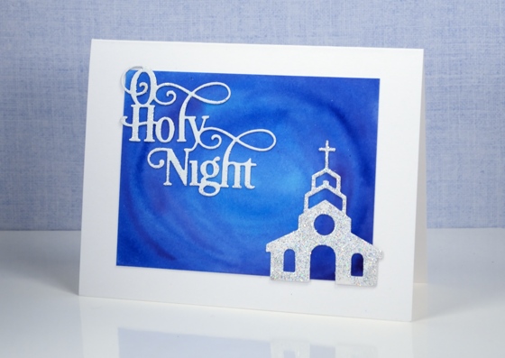
Yesterday I posted the first card painted with my new Peerless Watercolour paints along with a video showing how I organized my paints into a palette. The cards I have today feature deep blue skies also painted with Peerless watercolours.
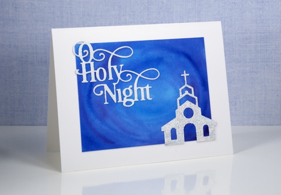
Peerless watercolours are unusual as the paint is concentrated in a dry sheet of cardstock. To use it you have to add water to the cardstock. I am only just beginning to use mine but I am already impressed by the intensity of the colour and the ease with which they blend. For both these cards I used a mix of blues and purples and blended them on the watercolour panel. I was happy with the mix of colour as I painted but was even more impressed when I returned to the panels after they had dried and saw how they colours had continued to blend resulting in soft smooth variations.
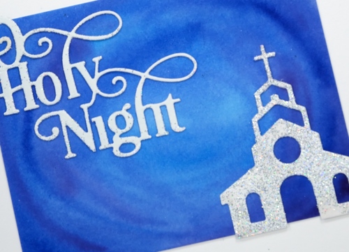
I kept the design simple as far as elements were concerned but fancy when it came to texture and sparkle. I embossed both the sentiment and church with WOW Diamond white embossing glitter giving a second coat to the church for maximum bling. I can’t imagine the circumstances under which a church would be so sparkly but it looked so pretty against that sky I had to let it bling!
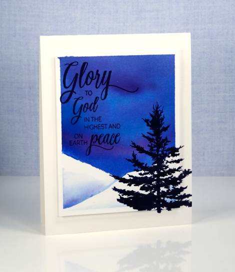
I was far more traditional with this card adding a sentiment and tree in black ink.
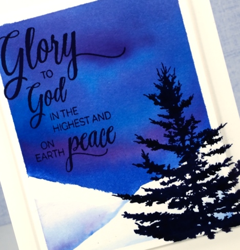
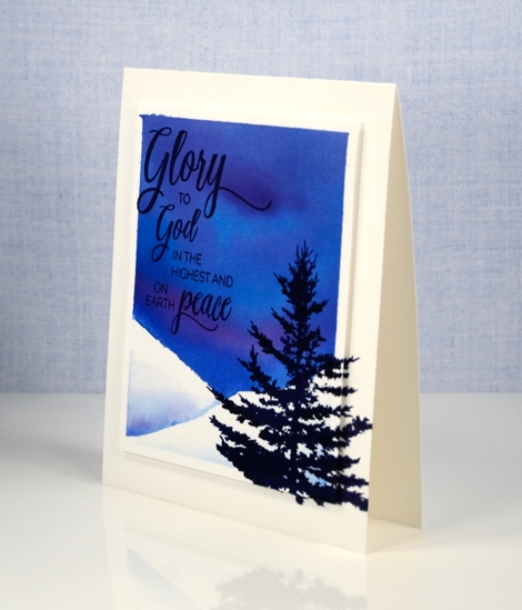
I added a little interest by stamping the tree on both the card base and the feature panel which is popped up on a layer of foam.
I received my peerless watercolour paints from the kind people at The Foiled Fox online store. The store has a wonderful mix of art, paper craft and calligraphy supplies and in my opinion they are carrying all the cool stuff! They also have a blog showcasing their own design team and guests from around the world.
Supplies
Stamps: Woodland beauty, Holy Night (PB)
Dies: Chapels, O Holy Night
Ink: Versafine onyx black (Tsukineko)
Paint: Peerless watercolours
Paper: hot pressed Fabriano watercolour paper
Also: WOW diamond white embossing glitter
Forest grove
Posted: October 7, 2016 Filed under: gift card pocket, Serenity, Snowy Grove, Stamped Landscapes | Tags: Fabriano Watercolour Paper, Penny Black creative dies, Penny Black stamps, Ranger Distress inks, Ranger Distress stains 7 Comments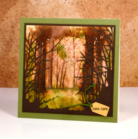
As you might know I use hot pressed watercolour paper 90% of the time because it is smooth and takes stamping so well, giving me a complete images. Occasionally, however, I like to pull out some cold pressed or even more occasionally some rough watercolour paper because the texture gives a whole different look. The labels hot, cold and rough, when attached to watercolour papers refer to the way the paper is pressed. Hot is flattened with heat and pressure making it the smoothest of all three. Cold is flattened with pressure but not heat and rough is flattened with less pressure than cold, making it the most textured of the three types.
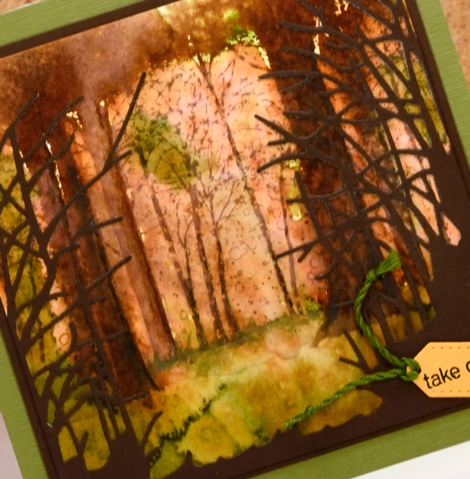
I stamped the ‘snowy grove’ stamp on cold pressed paper in vintage photo ink. I then used the image as a starting point for painting some of the trees more distinctly. In some cases I joined a few trunks together with extra ink to create wider trees. I painted some foliage plus the forest floor with crushed olive and peeled paint distress stains and spritzed with water to blend and blur both the ground and the canopy. I cut the ‘serenity’ die from brown cardstock to add some framing and give the impression of looking into a grove of trees. The tiny tag is cut with the ‘gift card pocket’ die.
The trees around here still have plenty of green on them but we are beginning to see gorgeous colour too. Have a great weekend and Happy Thanksgiving Canadians!
Supplies:
Stamps: Snowy Grove, Snippets (PB)
Dies: Serenity, gift card pocket
Inks: vintage photo, crushed olive, peeled paint distress inks & stains(Ranger)
Cardstock: Cold pressed watercolour paper, brown cardstock, green textured cardstock
Vintage poinsettia
Posted: September 22, 2016 Filed under: gift card pocket, Scarlet Majesty | Tags: Faber-Castell Albrecht Durer Watercolour pencils, Penny Black creative dies, Penny Black stamps, Ranger Distress inks, Tsukineko Versafine inks 8 Comments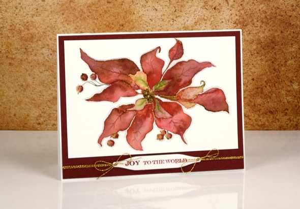
Today’s card is a contrast to the sparkly bright poinsettias earlier in the week. I returned to a style I have featured on the blog several times this year, a vintage appearance. To achieve the aged look I stamp first in vintage photo distress ink then blend the stamped ink with watercolour pencils. I worked one petal at a time and used a wet paintbrush to pick up colour from the pencils. I chose a couple of reds, and a light green for the petals and a dark brown for the berries. Once the whole image was painted I coloured around the edge with a grey pencil to help ‘lift’ it off the page a little.
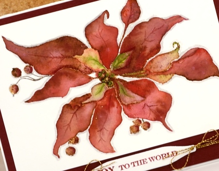
I matted the panel with textured burgandy cardstock and added a sentiment on one of the handy tags from the gift card pocket die (a set that gives you way more than just a gift card pocket; its full of tabs, tags, flowers, scalloped shapes…).
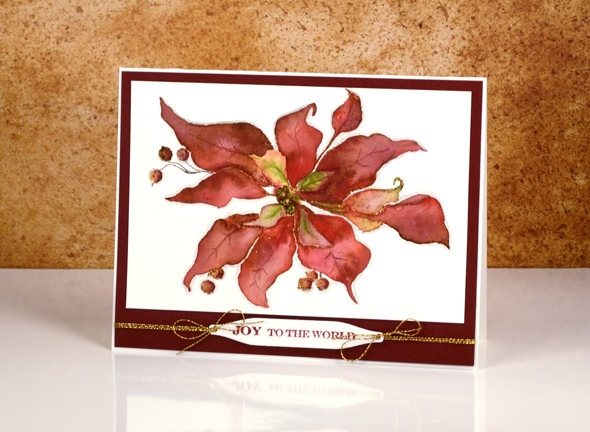
As I finished editing this post it occurred to me that the vintage look on my poinsettia does give it a bit of a ‘dried up ‘cos I didn’t get watered look’. Now, how would I know that look I wonder?
Supplies:
Stamps: Scarlet Majesty, Holiday Snippets (PB)
Dies: Gift Card Pocket
Inks: Versafine Crimson Red ink (Tsukineko) vintage photo distress ink(Ranger)
Cardstock: Fabriano 100% cotton hot pressed watercolour paper, Burgandy textured cardstock
Also: Faber-Castell Albrecht Durer watercolour pencils, Gold cord
Stacked die cuts
Posted: August 14, 2016 Filed under: Brusho, shall we dance | Tags: Brusho, Penny Black creative dies 9 Comments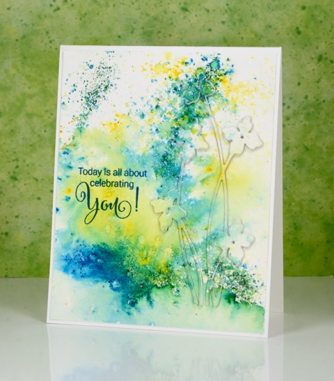
When I first tried this technique I did it the same way many did, by cutting multiples die cuts from cardstock and gluing them on top of each other. I now use a quicker method where I die-cut the image out of foam which replaces the stack of cardstock die cuts. I always find it a little tricky to stack the very fine stems and letters; the foam stretches a bit and the cardstock is very hard to line up. Despite these fiddly factors I managed to get it all in place to create this subtle floral design on another abstract watercoloured panel.
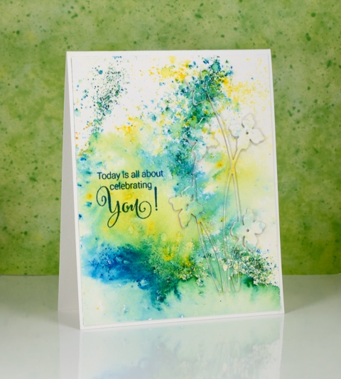
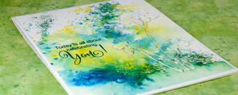
This was one of those panels where the brusho patterns turned out to be very pretty so I didn’t want to lose much by stamping over it or cropping. Raising a die cut image is a great solution when you want to preserve some pattern but still have a focal image.
Supplies:
Stamps: Sprinkles & Smiles (PB)
Die: Shall we dance
Paints: Brusho powders (Colourcraft)
Inks: Deep Lagoon ink (Tsukineko)
Cardstock: Fabriano 100% cotton hot pressed watercolour paper
Also: stick it adhesive sheet, adhesive backed fun foam
Round the watercolour world
Posted: August 8, 2016 Filed under: Brusho, love to travel, mini community, Watercolour | Tags: Brusho, Fabriano Watercolour Paper, Penny Black creative dies 5 Comments
I have more watercolour die cuts to share. This card has a much higher fiddliness factor than the previous ones and has convinced me that I should never video myself making a shaker card! Rather than trying to describe my trial and error process for making this shaker card I will just list the layers I used from little die cuts right down to the card base. The mini community and ‘the world’ were cut from brusho panels.
watercoloured ‘mini community’ & ‘love to travel’ die cuts with stick-it adhesive on the back
black cardstock panel
acetate
foam with circle die cut from centre
watercolour panel to be ‘the world’
card base

I saved the little die-cut bus and cars to put inside the shaker area with the glitter, sequins and micro beads. It wasn’t until I started shaking it that I realised the bus and cars would end up in countless pile ups!

Supplies:
Stamps: Sprinkles and Smiles (PB)
Die: Mini community Love to Travel (PB)
Paints: Brusho (Colourcraft)
Cardstock: Fabriano 100% cotton hot pressed watercolour paper, Neenah solar white, Neenah epic black
Also: stick it adhesive sheet, glitter, sequins, micro beads
Watercolour Fuchsias
Posted: August 5, 2016 Filed under: Fuchsia, Watercolour | Tags: Penny Black creative dies, Penny Black stamps, Tsukineko Versafine inks 10 Comments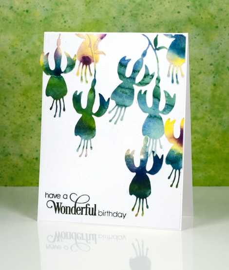
I’ve been cutting up watercolour panels again; it really is a great way to use up experiments or abandoned projects. Sometimes I have panels that were my ‘practice’ for something else or part of a class where I demonstrated a technique but then moved on. The colours in the panels are pretty but the pattern might be a bit random or unattractive. Using a die cut means I can cut from the sections where I really like what the colours are doing. These panels were painted with Gansai Tambi paints.
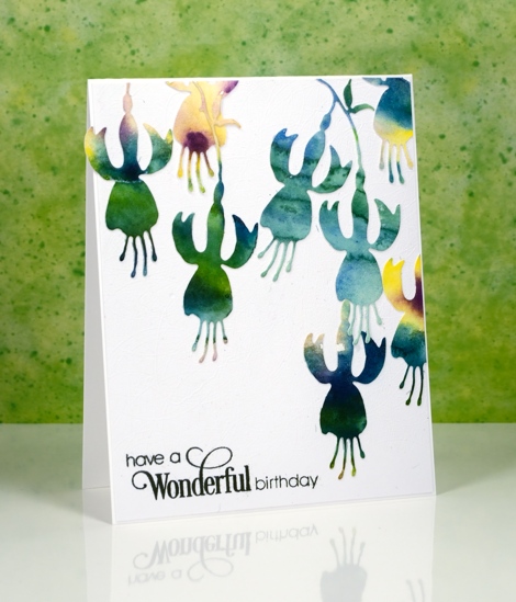
I put stick-it adhesive on the back then cut all these fuchsias from a couple of panels featuring the same blue green tones. I arranged them then attached them all to a white panel and then to a white card base. My photography didn’t pick up the texture on the white panel as it is quite subtle but it is a cute trick if you want to try it. The cutting base panel for my die-cutting machine is very well used all over so when a piece of cardstock is run through the machine the base transfers an intricate pattern of intersecting lines which creates subtly textured cardstock. I am going to include this card in the Casology ‘Watercolour’ challenge.
Supplies:
Stamps: Sprinkles and Smiles (PB)
Die:












