
Fancy Fish
Posted: March 22, 2017 Filed under: Alcohol Ink, Fancy Fish | Tags: Penny Black creative dies, Ranger Alcohol Ink 7 Comments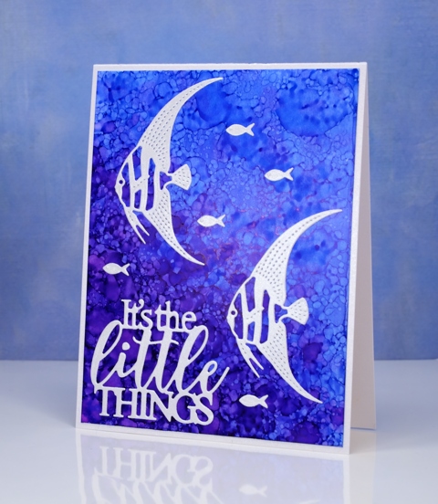
I have another alcohol ink background to share today. If you didn’t see the yesterday’s card you might want to click here (there’s a giveaway provided by The Foiled Fox so it’s worth a visit!) When I saw the new fancy fish dies from Penny Black, I immediately thought of the patterns possible with alcohol inks and blending solution. To create this kind of pattern I started with plenty of dark and light blue ink on my yupo paper then dropped some blending solution on a felt pad and pounced that all over the panel. The blending solution creates little bubble shapes in the ink. The felt pad also picks up blue ink from the yupo paper and prints it down again so more little bubbles.
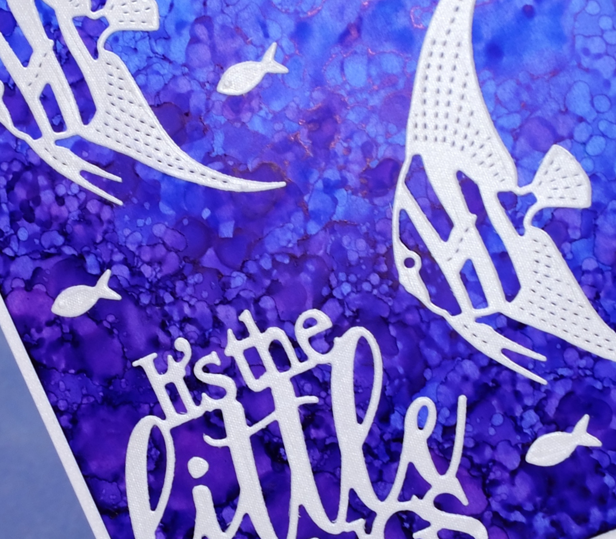
I die cut the fish and sentiment from a silvery grey envelope I had saved; it had a bit of texture and a little shimmer to it. The die set, Fancy Fish includes two detailed fish and a teeny tiny fish; I have a card tomorrow featuring the third fish.
Supplies
Dies: Fancy Fish, Dream big
Inks: indigo, pool alcohol inks (Ranger)
Paper: white yupo, neenah solar white, silver envelope
Floral border
Posted: February 9, 2017 Filed under: Centerpiece, Stitched Edges | Tags: Fabriano Watercolour Paper, Penny Black creative dies, Penny Black stamps, Sakura Koi watercolour paints 18 Comments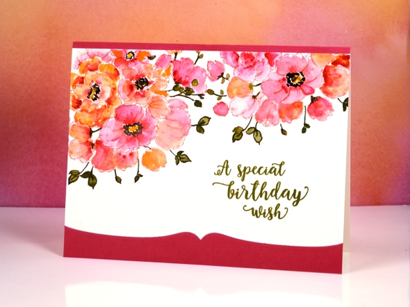
Between Christmas and New Year I did some major re-organising in my work room and changed the way I store my stamps. I am still working out a few details and wondering the best way to store my wood block stamps but other than that the new system seems to be working well. One benefit of doing some serious sorting was re-acquainting myself with my supplies. I pulled out a stamp from a few years ago and my Koi watercolour travel set to make this card.
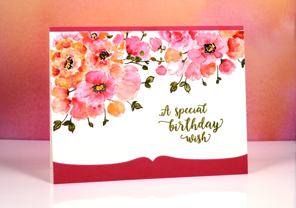
The stamp is a bouquet of flowers in a vase but as you can see I left the vase out of the picture and just worked with the flowers to create a border. With masking I could have positioned the flowers even more closely but I was hoping to finish this card fairly quickly so I just stamped the flower part of the stamp with the MISTI then moved my watercolour panel and stamped again. I used distress ink to stamp so I could blend it while painting. To keep it simple I used two colours of paint on the petals switching back and forth between a pink and a pale orange. I painted olive green into the leaves but then went around the edges and over the stems with a marker. To complete the flowers I painted black dots and yellow centres.
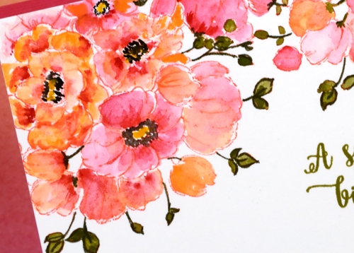
It really was a fairly quick panel to paint, the time consuming part ended up being the way I mounted it between a strip of pink and a die-cut edge of pink. I should have just attached it over the top of a pink panel but I made it less bulky but more fiddly by cutting both the watercolour panel and the pink cardstock with the edge die then aligning them on the card base. The Happy Little Stampers challenge this month is watercolour with an optional twist of die-cutting, so I’m popping over to add this one in.
As I write this I am sitting beside an amaryllis which looks like it might just burst out in bloom today. It is a gift from one of my artsy accomplices and it has been growing very steadily since the new year. It’s nice to have a real flower inside when all outside is snow and ice!
Supplies
Stamps: Centerpiece, words of kindness (PB)
Creative Dies: stitched edges (PB)
Inks: abandoned coral distress ink (Ranger) Olive grove memento marker, versafine Spanish moss (Tsukineko)
Cardstock: Fabriano 100% cotton hot pressed watercolour paper, Neenah Natural White 110lb cardstock, pink cardstock
Also: Koi watercolor field sketch travel kit (Sakura)
Family Tree
Posted: February 6, 2017 Filed under: Hand lettered, Tree heart, Triple Banner | Tags: color burst, Hand lettering, Penny Black creative dies, Penny Black stamps 16 Comments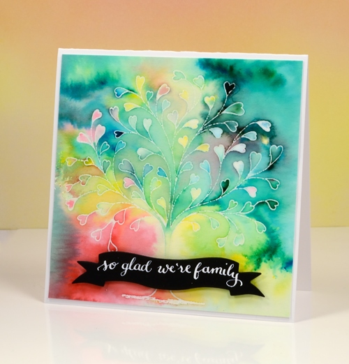
This delicate tree stamp is called `tree heart`but it reminded me of a family tree. I tried turning it into my family tree with names along the branches but it did not look that good! Instead I used the emboss resist technique with colorburst powders.
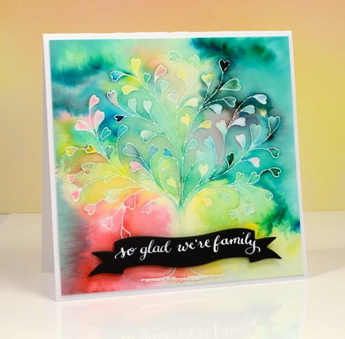
I embossed the tree in clear powders on hot pressed watercolour paper then sprinkled a few different colours of powder over the panel. I kept the colours separate as I sprinkled knowing they would blend anyway as I started adding water. I spritzed first then used a small paintbrush to move and blend the paint.
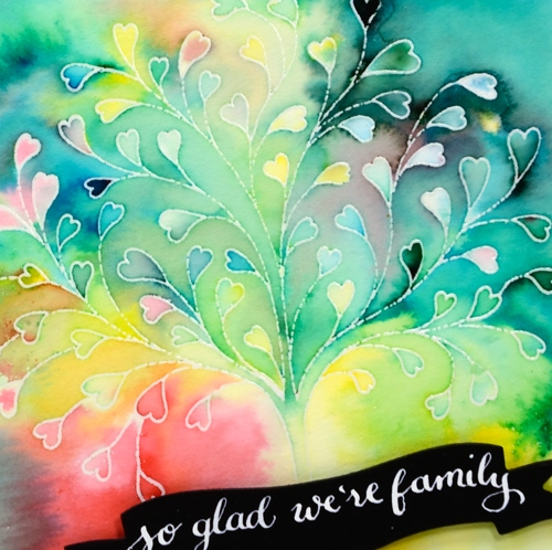
I love the way the emboss resist technique traps colours in little white borders. My next live class is a Watercolour resist class and, as often happens, I nailed two projects then took much longer to finalise the third. I was so happy to complete the designs I rewarded myself with some lettering playtime and made a bunch of custom black on white sentiments. I pulled out nine different banner, tag and label dies by Penny Black, cut them from black cardstock then used Dr Ph Martins Bleedproof white paint and a nib pen to write a sentiment on each one. The nib holder in the photo is an exclusive handmade holder sent to me by the lovely team at The Foiled Fox. It is delightful to write with. The bleedproof white paint is too thick for the nib straight out of the jar so I mixed some with a bit of water and it worked nicely.
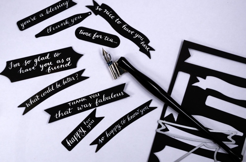
Now I have a few sentiments in reserve ready to add to future cards.
Supplies:
Stamps: Tree-heart(PB)
Dies: Triple banner, Tagged, A Pocketfull (PB)
Paint: Colorburst watercolor powder (Ken Oliver) Bleed proof white (Dr Ph Martin)
Cardstock: hot pressed watercolour paper, Neenah Solar White
Ink: versamark (Tsukineko)
Also: clear embossing powder (WOW)
Nib holder: Handmade by The Foiled Fox
Lovely Neighbourhood
Posted: February 1, 2017 Filed under: Color Burst, Neighborhood love | Tags: color burst, Fabriano Watercolour Paper, Penny Black creative dies, Penny Black stamps 2 Comments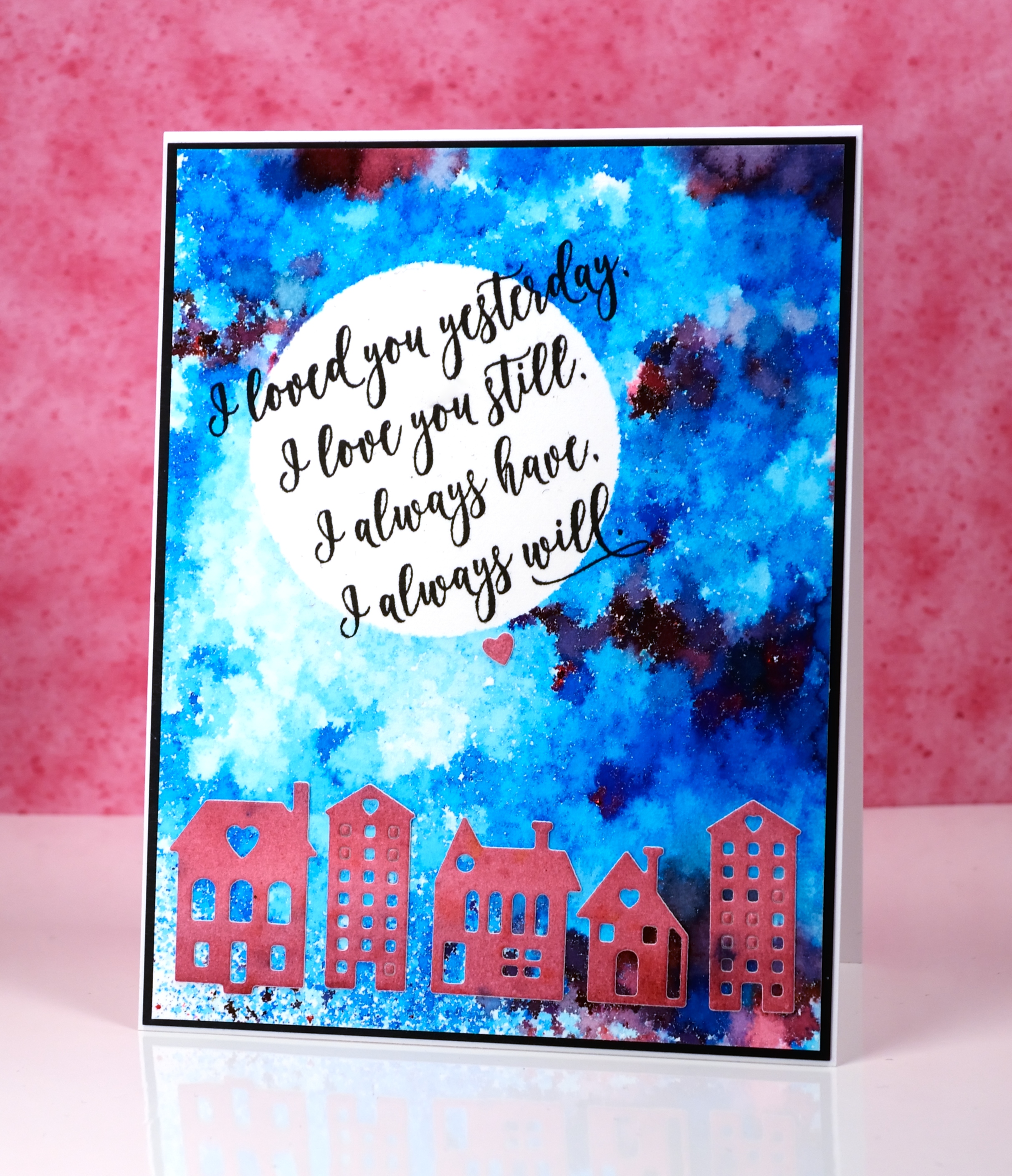
These cute little dies are part of a set called Neighborhood love; I love the little house and building dies Penny Black has brought out even though they challenge my fear of the fiddly factor. I started this card by positioning a frisket film circle mask on a piece of watercolour paper. I sprinkled ultramarine blue powder and a tiny bit of merlot over the panel and spritzed it lightly from above. I spritzed only until I could see some patterns appearing but stopped before all the spots of colour started joining together. I used a heat tool to dry it, pointing the tool down at the panel not from the side to reduce the chance of the wet paint moving across the panel. It reminds me of a mosaic.
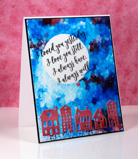
I painted another small piece of watercolour paper with merlot colorburst powder then die cut the buildings from the piece and attached them across the bottom of the panel.
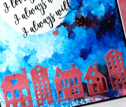
I removed the mask then wanted to hand letter a sentiment inside the moon; I ended up not being game and chose this sweet sentiment from the ‘forever & always’ set.
Supplies:
Stamps: Forever & Always (PB)
Die: Neighborhood Love (PB)
Paints: Merlot & Ultramarine Blue Colorburst powders (Ken Oliver)
Inks: Versafine onyx black ink (Tsukineko)
Cardstock: hot pressed watercolour paper, neenah epic black cardstock
Also: Grafix frisket film
Stencilled breeze
Posted: January 27, 2017 Filed under: Brusho, CAS, Fresh Breeze | Tags: Brusho, CAS, Penny Black creative dies, Penny Black stamps 7 Comments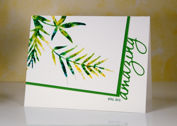
Earlier this week I posted a card made out of a leftover, the negative print from a stencil used for watercolouring. Today’s card is a positive print made through a stencil (not using the same stencil as the earlier card). I created the stencil for this card myself by die-cutting the shape from a piece of stencil plastic. You could use an old plastic folder as long as it is not too thick for your die cutting machine to handle. The die I used is ‘fresh breeze‘ from Penny Black. I taped my home made stencil to a piece of cold pressed watercolour paper and spread moulding paste over it, keeping the layer fairly thin with a palette knife. Next I sprinkled yellow and green brusho powder over the stencil then spritzed with water to activate the brusho. Too much water and it seeps under the stencil, not enough and the brusho doesn’t activate. Once the brusho appeared a little blurry I removed the stencil and let the panel dry for quite some time.
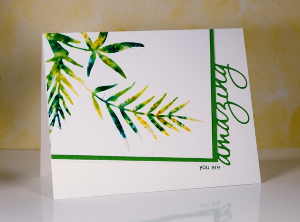
I chose the angled rectangle layout and messed it up by attaching the panel upside down on my card base. I had to cut it out of the cardbase and attach it to a new one so it is a tad bulky under the stencilled panel! I matted in green and trimmed off the top of the die cut word so it would appear to be attached to the mat. I inked just two words on a sentiment stamp so I could turn it into a phrase.
I’m going to add this one over at the Sweet Stampin’ Dies and Punches challenge. Thanks for dropping by.
Supplies:
Stamps: Heartfelt (PB)
Die: Fresh Breeze , OMG (PB)
Inks: Cottage ivy memento (Tsukineko)
Paint: Brusho (Colourcraft)
Paper: Canson 100% cotton cold pressed watercolour paper, green cardstock
Also: moulding paste
Butterfly Heart
Posted: January 16, 2017 Filed under: butterfly heart pop out, CAS | Tags: Peerless Transparent Watercolors, Penny Black creative dies 7 Comments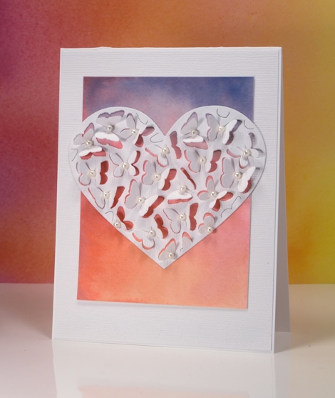
If you have visited the Penny Black blog lately you will know about the new Follow Your Heart release, if not I will be sharing some of new dies and stamps over there and here on my blog this week. Because the butterfly heart pop out die only partially cuts the butterflies you can fold up the wings to reveal whatever is underneath. I tossed up whether to cut the heart out of the watercolour panel or white but decided to have the watercolour panel peeping through the wings and framing the heart. I painted the gradated panel with yellow, pink then blue blending each colour into the one beside it. I attached the coloured panel to a linen textured white panel and cut the heart out of the same textured white cardstock.
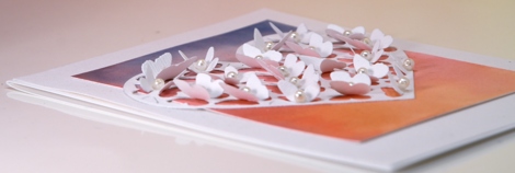
I bent all the butterfly wings up before gluing the heart onto the watercolour panel so I wouldn’t accidentally glue any wings flat. Once the heart was firmly attached I glued a seed pearl in the centre of each butterfly and attached the whole panel to a white card base. If I were to mail this one I would probably need a box-type envelope so I think it might end up being a hand delivered card.
Supplies:
Die: Butterfly Heart Pop Out (PB)
Paints: Peerless watercolors
Cardstock: hot pressed watercolour paper, neenah solar white, textured white
Also: white seed pearls
Forest – Casology 231
Posted: January 11, 2017 Filed under: tall trees | Tags: Penny Black creative dies, Penny Black stamps 29 Comments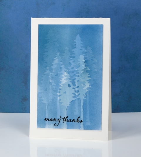
My subtle forest is an experiment in masking. I painted the panel a month back and it was sitting in the pile of possibilities. When I saw what the Casology challenge theme was this week I thought of this panel straight away. To paint this misty forest I use the PB ‘tall trees’ dies to cut masks from frisket film. Frisket film is a removable plastic film used for masking when painting and drawing. I positioned the two tree masks then painted a pale blue wash over the trees, let it dry then repositioned the masks. I repeated this process numerous times to create my forest. With each wash the panel became a darker shade of blue and the previously masked trees received some colour also. Having two different tree dies added a little bit of shape and height variety.
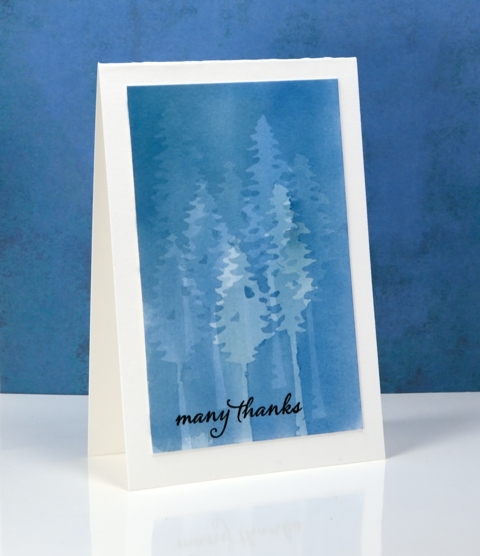
I’m sorry once again that I can’t remember which paint I used. I don’t think it matters too much; I would use any of my watercolour mediums and keep it fairly diluted so I could keep adding layers. I was careful to let it dry thoroughly between each addition of paint so there would be no blurry edges. I also pressed the frisket masks down very carefully so the paint wouldn’t creep under the edges. I finished the card simply by adding a black sentiment and a natural coloured card base.
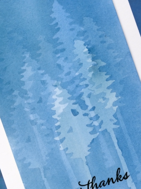
It’s an interesting technique which I haven’t finished playing with…
My blue forest works for the City Crafter challenge this week too.
Supplies
Stamps: Happy Snippets (PB)
Dies: Tall Trees (PB)
Ink: Versafine onyx black ink (Tsukineko)
Paper: hot pressed watercolour paper
Paint: watercolour paint of some kind??
Also: grafix frisket film extra tac
Batik style background
Posted: December 29, 2016 Filed under: heart string, Peacock Feather | Tags: Brusho, Penny Black creative dies, Penny Black stamps, WOW embossing powders 4 Comments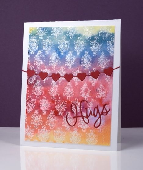
The emboss resist method creates pretty backgrounds especially when painted in a rainbow of colour. I used three primary colours overlapping them to end up with the yellow, orange, red, purple, blue and green. I stamped the peacock feather pattern in versamark and embossed in clear powder on watercolour paper and the slight texture of the watercolour paper combined with the very fine detail of the stamp meant that I did not get a perfect impression. Once I added the colour over the top I noticed that it looks very much like a batik fabric print.
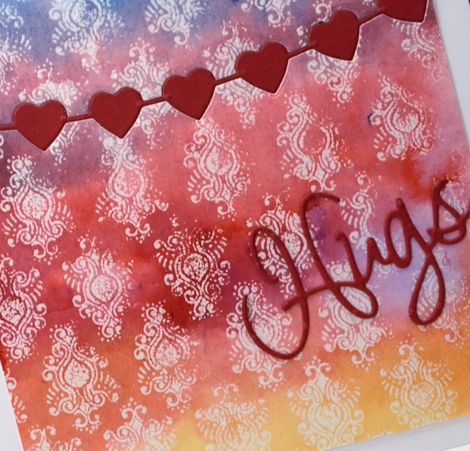
I trimmed the panel then used the heart string die to cut the piece in two. With the same die I cut a string of red hearts then attached the panel to a card base inlaying the red hearts but attaching the die cut word on top of the panel.
Supplies
Stamps: Peacock Feather (PB)
Dies: heart string, love expression (PB)
Ink: versamark (Tsukineko)
Paint: yellow, prussian blue, crimson brusho (Colourcraft)
Paper: hotpressed 100% cotton watercolour paper, red cardstock, Neenah solar white cardstock
Also: WOW clear embossing powder
Joy
Posted: December 24, 2016 Filed under: Into the sky, manger | Tags: color burst, liquid metals, Penny Black creative dies, Penny Black stamps, Ranger Distress stains, WOW embossing powders 13 Comments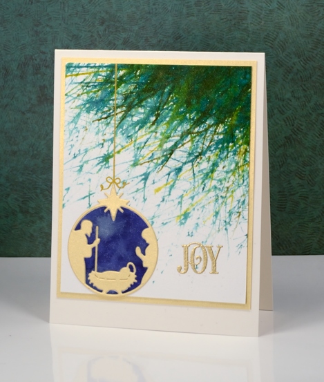
Joy to the world! The Lord is come;
Let earth receive her King;
Let every heart prepare him room,
And heaven and nature sing.
No more let sins and sorrows grow,
Nor thorns infest the ground;
He comes to make his blessings flow
Far as the curse is found.
He rules the world with truth and grace,
And makes the nations prove
The glories of his righteousness,
And wonders of his love,
And wonders of his love,
And wonders, wonders, of his love.
Supplies
Stamps: Into the sky, Joy filled (PB)
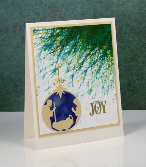
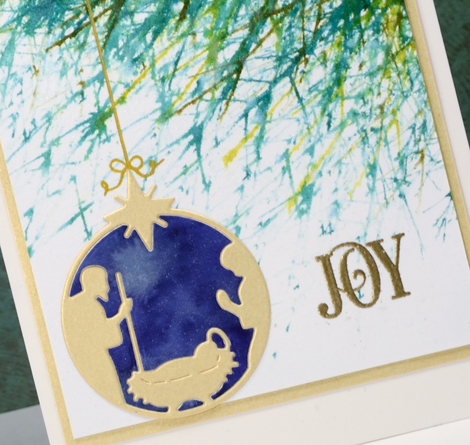
Die: manger (PB)
Paints: indigo, terre verte colorburst & Platinum liquid metal(Ken Oliver)
Ink: Encore gold ink(Tsukineko) evergreen bough, pine needles, crushed olive, forest moss distress stains ( Ranger)
Paper: hot pressed Fabriano watercolour paper, shimmer gold paper
Also: metallic rich embossing powder (WOW)
You warm my heart
Posted: December 22, 2016 Filed under: CAS, crystal trio, What's in your cup | Tags: Brusho, Penny Black creative dies, Penny Black stamps 4 Comments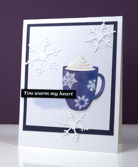
This message is definitely for you my blog readers; you really do warm my heart with all the kind encouragement you leave in the comments. I have been working on a Valentine themed class for January 2017 and the cute little die-cut cup is one of the stars of the new class. I settled on classic red & white for the Valentine class but not before painting quite a few cups in other colours. This little blue cup with its snowflakes is just right for a day which started with snowfall and ended with a blue sky.
I die cut the cup out of watercolour paper then painted it with blue brusho watercolour paint. To give the cup some shape I painted some purple over the blue on the left hand side. Once it was dry I embossed the snowflakes over the top and added the whipped cream die cut piece. I attached the cup to a textured white panel and painted a pale shadow beside the cup then added snowflakes, a sentiment and a purple mat to frame it.
I’ve been making gingerbread today following my usual pattern of burning the first tray and half the second before settling on a shorter cooking time.
Supplies
Stamps: season’s gifts (PB) note: I printed the sentiment on my computer; it’s not a stamp
Dies: crystal trio, what’s in your cup (PB)
Inks: versamark (Tsukineko)
Paper: hot pressed watercolour papers (Fabriano),white linen textured cardstock, purple cardstock, black cardstock
Also: brusho watercolour crystals (Colourcraft), white embossing powder












