
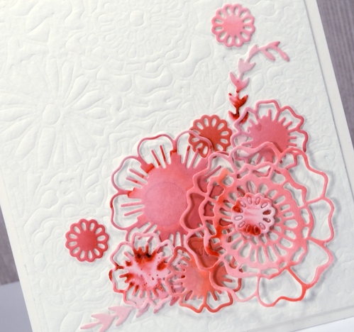
Pop out roses
Posted: April 11, 2017 Filed under: Pop out rose, Script | Tags: Brusho, Penny Black creative dies, Penny Black stamps, Ranger Distress inks 4 Comments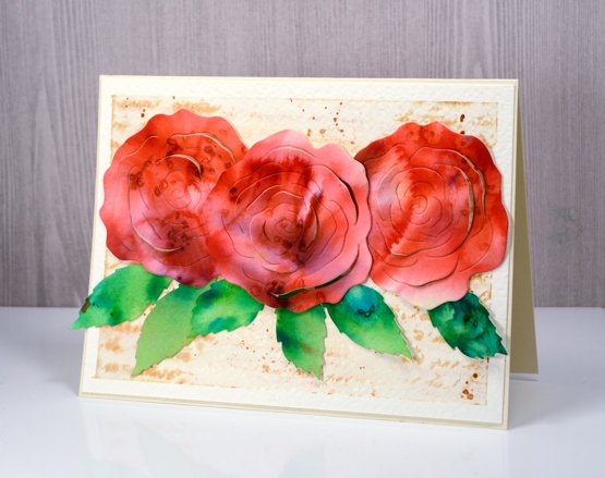
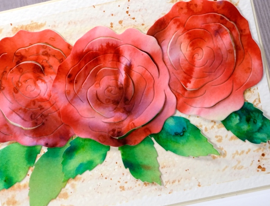
I’m a guest over at The Foiled Fox today sharing these die cut roses. This really was an easy card to make because the ‘pop out rose‘ die creates the lovely petals and brusho powders create the pretty colours. I used three different red brusho powders on watercolour paper and some leaf green brusho for the leaves. While the paper was still damp I sprinkled some salt over the panel to get subtle patterns.
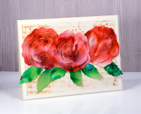
The partial cuts in the roses make it possible to lift petals so I folded some up and kept others glued down when I attached the roses to the background panel. To make the background panel I stamped the ‘script’ stamp from Penny Black on cold pressed watercolour paper in tea dye distress ink then painted over the top with water. The result is a softly blurred background with splatters of ink to add to the aged look. Pop over to the Foiled Fox blog for more details and to see the products I have used on this card.
Thank you to the wonderful Foiled Fox team for having me back again; it’s always a pleasure.
Red Tulips
Posted: April 10, 2017 Filed under: gift card pocket, Hand lettered, Tulip Queue | Tags: Peerless Transparent Watercolors, Penny Black creative dies, Penny Black stamps 10 Comments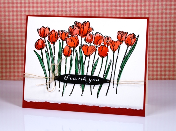
I have planted quite a few tulips in our garden over the years and over 100 daffodils. Sadly I do not get to see that many when spring rolls around. I believe the squirrels dine out on the tulips; I’m not sure if they eat the daffodils too. I do get a few red tulips each year which have been blooming ever since we moved here so I can’t take any credit for keeping them alive!
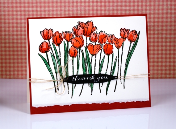
I stamped this lovely outline stamp on hot pressed watercolour paper and coloured it with peerless watercolour paints. The deckled edge is left when I cut up the large sheets of watercolour paper I buy. Sometimes it makes a nice design detail.
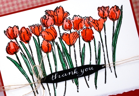
I used a hand lettered sentiment tied on with some hemp twine and framed it all in red to make the tulips pop.
Supplies:
Stamps: Tulip Queue (PB)
Dies: gift card pocket set (PB)
Inks: versafine onyx black (Tsukineko) Dr Ph Martins bleedproof white
Cardstock: fabriano hot pressed watercolour paper, red and black cardstock
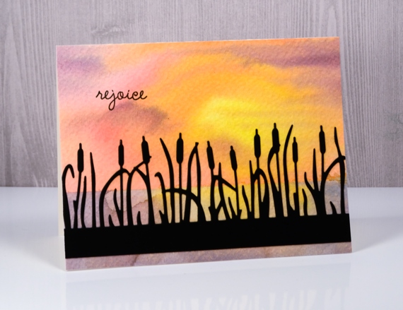
Dawn & Dusk
Posted: April 4, 2017 Filed under: cattail clique | Tags: Fabriano Watercolour Paper, Penny Black creative dies, Penny Black stamps, Ranger Distress stains 10 Comments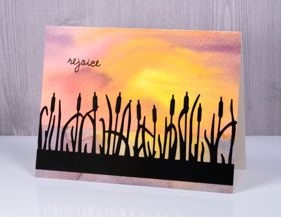
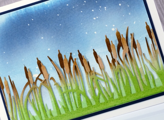
The star of today’s cards is the pretty cattails clique die from Penny Black. I cut it as a silhouette out of black cardstock for my dawn card and painted it for my dusk card later on in this post.
To create my dawn background I taped down some rough watercolour paper. More often than not I use hot pressed(smooth) watercolour paper but I decided this time to let the texture of rough paper add to my project. I taped across the panel about two thirds of the way down so I could paint the sky first. I used the wet into wet technique and painted first mustard seed, then worn lipstick, spiced marmalade and dusty concord distress stains onto the panel. In some places I blended the colours into each other but left one area lighter and more yellow to represent the sun. When that was dry I removed the tape and positioned it over the top section to reveal the lower section. I painted again with the same colours but blended it more to represent the reflection of the sky in the water.
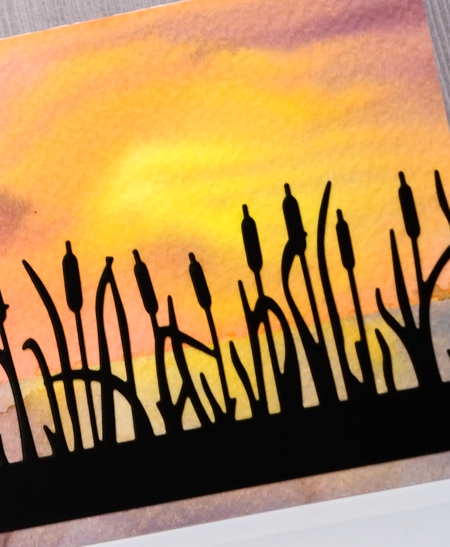
I applied a double sided adhesive to black cardstock then die cut the ‘cattails clique’ out of it and attached it to the watercolour panel and added a sentiment in black ink.
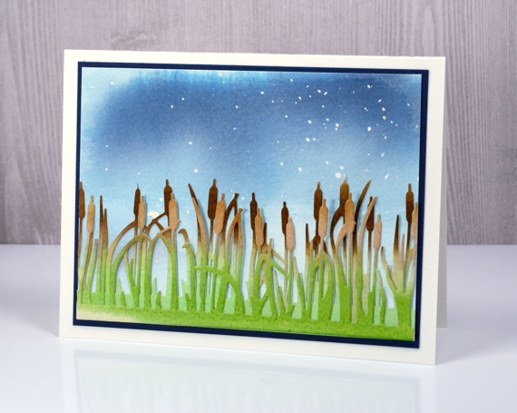
For my dusk card I used cold pressed watercolour paper but this time started by splattering masking fluid over it. I then painted stormy sky and faded jeans distress stain over the panel diluting it with water towards the bottom. On separate pieces of cold pressed watercolour paper I painted gathered twigs distress stain across the top of each panel and mowed lawn distress stain over the bottom of the panel. Once they were dry I cut two more ‘cattails’ pieces to layer over my sky panel.
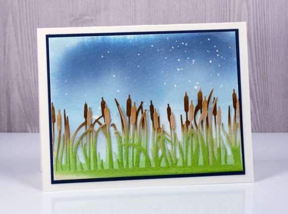
Before assembling the card I rubbed all the masking fluid off the blue painted panel to reveal ‘stars’ in the evening sky. I layered and offset my cattail die cuts, attached them at the bottom of the panel and matted the scene in dark blue cardstock.
I love creating scenes with stamps and dies so the cattails die makes me happy.
Supplies
Stamps: Spiritual snippets (PB)
Dies: Cattail Clique (PB)
Inks: mustard seed, worn lipstick, spiced marmalade, dusty concord, stormy sky, faded jeans, mowed lawn, gathered twigs distress stains, versafine onyx black ink
Paper: rough & cold pressed watercolour paper, black cardstock, blue cardstock
Also: masking fluid, double sided adhesive sheets
More Matelasse
Posted: March 28, 2017 Filed under: A blizzard, bird flower doily, Brusho, CAS, Dies, Metropolitan, No two are alike, the gift | Tags: Brusho, CAS, Penny Black creative dies 5 Comments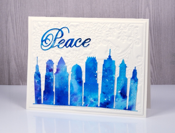
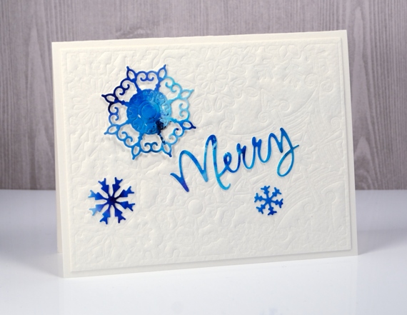
I have a few more cards made with matelasse style backgrounds topped with bright brusho elements. I once again chose intricate dies for the backgrounds. In the cards above and below I embossed watercolour paper with the no two are alike die. For focal elements I die-cut the city skyline, some snowflakes and a couple of words from a panel painted with turquoise and cobalt blue brusho.
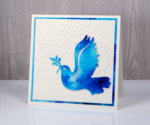
The background below was embossed with the bird flower doily then matted with the same painted paper I die cut the dove from. All the dies I used for these three cards are listed and linked below.
I used my big shot/big kick to emboss these panels and my ‘sandwich’ was:
- multipurpose platform with one tab showing and one flipped open out of the way
- cutting plate
- silicon mat
- watercolour paper (damp)
- die
- cutting plate
Matelasse cards & a winner
Posted: March 27, 2017 Filed under: Brusho, CAS, layered flower, Leaflets, the garden | Tags: Brusho, Fabriano Watercolour Paper, Penny Black creative dies 8 Comments
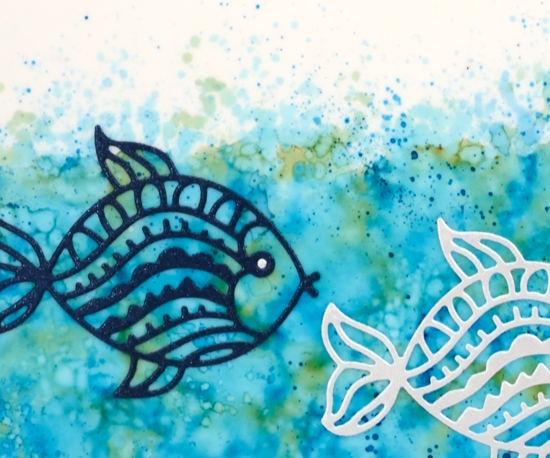
Two fish, blue fish
Posted: March 23, 2017 Filed under: Fancy Fish 12 Comments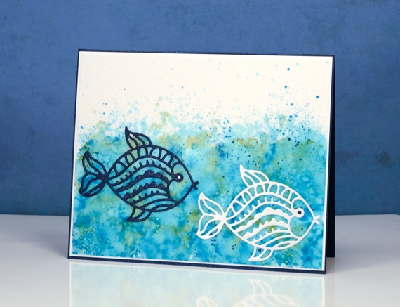
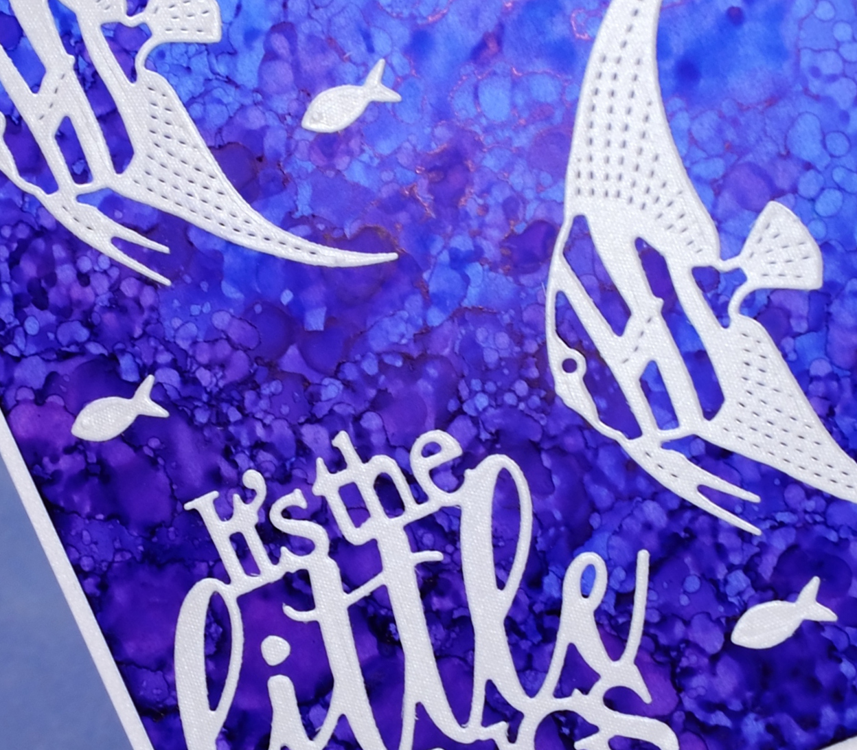
I have a third alcohol ink background to share today. I think this one might be my favourite. I love the splash of colour above the waves. I didn’t set out to create the sea complete with wavy splashes above the surface; I just experimented with colours, ink and blending solution using a felt pad to lay colour over colour. The result was little bubbles but also excess spatter which is what made it so sea-like. I cut one fish out of sparkly dark blue cardstock and the other out of white.
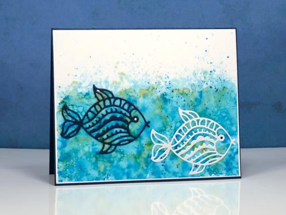
I cut one fish out of sparkly dark blue cardstock and the other out of white. I ended up using the same blue cardstock for the card base and the white cardstock for a very narrow mat to frame the panel.
You probably recognise the title of today’s post as being taken from one of Dr Seuss’ delightful books. One Fish, Two Fish, Red Fish, Blue fish was one of my early favourites and one I used when teaching each of my children to read.
Supplies
Dies: Fancy Fish
Inks: willow, turquoise alcohol inks (Ranger)
Paper: white yupo, neenah solar white, silver envelope
Fancy Fish
Posted: March 22, 2017 Filed under: Alcohol Ink, Fancy Fish | Tags: Penny Black creative dies, Ranger Alcohol Ink 7 Comments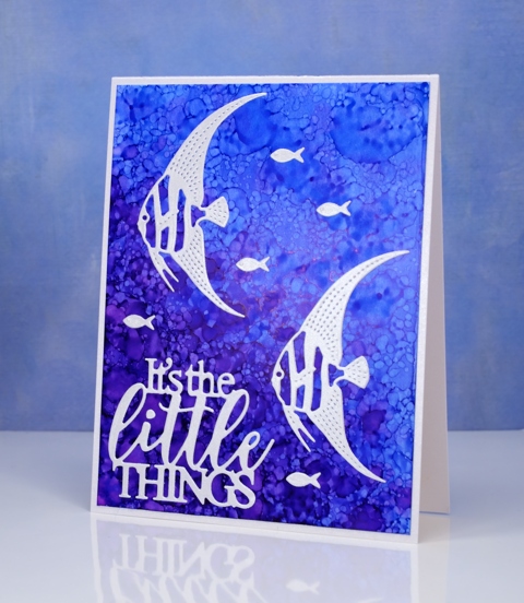
I have another alcohol ink background to share today. If you didn’t see the yesterday’s card you might want to click here (there’s a giveaway provided by The Foiled Fox so it’s worth a visit!) When I saw the new fancy fish dies from Penny Black, I immediately thought of the patterns possible with alcohol inks and blending solution. To create this kind of pattern I started with plenty of dark and light blue ink on my yupo paper then dropped some blending solution on a felt pad and pounced that all over the panel. The blending solution creates little bubble shapes in the ink. The felt pad also picks up blue ink from the yupo paper and prints it down again so more little bubbles.
I die cut the fish and sentiment from a silvery grey envelope I had saved; it had a bit of texture and a little shimmer to it. The die set, Fancy Fish includes two detailed fish and a teeny tiny fish; I have a card tomorrow featuring the third fish.
Supplies
Dies: Fancy Fish, Dream big
Inks: indigo, pool alcohol inks (Ranger)
Paper: white yupo, neenah solar white, silver envelope
Floral border
Posted: February 9, 2017 Filed under: Centerpiece, Stitched Edges | Tags: Fabriano Watercolour Paper, Penny Black creative dies, Penny Black stamps, Sakura Koi watercolour paints 18 Comments
Between Christmas and New Year I did some major re-organising in my work room and changed the way I store my stamps. I am still working out a few details and wondering the best way to store my wood block stamps but other than that the new system seems to be working well. One benefit of doing some serious sorting was re-acquainting myself with my supplies. I pulled out a stamp from a few years ago and my Koi watercolour travel set to make this card.
The stamp is a bouquet of flowers in a vase but as you can see I left the vase out of the picture and just worked with the flowers to create a border. With masking I could have positioned the flowers even more closely but I was hoping to finish this card fairly quickly so I just stamped the flower part of the stamp with the MISTI then moved my watercolour panel and stamped again. I used distress ink to stamp so I could blend it while painting. To keep it simple I used two colours of paint on the petals switching back and forth between a pink and a pale orange. I painted olive green into the leaves but then went around the edges and over the stems with a marker. To complete the flowers I painted black dots and yellow centres.
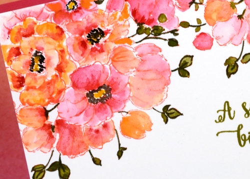
It really was a fairly quick panel to paint, the time consuming part ended up being the way I mounted it between a strip of pink and a die-cut edge of pink. I should have just attached it over the top of a pink panel but I made it less bulky but more fiddly by cutting both the watercolour panel and the pink cardstock with the edge die then aligning them on the card base. The Happy Little Stampers challenge this month is watercolour with an optional twist of die-cutting, so I’m popping over to add this one in.
As I write this I am sitting beside an amaryllis which looks like it might just burst out in bloom today. It is a gift from one of my artsy accomplices and it has been growing very steadily since the new year. It’s nice to have a real flower inside when all outside is snow and ice!
Supplies
Stamps: Centerpiece, words of kindness (PB)
Creative Dies: stitched edges (PB)
Inks: abandoned coral distress ink (Ranger) Olive grove memento marker, versafine Spanish moss (Tsukineko)
Cardstock: Fabriano 100% cotton hot pressed watercolour paper, Neenah Natural White 110lb cardstock, pink cardstock
Also: Koi watercolor field sketch travel kit (Sakura)
Family Tree
Posted: February 6, 2017 Filed under: Hand lettered, Tree heart, Triple Banner | Tags: color burst, Hand lettering, Penny Black creative dies, Penny Black stamps 16 Comments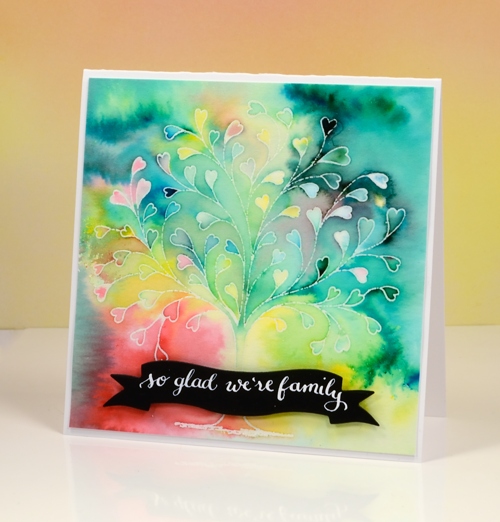
This delicate tree stamp is called `tree heart`but it reminded me of a family tree. I tried turning it into my family tree with names along the branches but it did not look that good! Instead I used the emboss resist technique with colorburst powders.
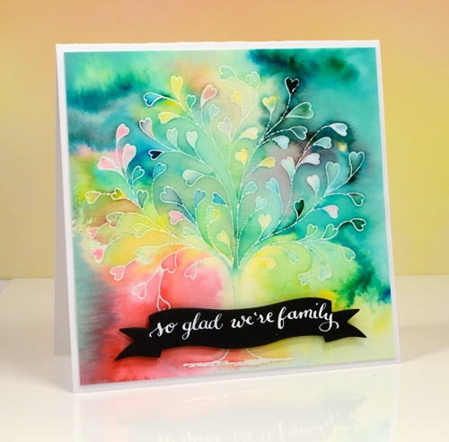
I embossed the tree in clear powders on hot pressed watercolour paper then sprinkled a few different colours of powder over the panel. I kept the colours separate as I sprinkled knowing they would blend anyway as I started adding water. I spritzed first then used a small paintbrush to move and blend the paint.
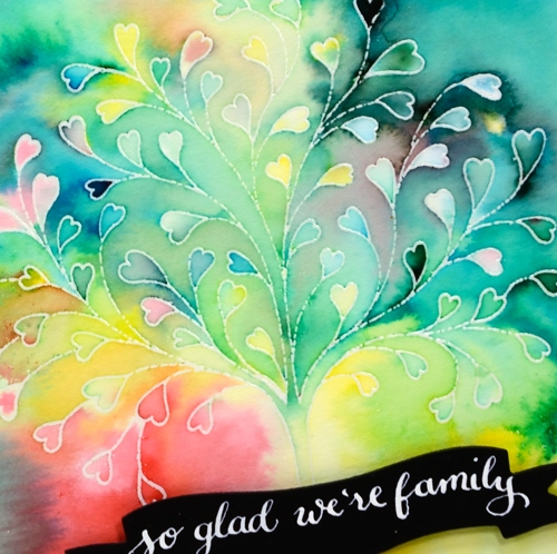
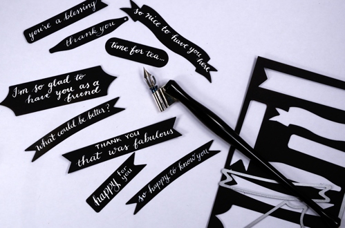
I love the way the emboss resist technique traps colours in little white borders. My next live class is a Watercolour resist class and, as often happens, I nailed two projects then took much longer to finalise the third. I was so happy to complete the designs I rewarded myself with some lettering playtime and made a bunch of custom black on white sentiments. I pulled out nine different banner, tag and label dies by Penny Black, cut them from black cardstock then used Dr Ph Martins Bleedproof white paint and a nib pen to write a sentiment on each one. The nib holder in the photo is an exclusive handmade holder sent to me by the lovely team at The Foiled Fox. It is delightful to write with. The bleedproof white paint is too thick for the nib straight out of the jar so I mixed some with a bit of water and it worked nicely.
Now I have a few sentiments in reserve ready to add to future cards.
Supplies:
Stamps: Tree-heart(PB)
Dies: Triple banner, Tagged, A Pocketfull (PB)
Paint: Colorburst watercolor powder (Ken Oliver) Bleed proof white (Dr Ph Martin)
Cardstock: hot pressed watercolour paper, Neenah Solar White
Ink: versamark (Tsukineko)
Also: clear embossing powder (WOW)
Nib holder: Handmade by The Foiled Fox
Lovely Neighbourhood
Posted: February 1, 2017 Filed under: Color Burst, Neighborhood love | Tags: color burst, Fabriano Watercolour Paper, Penny Black creative dies, Penny Black stamps 2 Comments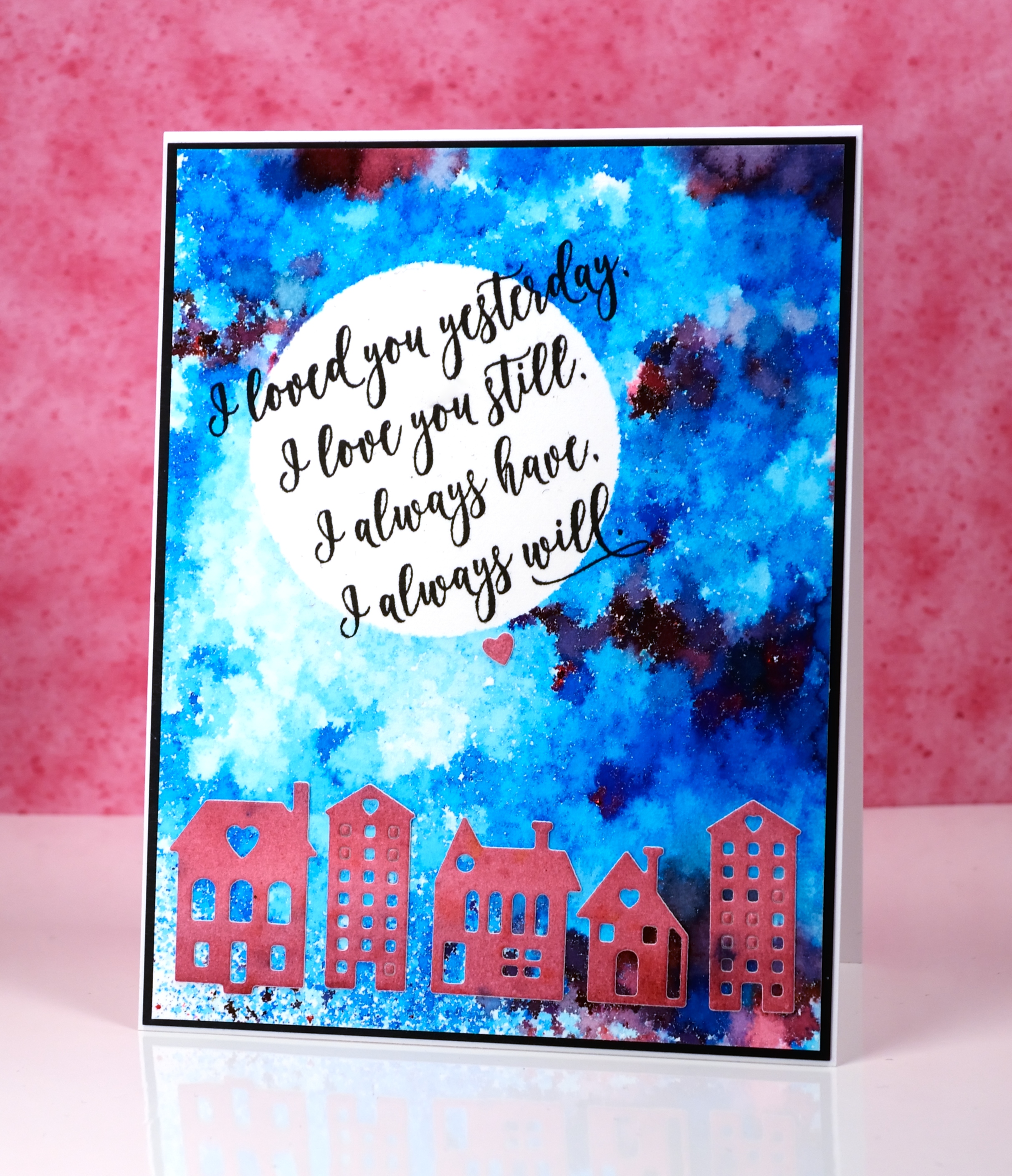
These cute little dies are part of a set called Neighborhood love; I love the little house and building dies Penny Black has brought out even though they challenge my fear of the fiddly factor. I started this card by positioning a frisket film circle mask on a piece of watercolour paper. I sprinkled ultramarine blue powder and a tiny bit of merlot over the panel and spritzed it lightly from above. I spritzed only until I could see some patterns appearing but stopped before all the spots of colour started joining together. I used a heat tool to dry it, pointing the tool down at the panel not from the side to reduce the chance of the wet paint moving across the panel. It reminds me of a mosaic.
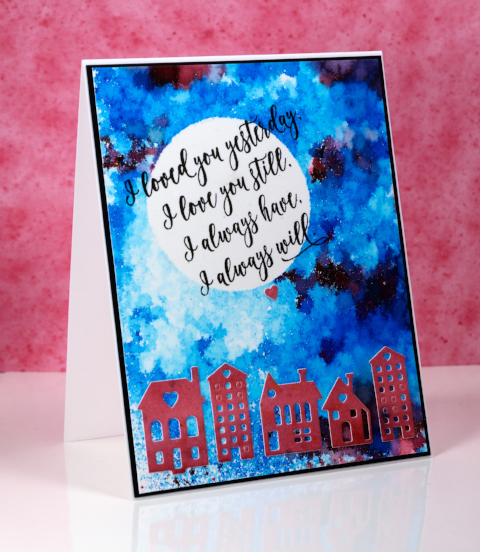
I painted another small piece of watercolour paper with merlot colorburst powder then die cut the buildings from the piece and attached them across the bottom of the panel.
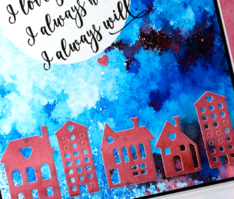
I removed the mask then wanted to hand letter a sentiment inside the moon; I ended up not being game and chose this sweet sentiment from the ‘forever & always’ set.
Supplies:
Stamps: Forever & Always (PB)
Die: Neighborhood Love (PB)
Paints: Merlot & Ultramarine Blue Colorburst powders (Ken Oliver)
Inks: Versafine onyx black ink (Tsukineko)
Cardstock: hot pressed watercolour paper, neenah epic black cardstock
Also: Grafix frisket film


