
Forest grove
Posted: October 7, 2016 Filed under: gift card pocket, Serenity, Snowy Grove, Stamped Landscapes | Tags: Fabriano Watercolour Paper, Penny Black creative dies, Penny Black stamps, Ranger Distress inks, Ranger Distress stains 7 Comments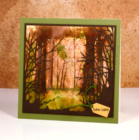
As you might know I use hot pressed watercolour paper 90% of the time because it is smooth and takes stamping so well, giving me a complete images. Occasionally, however, I like to pull out some cold pressed or even more occasionally some rough watercolour paper because the texture gives a whole different look. The labels hot, cold and rough, when attached to watercolour papers refer to the way the paper is pressed. Hot is flattened with heat and pressure making it the smoothest of all three. Cold is flattened with pressure but not heat and rough is flattened with less pressure than cold, making it the most textured of the three types.
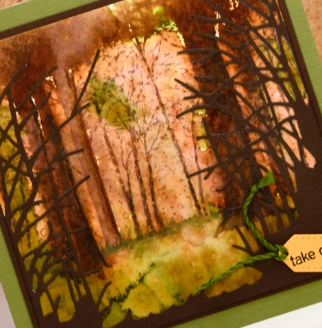
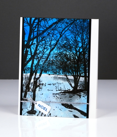
I stamped the ‘snowy grove’ stamp on cold pressed paper in vintage photo ink. I then used the image as a starting point for painting some of the trees more distinctly. In some cases I joined a few trunks together with extra ink to create wider trees. I painted some foliage plus the forest floor with crushed olive and peeled paint distress stains and spritzed with water to blend and blur both the ground and the canopy. I cut the ‘serenity’ die from brown cardstock to add some framing and give the impression of looking into a grove of trees. The tiny tag is cut with the ‘gift card pocket’ die.
The trees around here still have plenty of green on them but we are beginning to see gorgeous colour too. Have a great weekend and Happy Thanksgiving Canadians!
Supplies:
Stamps: Snowy Grove, Snippets (PB)
Dies: Serenity, gift card pocket
Inks: vintage photo, crushed olive, peeled paint distress inks & stains(Ranger)
Cardstock: Cold pressed watercolour paper, brown cardstock, green textured cardstock
Wintry Trail
Posted: September 29, 2016 Filed under: Wintry Trail | Tags: Penny Black creative dies, Penny Black stamps, Ranger Distress stains, Tsukineko Versafine inks 14 Comments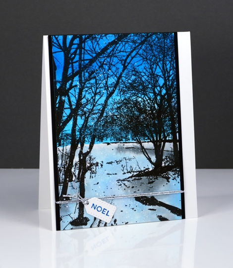
The new ‘Wintry Trail’ stamp from Penny Black is one that you can add a lot of colour step by step or a little colour behind black silhouette stamping. I chose the silhouette style for this winter scene. I painted a deep blue sky and a paler snowy or icy ground. As I painted I intended the ‘ground’ to be covered in snow but as I look at the photos I think it looks a little like the ice of a frozen pond reflecting the colour of the sky.
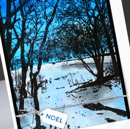
I have seen skies as blue as this one while ski-ing in the Gatineau hills. The contrast of snow and trees is dramatic and beautiful. To make my version I stamped the scenic stamp on hot pressed watercolour paper in versafine onyx black ink. I painted the sky first in turquoise and cobalt blue brusho and let that dry. I used a more diluted turquoise and diluted black brusho to paint the ‘ice’ and shadows. You can see there are little dots of white over the panel which means I started by flicking masking fluid over the panel.
The tiny tag is from the Gift Card Pocket die set and was just the right size for one wee word!
Thank you so much for all the lovely comments about this week’s winter watercolours. I’m glad you enjoyed them and would love to hear if you tried any of the same techniques.
Supplies
Stamps: Wintry Trail, Holiday Snippets (PB)
Dies: Gift Card Pocket
Ink: Versafine onyx black ink, blue lagoon ink (Tsukineko)
Paper: hot pressed watercolour paper, Neenah epic black paper
Paint: Turquoise, Cobalt Blue, Black brusho powder
Also: Daler Rowney masking fluid, Silver cord
Vintage poinsettia
Posted: September 22, 2016 Filed under: gift card pocket, Scarlet Majesty | Tags: Faber-Castell Albrecht Durer Watercolour pencils, Penny Black creative dies, Penny Black stamps, Ranger Distress inks, Tsukineko Versafine inks 8 Comments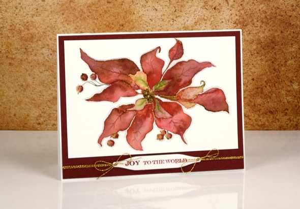
Today’s card is a contrast to the sparkly bright poinsettias earlier in the week. I returned to a style I have featured on the blog several times this year, a vintage appearance. To achieve the aged look I stamp first in vintage photo distress ink then blend the stamped ink with watercolour pencils. I worked one petal at a time and used a wet paintbrush to pick up colour from the pencils. I chose a couple of reds, and a light green for the petals and a dark brown for the berries. Once the whole image was painted I coloured around the edge with a grey pencil to help ‘lift’ it off the page a little.
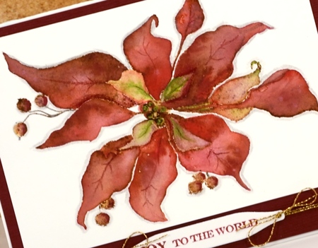
I matted the panel with textured burgandy cardstock and added a sentiment on one of the handy tags from the gift card pocket die (a set that gives you way more than just a gift card pocket; its full of tabs, tags, flowers, scalloped shapes…).
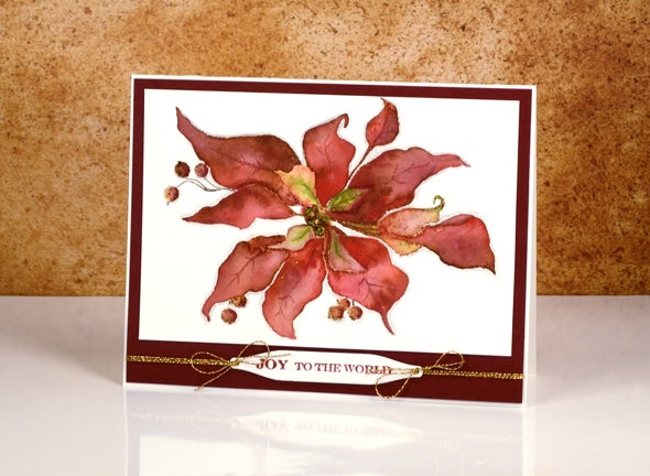
As I finished editing this post it occurred to me that the vintage look on my poinsettia does give it a bit of a ‘dried up ‘cos I didn’t get watered look’. Now, how would I know that look I wonder?
Supplies:
Stamps: Scarlet Majesty, Holiday Snippets (PB)
Dies: Gift Card Pocket
Inks: Versafine Crimson Red ink (Tsukineko) vintage photo distress ink(Ranger)
Cardstock: Fabriano 100% cotton hot pressed watercolour paper, Burgandy textured cardstock
Also: Faber-Castell Albrecht Durer watercolour pencils, Gold cord
Stacked die cuts
Posted: August 14, 2016 Filed under: Brusho, shall we dance | Tags: Brusho, Penny Black creative dies 9 Comments
When I first tried this technique I did it the same way many did, by cutting multiples die cuts from cardstock and gluing them on top of each other. I now use a quicker method where I die-cut the image out of foam which replaces the stack of cardstock die cuts. I always find it a little tricky to stack the very fine stems and letters; the foam stretches a bit and the cardstock is very hard to line up. Despite these fiddly factors I managed to get it all in place to create this subtle floral design on another abstract watercoloured panel.
This was one of those panels where the brusho patterns turned out to be very pretty so I didn’t want to lose much by stamping over it or cropping. Raising a die cut image is a great solution when you want to preserve some pattern but still have a focal image.
Supplies:
Stamps: Sprinkles & Smiles (PB)
Die: Shall we dance
Paints: Brusho powders (Colourcraft)
Inks: Deep Lagoon ink (Tsukineko)
Cardstock: Fabriano 100% cotton hot pressed watercolour paper
Also: stick it adhesive sheet, adhesive backed fun foam
Round the watercolour world
Posted: August 8, 2016 Filed under: Brusho, love to travel, mini community, Watercolour | Tags: Brusho, Fabriano Watercolour Paper, Penny Black creative dies 5 Comments
I have more watercolour die cuts to share. This card has a much higher fiddliness factor than the previous ones and has convinced me that I should never video myself making a shaker card! Rather than trying to describe my trial and error process for making this shaker card I will just list the layers I used from little die cuts right down to the card base. The mini community and ‘the world’ were cut from brusho panels.
watercoloured ‘mini community’ & ‘love to travel’ die cuts with stick-it adhesive on the back
black cardstock panel
acetate
foam with circle die cut from centre
watercolour panel to be ‘the world’
card base

I saved the little die-cut bus and cars to put inside the shaker area with the glitter, sequins and micro beads. It wasn’t until I started shaking it that I realised the bus and cars would end up in countless pile ups!

Supplies:
Stamps: Sprinkles and Smiles (PB)
Die: Mini community Love to Travel (PB)
Paints: Brusho (Colourcraft)
Cardstock: Fabriano 100% cotton hot pressed watercolour paper, Neenah solar white, Neenah epic black
Also: stick it adhesive sheet, glitter, sequins, micro beads
Watercolour Fuchsias
Posted: August 5, 2016 Filed under: Fuchsia, Watercolour | Tags: Penny Black creative dies, Penny Black stamps, Tsukineko Versafine inks 10 Comments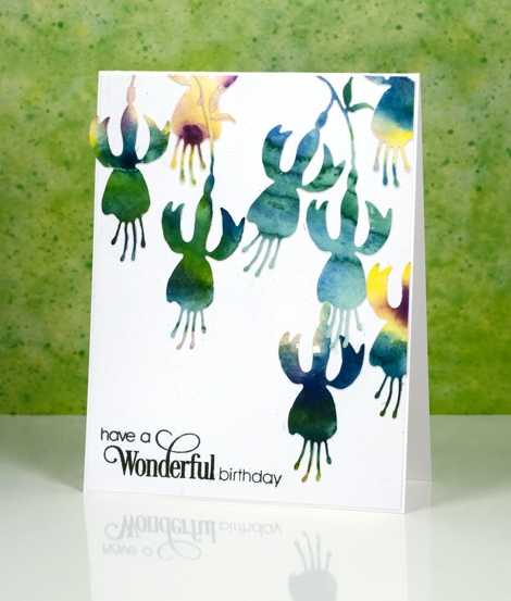
I’ve been cutting up watercolour panels again; it really is a great way to use up experiments or abandoned projects. Sometimes I have panels that were my ‘practice’ for something else or part of a class where I demonstrated a technique but then moved on. The colours in the panels are pretty but the pattern might be a bit random or unattractive. Using a die cut means I can cut from the sections where I really like what the colours are doing. These panels were painted with Gansai Tambi paints.
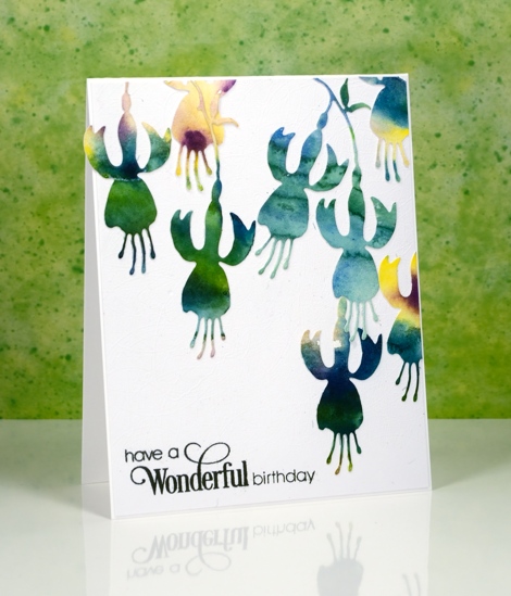
I put stick-it adhesive on the back then cut all these fuchsias from a couple of panels featuring the same blue green tones. I arranged them then attached them all to a white panel and then to a white card base. My photography didn’t pick up the texture on the white panel as it is quite subtle but it is a cute trick if you want to try it. The cutting base panel for my die-cutting machine is very well used all over so when a piece of cardstock is run through the machine the base transfers an intricate pattern of intersecting lines which creates subtly textured cardstock. I am going to include this card in the Casology ‘Watercolour’ challenge.

Supplies:
Stamps: Sprinkles and Smiles (PB)
Die:
Watercolour Dance
Posted: August 3, 2016 Filed under: Brusho, CAS, shall we dance, Watercolour | Tags: Brusho, Penny Black creative dies, Penny Black stamps 21 Comments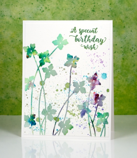
It’s really quite hot here at present and this card some how makes me feel a little cooler. It’s either the watery splatter or the cool blues and greens. I used up another abstract watercolour panel to make this card; there is quite a pile of painted or stamped panels sitting on my desk waiting to be turned into something. As you can probably guess this panel was mainly green but had a bit of purply pink on it. I am pretty sure it was done with brusho because there are little bits of other colours mixed in which is one of the nice features of brusho paint – the colours are not purely one pigment.
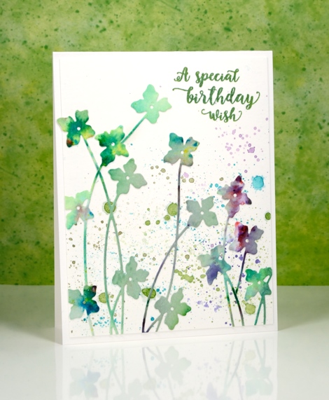
I used the new ‘shall we dance’ die from Penny Black to cut as many flowers as I could. I didn’t need them all to be complete die cuts as I wanted some tall and some short. Before I cut them I put ‘stick it’ adhesive on the back of the whole panel to make things easier later. Once I had all the flowers I could squeeze out of the panel I played around with positioning until I was happy. I did it all on a plain white panel assuming that I would keep the background blank and let the colours in the flowers pop. It would have been ok that way but I decided to use my watercolour pencils to try a little splatter in similar colours to the flowers. It may not be strictly white space any longer but it is pretty.
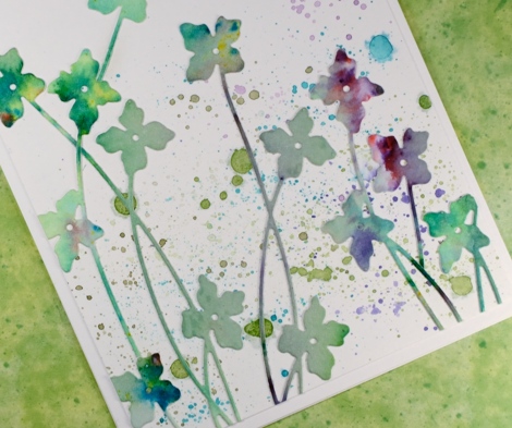
I am going to let this card play along with not one, but two challenges.
The CASology cue card is

and the CAS Mix Up challenge is

I read the fine print and discovered that if you didn’t have sprays then splatter is just fine so we’re in!
Supplies:
Stamps: Words of Kindness (PB)
Die: Shall we dance
Paints: Brusho powders (Colourcraft)
Inks: Cottage Ivy Memento ink (Tsukineko)
Cardstock: Fabriano 100% cotton hot pressed watercolour paper
Also: stick it adhesive sheet
Strange things are happening
Posted: August 1, 2016 Filed under: Field of Dreams, Zigs & zags | Tags: Kuretake Gansai Tambi watercolour paints, Penny Black creative dies, Penny Black stencils 9 Comments
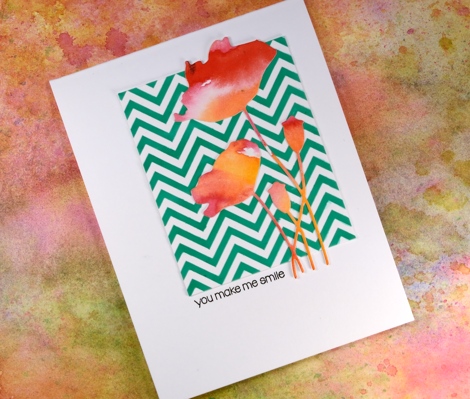
Strange indeed to see me enter a challenge, follow a sketch, use a chevron pattern and texture paste! I would not be surprised if you thought someone else had taken over my blog. There are two signs, however that this is my card, those watercoloured poppies might look familiar and the placement of that little sentiment is pretty standard for me also.
How did this happen? Well, I have been meaning to try adding texture to cards for a while so I picked up some molding paste and applied it through a couple of stencils. In this experiment I mixed liquid metal into the paste before spreading it through the ‘Zigs and Zags’ stencil from Penny Black. It didn’t end up with a metallic look but it took on the green of the ‘verdi gris’ liquid metal. It has been a while since I did a challenge other than One Layer Simplicity (new one is up today) so I checked a couple of my favourites and found the sketch on “Case this Sketch“.

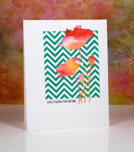
The die-cut poppies were sitting on my desk along with some other left over watercolour painted panels. (I will share projects featuring the other panels later this week.) This card really is an exercise in contrasts, the soft blends of the paint against the sharp corners of the zigzag, the pops of red over the stripes of green and the tiny black letters in the midst of a large expanse of white space.
As Joan Bardee would say:
MOOD WHEN DONE: Surprised but satisfied!
Supplies:
Stamps: Snippets (PB)
Dies: Field of Dreams (PB)
Stencil: Zigs & Zags (PB)
Inks: Versafine onyx black (Tsukineko)
Mediums: Molding paste (Golden) Verdi gris liquid metal (Ken Oliver) Watercolour paint (Kuretake Gansai Tambi)
Cardstock: Hot pressed Fabriano watercolour paper, Neenah solar white cardstock
Stamping with alcohol inks
Posted: June 4, 2016 Filed under: Alcohol Ink, Autumn Jewels, Pinwheel | Tags: Penny Black creative dies, Penny Black stamps, Ranger Alcohol Ink 11 Comments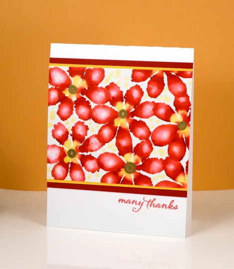
A few months ago I tried all sorts of fun techniques with alcohol inks and I am keen to get them back off the shelf to try some more. Today’s cards are all examples of stamping with alcohol inks, using die-cut felt as the ‘stamp’.

I did all the stamping on glossy photo paper which allows the inks to move and blend a little but nowhere near as much as the on yupo paper. Yupo paper is a synthetic paper which is totally waterproof so the ink does not soak into it at all but spreads across it as it dries. The photo paper does absorb ink even as the glossy surface lets it spread and blend a little.
By varying the amount of ink you drop on the felt die-cut you can get a lacy effect or a full print. By adding a little blending solution to the felt you can dilute the colour and get a blurry effect within the shape. The possibilities are extensive with this technique.
Supplies:
Stamp: Words of Kindness, Sentiment Collection, Happy Snippets (PB)
Die: Autumn Jewels , Pinwheel (PB)
Ink: Alcohol inks (Ranger)
Cardstock: Glossy photo paper, coloured cardstock, Neenah solar white & natural white
Stencilled
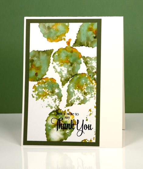
Posted: May 31, 2016 Filed under: Alcohol Ink, Hypnotic | Tags: Penny Black creative dies, Penny Black stencils, Ranger Alcohol Ink 16 Comments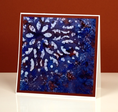
If you haven’t tried stencils with your alcohol inks you might be surprised at the lovely effects you can get. Let me warn you though, they might not do what you want them to, but they will probably do something cool. There is a bit of trial and error involved when working out how much blending solution or rubbing alcohol to apply through the stencil. Too much and it spreads under the stencil and you lose the pattern definition. Too little and you will not remove enough colour to get a pattern. It is worth playing with applicators too. Applying solution with a q-tip will take much longer but you will have more control.
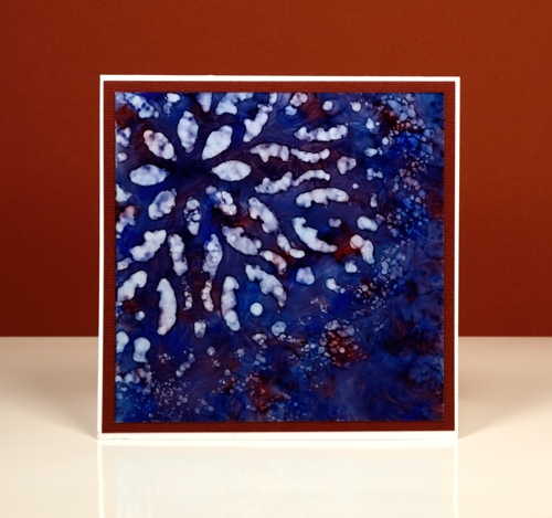
I started with a deep blue pattern on yupo paper with little patches of burgandy ink. When it was dry I positioned the ‘hypnotic’ stencil over one corner then removed colour with blending solution on a felt applicator. I kept an eye on the felt as I pounced it through the stencil because it was picking up blue ink. If it got too blue it wasn’t removing ink anymore. I like the batik look with some lines of blue in the white spaces
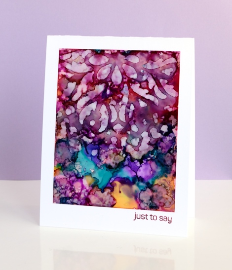
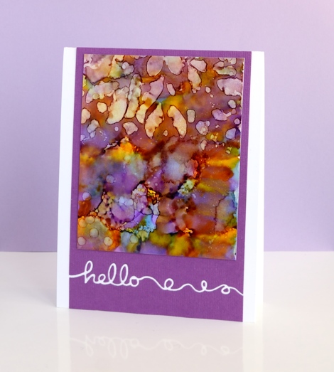
On these two purple toned panels I used the same technique but was not as careful to keep the stencil still on the one below. The pattern from the stencil is just a mix of abstract shapes. The blue panel at the top of this post is all about the stencilled pattern but these two messy purple ones are just here because I love the colours. Before I die cut the word ‘hello’ out of the purple cardstock I positioned a strip of ‘stick it’ adhesive on the back where the word would be. That made it easy to attach the panel to the card base and pop in the little loops and circles that were cut out. I saved the purple ‘hello’ cut out of the card below and stuck it inside the card above.
Supplies:
Stencil: Hypnotic (PB)
Stamp: Happy Snippets (PB)
Die: Doodles (PB)
Ink: Alcohol inks (Ranger)
Cardstock: Yupo, mauve cardstock, Neenah solar white


