
Happy Thanksgiving
Posted: October 9, 2023 Filed under: Echidna Studios, Mooneys Trees | Tags: digital stamps, Echidna Studios, sennelier watercolours 3 Comments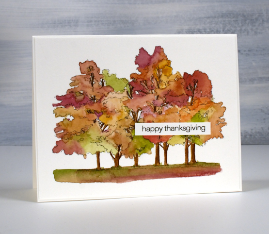
Happy Thanksgiving to all my Canadian readers. Hope you’re having a relaxing weekend maybe enjoying some autumn colour.
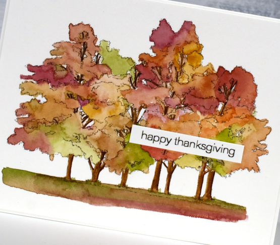
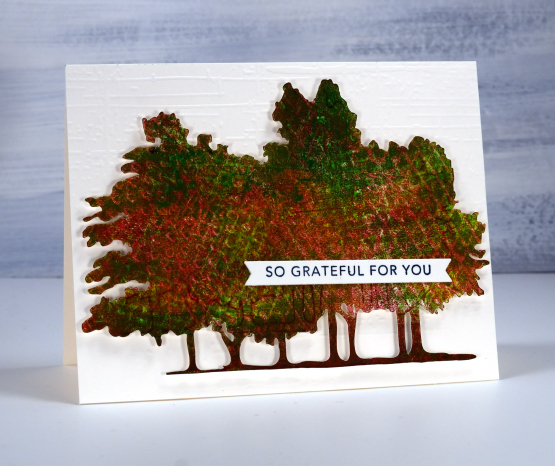
These trees are a digital image based on trees in a park not far from our home. What a treat to have such a personal image to paint. I used the simplified cut-out image in Friday’s blog post; this is the sketch version of Mooneys trees from Echidna Studios.
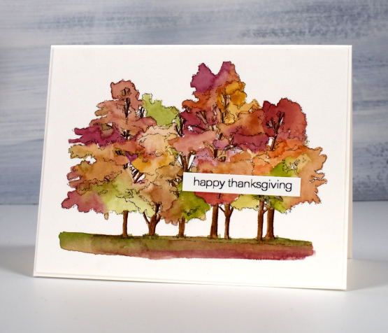
To see these trees beautifully painted with bister watercolour powders pop over here.
Mooneys Trees
Posted: October 6, 2023 Filed under: baby blue leaf embossing folder, Echidna Studios, Mooneys Trees, Paper Rose, Taylored Expressions, weathered | Tags: Echidna Studios, gel press, gel printing, Paper Rose, Taylored Expressions 6 Comments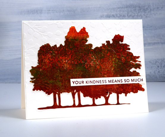
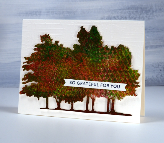
If you live in the same city as me you might have walked past these trees, sat under them or perhaps photographed them. My daughter worked from her own photo to create some digital stamps in different forms. Check out the sketch style, outline, silhouette and simplified version in the Echidna Studios etsy store. The set is named Mooneys Trees because they are growing in Mooneys Bay park.
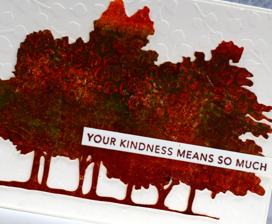
I used the simplified version to cut several pieces to gel print on. As you can see the trees fit on a 5.5″x4.25″ card base so I was able to print patterns on them on a 5×7 gel plate. If you are on IG you can watch a very short video of me printing the one above.
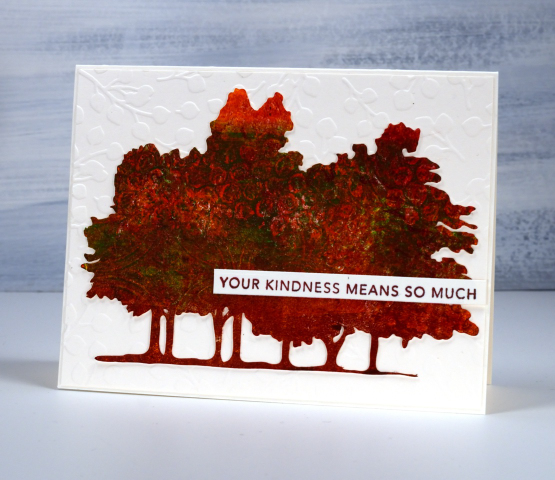
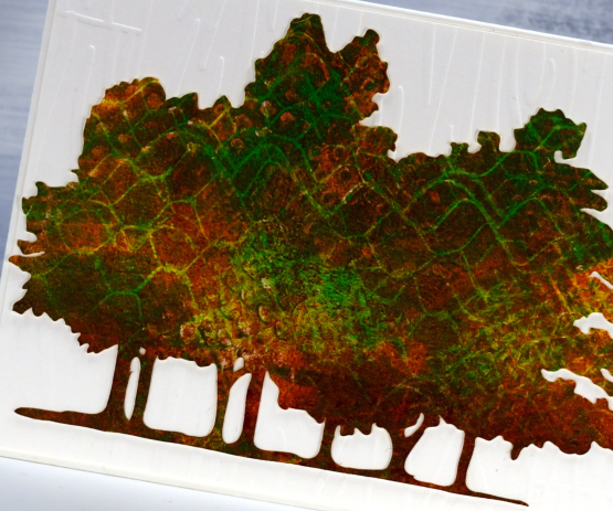
All the trees featured in this blog post were made by printing three layers of paint on top of each other, letting the paint dry in between layers. I varied the paint colours and texture on each layer. On the card above you might be able to pick out bubble wrap and textured cardboard patterns.
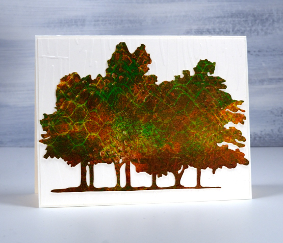
On the card directly above and below I used hessian (burlap) to add one texture as well as cardboard packaging on another layer. I also had plastic trays featuring criss-cross patterns to press on the gel plate.
Each printed tree cutout is attached to an embossed panel of cardstock. Only one of the tree cutouts is popped up because that task had too much of a fiddliness factor! The embossed background below is called ‘weathered’ from Taylored Expressions. The embossing folder used on the card at the top of the page is ‘baby blue’ from Paper Rose Studio and the embossing folder on the second card is from Close to my Heart but I don’t know the name; it creates the look of a wooden fence.
The two sentiments are from Taylored Expressions ‘simple strips background stamp‘ which stamps 18 sentiments to be cut out with the co-ordinating die. I really enjoyed making cards featuring local trees which are changing colour right now and of course I loved gel printing the cutouts to look autumnal.
My blogpost today features affiliate links to Scrap’n’Stamp. If you buy through these links I receive a small commission at no extra cost to you.
Gelprinted Phlox
Posted: October 5, 2023 Filed under: gel press, Taylored Expressions | Tags: gel press, gel printing, Taylored Expressions 2 Comments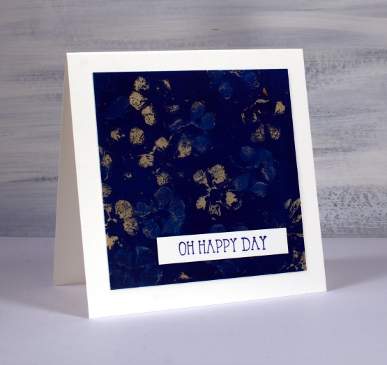
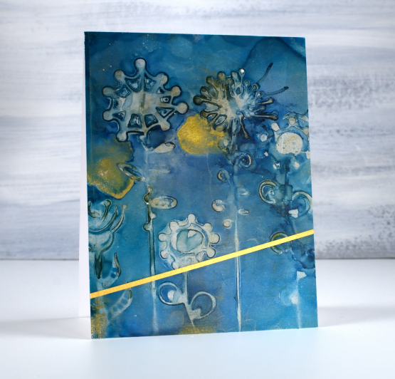
Yes, it’s another floral print from the gel plate. For this one I used phlox from my garden. I found that the phlox came apart quite easily so what I ended up doing was grabbing the little flowers that make up a whole flower head and stamping them individually. It took a little more time to press the flowers onto the plate one by one but the resulting print was very pretty.
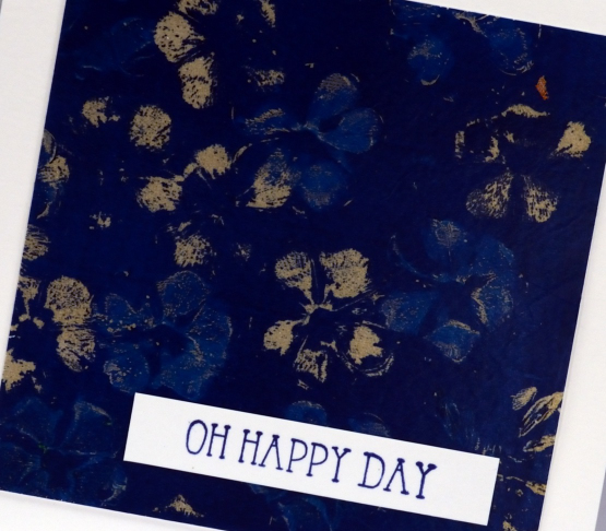
When you look closely you will see the flower prints are two different colours, tan and blue. I brayered dark blue paint on the plate then pressed the little phlox flowers into the paint. As I pressed a flower onto the plate it removed paint leaving an empty flower shaped space. If I immediately pressed the flower onto the plate again it left a blue print because the petals were already covered in paint and wouldn’t remove much more until I ‘stamped’ the paint off on scrap paper. I picked up the print with shimmery pale gold paint which shows through where the flowers removed more paint.
To see my technique for gel printing with flowers check out my recent youtube video.
I used the print to make an anniversary card for a lovely couple celebrating their 55th wedding anniversary. Once again the sentiment from Taylored Expression stamped in versafine clair twilight ink said it all.
My blog features affiliate links to the following companies. If you buy through these links I receive a small commission at no extra cost to you.
Butterflies
Posted: October 3, 2023 Filed under: butterflies, Echidna Studios | Tags: Echidna Studios, Finetec artist mica watercolour paint, sennelier watercolours 2 Comments
The two butterfly images featured on today’s cards are part of a digital set called ‘butterflies‘ from Echidna Studios. If you look closely at the butterfly above you can see a hint of shimmer in that centre blue section. Most of the paint is actually shimmery in real life I just couldn’t capture it on camera.

To get the shimmery look on the wings I painted with traditional watercolours first then painted over the top with finetec pearlescent watercolours.
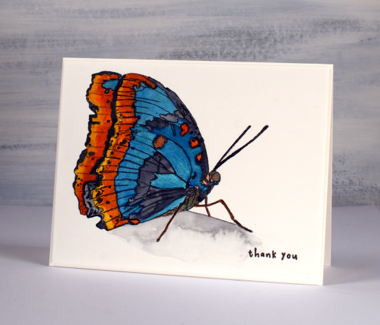
The stamp above has a line on it which suggests an edge to ground the butterfly; it’s clearly not in flight. I painted the area under the line with a pale grey paint then added water to spread and dilute the colour. You can see I added water to a dryer area; that’s why I got the cauliflower effect. I could have smoothed out the whole area but I occasionally like those kind of watermarks; they add interest. I completed the card with a teeny sentiment which balances the black outlines of the printed butterfly.
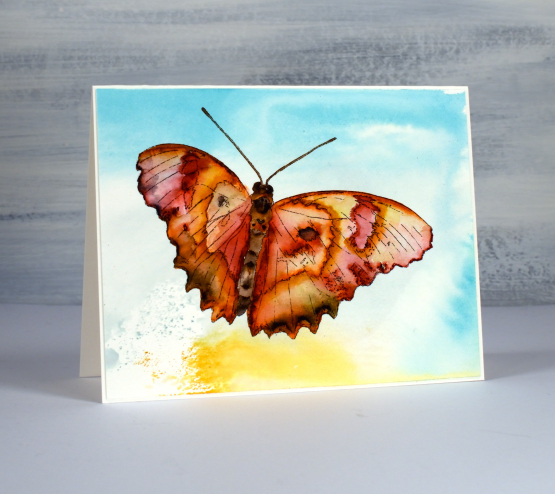
The second butterfly is in flight so I have nothing in the scene other than background colour. I printed the digital image with the laser printer on hot pressed watercolour paper then, before painting the butterfly I picked up some smooshed and diluted ink from my glass mat.

I feel like I have described my smoosh, spritz and swipe method many times but if you haven’t heard me mention it before here’s how it goes. I smoosh(press down) a distress ink pad on my glass mat to leave ink. In this case I used tumbled glass, scattered straw and weathered wood. I spritz the ink so it spreads and sometimes blends then I swipe my panel of watercolour paper through the ink. You never know what you’ll get. Sometimes I re-swipe to pick up a bit more ink.

After the abstract background was dry I used Sennelier watercolours to paint the butterfly. Painting a butterfly is trickier than I thought. In my mind the wings are full of blended colour but actually they are full of intricate patterns that don’t blend together. All that to say this is definitely not a botanically correct painting!
Today’s post features affiliate links to the The Foiled Fox. If you buy through these links I receive a small commission at no extra cost to you.
Gel Print Floral Card Combos – Video
Posted: October 2, 2023 Filed under: gel press, Tutorial | Tags: gel press, gel printing, Tutorial, video 2 Comments
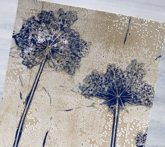
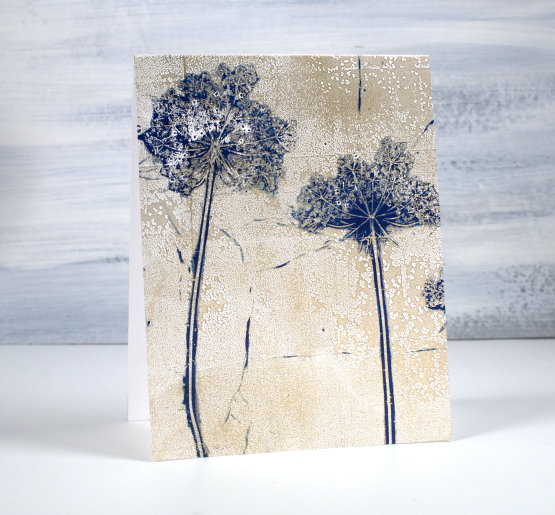
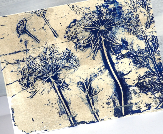
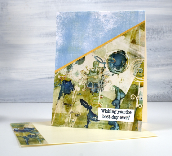
One of my favourite things to print on a gel plate is flowers. One of my favourite flowers to print is Queen Anne’s Lace. You might think, as I did, that Queen Anne’s Lace would be too fragile to print but it is surprisingly strong and the gel plate picks up all that delightful detail.
I don’t always print an envelope and card front in one go but it is a nice way to get a matching pair. I used a 9″x11″gel plate to easily fit both. I mention in the video that you can print the flowers over and over; the paint that clings to the flower head makes it sturdier rather than pulling it apart. The first few prints might leave some seeds on the gel plate and print but that just adds to the realism in my opinion.
Thank you to those of you who subscribed to my youtube channel last week. I am slowly building my community of subscribers again after losing my first channel. There are some of my early gel printing videos on the new channel marked with a ‘from the archives’ label and there is a gel printing playlist if you want to binge the lot.
If you don’t have a gel plate large enough to pick up a card front and envelope in one print you could always do two prints one after the other keeping your paint colours the same.
Below are a few more card and envelope combos I’ve printed using this same technique with a sticker to mask a space larger enough for the address.

You can see on this card featuring Queen Anne’s Lace and grasses that the print does not reach to the top of the card front. I guess I didn’t press down evenly when taking the print.
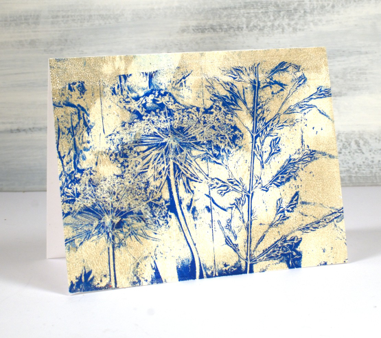
Of course you can make co-ordinating card and envelope prints using any pattern; it doesn’t have to be plants but when I have plants, not snow in the yard I like to choose plants. I’ve also used stencils.

I hope you give this technique a try; it makes an eye catching bit of mail to send. Make sure you use removable stickers to mask your address box; you can probably guess why I mention that!
If you are new to gel printing check out my online course Gel Print Journey to learn all the basics and try all sorts of patterns and combos.
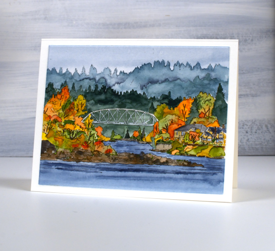
A Portland Bridge
Posted: September 29, 2023 Filed under: Echidna Studios, portland bridge | Tags: Echidna Studios, Fabriano Watercolour Paper, sennelier watercolours 13 Comments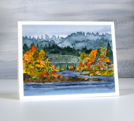
You might recognise the style of this image; it’s a new digital landscape stamp called Portland Bridge from Echidna Studios etsy store. My daughter and I both have designs in her store but this style is one of her strengths, drawn from photos she has taken herself. She was thrilled to compete in Oregon earlier this year and while there took beautiful photos of the surrounding scenery. This bridge is called Lake Oswego Railroad Bridge. I know I’ve had a few readers from Oregon over the years; do you know this bridge?
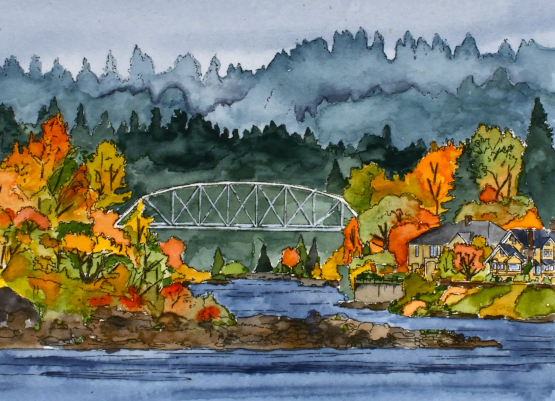
Echidna Studios includes digital images for printing, cutting or both. (read to the end of this post to learn about a giveaway) I printed this one on Fabriano hot pressed watercolour paper manually fed through my laser printer. I painted the scene with Sennelier watercolour paints starting with a diluted blue sky and the same blue but deeper for the river. After that dried I mixed some green in with the same blue to paint the background trees and added more green for the second and third layer of trees. I used a mix of brown and blue for the rocks. When those areas dried I mixed some light greens, yellows and oranges to paint all the trees clustered around the river and houses. I left the bridge and houses until last, using a white gel pen where necessary to bring back white lines to the bridge. I thought this scene would take me much longer to paint but by working in sections as described above it probably took a bit over an hour.
Pop over to the Echidna Studios store and take a look at the wide variety of images and stencil cutting files available. To be entered in a draw for a free digital image head over to Instagram, follow Echidna Studios and comment on one of their posts. We are wanting to spread the word about these fabulous designs. There are now over 50 designs with new ones being added each week.
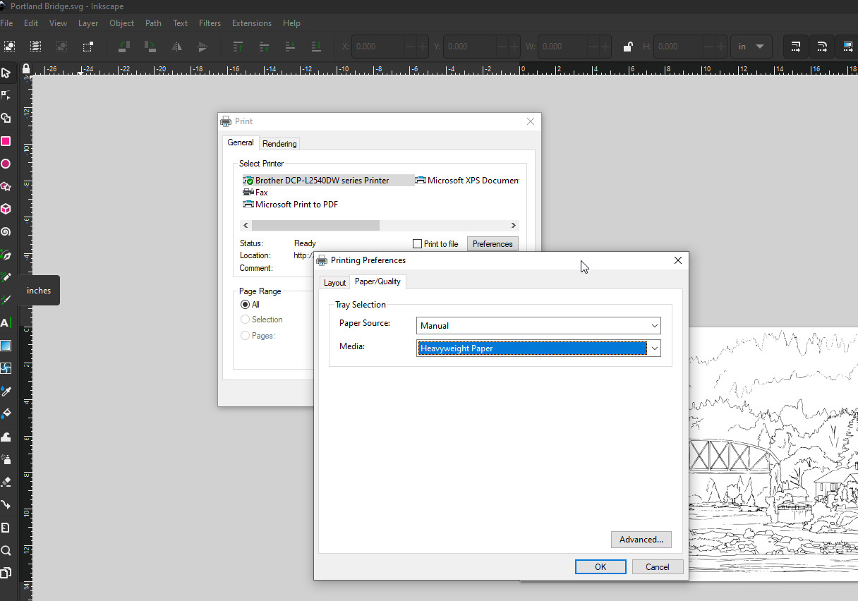
The screen shot above shows the settings used to print successfully on watercolour paper. I included it in case you haven’t tried. I open the digital image in Inkscape but you could use other apps. When the printer dialog pops up on the screen I go to preferences so I can select paper quality as heavyweight and paper source as manual. I imagine the dialog box is different depending on your printer but this information might be helpful for you. Being able to print on watercolour paper and not have it brush off or smudge has been wonderful for digital images.
Have a wonderful day.
Oops; I forgot your birthday
Posted: September 28, 2023 Filed under: Classes, gel press | Tags: Classes, gel press, gel printing, online class 2 Comments
My family and friends know I have issues with remembering birthdays in a timely manner. I combined a vintage sewing pattern image with a partial gel print to send an apologetic belated birthday greeting.
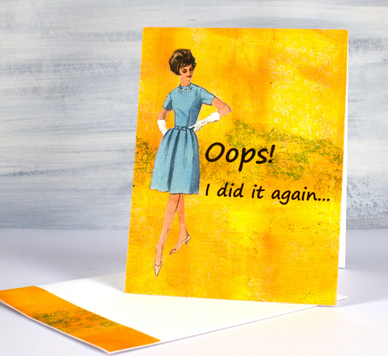
Combining vintage pictures or photos with gel prints on a card is an idea I got from my friend Betty. She has made many clever cards using the same combo. Now that I have made one of my own I’m going to have to do it again, hopefully not due to a missed birthday!
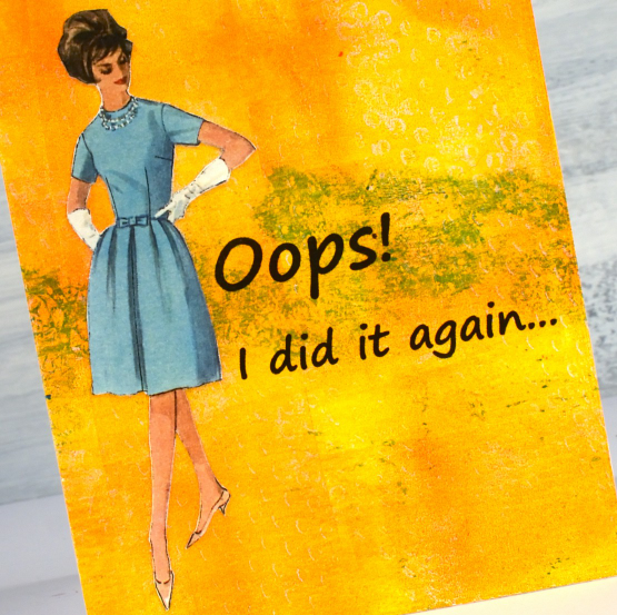
I’ve been prepping for my next Art Journal Adventure class which features images from vintage sewing patterns so that is how I happened to have this fashionista backed and cut out. The bright orange print is one from my online Gel Print Journey class and the contrast turned out to be a winner. Since I am talking about classes please check out my Classes page and if any of the online courses capture your interest use the code ENDOFSUMMERSALE at checkout for a 20% discount during September.
To be notified about future classes join my mailing list CLICK HERE.
Artsy Alcohol Ink on the Gel Plate
Posted: September 26, 2023 Filed under: Alcohol Ink, artsy stems, Darkroom Door, gel press, Tim Holtz | Tags: Alcohol Ink, Darkroom Door stamps, gel press, gel printing, Ranger Alcohol Ink 4 Comments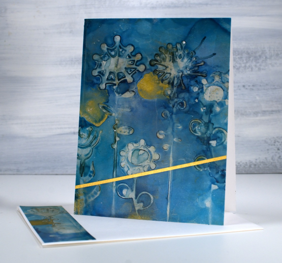
I have a couple of cards made from alcohol prints on the gel plate which is the technique feature in my last two youtube videos. I love the colours in this one and the funky patterns made using die-cut artsy stems, which are Tim Holtz dies.

The technique used in the recent youtube videos involves stencils not die-cuts but the effect is the same when the die-cuts are cut from stencil film or similar thin non-porous material. I use films from Grafix, either matte duralar or craft plastic.
I can’t remember the exact inks I used for the panel above but my guess is a deep blue such as glacier as well as some gold mixative or alloy ink. I pulled the print with the transparent gold paint used in this video so the panel has a subtle shimmer to it in real life. I loved the pattern so much I decided to add the narrow strip of gold but no sentiment.
The second card was also made using alcohol inks on the gel plate but is a more grungy print due to the mix of green and cream paint used to pull the print and the mix of yellow, green and blue alcohol inks used to make the pattern on the gel plate.
Rather than use the whole panel I added a simple blue gel printed piece to the top of the card front and once again a gold strip of cardstock. The sentiment is from the Darkroom Door happy birthday set.

I hope you enjoy these two examples of what can be made from alcohol ink gel prints. Let me know if you try the technique.
This post features affiliate links to the Scrap’n’Stamp. If you buy through these links I receive a small commission at no extra cost to you.
More Alcohol Inks on the Gel Plate
Posted: September 25, 2023 Filed under: Alcohol Ink, Dies, Flutters, gel press, Lavinia, Penny Black, pods stencil, Taylored Expressions | Tags: Alcohol Ink, gel press, gel printing, Lavinia, Penny Black creative dies, Taylored Expressions 1 Comment
Using alcohol inks and stencils on the gel plate is a bit of an addiction for me right now so I filmed another one to show you. A friend let me know that if you receive my blog posts by email the video doesn’t show up in the email. To see the video just click on the title of the blog post and it will take you to my blog. If you would like to subscribe to my youtube channel too that would be delightful.
I started this print with the Lavinia pods stencil already covered in ink and then added more ink and isopropyl alcohol when it was on the gel plate. Take a look at the video below to see the process.
I would love to hear if you try this technique. As I mentioned last week I like pulling the prints with paper or cardstock because they are surfaces that I wouldn’t normally use with alcohol inks.
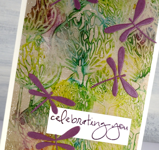
The finished card does include most of the print; it is a larger size than my usual A2 cards. I decided to add the Penny Black dragonflies in the wine colour which matches the alcohol ink I added very sparingly. In retrospect you will probably agree I could have added more. The sentiment is from Taylored Expressions ‘In and Out Birthday’ stamped in Chianti versafine clair ink.

My blog features affiliate links to the following companies. If you buy through these links I receive a small commission at no extra cost to you.
Ecstasy Crafts (Ecstasy Crafts offers a discount code heathertecs10 you can use for a 10% discount at checkout)
Autumn Entrance
Posted: September 21, 2023 Filed under: autumn entrance, Penny Black | Tags: Fabriano Watercolour Paper, Penny Black stamps, Ranger Distress inks 9 Comments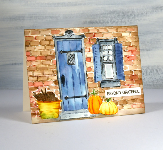
Days are getting shorter, nights are getting cooler and autumn is officially a few days away. I created this welcoming little scene with the Penny Black set ‘autumn entrance‘. The largest stamps are the door, the window and the bricks but then there are four different pumpkin stamps, the basket of wood, a wreath and a potted plant. Looks like I will be making a winter version too.
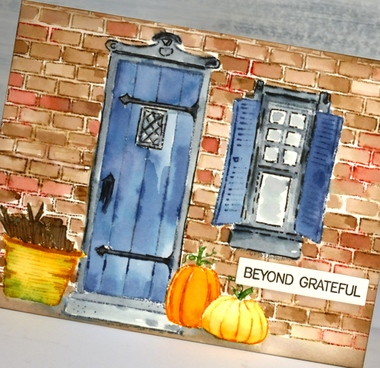
I stamped the door, window, pumpkins and basket on post-it notes, then cut them out so I could arrange them on a hot pressed watercolour paper panel. With the post-it masks in place I stamped the brick background over the top in ground espresso and barn door distress inks. I removed the door and window masks then stamped both images with faded jeans, weathered wood and black soot distress inks. Next the basket and tall pumpkin masks came off so I could stamp with mowed lawn, spiced marmalade, wild honey and carved pumpkin inks. Finally I removed the small pumpkin mask and completed the scene.
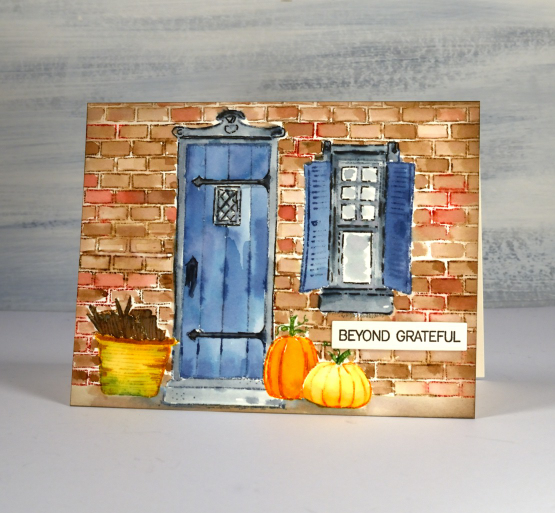
With the masks off and the stamping complete I used a brush and water, along with extra ink smooshed on my glass mat, to paint all the elements. I added a sentiment from the PB ‘ever thanks‘ set to complete the card. I do enjoy creating scenes or vignettes with stamps and this is a great set for doing just that. Do you have any sets that help you create little landscapes or scenes?
My blog features affiliate links to the following companies. If you buy through these links I receive a small commission at no extra cost to you.
Ecstasy Crafts (Ecstasy Crafts offers a discount code heathertecs10 you can use for a 10% discount at checkout)


