
Let the colouring begin
Posted: July 5, 2016 Filed under: Brusho, Sweet Perfume | Tags: Brusho, Canson Moulin du Roy watercolour paper, Penny Black stamps 32 Comments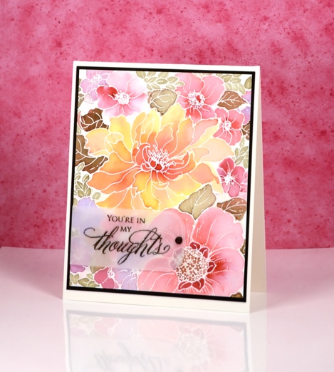
Today is day 1 of Kathy Racoosin’s latest ‘30 Day Coloring Challenge‘. If you haven’t heard about it click on the link and read the details. It is a no pressure, loads of inspiration, tutorials and prizes type of challenge. Kathy is a colouring wizard and she shares her tips and tricks on her blog and in her very friendly conversational videos.
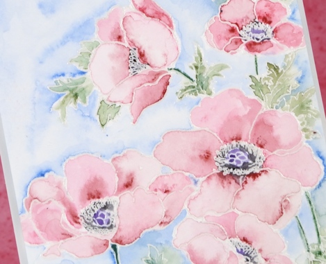
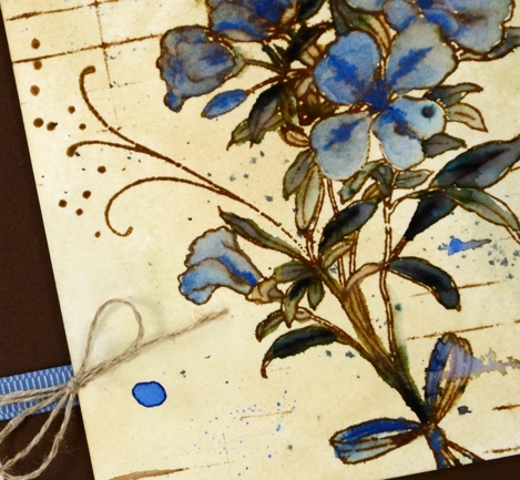
I had fun colouring this large scale floral design with brushos. I embossed the image on watercolour paper with silver pearl powder. I limited myself to four colours from the brusho range and I created different shades and values by mixing and diluting. The pink flowers are a mix of crimson and cobalt blue; some have little or no blue mixed in. The central flower is a mix of yellow and crimson. To make sure my greens blended in with the colours of the flowers I mixed some crimson with leaf green and created muted green-browns. In order not to loose too much of the panel behind a sentiment strip I embossed on vellum and added a half pearl over the adhesive. I didn’t have any black half pearls but a sharpie did the trick.

I have something quite new to share tomorrow. See you then.
Supplies
Stamps: Sweet Perfume, Special Thoughts (PB)
Paints: leaf green, cobalt blue, crimson, yellow brusho
Ink: Versamark ink
Paper: hot pressed Canson Moulin du Roy watercolour paper, Neenah Epic black cardstock, vellum
Also: black & silver pearl embossing powders, half pearl
OLS29 Christmas in July
Posted: July 1, 2016 Filed under: CAS, One-Layer Simplicity challenge, Spread Cheer | Tags: Faber-Castell Albrecht Durer Watercolour pencils, Penny Black stamps, Speedball elegant writer, Tsukineko Memento inks, Tsukineko Versafine inks 18 Comments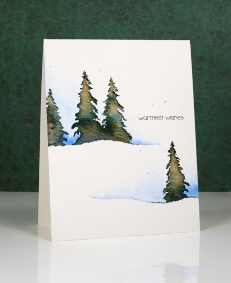
I am hosting the One Layer Simplicity Challenge this month and the theme is ‘Christmas in July’. I know some of you make Christmas cards all year but I usually start around now and keep going until December! If you haven’t even thought about Christmas cards then perhaps this challenge will be a motivator. Perhaps you want to enjoy the summer sun and not think about December at all – that is totally fine too!
To make this one layer card I tore a piece of painter’s tape lengthwise into two strips and positioned them on my watercolour paper card base. I painted some blue along the torn tape edge and faded it to white. Keeping the tape in place I stamped a few trees in Memento Northern Pine ink and added a few dabs of black elegant writer pen. After stamping I painted over the tree to blend the ink. Northern Pine separates into brown and green when diluted which gives the foliage some variety in colour.
I’ve been reading a book called ‘The Non-Designer’s Design Book’ which has made me think about layout in terms of alignment, repetition, contrast and proximity. The book is concerned mainly with text documents like business cards, menus, ads, etc but the principles are relevant to art layout too. I found myself trying to apply what I’ve learnt when working out where my sentiment would go.
Supplies:
Stamps: Spread Cheer(PB)
Inks: Northern Pine Memento ink, Versafine Olympia green (Imagine Craft/Tsukineko)
Pencils & Pens: blue watercolour pencil (Faber Castell), elegant writer pen (Speedball)
Cardstock: Canson Moulin du Roy 100% cotton hot pressed watercolour paper
Our graduate
Posted: June 27, 2016 Filed under: Pastoral, Spread Cheer, Stamped Landscapes | Tags: Dr Ph Martin Hydrus watercolor paints, Penny Black stamps 14 Comments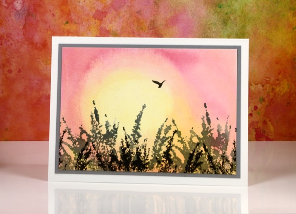
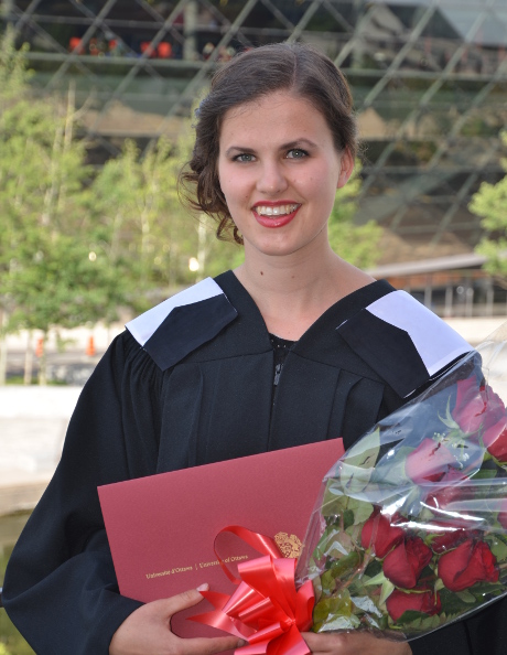
A week ago we had the privilege of watching our older daughter graduate from university. She has worked very hard, achieved excellent results and is off to undertake a Master’s in September. I chose her card from a selection I made last year; it could be a sunset or sunrise and the bird is flying off into it. My first chick is leaving the nest! As you can imagine I am very proud of her but not looking forward to her being miles away. It will be a great excuse to travel and see her though.

The background sunrise was painted wet into wet so I could blend the pink and yellow. I lifted out some yellow in the centre to make it brighter to look like the sun. As you lift the colour out it is important to rinse your brush and remove some of the water; you don’t want to return colour to your panel or create a watermark by dropping in extra water. I waited for the background to dry before stamping grey and black foliage in the foreground and a bird in the sky.
Supplies:
Stamps: Pastoral, Spread cheer (PB)
Inks: Hydrus Watercolour (Dr Ph Martin) I can’t remember which grey and black inks I used?!?
Cardstock: Hot pressed Fabriano watercolour paper, grey cardstock, Neenah solar white cardstock
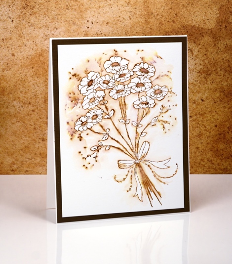
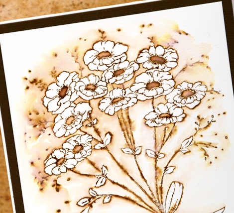
Pastel Poppy Gems
Posted: June 16, 2016 Filed under: Poppy Gems | Tags: Faber-Castell Albrecht Durer Watercolour pencils, Fabriano Watercolour Paper, Penny Black stamps 10 Comments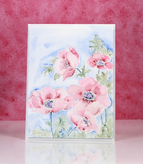
This week my colouring has grown softer each day. I changed mediums for this card and pulled out my tried and true watercolour pencils. I have added to my set lately but the originals are still the set I bought in university for my art subjects. I remember my parents thinking they were quite an expensive purchase then but I would say we got our money’s worth!
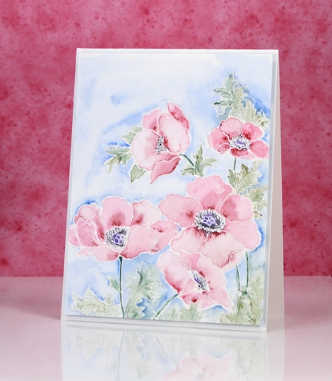
I embossed the poppy gems stamp in clear powder then painted each petal one at a time. I applied two pinks from the pencils and blended from dark to light, keeping some watermarks and blending others out. On yesterday’s card I kept the blending very smooth but sometimes I like to have a few watermarks here and there.
Colouring three times in a row is great practice for Kathy Racoosin’s upcoming 30 day colouring challenge. The next one starts on July 5th and lasts until August 3. I will share more details closer to the time but it is a great challenge, no pressure to colour every single day, plenty of wonderful inspiration from Kathy and some prizes along the way.
Supplies:
Stamps: Poppy gems(PB)
Inks: Versamark (Tsukineko)
Pencils: Pine green 267, Chromium green opaque 174, Dark red 225, Madder 142, True blue 148 (Faber Castell Albrecht Durer watercolour pencils)
Cardstock: Fabriano 100% cotton hot pressed watercolour paper
Bright Poppy Gems
Posted: June 15, 2016 Filed under: Poppy Gems | Tags: Fabriano Watercolour Paper, Kuretake Zig clean color real brush markers, Penny Black stamps, Tsukineko Versafine inks 15 Comments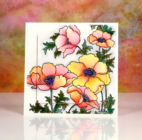
I’m sharing some more colouring today and yes, more poppies too. Poppies just keep on popping up on this blog don’t they!? Believe it or not I used the same medium on today’s card as yesterday’s very bright and bold card. The colours today are still bright but are blended out to much paler shades.
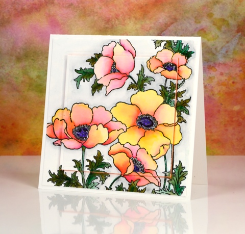
I stamped the large ‘poppy gems’ stamp in versafine onyx black and embossed in clear then used zig clean color real brush pens. Yesterday I pretty much filled the petals with colour and blended one colour over another. On today’s card I started with a little pink at the centre edge of each petal and a little yellow at the outside edge and blended the two colours with water to create a softer effect.
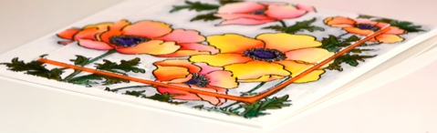
I spied the raised panel layout on a couple of pretty cards recently and chose to do it on this one with a piece of orange fun foam. I have an even paler more pastel poppy card up next. See you soon and thanks for dropping by.
Supplies:
Stamps: Poppy gems, (PB)
Inks: Versafine Onyx Black (Tsukineko) Zig Clean Color real brush markers (Kuretake)
Cardstock: Fabriano 100% cotton hot pressed watercolour paper
Also: orange fun foam, spellbinders square die
Love art poppies
Posted: June 14, 2016 Filed under: CAS, Love Art | Tags: Kuretake Zig clean color real brush markers, Penny Black stamps, Tsukineko Versafine inks 12 Comments
My inspiration for this panel came from my garden. I only have one colour of poppy in my garden, orange. I didn’t quite capture the colour; but it was a good colouring exercise. To create the collection of poppies I had to mask several times then stamp over my masks. Fortunately the cutting required for a mask of this poppy wasn’t too fussy!
I used zig clean color real brush markers and worked with one orange, one yellow and one red. The colours remained bold and bright because I blended with very little water and just worked with a combination of red and orange or orange and yellow. The centres are purple and black. The background is also zig markers, a mix of blue and light green with water marks to break up the brightness and give a little texture.
When I photograph my cards I sit them on a piece of glossy cardstock; I like the strong reflection I got this time.
I fully intended to add a sentiment in that big empty space in the top right corner but didn’t notice I hadn’t until I was editing my photos. I will wait and see who I send it to and add a sentiment later.
Supplies:
Stamps: Love Art (PB)
Mediums: Zig Clean color real brush markers(Kuretake) Versafine Onyx Black ink (Tsukineko)
Cardstock: Hot pressed Fabriano watercolour paper, Neenah Epic Black cardstock
Vintage sunbursts
Posted: June 10, 2016 Filed under: Nature's Paintbrushes, Sunbursts | Tags: Penny Black stamps, Ranger Distress inks, Speedball elegant writer 9 Comments
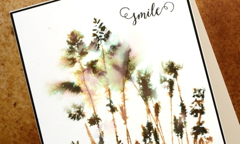
I have two last cards to wrap up my vintage watercolour week. These differ from all the previous cards as they were stamped with solid or ‘silhouette’ stamps rather than outline stamps. The technique used on all my other cards involved pulling brown ink from the outline either into the image or into the back ground.
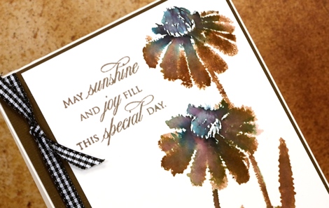
With a solid stamp the inside of the image is already full of ink so I adapted my technique in order to get the same vintage brown & black effect. Because there were no petals or wings to be filled I didn’t incorporate watercolour pencils into these designs. On the ‘sunburst’ stamp above I inked most of the stamp with vintage photo distress ink but left the flower centres and the base of the stems to be inked with the elegant writer pen. I spritzed the stamp so the brown and black would blend into each other and the pink and green tones would bleed out of the black. I moved the colour around a little with a paintbrush.
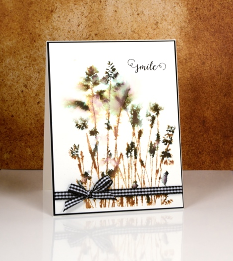
On the ‘nature’s paintbrushes’ stamp I inked first with vintage photo ink then added the elegant writer black on the seed heads of the grasses. I spritzed with water before stamping and also on the watercolour panel so the colour and image would bleed into the surrounding area.
When I was looking for some ribbon or twine to finish the cards I spied my black gingham and was surprised how much I liked it on the predominantly brown card.
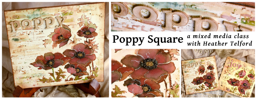
Thank you so much for leaving me such kind comments this week; I glad some of you have tried the technique or plan to. I know many of you are not in my area but for those who are, I have a June class where we will be using similar techniques to make a poppy themed art square. (My first mixed media class!) All the details are on my upcoming classes page. I am also offering it at Crop A While in Orleans.
Supplies:
Stamps: Sunbursts, Nature’s Paintbrushes, Happy Snippets, Treasured Sentiments(PB)
Inks: Vintage Photo distress ink (Ranger) Elegant writer pen (Speedball)
Cardstock: Hot pressed Fabriano watercolour paper, black and natural cardstock (Neenah)
Also: black and white gingham ribbon
Vintage Flower Box
Posted: June 9, 2016 Filed under: Flower box | Tags: Faber-Castell Albrecht Durer Watercolour pencils, Fabriano Watercolour Paper, Penny Black stamps, Ranger Distress inks, Speedball elegant writer 13 Comments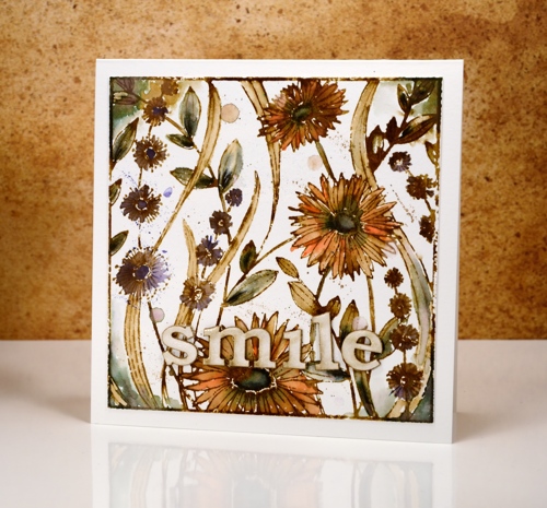
I’m continuing my vintage watercolour theme today with the square ‘flower box’ stamp. I completed this panel using the technique shared in my video tutorial. I stamped the image with vintage photo ink and added black here and there with the ‘elegant writer’ pen from speedball.
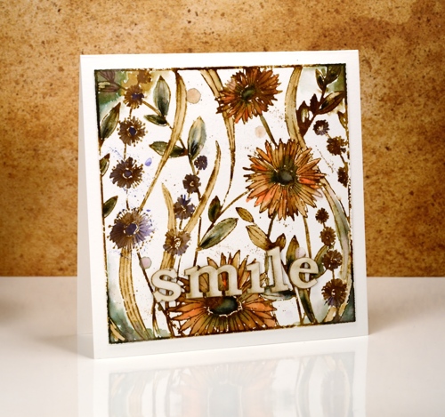
Most of the leaves and the centres of the large flowers have a black/green tinge to them; this is what happens when you add water to the elegant writer ink. I also spread it around the corners with a paint brush.

The orange and purple colouring is from watercolour pencils. I pulled colour from the pencils and filled the petals and flower shapes drawing in brown from the stamped outlines at the same time. I added splatters of colour from the pencil and water droplets for an aged look.

The word ‘smile’ is laser cut from matboard and glazed with crackle glaze. Thanks for joining me this week; I’m so pleased you are enjoying my vintage theme.
Supplies:
Stamps: Flower Box (PB)
Inks: Vintage Photo distress ink,Vintage Photo distress stain (Ranger) Elegant writer pen (Speedball)
Cardstock: Hot pressed Fabriano watercolour paper
Also: Albrecht Durer watercolor delft blue, raw umber, dark orange pencils (Faber-Castell), Rock candy clear crackle paint(Ranger)
Vintage Elegance
Posted: June 8, 2016 Filed under: Elegance in Motion, Life's Journals 8 Comments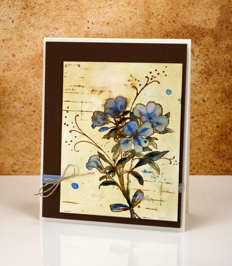
Today’s vintage style card has a slightly different look to it because I gave the watercolour paper some colour before I began. While I was working with vintage photo ink and different stamps I just cleaned each stamp with a wet wipe. The wipe became quite ‘vintagy’ itself but before I threw it away, I tried wiping it across a piece of watercolour paper to see how much colour transferred. The result is the yellowed look on this card.
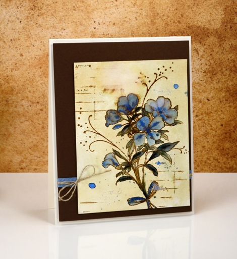
I let the paper dry completely before stamping the ‘Elegance in motion’ stamp in vintage photo ink. Once again I used the elegant writer pen but only on a couple of leaves. The rest of the colouring was done with a blue water colour pencil, a pale first layer then more intense details.
I added some lines using the ‘library card’ stamp then splattered and blurred the stamping in a few places. I was happy to find some blue ribbon in just the right tone and some linen twine for a little accent on the side. You can find my earlier ‘vintage watercolour’ cards here:birdhouse, butterflies, tulips, jubilance, poppies.
Supplies:
Stamps: Elegance in Motion, Life’s journals (PB)
Inks: Vintage Photo distress ink,Vintage Photo distress stain (Ranger) Elegant writer pen (Speedball)
Cardstock: Hot pressed Fabriano watercolour paper, brown cardstock, Neenah natural white cardstock
Also: Albrecht Durer watercolor phthalo blue pencil (Faber-Castell), blue ribbon, linen twine
Vintage Jubilance
Posted: June 7, 2016 Filed under: CAS, Jubilance | Tags: CAS, Penny Black stamps, Ranger Distress inks, Ranger Distress stains 17 Comments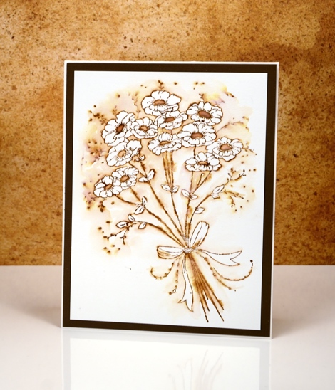
More vintage flowers on display today with a slightly different technique to try. As with my previous vintage style watercolours (birdhouse, butterflies, tulips) I stamped the image in vintage photo distress ink. Other water based dye inks in brown would probably work but I like the ease with which I can dilute and spread the vintage photo ink or stain.
After stamping, instead of pulling ink from the outline into the flowers and leaves, I pulled ink out into the background leaving the flowers and leaves white. The contrast of brown with white makes the flowers pop and look whiter than they would if they were not surrounded by colour. It is a simple technique you could try with any colour ink.
I would love to hear if you try some ‘vintage style watercolour’. Thanks for dropping by.
Supplies:
Stamps: Jubilance (PB)
Inks: Vintage Photo distress ink,Vintage Photo distress stain (Ranger)
Cardstock: Hot pressed Fabriano watercolour paper, brown cardstock


