
Vintage Jubilance
Posted: June 7, 2016 Filed under: CAS, Jubilance | Tags: CAS, Penny Black stamps, Ranger Distress inks, Ranger Distress stains 17 Comments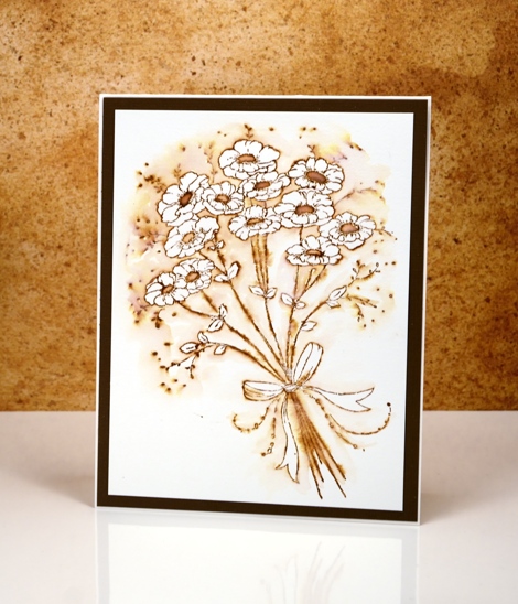
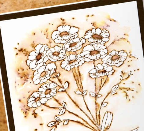
More vintage flowers on display today with a slightly different technique to try. As with my previous vintage style watercolours (birdhouse, butterflies, tulips) I stamped the image in vintage photo distress ink. Other water based dye inks in brown would probably work but I like the ease with which I can dilute and spread the vintage photo ink or stain.
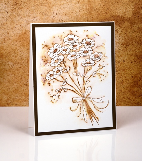
After stamping, instead of pulling ink from the outline into the flowers and leaves, I pulled ink out into the background leaving the flowers and leaves white. The contrast of brown with white makes the flowers pop and look whiter than they would if they were not surrounded by colour. It is a simple technique you could try with any colour ink.
I would love to hear if you try some ‘vintage style watercolour’. Thanks for dropping by.
Supplies:
Stamps: Jubilance (PB)
Inks: Vintage Photo distress ink,Vintage Photo distress stain (Ranger)
Cardstock: Hot pressed Fabriano watercolour paper, brown cardstock


Great idea to leave the flowers white! Painting is beautiful. I like using this technique with the Penny Black kids stamps. Peeled Paint, Stormy Sky and Faded Jeans Distress Inks also give a great effect. Thanks for all the inspiration!
Yes, it is a technique you could do with any colour; I’m just sticking with brown this week. I have done it with chipped sapphire which is a lovely contrast with white.
You’re convincing me that I really must try stamping 🙂 I love these vintage looks you’re creating.
Oh yes, give it a try; it’s a lot of fun!
Definitely plan to do this very soon. 🙂
Very pretty. Simple but elegant.
Love this series of vintage creations!
I must say this is beautiful Heather and I love the idea of pulling the colour out of the flowers and leaves and in to the background which works fabulously. x
Love this.
Truly a beautiful card Heather…will be giving this a try!!!
Paper Hug,
jan
Beautiful card! Love this technique.
[…] Vintage Jubilance → […]
Your series this week has been so very pretty! (As you know, I’ve been seeing them on IG…) It would probably never occur to me to start a card with browns, but you may just have inspired me. I really like the way the white flowers stand out against the watercolour shading.
I love how this gives almost a look of wood burning
[…] Get all of the details on the card above by clicking this “link we LOVE.” […]
SO, SO pretty – you seem to amaze me every time!!
Such a beautiful card. I’ll give this a try later today as soon as I get my chores out of the way.