Stripes & Daisies
Posted: May 16, 2025 Filed under: Hand painted, Tim Holtz, Watercolour, wild flowers #1 | Tags: Fabriano Watercolour Paper, Hand painted, Tim Holtz 2 Comments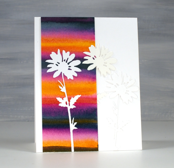
Back in February, I posted a pile of watercolour possibilities; you can see them here. The very bright strip on this card is one of the panels I painted during a watercolour technique class. I didn’t note down the exact paint colours but it would have been a limited palette of only 3 or 4. My guess is a yellow, a blue and a pink.
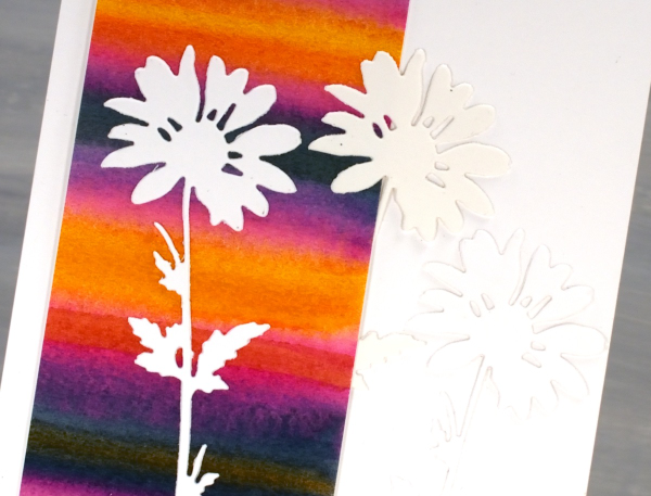
I used only half the painted panel on this card which means I can make another card or decorate the envelope. The background is so bright I liked crisp white daisies on top, it was a bit like putting together a summer outfit. The daisies were cut with Tim Holtz wildflowers dies and it looks like I cut 2 from white and one from cream cardstock. When I added the photos to this post I thought, ‘oh no! Did I add a cream daisy in?’ I pulled out the actual card and the daisies are indeed all white. Sadly the angle and lighting when I took the photo seems to be suggesting otherwise.
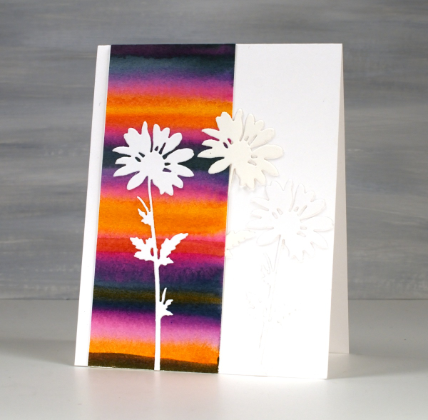
To just have one daisy was too stark so I added the other two to create a little more texture but no competing pattern or colour. I might put a sentiment on when I send it or I might not; we will see. Thank you for all your lovely messages about my Dad’s birthday and the card I made. The community of people who read my blog are so thoughtful; I always love hearing from you.
Zig Zag Print cards
Posted: May 28, 2024 Filed under: gel press, Heather lowercase die set, Penny Black, Pink Fresh studio, Stencils, Tim Holtz, wild flowers #1, Zigs & zags 3 Comments
Recently I posted several ’tiled’ collage cards on the blog and mentioned there would be more to come. Today’s cards once again feature gel printed panels arranged and decorated in two ways.

I used three different gel prints to ’tile’ the card above, a plain blue print, a print created with a zig-zag stencil and a print made with the an impression from an embossing folder. To tie together the dark blue, light blue and yellow + blue prints I added a navy wildflower (Tim Holtz) and navy ink splatter.

To create the square birthday card below I used ’tiles’ from the same print but rearranged them on the card front so they didn’t fit together like a jigsaw.

The brassy-gold paint used on the gel print prompted me to die-cut letters, stars and the word birthday from a similar colour cardstock to create a sentiment. This post includes affiliate links from Foiled Fox. If you buy through these links I receive a small commission at no extra cost to you.

Pink & Blue Squares
Posted: May 18, 2024 Filed under: Collage cards, Dies, gel press, gift card pocket, Penny Black, Tim Holtz, wild flowers #1 | Tags: collage, gel printing, Penny Black creative dies, Tim Holtz 3 Comments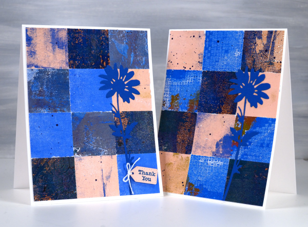
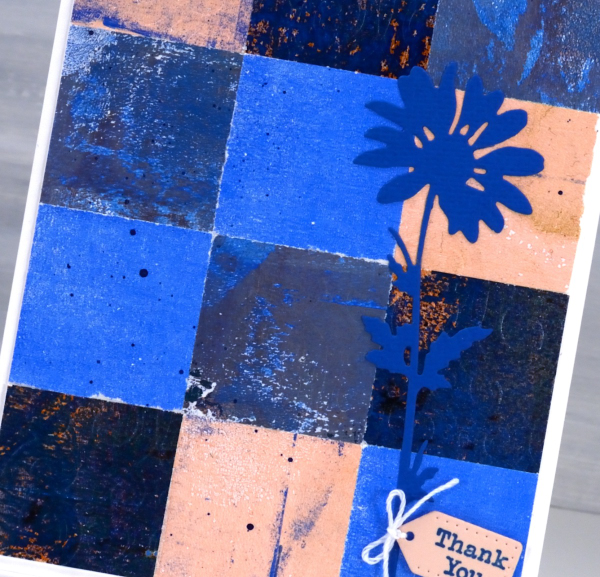
As mentioned in previous posts my stash of gel prints is considerable. I am always on the look out for ways to use them. Large prints are great for covers on handmade books; I use many smaller prints for card fronts and collage.
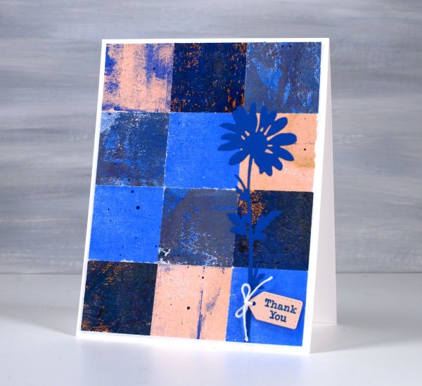
These two collage cards are made from four or five different gel prints. I punched the squares with a 1 3/8″ punch then fiddled around with the layout until I was happy with it. Because I love things to match all the prints had some blue in them and there is some repetition of pink as well.
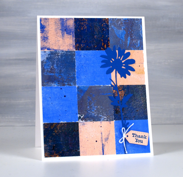
The prints were part of my stash and were not made specifically for these cards so some have patterns and others were probably second or third pulls to clean off a plate. Once I had them arranged to my satisfaction I die-cut Tim Holtz wildflowers and added a tiny Penny Black tag. You’ll see more of this style in the next few weeks as I made them in several different colour combinations. Those of you who know me might have noticed the dark blue splatter on the both cards; I always think a bit of splatter ties thing s together.
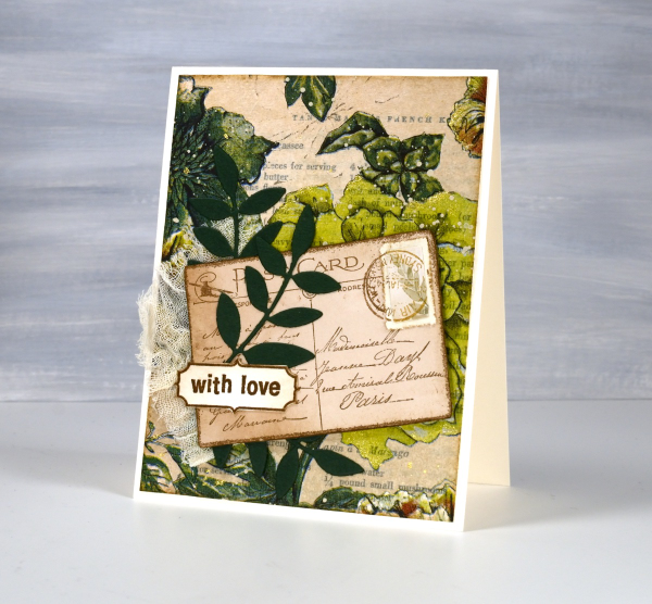
Greenery Collage Cards
Posted: April 3, 2024 Filed under: Collage cards, Darkroom Door, Dies, Finetec paints, gift card pocket, global postmarks, Leaves, measuring tape, Mixed Media, paris postcard, Penny Black, Tim Holtz, wild flowers #1 | Tags: collage, Darkroom Door stamps, Finetec artist mica watercolour paint, Mixed Media, Penny Black creative dies, Penny Black stamps, Tim Holtz 6 Comments
Continuing with the collage theme I have three cards featuring greenery from a paper napkin. I know people have been creating with paper napkins for years but I am new to the game. I have a small collection of pretty paper napkins to use on cards, book covers and journal pages. The green ones featured here are large dinner napkins found at Winners, probably in that tempting ‘just before the checkout’ area!

I glued the printed layer of the napkin over book pages to make my main panels and aged the edges with green and brown inks. I created a couple of little vintage postcards with the Paris postcard stamp, a background with the Measuring Tape stamp, sentiments and postmarks all from Darkroom Door.
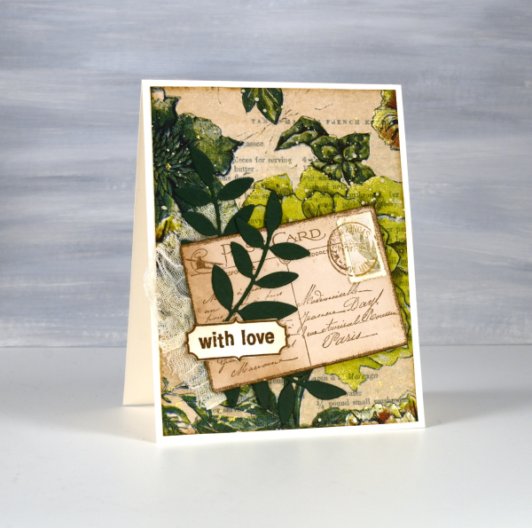
Once again I used some cute dies from Penny Black to cut tickets, file divider, tag and leaves adding blending around the edges for the vintage look.
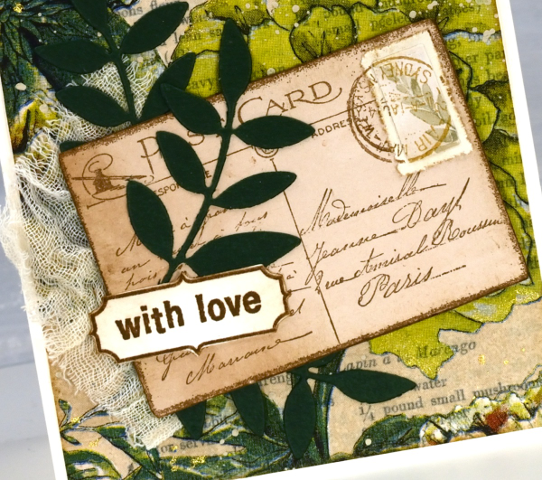
The scrap of cheesecloth, the lace and the grosgrain ribbon were all found around here, maybe the ribbon is actually vintage; it looks a bit discoloured from age which meant it co-ordinated well.

The lovely Queen Anne’s lace die is from the Tim Holtz ‘wildflowers #1 set.
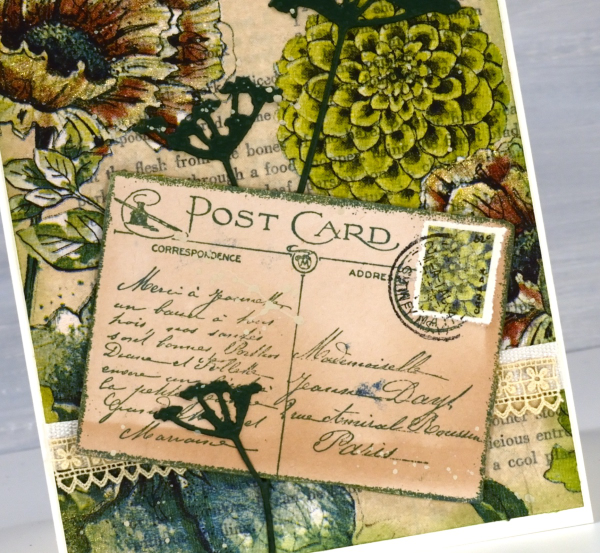
I did make my own little postage stamps for the postcards because I’m still in love with faux postage. These ones had to be quite small so I didn’t use a die I just punched tiny holes with a needle to perforate the edges. You can see a bit of splatter here and there with ivory paint and there are touches of gold watercolour paint on the petals of a few flowers too!
This post includes affiliate links from Foiled Fox and Scrap’n’Stamp . If you buy through these links I receive a small commission at no extra cost to you.
Blue flowers on red gel print
Posted: March 2, 2022 Filed under: gel press, harmonious, Penny Black, Tim Holtz, wild flowers #1 | Tags: gel press, gel printing, Penny Black stamps, Tim Holtz, To 3 Comments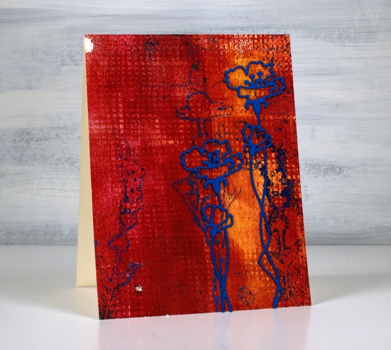
Here is another of my gel prints from last week. When I sit down to write my process for you I get a little confused as to the order I did things. With gel printing you need to do the top layer of the final print first on the plate then layer the background over the top. I don’t list the paints I use for my prints because I end up with many paints over my work surface during a printing session of several different brands. If you are wondering about paints for gel printing, use any acrylics you have and see what you like best.
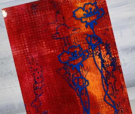
I imagine I brayered blue paint on the plate first, then pressed the fiddly flower die cuts into the paint, took a print to remove all but the outlines of blue then brayered the orange and red over that. I added texture to the red layer and took the final print, I think. The grid print you see was made by pressing a textured piece of cardstock into the paint on the gel plate. I guess I need to video my process for myself as well as to share with you!
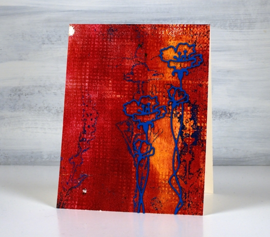
The blue prints were not as distinct as I had hoped; I’ll keep working on that. I do like the shadow flowers though and when I found an outline flower die from Penny Black I stacked two blue layers and added it over the shadows. I like its grunginess, bold colours, shadow flowers and grid texture. And those two odd white dots were made as old paint peeled off the plate. Gel printing is full of delightful surprises.
Supplies
(Compensated affiliate links used when possible)