
Fine baubles
Posted: December 14, 2017 Filed under: fine baubles | Tags: Darkroom Door stamps, Kuretake Zig clean color real brush markers, WOW embossing powders 5 Comments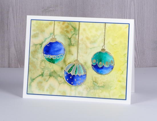
Today I have three pretty baubles out of the ‘Fine Baubles’ set from Darkroom Door. I stamped them on hot pressed watercolour paper in versamark and drew a cord from the top of each one with an embossing pen. I embossed in gold powder then coloured with zig clean color real brush markers. The ink in these markers is so vibrant you need very little on your paper; it is possible to blend it easily with water, or as I did, with a clear wink of stella marker for some sparkle. I used blue, turquoise and green markers for each bauble.
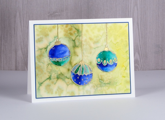
After colouring and blending the baubles I roughly coloured the background with a yellow and an olive green marker. I didn’t need to cover the whole area, rough shading with plenty of gaps was enough. I blended the shading with water to fill the whole background then sprinkled salt over the wet ink to create patterns.
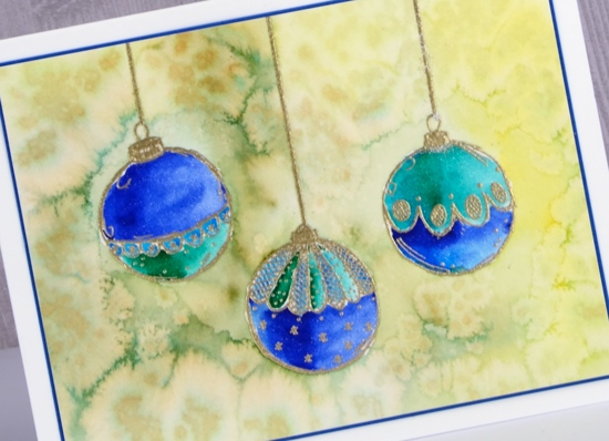
To finish off the card I matched the blue of the baubles with a narrow blue mat and attached to a white card base. I think I’ll be pulling out my tree and baubles any day now.
Supplies
Stamps: Fine baubles (Darkroom Door)

Ink: versamark, versamarker

Paper: hot pressed watercolour, neenah solar white, blue card


Markers: zig clean color real brush markers, clear wink of stella

![]()
Also: WOW metallic gold rich embossing powder, salt

More layered poinsettias
Posted: November 29, 2017 Filed under: Brusho, layered poinsettia | Tags: Brusho, Penny Black creative dies, Penny Black stamps, WOW embossing powders 10 Comments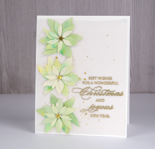
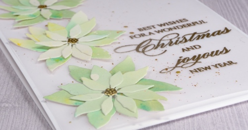
I liked that first layered poinsettia card so much I made another, this time with some pale green brusho to get the ‘white poinsettia’ look. I think I could go even lighter with my paint so there may be another poinsettia card to come. I started with watercolour paper splattered with masking fluid so I would have little white dots over the petals at the end.
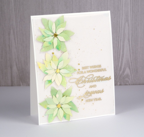
I painted lime green brusho on the watercolour panel but it ended up separated into distinct areas of blue and yellow so I add a tiny bit of olive green brusho to get everything looking greener. When I die-cut the petals I tried to keep the smaller ones a little lighter and the larger ones darker.
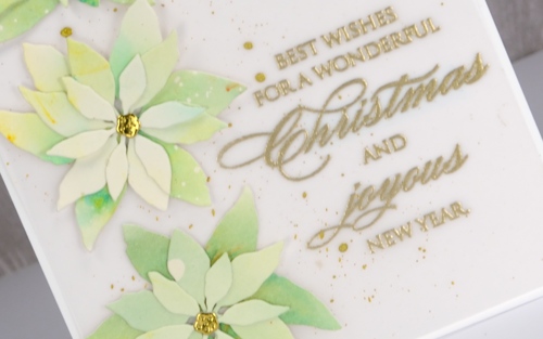
Even though I was aiming for clean and simple when I lay the petals on a white card base, it was a little too stark. A layer of vellum softened the base and I splattered gold paint over it then added an embossed sentiment. Solving the vellum adhesive problem was easy under the die cuts and sentiment but the corners needed something too so I added just the tiniest amount from my tombow tape runner to hold them down to the card base.
Stay tuned because I think there are another couple of colour schemes yet to be tried with this pretty little die set!
Supplies
Dies: layered poinsettia

Stamps: joy & happiness

Versamark ink, WOW gold metallic rich embossing powder


Paints: finetec mica pearl 12, brusho 12, brusho 8, masking fluid


Neenah solar white cardstock, hot pressed watercolour paper, vellum


Season’s greetings
Posted: September 21, 2017 Filed under: Berry speckled | Tags: Fabriano Watercolour Paper, Penny Black stamps, Ranger Distress inks, Ranger Distress stains, Tsukineko Memento inks, WOW embossing powders 4 Comments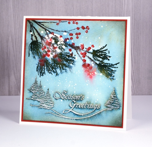
I have yet more snow on the blog today with this wintry berry branch over a snow dusted sentiment. The look is a little vintage again but with muted colours rather than lots of brown. I have some old Christmas cards of my mothers tucked away somewhere I should pull them out because this look reminds me of some of them.
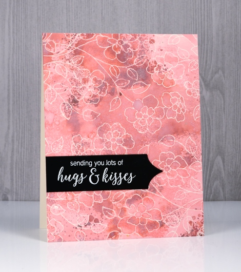
I began with a splattering of masking fluid over a piece of hot pressed watercolour paper. Once dry, I positioned the panel in a stamp positioning tool and stamped the ‘tree & greeting stamp’ from ‘A Festive Season’ set in memento northern pine ink. I removed the panel from stamp positioner but left the stamp in place. In the top left corner I stuck a circle of frisket film to mask a moon shape then painted over the whole panel with water. Colour bled out of the northern pine ink and started filling the panel; I added faded jeans distress stain so I could cover the whole piece with diluted blue/green colour. Once the panel was dry I removed the mask and placed the panel back in the stamp positioner away from the ‘tree & greeting’ stamp so I could place the ‘berry speckled’ stamp to overlap some of the moon. I inked and stamped one colour at a time with the following markers: berries – candied apple distress marker, needles – northern pine memento marker, and branch & twigs – espresso truffle and rich cocoa memento markers.To soften the look of the branch I spritzed it and let some colour bleed into the surrounding area. When dry I added shadows on the berries with the bullet tip of the candied apple marker.

Supplies
Distress Oxide background
Posted: August 8, 2017 Filed under: Butterfly trio, Sweet Perfume | Tags: distress oxide inks, Penny Black creative dies, Penny Black stamps, WOW embossing powders 8 Comments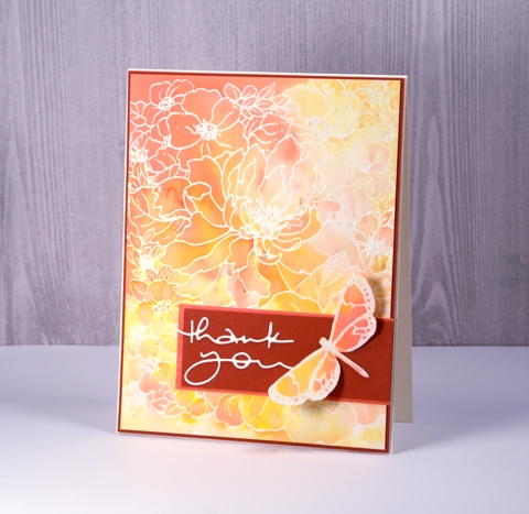
I’ve been playing with distress oxide inks again and its all because of the wonderful folk at the Foiled Fox. I loved the first 12 colours released but when I saw salty ocean, peacock feathers and seedless preserves in the second release I was pretty happy. I am guest blogging over on the Foiled Fox blog today with all the details about this card.
Our family has been enjoying a visit from my sister-in-law, Dale for a few weeks. She came from Australia via Alaska and we have had the chance to do a few little trips around Ontario and Quebec while she’s been here. One afternoon while we were home I was downstairs in my workroom trying to nail this card. I loved the soft blends in the background but deciding on features for the foreground was not happening. Dale came down to see what I was doing and we ended up collaborating to complete the card.

Supplies
Stamps:Sweet Perfume, Butterfly Trio (PB)
Die: Many Thanks (PB)
Inks: spiced marmalade, abandoned coral, wild honey distress oxide inks (Ranger) versamark (Tsukineko)
Papers: hot pressed watercolour paper, Neenah natural white cardstock, brick red cardstock
Also: clear embossing powder (WOW)
Wildflowers blue
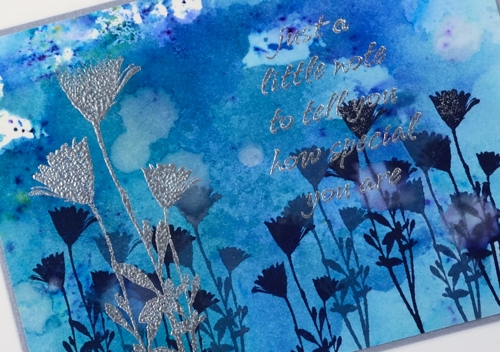
Posted: August 7, 2017 Filed under: Bright Blossoms vol 1&2, Brusho, French Script, Wildflowers Vol 2 | Tags: Brusho, Darkroom Door stamps, Ranger Distress inks, Ranger Distress stains, WOW embossing powders 7 Comments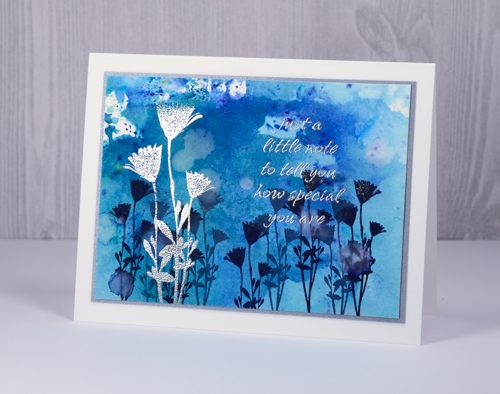
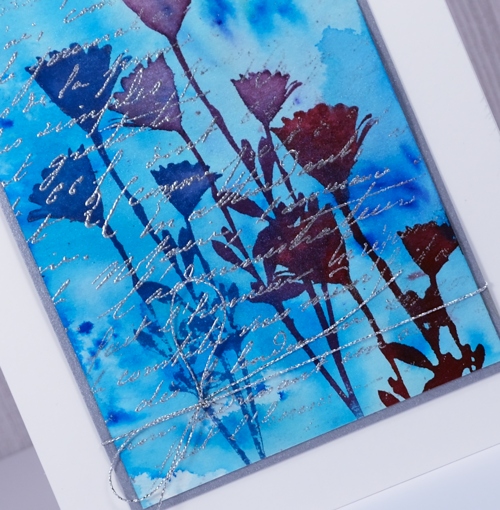
I have a couple more cards that came out of my session with the Darkroom Door Wildflowers vol 2 stamps recently. I began by making blue watercolour backgrounds with brusho paints on hot pressed watercolour paper. Rather than apply the paint directly to the paper, I sprinkled it on a craft sheet, spritzed, then pressed the paper into the paint. I was able to pick up paint that was almost in crystal form as well as soft blended sections.
In the Wildflowers vol 2 set there is a large and a small version of the same flower so I used the small stamp on the panel above to create a base of flowers in chipped sapphire and stormy sky distress inks. I shook water droplets onto the panel to create pale watermarks here and there. Once the panel was dry I wiped an anti-static powder pillow across it and embossed the flowers and a sentiment from Bright Blossoms vol 1 in silver over the top of the blue. The silver catches the light depending on the angle but is tricky to capture with the camera.
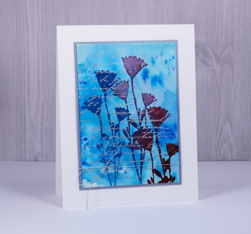
On my second card I created the painted background the same way then stamped the flower three times in different distress stains. Once again I embossed over the top with silver, this time using a partial stamping of the French Script background stamp. I framed both panels in silver cardstock and added silver thread around the second panel before attaching to white card bases.
Supplies
Stamps: Wildflowers vol 2 , French Script, Bright Blossoms vol 1 (Darkroom Door)
Inks: chipped sapphire, stormy sky distress inks & blueprint sketch, seedless preserves, aged mahogany distress stains (Ranger) versamark (Tsukineko)
Paper: Neenah solar white, hot pressed watercolour paper, brushed silver cardstock
Paint: prussian blue, cobalt brusho (Colourcraft)
Also: silver cord, silver embossing powder
Happy Canada Day
Posted: July 1, 2017 Filed under: Felicity | Tags: Brusho, Fabriano Watercolour Paper, Penny Black creative dies, Penny Black stamps, WOW embossing powders 8 Comments
Supplies
Stamps: Felicity (PB)
Dies: Dies: celebrations (PB)
Paper: hot pressed watercolour paper, Neenah solar white and red pepper cardstock, vellum
Inks: versamark (Tsukineko)
Also: white embossing powder, clear wink of stella
Morning glory emboss resist
Posted: June 27, 2017 Filed under: flower medley | Tags: Faber-Castell Albrecht Durer Watercolour pencils, Nuvo crystal drops, Penny Black stamps, Tsukineko Versafine inks, WOW embossing powders 4 Comments
Yes, it’s another emboss resist card, this time a delicate, ‘stay inside the lines’ one. I embossed the morning glory stamp from the transparent flower medley set with clear powder over black ink. I coloured with watercolour pencils, a blue and a purple for the flowers and a couple of greens for the leaves.
When I trimmed my panel I decided it need a little something in between the flowers so added some black nuvo crystal drops here and there in different sizes. Within minutes I managed to put something down on top of the panel which smeared some of the black drops! I let it finish drying then trimmed it and separated the two sections on a black card base. Now when I use nuvo crystal drops I take my panel and place it on the other side of the room where I am less likely to dump something on top of it.
Just in case you missed my last few posts I am embossing all the things at present because I have a challenge happening with The Foiled Fox right now and I would love you to get involved. You have three more days to add your emboss resist card to our link up. Hope to see it there soon.

Supplies
Stamps: flower medley, delicate flowers
Paper: hot pressed watercolour paper, epic black neenah cardstock
Inks: onyx black versafine,
Paints: Albrecht Dürer watercolour pencils (Faber Castell)
Also: ebony nuvo crystal drops, clear embossing powder
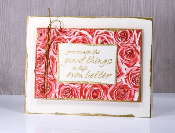
Roses three ways
Posted: June 7, 2017 Filed under: Bright Blossoms vol 1&2, Roses | Tags: Darkroom Door stamps, Ranger Distress stains, Tsukineko Memento inks, WOW embossing powders 5 Comments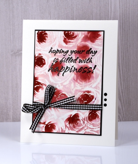
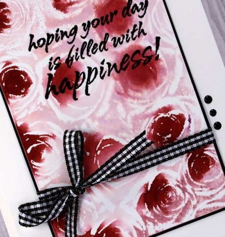
I love to use distress stains applied with the sponge dauber so I had to try them with this stamp from Darkroom Door. I tried two other techniques shown further down in the post and taught a couple more techniques in my most recent class. For the card above I used a stamp positioner so I could add one colour at a time. I inked the Roses stamp with Victorian velvet and stamped on hot pressed watercolour paper. I then dabbed the Aged Mahogany stain on the centres of the Roses in the stamp and and stamped again. The colours blended as both were wet. I chose to make all the accents black, adding an embossed sentiment from Bright Blossoms vol 1, a black mat, b&w gingham ribbon and three dots of black crystal drops.
I stuck with the same two distress stains for the next card but adding them over the embossed image created the negative of the one above.
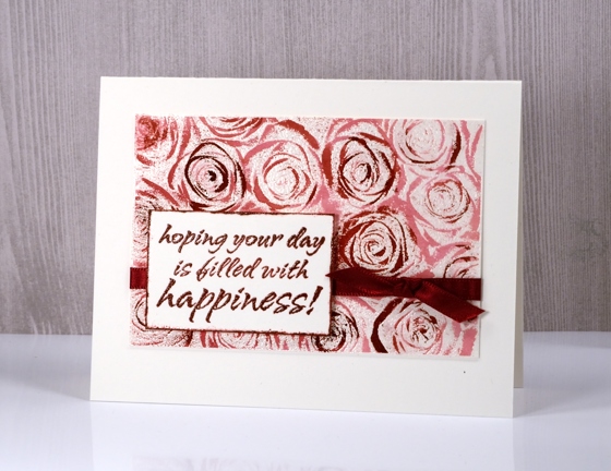
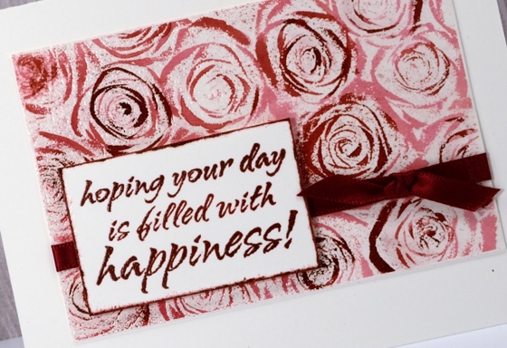
I painted Victorian velvet stain over the whole embossed image then added aged mahogany with a paintbrush here and there to create darker roses or just darker accents. I finished it off again with a ribbon and embossed sentiment, framing the sentiment by swiping the crimson red ink around the edges of the panel then embossing in clear powder.
My third technique was done with Memento ink but would work well with any dye based water soluble ink. I covered the stamp with memento love letter ink then darkened the centres of the roses with a rhubarb stalk marker, spritzed the stamp lightly and stamped it on hot pressed watercolour paper.
I used a small round watercolour brush (or water brush, can’t remember) to blend the stamped ink. This gave the petals a soft pink colour, left the stamped areas as dark shadows and in a few places where I didn’t blend at all there are some contrasting white areas.
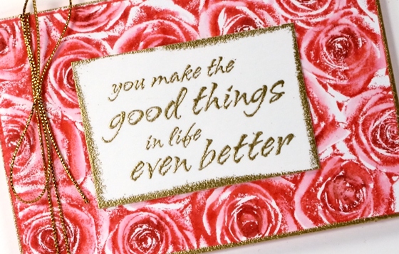
I finished it off with gold accents running the versamark pad around the edges of the sentiment panel, rose panel and card front then embossing those edges in gold powder.
The stamp itself is very detailed so it doesn’t need too much in the way of colouring but I was happy to come up with techniques that gave me the option of sharper images or softer blended images.
Supplies
Stamps: Roses, Bright Blossoms vol 1 & 2 (Darkroom Door)
Inks: versamark, versafine onyx black & crimson red, memento love letter ink, memento rhubarb stalk marker (Tsukineko) Victorian Velvet & Aged Mahogany distress stains (Ranger)
Papers: hot pressed watercolour paper, neenah solar white & epic black cardstock
Also: gold & clear embossing powder, gingham ribbon, burgandy satin ribbon, nuvo black ebony crystal drops, gold cord
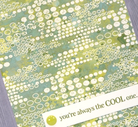
Distress Oxide Trials – one or two colours
Posted: May 5, 2017 Filed under: Blips, Felicity, Shades, Triple Banner | Tags: distress oxide inks, Penny Black creative dies, Penny Black stamps, WOW embossing powders 15 Comments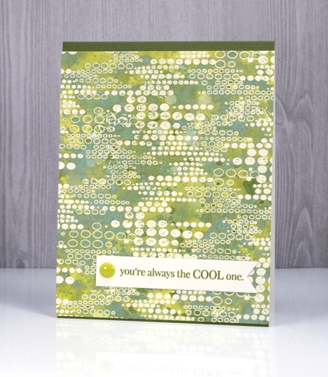
As I’ve been reading your comments about distress oxide inks I have noticed some of you are not sure you want them so have held off or only bought one or two to try. I decided to see what I could do with just one or two colours. I’ve been having so much fun with about half the colours I haven’t even opened them all yet and sadly spiced marmalade is currently hiding somewhere in my messy busy and productive workroom. All that to say, if you only have one or two colours, do some experimenting with them anyway; you might be surprised.
This green themed card is inked with only peeled paint distress oxide ink and yet there is a light and dark teal green, and dark and light olive tones as well. I was pretty impressed. I think the key to this effect is in the layering of colour. I pressed my ink pad on my craft mat, spritzed the ink then swiped my embossed panel through the ink. Colour only partially filled the panel; I dried it then repeated the process over and over. Each layer of ink reacts with the ink already on the paper and the un-inked areas on the paper. I also did some splattering of ink and water and some dabbing of water with a paper towel to lift a bit of colour. Because my panel was embossed I had to be careful not to reheat the embossing too much so I kept the heat tool moving. I love the effect around this ‘blips’ background stamp. A friend of mine used this stamp with great results recently by sprinkling brusho over the embossed image. Seeing her lovely card reminded me I had this stamp tucked away.
My second card uses only two distress oxide inks, worn lipstick and fired brick. I was hoping to do cards in just one colour but I wasn’t getting the same variety of colours from worn lipstick. My guess is that I spoiled my chances by covering the whole panel with my first layer of diluted ink rather than just part of the panel. I did manage to build up some different pinks over the top of the first layer but the differences were not as dramatic as shown on the green above. I will try again and use the same partial inking technique over and over and see what happens.
I did still manage to get some nice colour trapped inside the embossing creating light and dark petals and leaves. To provide just a bit more contrast I swiped it through some fired brick diluted ink a few times. When I press my ink on my craft mat then spritz it lightly it forms little beads of ink. Swiping through them spreads colour across the panel but pressing the paper down on top picks up little dots of ink, another cool effect I think.
I finished both cards with embossed sentiment banners and a few embellishments.
I have a growing list of suggestions from readers to try next week. Thanks for all your encouragement, tips and questions.
Supplies
Stamps: Felicity, Blips, Amazing!, Special Thoughts (PB)
Dies: Triple Banner, Shades
Paper: hot pressed watercolour paper, Neenah natural white and epic black cardstock
Inks: versamark (Tsukineko) Distress oxide peeled paint, worn lipstick, fired brick (Ranger)
Also: WOW clear embossing powder, Studio Katia sparkling crystals, Simple stories enamel dots
Sweet perfume
Posted: May 2, 2017 Filed under: Sweet Perfume | Tags: Faber-Castell Albrecht Durer Watercolour pencils, Penny Black stamps, WOW embossing powders 19 Comments
This panel is another I coloured while away in Toronto. I took my watercolour pencils, some brushes and several stamped panels, some embossed others just stamped in light colours to paint over. I did a ton of walking and exploring while there but also met up with my daughter in coffee shops during the day as she was working on a thesis most of the time. She sat at her laptop, I painted for a while, drunk some tea then headed out exploring again.
I have already posted a card featuring this image stamped on black cardstock. This one was not stamped on black; it was embossed on hot pressed watercolour paper. I did all the painting with my watercolour pencils filling the flowers with pinks and purples and the leaves with a few shades of green. When I had finished there were a few spaces between flowers with no colour at all. I decided to paint them black. It really did not look very good but I packed it away and moved onto something else. When I came home and took some time to turn my panels into cards I trimmed this one back so the flowers were cropped on all sides then tried several coloured mats to frame it. The black card base ended up being the best option. Those few little black sections on the coloured panel tied in with the card base nicely. I also tried a few sentiments but ended up going without. On the inside I have glued a pale pink panel to write on.

Thanks for dropping by; I’ll be back with my next distress oxide trial tomorrow, I think it is my favourite so far.
Supplies:
Stamps: Sweet Perfume (PB)
Pencils: Albrecht Durer watercolour pencils (Faber Castell)
Ink: Versamark ink
Paper: hot pressed watercolour paper, Neenah Epic black cardstock
Also: gold embossing powders, gold organza ribbon


