
Roses three ways
Posted: June 7, 2017 Filed under: Bright Blossoms vol 1&2, Roses | Tags: Darkroom Door stamps, Ranger Distress stains, Tsukineko Memento inks, WOW embossing powders 5 Comments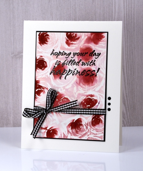
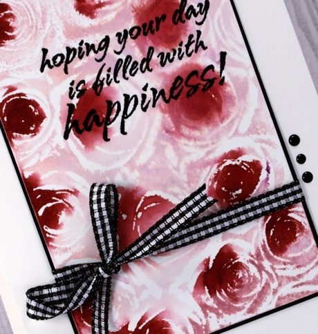
I love to use distress stains applied with the sponge dauber so I had to try them with this stamp from Darkroom Door. I tried two other techniques shown further down in the post and taught a couple more techniques in my most recent class. For the card above I used a stamp positioner so I could add one colour at a time. I inked the Roses stamp with Victorian velvet and stamped on hot pressed watercolour paper. I then dabbed the Aged Mahogany stain on the centres of the Roses in the stamp and and stamped again. The colours blended as both were wet. I chose to make all the accents black, adding an embossed sentiment from Bright Blossoms vol 1, a black mat, b&w gingham ribbon and three dots of black crystal drops.
I stuck with the same two distress stains for the next card but adding them over the embossed image created the negative of the one above.
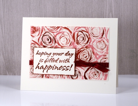
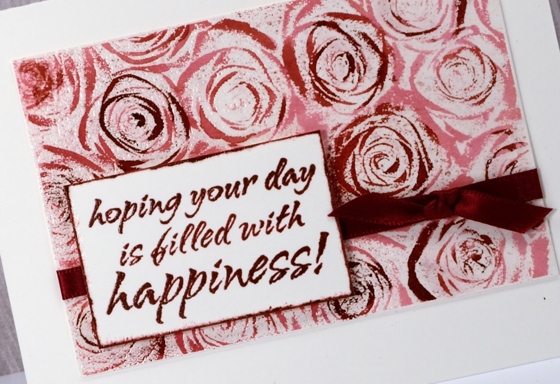
I painted Victorian velvet stain over the whole embossed image then added aged mahogany with a paintbrush here and there to create darker roses or just darker accents. I finished it off again with a ribbon and embossed sentiment, framing the sentiment by swiping the crimson red ink around the edges of the panel then embossing in clear powder.
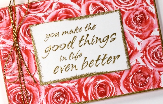
My third technique was done with Memento ink but would work well with any dye based water soluble ink. I covered the stamp with memento love letter ink then darkened the centres of the roses with a rhubarb stalk marker, spritzed the stamp lightly and stamped it on hot pressed watercolour paper.
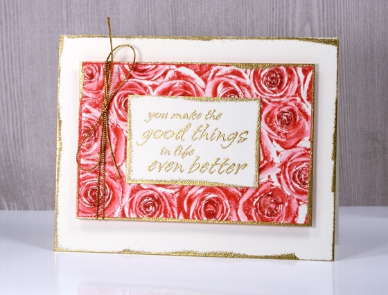
I used a small round watercolour brush (or water brush, can’t remember) to blend the stamped ink. This gave the petals a soft pink colour, left the stamped areas as dark shadows and in a few places where I didn’t blend at all there are some contrasting white areas.
I finished it off with gold accents running the versamark pad around the edges of the sentiment panel, rose panel and card front then embossing those edges in gold powder.
The stamp itself is very detailed so it doesn’t need too much in the way of colouring but I was happy to come up with techniques that gave me the option of sharper images or softer blended images.
Supplies
Stamps: Roses, Bright Blossoms vol 1 & 2 (Darkroom Door)
Inks: versamark, versafine onyx black & crimson red, memento love letter ink, memento rhubarb stalk marker (Tsukineko) Victorian Velvet & Aged Mahogany distress stains (Ranger)
Papers: hot pressed watercolour paper, neenah solar white & epic black cardstock
Also: gold & clear embossing powder, gingham ribbon, burgandy satin ribbon, nuvo black ebony crystal drops, gold cord


all three versions are eye-poppingly gorgeous! Spell-check doesn’t like that word, but it is perfectly descriptive. I love that you do all the experimenting for us, Heather!
Yes, I agree. My fave is the last card. Beautiful work.
They are all beautiful Heather but I think that the colours and the definition in the last is definitely my favourite. x
Wow amazing cards all 3 of them but the 3rd one looks like a photograph its incredible! I’ll have to try this technique too. Thanks for sharing!
Brilliant Heather, you’re so imaginative!!
Thanks for sharing,
Shaz in Oz.x
http://calligraphycards-shazinoz.blogspot.com.au/