
Gone Kayaking
Posted: September 11, 2024 Filed under: Echidna Studios, Gone Kayaking | Tags: Echidna Studios, Fabriano Watercolour Paper 7 Comments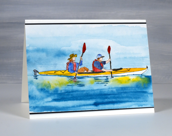
Not only is this a delightful digital stamp from Echidna Studios, it could also be a depiction of what I am doing as you read this post. Even though I am writing this post before I leave home, when it is published I will be camping and could be kayaking, biking, hiking, reading or snoozing in the hammock, who knows?
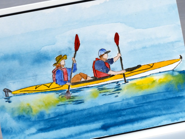
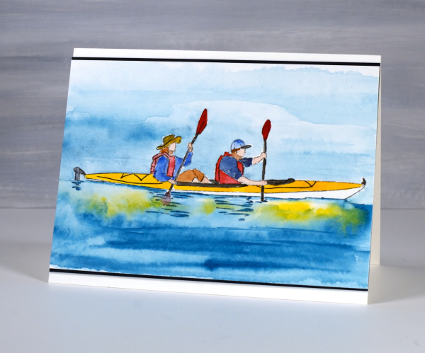
This two-person kayaking image is one of the digital designs in the ‘Gone Kayaking‘ set designed by my daughter. The other image features a single kayak. I printed the image on hot pressed watercolour paper then painted it with Sennelier watercolour paints. I sometimes finish off a watercolour with a finetip marker adding fine lines or definition which might have got lost in the painting process.
Thanks for dropping in, I’ll be back with more art when I return from my camping get-away.
Window Box
Posted: August 8, 2024 Filed under: Echidna Studios, Finetec paints, Stampin Up, Window box | Tags: Coliro paints, digital stamps, Echidna Studios, Fabriano Watercolour Paper, Finetec artist mica watercolour paint, Staedtler watercolour brush pens, Stampin Up 4 Comments
Don’t you just want a window like this? With blooming flowers not wilting in the heat! This digital stamp is called ‘Window Box’ and it is new from Echidna Studios. My daughter designed it and there are three files to play with in the set, the image you see here as well as a separate window image and a separate window box image. I’m looking forward to trying the window box image by itself enlarged to fill a card front.
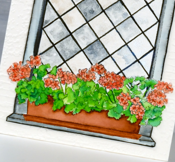
I printed the image on hot pressed watercolour paper and used Staedtler watercolour brush markers to colour the flowers, leaves, box and window frame. The window panes I painted with Coliro pearlcolors from Finetec. Some pearl or metallic paints are ‘interference’ paints which look very different on black paper as compared to white. The blue pearl paint I used from the ‘Ocean’ set looks very blue on black paper but looked silvery grey on white even with a touch of cream depending on the way the light hits it. This was exactly the effect I wanted so the panes appear like old leadlight windows where each pane reflects the light differently.
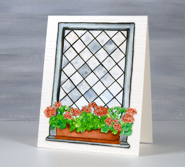
I coloured the leaves with two greens, blending them together with water and a paintbrush. I used the same technique for the flowers with a coral and a peach coloured marker. The planter was painted with a terracotta colour and the frame with black, diluted to appear grey in places. I wasn’t planning to cut this image out but it really needed to be attached to an embossed panel of aged brick. I’m sure you understand. The embossing folder is ‘exposed brick’ from Stampin Up. This post includes affiliate links from Foiled Fox. If you buy through these links I receive a small commission at no extra cost to you.
Bikes, old & new
Posted: July 11, 2024 Filed under: AALL & Create, city bike, Echidna Studios | Tags: AALL & Create, Echidna Studios, Fabriano Watercolour Paper, sennelier watercolours 8 Comments
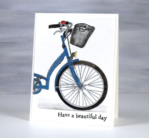
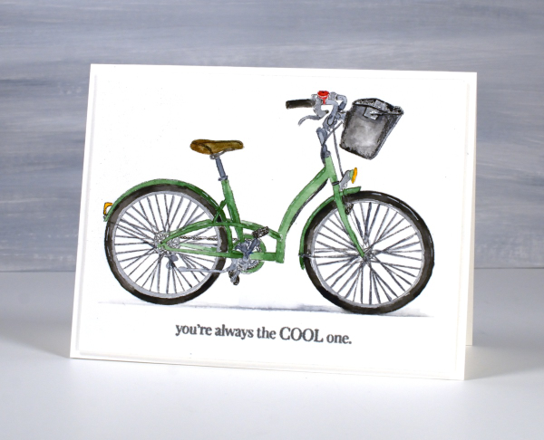
The green bike above is a new digital bike stamp designed by my daughter. As with many of her digital designs, she snapped a photo, then turned it into a ‘storybook style’ outline drawing. It’s called City Bike and is available in the Echidna Studios etsy store as a digital stamp (not cutting file).
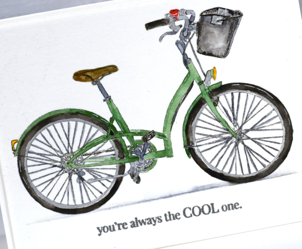
I printed the bike in two sizes on hot pressed watercolour paper so I could paint it and turn it into two cards, one landscape orientation and the second, a portrait-oriented close up of the front of the bike.
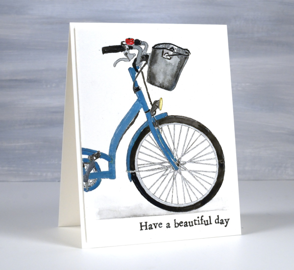
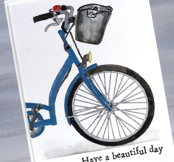
I did some of the painting with Sennelier watercolour paints but I also used a silver gel pen for the spokes and rims, metallic brush markers for the blue bike and a very fine tip black marker to go over some of the little details.
I just so happen to have a new bike of my own which means bikes are on my mind. I picked it up a few days ago and it’s definitely more modern than the one of the cards. I am pretty excited; it’s been a while since I’ve had a bike of my own and I’ve never had a new one. I have to tell you the colour is ‘sea sparkle’ which made me smile, sounds like an ink pad colour!

Back to the cards – I cut both panels with WaffleFlower A2 layering dies then added an extra panel of thick cardstock underneath to lift the picture panel a bit. I added the Penny Black ‘cool one’ sentiment and the beautiful day sentiment from the AALL & Create set ‘Everyday Sentiments’. You’ll be seeing more of the AALL & Create sentiments as they are a quirky typewriter font which I love.
Are you a bike rider? Let me know what your favourite outdoor activity is. As you may have guessed this post includes affiliate links from Foiled Fox. If you buy through these links I receive a small commission at no extra cost to you. Click over to the Echidna Studios store to see more delightful designs like this sweet bike.
Cornflowers
Posted: June 20, 2024 Filed under: AALL & Create, cornflower, Foiled Fox store, The Foiled Fox | Tags: AALL & Create, Fabriano Watercolour Paper, Ranger Distress inks 7 Comments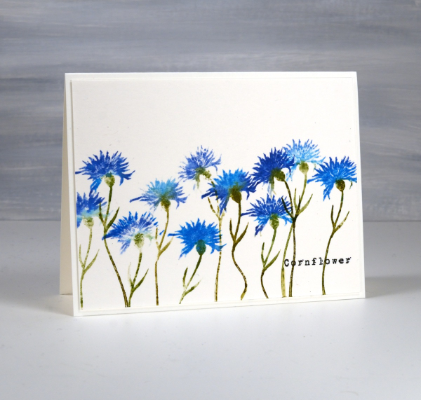
I have cornflowers growing in my garden but they are still quite small seedlings so no signs of flowers at this stage. I am hoping they will bloom some time this summer. Meanwhile I’ve been stamping some, in blue of course. I had blue cornflowers in my wedding bouquet and flower crown so they are quite special to me.
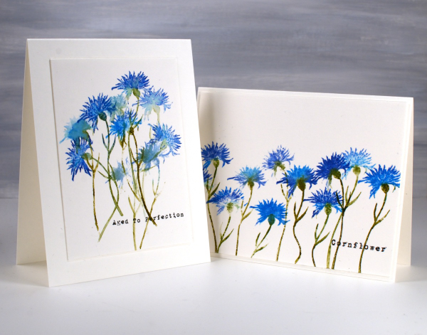
I’ve teamed up with the Foiled Fox to bring you this post and it is wonderful to be collaborating with them again. The stamps featured on today’s cards are from AALL & Create; the set is called ‘Cornflower‘ and includes two flower stamps and two sentiments.
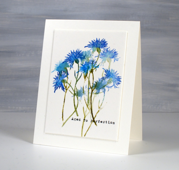
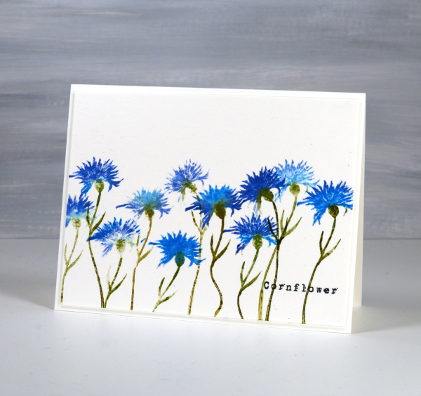
I’ve stamped the solid cornflower stamp repeatedly to create these two cards using a couple of techniques to make the flowers look different. The stem on the stamp is thin and bendable so I was able to make the flowers lean left or right and even have a wiggle in the stem! I inked the petals with both prize ribbon and salty ocean distress inks, spritzing the stamp before pressing it on the hot pressed watercolour panel so the inks blended. I also did some second generation stamping to get paler impressions of the flowers.
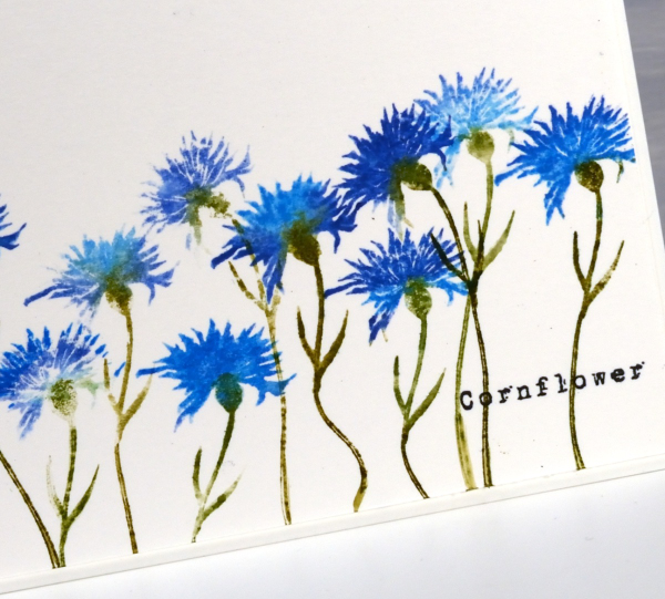
You might know that I love typewriter font so I was very happy to see a couple of word stamps in a slightly distressed typewriter font. I added them with versafine clair nocturne ink because it is such a crisp reliable ink. Thanks for dropping in; I hope you will go and check out the wealth of inspiration on the Foiled Fox blog and have a browse around their lovely online store while you’re there. (Naturally this post includes affiliate links, feel free to use them.)
Dancing Pink Daisies
Posted: April 24, 2024 Filed under: dancing daisies, Penny Black | Tags: Fabriano Watercolour Paper, Papertrey ink, Penny Black stamps 4 Comments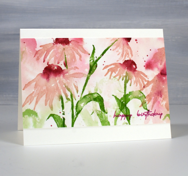
April showers bring May flowers I’ve heard so the showers we’re having today should only help bring some colour to the garden in the coming weeks. The dancing daisies stamp from Penny Black is such a beauty and I love to create a sense of movement with layered stamping.
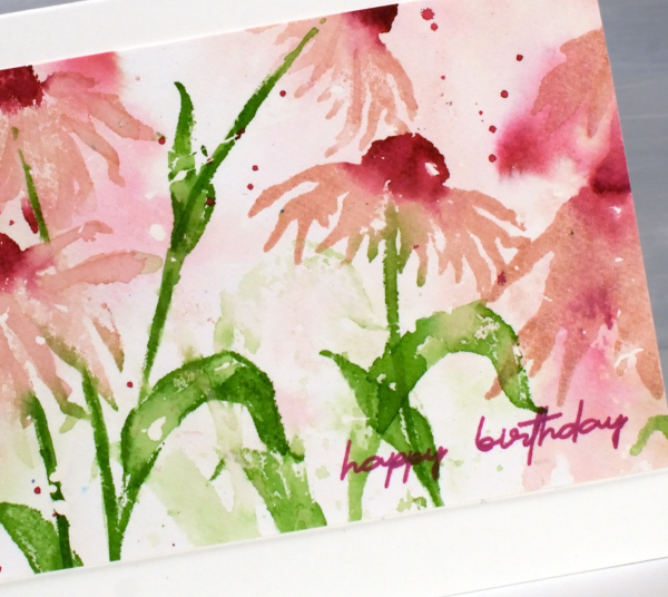
I created this panel on hot pressed watercolour paper a few years back as added inspiration for my Floral Faves online class but it was sitting in a folder not being enjoyed. I recently trimmed the ends off, turned it into a card and it is on it’s way to a friend for her birthday.
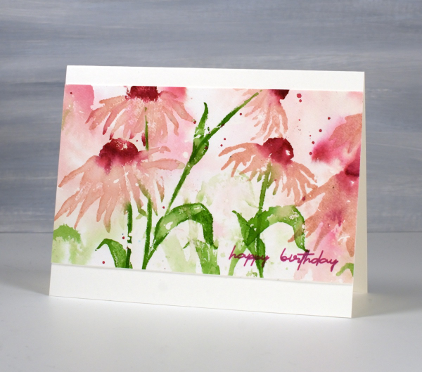
I only used three ink colours and relied on water to dilute their intensity along with second generation stamping for paler background hues. I used sweet blush, scarlet jewel and new leaf inks from Papertrey ink but you could do something similar with any watersoluble inks you have. This post includes affiliate links from Foiled Fox. If you buy through these links I receive a small commission at no extra cost to you.
Standing Ducks
Posted: March 12, 2024 Filed under: Echidna Studios, sennelier watercolours, standing ducks | Tags: Echidna Studios, Faber-Castell Polychromos Colour Pencil, Fabriano Watercolour Paper, sennelier watercolours 5 Comments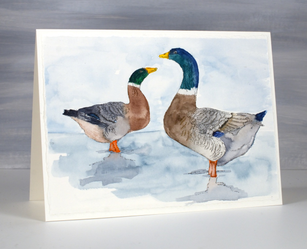
Introducing ‘standing ducks‘, a lovely digital stamp set from Echidna Studios. The weather has turned much warmer round here so there are puddles instead of snow to be seen; the type of weather where you might see ducks standing or swimming around. It is too early for ducklings but in the past we have had to slow down and stop for duck families on the busy road behind our house.

I printed both ducks from the set on hot pressed watercolour paper then painted them with Sennelier watercolour paints. I added some finishing touches with coloured pencils. I also printed the left facing duck on some pastel paper as I received a set of pastel pencils for my birthday and have started learning how to use them. As you can imagine pastel is very soft so it is fun to blend but easy to smudge. When I have done a little more learning and practicing I hope to share some pastel pencil colouring.
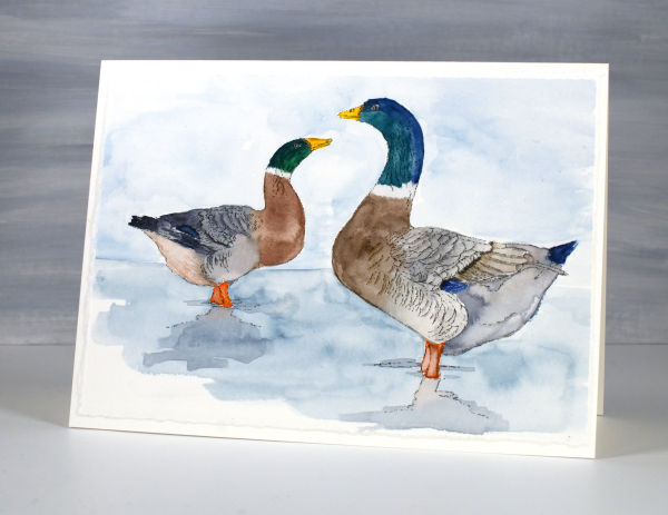
This card is another ‘larger than usual card’ measuring just over 5″ x 7″. The piece of watercolour paper I printed on had one deckled edge so I tore the other three edges to keep a deckled look round the whole panel.
Tulips & more tulips
Posted: February 21, 2024 Filed under: Echidna Studios, sennelier watercolours, tulip background, tulip set, Watercolour | Tags: digital stamps, Echidna Studios, Faber-Castell Albrecht Durer Watercolour pencils, Faber-Castell Polychromos Colour Pencil, Fabriano Watercolour Paper, sennelier watercolours 11 Comments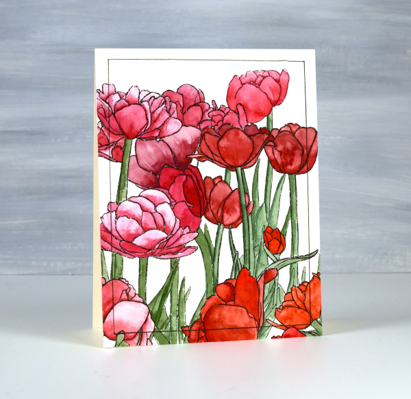
If there are tulips already blooming where you live you must let me know in the comments! It will be another two or three months before they bloom around here. All the more reason to have some blooming here on the blog. The group you see on the card above are part of a new digital stamp called ‘tulip background‘ from Echidna Studios. The whole image is a landscape oriented design and I printed it on hot pressed watercolour paper to be 8½” wide which gave me plenty of choice when deciding which part to use on a portrait oriented card.

I used Sennelier watercolours to paint the design using various mixes of four different reds and pinky red paints. I also used one of the reds to give the green paint a more muted realistic tone. Once I had painted all the tulips and stems I used polychromos pencils to add extra shading and shadow. This is a technique I learnt from Kathy Racoosin and it always adds to the finished panel. I ruled a narrow black line around the panel to frame it.

The flowers below are from a co-ordinating digital set simply called ‘tulip set‘ also from Echidna Studios. The set includes three individual tulips. I didn’t paint this one, my daughter did, using watercolour pencils. She also fussy cut each of the three tulips to create a pretty layered arrangement. This post includes an affiliate link to The Foiled Fox, if you use it I receive a small commission at no extra cost to you.

Calla Lilies
Posted: February 12, 2024 Filed under: calla lilies, Coloured pencil, Echidna Studios | Tags: Echidna Studios, Faber-Castell Polychromos Colour Pencil, Fabriano Watercolour Paper, sakura Koi watercolor brush pens 11 Comments
Time for new digital stamps from Echidna Studios and these two, Calla Lilies, are stunners. Once again my daughter drew the designs from one of her own photos. I printed this first one on kraft paper and coloured it with Faber Castell polychromos pencils.

My palette was quite limited as I completed most of the colouring with a pink, a green and a white. When most of the colouring was complete I used a darker pink, a darker green and a black to add final shadows and shading.

I used watercolour techniques to paint the second lily design after printing it on hot pressed watercolour paper.
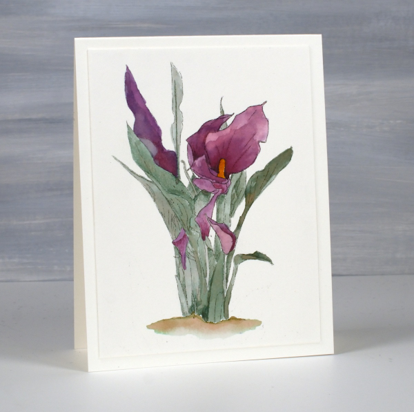
I found a photo on line to give me some colour inspiration and worked with watercolour brush pens. to get the wine colour I mixed purple and red on a glass mat then picked up the ink with a paintbrush. When using two colours in this way it is easy to get different tones for the shadows and variations just by adding more of either the purple or the red to the mix. I used one green mixed with a small amount of the same red brush pen ink to give me a more muted tone.
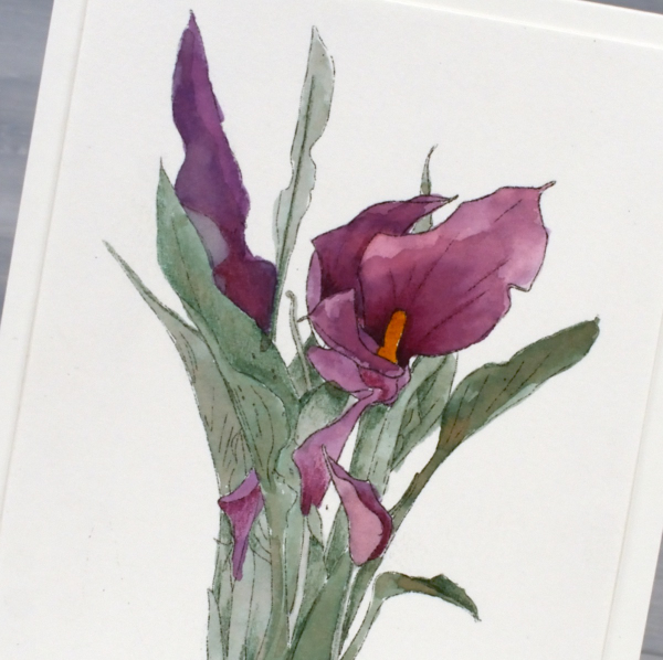
To see another colour scheme and orientation pop over to Echidna Studios instagram and take a look. I chose not to add sentiments even though they would make nice Easter cards. I think they would also be suitable sympathy cards so for now I’m leaving them blank. This post includes affiliate links to The Foiled Fox, if you use them I receive a small commission at no extra cost to you.

Postage Stamp Tulips
Posted: February 7, 2024 Filed under: Darkroom Door, Elizabeth Craft Designs, global postmarks, online class, Penny Black, postage stamps, splendiferous | Tags: Darkroom Door stamps, Elizabeth Craft Designs, Fabriano Watercolour Paper, online class, Penny Black stamps 11 Comments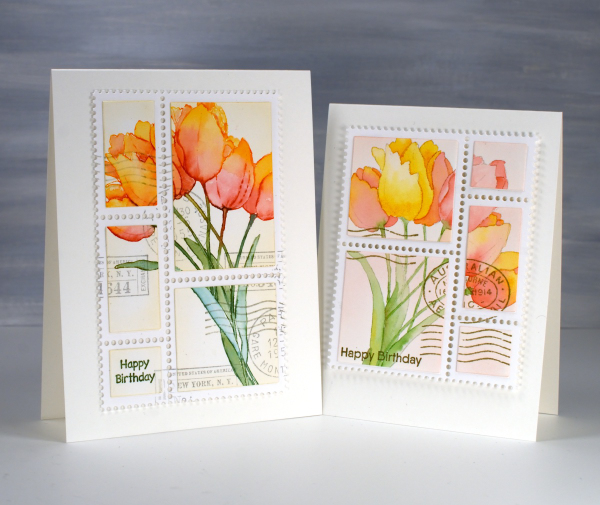
I’ve been inspired so many times by my talented friend Stamping Matilda, aka Godelieve Tijskens including her delightful faux postage stamps. I’ve wanted to make some for a while so I treated myself to a fancy die from Elizabeth Craft Designs. There are many ways to make faux postage stamps including with a clever tracing wheel usually use for sewing.

Once I had my die on hand I had to decide what to make my stamps from. I decided not to stamp something especially for the faux stamps. Instead I started using patterned papers and stamped panels that were sitting around looking pretty but not serving any other purpose. The two tulip panels featured on today’s cards were made for my online class Floral Faves. There is a lesson in the class where I show a range of methods for no-line watercolour. In designing and filming the class I created quite a few no-line watercolour panels that were never turned into cards…until now. I stamped the tulips using the Penny Black stamp, ‘Splendiferous‘.

The ‘postage stamps‘ die cuts a large panel of perforated stamps all joined together. There are also small dies in the set that cut rectangles to attach inside the perforated sections. Once I had my tulip sections attached I used Darkroom Door set, ‘global postmarks‘ to add postmarks. I popped up my faux postage stamps on one A4 card and one slightly smaller card. Of course I proceeded to search my pile of possibility for more panels to turn into faux stamps! Today’s post features an affiliate link to Scrap’n’Stamp. If you buy through this link I receive a small commission at no extra cost to you.
Like a box of chocolates
Posted: January 17, 2024 Filed under: Echidna Studios, valentines chocolates | Tags: Echidna Studios, Faber-Castell Polychromos Colour Pencil, Fabriano Watercolour Paper, sennelier watercolours 6 Comments
We have been enjoying a rather nice selection of chocolates at our place; the Christmas stash is lasting well! Not long after Christmas my husband and I celebrated our anniversary and it is only a month before our February birthdays so we’ve never really been big on celebrating valentines day. That being said, I loved painting this box of chocolates. It wasn’t better than eating chocolate but it was very satisfying all the same. The digital image is from the Valentines Chocolate stamp set which includes two images; the other one has chocolate coated strawberries. And yes they are from Echidna Studios, more of my daughter’s art work.

I printed the image on hot pressed watercolour paper and painted with a limited palette of browns, paynes grey, pink and yellow. I used a white gel pen to add some details and did extra shading with coloured pencils after all the painting was completed.
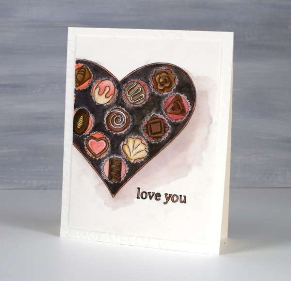
It’s not very obvious but you might just be able to see the texture of an embossing folder on the card base. I used a large cuttlebug folder with curly patterns, subtle but cute. Thanks for dropping by. May your chocolate stash be ever enough! Today’s post features affiliate links to The Foiled Fox. If you buy through these links I receive a small commission at no extra cost to you.












