
Christmas Storefront
Posted: December 21, 2023 Filed under: Christmas bush, Christmas storefront, Darkroom Door | Tags: Darkroom Door stamps, digital stamps, Echidna Studios, Fabriano Watercolour Paper 3 Comments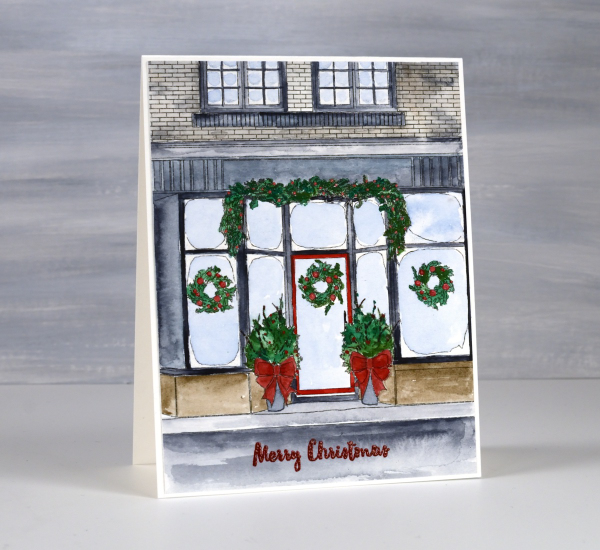
This delightful Christmas storefront is a digital design from Echidna Studios. Once again my daughter took a photo and sketched it into a digital stamp. I was delighted with the result as I had taken photos of a similar store front in Wakefield Quebec last January and sadly my photos did not represent well the beauty of the decorated store.
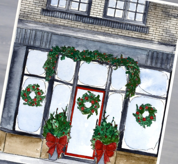
I printed the image on hot pressed watercolour paper then painted the scene with Sennelier watercolours. I kept the palette simple, painting the building in pale brown and Payne’s grey so the decorations would stand out. I don’t think you can see in the photo but all the icy edges of the window are coloured with wink of stella markers both the white and the clear, for a little sparkle.
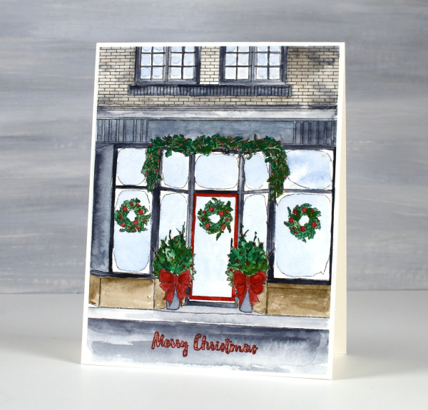
Once finished, the grey in the foreground seemed like a good place for the Darkroom Door sentiment from the ‘Christmas Bush‘ set stamped and embossed in red to match the bows and berries.
I mentioned in one of my posts that I sprained my ankle in November. An aircast has made it possible to walk on it but subsequent x-rays showed a fracture so it has now been in an aircast for over five weeks. I had a follow up and more x-rays today and have been approved to walk around without the aircast at home. So it is getting better…literally one step at a time. As you can imagine I haven’t really been strolling around pretty little stores this year, my family has been running errands for me and there have been a few deliveries to our door.
Holly Leaves – framed
Posted: December 12, 2023 Filed under: Echidna Studios, holly leaves, Karin brushmarkers | Tags: Echidna Studios, Fabriano Watercolour Paper, Karin brushmarkers, Penny Black stamps, sennelier watercolours 1 Comment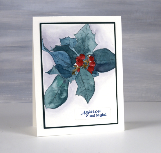
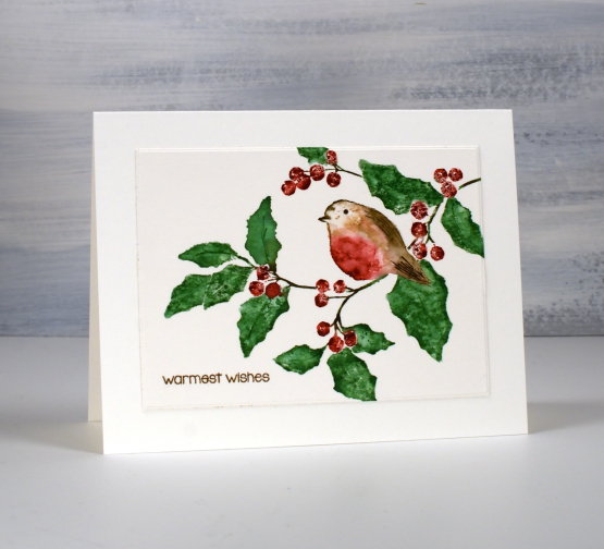
This is my second pair of cards featuring the new ‘holly leaves‘ digital stamp set from Echidna Studios. In an earlier post I shared the foiled cards which were overfoiled by accident but came out looking very shimmery and still accepted watercolour. For today’s cards I printed the holly images larger and didn’t foil them. I once again used Fabriano hot pressed watercolour paper and Sennelier watercolours to paint the two images.
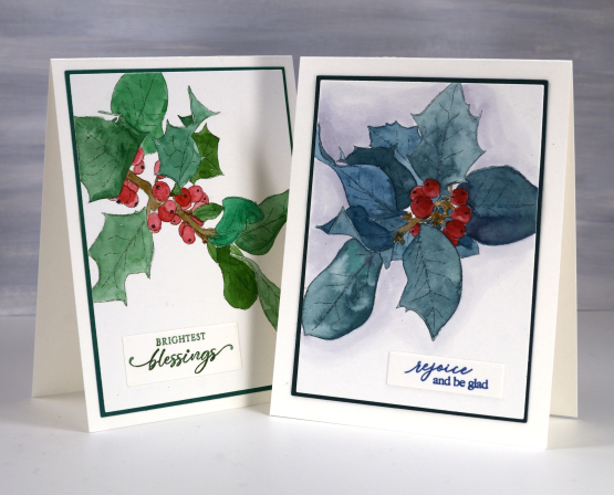
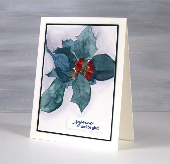
If you remember the foiled post you might notice I made the same colour choices, an unrealistic blue-green and a more realistic green-green! A little hint if you are painting berries, it is always nice to have a darker and a lighter side to suggest dimension but even without that a little black or white dot can make them immediately more realistic.
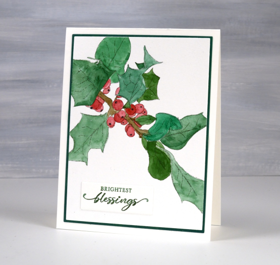
I chose to mat these panels and found a suitable blue green but ended up blending mowed lawn distress ink over a piece of light green cardstock to create a matching green for the card above. Blending ink to create matching mats is something Ardyth does all them time. She is full of clever strategies. I chose to add a shadowy background around the blue-green leaves using a grey Karin marker and water to dilute and spread the ink. The sentiments are from PB ‘jolly snippets‘ and ‘light of Christmas‘ sets.
Today’s post features affiliate links to The Foiled Fox. If you buy through these links I receive a small commission at no extra cost to you.
Berry Branches
Posted: December 11, 2023 Filed under: a berry branch, Penny Black | Tags: Fabriano Watercolour Paper, Penny Black stamps, Ranger Distress inks 10 Comments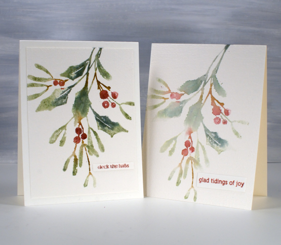
It’s another old favourite, maybe I say that a lot but when it comes to Penny Black brushstroke foliage stamps need I say more? This one is called ‘a berry branch‘ and I’ve featured it once a few years back on two different cards. How is that possible? I know it did turn up in classes a few years back and it was definitely part of this years ‘Painting with Stamps’ in-person class. Some of my previous posts have shown first and second generation prints from the same ‘inking’ and the two cards above are another example.
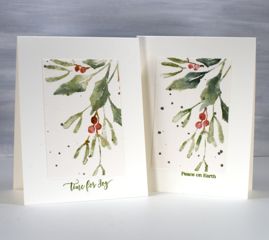
I keep the stamp in the stamp positioner and after stamping one panel I place another one in the same corner, spritz the still inky stamp and then stamp a paler more diluted impression. Often the second one ends up being my favourite. I used distress inks which work so well with added water.

When using this technique you can’t always control where the colours will blend into each other but I don’t let that worry me. I quite like the areas where green blends into brown into red.

Some of the panels got the splatter treatment, all were embossed with the canvas embossing folder and I added small PB sentiments either to the panel or just underneath it. Just one stamp but definitely a pretty one! Today’s post features affiliate links to The Foiled Fox. If you buy through these links I receive a small commission at no extra cost to you.
Holly Leaves – foiled
Posted: December 7, 2023 Filed under: Echidna Studios, holly leaves, Taylored Expressions | Tags: Echidna Studios, Fabriano Watercolour Paper, sennelier watercolours, Taylored Expressions 5 Comments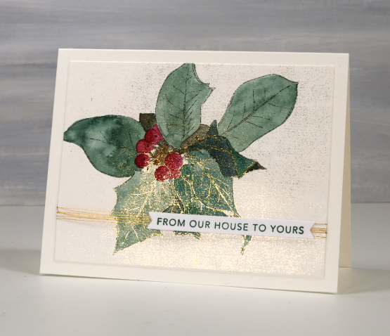
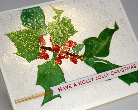
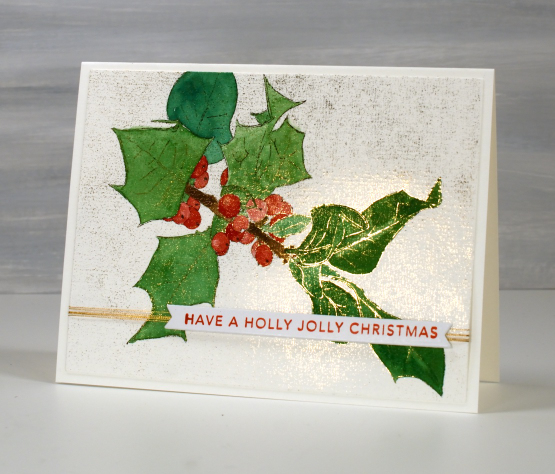
The foiling on these cards didn’t work properly yet here they are on display on my blog. I decided the foiling error was pretty enough to use anyway, I just can’t tell you for sure how to achieve this accidental look! The images are new digital stamps from Echidna Studios, called ‘Holly Leaves‘. I printed both images on hot pressed watercolour in my laser printer then foiled with gold foil. Whether it was a smudgy print or a different type of foil I’m not sure but foil attached to the background as well as the outline image.

As you can see, I was still able to watercolour the images using Sennelier watercolour paints. Even though the camera didn’t capture it, the whole outline image is foiled plus some speckling in the background.
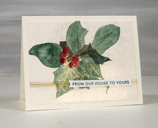
I’m not sure that holly comes in the blue green colour I chose for the card above but I like a bluey green so I keep choosing it on my projects. The green shown below might be more realistic.
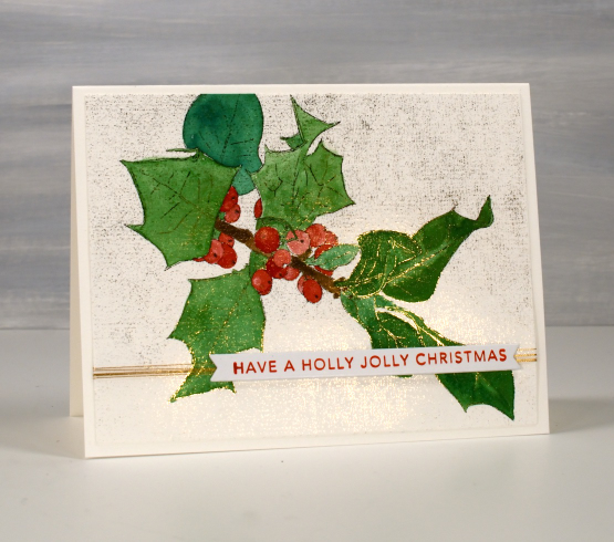
I added some gold metallic thread then finished both cards with Taylored Expressions sentiment strips.
I have also painted these holly images without foiling but I think this post is long enough so I will share those cards another day. I’ve noticed lately that when my posts are quite long an ad appears before the end of the post. Sadly I have no control over that. If I don’t want ads I have to pay extra to not have them. Just think of my posts like a magazine page, ads do pop up here and there.
I don’t make money from the ads but I do make a small commission if you click one of my links from Foiled Fox or Scrap’N’Stamp. When you buy a digital stamp or cutting file from Echidna Studios both my daughter and I get very excited and congratulate each other! You might have heard the line, ‘When you buy from a small business, an actual person does a little happy dance.’ We dance!
Old favourites
Posted: November 10, 2023 Filed under: Berry kissed, Penny Black, Uncategorized | Tags: Fabriano Watercolour Paper, Penny Black stamps, Tsukineko Memento inks 6 Comments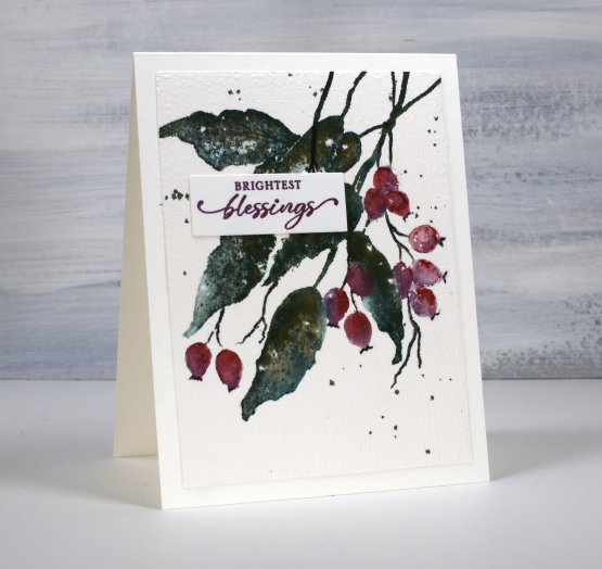
When I say old favourites I am talking in crafting years not harking back to my grandmother’s time. The PB stamp featured on today’s card is definitely a favourite, it’s called ‘berry kissed‘ and it’s been around a few years.
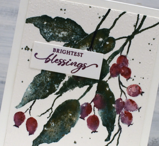
Another old favourite on this card is my often used technique of splattering masking fluid on my hot pressed watercolour paper before stamping or painting. After all the ink is added and dried I remove the masking fluid to reveal little white dots here and there which look like snow.
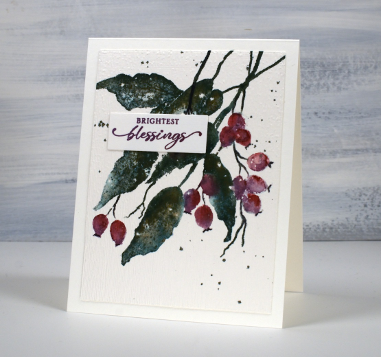
The final old favourite worth mentioning on this card is the ‘magic’ ink, memento northern pine. It is a dark green dye ink and when it is wet it bleeds into greens, blues and browns. I stamped the leaves with this ink then blended over them with a paintbrush and you can see all the different tones, especially in the close up photo. And yes, the placement of the sentiment does cover a few blotchy berries!
Today’s post features affiliate links to the following companies. If you buy through these links I receive a small commission at no extra cost to you. The Foiled Fox & Scrap’n’Stamp
Double Tweetings
Posted: November 3, 2023 Filed under: Penny Black, season's tweetings | Tags: Fabriano Watercolour Paper, Penny Black stamps, Ranger Distress inks 7 Comments
Today’s cards are a 2 for 1 technique. Using the PB stamp season’s tweetings I created both a bold and a soft version with only a little extra inking on the second generation impression. I worked on hot press watercolour paper with distress inks and markers. After stamping the first time I blended the leaves and bird with a paintbrush and water.
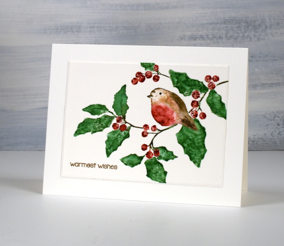
If you haven’t heard the term ‘second generation’ in regard to stamping it is simply the pale ghost image you get when you stamp a stamp a second time without re-inking. In this case I spritzed the stamp lightly with water before stamping a second time so the inks would not be too dry to leave an impression.
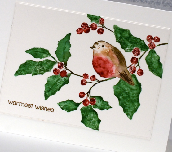
The second impression gave me the pale, slightly blotchy leaves which I quite liked so I dried the panel and added more ink to the bird with markers before stamping again. Of course working in a stamp positioner makes this very straight forward. The result is a bokeh type background with the bird prominent in the middle.

Many of my Christmas cards this year feature a one stamp design with loads of white space around the image. It is a bonus to get some two-for-one panels.
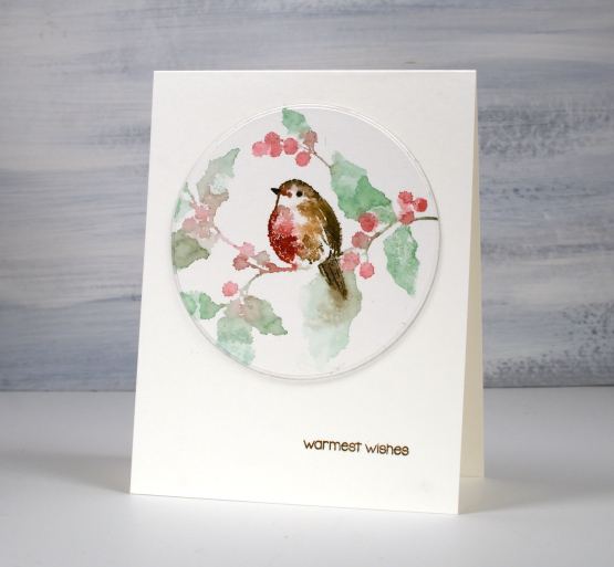
I finished both cards with a small sentiment from the PB set ‘holiday snippets’
Today’s post features affiliate links to The Foiled Fox. If you buy through these links I receive a small commission at no extra cost to you.
Just Trilling
Posted: October 30, 2023 Filed under: CAS, Penny Black, trilling trio | Tags: Fabriano Watercolour Paper, Penny Black stamps, Ranger Distress inks 7 Comments
These two sweet birds are from the Penny Black ‘trilling trio’ set. There is also a cardinal in the set. I made these cards as samples for my current ‘Painting with Stamps’ class. They are examples of when slow and steady wins the race. The stamps were in my stamp positioner and, starting with the palest colours I slowly added ink to the stamp a colour at a time, stamping after each application so as to not overwhelm the small image. I did some blending on the panel with a paintbrush but again my process was ‘little by little’.(Trilling Trio is available in both the US Foiled Fox store and Scrap n Stamp in Canada)
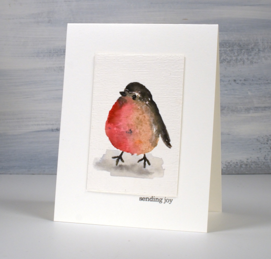
I do enjoy the clean look of a simple image on a plain card base but added just a little texture to these images with an embossing folder to create a distinction between the panel and the base.
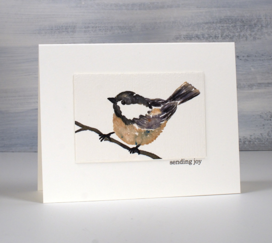
On the little chickadee above and below I stamped the large coloured sections in the stamp positioner then at the very end added some ‘feather texture’ with the fine tips of markers.
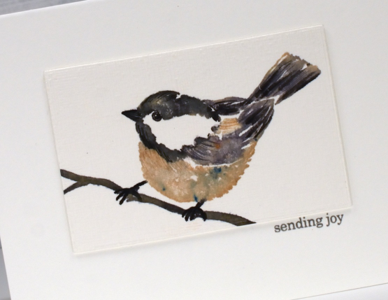
If you are working with bird stamps and your images are not quite coming alive I have found it helpful to use a fine tip pen to define the eye, adding the white dot back in if necessary with a white gel pen. I had not positioned this little chickadee well on my watercolour paper and it looked like it was falling backwards until I drew a simple twig with a marker to give it a reason to be at the odd angle I’d placed it! The tiny sentiment from PB ‘holiday snippets’ was just what I needed stamped in grey to keep it subtle.
Today’s post features affiliate links to the following companies. If you buy through these links I receive a small commission at no extra cost to you. The Foiled Fox & Scrap’n’Stamp
Scarlet Majesty
Posted: October 26, 2023 Filed under: Finetec paints, Penny Black, Scarlet Majesty | Tags: distress markers, Fabriano Watercolour Paper, Finetec artist mica watercolour paint, Penny Black stamps, Ranger Distress inks 7 Comments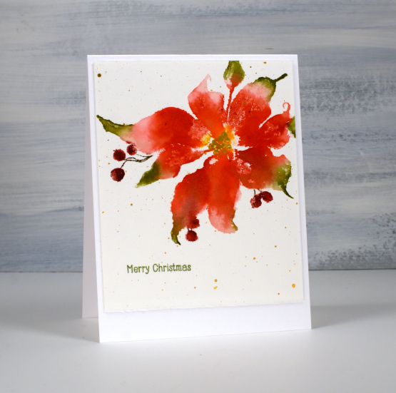
Penny Black has released a lovely selection of poinsettia stamps over the years but this one might just be my favourite (don’t tell the others). The endearing feature on this image is those curly ends on the petals. I just love how whimsical they look. This pretty poinsettia is called ‘scarlet majesty‘ and I have featured it in years gone by.
You might have noticed that I don’t have pictures of the products used in my projects at the end of my blog posts anymore. I decided to return to just linking to products in the written text of the post. Many of the links will still be affiliate links and when clicked will take you straight to one of the three stores where I earn affiliate income. Some of the links won’t be affiliate links, they will just be for your convenience.
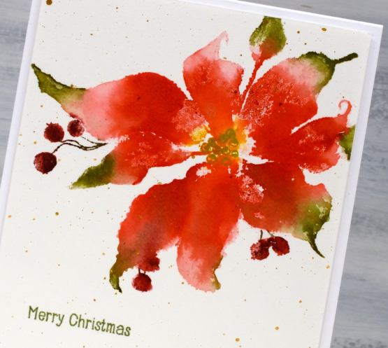
To create this panel I worked in a stamp positioner so I could work on one or two parts of the stamp at a time rather than try and get it right in one go. I used a couple of red distress inks to stamp the petals but wiped ink off the tips so I could ink them with green ink. I gave the stamp a spritz to get the inks moving and after stamping, blended from red to green with a paint brush. I also used some yellow ink in the centre of the poinsettia and later drew the seeds over the top with a gold gel pen.
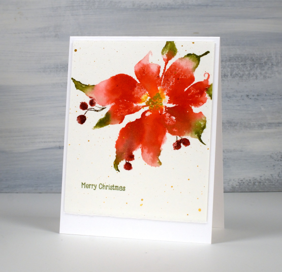
To ink those sweet little berries I switched to water-based markers. Once dry I splattered gold paint over the panel and added a little sentiment from the PB ‘holiday snippets’. As is my preference I worked on Fabriano hot pressed watercolour paper.
Thanks for dropping by today. I appreciate your support and love to read the kind messages you leave in the comments.
Today’s post features affiliate links to The Foiled Fox. If you buy through these links I receive a small commission at no extra cost to you.
Warm Reception
Posted: October 20, 2023 Filed under: Penny Black, warm reception | Tags: Artline Stix brush markers, Fabriano Watercolour Paper, Penny Black stamps, Ranger Distress inks 7 Comments
I continue to enjoy the gorgeous autumn colours outdoors these days but there will be a few wintry scenes appearing as I create cards for the coming months. This sweet house, a Penny Black stamp called ‘warm reception‘, is similar to several we see on our drive to church. They are lovely houses and look impressive during all the seasons including when they are surrounded by snow.
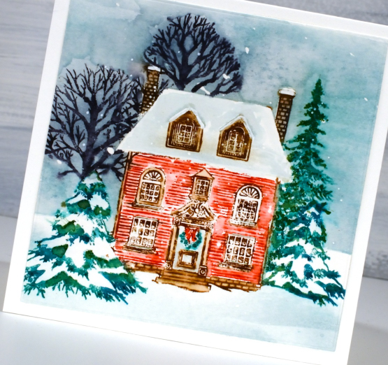
I did all the inking of the stamp with watersoluble markers with the stamp in a misti so I could stamp, re-ink and stamp again as needed. I was experimenting with a brand of markers I haven’t used direct to stamp before. I originally bought them for brush lettering. If you are in Australia you’ll be able to find them but elsewhere in the world they are not so common. The brand is Artline and the shell of each marker looks a bit like lego! I inked the house and trees with red, brown, green and black using the side of the brush nib to apply ink to the stamp. I spritzed the stamp lightly then stamped on hot pressed watercolour paper. After I had stamped everything I blended some of the ink with a brush and water to fill the walls of the house, tree branches and foliage.
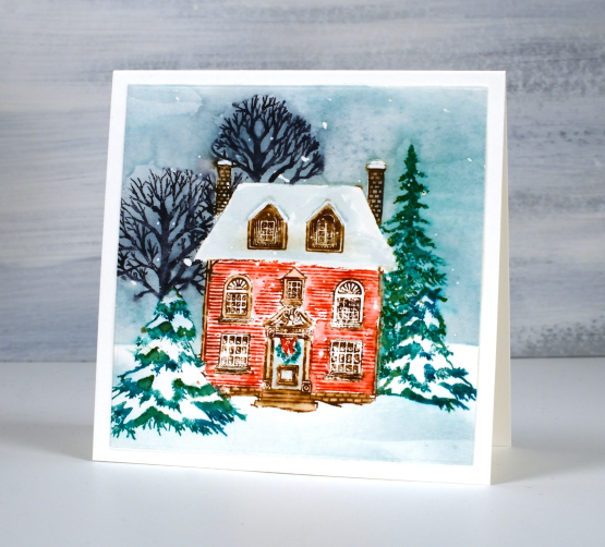
To add background I stamped and cut a simple mask of the house from post-it note and lay it over the house so I could use a blending brush and speckled egg distress ink to fill the background sky. Once I had applied the ink I painted over it with water, just loosely, to give it the same watercolour look the rest of the image had.
I have mentioned before that distress markers have been discontinued, that’s why I wanted to try the Artline for inking stamps. I also have a pack of Staedtler water based brush pens that work well.
Today’s post features affiliate links to The Foiled Fox . If you buy through these links I receive a small commission at no extra cost to you.
Cape Wickham Lighthouse
Posted: October 13, 2023 Filed under: cape wickham lighthouse, Echidna Studios, Stamped Landscapes | Tags: Echidna Studios, Fabriano Watercolour Paper, sennelier watercolours 10 Comments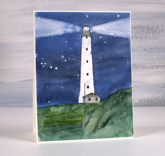
Recently I posted a card featuring a bridge in Oregon and asked if anyone knew or had visited the bridge. It was lovely to hear from people who lived in Oregon or had visited. One person lived very near the bridge. I would love to hear from people who have seen today’s lighthouse, it is quite remote. This image is another Echidna Studios digital stamp and is special to me for several reasons.
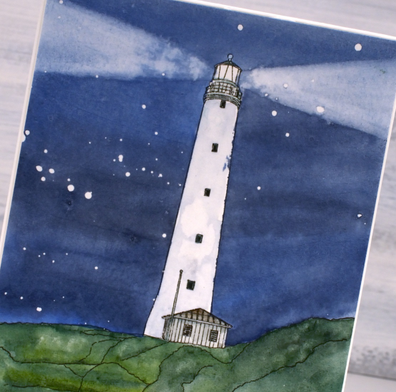
The lighthouse is called the Cape Wickham Lighthouse and it is on King Island in Australia. My daughter created the digital design from a photo but it wasn’t one of her photos; she’s never been there. The reference photo is from a slide my dad took in 1963 when our family lived on King Island. I was born there and at age 2 had my photo taken in front of the lighthouse. So you see there is input from three generations of my family in this card!
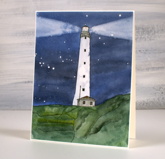
I printed the digital image on hot pressed watercolour paper, masked the lighthouse with a few strips of painter’s tape then splattered masking fluid over the sky. I painted the sky with Sennelier watercolours and while it was still damp painted removed paint with a damp brush to create the beams of light. Once the sky was dry I removed the tape so I could add some shadow to the lighthouse and paint the grass and hut. I removed the masking fluid to reveal the stars once everything was dry. (now I’m not sure that the Cape Wickham light shines out both ways like that but I used artistic license).
Let me know if you have seen or heard of the Cape Wickham lighthouse; it is the tallest in the Southern Hemisphere!












