
Reach for the stars
Posted: December 8, 2015 Filed under: Prancers, Stamped Landscapes | Tags: Fabriano Watercolour Paper, Kuretake Gansai Tambi watercolour paints, Penny Black stamps 11 Comments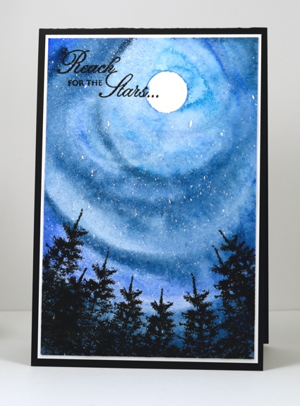
Today’s card reminds me of photos I have seen taken with a fish eye lense so the world all leans into the photograph. I could have added the colours of northern lights as I sometimes would but I stuck to the more common blues of a night sky. It was a fairly simple card to make. I positioned a circle mask then splattered masking fluid on a piece of watercolour paper, once the masking dried I painted blue gansai tambi paint in circles around the moon to fill the panel. To finish the card I stamped black trees and a sentiment, matted and added the panel to a black card base.
We have had some beautiful sunset skies lately; I haven’t taken many photos but I have tried to imprint them on my mind to recreate with paint and ink at a later time. It is weird to be into December and not have snow or even the need to wear gloves yet. No-one in our house is complaining about the lack of shoveling but my son is wanting to start on the outdoor rink and my husband is keen to ski. What does it look like where you are? White Christmas or green?
Supplies:
Stamps: Prancers, Eloquence (PB)
Inks: Black Soot ink (Ranger) Versafine Onyx Black (ImagineCraft/Tsukineko)
Cardstock: Fabriano 100% cotton hot pressed watercolour paper, Neenah Classic Crest Solar White, Neenah Epic Black cardstock
Also: Winsor & Newton masking fluid, Kuretake Gansai Tambi watercolour paints
Stamped wreath & swag
Posted: December 6, 2015 Filed under: Nature's Gifts, Winter moments | Tags: Fabriano Watercolour Paper, Penny Black stamps, Sakura Koi watercolour paints 15 Comments 
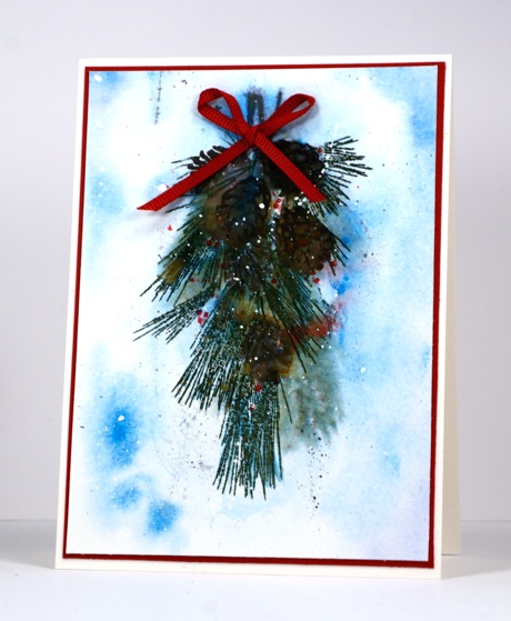
Last Sunday afternoon while sitting at the walk-in clinic waiting for my son to be seen I sketched a wreath and practised some lettering in a sketchbook. (He is fine, the doctor got him sorted and he was well enough to play basketball on Monday which of course was the real concern!) Once I returned home I was inspired to stamp a wreath and a swag using stamps from a couple of sets. I do own wreath stamps but wanted to see what I could come up with myself. For the wreath all the stamps came from the Nature’s Gifts set. To stamp the swag below I substituted smaller pinecones from the Winter Moments set.
I began by splattering masking fluid on one large panel still in my cold pressed watercolour block. Next I painted the background blue for both designs (plus 2 more) using the Sakura Koi watercolor travel set. I just wanted soft edges on the blue so I added plenty of water and also removed some colour with a brush or paper towel. While the background was still wet I stamped some pine needles and let them bleed into the damp paper to create a very soft look. Then I walked away while it dried. Once it was almost dry I stamped the rest of the elements adding a little water here and there with a paintbrush to blend colours and soften the images. I added little red dots on the swag as berries then let it all dry before rubbing off the masking fluid. I decided against any sentiment but added red ribbon and mats to bring out the colour of the berries.
After finishing these two stamped panels I created another swag and wreath which I will share tomorrow. My method was similar but I painted them instead of stamping.
Thank you so much for your kind and enthusiastic response to my ‘Stamping the Stories’ collection. I really enjoyed creating each card and was thrilled to see you enjoyed them too.
Supplies:
Stamps: Nature’s Gifts, Winter Moments (PB)
Inks: Memento Espresso Truffle, Love letter, Rhubarb Stalk, Lady Bug, Northern Pine, Potter’s Clay, Northern Pine, Tuxedo Black ink pads and markers (Tsukineko)
Cardstock: Fabriano 100% cotton cold pressed watercolour paper,
Also: Sakura Koi watercolours, Winsor & Newton masking fluid, red ribbon
Stamping the stories: The Lion, the Witch and the Wardrobe
Posted: December 5, 2015 Filed under: Prancers, Stamped Landscapes, Uptown | Tags: Fabriano Watercolour Paper, Penny Black stamps, Ranger Distress stains 25 Comments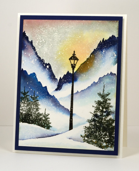
This scene is from a book, a whole series in fact, that is well loved by our family. I read the books to the children; they read them once they were able. We listened to the radio theatre series from Focus on the Family and when the movies came out we watched them. We knew the books so well that we were quite nitpicky about the movies but we enjoyed them despite the deviations from the original. If there is someone who does not recognize this little vignette, the series is the Chronicles of Narnia by C.S. Lewis. For those who recognised it straight away, which is your favourite Narnia story? My son’s favourite is ‘The Horse and his Boy, my older daughter’s ‘The Lion, the Witch and the Wardrobe, my younger daughter’s, ‘The Magician’s Nephew’ and for me ‘The Dawn Treader’ but ‘Last Battle’ is a close second. You see there is something for everyone. If you haven’t read them, get on it!
When the story begins it is ‘always winter but never Christmas’ in the magical land of Narnia. The white witch has made it so. Lucy meets Mr Tumnus the faun under the lamp post you see in the scene above. I painted it with distress stains over a generous splatter of masking fluid and used the ‘oh so useful’ trees from the ‘Prancers’ set in the foreground. I followed this card up with an art journal page because it was so much fun to paint.
This is the last of my stamping the stories cards; it has been fun to share them. Thank you so much for visiting and joining in the conversations.
Stamping the stories cards: Mary Poppins, Wind in the Willows, Peter Pan, Lord of the Rings
Supplies:
Stamps: Prancers, On the town (PB)
Inks: Chipped Sapphire, Mahogany, Scattered Straw, Salty Ocean, Iced Spruce distress stains (Ranger), Northern Pine, Versafine Onyx Black (ImagineCrafts/Tsukineko)
Cardstock: Fabriano 100% cotton hot pressed watercolour paper, Neenah patriot blue
Also: Winsor & Newton masking fluid
Stamping the stories: Wind in the Willows
Posted: December 3, 2015 Filed under: Sprigs, Stamped Landscapes | Tags: Fabriano Watercolour Paper, Penny Black stamps, Ranger Distress stains, Tsukineko Versafine inks 12 Comments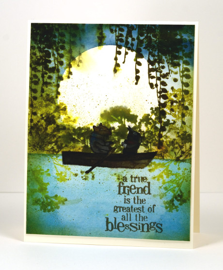
I was surprised how much I enjoyed this book. I don’t think I read it as a child; it was later when training to be a primary school teacher, reading all the classics and designing lessons and such. I am not that keen on animal books but this one is a delight; Ratty and Mole are such appealing characters. I read it to my children from a beautifully illustrated edition (Michael Hague once again) given to me by my Nanna on my 21st birthday. Some of the double page illustrations are incredible watercolours which surprise you with their intricate details.
I initially had the boat moored by the river bank with no Ratty and Mole in it but my daughter said I had to put them in. I did not have any suitable stamps so I had to paint them myself. Unlike the talented Sandy Allnock I do not find animals easy to paint or colour, let alone draw! I found an E. H. Sheppard illustration to assist me and did my best. I’m glad the moon is behind them; they are legitimately dark and shadowed. I realise the boat is backwards; I was so caught up in adding Ratty and Mole I put the oars in the wrong hands, ahem, paws!
Anyway, back to the beginning, I started by painting the river then positioned a large circle mask cut from frisket film before painting the sky. I removed the mask and stamped the foliage and spritzed it so it would bleed a little into the surrounding area. I let everything dry before I painted the boat and its inhabitants. I think the sentiment was just the right one for Ratty and Mole.
What are your favourite fantasy books? Do you even enjoy fantasy? Books about other worlds and magic lands have always intrigued me. I know Wind in the Willows isn’t another world or a magical tale but the animals do talk and go messing about in boats so you do have to use your imagination a little bit.
Supplies:
Stamps: Sprigs, Friendship (PB)
Inks: Forest Moss, Crushed Olive, Peeled Paint distress (Ranger), Versafine Spanish Moss (ImagineCrafts/Tsukineko)
Cardstock: Fabriano 100% cotton hot pressed watercolour paper, Neenah Classic Crest Natural White 110lb smooth
Also: Gansai Tambi paints, Grafix extra tack frisket film
Stamping the stories: Peter Pan
Posted: December 2, 2015 Filed under: Pirates | Tags: Fabriano Watercolour Paper, Kuretake Gansai Tambi watercolour paints, Penny Black creative dies, Penny Black stamps, Tsukineko Versafine inks 11 Comments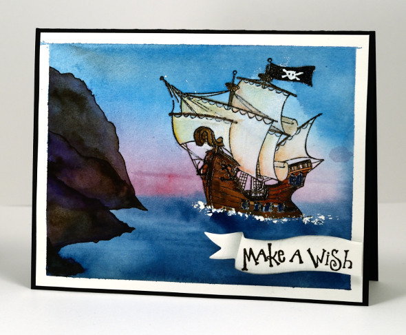
I am continuing the journey through imaginative books and stopping in Neverland today. When I was creating cards for the challenge I had to make sure there was a scene or setting from the book I could stamp or paint with some success. In thinking about Peter Pan, a story I enjoyed as a child and read to my children, I remembered this pirate ship stamp and pulled it out for the first time. I also pulled out one of my copies of Peter Pan for inspiration, the one illustrated by the incredibly talented Michael Hague.
To create this scene I painted some masking fluid where the waves would be then embossed the ship in black. I used watercolour paints to paint the sea, sky and cliffs then concentrated on the ship using paints then watercolour pencils for some finer details at the end. The sentiment is stamped on a die cut banner then trimmed and popped up over the panel.
After creating all my ‘story book’ cards I realised the books I chose were all made into movies. Perhaps that is a sign of a good story? I know I loved the books first and sometimes enjoyed the movies later on. It was the whimsical parts of Peter Pan that appealed to me, Wendy sewing on Peter’s shadow, the dog being their Nanna (although I did not get that as a child!?) and a ticking crocodile!
Supplies:
Stamps: Pirates, Sweet Wishes (PB)
Inks: Versafine Onyx Black (ImagineCrafts/Tsukineko)
Cardstock: Fabriano 100% cotton hot pressed watercolour paper, Neenah Epic Black cardstock
Dies: Triple Banner (PB)
Also: Gansai Tambi paints, masking fluid
Imagine
Posted: November 30, 2015 Filed under: Soft Wings | Tags: Fabriano Watercolour Paper, Kuretake Gansai Tambi watercolour paints, Penny Black creative dies, Penny Black stamps 8 Comments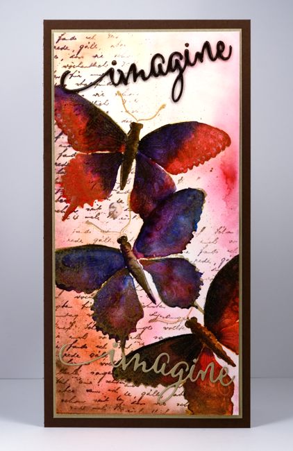
Many of you are familiar with the fabulous online stamping community ‘Splitcoaststampers‘. I have been a member for years and have appreciated the wealth of resources provided and the warm interaction and encouragement of the members. I was honoured to be invited at the beginning of this year to be a member of the Splitcoast design team, The Dirty Dozen. While a ‘Dirty Girl’ I was tasked with creating six projects each month inspired by a monthly theme. Back in April these projects were for fan club members only. It is one of the ways Splitcoast says thank you to fan club members for their financial support. Splitcoast membership is free but by paying a yearly subscription to the fan club you enjoy more resources and privileges while contributing to the running costs.
I was thrilled to be asked to join the ‘Dirty Dozen’ but I was a little apprehensive about thinking up a bunch of projects each month on a set theme. Themed challenges have a way of freezing up my creative juices! But a challenge is meant to be just that, a challenge and the results can be surprising. I met each challenge and was so happy to be taken outside my comfort zone. Each month I was blown away by the projects created by the rest of the team.
I enjoyed all the months but my favourite ended up being the ‘Imagine that’ challenge. I have turned the projects from that month into a story book week here on my blog. I’ll be back tomorrow with the first story book inspired card.
Supplies:
Stamps: Soft Wings, Letter background (PB)
Dies: Envision (PB)
Inks: Versamark, Rich Cocoa (Tsukineko)
Cardstock: Fabriano 100% cotton hotpressed watercolour paper, gold cardstock, brown cardstock
Also:Water colour with Gansai Tambi paints, gold embossing powder
Hide, Seek and Paint with Brusho
Posted: November 5, 2015 Filed under: Brusho, Hand drawn, Hand lettered | Tags: Brusho, Fabriano Watercolour Paper, Hand lettering 11 Comments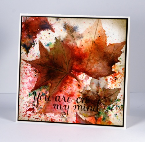
The brusho magic continues as I said it would! I keep referring to it as magic because you really don’t know what is going to appear when you spritz water and add the brusho powders. How much water, how much powder, which you do first, how much you continue to add – all these factors will affect the outcome. The unpredicability of the medium did make my live brusho periscope yesterday a little nerve wracking but I still enjoyed myself with those who were able to join me live. It will be available for a bit longer on Katch. (wish you could fast forward through the clumsy beginning; I promise it gets better!)
My process for arriving at the finished leaf card involved several steps beginning with the random scattering of warm toned powders plus a little green. I spritzed, sprinkled powder and repeated until I had pretty patterns appearing then I left it; I walked away and went and ran errands so there was no temptation to fiddle with it before it dried. When I returned I looked for leaf shapes or sections of leaves that had occurred randomly in the panel, then enhanced and completed those shapes. The painting step did take quite a while and involved stopping and starting. I tried to move the existing colour on the panel with a brush as much as possible but sometimes added a bit more brusho where needed. There were two small brown leaves that emerged in the bottom right hand corner so I painted a couple more to make a little pile. I add veins to one leaf with a craft knife then added brown paint which settled in the cuts but it turned out darker than I wanted so I switched to a watercolour pencil to add the veins to the other leaves.
The sentiment is hand drawn with pen and ink, something I have been practising lately. Unfortunately it is not easy on my hands so I can’t do too much. I did learn traditional calligraphy years ago so some of the concepts are familiar and others are new and tricky!
You may have heard that Jennifer McGuire is hosting a Share Handmade Kindness Campaign during November at present and challenging card makers to send their cards out and make a difference to someone’s day. I don’t need the reminder to do the handmaking but the actually sending through the mail is a challenge I am taking on; I want to get this card in the mail today! Susan Raihala is challenging us to make and send Gratitude cards right now also. And if you’re forging ahead with your Christmas cards don’t forget the Caring Hearts card drive.
Thanks for dropping by. There will be a break from the Brusho tomorrow while Gansai Tambi paints take the stage instead.
Supplies:
Medium: Brusho powders & Faber Castell Albrect Durer watercolour pencils, Brown ink
Cardstock: Hotpressed Fabriano paper, Epic Black Neenah cardstock
Warm toned leaves
Posted: October 16, 2015 Filed under: Bister, Lush & Lavish | Tags: Bister, Fabriano Watercolour Paper, Penny Black creative dies, Penny Black stamps, Ranger Distress stains 4 Comments
Here are the warm toned leaves I promised in contrast to the cool toned ones I posted a few days ago. Ottawa is enjoying fabulous colours this year; the yellows appeared first but now the orange and reds have joined in and they really are amazing.
Today’s loose and somewhat messy card reminds me of a leaf pile; we have had some pretty impressive ones over the years. Once again I created my panel in a couple of layers, starting with some orange toned leaves stamped onto wet watercolour paper. The leaf images bled in all directions creating the blurry shapes you see in the background. When they were dry I stamped with reds and browns and used a brush to fill in the leaves. I also sprinkled brown bister which ended up separating into black and brown with a few red and blue spots as well. When it was all dry I splattered some gold dots over the panel with a wink of luna pen. To complete the card I cut the ‘thank you’ sentiment out of both the panel and a piece of red cardstock so I could do an inlay to match the mat.
Are you raking leaves or have you yet to start like us?
Supplies
Stamps: Lush & Lavish (Penny Black)
Dies: Stylish Gratitude (Penny Black)
Inks: Rusty Hinge, Mustard Seed, Spiced Marmalade, Barn Door distress stains (Ranger)
Cardstock:Fabriano hot pressed 100% cotton hot pressed watercolour paper
Also: Gold wink of luna pen, brown bister powder
Cool tone leaves
Posted: October 13, 2015 Filed under: Bister, Filigree Foliage | Tags: Bister, Fabriano Watercolour Paper, Tsukineko Memento inks 10 Comments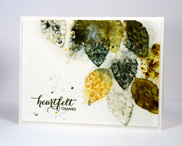
As you can see I haven’t put away the Filigree Foliage set. This time I didn’t paint out the filigree pattern as I have on previous cards; I kept it for a more decorative look. These colours reflect what is in my yard right now. There are plenty of yellow leaves floating down but the deep red ones are holding back.
I created this panel in layers starting by wetting the paper and stamping a few green leaves which then blended into the background laying down colour without leaving distinct shapes. When that had dried a little I stamped again in greens and mustard, spritzed some more water and also sprinkled some bister powder. Finally I stamped with water to create a few very pale impressions which picked up some of the bister lying around. I realise some of my stamped images are incomplete, some are distinct, others are blurred which is not everyone’s preference. I like to let the water and inks bleed and blend a little for some unique effects.
I’ll be back soon with some warm toned leaves. Thanks for dropping by.
Supplies
Pumpkins aplenty
Posted: September 23, 2015 Filed under: Periscope, Pumpkins | Tags: Fabriano Watercolour Paper, Penny Black stamps, Periscope, Ranger Distress stains 14 Comments
Have you seen all the pumpkins lined up in the fields waiting for…well I’m not sure what they’re waiting for, to be bought I guess, or to be collected. It is a sign of autumn to see them all there in their orange glory. I have never been a fan of orange but the distress stain, spiced marmalade, has softened my opinions a bit, it is such a rich colour.
I have two very similar cards today because I watercoloured one as a practice and then broadcast on periscope the watercolouring of the other. I scoped it yesterday so it is still available to watch on the web here.
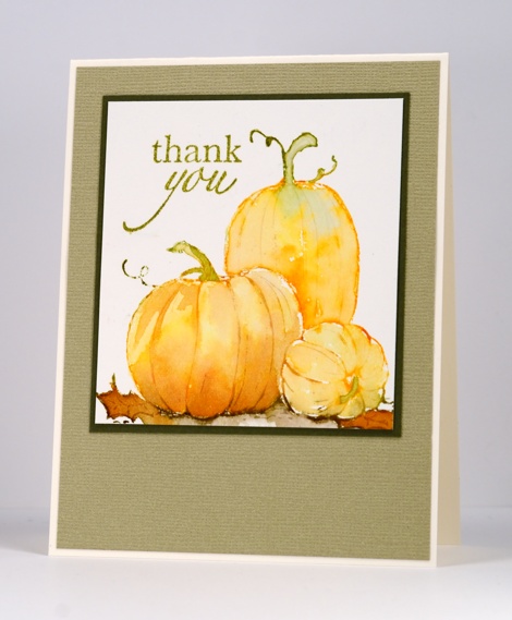
I used the same technique for both panels, inking the stamp directly with distress stains, spritzing it then stamping on watercolour paper. While the stain was still wet I used a waterbrush to pull colour from the outline into the pumpkins and leaves. Anywhere that I didn’t have enough stain to spread I picked up some extra from an acrylic block and painted it on.
Thanks for dropping by.
Supplies:
Stamps: Pumpkins, Snippets, Enjoy (PB)
Inks: Spiced Marmalade, Rusty Hinge, Ground Espresso, Peeled Paint, Forest Moss distress stains (Ranger) Versafine Olympia Green & Spanish Moss (Tsukineko)
Cardstock: Hot pressed watercolour paper, Neenah natural white cardstock, Kazazz textured cardstock
Also: gold embroidery thread


