
Bright Poppy Gems
Posted: June 15, 2016 Filed under: Poppy Gems | Tags: Fabriano Watercolour Paper, Kuretake Zig clean color real brush markers, Penny Black stamps, Tsukineko Versafine inks 15 Comments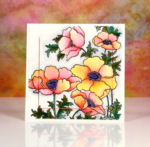
I’m sharing some more colouring today and yes, more poppies too. Poppies just keep on popping up on this blog don’t they!? Believe it or not I used the same medium on today’s card as yesterday’s very bright and bold card. The colours today are still bright but are blended out to much paler shades.
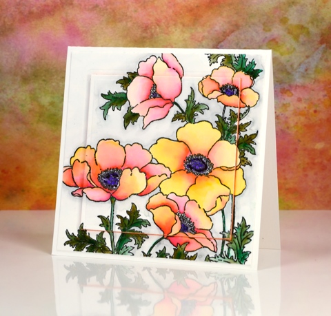
I stamped the large ‘poppy gems’ stamp in versafine onyx black and embossed in clear then used zig clean color real brush pens. Yesterday I pretty much filled the petals with colour and blended one colour over another. On today’s card I started with a little pink at the centre edge of each petal and a little yellow at the outside edge and blended the two colours with water to create a softer effect.
I spied the raised panel layout on a couple of pretty cards recently and chose to do it on this one with a piece of orange fun foam. I have an even paler more pastel poppy card up next. See you soon and thanks for dropping by.
Supplies:
Stamps: Poppy gems, (PB)
Inks: Versafine Onyx Black (Tsukineko) Zig Clean Color real brush markers (Kuretake)
Cardstock: Fabriano 100% cotton hot pressed watercolour paper
Also: orange fun foam, spellbinders square die
Vintage Flower Box
Posted: June 9, 2016 Filed under: Flower box | Tags: Faber-Castell Albrecht Durer Watercolour pencils, Fabriano Watercolour Paper, Penny Black stamps, Ranger Distress inks, Speedball elegant writer 13 Comments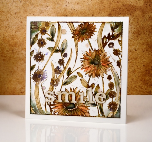
I’m continuing my vintage watercolour theme today with the square ‘flower box’ stamp. I completed this panel using the technique shared in my video tutorial. I stamped the image with vintage photo ink and added black here and there with the ‘elegant writer’ pen from speedball.
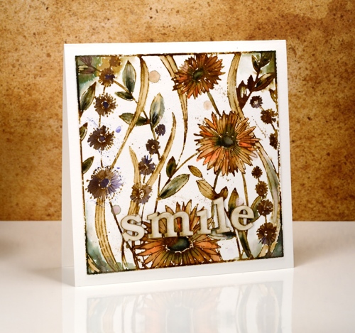
Most of the leaves and the centres of the large flowers have a black/green tinge to them; this is what happens when you add water to the elegant writer ink. I also spread it around the corners with a paint brush.

The orange and purple colouring is from watercolour pencils. I pulled colour from the pencils and filled the petals and flower shapes drawing in brown from the stamped outlines at the same time. I added splatters of colour from the pencil and water droplets for an aged look.

The word ‘smile’ is laser cut from matboard and glazed with crackle glaze. Thanks for joining me this week; I’m so pleased you are enjoying my vintage theme.
Supplies:
Stamps: Flower Box (PB)
Inks: Vintage Photo distress ink,Vintage Photo distress stain (Ranger) Elegant writer pen (Speedball)
Cardstock: Hot pressed Fabriano watercolour paper
Also: Albrecht Durer watercolor delft blue, raw umber, dark orange pencils (Faber-Castell), Rock candy clear crackle paint(Ranger)
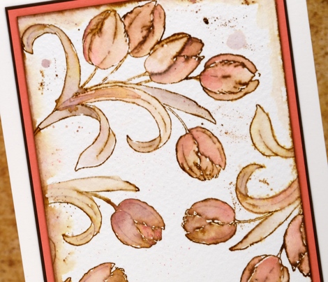
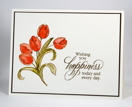
Vintage tulips
Posted: June 6, 2016 Filed under: Flower Gala | Tags: Faber-Castell Albrecht Durer Watercolour pencils, Fabriano Watercolour Paper, Penny Black stamps 14 Comments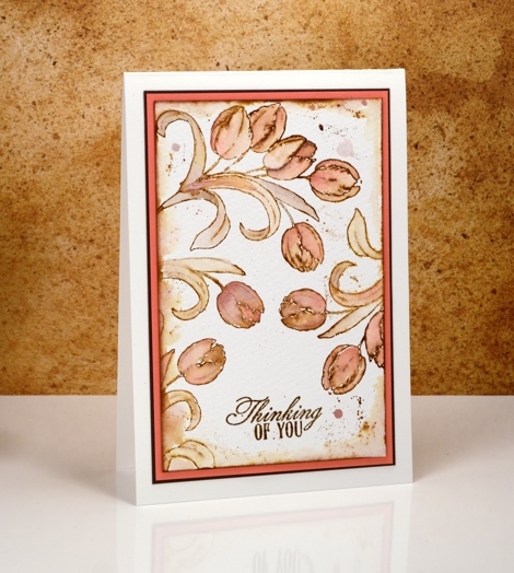
I have some more vintage style watercolour cards to share this week. Last month I posted a video tutorial showing a method for creating a vintage look with brown dye ink and watercolour pencils. I have created a few more cards along the same lines dreamed up some variations as well. To see the original card and video tutorial click here.
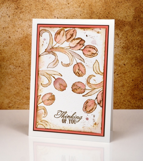
For this tulip card I used almost the same method as shown in the video but left out the elegant writer pen (as I did in this butterfly card). I stamped the original tulip images in vintage photo distress ink then blended the ink in the outline stamping with colour from both pink and brown watercolour pencils. I painted some distress stain around the edges of the watercolour panel and splattered some as well.
Thanks for dropping in; I hope you’ll come back each day this week for more vintage style designs.
Supplies:
Stamps: Flower Gala , Soar (PB)
Inks: Vintage Photo distress ink,Vintage Photo distress stain (Ranger)
Cardstock: Hot pressed Fabriano watercolour paper, brown cardstock, coral cardstock
Also: Albrecht Durer watercolor medium flesh, VanDyke pencils (Faber-Castell)
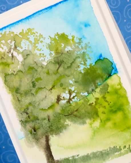
Autumn Mist
Posted: June 2, 2016 Filed under: Shade Canopy, Stamped Landscapes | Tags: Fabriano Watercolour Paper, Penny Black stamps, Tombow dual brush pens, Tsukineko Memento inks 8 Comments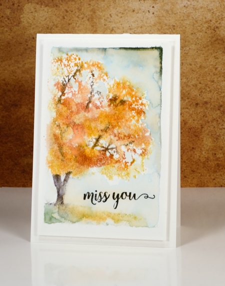
Don’t worry I am not switching over to fall cards. I just happen to have made a card in autumn colours with a misty look about it so the line from Puff the Magic Dragon sprang to mind. I created both of today’s cards with the ‘shade canopy’ stamp from Penny Black. The little scenes are framed with the white edge made when I tape the watercolour paper down with painter’s tape.
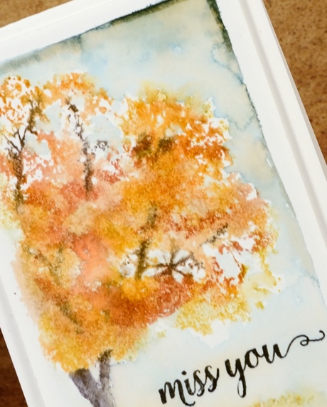
I used markers to ink the stamp and for the backgrounds on both cards. The autumn card is coloured with memento markers and the summer one with tombow dual brush pens.
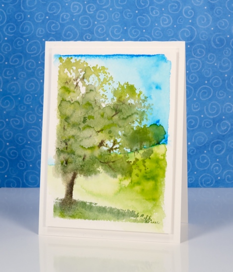
It is possible to get quite a lot of definition in the foliage by inking the stamp and adding little or no water or, as I did, use more water on the stamp and achieve a looser more impressionistic look. On the summer card I coloured the sky and hill first then added the tree over the top. For the fall card I painted the sky last, adding it around the foliage.
Supplies:
Stamps: Shade Canopy, Words of Kindess(PB)
Inks: Tangelo, Potter’s Clay, Espresso Truffle, Northern Pine Memento markers Versafine Onyx black (Tsukineko), 173, 452, 126, 228 dual brush pens (Tombow)
Cardstock: Fabriano 100% cotton hot pressed watercolour paper
Sun and sea
Posted: May 24, 2016 Filed under: Brusho, Out to sea, Serenity | Tags: Brusho, Fabriano Watercolour Paper, Penny Black creative dies, Penny Black stamps 4 Comments
Over on the Penny Black blog this week ‘Father’s Day’ cards are the feature. My card could definitely be used for Father’s Day (if I remember to post it!) but it could be just as easily used for any friend or family member. The colour scheme and the lack of floral images does make it a good choice for a masculine card.
Four different painted panels were cut up then layered to create my sunny seascape. The background blue panel is one piece of cold pressed watercolour paper; I taped masking tape across the horizon about 2/3 of the way up then painted some masking fluid in lines to suggest waves and light on the sea. Once the masking fluid was dry I painted the sea with cobalt blue and turquoise brusho. Once that dried I repositioned the tape to mask the edge of the sea so I could paint the sky with turquoise brusho.
All the remaining pieces were painted on hot pressed watercolour paper. For the tree and grass I used three greens (listed below) and dark brown brusho. I used a large piece of watercolour paper adding brown just in the area where I would die cut the tree. After die cutting the tree I used a craft knife to cut a hill from the rest of the green area. To keep the tree sitting flat on the background I used the bottom of the tree die to cut into the green hill then inserted the tree in the space when assembling the scene.
I used the ‘Out to Sea’ die to cut a yacht from a yellow brusho panel then painted red over the hull of the boat. The only other piece to cut was the sun which came out of a piece I painted with yellow and a sprinkle of red.
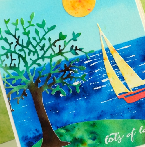
To make assembly a bit easier I applied ‘stick it’ adhesive to the tree panel before cutting it out. I embossed the little sentiment in white before putting it all together. My husband just walked past and was surprised that this was one of my cards; it is a bit of a departure from my usual.
Supplies
Stamps: Happy Snippets
Dies: Out to sea, Serenity
Paints: leaf green, sea green, emerald green, cobalt blue, turquoise, yellow, ost. red, dark brown brusho
Ink: Versamark ink
Paper: hot & cold pressed Fabriano watercolour paper
Also: white embossing powder, masking fluid
Shaded Canopy
Posted: May 2, 2016 Filed under: Shade Canopy, Stamped Landscapes | Tags: Fabriano Watercolour Paper, Penny Black stamps, Ranger Distress stains 3 Comments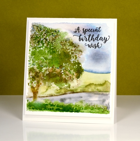
‘Shaded Canopy’ is another lovely (and versatile) stamp from the new ‘A Little Bit of Sunshine’ release. My scene today could be spring or summer depending on where you live. When I first moved to Canada I could not believe how bright green the summers were. Where I lived in Australia I was used to pale muted colours in summer because everything became very dry.
I used distress stains and inks for stamping and for painting the background leaving a space around the scene to frame it then popping up the panel on the same colour card base.
I am teaching a class this month in Ottawa where we will use this stamp to create four cards, one for each season.
Supplies:
Stamps: Shade Canopy, Words of Kindess(PB)
Inks: Forest Moss, Peeled Paint, Weathered Wood, Tumbled Glass, Mowed Lawn, Vintage Photo distress stains (Ranger)Versafine Onyx black (Tsukineko)
Cardstock: Fabriano 100% cotton hot pressed watercolour paper
Iris Shimmer
Posted: March 23, 2016 Filed under: Color Burst, Pure Iris | Tags: color burst, Fabriano Watercolour Paper, Penny Black stamps 19 Comments
I am having all sorts of fun with brushstroke stamps at present while teaching my March class. Not only have I been experimenting with all my floral brushstroke stamps and a range of mediums, I have been inspired by the creativity of the class members also.
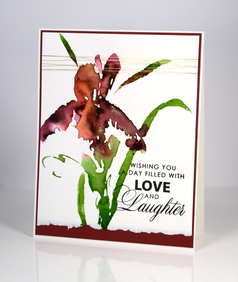
In my most recent class someone created a beautiful burgandy iris with the “pure iris” stamp and some merlot colorburst powder. Her petals could not have looked more life like! I tried the combo at home and added some pearl-ex spray and some yellow gold liquid metal. My camera did catch some shimmer in the photos so you can imagine how much there is in real life. I took a little video of it shimmering in the sunlight and posted it on instagram.
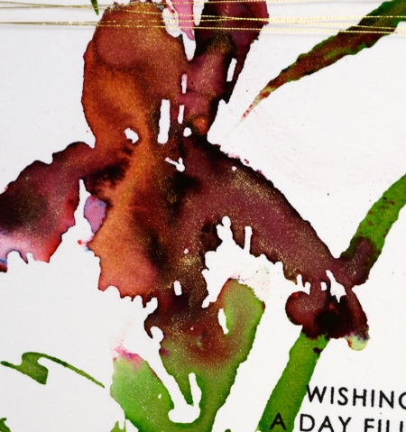
Supplies:
Stamps: Pure Iris, Special Wishes (PB)
Mediums: Colorburst powders, Liquid Metal (Ken Oliver) Versafine Onyx Black ink (Tsukineko)
Cardstock: Hot pressed Fabriano watercolour paper, Burgandy cardstock
Also: gold metallic thread
Orange Iris
Posted: March 1, 2016 Filed under: Passionate | Tags: Fabriano Watercolour Paper, Penny Black stamps 10 Comments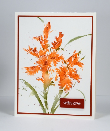
This is the third colour scheme I have chosen to stamp the irises and there may yet be more! Don’t be mad but I didn’t write down my colours and my desk is covered in stuff so your guess is as good as mine. I have been doing a better job recording my supplies by snapping a photo of the panel beside the supplies at the time of creating. Apparently I did not do that this time. What I can tell you is that I splattered some water on the panel first then stamped in watersoluble die inks; this creates some soft blurry patches here and there. I blended a few areas with a paint brush and added some finer details and splatters with watercolour pencils. I embossed a sentiment on brown card and popped it up over the panel matted in the same colour.
I just did a search of ‘iris’ on the interwebs and it came up covered in the relatively common purply-blue variety but there were also a few other colour combinations I might just have to try and replicate. There was one deep apricot one with blue accents and a burgandy one and a peach one and … this is going to be a busy stamp!
(BTW This pretty stamp is called ‘passionate’ and it is a brushstroke stamp. I just updated my classes page with details of my upcoming ‘Working with Brushstroke stamps’ class. I will be teaching it twice at the Riverside Drive location and twice at Crop A While scrapbooking store in Orleans.)
Supplies:
Stamps: Passionate, Snippets (PB)
Inks: A pretty orange ink and an olivey green ink
Pencils: Faber-Castell Albrecht Durer watercolour pencils
Cardstock: Fabriano 100% cotton hot pressed watercolour paper, brown cardstock
Elegance
Posted: February 29, 2016 Filed under: CAS, Elegance | Tags: CAS, Faber-Castell Albrecht Durer Watercolour pencils, Fabriano Watercolour Paper, Penny Black stamps, Tsukineko Versafine inks 11 Comments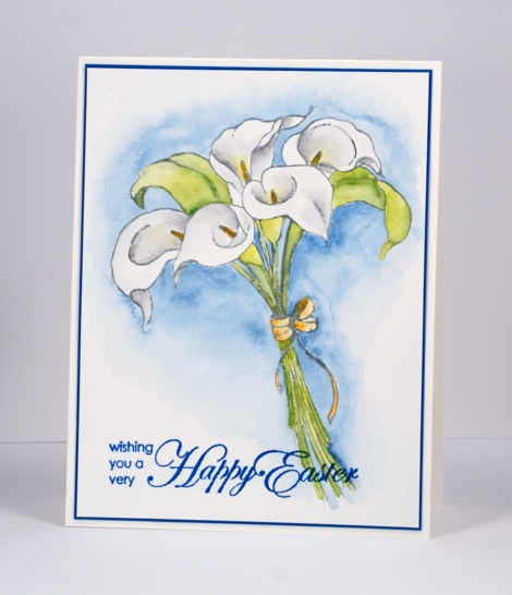
Elegance is the perfect name for this new stamp featuring a bunch of calla lilies. I think I had some in my garden once but apparently you need to dig them up each year and replant them?? That was just not going to happen I’m afraid, no matter how elegant they might be. I have quite a few day lilies that come up year after year and multiply with no attention from me so I have just stuck with them!
I stamped in weathered wood stain because I wanted to keep the lilies looking white; ink would have worked just as well but I only had stain. I used my watercolour pencils to colour the flowers and background (colours listed below). I found a scrap of exactly the right blue card to frame the panel and matched it with versafine ink for the sentiment.
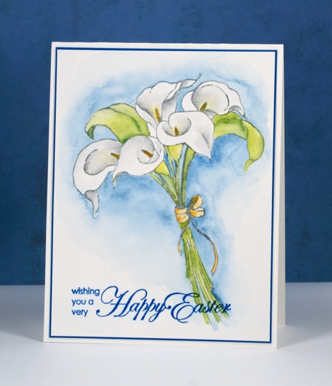
I must admit I am taken by surprise that Easter is less than a month away; 2016 is flying by!
Supplies:
Stamps: Elegance, A very happy easter (PB)
Inks: Weathered Wood distress stain(Ranger) Blue Lagoon versafine ink (Tsukineko)
Pencils: Albrecht Durer watercolour pencils sap green 167, apple green 170, lemon cadmium 105, light orange 113, light grey 195, medium grey 197, night green 155 for background (Faber-Castell)
Paper: Fabriano 100% cotton hot pressed watercolour paper, blue cardstock
Flower Gala
Posted: February 19, 2016 Filed under: Flower Gala, Uncategorized | Tags: CAS, Fabriano Watercolour Paper, Penny Black stamps, Ranger Distress stains, Tsukineko Versafine inks 19 Comments
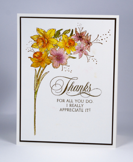
The daffodils above and the tulips below make up the pretty new ‘Flower Gala’ cling set from Penny Black. I kept my layouts simple positioning each stamp to neatly frame a sentiment. The sentiments are new too, one from each of the new sentiment sets in the ‘So Special‘ release. (listed below). I stamped both the flower stamps in vintage photo distress ink then painted the interior with distress stains which blended with the vintage photo ink for an aged effect
The ‘So Special’ reveal continues on the PB blog this week as the transparent stamps are featured and you still have a chance to win a shopping spree until Feb 28th.
Supplies:
Stamps: Sentiment Collection, Special Thoughts, Flower Gala (PB)
Inks: Vintage photo ink, Scattered Straw, Spiced Marmalade, Seedless Preserves, Peeled Paint, Abandoned Coral, Worn Lipstick, Forest Moss distress stains (Ranger) Vintage Sepia (Tsukineko)
Cardstock: Fabriano 100% cotton hot pressed watercolour paper, brown cardstock


