
Good Day Bouquet
Posted: June 7, 2023 Filed under: good day bouquet, Penny Black, Time | Tags: Fabriano Watercolour Paper, Penny Black stamps, Ranger Distress inks, Staedtler watercolour brush pens 3 Comments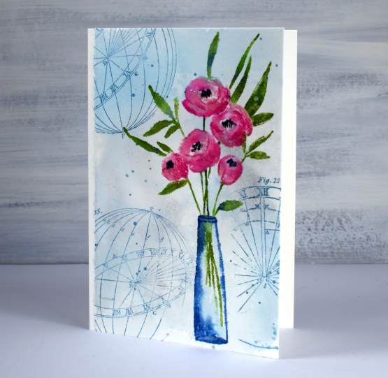
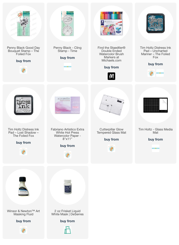
Good day bouquet is a pretty vase stamp from Penny Black. I used a strip of hot pressed watercolour paper and kept the deckled edge which is on the large sheets I buy then cut into smaller pieces for card panels and other projects. I smooshed uncharted mariner and lost shadow distress inks on my glass mat, diluted it with water then swiped the watercolour panel through the ink. There was a fine splatter of masking fluid on the panel which is most noticeable on the side of the vase.
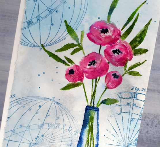
I chose to use water-based brush markers to colour the stamp. As the distress markers are being discontinued I have been testing out alternatives for inking stamps. Water-based markers can be helpful in inking small areas on a stamp. For the flowers, leaves and stems I used Staedtler water-based markers; the pack I bought has 36 colours so I was able to use three different pinks for the flowers and a couple of greens for the stems. I used uncharted mariner for the vase and then later for the ‘time’ stamps I added to the background. When I ink my stamps with markers I spritz the stamp before pressing it onto the panel and sometimes blend the stamped image with water also. I inked the centres of the flowers with black, then after stamping used the small tip end of the black marker to add more detail.
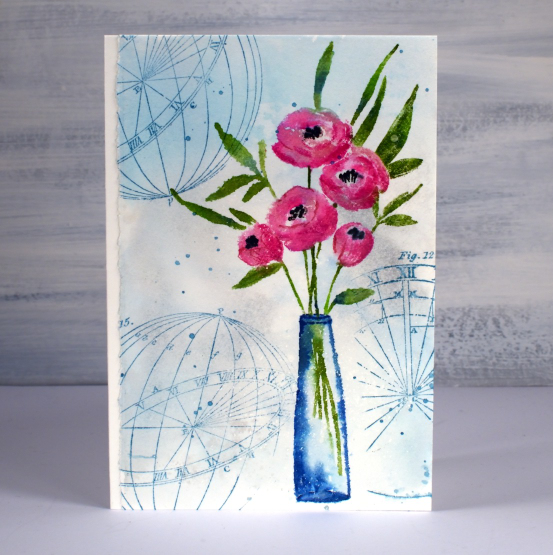
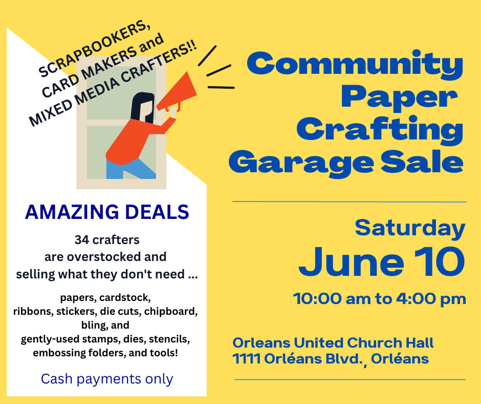
To finish I added some water splatter which I dabbed away with a paper towel and some ink splatter because you know I love to splatter! If you are in Ottawa don’t forget you have the opportunity to pick up some crafty bargains this weekend at the Saturday garage sale, details below.
(Compensated affiliate links from Foiled Fox & Scrap n Stamp)
Tea, Coffee, Art Journalling?
Posted: February 28, 2023 Filed under: 6"x 6" journal, Art Journal, Background Stamps, coffee time, Cup of tea, Darkroom Door, Dies, Gazette, Penny Black, Script, Time, What's in your cup, World Map | Tags: Art Journal, Darkroom Door stamps, Penny Black creative dies, Penny Black stamps, Ranger Distress inks 2 Comments
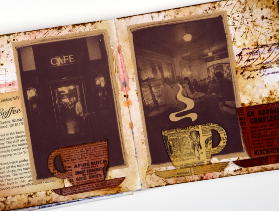
Today I am posting a few pages from last year’s Art Journal Adventure workshops. I taught seven different ‘episodes’ last year and one month the theme was coffee and tea. I did a few pages before the sessions and then created a different page during each class. I don’t like replicating the same spread in my art journal so each one had a different colour scheme and style.

Even though I am more of a herbal tea drinker than a coffee drinker I ended up creating three coffee themed pages and two tea themed. You can see the first coffee themed page here. As you can see from the three spreads featured here I use a variety of techniques, papers and elements in my pages. The common technique on these pages is a watercolour background and the common element is the chipboard cups. Both the coffee themed pages feature photos from an old coffee themed diary. In both cases I took my colour scheme from the photo and added browns.
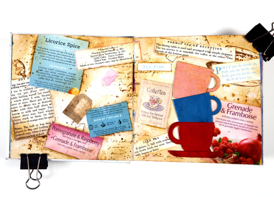
This tea themed page could also be called ‘these are a few of my favourite teas!’ I used packaging from boxes and sachets, embossed the teacups to match and add snippets from old books and magazines.
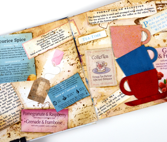
These pages show how I gather elements and papers from here, there and everywhere when creating a page. I used inks, embossing powders and glazes, stamps and stencils for these pages but I also used an old diary, packaging, pages from a vintage recipe book, and old teabags!
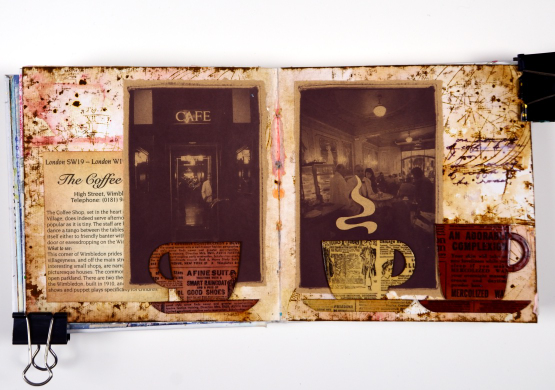
I almost didn’t finish this last spread but once I had stamped then glazed the cute chipboard cups I knew I had to finish. Now I want a mug with vintage newsprint on it!
Art Journal Adventure for 2023 kicks off this week. There is still space in the Friday class and the Monday class. We will be creating with semi- transparent papers.
(Compensated affiliate links from Foiled Fox, Scrap n Stamp)
Limberlost card
Posted: July 8, 2016 Filed under: Butterfly trio, Color Burst, Time, Wondrous | Tags: color burst, Penny Black stamps, Ranger Distress stains 28 Comments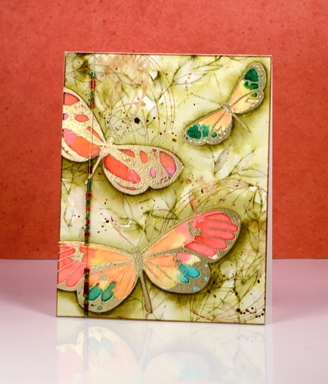
Earlier in the week I posted my art journal page inspired by ‘A Girl of the Limberlost‘. After completing the page I wanted to create a card with a similar feel. When I created my first book inspired journal page (The Lion, the Witch and the Wardrobe) I created the card first then expanded the scene into a double page. This time I am working the other way round.
I created the butterflies the same way as shown on the video but directly on the watercolour panel. I used gold embossing powder and changed the colour palette for the wings. I stamped the butterflies again on label paper and cut them out to make masks to protect the painted butterflies while I stamped and coloured the background foliage. This panel was my colouring for day#3 of Kathy Racoosin’s 30 day colouring challenge.
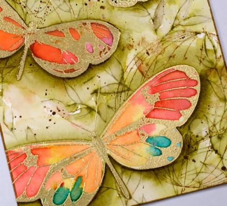
I used the large leafy outline stamp, Wondrous, inked with forest moss distress stain to fill the background with leaves then painted forest moss stain in and around the leaves. I painted extra layers around the edges of the butterflies to lift them a little. When that all dried I stamped on of the new ‘time’ stamps and spritzed it so it would bleed into the background. To finish the background I splattered some dark brown stain and some water.
The panel was already quite large so I decided not to mat it in a co-ordinating colour. Instead I chose to string some beads on a gold thread and attach that down the side of the card. Thank you for all your generous comments this week. I am thrilled you enjoy what I share here and always love to hear from you. I was very interested to read that several of you enjoyed ‘A Girl of the Limberlost” as much as I did.
Supplies
Stamps: Butterfly trio, Time, Wondrous (PB)
Ink: Versamark ink, (Tsukineko) vintage photo, forest moss distress ink and stain
Paints: Colorburst alizarin crimson, merlot, tangerine, phthalo green and liquid metal yellow gold, iron oxide (Ken Oliver)
Paper: hot pressed Fabriano watercolour paper, Neenah Epic black cardstock, vellum
Also: gold embossing powder, gold thread, seed beads


