
Lovely Neighbourhood
Posted: February 1, 2017 Filed under: Color Burst, Neighborhood love | Tags: color burst, Fabriano Watercolour Paper, Penny Black creative dies, Penny Black stamps 2 Comments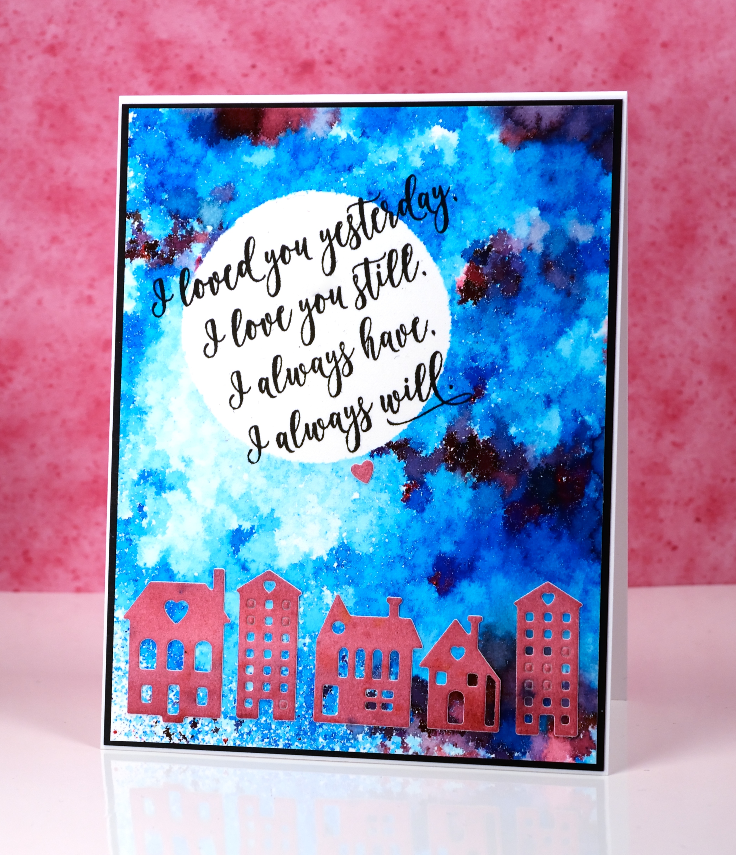
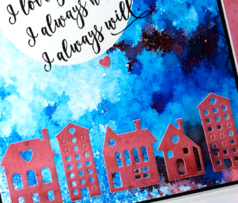
These cute little dies are part of a set called Neighborhood love; I love the little house and building dies Penny Black has brought out even though they challenge my fear of the fiddly factor. I started this card by positioning a frisket film circle mask on a piece of watercolour paper. I sprinkled ultramarine blue powder and a tiny bit of merlot over the panel and spritzed it lightly from above. I spritzed only until I could see some patterns appearing but stopped before all the spots of colour started joining together. I used a heat tool to dry it, pointing the tool down at the panel not from the side to reduce the chance of the wet paint moving across the panel. It reminds me of a mosaic.
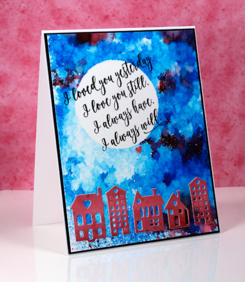
I painted another small piece of watercolour paper with merlot colorburst powder then die cut the buildings from the piece and attached them across the bottom of the panel.
I removed the mask then wanted to hand letter a sentiment inside the moon; I ended up not being game and chose this sweet sentiment from the ‘forever & always’ set.
Supplies:
Stamps: Forever & Always (PB)
Die: Neighborhood Love (PB)
Paints: Merlot & Ultramarine Blue Colorburst powders (Ken Oliver)
Inks: Versafine onyx black ink (Tsukineko)
Cardstock: hot pressed watercolour paper, neenah epic black cardstock
Also: Grafix frisket film
Gold love
Posted: January 31, 2017 Filed under: Color Burst, Effulgence, Guest design | Tags: color burst, Penny Black stamps, WOW embossing powders 12 Comments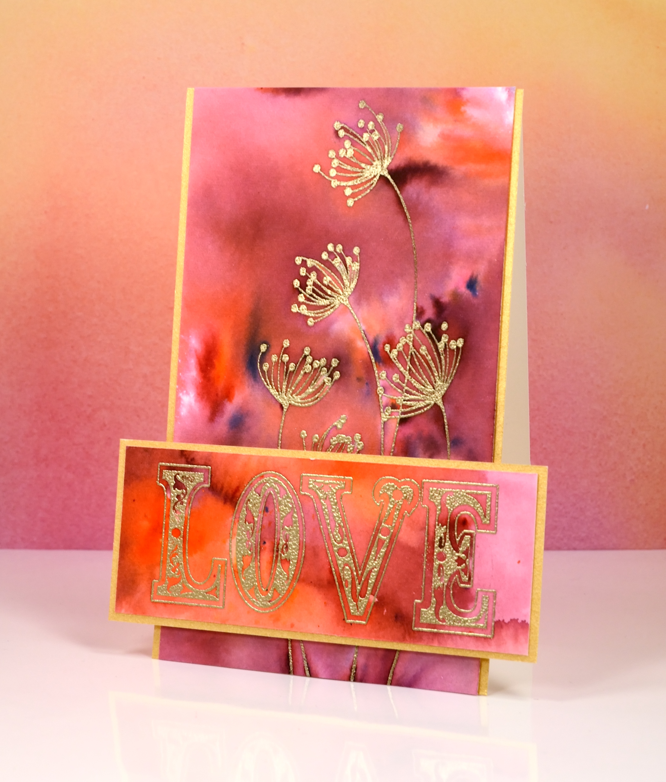
I’m thrilled to be a guest on The Foiled Fox blog today. If you have never visited The Foiled Fox you absolutely should; their blog is full of delightful projects and their shop is stocked with all the good stuff, paints, inks, stamps, markers, tools…and so much more. To find out more about this card just pop over to The Foiled Fox where there are some more pics and details.
Supplies:
Stamps: effulgence, all about love(PB)
Paint: Merlot & Tangerine Colorburst watercolor powder (Ken Oliver)
Cardstock: hot pressed watercolour paper, gold shimmer
Ink: versamark (tsukineko)
Also: gold embossing powder
Stencilled breeze
Posted: January 27, 2017 Filed under: Brusho, CAS, Fresh Breeze | Tags: Brusho, CAS, Penny Black creative dies, Penny Black stamps 7 Comments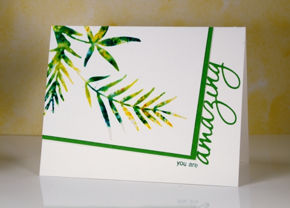
Earlier this week I posted a card made out of a leftover, the negative print from a stencil used for watercolouring. Today’s card is a positive print made through a stencil (not using the same stencil as the earlier card). I created the stencil for this card myself by die-cutting the shape from a piece of stencil plastic. You could use an old plastic folder as long as it is not too thick for your die cutting machine to handle. The die I used is ‘fresh breeze‘ from Penny Black. I taped my home made stencil to a piece of cold pressed watercolour paper and spread moulding paste over it, keeping the layer fairly thin with a palette knife. Next I sprinkled yellow and green brusho powder over the stencil then spritzed with water to activate the brusho. Too much water and it seeps under the stencil, not enough and the brusho doesn’t activate. Once the brusho appeared a little blurry I removed the stencil and let the panel dry for quite some time.
I chose the angled rectangle layout and messed it up by attaching the panel upside down on my card base. I had to cut it out of the cardbase and attach it to a new one so it is a tad bulky under the stencilled panel! I matted in green and trimmed off the top of the die cut word so it would appear to be attached to the mat. I inked just two words on a sentiment stamp so I could turn it into a phrase.
I’m going to add this one over at the Sweet Stampin’ Dies and Punches challenge. Thanks for dropping by.
Supplies:
Stamps: Heartfelt (PB)
Die: Fresh Breeze , OMG (PB)
Inks: Cottage ivy memento (Tsukineko)
Paint: Brusho (Colourcraft)
Paper: Canson 100% cotton cold pressed watercolour paper, green cardstock
Also: moulding paste
Poppy quarters
Posted: January 25, 2017 Filed under: Poppy Time, Twirls | Tags: Brusho, liquid metals, Penny Black creative dies, Penny Black stamps 5 Comments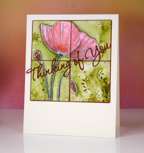
This poppy panel was left as an extra from a class I taught last year. I didn’t want to create the class card again so I divided the poppy image into quarters using square dies.
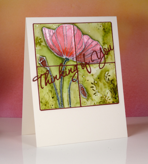
I layered the quarters on a burgandy mat and also die cut a sentiment which matched the deepest red in the poppy, seed pod and bud. The poppy itself was embossed in silver then painted with a mix of brusho and liquid metals so it has a shimmery look when tilted to the light. The green background was made by stamping one of the ‘twirls’ stamps in peeled paint distress stain then painting over it to dilute and spread the green around the poppy.
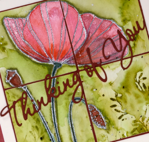
Won’t be long now before the poppies appear, only four or five months!
Supplies
Stamps: Poppy Time, Twirls (Penny Black)
Die: Wishes (PB) Shapeabilities squares (Spellbinders)
Inks: versamark (Tsukineko) peeled paint distress stain (Ranger)
Paints: brusho (Colourcraft) platinum liquid metal (Ken Oliver)
Cardstock: Fabriano cold pressed watercolour paper, Red cardstock
Also: silver embossing powder
Stencil negative
Posted: January 24, 2017 Filed under: Brusho, Promenade, Uncategorized | Tags: Brusho, Penny Black stamps, Penny Black stencils 14 Comments
The technique I have to share today is one of those ‘don’t waste all that pretty paint’ techniques. Sometimes I will be creating something and paint or ink ends up all over a mat, stamp or in this case, a stencil after the initial project is completed. Rather than simply rinse the ink or paint off it is usually worth taking a print or swiping a piece of paper through the excess paint to pick up all the pretty.
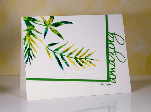
I was creating panels using the Penny Black stencil, promenade, along with molding paste and brusho paint. Once I had finished sprinkling brusho over the stencil and paste, I spritzed with water before removing the stencil. The stencil was covered in diluted brusho so I pressed it onto a piece of cold pressed watercolour paper and this patterned piece was the result. Incidentally I also made two cards with the stencilled shape on them but they did not photograph well at all. They look fine in real life!
I like the ‘negative’ print from the stencil enough that I might just create a negative print as a technique on its own. But then would I end up with a pretty ‘positive print’ as a by product of my creating!?!
This post was brought to you from my ‘pile of possibilities‘.
Supplies:
Stamps: Amazing (PB)
Stencils: Promenade (PB)
Inks: Versamark(Tsukineko)
Paint: Brusho (Colourcraft)
Paper: Canson 100% cotton cold pressed watercolour paper, Neenah epic black
Also: white embossing powder
Powdered snowflakes
Posted: January 20, 2017 Filed under: All is Bright, Color Burst, Soft Grace | Tags: color burst, Penny Black stamps 19 Comments
The keyword for the January challenge over at CAS watercolour is snowflake and there are a few days left to participate. I have very simple looking cards to share but they are not quite so simple to make. There is a bit of trial and error involved in order to avoid a colourful mess. To create these two little cards I used what I like to call the ‘water stamping technique’. I stamped with only water then lightly sprinkled colorburst powder over the water stamped image. I left it alone to dry then shook off any extra powder that hadn’t been activated by the water.

The problem comes when you have too little or too much water. Too little gives you an incomplete image, too much and you get a mess! I applied water to my stamp with a paint brush rather than a spritzer and stamped on watercolour paper. It’s a fun technique to try and won’t really deplete your supply of materials too much!
Supplies:
Stamps: All is bright, Soft Grace (PB)
Paint: Colorburst watercolor powder (Ken Oliver)
Cardstock: hot pressed watercolour paper
Love you still
Posted: January 19, 2017 Filed under: Penny Black, Red blush | Tags: Penny Black stamps, Ranger Distress inks, Ranger Distress stains, Tsukineko Versafine inks 4 Comments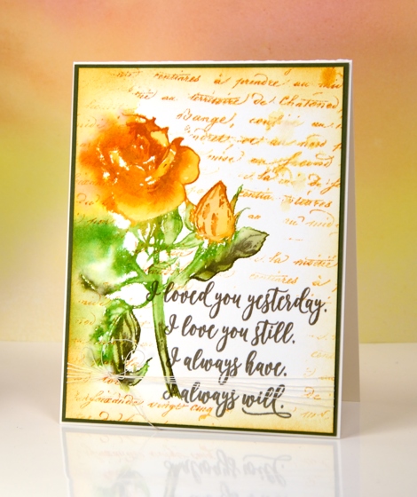
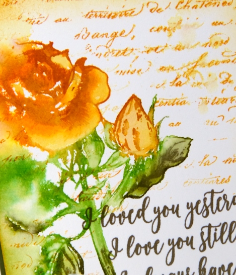
Today I am featuring another new stamp from the ‘Follow your Heart’ release, this rose stamp is called ‘red blush’ something I did not realise when I designed my yellow and orange card!
I used a stamp positioner for this card so I could create a watery image initially but still be able to add some definition over the top once the first stamping had dried. I began by spritzing water down the left hand side of the panel. I inked the rose with wild honey, peeled paint and forest moss distress stain then stamped it and let the colour blend into damp area of paper. Where the stamp had hit dry paper I used a paint brush to blend colour into the petals, stem and leaves. I let the panel dry before inking and stamping the right hand side of the rose again to add definition. I stamped the sentiment next in vintage sepia ink.
At this point in my creative process I decided to add script background around the rose and sentiment so I masked both with post-it notes and stamped the stamped in wild honey distress ink and lightly spritzed a couple of places. I also sponged wild honey distress ink around the edges then matted the panel in olive green and added some cotton thread wrapped around the bottom of the panel and secured with a bow.
Thank you for stopping by to see my ‘Follow your heart‘ projects. You might have noticed that my projects this week were not strictly Valentine cards more cards that could be given to loved ones any time. Do you make and give Valentine cards?
Supplies
Stamps: Red blush, Forever & Always , Script(PB)
Ink: forest moss, wild honey, peeled paint distress stains, wild honey distress ink (Ranger) versafine vintage sepia ink (Tsukineko)
Also: cotton thread
Paper: hotpressed 100% cotton watercolour paper, olive green cardstock
Be Mine
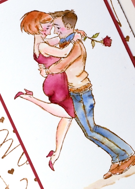
Posted: January 17, 2017 Filed under: a rose, Peerless watercolours, with affection | Tags: Peerless Transparent Watercolors, Penny Black stamps, Ranger Distress inks 4 Comments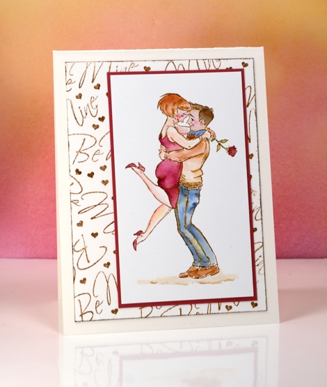
This cute little couple is a new stamp from Penny Black called ‘the rose’. I stamped it in vintage photo distress ink then watercoloured it with peerless watercolour paints. I like the muted look of the vintage photo ink combined with the paint from the peerless palette.
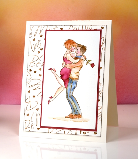
I kept the design pretty simple by adding only ground under their feet but no extra background images or colour. Instead I made my own patterned panel by stamping the ‘be mine’ sentiment along with a tiny heart repeatedly in vintage photo ink. The tiny heart is cut from a row of five included in the ‘from the heart’ set. It was ideal for filling in little gaps around the words.
Pop over to my youtube channel to see how I set up my peerless palette.
Supplies:
Die: A Rose, With Affection, From the Heart
Paints: Peerless watercolors
Cardstock: hot pressed watercolour paper, neenah natural white, red cardstock
Ink: vintage photo distress ink
Butterfly Heart
Posted: January 16, 2017 Filed under: butterfly heart pop out, CAS | Tags: Peerless Transparent Watercolors, Penny Black creative dies 7 Comments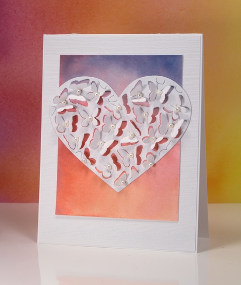
If you have visited the Penny Black blog lately you will know about the new Follow Your Heart release, if not I will be sharing some of new dies and stamps over there and here on my blog this week. Because the butterfly heart pop out die only partially cuts the butterflies you can fold up the wings to reveal whatever is underneath. I tossed up whether to cut the heart out of the watercolour panel or white but decided to have the watercolour panel peeping through the wings and framing the heart. I painted the gradated panel with yellow, pink then blue blending each colour into the one beside it. I attached the coloured panel to a linen textured white panel and cut the heart out of the same textured white cardstock.
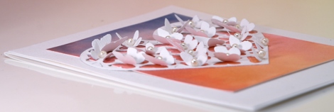
I bent all the butterfly wings up before gluing the heart onto the watercolour panel so I wouldn’t accidentally glue any wings flat. Once the heart was firmly attached I glued a seed pearl in the centre of each butterfly and attached the whole panel to a white card base. If I were to mail this one I would probably need a box-type envelope so I think it might end up being a hand delivered card.
Supplies:
Die: Butterfly Heart Pop Out (PB)
Paints: Peerless watercolors
Cardstock: hot pressed watercolour paper, neenah solar white, textured white
Also: white seed pearls
Mid winter sky
Posted: January 12, 2017 Filed under: Color Burst, Into the sky | Tags: color burst, liquid metals, Penny Black stamps, Tsukineko Versafine inks 13 Comments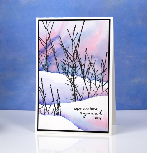
The sky has been very pretty around dusk lately, not the deep colours in today’s card but a soft apricot glow on the horizon along with yellows, pinks and blues. I used Colorburst powders to create this sky and the shadows between the snow banks. First I positioned a torn post-it mask across the watercolour panel and stamped the ‘into the sky’ branches over the mask. I removed the mask and repositioned it lower down and stamped some more branches on the right then finally placed the mask even further down the panel and stamped the tips of the branches on the left, all in versafine black ink.
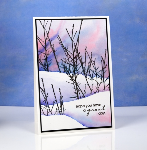
Once the ink was dry I painted the sky in the top portion of the panel making sure I kept the paint above the bottoms of the branches. I tilted the panel to let the pinks and blues mix into patterns and new shades. I did the same behind the remaining branches but did not paint right up to the top of the snow bank above.
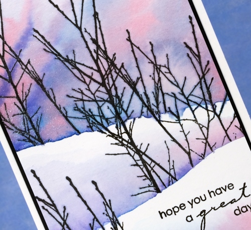
I mixed the paint powders in a palette and added platinum liquid metal for a little shimmer and sparkle. I hope the beauty around you inspires you today.
Supplies:
Stamps: Into the sky, Amazing (PB)
Paints: Alizarin Crimson, Indigo & Ultramarine Blue Colorburst powders (Ken Oliver)
Inks: Versafine onyx black ink (Tsukineko)
Cardstock: hot pressed watercolour paper, neenah epic black cardstock
Also: Platinum Liquid Metal (Ken Oliver)


