Lilacs video tutorial
Posted: February 19, 2018 Filed under: lilacs, Tutorial | Tags: Penny Black stamps, Ranger Distress stains, video 12 Comments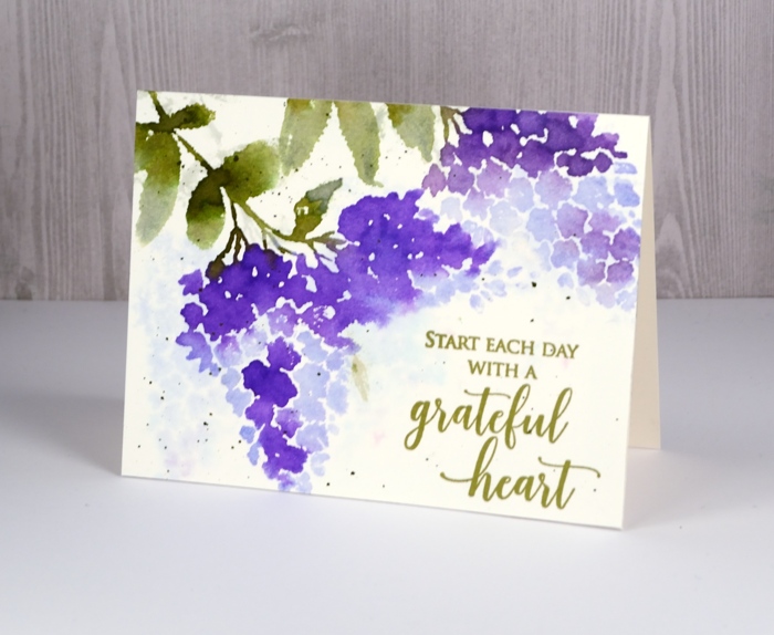
I am excited to share not only these pretty new stamps today but a video tutorial as well! I know, it is hard to believe.
I created this card using a technique I love to use with brushstroke stamps: watercolour with distress stains. I generally use the dauber topped distress stains but as they are being discontinued I thought I would try applying stain with a paint brush. It adds another step in application but the end result is just as pretty.
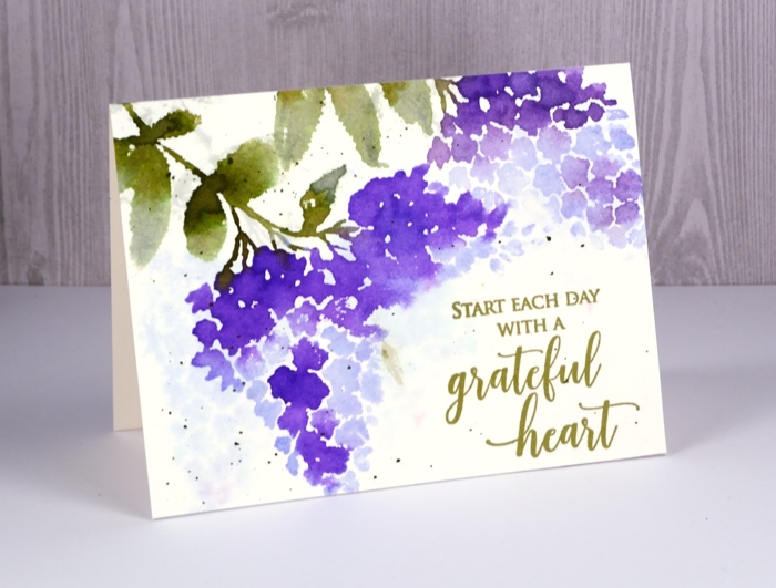
I filmed this video and a couple more with my son’s new camera which I am still getting used to so there are some focusing issues where the camera chooses to focus on my hand instead of the panel. I didn’t think it was enough of a problem to start again so I hope it isn’t too annoying. You get to see me drop my paintbrush with stain on it in the middle of the panel and come up with a quick fix too. I hope you enjoy the video and get to do some creating of your own.
Thanks for dropping by.
Supplies
Stamps: lilacs, grateful heart
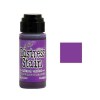
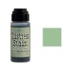
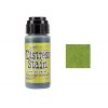
Distress stains: shaded lilacs, wilted violet, bundled sage, peeled paint
Inks: Spanish moss versafine ink
Paper: hot pressed watercolour, neenah natural white

Tools: MISTI
Floral medley
Posted: February 16, 2018 Filed under: floral medley | Tags: Faber-Castell Albrecht Durer Watercolour pencils, Penny Black stamps, WOW embossing powders 7 Comments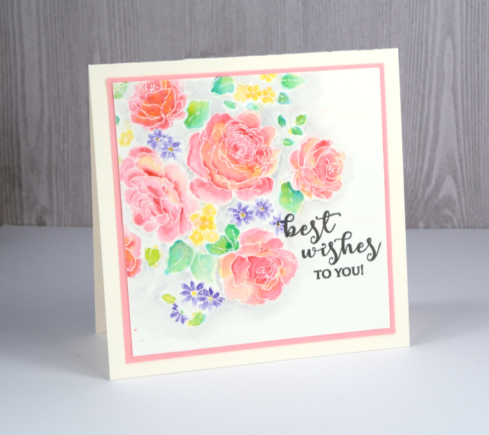
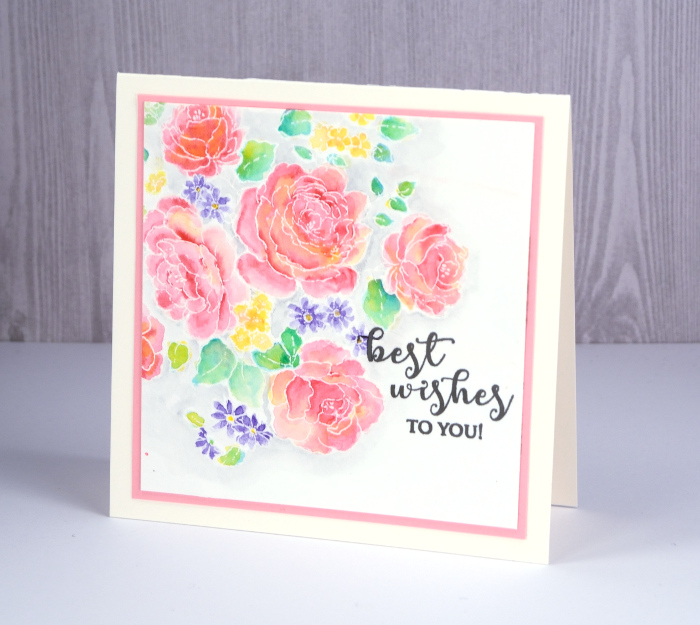
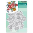
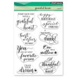
Sweet Spring has arrived, on the Penny Black blog that is! Sweet Spring is Penny Black’s brand new release and as you can imagine it’s full of flowers. I’ve been having fun using some of my favourite techniques to colour those flowers so let’s take a look at today’s blooms. This big stamp is called ‘flower medley’ and I’ve paired it with a new sentiment from the ‘grateful heart’ set. (list and links below)
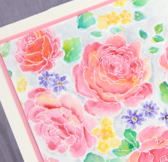
I embossed the flower medley stamp on hot pressed watercolour paper with white powder then used my watercolour pencils to paint in and around all the leaves and flowers. The embossing keeps everything contained so I was able to pick up colour from my pencils with a waterbrush, paint a petal or leaf then drop in more of the same colour for some depth or a different colour to create some blended areas. Once all the flowers and leaves were coloured I painted around them all with a grey watercolour pencil.
Next I used a trick I occasionally employ to flatten my watercoloured panels. I turned on my minc, popped the panel inside a folded piece of computer paper and ran it through the minc on a low heat setting. It ironed my panel nicely but also melted and removed some of the embossing. If I had used an embossing powder with some colour or shine then I wouldn’t have wanted it to disappear but clear or white embossing just masks the white paper underneath so melting it off didn’t change my design at all. The panel ended up very smooth so I was able to overlap the floral design with a sentiment stamped in versafine smokey gray ink. I matted the panel with co-ordinating pink cardstock and then added it to a square cream card base.
Now click on over to the Penny Black blog for the full reveal and a giveaway!
Supplies
Stamps
Inks: versamark, versafine smokey gray
Pencils: Faber-Castell Albrecht Dürer watercolour pencils
Paper: hot pressed watercolour paper, pink cardstock
Also: opaque white embossing powder, minc foil applicator
Good neighbours
Posted: February 13, 2018 Filed under: Coloured pencil, Good neighbours | Tags: Faber-Castell Polychromos Colour Pencil, Penny Black stamps 7 Comments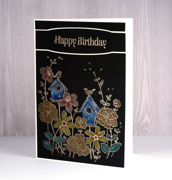
After teaching some colour pencil classes I am feeling inspired to use my pencils more often. I especially like the look on black cardstock but it is trickier to get a good photo. I used my Faber-Castell polychromos pencils for this card paired with the ‘good neighbors’ stamp from Penny Black.
I embossed the stamp with platinum powder then used a selection of coloured pencils to fill all the images. I wanted the sentiment to add some more interest to the black panel so I die-cut the top of my image panel with one of the PB stitched edges dies, used the same die to frame the sentiment then cut a little strip again with the same die to complete the rectangle again at the top.
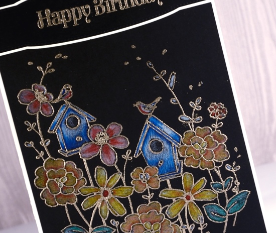
The sentiment is embossed in platinum and then all the panels are attached to a cream card base. A little larger than my usual, hence the side fold. I’m teaching a coloured pencil technique class in Toronto in April; you can find the details on my upcoming classes page.
Supplies
Stamps: good neighors, spice of life

Die: stitched edges
Ink: versamark
Also: WOW metallic platinum superfine embossing powder, Faber Castell Polychromos pencils
Snow blooms
Posted: February 8, 2018 Filed under: a little secret, Effulgent | Tags: Penny Black stamps, Ranger Distress inks 12 Comments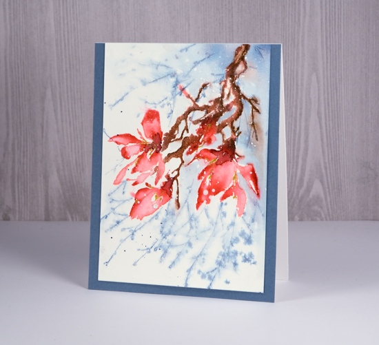
I sense a bit of a theme in this week’s cards; do you think maybe I’m thinking about spring? I am surrounded by gorgeous floral stamps in my workroom but by six foot snow banks outside. So today’s card started out as just a pretty pink magnolia but ended up caught in some flurries.
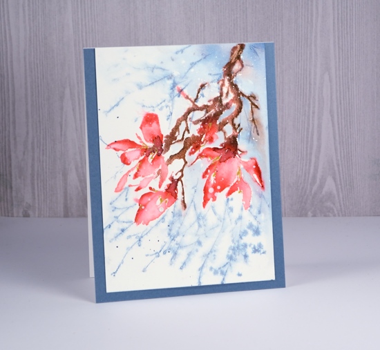
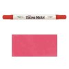
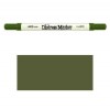
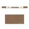
My plan was to build up colour step by step, keep it controlled and neat (not loose and watery). I stamped the whole stamp in worn lipstick ink then coloured the darker areas of the petals with a festive berries marker, the sepals in forest moss marker and the twigs in gathered twigs marker. I then blended the colour with water on a small brush so it was still fairly neat.
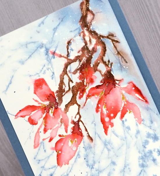
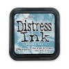
I wanted some extra foliage in the background and that’s when things started to go a little freestyle. I masked the flowers with a post it and stamped the ‘a little secret’ stamp a couple of times in stormy sky ink. The two stamps did not really look like they belonged together so I left behind my ‘neat’ plan and started spritzing the water around. The background softened but not quite enough so I painted some stormy sky into the background also. As I painted stormy sky right up to the edge of the branch the brown bled into the blue, things got loose and watery and, in my opinion, more appealing. I added some aged mahogany ink to the the centres of the flowers and some gold gel pen highlights. Then I wanted some snow as well so I splattered white gesso over the petals. I found a co-ordinating blue to frame the panel and kept it without a sentiment for now.
Supplies
Stamps: effulgent, a little secret
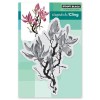
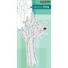
Distress inks and markers: worn lipstick, festive berries, forest moss, gathered twigs, stormy sky, aged mahogany
Paper: hot pressed watercolour paper,
Paint: white gesso
Also: gold gel pen
Graceful whisper
Posted: February 7, 2018 Filed under: graceful whisper | Tags: Penny Black stamps, Ranger Distress stains, Tsukineko Memento inks 14 Comments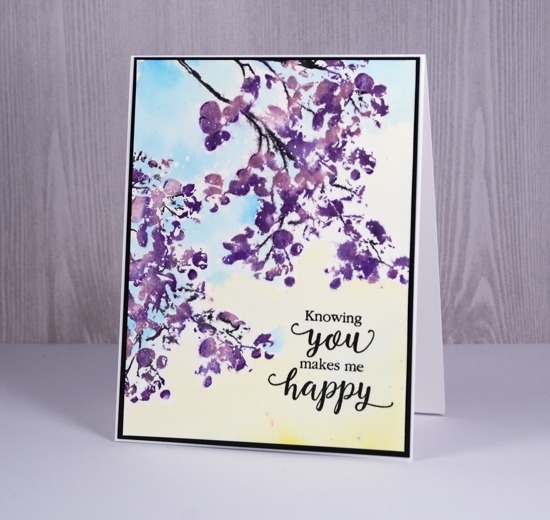
This branch has been waiting patiently for some ink so I went rather non-traditional and pulled out some purples to create this card. I splattered a few panels of hot pressed watercolour paper with masking fluid yesterday so I would have them on hand for future projects. The effect is subtle on this one but you can see little white dots in the sky and foliage if you look closely.
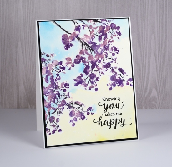
I used a couple of teardrop memento inks and a marker to ink the stamp. With the teardrops it is possible to apply ink somewhat strategically. I started with the lighter grape jelly ink and dabbed it here and there over the stamp. My panel was in my stamping platform so I was able to do grape jelly ink first, then add some dabs of the darker elderberry ink second. I went back and forth with the two inks and occasionally a spritz of water until I was happy with the image. I coloured the stems with a memento tuxedo black marker, stamped to complete the image then moved the panel to stamp a second branch the same way.
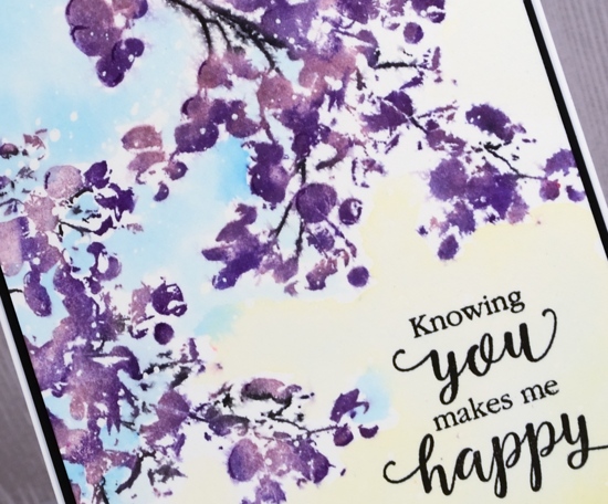
Once all the stamping dried I used mustard seed and salty ocean distress stain to paint the sky. I kept it fairly diluted and dabbed with a paper towel if I had too much water or stain. To finish it off I stamped the sentiment from the PB ‘sentiment collection’ set in versafine onyx black ink then matted the panel with black and attached it to a white card base.
Supplies
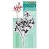
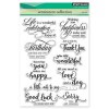
Stamps: graceful whisper, sentiment collection
Inks: grape jelly, elderberry, tuxedo black marker
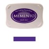
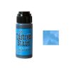
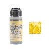
Stains: salty ocean, mustard seed
Paper: hot pressed watercolour, neenah epic black, neenah solar white


Also: masking fluid
Roses all over
Posted: January 30, 2018 Filed under: Bister, My Favorite Things, Roses all over, Shades | Tags: Bister, My Favorite Things, Penny Black creative dies 15 Comments
I pulled out my bister powders the other day; they were kind of pushed to the back of the watercolour shelf. They turned out to be a perfect match for this ‘roses all over’ stamp from My Favorite Things. Bister (and brusho and colorburst) does wonderful things when sprinkled over embossing because the powder gets trapped inside the ‘walls’ of embossing and keeps colours and shades separate. If you are not familiar with bister, you can read about it here. The colours are earthier than brusho and colorburst which is nice for a change.

Believe it or not this panel is painted with just red bister; all that lovely variety is from one colour. I embossed the watercolour panel with platinum embossing powder then sprinkled the red bister over it and spritzed with water. I watched to see if sections were filling with colour before spritzing or sprinkling a second time. Once there was enough powder I used a paint brush in just a few places to blend or spread the colour. I did not have to do much with the brush because MAGIC.

I found a cardstock that co-ordinated to mat the panel and create a banner for the sentiment. The banner die is from the PB ‘shades’ set and the sentiment embossed in platinum is from the PB ‘banner sentiments’ set.
Thanks for dropping by.
Supplies
Stamps: roses all over (MFT), banner sentiments(PB)


Die: shades (PB)

Ink: versamark
Paint: bister powder red
Cardstock: hot pressed watercolour, neenah natural white, red cardstock
Also: platinum embossing powder
Circle of hearts
Posted: January 25, 2018 Filed under: hearts in circle | Tags: Brusho, Finetec artist mica watercolour paint, Penny Black creative dies 4 Comments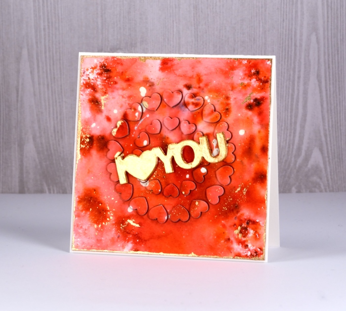
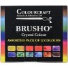
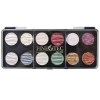
For today’s rather bold card I started, as I often do with a masking fluid splattered panel. I continued, as I often do by sprinkling brusho powder over the panel then spritzing with water to activate it. I do tend to be a ‘chap of one idea’ at times don’t I? (Can you place that quote from one of my favourite book series?) This time the brusho was rose red and terracotta. Once dry, I splattered gold finetec paint over the panel and let it dry. I removed the masking fluid, trimmed the panel to a square then painted the edges with gold paint.
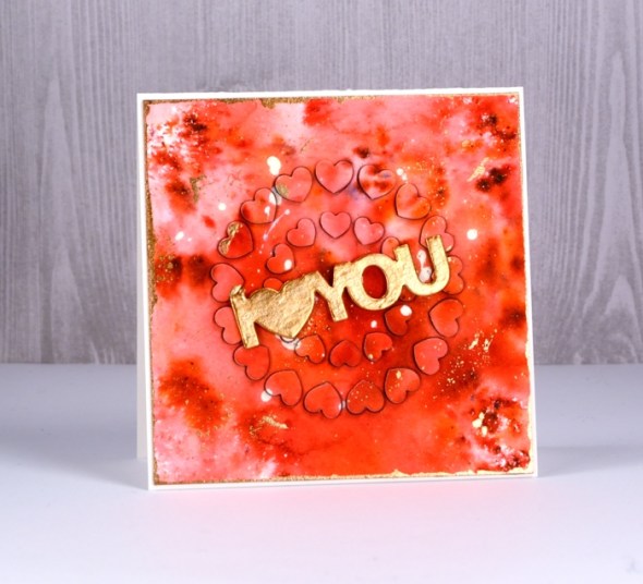
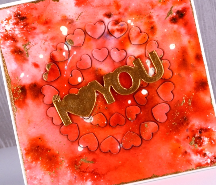
That was the easy part; after that the fiddliness factor rose considerably. I attached adhesive sheet to the back of the panel and die cut ‘hearts in circle’ from the centre of the panel and from a red adhesive backed foam sheet. I carefully saved the little hearts in formation on a piece of ‘press n seal’. I peeled the backing off the watercolour panel and attached it to the card front. Next I pressed the die cut adhesive backed foam hearts into each space in the die cut panel. Finally I peeled the backing off the die cut watercolour hearts and attached them on top of foam hearts. This was a little like completing a jigsaw puzzle.
Supplies


In my heart
Posted: January 24, 2018 Filed under: Tree heart, Triple Banner | Tags: Kuretake Gansai Tambi watercolour paints, Penny Black creative dies, Penny Black stamps, WOW embossing powders 4 Comments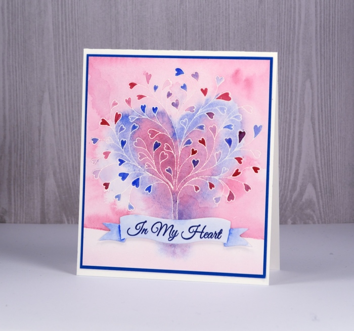
This stamp is called ‘tree-heart’ but I always think of it as a family tree. After all what better to have on a family tree but a whole bunch of hearts? I stamped the tree in versamark and embossed with clear powder on hot pressed watercolor paper. Next I painted water over the top section of panel and added pink and blue watercolour paints. Keeping it loose I painted a heart shape over tree with both pink and blue. I filled in the heart leaves with more intense pink and blue paint then painted diluted pink over base area.
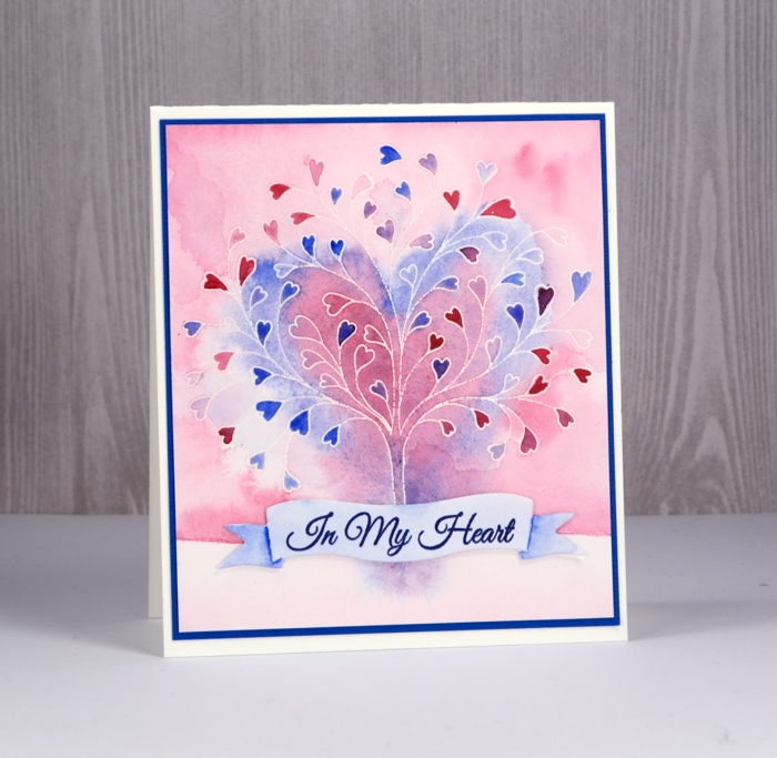
I grabbed a scrap of watercolour paper, painted diluted blue over it and stamped a sentiment from ‘happy hearts’ in versafine majestic blue ink. I die cut a banner to contain the sentiment and painted shadows on the ends of banner with blue paint.
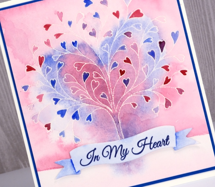
To finish I attached the banner to the tree panel with very low profile adhesive dots and matted the panel in blue cardstock before attaching to a white cardbase.
Supplies


Brusho Rose
Posted: January 23, 2018 Filed under: Rose | Tags: Brusho, Fabriano Watercolour Paper, Penny Black creative dies 12 Comments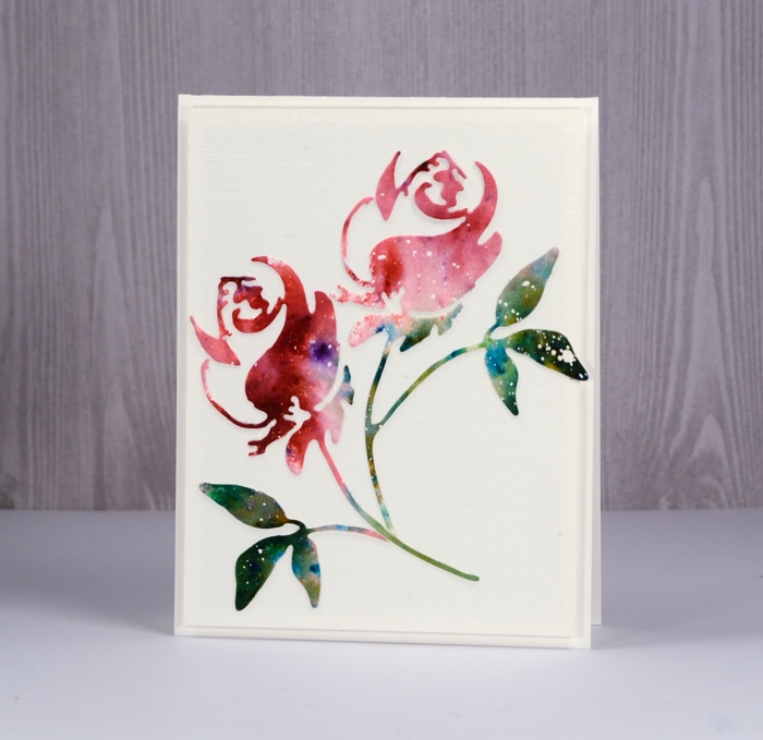
Ah, brusho, how I love thee! My cards on the Penny Black blog and here on my blog this week are all ‘love themed’ so it shouldn’t matter that it’s a paint that I’m in love with, should it? Brusho paint powders do such magical things I never tire of putting them to use.
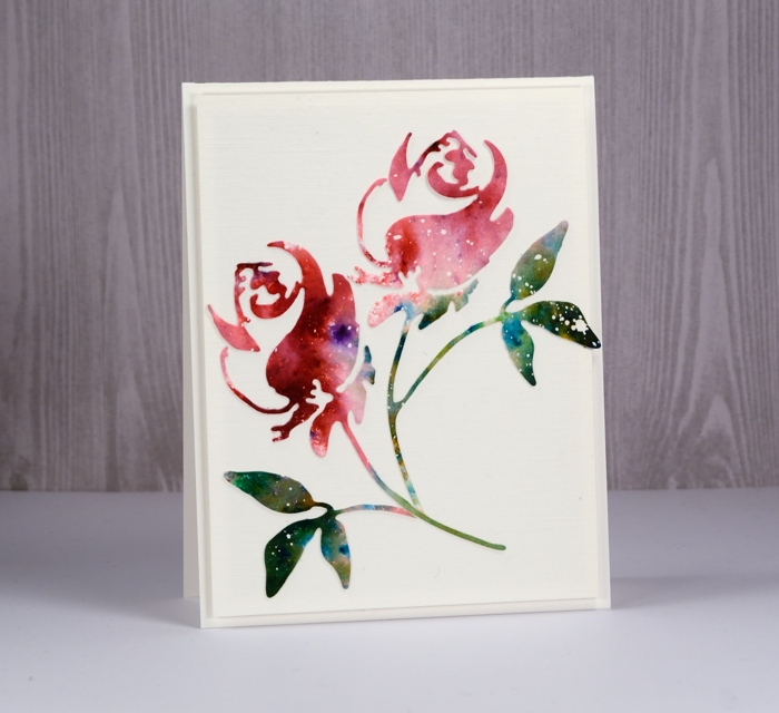
To create this simple card I started with a piece of hot pressed watercolour paper already splattered with masking fluid. I sprinkled rose red brusho on one end of the panel and a mix of leaf green and olive green brusho over the other end. I spritzed with water to activate the paint and added more water and moved the paint around to create a varied coverage. Once it was completely dry I die cut a couple of roses using the Penny Black ‘rose’ die. I kept one die-cut complete and trimmed the rose and leaves off the other to arrange separately on a panel of linen textured cardstock.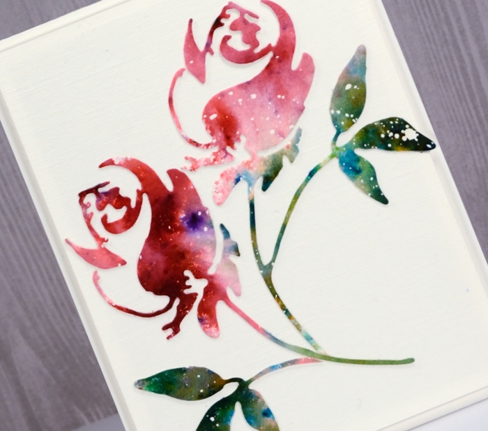
I popped up the panel on a natural white card base and left it sentiment free to keep my options open.
Supplies

Shimmer heart
Posted: January 22, 2018 Filed under: Sweetheart | Tags: Finetec artist mica watercolour paint, Penny Black stamps 16 Comments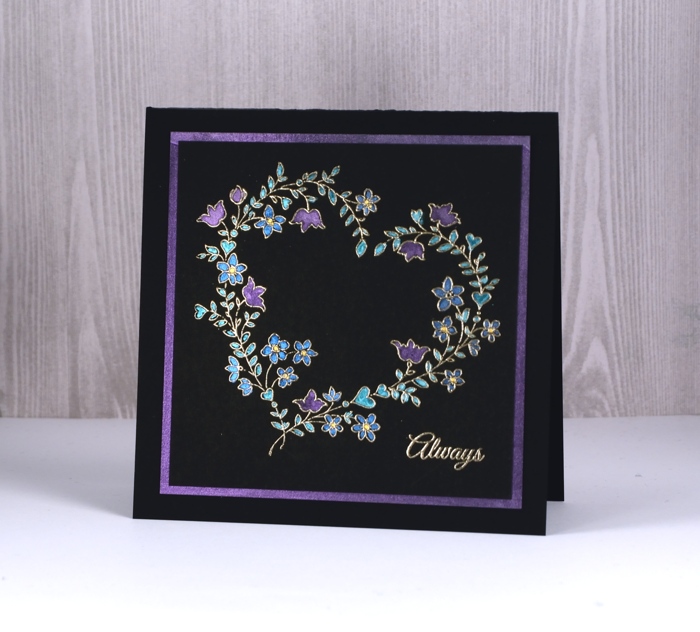
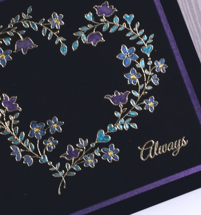
I don’t often stamp on directly on black but maybe I should more often, the effect is quite striking. I stamped the ‘sweetheart’ stamp and a sentiment in versamark on neenah epic black cardstock and embossed them in platinum embossing powder. I then used a small watercolour brush to fill all the hearts and flowers with finetec pearlescent paint. The finetec paints are watercolour so I added a drop of water to the colour and mixed it in the palette before painting.
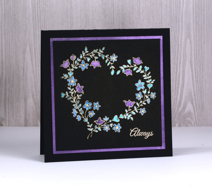
The effect is very shimmery, more so than is apparent in the photos. I wanted the same colour and amount of shimmer on the mat to frame the panel so ended up painting a border of pearlescent purple on a square of black cardstock to frame my panel before attaching both to a black card base.
Supplies