
Radiant blooms
Posted: April 30, 2018 Filed under: Peerless watercolours, radiant | Tags: Faber-Castell Polychromos Colour Pencil, Peerless Transparent Watercolors, Penny Black creative dies, Penny Black stamps, Tsukineko Versafine inks 12 Comments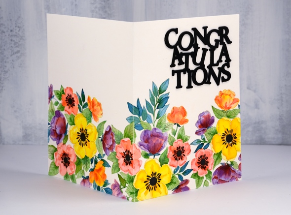
I am sharing floral cards this week here and on the Penny Black blog. This particular one makes me happy. It took me an age to complete but I think it’s bright and sunny. I’ve been wanting to create a card where the design continues across the back and front; my next challenge is one where the design covers back, front and inside!
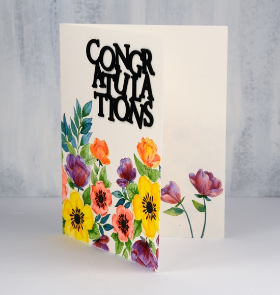
I used the large floral stamp from the transparent set ‘radiant’; it’s part of the new Nature’s Art release from Penny Black. I used my stamping platform and antique linen ink to stamp three prints across the panel. I wanted them to fit nicely together but not look like a repeat pattern so I changed the direction each time. If I had been really diligent I would have masked the first before I stamped the next but I just let them overlap a little. When it came to adding colour I decided which petals or leaves would be in front and painted accordingly. You can’t tell now can you?
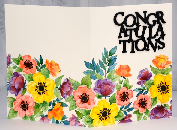
I used quite a few colours but I mixed and matched a bit. Basically I chose a yellow and orange for the large flowers, a peach and a pink for the medium flowers then did some smaller flowers with the orange and the pink (not new colours) I added a purple to the mix but shaded with the pink used earlier. On each flower I painted the lighter colour first then dropped in some of the darker one where I wanted shadow. I painted half the leaves with green and the other half with blue green then added shading to all with a darker green. When the same colour pops up in a few different mixes on your design it keeps things cohesive and visually appealing. Once all the painting was completed I used coloured pencils here and there to darken shadows and add more definition
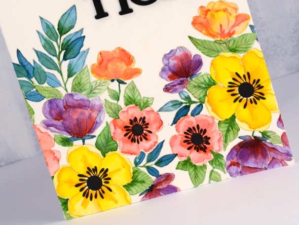
The set includes solid centres in two sizes for the flowers so I stamped them in black and created my die cut stacked sentiment in black also. And I almost forgot to mention I stamped and painted a couple of flowers inside too.
I’ll be back with more bright and breezy florals tomorrow.
Supplies
Stamps: radiant 30-481 (PB)

Die: congratulation 51-439 (PB)

Inks: antique linen distress ink, nocturne versafine clair

Paint: Peerless watercolours

Paper: hot pressed watercolour, neenah black


Pencils: Faber-Castell polychromos pencils
fantastic
Posted: April 20, 2018 Filed under: Alcohol Ink, curved stitch | Tags: Foiling, Minc, Penny Black creative dies, Ranger Alcohol Ink 7 Comments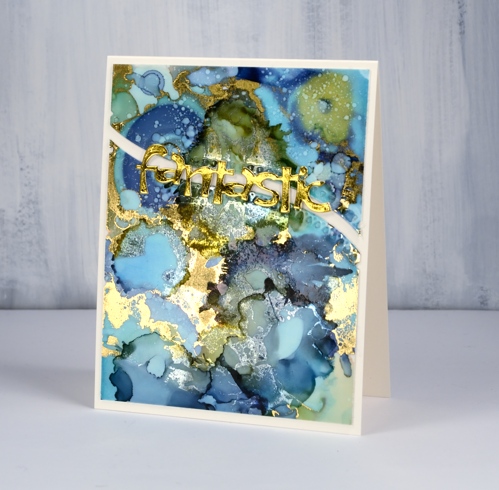
Not long ago I learnt from a couple of friends that foil will stick to some alcohol inks. I posted a card at that time and continued to experiment with foil and alcohol ink panels. If the alcohol ink sitting on the yupo paper is a little sticky the foil will stick more readily than if the inks are long dried. I ran today’s panel through my minc not long after I’d created it and a lot of gold foil stuck. Foil doesn’t stick to all colours of alcohol ink and I’m sorry to say I have not done exhaustive testing to know which ones work. I just layer on some foil, run it through the minc and see what I get!
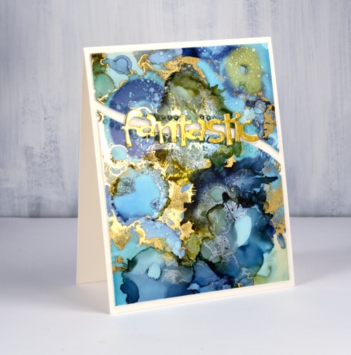
I was pretty happy with what I got this time there were some really pretty gold highlights, but a few more than I wanted. I decided to see whether I could add alcohol ink over the top of the foiling just to tone some of the gold down a little. I was pleasantly surprised to see the gold foil change to a dull silver when it came in contact with the ink. It is definitely hard to photograph the results but my blue and green panel has gold highlights as well as subtler silver patterns.
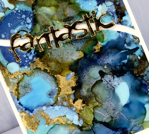
To turn my panel into a card I backed the yupo with white cardstock then cut it in two using the curved stitch die from Penny Black. I stacked some gold die-cuts to make the word ‘fantastic’ look a little more fantastic and added it all to a natural card base. I think this one might turn up as a graduation card this June.
Supplies
Dies: curved stitch, fantastic


Inks: ranger alcohol inks aqua, willow, denim


Paper: yupo, neenah solar white, neenah natural white, gold foil


Also: gold foil, minc, rubbing alcohol


Becoming
Posted: April 12, 2018 Filed under: becoming | Tags: Penny Black stamps, Ranger Distress stains, Tsukineko Versafine inks 5 Comments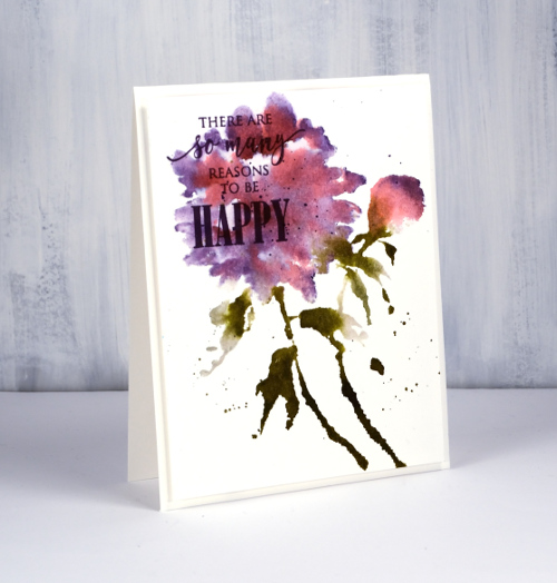
I am sharing this card on the Foiled Fox blog today, a great place to visit if you are looking for some inspiring content or some lovely products (in their online store). I am grateful to The Foiled Fox for supporting my creative work in a variety of ways and I want to let you know my blog includes affiliate links to their online store which give me a small commission.
Yet again I used my distress stains to work with a Penny Black floral stamp. You may have heard the distress stain daubers are being discontinued but the spray stains are not so I intend to refill my daubers from my spray stains; the stain is the same in both bottles. If you don’t want to get messy and do refills you can just paint stain onto your stamp with a brush or use an ink pad and spritz your stamp for a looser, more watery look.
I started in my stamping platform by inking the flower and bud with worn lipstick stain. I stamped then cleaned the stamp so I would not contaminate the dauber of the dusty concord distress stain when I added that next. I kept the dusty concord mainly around the edges of the flower and tip of the bud but it blended into the flower a little which is what I was after.
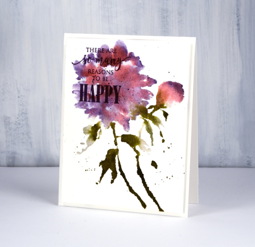
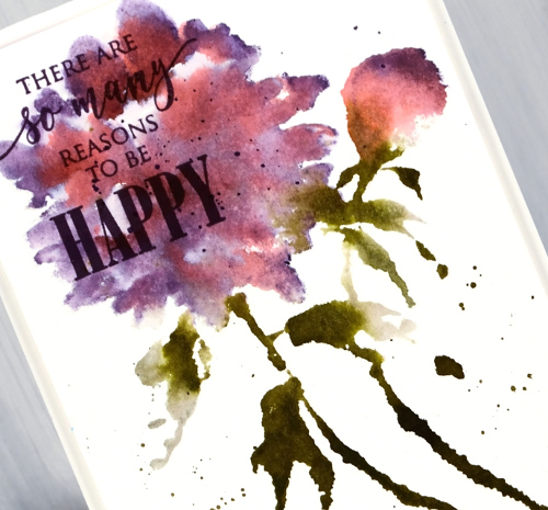
I added a sentiment in versafine clair monarch ink then popped up the whole panel on white foam before adding it to card base.
Supplies
Stamps: PB Becoming, Just Believe


Distress stains: pumice stone, forest moss, worn lipstick, dusty concord


Ink: versafine clair monarch
Paper:
Also: white foam

Spontaneous joy
Posted: April 11, 2018 Filed under: spontaneous joy | Tags: Penny Black stamps, Tsukineko Memento inks 6 Comments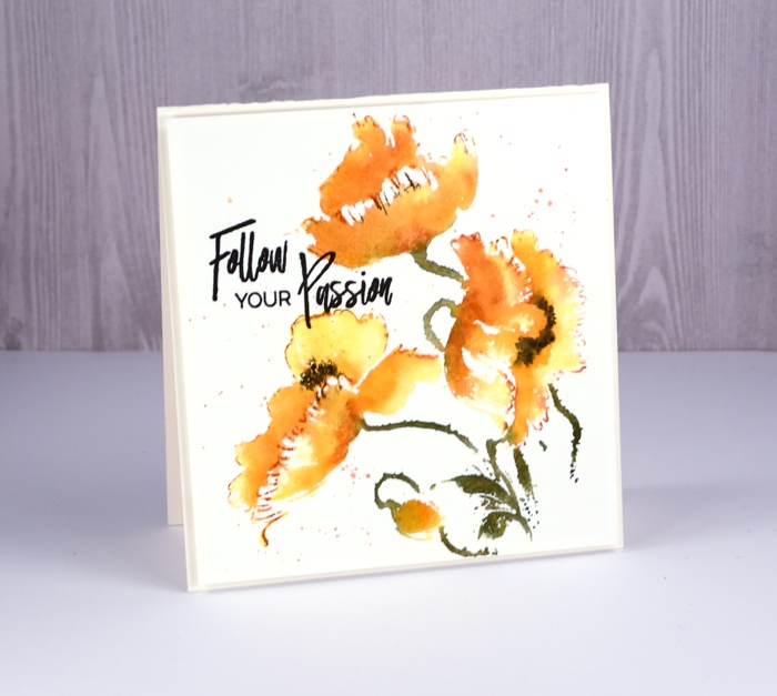
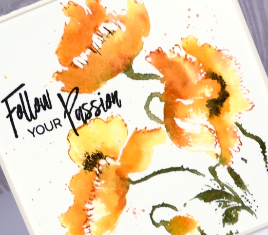
I am happy to share another video with you today. I know…that’s three this year and it’s only April. The future is looking promising. So far the three I have posted were all filmed on the same day but rest assured there are three more in process now. The stamp on today’s card is another pretty brushstroke stamp from Penny Black. I have a few techniques I use with brushstroke stamps ranging from very detailed to very loose and watery. This card has quite a loose look but it’s still clear we are looking at poppies!
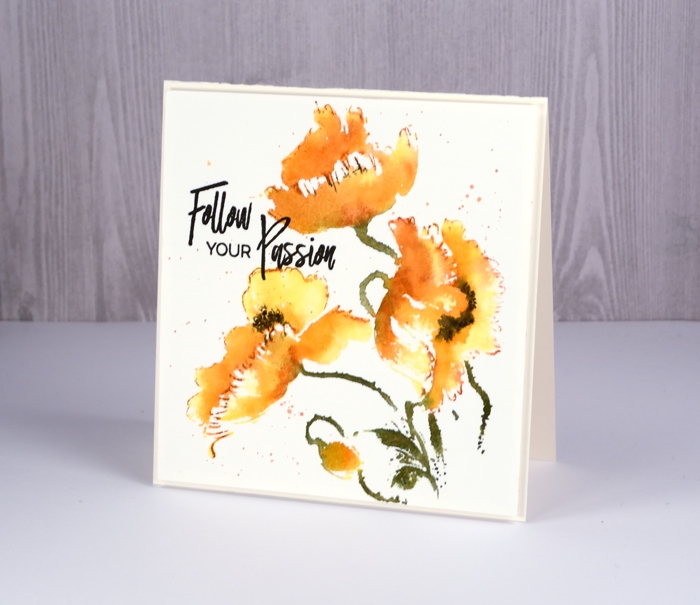
I used a combination of mememto ink pads and markers and worked in a stamp positioner so I could build the colour up step by step. Check out the video to see my whole process.
Thank you for the encouraging comments left here and on youtube about my videos. I am so happy to provide them and thrilled to hear the techniques are making sense and inspiring you to try them yourself.
Supplies
Stamps: spontaneous joy, just believe

Inks: versafine onyx black, memento dandelion ink, memento tangelo, potter’s clay, espresso truffle, northern pine, olive grove markers


Paper: hot pressed watercolour paper
Also: MISTI

Flower Pageant
Posted: April 9, 2018 Filed under: flower pageant | Tags: Penny Black stamps, Ranger Distress stains 4 Comments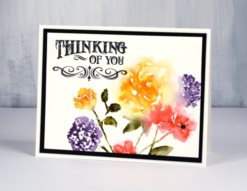
Yes, I used my distress stains for watercolouring again! I could definitely have used ink pads or markers but I really like the uneven amount of pigment and liquid the stains lay down when stamped. Odd isn’t it that I like the coverage to be uneven? With uneven coverage I think the stamping looks more handpainted. I used a stamp positioning tool because you can’t be sure with stain exactly what kind of impression you will get first go. I started with the large flower that is flanked by four little flowers. First I just inked the rose with spiced marmalade distress stain then used a paint brush and water to blend the stain out into pale petals. Next I added the dusty concord, festive berries and forest moss stain to the flowers and leaves surrounding the orange rose. I also blended them with a little water, just enough for them to soften into each other but not lose all definition.
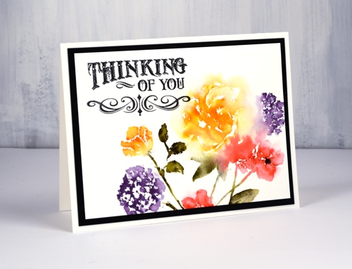
To fill out the design I stamped one of the smaller stamps and blended slightly with water also. At this point I felt my design was looking a bit vintagy so I pulled out an older PB sentiment set incorporating a vintage style font and paired it with one of the new flourish border stamps.
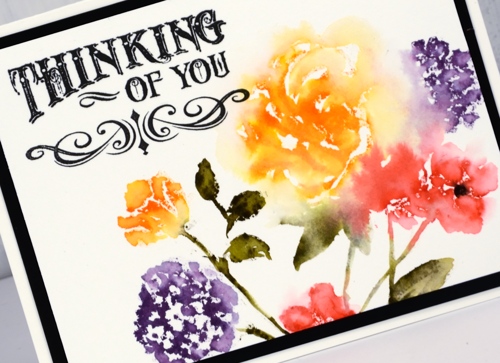
A wide black mat tied it all together. I think these stamps might lend themselves to a repeat pattern on a larger piece of paper. Might have to try that.
Supplies
Stamps: flower pageant, flourish borders, sentimental


Distress stains: forest moss, spiced marmalade, festive berries, dusty concord


Ink: versafine clair nocturne
Paper: hot pressed watercolour, neenah black
You’re spectacular
Posted: April 6, 2018 Filed under: Brusho, fantastic, Zigs & zags | Tags: Brusho, Foiling, Penny Black creative dies, Penny Black stamps, Penny Black stencils 6 Comments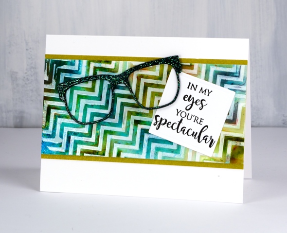
Does that background look a little skewed to you? It’s that exact feature that made me use it for an ‘eye sight’ themed card, something you might have to look at with your head on the side.
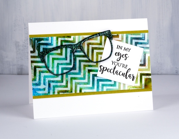
I taped the zigs & zags stencil from Penny Black onto a piece of hot pressed watercolour paper then spread deco transfer gel over. I carefully removed the stencil and let the gel dry. Once dry I lay a piece of white foil over the panel and ran it through my minc foiling machine. The result was a white on off-white chevron panel. Because I had created it on watercolour paper I was able to use brusho and a spritzer to make a multicoloured pattern. Once the panel dried and I decided on the ‘spectacle & eyesight’ theme. I wanted the die cut glasses to look a little fancy so I added adhesive sheet to the back of black cardstock then cut three pairs of glasses. I was just going to emboss them with clear powder but thought sparkly clear powder might be even better. After adhering the three die cuts together in a stack I pressed the top layer onto my versamark ink then dipped it in WOW clear sparkle powder. Even though the powder is clear it ended with a slight green sparkle to it. It looks a little different depending what base colour you emboss over. I pressed the glasses onto my versamark again and embossed in clear powder over the top of the sparkle.
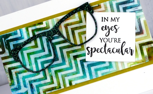
My sentiment is just one of the eyesight themed sentiments in the ‘perspective’ transparent set from Penny Black. To complete the card I matted the zig zag panel in a co-ordinating colour, attached the sentiment then the glasses and attached it all to a white card base. Not my usual style but I had a lot of fun putting it together.
Supplies
Stamps: perspective

Dies: glasses (PB), 2″ square die

Stencil: zigs & zags (PB)

Paint: colorburst turquoise, olive green, ultramarine


Ink: versamark

Paper: hot pressed watercolour, neenah epic black, neenah solar white, olive green
Also: clear sparkle embossing powder, clear embossing powder, double sided adhesive sheets, MINC, white foil, deco transfer gel


Painted Sunfire
Posted: April 4, 2018 Filed under: cherry blossom, Foiling, Peerless watercolours, stitched square & circles, Sun fire | Tags: Peerless Transparent Watercolors, Penny Black creative dies 11 Comments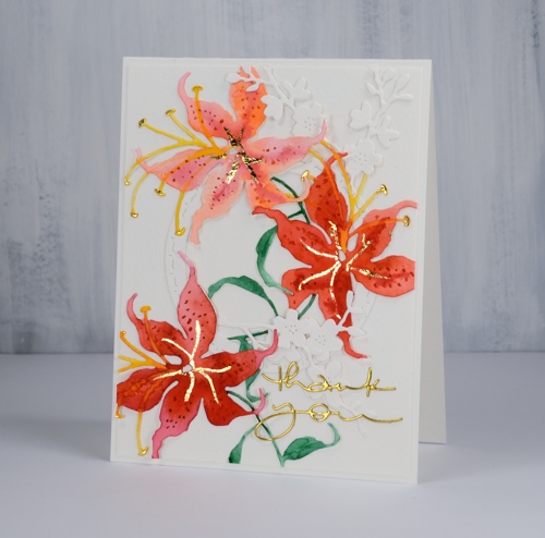
When creating die cut cards I sometimes paint the watercolour paper first, as I did for the brusho card posted a couple of days ago. Other times I do the die cutting and paint each element separately. For today’s card I cut three lilies ( a Penny Black die named ‘sunfire’) from hot pressed watercolour paper then painted them with peerless watercolours.
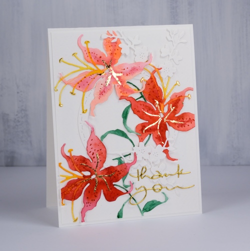
I chose a pink, a red and an orange paint and used at least two of them on each flower which gave me variety in the blooms but a cohesive look overall. I let the petals dry before using the red paint to add dots and the yellow paint for the stamen. I used a blue-ish green on the stems and leaves. Once all the paint was dry I used a glue pen to add a vein down the centre of the petals and also dabbed the ends of each stamen. I let the glue sit and dry partially then pressed gold foil over it .
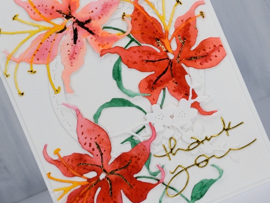
To create a floral arrangement I cut a circle and some cherry blossom from unpainted watercolour paper and glued down all the elements. It took me a while to work out a layout that looked balanced. The die cut lilies are quite large so I trimmed bits off in order to fit them all on the card front. I finished it off with a gold foil die cut sentiment.
Supplies
Dies: sunfire, cherry blossom, many thanks, stitched square & circles


Paper: cold pressed watercolour paper, gold foil cardstock


Paint: Peerless watercolour paints
Also: quickie glue pen, gold foil

Classes here and there
Posted: April 2, 2018 Filed under: Classes, Darkroom Door, Penny Black | Tags: Classes Leave a commentIf you live in the Ottawa or Toronto area this post is for you. I’d like to draw your attention to my upcoming classes page. I teach art and card making classes each month in Ottawa, a few times a year in Toronto and occasionally in other places. All my classes are listed on my Upcoming classes page but I thought I would mention them here on the blog and highlight one you won’t find listed on my class page.
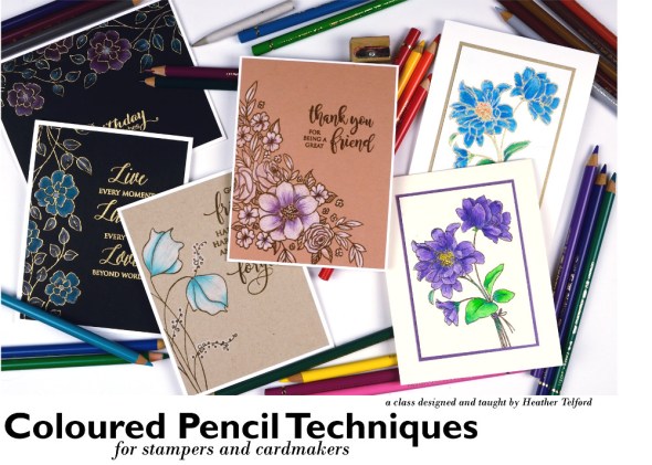
On April 7 I will be in Toronto teaching a Coloured Pencil Technique class
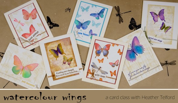
and my Watercolour Wings class.
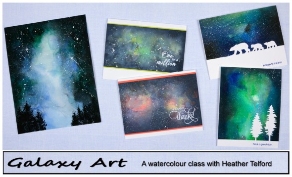
In Ottawa on April 12, 13, 14(already full) & 16 and in Toronto on May 26th I am excited to be teaching my Galaxy Art class.
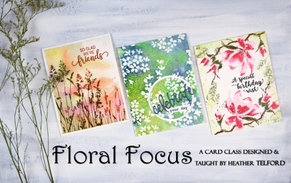
In Ottawa on May 10, 11, 12 & 14 and in Toronto on May 26 I will be celebrating spring with my Floral Focus class.
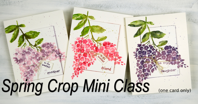
You will find all the details on my Upcoming Classes page. You can sign up for most classes through the links on the class page but to attend the ones held at Crop A While in Ottawa you will need to contact the store directly. Crop A While scrapbooking store is hosting a “Hello Spring Super Crop” on April 28 where I will be teaching a mini class (one card). To register for the crop and my mini class you will need to contact Crop A While. If you have any questions please use the contact me link.
Bodacious brusho
Posted: April 2, 2018 Filed under: bodacious, Brusho, CAS | Tags: Brusho, Penny Black creative dies, Penny Black stamps 8 Comments
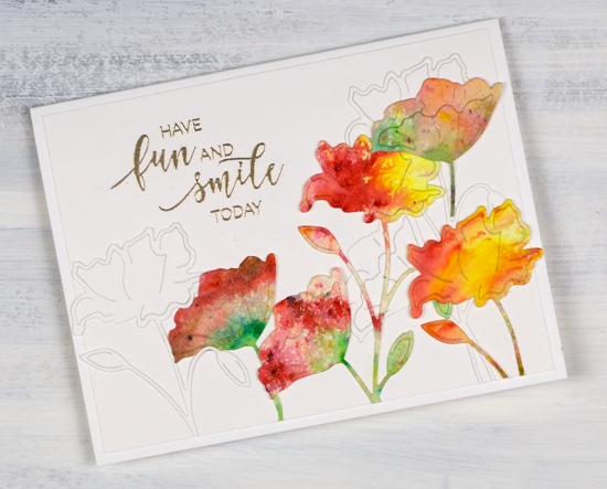
This week I have a couple of painted die cut cards to share. To create this one I first sprinkled leaf green, sunburst yellow and rose red brusho over a piece of hot pressed watercolour paper and spritzed with water to activate the paint. The colours did blend together a little but I was able to keep some distinct red, yellow and green areas. Once dry I used the ‘bodacious’ die from Penny Black to cut several flowers. I also cut white flowers with the same die. When creating my layout I glued down a few white diecut flowers first then coloured ones over the top. I trimmed stems and buds so I could arrange the flowers at different heights and facing different directions.
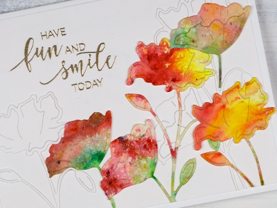
I embossed a sentiment from the ‘smile today’ set in platinum, trimmed the white background panel and attached it to a white card base.
Supplies
Stamps: smile today!

Die: bodacious

Paper: hot pressed watercolour, neenah solar white, white linen texture paper
Paint: leaf green, sunburst yellow, rose red brusho
Also: platinum embossing powder
Poppy blessing
Posted: March 21, 2018 Filed under: Parade of flowers | Tags: Faber-Castell Albrecht Durer Watercolour pencils, Penny Black stamps, WOW embossing powders 4 Comments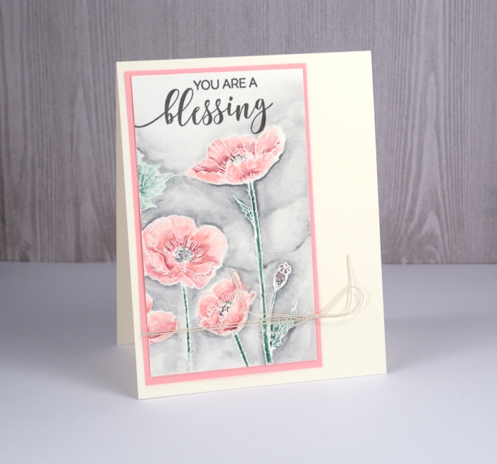
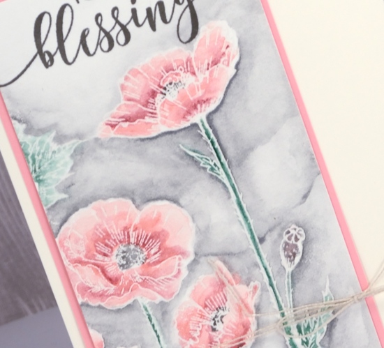
This is the second card I’ve posted featuring the ‘parade of flowers’ stamp from Penny Black. To create this one I used just a section of the stamped image and worked with the emboss resist method. I stamped in versamark and embossed in clear powder on hot pressed watercolour paper.
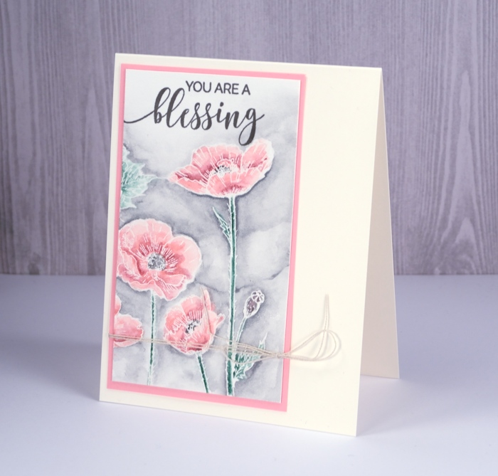
The painting is all done with watercolour pencils. I use a waterbrush or wet paintbrush to pick up colour from the pencils. I used 2-3 pinks to fill the flowers, a green for the stems, a brown for the seed pod and black for the poppy centre. I painted the background with a grey watercolour pencil, added a sentiment in versafine smokey gray ink, a pink mat and a little twist of twine.
Happy Spring!
Supplies
Stamps: parade of flowers, choose happy


Inks: versamark, versafine smokey gray
Pencils: Faber-Castell Albrecht Dürer watercolour pencils
Paper: hot pressed watercolour paper, pink cardstock

Also: clear embossing powder, twine












