
Botanical script
Posted: February 11, 2018 Filed under: Botanical Script | Tags: Darkroom Door stamps, Ranger Distress inks, Tsukineko Versafine inks 7 Comments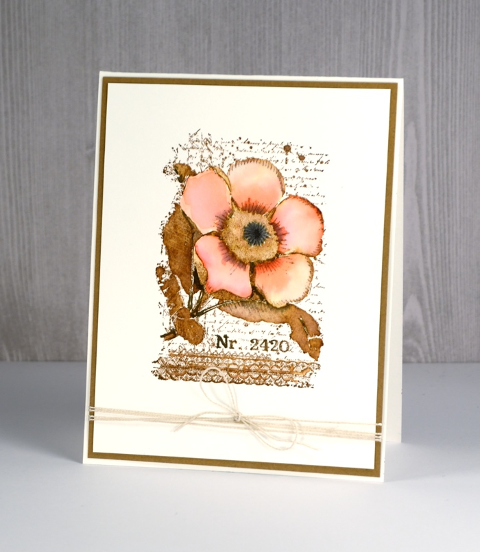
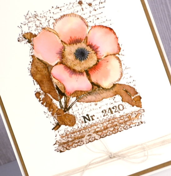
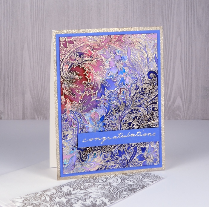
I am very happy to be sharing these two cards over on the Darkroom Door blog today. Both cards feature a floral collage stamp from the new Botanical Script set. You can find all the instructions over at Darkroom Door. My first card is done in a vintage style with distress inks.
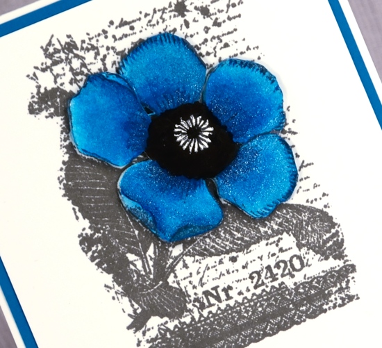
My second card is bolder and brighter with a sparkly blue and white colour scheme.
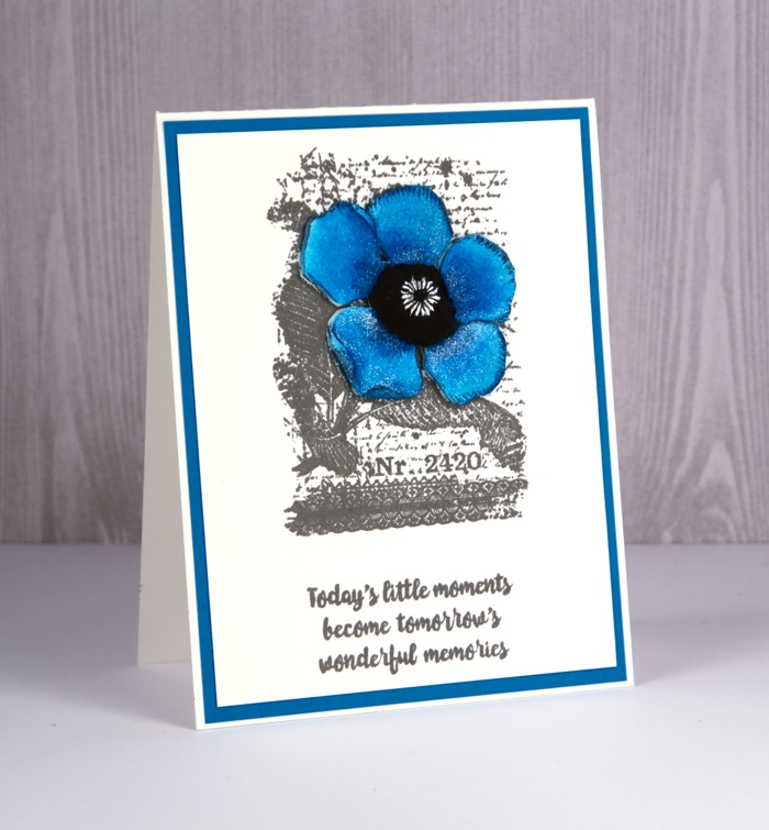
I layered this one by cutting out and painting an extra flower. All the steps and supplies are listed on the Darkroom Door blog. While you’re there you can see the other pretty stamps from the Botanical Script set.
Wings
Posted: January 31, 2018 Filed under: Butterflies, Classes, Coloured pencil | Tags: Darkroom Door stamps, Faber-Castell Polychromos Colour Pencil, Prismacolor pencils, Tsukineko Versafine inks 5 Comments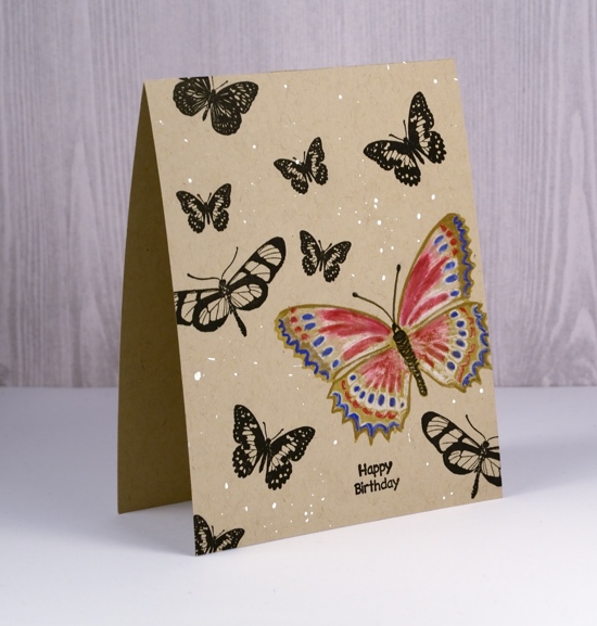
I spent a large chunk of today working on a future class, not the projects (the most fun part), but the photography, editing, promotional blurb, etc. While doing that I got inspired to combine the technique from the class next week with the theme from the class next month and this quick card was the result. I haven’t done a one layer card in a while and I rarely work with kraft cardstock so it was fun to change gear a little. I stamped butterflies from the Darkroom Door set, ‘Butterflies‘ in versafine onyx black and toffee inks then coloured the toffee one with coloured pencils.
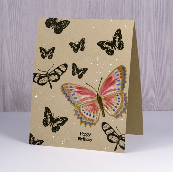
The white paint over the card front is part random splatter of copic opaque white pigment and part sigma white gel pen dots. The sentiment is from the DD set, Happy Birthday. I am always keen to participate in Kathy Racoosin’s 30 Day Coloring Challenge but never manage it on all thirty days. Today’s colouring did not take long, which is what she suggests, and it was fun to squeeze it in.
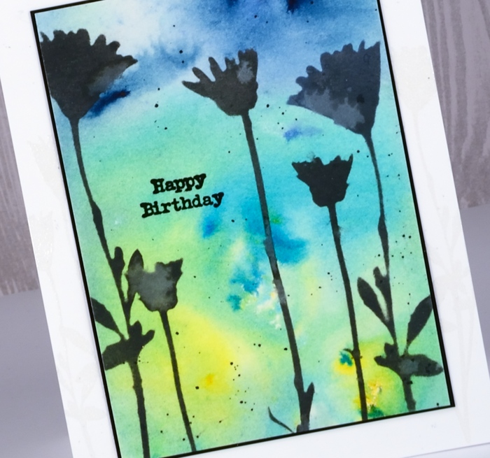
Wildflowers
Posted: January 26, 2018 Filed under: wildflowers | Tags: Brusho, Darkroom Door stamps, Darkroom Door stencils, distress oxide inks 4 Comments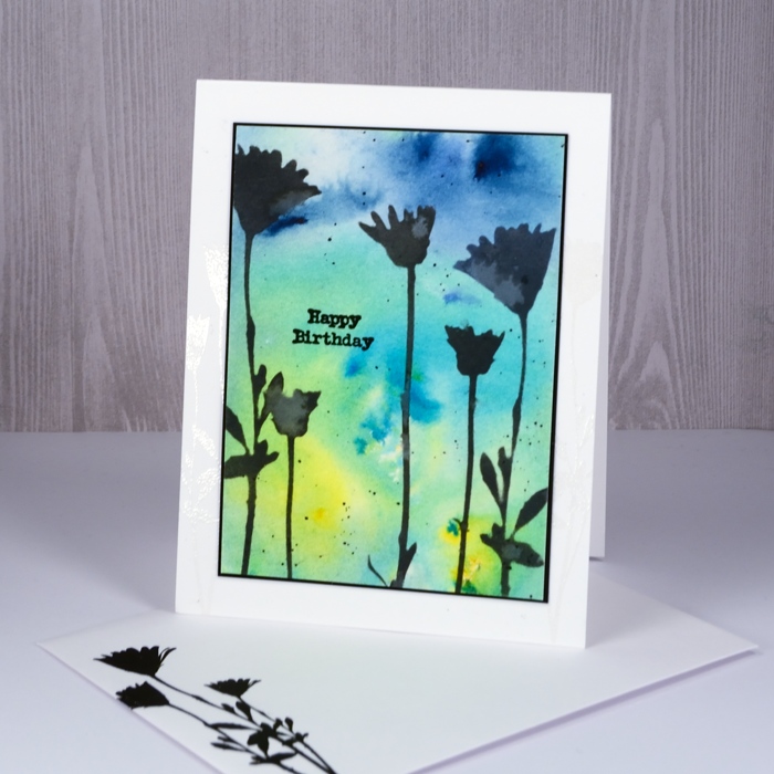
Happy Australia Day! What better to feature on the blog than a card made with Australia’s own Darkroom Door designs. The fact is though, by the time I get out of bed on Australia Day the festivities over there are practically over. I am currently sixteen hours behind my family on the east coast of NSW!
I’ve been pairing stencils with a few different things lately. For today’s card I sponged through the Darkroom Door stencil, wildflowers, with black soot distress oxide ink. You can see the watermarks on the stenciled flowers, a chalky white effect particularly obvious with the oxide inks. But before I did that I began by sprinkling brusho over a panel of watercolour paper. I spritzed with water and let the patterns happen. Once that was dry I sponged the black soot oxide through the stencil then splattered some droplets of water on top. I dabbed them up fairly quickly to create the watermarks.
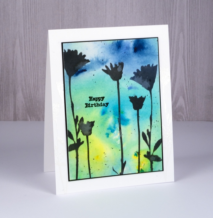
I cut a black mat to be a very narrow frame around the panel and added a black sentiment from the Darkroom Door Happy Birthday set.
Supplies
Stamps: happy birthday
Stencil: wildflowers
Paint: brusho paints sunburst lemon, leaf green, ost blue brusho
Ink: versafine onyx black, black soot distress oxide
Paper: hot pressed watercolour, solar white, epic black
Also: clear embossing powder
Another flower garden
Posted: January 20, 2018 Filed under: Flower garden | Tags: Darkroom Door stamps, sakura Koi watercolor brush pens, WOW embossing powders 10 Comments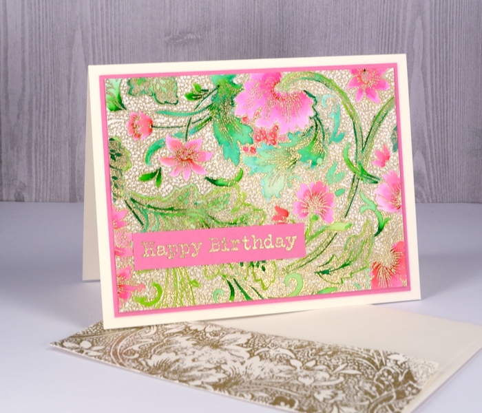
The ‘flower garden’ stamp from Darkroom Door performed so well with the random application of colorburst paint I tried it with a more controlled colouring method. I embossed this panel in gold then used Koi colouring brush pens. I decided to colour only the leaves and flowers and leave the tiny circle pattern filler uncoloured. Adding colour to gold embossing like this reminds me very much of Cloisonné which I saw on little trinkets as well as substantial, beautiful vases in China. I used two greens, a pink and a red to colour the design and kept blending with water to create soft gradation of colour.
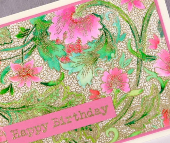
I matted the panel in pink and embossed a sentiment from the Darkroom Door ‘happy birthday’ set which includes sixteen ‘happy birthdays’ in different fonts and sizes! You might have noticed with both the flower garden cards I managed to add a stamped envelope too. I’m trying to get into the habit of creating a matching envelope while I have all the supplies out rather than thinking about it later but being too lazy to do it…
Supplies
stamps: flower garden, happy birthday


Ink: versamark

Paper: hot pressed watercolour, neenah natural white, pink cardstock


Markers: Koi coloring brush pens yellowgreen, green, red, pink

Also: WOW metallic rich gold embossing powder

Flower garden
Posted: January 18, 2018 Filed under: Flower garden | Tags: color burst, Darkroom Door stamps, WOW embossing powders 14 Comments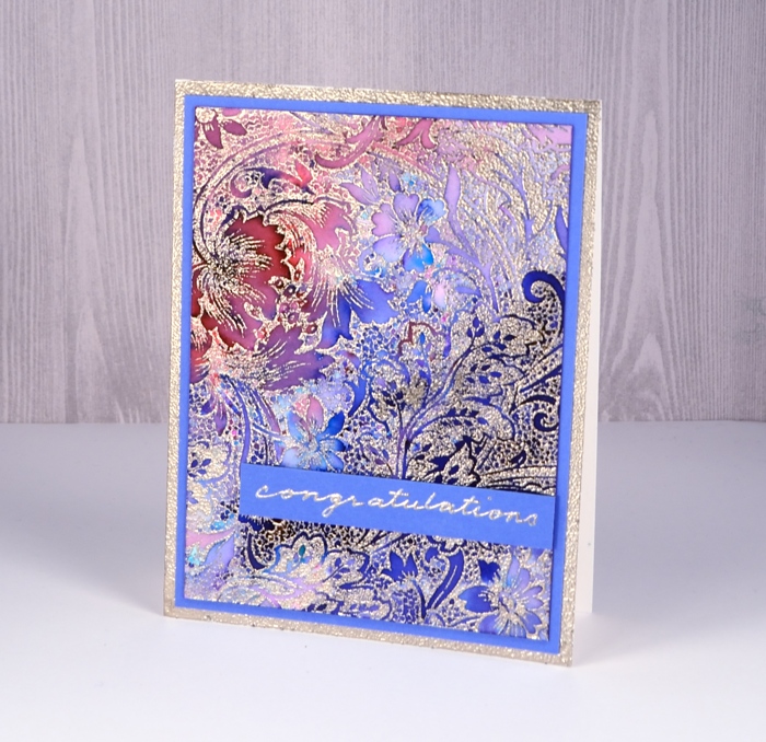
I was excited to see this stamp at Darkroom Door when I visited last year; I don’t remember ever noticing it before. It appealed at once and I’m happy to say this panel made me very happy. I embossed the large background stamp, ‘flower garden’ on hot pressed watercolour paper with platinum embossing powder (my current fave) then sprinkled two colours of colorburst paint powders lightly over the panel. A little goes a long way with colorburst and considering how much embossing there is I didn’t need much powder.
I spritzed the panel with water and watched it be magical. The two colours were indigo and alizarin crimson; the indigo gave me all the blues along with a tiny spot of green. The alizarin crimson gave me all the pinks and reds and the purples were a mix. I did do some blending with a paint brush just to make sure colour filled all the spaces. I diluted a few areas with water and pulled out some colour with a ‘thirsty brush’ to create some pale areas.

I tried a few different mat colours before picking blue then decided the white card base was a bit stark. To create a platinum border on the card base I ran my tape runner around the edges of the card front then embossed with the same platinum powder. I decided to write my own sentiment but the silver gel pen did not match the platinum embossing powder. I discovered that I could emboss the gel pen writing if I was really quick with the powder and didn’t let the ink dry for even a second. It might not surprise you to know today’s colours happen to be my favourites.
Supplies
stamps: flower garden

Ink: versamark
WOW metallic platinum superfine
Paint: Colorburst alizarin crimson & indigo


Paper: hot pressed watercolour, neenah solar white, blue cardstock


Ferns
Posted: January 16, 2018 Filed under: ferns, Leaves, Stencils | Tags: Darkroom Door stamps, Darkroom Door stencils, Ranger Distress inks, Tsukineko Stazon inks 4 Comments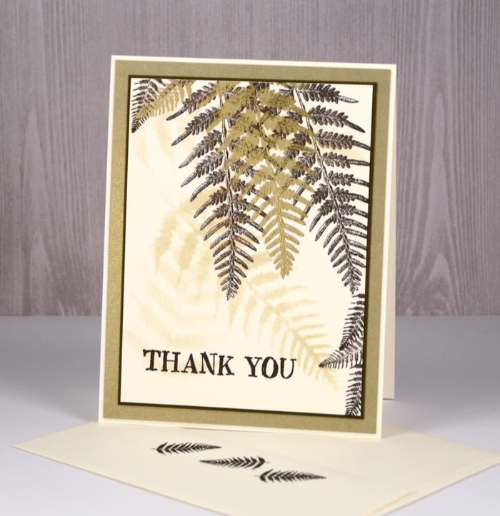
Darkroom Door has a wonderful range of stencils that co-ordinate with quite a few of their stamps. I used the ferns stencil to create a soft background for the fern stamps from the ‘leaves’ set. I used neenah natural white paper and sponged with the antique linen distress ink through the stencil. I did it three times to create a few soft background images.
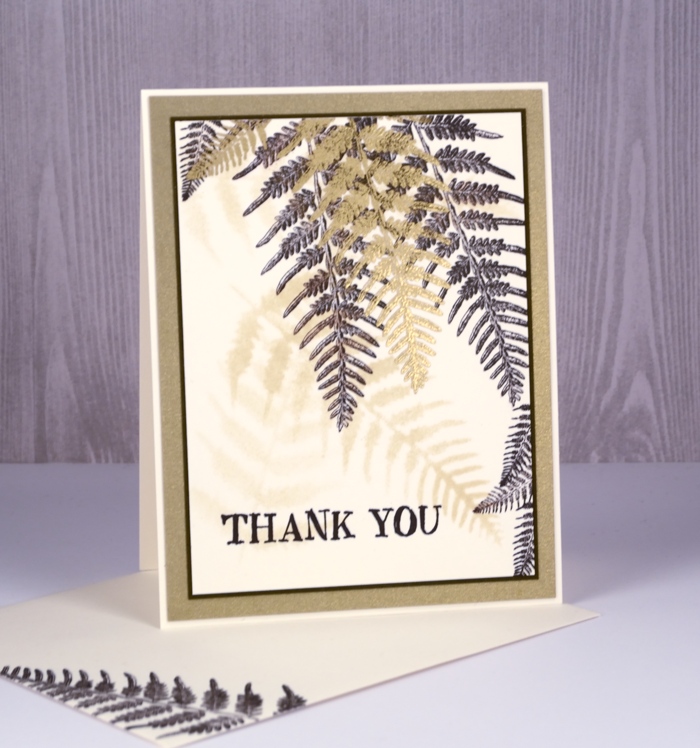
Over the top I stamped both the large and small ferns from the leaves set in stazon ganache ink. I have been pulling out the stazon inks whenever I’m working with the fine details of some of the Darkroom Door stamps. Initially I bought the stazon inks to pair up with my alcohol ink backgrounds but they are very good for fine detail stamping.
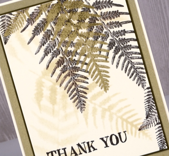
Once I had stamped quite a few ferns in ganache ink I stamped one large fern and one small in versamark then embossed them in gold. The sentiment and ferns on the envelope are stamped in stazon ganache. I added a narrow dark brown mat and a wider brushed gold mat also and attached it all to a natural white card base.
Supplies
Stamps: Leaves, Thank you


Stencil: ferns

Paper: neenah natural white, brushed gold, textured brown
Inks: antique linen distress, stazon ganache, versamark
Also: metallic gold rich embossing powder
Fine baubles
Posted: December 14, 2017 Filed under: fine baubles | Tags: Darkroom Door stamps, Kuretake Zig clean color real brush markers, WOW embossing powders 5 Comments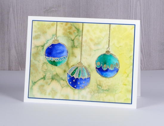
Today I have three pretty baubles out of the ‘Fine Baubles’ set from Darkroom Door. I stamped them on hot pressed watercolour paper in versamark and drew a cord from the top of each one with an embossing pen. I embossed in gold powder then coloured with zig clean color real brush markers. The ink in these markers is so vibrant you need very little on your paper; it is possible to blend it easily with water, or as I did, with a clear wink of stella marker for some sparkle. I used blue, turquoise and green markers for each bauble.
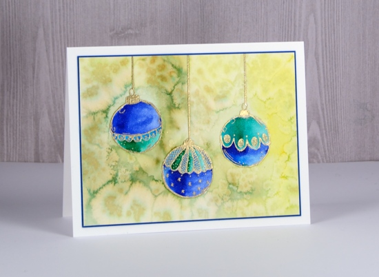
After colouring and blending the baubles I roughly coloured the background with a yellow and an olive green marker. I didn’t need to cover the whole area, rough shading with plenty of gaps was enough. I blended the shading with water to fill the whole background then sprinkled salt over the wet ink to create patterns.
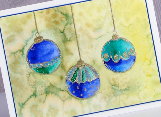
To finish off the card I matched the blue of the baubles with a narrow blue mat and attached to a white card base. I think I’ll be pulling out my tree and baubles any day now.
Supplies
Stamps: Fine baubles (Darkroom Door)

Ink: versamark, versamarker

Paper: hot pressed watercolour, neenah solar white, blue card


Markers: zig clean color real brush markers, clear wink of stella

![]()
Also: WOW metallic gold rich embossing powder, salt

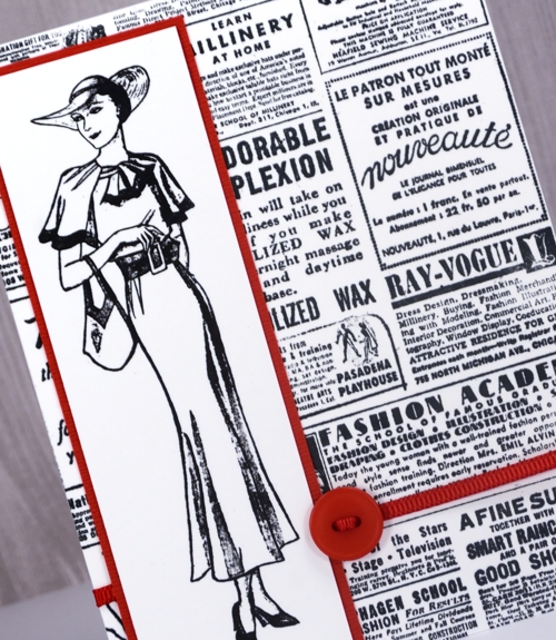
A Dressember card
Posted: December 4, 2017 Filed under: 1920s Chic, Gazette | Tags: Darkroom Door stamps, Tsukineko Memento inks, Tsukineko Stazon inks 1 Comment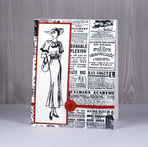
Today’s post is a little different to my usual; it’s more about a cause than a card. I have committed to wearing dresses everyday this month as part of the worldwide Dressember campaign to raise funds to end modern day slavery. This is the second time I have taken this challenge. In 2014 I wore a dress everyday in December and raised $1240. This year I have teamed up with my daughter Alexandra and my friend Nan and our target is $2500.
I would love it if you would support me in raising funds for this cause. If you want to find out more about the cause please click on the links provided earlier in this post. If you would like to donate then click over to my fundraising page.
If you would like to check up and see if I am really wearing a dress everyday in December I am documenting them on my instagram and pinterest feeds. (I’d love to send anyone who donates to Dressember a handmade card so use my contact button to let get in touch if you do)
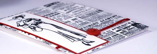
If you would like to know more about these stunning fashion related stamps you can find them at Darkroom Door.


Correspondence
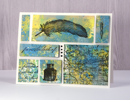
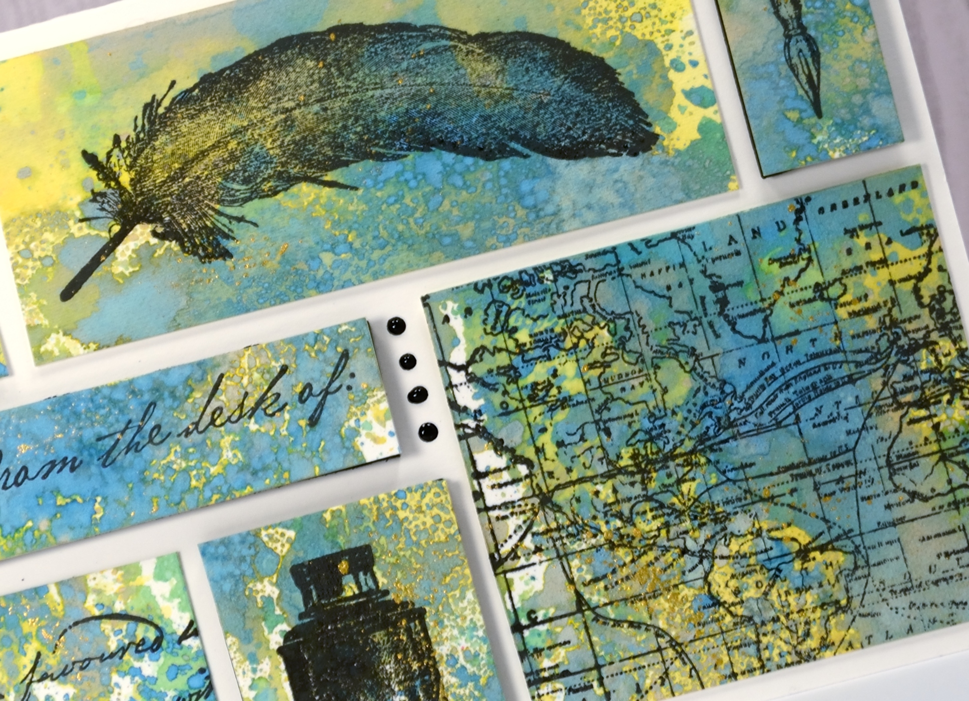
Posted: November 30, 2017 Filed under: Correspondence, World Map | Tags: Darkroom Door stamps, distress oxide inks, Finetec artist mica watercolour paint 7 Comments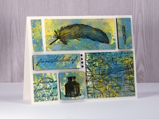
Supplies used:
Stamps: Darkroom Door Correspondence set, Darkroom Door World Map
Ink: Versafine Ink Onyx Black
Distress Oxide inks: Fossilized Amber, Broken China, Cracked Pistachio
Also: gold paint, Nuvo Black ebony crystal drops, black foam sheet, craft mat
Paper: Neenah solar white, Hot pressed watercolour paper
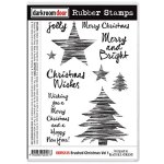
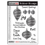
Brushed Christmas Joy
Posted: November 21, 2017 Filed under: Brushed Christmas vol 1&2 | Tags: Darkroom Door stamps, Tsukineko Memento inks 4 Comments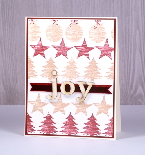
I had some fun with small stamps and a stamp positioner to create this simple card. Darkroom Door has two ‘Brushed Christmas’ sets containing stamps with the brushed look you see in these images. There are big trees and little trees, bit and little stars and baubles as well. It was easy enough to stamp one image, slide my cardstock along and stamp the next and so on to reach across the panel. I centred the trees by starting with the middle tree but I wasn’t quite so particular with the stars or baubles.
The ribbon across the panel is velvet and the laser cut letters are left over from a mixed media class I did a while back. I think it’s cute that the ‘o’ on the velvet looks like a buckle on Santa’s belt (totally unplanned ofcourse)
Supplies
Brushed Christmas vol 1 & 2
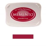
Memento Inks: desert sand, rhubarb stalk

Papers: neenah natural white, burgandy cardstock
Tools: MISTI stamp positioner


