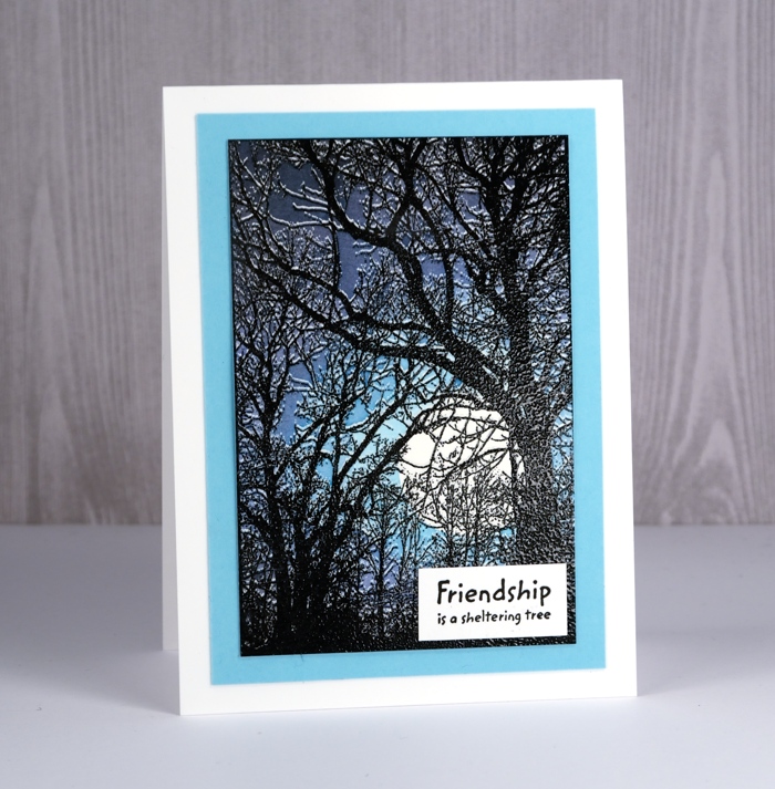
Shimmery leaves
Posted: April 25, 2018 Filed under: fine leaves, Shimmerz | Tags: Darkroom Door stamps, Shimmerz 8 Comments![]()
It’s all about experimentation on the blog today. I have some new inky products and some freshly cut stamps. The Foiled Fox team was kind enough to send me some Shimmerz sprays to play with so I teamed them up with the emboss resist techniques and the fine leaves stamps from Darkroom Door.
![]()
To make the panel above I embossed the leaves in gunmetal embossing powder; it’s a new one from Ranger which is not as shiny as silver but shinier that just grey. I like it. I sprayed some shimmerz sprays on my craft mat and swiped the embossed panel through it to pick up colour. I dried it then repeated with a couple of different colours which built up some variety and depth around the leaves. I wanted the leaves to be more prominent so I picked up shimmerz blue and yellow with a paint brush and painted inside some of the leaves. The spritzed background was also done with shimmerz, just heliotrope and blue.
![]()
I found a scrap of light blue cardstock to mat the panel then added all the layers to a natural white card base.
The sprays are quite strongly pigmented but the colours dry with a softness to them. As I was creating these panels I was wiping excess spray onto a couple of journal pages to build up some background colour. I’m excited to try a few more colours and techniques.
![]()
My second panel was completed in a similar way but I added way more shimmerz spray both by swiping off my craft mat and spraying directly on the embossed panel. The leaves and sentiment are embossed with white powder this time.
![]()
It’s a shame you can’t see how pretty the shimmer is on the painted panel and also the gold shimmer cardstock I used to mat it. I love the way embossing catches colour in confined spaces making that one central leaf a mix of dark blue, light blue, yellow and green
![]()
As you can probably imagine I did more experimenting, so I’ll be back with a few more ideas later in the week.
Supplies
Stamps: fine leaves (DD), all occasions (DD)


Ink: versamark

Shimmerz Sprays: Jen B Blue, Eggnoggin’, Walkin’ on a tight Heliotrope
![]()
![]()
![]()
Paper: hot pressed watercolour paper, neenah natural white, gold shimmer cardstock, blue cardstock


Also: WOW opaque white embossing powder, Ranger gunmetal embossing powder

Bold & Beautiful Butterflies
Posted: April 23, 2018 Filed under: Butterflies | Tags: Brusho, Darkroom Door stamps, Kuretake Zig clean color real brush markers, WOW embossing powders 7 Comments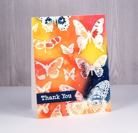
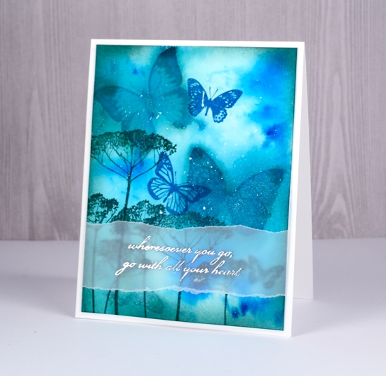
I have ‘Butterflies – Two Ways’ to serve up to you today. The butterflies in the both cards are from the Darkroom Door set, ‘Butterflies’. As the stamps from Darkroom Door arrive uncut I decided to stamp the whole sheet of butterflies a few times before I cut it into thirteen separate butterflies. I stamped it in versamark then embossed in clear powder on watercolour paper to make this card.
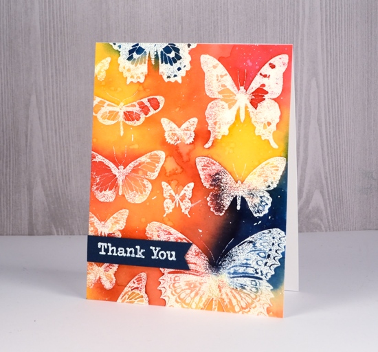
All the colour for this emboss resist design is from my beloved brusho paints. I mixed them in a palette rather than sprinkle and spritz and built up the colour with several layers. Working with prussian blue, yellow, rose red and orange brusho I was able to create some bold contrasts between the primary colours as well as with the white embossing. After completing the painting I dropped some water over the panel, let it sit then dabbed it up with a paper towel. The result is pale odd shaped watermarks. I also splattered some white gesso over the panel to break up the background colour a bit.
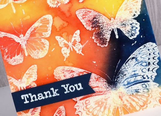
To finish the card I popped up a blue banner with a white embossed sentiment from the ‘Thank You’ set.
Then I went all minimal for my second card made once the set was cut into individual stamps. I have seen similar paintings and cards all over pinterest featuring three watercolour butterflies in a vertical arrangement. I decided to use zig clean color real brush pens to create the watercolour effect. The pens are pretty juicy so I had no trouble applying enough colour to blend nicely on the stamps and panel.
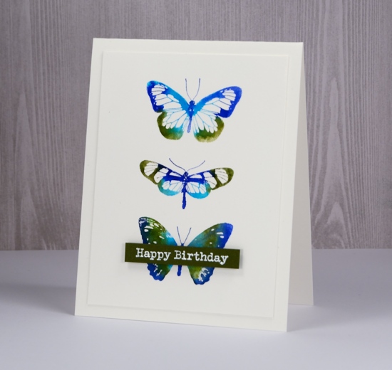
I limited my choice to light green, cobalt blue, blue and olive green, however as I write this post and look at the finished card I wonder if I actually used the light green. If I did I think it got overwhelmed by the darker colours. I applied the ink directly to the stamps, spritzed and stamped. That is it. I wanted the blending to occur on the stamp rather than spritzing the watercolour panel after stamping so the butterflies would keep their clean edges. I debated blending inside the butterflies but the white space in the wings looked pretty so I told myself I don’t need to blend everything.
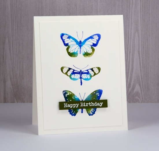
I trimmed the panel so it was ¼” smaller than the card base and once again added an embossed sentiment on a popped up banner.
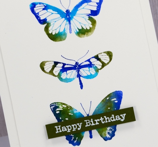
Which do you prefer, colour & paint everywhere or a simple neat little butterfly trio?
Supplies
Stamps: Butterflies


Ink: versamark
Paint: brusho prussian blue, yellow, rose red, orange (bold card)

Markers: light green, cobalt blue, blue, olive green Kuretake Zig clean color real brush markers (CAS card)

Paper: hot pressed watercolour paper, dark blue cardstock, green cardstock
Also: white ep, dimensional tape, MISTI


Norah Head lighthouse
Posted: April 16, 2018 Filed under: lighthouse | Tags: Darkroom Door stamps, Ranger Distress inks, Ranger Distress stains 19 Comments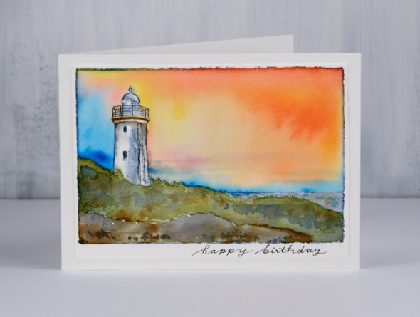
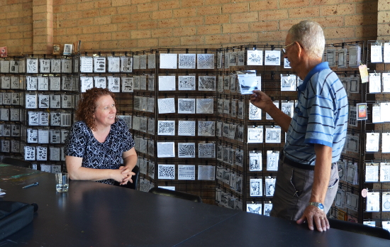
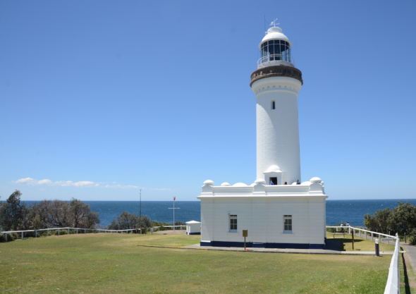
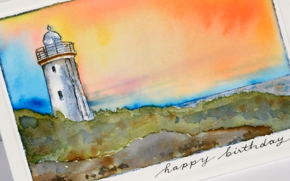
Today’s card has been sent to my dad for his birthday but considering the time it takes for mail to get from Canada to Australia these days and my own postal disorder it did not arrive in time. He is currently visiting my brother so this post provides a sneak peak before the real thing arrives in his mail box. Happy Birthday, Dad! I chose this stamp from Darkroom Door for several reasons. When I first visited Darkroom Door in 2016 I enjoyed visiting and talking with the owners Rachel and Stewart. When my dad returned to pick me up he walked in, looked at all the DD stamps displayed and was drawn to two stamps in particular; this was one of them. During the same 2016 trip Dad and I went to the Norah Head lighthouse, featured on this stamp and not too far from my parents’ home. We went for a quick look and discovered there was a guided tour about to start so we joined in. We heard the history of the light and enjoyed the views from several vantage points.

To paint this scene I stamped the scene in distress inks, the top border, sea and light in stormy sky, the land around the light in forest moss and the foreground rocks in black. I then used stains to paint the scene; I’ve listed them below. After painting I used a fine tip micron pen to re-draw the railing and details on the light then wrote a sentiment.
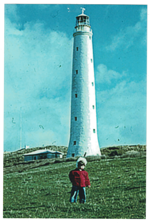
My father has been interested in lighthouses for years and has visited many around the world. I have a connection to one from very early in my life. I was born on King Island in Bass Strait, off the coast of Tasmania and home of the tall Cape Wickham lighthouse. Although I don’t remember the occasion I have a photograph Dad took of me in front of the light.
Supplies
Stamp: lighthouse (DD)

Inks: stormy sky, forest moss, black soot distress inks & markers


Stains: worn lipstick, mustard seed, salty ocean, forest moss, black soot, stormy sky, vintage photo distress


Paper: hot pressed watercolour paper
Tools: stamping platform

Also: micron pen .01

Classes here and there
Posted: April 2, 2018 Filed under: Classes, Darkroom Door, Penny Black | Tags: Classes Leave a commentIf you live in the Ottawa or Toronto area this post is for you. I’d like to draw your attention to my upcoming classes page. I teach art and card making classes each month in Ottawa, a few times a year in Toronto and occasionally in other places. All my classes are listed on my Upcoming classes page but I thought I would mention them here on the blog and highlight one you won’t find listed on my class page.
On April 7 I will be in Toronto teaching a Coloured Pencil Technique class

and my Watercolour Wings class.

In Ottawa on April 12, 13, 14(already full) & 16 and in Toronto on May 26th I am excited to be teaching my Galaxy Art class.

In Ottawa on May 10, 11, 12 & 14 and in Toronto on May 26 I will be celebrating spring with my Floral Focus class.

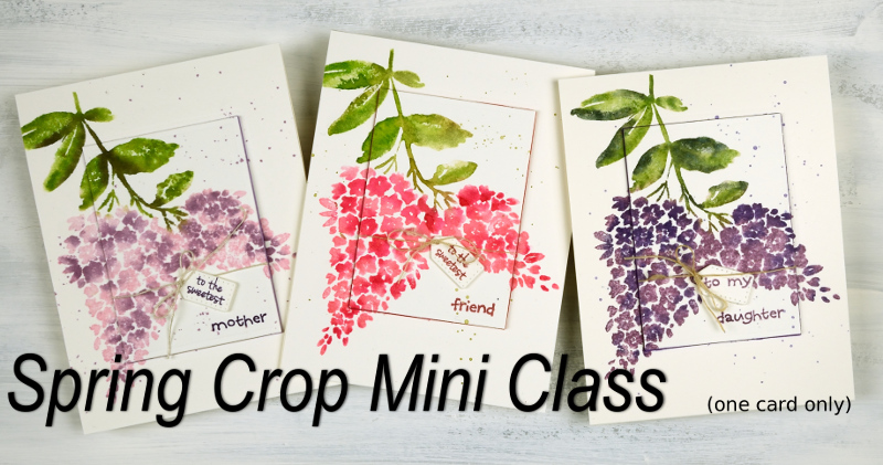
You will find all the details on my Upcoming Classes page. You can sign up for most classes through the links on the class page but to attend the ones held at Crop A While in Ottawa you will need to contact the store directly. Crop A While scrapbooking store is hosting a “Hello Spring Super Crop” on April 28 where I will be teaching a mini class (one card). To register for the crop and my mini class you will need to contact Crop A While. If you have any questions please use the contact me link.
Tulip Sympathy card
Posted: March 29, 2018 Filed under: Alcohol Ink, Tulips | Tags: Darkroom Door stamps, Ranger Alcohol Ink 1 Comment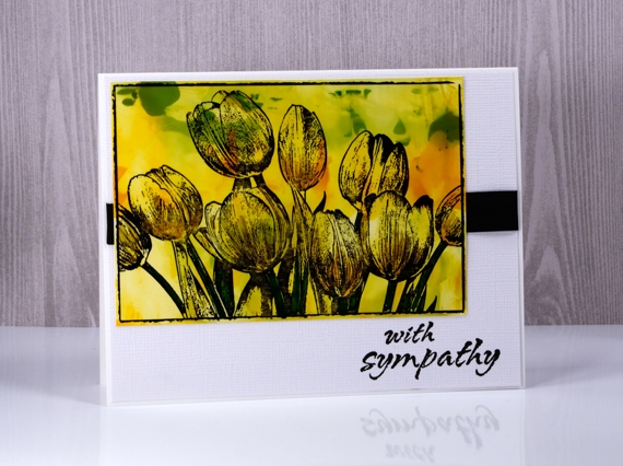
I have used an alcohol ink background to add colour to this tulip card. Deciding on a colour scheme and image for a sympathy card can be difficult but flowers are given and appreciated at times of joy as well as sadness. Out of interest I looked up what meaning if any, has been assigned to yellow tulips. Apparently the meaning has changed over time but yellow tulips now stand for hope and cheerful thoughts.
To create the yellow, orange and green panel I dropped alcohol inks on a craft mat then swiped photo paper through the colours. Sometimes it is necessary to swipe several times or add a bit of rubbing alcohol to get coverage over the whole panel. I inked the Darkroom Door tulip stamp with jet black stazon ink then pressed the photo paper panel down onto the stamp. To finish the card I wrapped some black ribbon around a textured white mat and added a sentiment also in black.
Supplies
Stamps: tulips, bright blossoms vol 2 (DD)


Ink: alcohol inks by Ranger, jet black stazon


Paper: neenah solar white, photo paper, textured white paper

Classic garden
Posted: March 27, 2018 Filed under: Flower garden | Tags: Darkroom Door stamps, Ranger Distress inks 3 Comments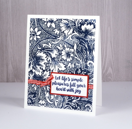
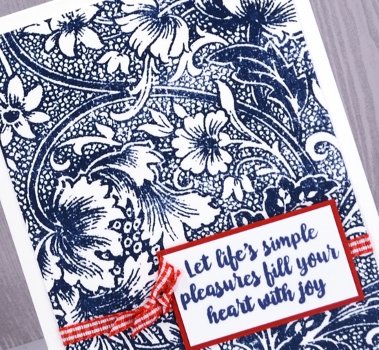
A few weeks back I created two fairly glamorous cards with this fancy stamp, glamorous because of the platinum and gold embossing I paired with the very detailed stamp. Today’s card is simply stamped in one colour and embellished with another colour creating this classic navy, red and white combo.
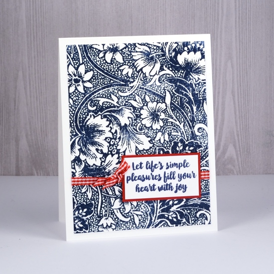
I stamped on neenah solar white cardstock in chipped sapphire distress ink; it is a very detailed stamp so using a stamping platform helped me get good coverage.
Quite a versatile stamp I think…
Supplies
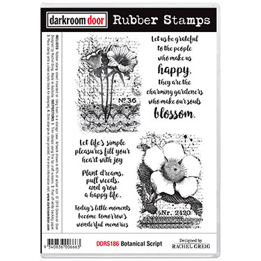
Stamps: flower garden, botanical script

Ink: chipped sapphire distress ink

Paper: neenah solar white, textured red

Also: stamping platform, red & white gingham ribbon
Wings & things
Posted: March 23, 2018 Filed under: Wildflowers Vol 1, Wings | Tags: Darkroom Door stamps, liquid metals, Ranger Distress inks 11 Comments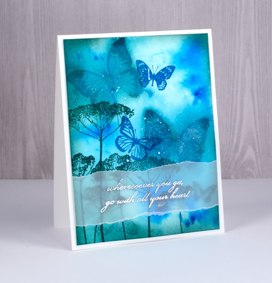
This is one of those cards that just evolved. I’ve had the butterfly stamps at hand while teaching a class with them. I did not have a definite plan; in fact, you may be surprised to hear it started with three butterflies stamped in rusty hinge distress ink. The panel sat around for a while then I decided to paint turquoise brusho and metallic sky liquid metal inside each of the brown butterfly outlines. I didn’t love that so I spritzed interference blue pearl-ex spray over all three butterflies to make the colour bleed into the surrounding area. Still not right, so I employed a technique one of my friends calls ‘drowning’ and spritzed the panel thoroughly. The result was a sparkly blue panel with muted butterflies now looking like background images.
I used pine needles and mermaid lagoon distress inks to stamp foreground images, more butterflies and some flowers. I framed the panel by sponging pine needles ink around the edges then splattered a little white gesso over it. As often happens with my cards I started thinking about a sentiment once there was no room left for one. Vellum to the rescue with an phrase embossed in silver.
Supplies
Stamps: wildflowers vol 1, wings


Inks: rusty hinge, mermaid lagoon distress ink, pine needles, versamark


Paper: hot pressed watercolour paper, vellum, neenah solar white cardstock


Paint: turquoise brusho, white gesso, metallic sky liquid metal


Also: silver embossing powder, interference blue pearl-ex powder mixed with water in a mister

Tea time?
Posted: March 19, 2018 Filed under: Cup of tea | Tags: Darkroom Door stamps, Tombow dual brush pens, WOW embossing powders 3 Comments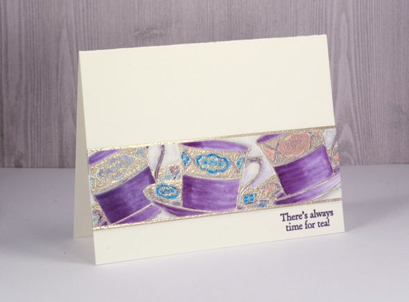
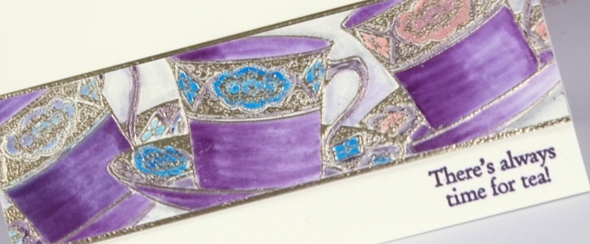
This card was practically complete weeks ago including a handlettered sentiment written with pen and ink. Unfortunately after leaving the ink to dry overnight I brushed my hand across the lettering only to see it smudge across my one layer card! I cut the strip of teacups out of the ruined card front and set them aside as I had other projects to complete. When I pulled them out again I decided to create an embossed mat to frame the teacups top and bottom then stuck the teacup panel on the embossed panel and then onto a new cardfront. I added a sentiment from the ‘cup of tea’ stamp set and finally finished my card.
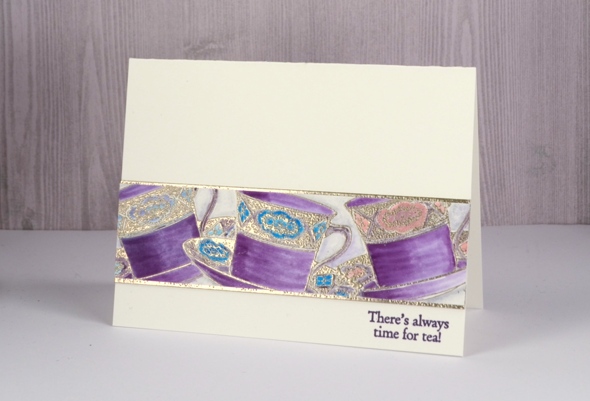
The teacups are stamped in versamark and embossed in platinum powder. After embossing one cup, I stamped and cut a tea cup mask, positioned it over the first cup then stamped a second and a third cup. I did all the colouring with tombow markers. When finishing the card a while later I tried my new versafine clair ‘monarch’ ink. I have always been happy with my versafine inks so I wondered what might be different about the new versafine clair inks. I have bought five colours to start with and so far I am very impressed with the sharp detailed stamping and no need for a second impression.
And by the way if you like a little sparkle, perhaps with embossing powder or something bolder, please check out the ‘Sparkle With Us’ challenge I’m hosting with The Foiled Fox. We’ve stretched it out for a wee bit longer so you still have a couple of days to join in.

Supplies
Stamps: Cup of tea

Inks: versamark, monarch versafine clair

Tombow markers: 679, 772, 515, 451, N75, N00


Paper: hot pressed watercolour paper
Also: WOW metallic platinum embossing powder

Peacock Feathers
Posted: February 27, 2018 Filed under: Botanical Script, Brusho, Feathers | Tags: Brusho, Darkroom Door stamps, Koi coloring brush pens, Kuretake Zig clean color real brush markers, Tsukineko Versafine inks, WOW embossing powders 4 Comments
I decided to try a couple of methods for colouring a peacock feather stamp, my first experiment with the ‘Feathers’ set from Darkroom Door. I look forward to trying all of them eventually but the gorgeous colours of the peacock feather prompted me to pick that one first.The colouring on this first card was zig clean colour real brush markers directly on the stamp. I used the stamping platform so I could add one colour at a time. I blended the centre a little with a brush to get solid colour then spritzed the stamp with interference gold pearl-ex spray and stamped over the marker image. This gave everything a little shimmer and blended the colours into each other a bit. My pearl-ex spray is homemade; I add a small amount (about 1/8 tsp into a small spritzer filled with water). I stamped ‘thanks’ over the feather with majestic blue versafine then embossed with clear powder. The border panel looks black but is actually blue to co-ordinate with the centre of the feather and the sentiment.

My second colouring method was brusho. I spritzed the stamp with the same gold pearl-ex spray then stamped on hot pressed watercolour paper. I dropped a tiny amount of ultramarine brusho at the top of the feather, also a little turquoise then olive green down the shaft of the feather then stamped again to activate the brusho with pearl-ex spray. I embossed a birthday sentiment in gold and framed the panel in gold shimmer cardstock.

My final colouring method was with Sakura Koi colouring brush pens. I kept the stamp in the stamping platform so I could ink then stamp a colour at a time. The Sakura pens are very bright so I thought they were a good match for the gorgeous colours of peacock feathers.
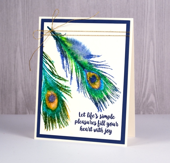
Once again I stamped the colours one or two at a time so I could keep the centre of the feather distinct. Once I had stamped both feathers I spritzed the gold pearl-ex spray over the whole panel which ended up doing two things: the barbs softened to look a little ‘hairy’ and the droplets of spray created a pattern of watermarks over the ‘eye’ of the feather.
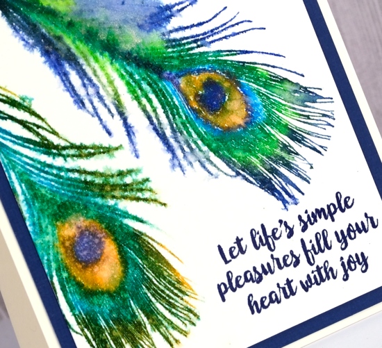
I ended up using majestic blue versafine ink again to add a sentiment from ‘botanical script’ set and cut a mat in the same colour. This card also has a slight shimmer to it so I added a gold cord for a finishing touch.
Supplies
Stamps: Happy Birthday, Thank you, Feathers, Botanical Script


Inks: Versamark, Majestic Blue Versafine

Markers: Zig clean color real brush markers, Koi Coloring Brush Pens


Paint: Brusho (ultramarine, turquoise, olive green)

Paper: hot pressed watercolour paper, blue cardstock, gold shimmer cardstock

Also: stamping platform, gold embossing powder, clear embossing powder, gold cord, pearl-ex interference gold spray


![]()
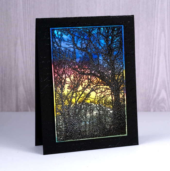
Woodlands
Posted: February 20, 2018 Filed under: French Script, Woodgrain, Woodlands | Tags: color burst, Darkroom Door stamps, Ranger Distress inks, Tsukineko Versafine inks, WOW embossing powders 4 Comments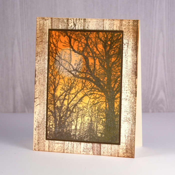
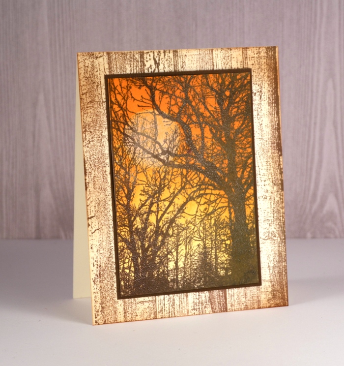
I had a lovely time with this new photo stamp from Darkroom Door. It’s called Woodlands and was perfect for creating an autumn scene, a winter scene and a sunset. Step by step instructions and a complete list of supplies are available on the Darkroom Door blog
The autumn scene involved brayering and distress inks.
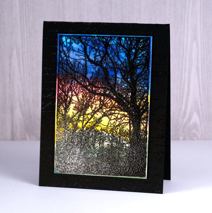
The sunset features the bright hues of colorburst powders over embossing.
The winter scene below, which might be my favourite, was painted with distress inks.
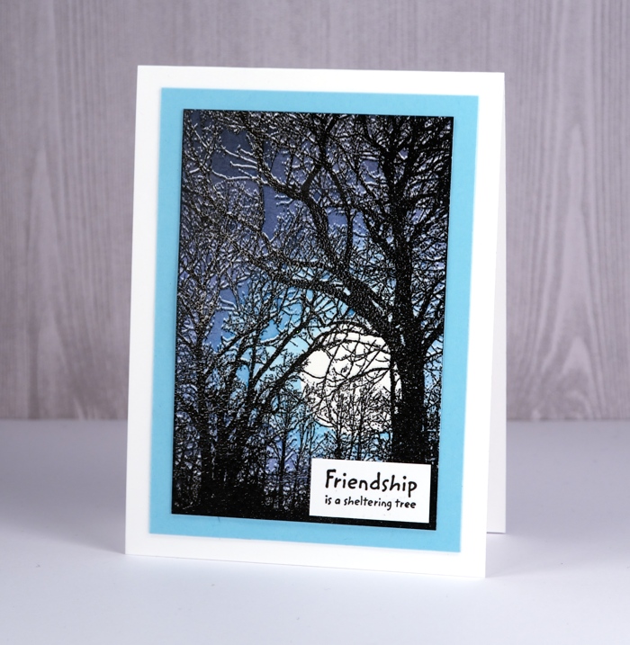
I used a cool technique with a stamp positioner to get a layer of snow on the branches; if you’re interested pop over to Darkroom Door and check it out.