
Bold & Beautiful Butterflies
Posted: April 23, 2018 Filed under: Butterflies | Tags: Brusho, Darkroom Door stamps, Kuretake Zig clean color real brush markers, WOW embossing powders 7 Comments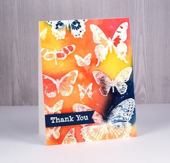
I have ‘Butterflies – Two Ways’ to serve up to you today. The butterflies in the both cards are from the Darkroom Door set, ‘Butterflies’. As the stamps from Darkroom Door arrive uncut I decided to stamp the whole sheet of butterflies a few times before I cut it into thirteen separate butterflies. I stamped it in versamark then embossed in clear powder on watercolour paper to make this card.
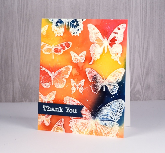
All the colour for this emboss resist design is from my beloved brusho paints. I mixed them in a palette rather than sprinkle and spritz and built up the colour with several layers. Working with prussian blue, yellow, rose red and orange brusho I was able to create some bold contrasts between the primary colours as well as with the white embossing. After completing the painting I dropped some water over the panel, let it sit then dabbed it up with a paper towel. The result is pale odd shaped watermarks. I also splattered some white gesso over the panel to break up the background colour a bit.
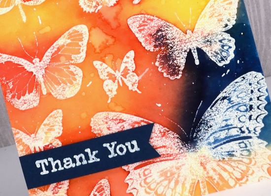
To finish the card I popped up a blue banner with a white embossed sentiment from the ‘Thank You’ set.
Then I went all minimal for my second card made once the set was cut into individual stamps. I have seen similar paintings and cards all over pinterest featuring three watercolour butterflies in a vertical arrangement. I decided to use zig clean color real brush pens to create the watercolour effect. The pens are pretty juicy so I had no trouble applying enough colour to blend nicely on the stamps and panel.
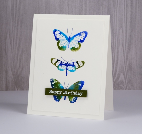
I limited my choice to light green, cobalt blue, blue and olive green, however as I write this post and look at the finished card I wonder if I actually used the light green. If I did I think it got overwhelmed by the darker colours. I applied the ink directly to the stamps, spritzed and stamped. That is it. I wanted the blending to occur on the stamp rather than spritzing the watercolour panel after stamping so the butterflies would keep their clean edges. I debated blending inside the butterflies but the white space in the wings looked pretty so I told myself I don’t need to blend everything.
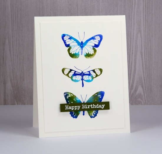
I trimmed the panel so it was ¼” smaller than the card base and once again added an embossed sentiment on a popped up banner.
Which do you prefer, colour & paint everywhere or a simple neat little butterfly trio?
Supplies
Stamps: Butterflies


Ink: versamark

Paint: brusho prussian blue, yellow, rose red, orange (bold card)

Markers: light green, cobalt blue, blue, olive green Kuretake Zig clean color real brush markers (CAS card)

Paper: hot pressed watercolour paper, dark blue cardstock, green cardstock

Also: white ep, dimensional tape, MISTI


The colours in your butterfly trio are sumptuous! I was in-love with the brusho panel and then scrolled down to the trio…I think I prefer the trio (if I HAD to choose! 😀 )! The trio is amazingly crisp and I, too, like the white spaces in the wings! Lovely!♥
Both cards are lovely. The white makes the colours pop and gives them a more delicate look. I’m a sucker for the typewriter font too.
So pretty, Heather! The colors in the first one are wonderful!… but of course, all of them are beautiful.
I think to choose a favourite from these two gorgeous cards would be extremely difficult Heather, and I love the hot Brusho colours on the first and then the cooler but nonetheless strong blues with the green on the more CAS card, and I love the straight to stamp colouring which you have done perfectly so that the butterflies are still well defined. I would be so delighted to be the recipient of either of these stunning cards! x
Gorgeous cards!
Both cards are beautiful on their own, but my favorite is the c&s card. Wonderful job keeping the edges – makes for a stunning card Heather!
Paper Hugs,
Jan
I love both but the VIrgo in me likes the butterflies all lined up!