
Vintage Jubilance
Posted: June 7, 2016 Filed under: CAS, Jubilance | Tags: CAS, Penny Black stamps, Ranger Distress inks, Ranger Distress stains 17 Comments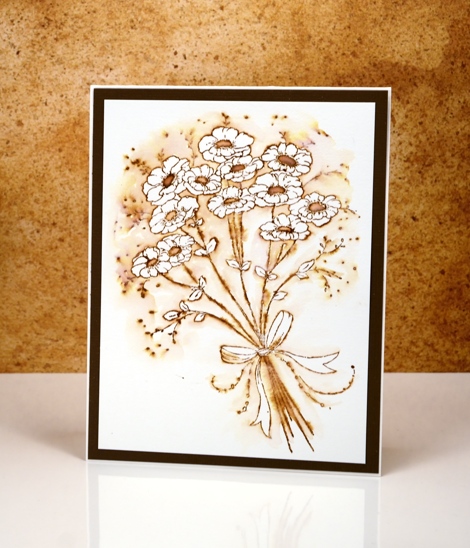
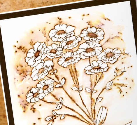
More vintage flowers on display today with a slightly different technique to try. As with my previous vintage style watercolours (birdhouse, butterflies, tulips) I stamped the image in vintage photo distress ink. Other water based dye inks in brown would probably work but I like the ease with which I can dilute and spread the vintage photo ink or stain.
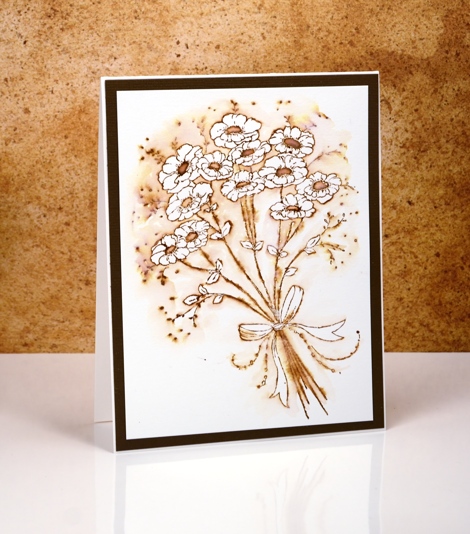
After stamping, instead of pulling ink from the outline into the flowers and leaves, I pulled ink out into the background leaving the flowers and leaves white. The contrast of brown with white makes the flowers pop and look whiter than they would if they were not surrounded by colour. It is a simple technique you could try with any colour ink.
I would love to hear if you try some ‘vintage style watercolour’. Thanks for dropping by.
Supplies:
Stamps: Jubilance (PB)
Inks: Vintage Photo distress ink,Vintage Photo distress stain (Ranger)
Cardstock: Hot pressed Fabriano watercolour paper, brown cardstock
Folk Flower
Posted: May 17, 2016 Filed under: Alcohol Ink, CAS, folk flower | Tags: Penny Black creative dies, Penny Black stamps, Ranger Alcohol Ink 7 Comments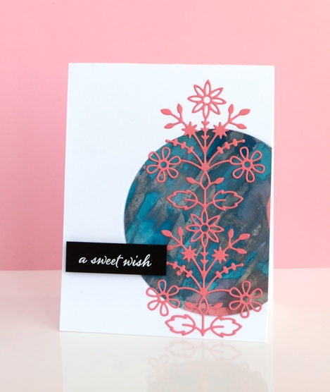
Having so many alcohol ink experiments on hand is helping with my resolve to try new layouts and sketches. The colours and patterns that appear almost magically when working with alcohol inks need little or no adornment. This panel was mainly aqua with some splotches of coral pink here and there until I added silver and scraped it across the panel with the coffee stirrer. I ended up with the rock formation style patterns which were kind of cool but the silver had taken over.
I played around with several ideas for using the panel including tossing it but finally settled on a layout inspired by this card on JJ Bolton’s blog. I chose the coral coloured cardstock for the die cut to bring out the few patches on the panel. The assembly of this layout did not go smoothly for me, (there is more than one reason I stick to the portrait gallery layout!) I cut a piece of light weight cardstock to stick behind the circle to keep everything together. When I ran my finger over the edge of the circle to press it firmly onto the backing, the silver ink smudged onto my clean white card base. I managed to transfer silver ink via my die cutting plates also. The metallic alcohol inks sit on the surface and therefore need some sort of fixative; (I have watched a tutorial about this just haven’t looked into whether I have the right fixative) Rather than make the same mistake three times I decided to polish the patterned circle with a paper towel as someone had done successfully in class to see how much silver would come off. I removed quite a bit which revealed more aqua and left the panel less smudgy. The rest of the assembly was more straight forward; I used ‘stick it’ adhesive on the back of the folk flower die cut and embossed the sentiment on black cardstock for contrast.
When I visited JJ Bolton’s blog to look at her card layout I read about the clever wax crayon technique she used on her card…something to try another day.
Supplies:
Stamps: Happy Snippets (PB)
Dies: Folk Flower (PB)
Ink: Alcohol inks, Versafine ink (Ranger)
Paper: glossy photo paper, Neenah Epic Black 100lb cardstock, Neenah solar white cardstock, coral cardstock
Also: stick it adhesive, white embossing powder
Floral repeats
Posted: May 12, 2016 Filed under: CAS, Poise, Sunny | Tags: CAS, Penny Black stamps, Tsukineko Memento inks 12 Comments
I played with a couple of smaller floral stamps recently to make some clean and simple cards. I guess they could have been even simpler by stamping the flowers once but I still managed to keep plenty of white space. To create both cards I inked the stamps with memento markers, spritzed the stamp with water then stamped on watercolour paper. I did some extra blending on the poppies with a paintbrush and stamped repeat prints without re-inking, which explains the difference in colour intensity.
To stamp a group of three sunflowers I inked only part of the stamp each time so the flowers could nestle into each other without the leaves and stems getting in the way. The layouts are the classic black mat+black sentiment deal.
Supplies:
Stamps: Poise, Special Thoughts, Sentiment Collection, Sunny (PB)
Inks: Memento markers(Tsukineko)
Cardstock: Hot pressed Fabriano watercolour paper, black cardstock
True Love
Posted: May 8, 2016 Filed under: CAS, Hand painted, Watercolour | Tags: Penny Black stamps, Sakura Koi watercolour paints 18 Comments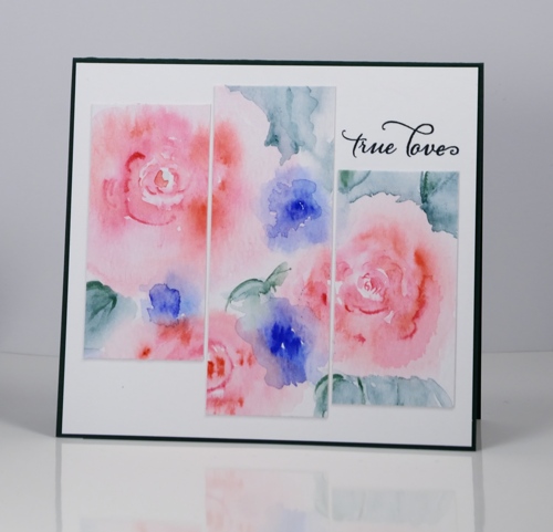
In keeping with my resolve to mix up my card layouts a wee bit I have a triptych inspired card to share. I painted the roses on a piece of watercolour paper, added leaves and blue flowers (not sure what they might be) then decided to find some inspiration on my ‘sketchy’ pinterest board. I sliced my panel into three strips of the same width then trimmed the ends so each would be a different length. The sentiment fitted quite nicely in one of the white spaces. I stamped the sentiment once in green then over the top in blue which gave me the bluey-green I was after to match my paint. I think the colours are soft enough to join in with the ‘pastels’ challenge on Less is More this week.
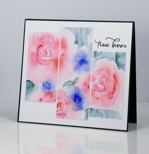
I hope you are having a lovely day.
Supplies:
Stamps: Happy Snippets, (PB)
Ink: Majestic Blue, Olympia Green Versafine inks (Tsukineko)
Paint: Sakura Koi watercolours
Paper: Heavy weight water media paper (Ken Oliver), Neenah SolarWhite 110lb cardstock, green cardstock
Layouts and sketches
Posted: May 6, 2016 Filed under: Alcohol Ink, CAS, Dies | Tags: CAS, Penny Black creative dies, Penny Black stamps, Ranger Alcohol Ink 7 Comments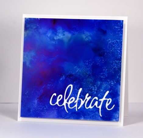
Recently I noticed how often my card designs involve a simple square or rectangle. Sometimes the panel is matted in black or a co-ordinating colour; other times it is popped up on the card base which creates a type of shadow mat. A matted panel with little embellishment is my most used layout. I’m not saying there is anything wrong with the matted panel approach; I often try to create a mini painting so framing it seems like an appropriate way to turn it into a card. However, there are many clever card makers who never default to the square or rectangular layout; each new card features angles, diagonal lines, curves, cutouts and all manner of creative designs. I’ve decided I need to mix things up a little in the sketch and layout area. Take the card above for example, the alcohol ink design reminded me of the ocean from beneath the surface with light above and bubbles all around. I really didn’t want to loose much of the blue pattern so I cut the sentiment out of the blue panel and popped it up. I like how it turned out but it was very much my usual style.
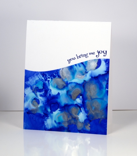
When I put this next card together I was working with a similar panel; the alcohol inks had done cool things creating a pattern I wanted to save if possible but not in yet another rectangular layout. By cutting a curve across the patterned yupo panel I was able to add some interest and bend a transparent sentiment stamp to hug the curve.

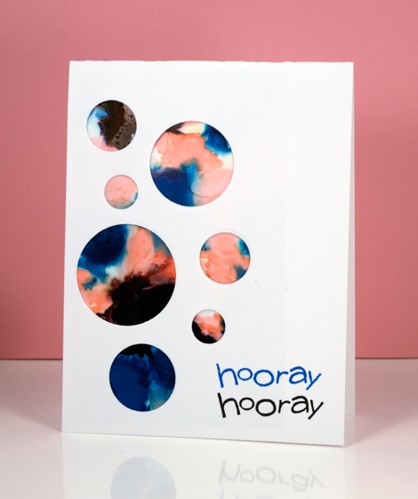
Once again I wanted to retain most of this warm toned alcohol ink design so I chose a cool new border die with curves that created a contrast with the angles of the stenciled pattern.
I have a board on pinterest where I am saving inspiration for new layouts. The card above was inspired by Paula Dobson’s bright happy card, pinned recently. Sketch challenges are another source of inspiration I hope to make use of more often. You may have noticed all the cards in this post were made from patterned panels, which of course, are easier to adapt to interesting layouts than pictures of real things! I may get adventurous and creative with my scenic or floral panels too, who knows?
Supplies:
Dies: Celebrations, Border Edges (PB)
Stamps: Happy Snippets, Sweet Wishes
Ink: Alcohol inks (Ranger) Versafine inks (Tsukineko)
Paper: Yupo paper, Neenah SolarWhite 110lb cardstock, Neenah Natural white cardstock
You’re Sweet
Posted: May 3, 2016 Filed under: Alcohol Ink, CAS, Dies | Tags: CAS, Penny Black creative dies, Ranger Alcohol Ink 5 Comments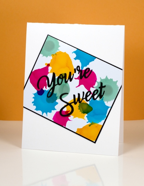
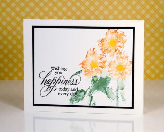
Earlier today I was admiring yet another fabulous card by Ardyth Percy-Robb, who is not only clever and creative, but also a faithful challenge participant. The card that caught my eye was for the May Pinterest Inspired Challenge featuring the image below:
Even though I love watercolour and the image above is full of lovely soft blends and bleeds I chose to use my recent arty crush, alcohol inks. I dropped sunshine yellow, pool, raspberry and juniper one colour at a time so I could squirt air at each drop before it dried. You can see how some inks create a new colour when they intersect but others cover or push the other colour. I matted in black and attached my panel to the card base askew before adding a die cut sentiment.
Supplies:
Die: You’re Sweet (PB)
Alcohol Ink: sunshine yellow, pool, raspberry, juniper (Ranger)
Paper: Kirkland photo paper, Neenah SolarWhite 110lb cardstock, Neenah epic black cardstock
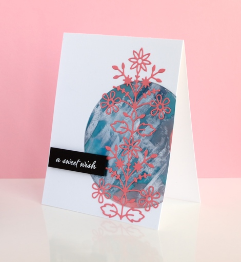
Out to Sea
Posted: April 27, 2016 Filed under: Alcohol Ink, CAS, Out to sea | Tags: CAS, Penny Black creative dies, Ranger Alcohol Ink 15 Comments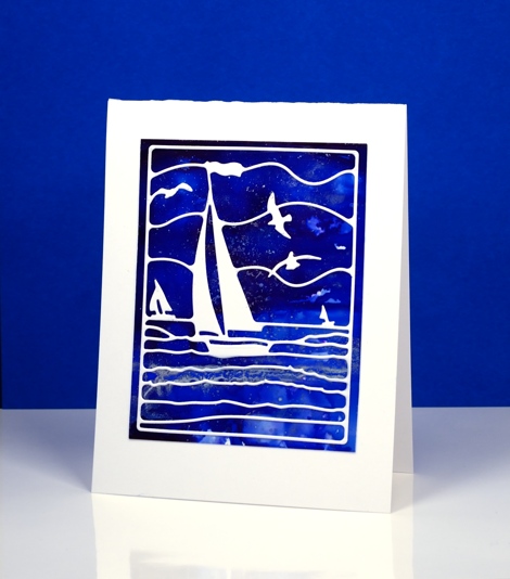
Is this not a stunning new die? I thought it was perfect to lay over my bright blue alcohol ink panel. Blue panels are the most challenging for me to photograph accurately. In real life there is more purple and the light blues are lighter. The speckled bits that conveniently look a bit like ocean spray or foam are silver accents. I created the panel by dropping some blue alcohol inks on yupo paper and blending. I added some silver alcohol ink and moved it around with extra blue ink and blending solution; the metallic inks don’t move much until another ink is added to them.
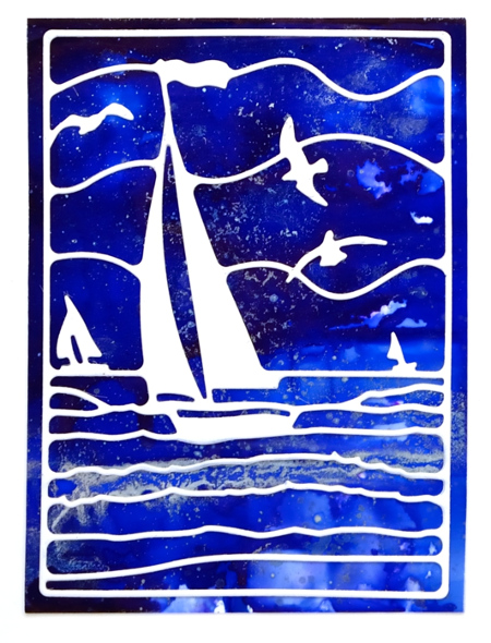
This die is also going to be beautiful over a watercoloured panel. If I am feeling patient and steady I might do the inlaid die technique but it really doesn’t need it; the overlay approach works just fine.
Supplies:
Die: Out to Sea(PB)
Alcohol Ink: denim, indigo, silver, alcohol blending solution (Ranger)
Paper: yupo paper, Neenah SolarWhite 110lb cardstock
Irises and blue
Posted: April 24, 2016 Filed under: Alcohol Ink, CAS, Love Art | Tags: CAS, Penny Black stamps, Ranger Alcohol Ink 13 Comments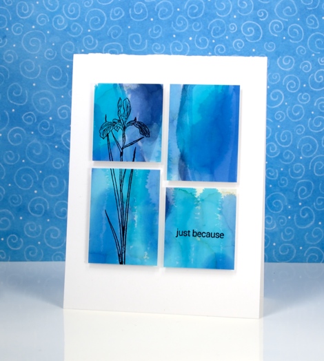
I am enjoying teaching a batch of Alcohol Ink classes at present and we have been having so much fun. The depth and impact of alcohol ink colour is quite something. I chose to use these two similar colour panels as background for iris stamps from the Love Art transparent set.
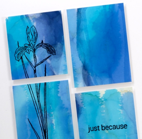
I blended a few blue alcohol inks on photo paper for these two panels. The circle pattern on the one below was achieved using a stencil. I dabbed through the stencil with blending solution to remove colour but also printed the stencil back onto the paper once it was covered in pale blue ink.
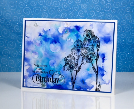
The sentiments and flowers are stamped in jet black archival ink.

I am just going to squeak this stencilled card into the second challenge at CAS Mix Up; there are twelve whole hours left to participate. The challenge this month is below; I used alcohol inks as my choice.

Supplies:
Stamps: Love Art, Special Thoughts, Snippets(PB)
Inks: Jet Black Archival (Ranger)
Alcohol Ink: pool, denim, indigo, alcohol blending solution (Ranger)
Paper: Kirkland photo paper, Neenah SolarWhite 110lb cardstock, Blue cardstock
CAS Mix up Challenge
Posted: March 18, 2016 Filed under: CAS, Color Burst, Dies, Love Art | Tags: CAS, color burst, Penny Black creative dies, Penny Black stamps 11 Comments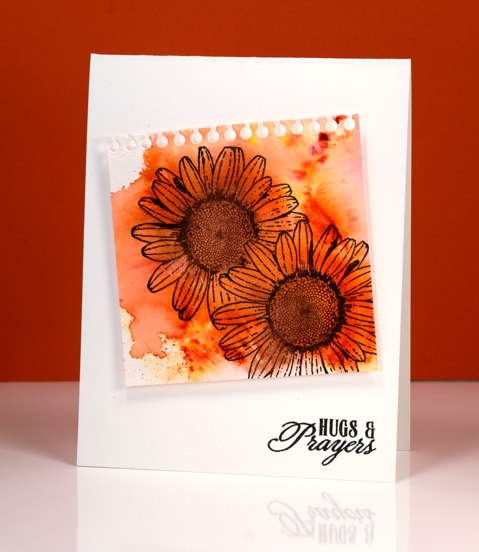
There is a new challenge on the block and it is definitely worth a look. It has been dreamed up by the very talented, Bonnie Klass and Loll Thompson and it’s called the CAS Mix up Challenge.
In their words:
Is CAS your style?? Do you love the look of clean and simple designs with lots of open space?? And have you seen all those fabulous mixed media techniques and products popping up all over and want to give them a try?? Then this is the challenge for you!
- stamping – no problem
- watercolour – absolutely
- my choice – a die cut
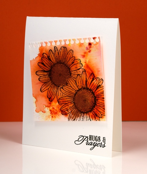
I splashed some water on my watercolour paper then added some Tangerine colourburst powder and some Copper liquid metal. I let the colour move and blend and tilted it to almost fill the paper then let it dry. I had to do a little fussy cutting to mask one daisy before I stamped the other but I seemed to have survived the ordeal. I used the notebook die from the ‘pocket full’ set to cut the top of the panel then popped it up on the card base before adding a sentiment. I tried to do the artistic-messy-thread-stuck-behind-the-panel trick but did not succeed. Maybe it was just as well because the challenge specified three elements not four!
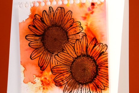
Pop over to the challenge and check out the entries; it is a feast of inspiration.
Supplies:
Stamps: Love Art, Soar (PB)
Die: A Pocket full (PB)
Mediums: Colorburst powders, Liquid Metal (Ken Oliver) Versafine Onyx Black ink (Tsukineko)
Cardstock: Cold pressed Fabriano watercolour paper
Happy
Posted: March 17, 2016 Filed under: Alcohol Ink, CAS | Tags: CAS, Penny Black stamps, Ranger Alcohol Ink 15 Comments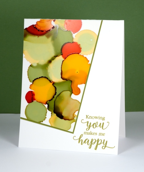
This new sentiment has appeared on a few of my cards already and will likely continue to do so. It is such a nice message and one I should send more often. This is one of my first alcohol ink experiments. I was just playing with the inks and ended up with an odd shape which did not immediately inspire me until I remembered this layout which is no doubt familiar to you; it is always popping up around the interwebs. I have been wanting to use if ever since I first saw it. I don’t know who first came up with the clever offset panel but I hope they feel proud whenever they see it on a card!
The inks I used were willow, pesto, poppyfield and honeycomb along with the blending fluid which lightened some of the colours. You can see both the pale and dark auras which appear around some of the inks. I am still using yupo paper for my creating, mainly because that is what I have and it works beautifully. I will get some glossy and photo paper to try out at some point. I have tried some doodling with my micron pens but nothing share-worthy yet.
Supplies:
Stamps: Sentiment Collection(PB)
Inks: Versafine Spanish Moss (Tsukineko)
Alcohol Ink: willow, pesto, poppyfield and honeycomb, alcohol blending solution (Ranger)
Paper: Yupo, Neenah Avon Brilliant White 110lb cardstock, green cardstock


