
Alcohol Inks + Stencil on the Gel Plate
Posted: September 18, 2023 Filed under: Alcohol Ink, Dies, gel press, Lavinia, Penny Black, Tutorial | Tags: Alcohol Ink, gel press, Lavinia, Tutorial, video 5 Comments
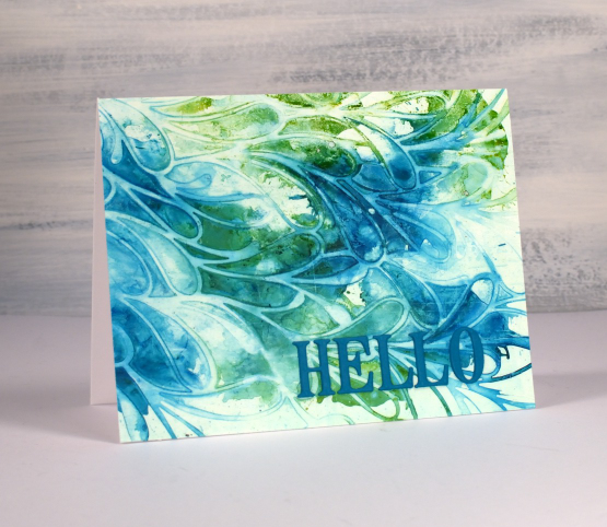
Recently I posted a card featuring a gel print made with alcohol inks and a stencil. You can check out that card here. There was quite a lot of interest in seeing a video of my process so that is what I have for you today. One of the bonuses of this technique is the way I can make more than one print from the same initial application of alcohol ink. I worked with T-Rex alcohol inks on a 5″x7″ gel plate.

As you will see in the video the first card (shown above) is made from the first print pulled from the gel plate.
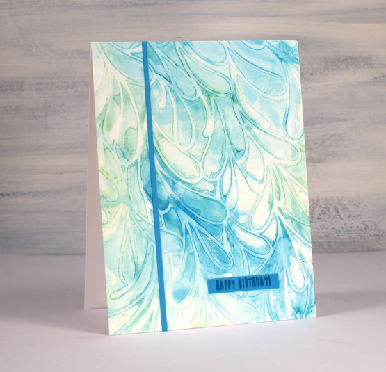
The second print pulled from the gel plate features the same inks but they are more muted because I diluted them to move them from the stencil to the plate. I quite like the softness of the second print.
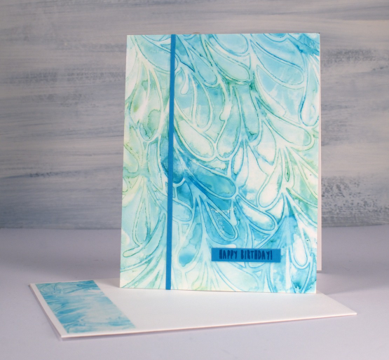
If a print works for me and honestly, they don’t all work, I often don’t want to cover them up with extra decoration or die cuts. That’s why I kept these card designs very simple with just a die cut ‘hello’ added to the first card. The second print which I made into the card below features an even smaller birthday sentiment and one thin strip of the same cardstock.

One of the reasons I like to work with alcohol inks on the gel plate is the fact that I can pull the prints with a piece of paper, in the case of these prints I used printer paper. When I work with alcohol inks apart from the gel plate I generally use a thicker plastic surface such as yupo or craft plastic. The inks move beautifully on those surfaces but the plastics are bulkier and a bit more expensive so it is nice to have the gel plate + paper option. The featured prints from today’s video were done on a 5″ x 7″ gel plate which meant I could get a 5.5″ x 4.25″ card front as well as a left over strip to add to the envelope.
If you are new to gel printing in general and would like to know more about creating a range of patterned prints please consider my online class, Gel Print Journey, where I cover all the basics with acrylic paint and all sorts of patterned and textured items. If you purchase any of my online classes before the end of September use the code: ENDOFSUMMERSALE for a 20% discount.
Tori’s Trees
Posted: September 14, 2023 Filed under: Tori's Trees | Tags: Echidna Studios, Fabriano Watercolour Paper, Penny Black stamps, sennelier watercolours 4 Comments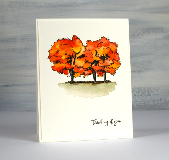
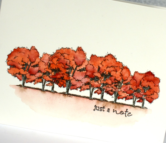
These lovely trees are so much fun to watercolour! If you scroll down you can see I’ve printed them in different sizes which probably tells you it’s a new digital stamp from Echidna Studios. My daughter created this design featuring a trio of trees on a property just out of Ottawa where friends of hers were married recently. She created a suite of wedding stationery for her friends and now I am playing with the designs myself.
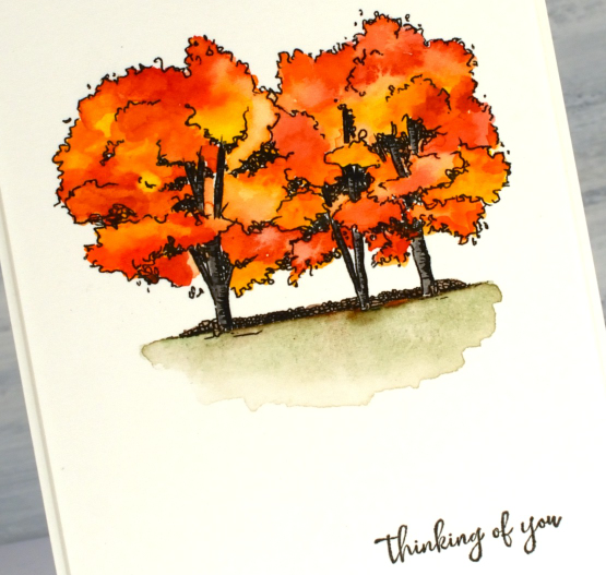
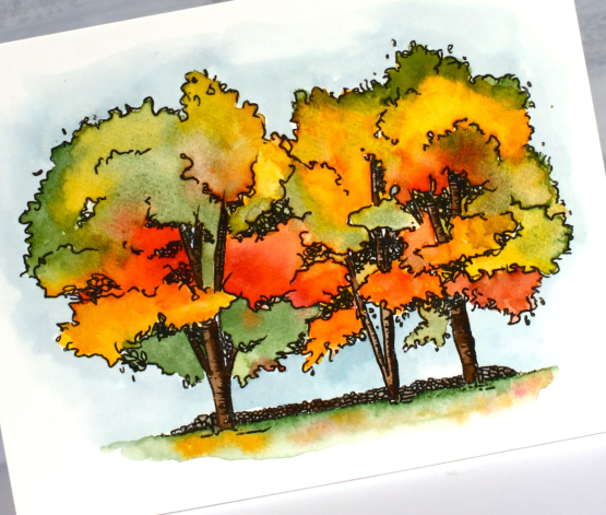
I printed all three panels on hot pressed watercolour paper and painted them with Sennelier watercolour paints. The tree image above is 3.25″ wide, popped up on a card base with a Penny Black sentiment added in black ink. I printed the trees larger, 4.75″ wide, on the landscape oriented card below, painted them again with Sennelier watercolours then added a pale sky background with diluted speckled egg distress ink.
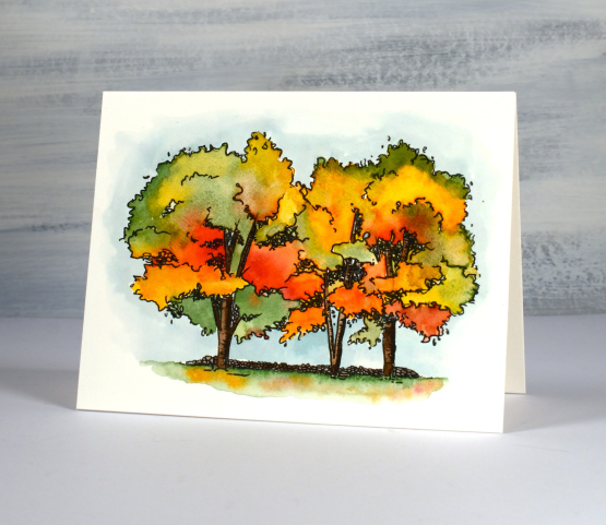
It was so much fun to blend the green, yellow and red on the trees then drop colour into a diluted green patch under the trees.
I’ve said before you can never have too many tree stamps and of course the beauty of this one is I can print them any size and even combine or flip them. You will definitely be seeing these trees again!
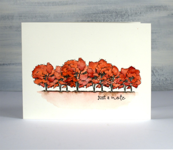
This last card is an one layer card, one 11″x 4.25″ piece of watercolour paper folded in half. I overlapped the tree image in different sizes to give me a wide display to paint in reds. Once again I finished it with a PB sentiment.
The trees are all still green around here but I have a hunch it won’t be long…
Leaf Background Stamp
Posted: September 12, 2023 Filed under: Echidna Studios, leaf background | Tags: Echidna Studios, Fabriano Watercolour Paper, Kuretake Zig clean color real brush markers, Ranger Distress inks 3 Comments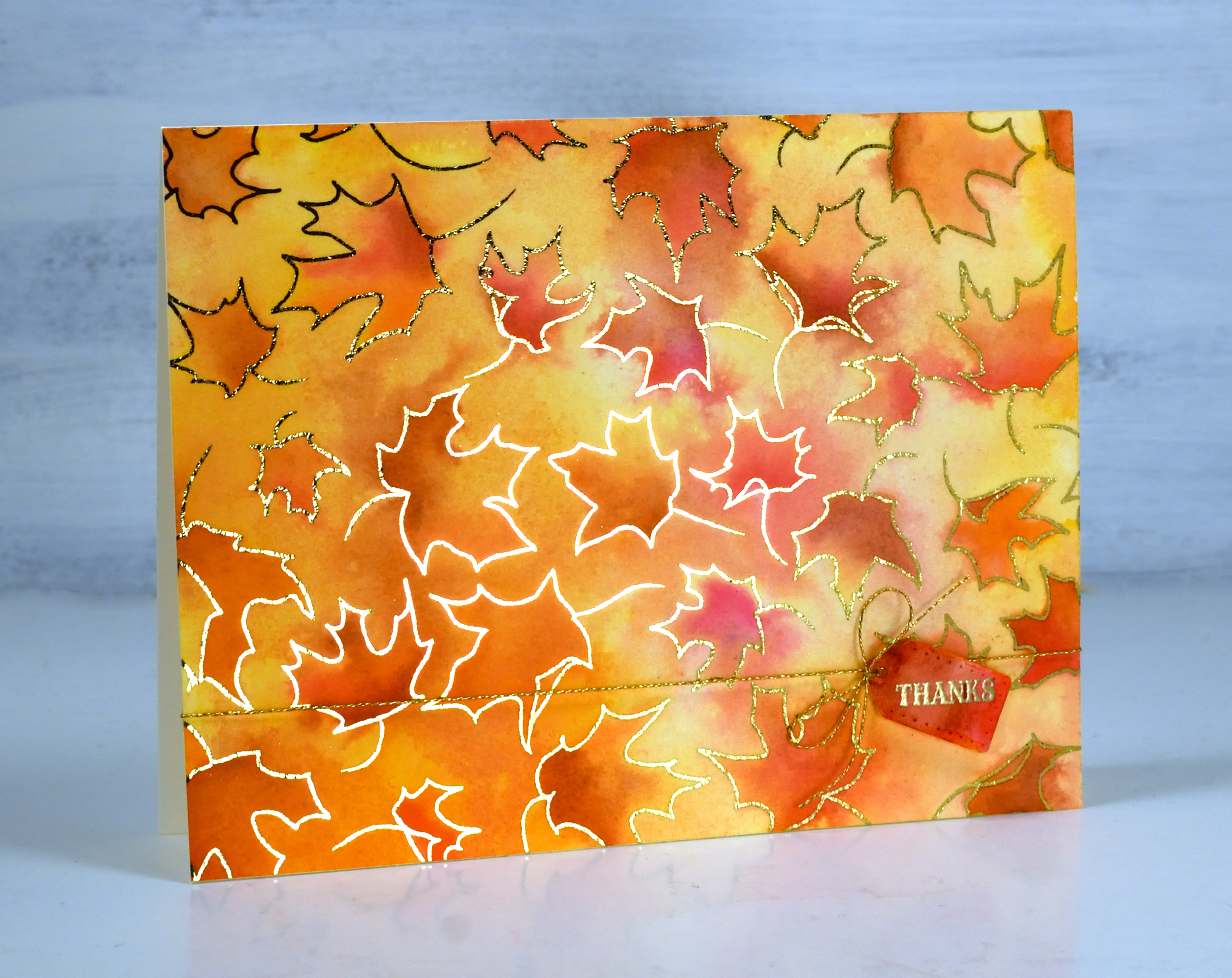
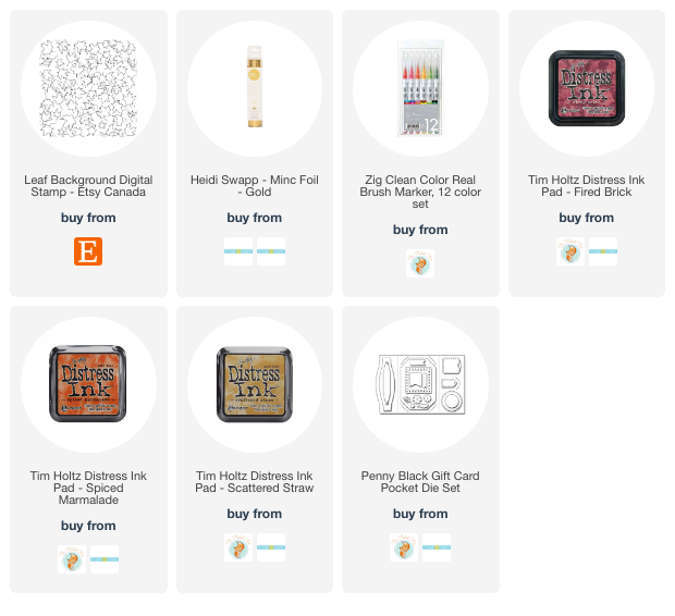
Just because I’m posting an autumn leaf card doesn’t mean I have given up on summer. If you know me you know I hold on until the end. But just in case you would like to be prepared here is a simple but eye-catching card to use during fall or especially for thanksgiving. The leaf background is a single digital stamp from Echidna Studios printed on watercolour paper then foiled with gold foil.
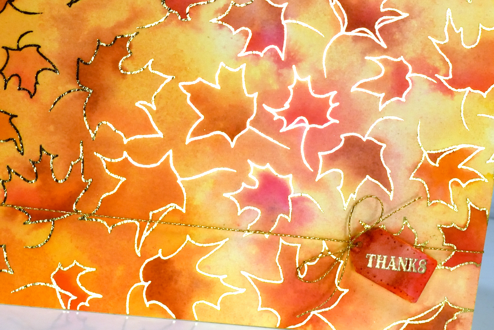
It is always hard to photograph a foiled card but somehow I managed to get quite a bit of the foiled shine in this photo. I watercoloured with fired brick, spiced marmalade and scattered straw distress inks and added some extra depth with zig real brush markers.
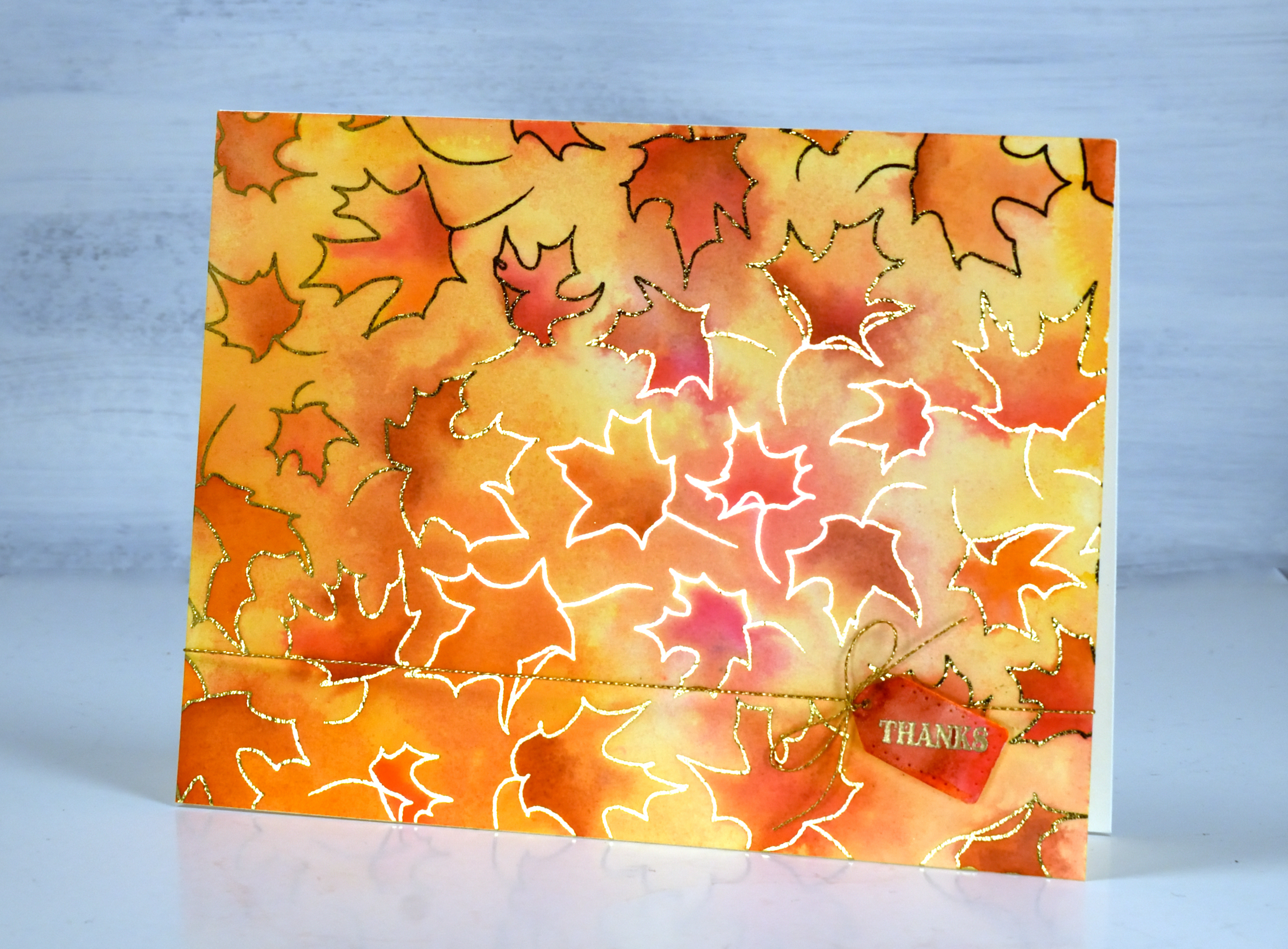
The little tag is from the Penny Black ‘gift card pocket die set’ paired with both a gold sentiment and cord to add even more shine. As I’ve mentioned before you can print the digital stamps any size you want so you could have larger leaves to colour or teeny tiny ones!
(Compensated affiliate links from Foiled Fox & Scrap n Stamp)
Late summer flowers
Posted: September 11, 2023 Filed under: Penny Black, sun kissed | Tags: Fabriano Watercolour Paper, Penny Black stamps 4 Comments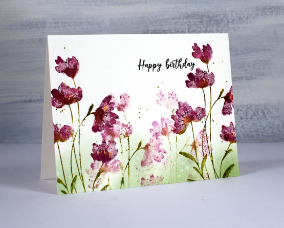
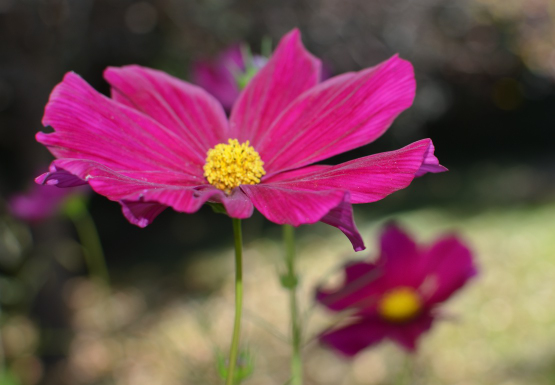
As you know I am often inspired by the season outside my window. My garden has been blooming for most of the summer but after the regular rainfall dried up I’m afraid I didn’t step in and keep it watered so the late summer display is not very impressive. I also stopped deadheading the flowers because the mosquitos have been vicious. Excuses, I know but one cosmos has been quietly growing all summer and is now tall and blooming so it is the inspiration for today’s card. The stamp featured in this card is Penny Black’s ‘sun kissed‘ which I used with a different colour scheme a few months ago.
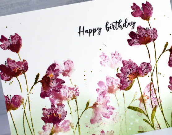
I worked in a stamp positioner so I could add second layers or ink or water where necessary. The cosmos in my garden is close to the colour of seedless preserves ink so that is what I used to ink the flower heads and peeled paint distress ink for the stems and leaves. After inking the stamp I spritzed lightly with water before stamping on hot pressed watercolour paper. If I wanted more ink I would wipe the stamp and reapply but if I wanted more blending I would spritz the stamp again and restamp. Before cleaning the diluted ink off the stamp completely I stamped it in another spot to get the soft background flowers.
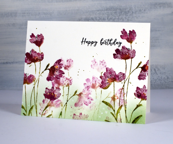
While the ink was still drying on the flowers I added some drops of wild honey ink to the centres of a few flowers. When everything was dry I using a blending brush to add peeled paint in to the base of the design. I splattered some green ink around the flowers and some water drops over the blending. To finish the card I stamped the sentiment from PB ‘birthday humor‘ in black and drew some black stamen with a fine tip pen.
Here is the inspiration flower from my garden.
My blog features affiliate links to the following companies. If you buy through these links I receive a small commission at no extra cost to you.
The Foiled Fox, Scrap’n’Stamp and Ecstasy Crafts (Ecstasy Crafts offers a discount code heathertecs10 you can use for a 10% discount at checkout)
Gazebo
Posted: September 8, 2023 Filed under: Coloured pencil, Echidna Studios, gazebo | Tags: digital stamps, Echidna Studios, Faber-Castell Polychromos Colour Pencil 5 Comments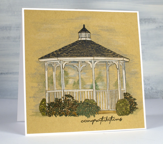
This dreamy gazebo image is the latest digital stamp from Echidna Studios. As I coloured it I had summer gatherings in mind but it would be pretty in autumn colours too.
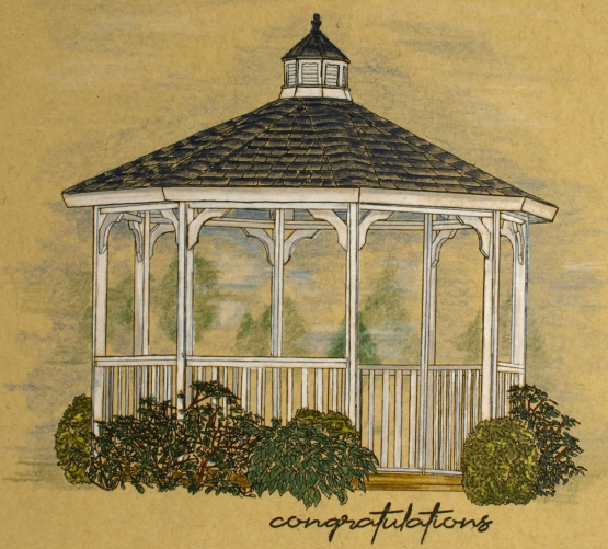
As I’ve mentioned before with a digital stamp it is possible to print it any size so I printed this one to fit a 5.5″ square and the gazebo itself is 4.25″ across. It is printed on a heavy weight kraft paper because I enjoy using coloured pencils on kraft. I really did want a white gazebo so it seemed the obvious choice. This particular kraft paper has a warmer look than the desert storm kraft cardstock I sometimes use. As you can see I coloured the gazebo and plants with enough pressure to fill the outlines and used the side of the sharpened pencil tip to add shading to the background and sky area.
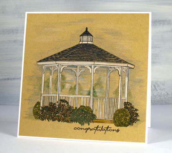
I added a sentiment from the Simply Graphic set ‘English sentiments‘ then attached the panel to a white card base. We went to a wedding many years ago where the bride and groom stood in a gazebo and the guests gathered round to watch which made me think a ‘congratulations’ sentiment fitted nicely.
There are fifty items in the Echidna Studios store now; please pop over and have a look around.
Happy Day Roses
Posted: September 5, 2023 Filed under: Brusho, My Favorite Things, Roses all over, Taylored Expressions | Tags: Brusho, My Favorite Things, Taylored Expressions 7 Comments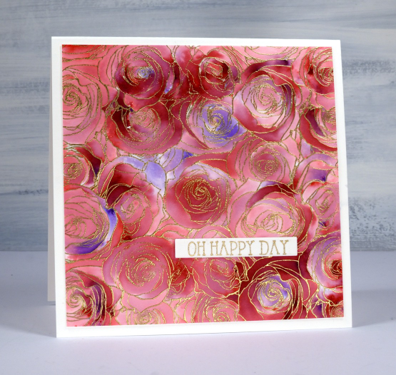
I made this large square card recently to give to a friend of ours on her wedding day. Our whole family was able to attend and celebrate with the bride and her family and it was indeed a happy day.
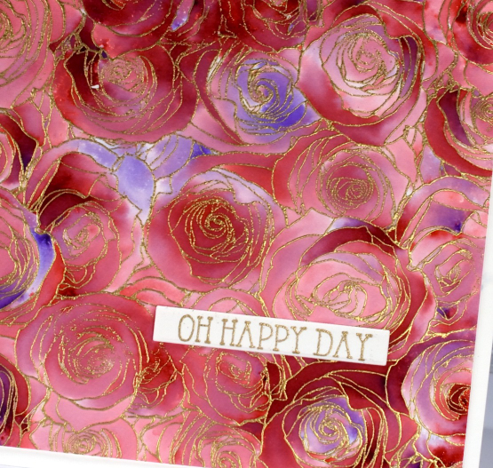
To make this card I used an old favourite technique with brusho and embossing. You might be surprised to know that I only used one colour of brusho, the crimson. I embossed the MFT ‘roses all over background stamp’ with gold powder on hot pressed watercolour paper. This stamp seems to be retired which is a travesty as it is lovely and also perfect for this technique. After a little research I discovered MFT have come out with a similar stamp which should also work. I could call the technique ‘sprinkle, spritz, trap, wait, wait, spritz and blend technique’ because that just about covers it. Sometimes with repeats.
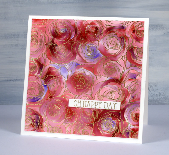
I sprinkle brusho powder over the embossed panel, not too generously, but hopefully some powder lands in most of the roses if not all the little sections. I spritz from above with water and then watch the brusho magic happen. You have to be patient and see how much colour spreads from that first spritz before you add more water. I want variation of colour trapped in the little sections so I don’t flood the panel with water. After the spritzing activates most of the brusho powder I use a paint brusho to fill the petals(sections) with colour. As you can see some areas are quite dark and others are pale. I pick up paint from the darkest areas with the paintbrush if I need to add paint to a bare section.
The sentiment is from a Taylored Expressions set called ‘in & out birthday’.
Here is another example of this technique but done with two colours of brusho.
Botanical Dream
Posted: August 30, 2023 Filed under: Alcohol Ink, botanical dream stencil, gel press, gelli plate, Taylored Expressions, The Crafter's Workshop, The Crafters Workshop | Tags: gel press, gel printing, Ranger Alcohol Ink, Taylored Expressions, The Crafter's Workshop 7 Comments
I think you’ve noticed my love of gel printing. Let me assure you it hasn’t diminished at all. Today’s card features an alcohol ink and stencil print completed on the gel plate then lifted with a layer of acrylic paint.

I’m not sure which alcohol inks I used but I am pretty sure there was a cloudy blue and a brown involved. I’ve learned to like blue and brown combos over recent years which has surprised me a bit. Often we use alcohol inks only on plastic surfaces such as yupo or craft plastic. What I like about using alcohol inks on the gel plate is the way I can lift the print with any paper at all. I plan to make a video showing this technique so stay tuned.

The lovely stencil featured here is called botanical dream from The Crafters Workshop. All the little spaces trap alcohol really well making it a great choice for this technique. I let the stencil sit on the alcohol ink pattern for a while so it dries then lift the print with acrylic paint. I finished the card with a cute greeting from the Taylored Expressions set ‘In & Out Birthday. The set is full of pretty fonts.
My blog features affiliate links to the following companies. If you buy through these links I receive a small commission at no extra cost to you.
Ecstasy Crafts (Ecstasy Crafts offers a discount code heathertecs10 you can use for a 10% discount at checkout)
Purple Potted Pretties
Posted: August 15, 2023 Filed under: Karin brushmarkers, Penny Black, potted pretties | Tags: Karin brushmarkers, Penny Black stamps 13 Comments
The first time I coloured this sweet stamp, potted pretties I used pencils on kraft cardstock but I knew it had to also be watercoloured. I was very happy to be able to get such a range of depth on the petals with just one watercolour marker.
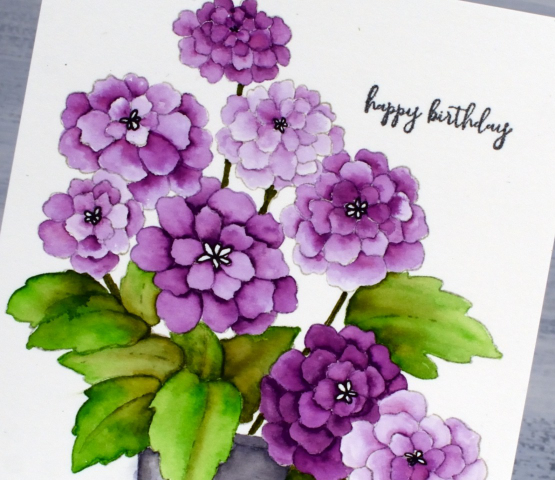
I worked on hot pressed watercolour paper and used four different markers from the Karin Brushmarker set of 26. For the petals I used one of the purples and had water and a brush handy to blend the ink. I put a few dots of ink from the purple marker at the narrow point of each petal then blended the ink to fill the petal. For a dark petal I laid down more ink initially, for the paler petals I sometimes used only the diluted ink left in the paintbrush.
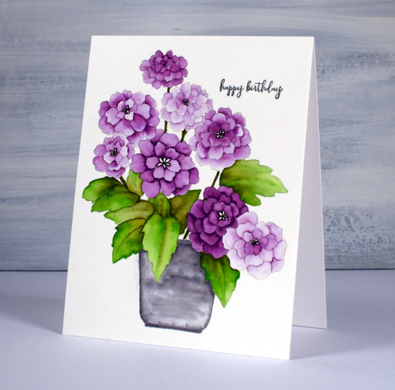
You can probably see the leaves are a mix of a bright green and an olive green and I coloured the pot with blended grey ink. I added a sentiment in black from the PB ‘how sweet’ set and used a black gel pen to define the centres of the flowers.
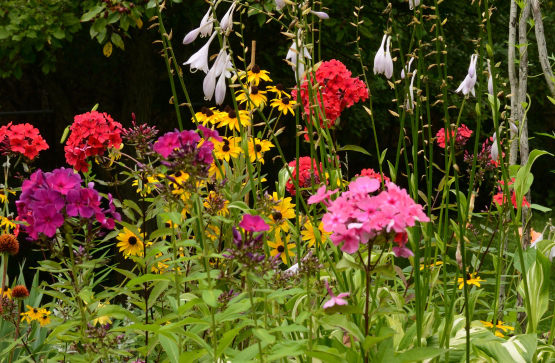
Here are a few of the flowers I’ve been enjoying in my own garden. They get hit by rain then they bounce back up again. Mostly…
Vintage Butterfly Journal page
Posted: August 8, 2023 Filed under: 49 and Market, 6"x 6" journal, Art Journal, Curators Adverts, gel press | Tags: Art Journal, gel press, gel printing 4 Comments
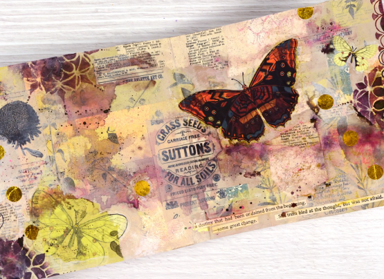
I recently completed this spread in my Ranger 6″x6″ kraft journal. The background or base of my page is covered in collage so by the time the page was finished very little of the kraft colour showed through.
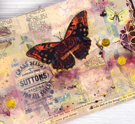
When I started this page I didn’t have a plan but I did have patterned papers on my table. I had some pink, yellow and apricot coloured gel print scraps, some yellow-green tissue paper printed with botanical images and as always, some vintage book pages. Some of the gel printed scraps were left over from the cards I featured in a post last week. I glued down the gel print scraps in no particular arrangement then began gluing the green tissue over the top. I have some fancy washi tape called ‘Curators Adverts‘ which is 4″ wide and covered in black-on-cream ads. I tore some pieces of that and added them over the paper collage.

The collaged page sat on my desk for several weeks before I resumed by adding acrylic paint in pale neutral tones including sand and old ivory. The paint began to tie the page together but it was still lacking a focal point. I flipped through the DK Bees, Birds and Butterflies Sticker Anthology and chose a few pale yellow butterflies which I added to the bottom left and top right corner.

You know I love splatter on my cards and journal pages so I added some droplets of dark brown ink, then spritzed it to dilute and move it around the page. The brown ink diluted to burgandy and pink tones which made me go back to the sticker anthology in search of a bolder butterfly. Once I had added it to the page I worked with walnut stain distress ink and Parker writing ink to add scallop patterns by hand and through the beaded mandala stencil.
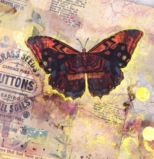
Final touches included some gold polka dot tissue paper, some sentences cut from book pages and sparkly gold watercolour paint. I really like the warm pinky brown tones of this page with some subtle yellow and green appearing sparingly. The vintage ad for grass seed is also a nice feature, centered but not the main attraction.
Collage is a favourite technique for me when beginning journal pages, how do you like to get started on a fresh new spread?
Wishing you comfort
Posted: August 3, 2023 Filed under: Branch 9 die, gel press, Moda Scrap, Penny Black, whisper | Tags: gel press, gel printing, Penny Black creative dies, Penny Black stamps 3 Comments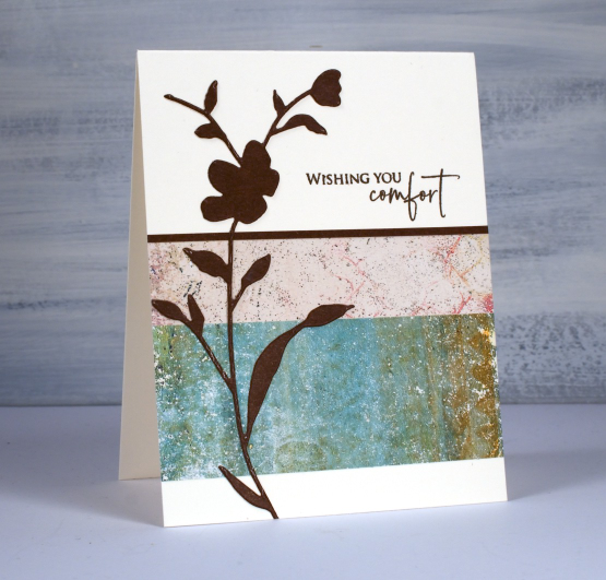
I’m always looking for ways to use my gel prints because I have many and want to make more! I found this two panel idea on Victoria Wilding’s instagram. I chose not to stamp on my prints but instead added the Penny Black ‘whisper’ die-cut over the top, a strip of cardstock along the edge and a sentiment from the PB set ‘strength‘.
If you don’t have gel prints you could use any kind of patterned paper but I would encourage you to check out my online course ‘Gel Print Journey‘ if you are interested in learning or trying new techniques.
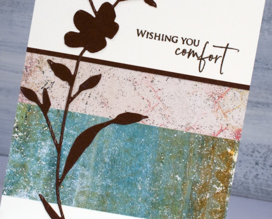
I thought the muted tones of the gel prints lent themselves to a sympathy card as did the dark brown cardstock rather than bold black.
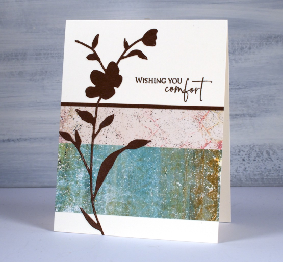
These gel prints are not very bulky as I printed on paper not cardstock. I added double sided adhesive to the back then attached the strips to the card base and trimmed off any overhanging paper.
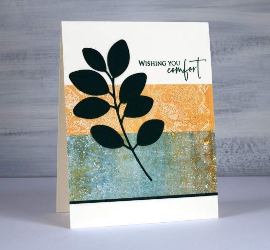
You might recognise the same greeny brown print on this second card but this time paired with a print featuring the PB background stamp, ‘bed of roses’.
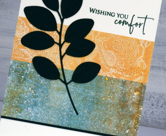
I cut both the Moda Scrap ‘branch 9‘ die and the edge strip from dark green cardstock and used a similar coloured ink for the sentiment. I know the cardstock looks black in the photo but it is truly dark green in real life.
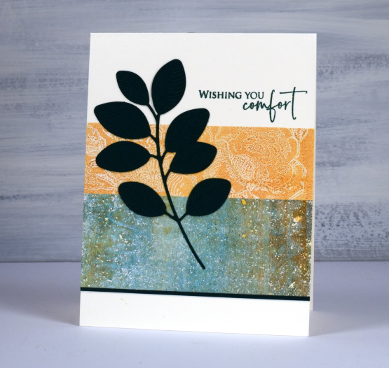
I liked the clean but pretty effect of two gel printed strips together and was able to make several cards using bits of 6″x6″ prints. I kept all the left over scraps too; you will see them in an upcoming journal page.


