
Gentle Breeze Tags
Posted: May 15, 2015 Filed under: Gentle Breeze, Tagged | Tags: Penny Black creative dies, Penny Black stamps, Ranger Distress stains 10 Comments
The new Penny Black release, Sunshine and Smiles, is now available. Jill Foster has been sharing beautiful projects on the PB blog all week. My card today features the new stamp, Gentle Breeze. I inked the stamp with distress stains and markers, spritzed it with pearl-ex spray then stamped on watercolour paper. I did this a couple of times on a large panel and added some splatter here and there with a paint brush. When the panel was finished I couldn’t decide on the orientation or whether to add a sentiment, a die-cut or a mat; I tried several things without satisfaction. Finally I tried a curved edge cut which ended up looking no good at all but left me with a strange shaped panel from which I managed to cut two tags. I added a little texture stamping, a sentiment and ended up with a CAS card. Speaking of CAS cards make sure you check out Penny Black’s second blog, Simplicity at its best; there is all kinds of cleverness shared over there. And, before I end off, don’t forget there is the ‘Blossom’ challenge in progress at One Layer Simplicity.
Supplies:
Stamps: Gentle Breeze, Textures, Heartfelt (PB)
Creative Dies: Tagged (PB)
Inks: Scattered Straw, Spiced Marmalade, Forest Moss distress stains (Ranger) Northern Pine memento ink (Imagine Craft/Tsukineko)
Cardstock: Fabriano 100% cotton hot pressed watercolour paper, Neenah Natural White 110lb cardstock
Also: Twill tape
Roses and wishes
Posted: May 12, 2015 Filed under: Efflorescence, Stitched Edges, Wishes | Tags: Fabriano Watercolour Paper, Penny Black creative dies, Penny Black stamps, Ranger Distress stains 5 Comments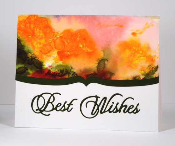
Today’s card is the one which produced the pretty coloured baby wipe that made the previous card possible. The watery rose panel above was initially much larger and there were red roses down below the orange ones. I used the wipe which ended up covered with orange, pink and green stain to clean off the rose stamp after each impression. I can’t really give you a play-by-play for this panel because I just kept on stamping, spritzing, painting and blotting until I ended up what you see above. There is a fine line between a soft blurred floral design and and a mess of washed out colour which some of you might think I have definitely stepped over (hehe) but I like the way the roses bleed into the background and the leaves bleed into the roses.
I cropped the red roses out because they were not so pretty then added a shaped border cut with one of the ‘stitched edge’ dies. I put ‘stick it’ adhesive on the back of the green cardstock before I cut the ‘best wishes’ sentiment which makes it very easy to attach to the card base.
Supplies:
Stamps: Efflorescence (PB)
Creative Dies: Stitched Edges, Wishes (PB)
Inks: Ripe Persimmon, Worn Lipstick, Forest Moss, Festive Berries, Spiced Marmalade distress stains (Ranger)
Cardstock: Fabriano 100% cotton hot pressed watercolour paper, Green paper, Neenah Avon Brilliant White 110lb cardstock
Tulip Festival
Posted: May 7, 2015 Filed under: Blooming Garden, Watercolour | Tags: Fabriano Watercolour Paper, Kuretake Gansai Tambi watercolour paints, Penny Black creative dies, Penny Black stamps, Ranger Distress stains 12 Comments
The Tulip Festival officially starts in Ottawa tomorrow, but as you can imagine the tulips have started celebrating ahead of the opening ceremonies. I decided to create a couple of tulip displays myself but on paper not in the garden. I do have two tulips in bloom which would make the ratio of blooming tulips to planted bulbs quite similar to yesterday’s sad daffodil ratio.
I worked on both these panels at the same time on the same piece of watercolour paper. They were only separated by a piece of masking tape which explains why there are little splatters of red on the panel below even though I intended to keep that one clean and white. When I finished these panels I was a bit ho-hum about them; they were ok but not exactly what I had hoped. Adding mats and sentiments made the difference. The one below had a blue watercolour border that I ended up cutting off to add a red border and sentiment instead. The blue border was too soft on an otherwise crisp contrasting card. On the one above the border was created by the tape so I decided not to add another colour cardstock for the sentiment but remove it with a die cut instead leaving a subtle but readable cream coloured sentiment.

Both cards were stamped and painted with distress stains over ‘masking fluid-splattered’ hot pressed watercolour paper. The top one got the extra spritz and splatter treatment at the end to make the tulips explode a little whereas the lower one was left with the colour inside the lines.
Supplies:
Stamps: Blooming Garden(PB)
Creative Dies: Many Thanks, For You (PB)
Inks: Mowed Lawn, Festive Berries, Ripe Persimmon distress stains (Ranger)
Cardstock: Fabriano 100% cotton hot pressed watercolour paper, Neenah Classic Crest Natural White 110lb smooth, Neenah chilli cardstock
Also: Stick it adhesive sheets, dimensional adhesive, Kuretake Gansai Tambi watercolour paints
Wedding flowers
Posted: April 20, 2015 Filed under: Centerpiece, Frame | Tags: Penny Black creative dies, Penny Black stamps, Ranger Distress stains 4 Comments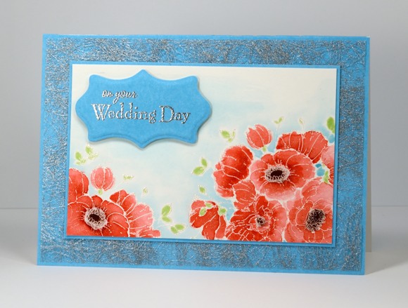
This week on the Penny Black blog the design team are sharing projects which display the versatility of the latest PB release, Time to Celebrate. Over the past few weeks we have shared Mother’s Day, Father’s Day and graduation cards but the stamps and dies can be used for so much more. I picked out the pretty flower stamp, Centerpiece to create a wedding card.
I stamped the floral part of the stamp twice, leaving the vase out altogether. I embossed the design in silver pearl powder which has a subtle sheen to it then watercoloured with festive berries distress stain on the petals and aged mahogany distress stain on the flower centers. The tiny leaves I coloured with a memento new sprout marker. Around the edge of the embossed flowers I painted tumbled glass distress stain, feathering it out to nothing with extra water. I chose to pick up the same blue in the card base and sentiment panel by using PB Clear Skies mix and match paper. It is not obvious in the photo but I coloured over all the flowers with a clear wink of stella marker which gave them all a soft sparkly shimmer. The delicate silver mat is actually fabric interfacing from France. A fellow card making friend brought it back and it was the perfect addition for a little silver accent on the wedding card.
I have just returned from a great weekend teaching at Bizzy B Stamp & Scrap in Toronto and will share some photos from the classes soon.
Supplies
Stamps: Centerpiece, You and Me (PB)
Creative Dies: Frames (PB)
Inks: Versafine, Memento New Sprout marker (Tsukineko) Festive Berries, Aged Mahogany, Tumbled Glass distress stains (Ranger)
Cardstock: Fabriano 100% cotton hot pressed watercolour paper, Clear skies mix & match paper(PB)
Also: Silver & Silver pearl embossing powder
Bird on a branch
Posted: April 17, 2015 Filed under: Happy News, Watercolour | Tags: Faber-Castell Albrecht Durer Watercolour pencils, Fabriano Watercolour Paper, Kuretake Gansai Tambi watercolour paints, Penny Black creative dies 13 Comments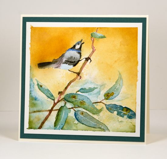
Last week I posted a card featuring negative painted leaves and mentioned a second card made at the same time. Both cards were inspired by gum leaves. This is the card I created using a negative mask cut from frisket film with the ‘happy news’ die. When I cut the bird and branch image out of the frisket film I used a piece that would cover most of my watercolour panel. I obviously didn’t think too much about where I was positioning it because I ended up with the bird balancing oddly on the diagonal branch. I think it would have been more natural if the branch was closer to horizontal but it still seems to work.
The frisket film works well masking watercolour paint but some does seep underneath. Fortunately on this panel the only seepage was around the leaves not the bird. I painted a layer at a time and let the colour dry in between to avoid getting the panel too wet. The paint is gansai tambi watercolour with some details done in watercolour pencils. I completed most of the painting before removing the mask. With the mask off I painted some extra leaves then worked with the green and blue seepage around the leaves to create the impression of more foliage in the background. Once the leaves were totally dry I scratched a spine into each leaf with a sharp knife.
At this point I wanted to create some contrast to make the bird pop a little more but I didn’t want to paint a fiddly background around all the edges. Instead I cut another ‘happy news’ mask from masking paper and positioned it directly over the painted bird (which was totally dry) I then sponged the golden colour using memento peanut brittle ink. Once I had good coverage I pressed a damp paper towel into the sponging to give it more of a watercoloured texture.
This is a technique I will play around with more because I have many dies and they make great outlines for watercolouring. Getting a negative and positive mask from each die cut means double the possibilities.
My dad celebrated his 80th birthday this week and hopefully this card has arrived in Australia and been opened by now. He and my mother check out the cards on my blog regularly and my dad drops hints from time to time that he would like to see some Australian scenes. I definitely had eucalyptus leaves in mind when I painted this scene but I can’t say that the bird resembles any particular Australian bird. (If the card hasn’t arrived yet Dad, you’re getting a sneak peak!)
Supplies
Creative Dies: Happy News (PB)
Inks: Memento Peanut Brittle ink (Tsukineko)
Cardstock: Fabriano 100% cotton hot pressed watercolour paper, Neenah Natural White 110lb cardstock, teal cardstock
Also: Kuretake Gansai Tambi watercolour paints, grafix extra tack frisket film, Faber-Castell Albrecht Durer watercolour pencils
Curtain Call Inspiration Challenge – Bouquet
Posted: April 15, 2015 Filed under: Efflorescence, Stitched Edges | Tags: Faber-Castell Polychromos Colour Pencil, Penny Black creative dies, Penny Black stamps, Ranger Distress stains 4 Comments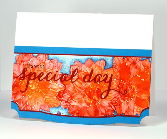
Penny Black is playing along with the Curtain Call Inspiration Challenge today and the inspiration picture is a big bright bouquet of flowers.
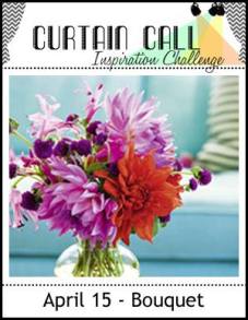
I chose to highlight one of the flowers, a dahlia I think, and repeated it three times across my panel. I inked the flower from the transparent set ‘Efflorescence’ in barn door and ripe persimmon distress stain, spritzed it so the stains would blend then stamped it once on the panel. I did one at a time so I could do all the painting for each one while the stain was still wet. I used a waterbrush to pull colour from the outline in to fill the petals. If the stain dried before I could pull colour in I squeezed some out of the bottle and picked it up with the brush. After letting the first flower dry I did another and then a third. When all three were dry I added a fine splatter of barn door stain.
The background is coloured with Faber Castell polychromos pencils in two blues, I also added some extra definition here and there on the petals with red and orange pencils. The bottom edge of the panel, as well as the red, the blue mat and the card base, is die-cut by one of the stitched edges dies. For the sentiment I stamped only part of a stamp from the Sprinke & Smiles set so I could finish the phrase with words die cut in the same red as the mat.
Make sure you check out the challenge and some more interpretations from the PB design team
Supplies:
Stamps: Efflorescence, Sprinkles and Smiles (PB)
Creative Dies: Stitched Edges, Splendid Wishes (PB)
Inks: Ripe Persimmon, Barn Door distress stains (Ranger), Versafine Onyx Black (Imagine Craft/Tsukineko)
Cardstock: Fabriano 100% cotton hot pressed watercolour paper, Red and Blue cardstock, Neenah Avon Brilliant White 110lb cardstock
Leaf negatives
Posted: April 6, 2015 Filed under: CAS, Happy News, Watercolour | Tags: Fabriano Watercolour Paper, Kuretake Gansai Tambi watercolour paints, Penny Black creative dies 18 Comments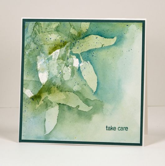
I am enjoying my new watercolour paints and experimenting with different ways to use them. The panel above is part of a masking experiment. I used the ‘happy news’ die to cut a mask from frisket film. Frisket film is made of plastic so I ran the die back and forth through the machine a few times to make sure it cut well. I saved both the negative and the positive die cut image and worked on two panels at once so one could dry while I painted the other. For the one above I used just the positive leaf and branch portion of the die cut image.
I pressed the frisket film leaves firmly onto hotpressed watercolour paper and painted some greens and blues around the leaves. The shape of the leaves reminds me of gum leaves (eucalyptus leaves) so I stuck with the muted blues and greens I remember from the gum trees in Australia. Some paint did seep under the frisket film in places but I didn’t worry as I knew I was doing several layers anyway. When the first layer was dry I repositioned the mask and repeated the process. I think I repositioned the mask three times; I’m not sure. By the time I had painted several layers the first white masked leaves were almost completely covered in paint but the outlines were still distinct. I added some splatter, a sentiment then matted in a co-ordinating teal cardstock.
The other panel I was working on used the negative frisket film mask and will be on the blog next week. Thanks for dropping by.
Supplies
Stamps: Snippets (PB)
Creative Dies: Happy News (PB)
Cardstock: Fabriano 100% cotton hot pressed watercolour paper, Neenah Avon Brilliant White 110lb cardstock, teal cardstock
Also: Kuretake Gansai Tambi watercolour paints, grafix extra tack frisket film
Birds, blooms and balloons
Posted: April 4, 2015 Filed under: CAS, Tweet Thing, Uplifting | Tags: CAS, Fabriano Watercolour Paper, Penny Black creative dies, Ranger Distress stains 10 Comments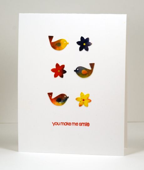
The theme at CASology this week is “Spring” and the sketch at CAS(E) this sketch is a 2×3 array. I had fun combining the two in the card above.
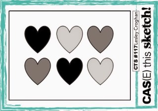
The watercolour panels were left over from my last class so I die cut little birds and flowers using dies from the ‘tweet things’ set to fit with the spring theme then arranged them according to the sketch.
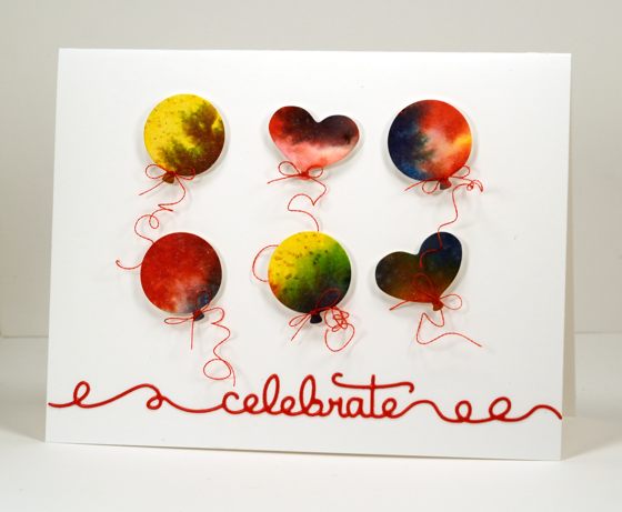
I don’t know that balloons are a spring thing but they do work perfectly for the sketch so I die cut some circle and heart balloons using dies from the ‘uplifting’ set, spent way too long tying six tiny bows of machine embroidery thread around the balloons then popped them up on dimensional tape. The embroidery thread is very shiny so I found the shiniest red cardstock I had and die cut the word celebrate from the ‘doodles’ set which works in well with the curls in the thread.
We had amazing spring weather yesterday; my girls and I went for a run in beautiful 15°C sunshine. This morning we woke up to fresh snow so my husband skied this afternoon. Happy Easter everyone.
Supplies:
Stamps: Snippets (PB)
Creative Dies: Tweet Things, Uplifting, Doodles (PB)
Inks: Barn Door, Mustard Seed, Chipped Sapphire Distress Stains (Ranger) Satin Red versafine ink (Tsukineko)
Cardstock: Fabriano 100% cotton hot pressed watercolour paper, Neenah solar white cardstock
Patterns on patterns
Posted: March 30, 2015 Filed under: Hidden Hearts, Hypnotic | Tags: Penny Black creative dies, Penny Black stencils, Ranger Distress inks 4 Comments
I’ve been wanting to create something with the large ‘Hypnotic’ circle stencil ever since it arrived but there were flowers to stamp first! Inspired by the pretty colour schemes of Karen Dunbrook I pulled out all my blue and green toned distress inks the other day and sponged over and around this pretty stencil. There was already masking fluid splatter over the Neenah Solar White panel to create some extra texture. I chose a spot close to the centre of the circle pattern to be the lightest area then worked out from there making the outer edges of the stencil the darkest areas. When I was happy with the sponging I splattered some blue and green ink over the panel and dropped some water also. To create the watermark on the right I painted water onto the stencil then pressed it onto the sponging. Once all was dry I removed the masking fluid and added a sentiment, the circular ‘Hidden Hearts’ die cut and a strip of matching cardstock along the base of the panel.
It is almost time for a new One Layer Simplicity challenge but before that appears on April 1st, pop on over and see the details the design team highlighted from all the creative March entries. I tried to create a ‘words only one layer card’ for the challenge this month but my attempts went from bad to worse ending with card which was comical it was so wrong. Sorry, but you’ll never see that one. I am going to try again in April with a fresh new challenge.
Supplies:
Stencil: Hypnotic (PB)
Creative Dies: Hidden Hearts, Stylish Gratitude (PB)
Inks: peacock feather, salty ocean, pine needles, chipped sapphire distress inks (Ranger)
Cardstock: Neenah Solar white cardstock, turquoise cardstock,
Centrepiece
Posted: March 27, 2015 Filed under: CAS, Centerpiece | Tags: Fabriano Watercolour Paper, Kuretake Gansai Tambi watercolour paints, Penny Black creative dies, Penny Black stamps 18 Comments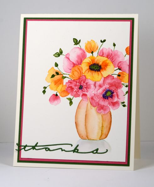
Have you visited the Penny Black blog this week? Jill Foster has been sharing gorgeous projects all week to showcase the new ‘Time to Celebrate’ release. There is a giveaway too, so make sure you drop in. This lovely vase of flowers is one of the new stamps and I pulled out my new watercolours to paint it. I started by inking the stamp with memento angel pink on the flowers and desert sand on the vase which gave me a pale outline for my painting. I used a small round watercolour brush and worked one petal or flower section at a time. I started by painting water onto a petal, added pale color to the watery area and spread it, then added darker colour on the section closest to the centre of the flower or to any areas that would be in shadow behind another petal. As I painted I dabbed excess paint and water away with a paper towel or dry paintbrush. I worked on sections that were not adjacent to each other so the paint could dry before I painted the petals next door. I used both paint and markers for the stems, leaves and flower centres.
When the flowers were dry I painted the vase and finally a pale shadow below it. I picked out some co-ordinating pink and green cardstock to mat the panel and die cut a green sentiment from the new 2 die set ‘Many Thanks’. Thanks for dropping in.
Supplies
Stamps: Centerpiece (PB)
Creative Dies: Many Thanks (PB)
Inks: Memento Angel Pink, Desert Sand, Bamboo Leaves, Grape Jelly, Tuxedo Black (PB)
Cardstock: Fabriano 100% cotton hot pressed watercolour paper, Neenah Natural White 110lb cardstock, pink and green cardstock
Also: Kuretake Gansai Tambi watercolour paints












