
Spring Things
Posted: March 25, 2015 Filed under: CAS, First Dance, Sun fire | Tags: Fabriano Watercolour Paper, Penny Black creative dies, Penny Black stamps, Ranger Distress stains 17 Comments
I pulled out one of last year’s floral stamps for this card and tried the co-ordinating die from this year’s release. I painted a pale background first and let it dry before I did any stamping. I inked the stamp directly with distress stains, spritzed, stamped then blended with a waterbrush and a clear wink of stella pen. The petals were inked in seedless preserves and dusty concord so there would be some light and dark purple to blend. On the main panel I added a few wink of stella highlights once I had blended the petals but on the die cut lily I did all the blending with a clear wink of stella so it has a subtle shimmer when it catches the light. The dots on the petals and the filaments get a bit lost when inked with distress stain so I went over them with a marker once the petals were dry.
I completed the card by matting the main panel in green and popping up the die cut lily over the top. I added a simple sentiment but I am realising now that this would have made a nice easter card. I guess I can stamp an easter sentiment inside.

Believe it or not I still have a few snowy scene card ideas bouncing around in my head. How about you – are you just stamping all things spring these days?
I’ve never entered Darnell’s cool NBUS challenge but I am eligible with my never before used ‘sun fire’ die so I will link up over there and at the Work it Wednesday Challenge on the Simon Says Stamp blog.

Supplies:
Stamps: First Dance, Snippets (PB)
Creative Dies: Sun fire (PB)
Inks: Dusty Concord, Seedless Preserves, Spiced Marmalade, Tumbled Glass, Ripe Persimmon, Forest Moss Distress Stains (Ranger)
Cardstock: Fabriano 100% cotton hot pressed watercolour paper, green cardstock, Neenah Natural white cardstock
Happy News
Posted: March 23, 2015 Filed under: CAS, Happy News, Watercolour | Tags: Fabriano Watercolour Paper, Kuretake Gansai Tambi watercolour paints, Penny Black creative dies 19 Comments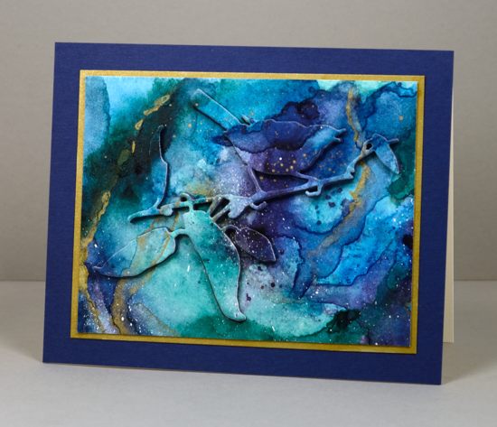
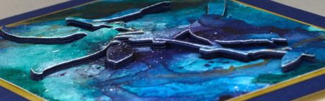
Penny Black has a mini release out today and you can see projects featuring the new stamps and dies on the blog and facebook all this week. I have two cards for you featuring the rest of the faux marble watercoloured panel I made last week. It was inspired by Sandy Allnock’s video of her faux glass technique. I used a bird & branch die called ‘Happy News’ from the new release. Rather than use only the die-cut or the negative I wanted to use both so I didn’t lose any of the pretty patterned panel. To raise the bird and branch above the background I stacked six die-cuts out of navy cardstock then stuck the watercoloured die-cut on top. This panel has proved quite hard to photograph; I’m not sure why but it is hard to get the greens to look like they do in real life. I switched to a grey background which lessened the contrast but it still isn’t quite what I see. (blue, green, gold, white-who knows?) To make it easier to stack the die-cuts I stuck scrapbook adhesive sheets on the back of my cardstock before cutting. To finish I matted it on gold cardstock then on a deep blue panel.
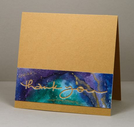
With my last little scrap of the faux marble watercoloured panel I created a CAS card on a kraft base which picked up the gold details. The ‘thank you’ die is another from the new PB release. I stuck the die-cut words inside the card.
Thank you for all your kind words about my poppy series. Let me know if there is another PB stamp you would like me to play around with and I will see if inspiration strikes!
Supplies
Creative Dies: Happy News, Many Thanks (PB)
Cardstock: Fabriano 100% cotton hot pressed watercolour paper, Neenah Natural White 110lb cardstock, gold , navy and kraft cardstock
Also: Kuretake Gansai Tambi watercolour paints 38, 50, 55, 56, 62, 66, 91 and gold wink of stella brush
Deep Pink Poppies
Posted: March 20, 2015 Filed under: Blooming Garden, CAS, Watercolour | Tags: Fabriano Watercolour Paper, Penny Black creative dies, Penny Black stamps, Ranger Distress stains 7 Comments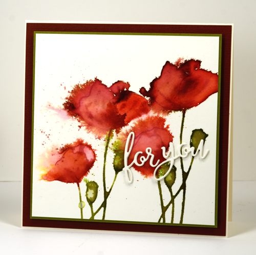
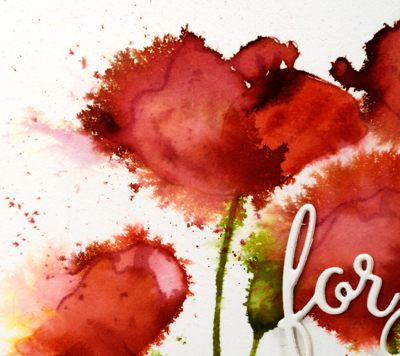
More poppies! I think this is the last for now. Maybe. As I mentioned in my last post, my poppy watercolouring has become progressively looser in the four cards I have recently created. This one might just be my favourite. It started out just like the last one; I inked the poppy stamp from Blooming Garden with distress stains (listed below). I stamped the image twice, spritzing the stamp with water before each impression but not re-inking. While the stain was wet I used a paintbrush to pull colour into the petals, adding stain or water here and there to make it lighter or darker. There was a bit of yellow left on the stamp from the previous card which ended up on the far left poppy and I quite like that happy accident. While the painted poppies were still damp I spritzed water over the images aiming from right to left so the poppy blow outs occurred in the same direction.
Even though this technique looks very loose and free it can go wrong very quickly. One of the keys to success is to spritz then wait to see what happens. If you spritz, take a quick look, think nothing has happened so spritz again, you can end up with water and colour everywhere but not in a very artistic arrangement. That kind of happened on the poppy under the die cut sentiment which, of course, is why it is under the die cut sentiment. Triple stacked die cut sentiment by the way. I really like the look of the stacked die cuts and I am getting better at lining them up so they look like one piece instead of multiples. I did try to incorporate some ribbon or embroidery thread but they just didn’t fit in so I resorted to simple mats to finish it off.
I’ve been inspired by Kathy Racoosin’s #thedailymarker30day colouring challenge. I haven’t coloured everyday but doing this poppy project has been like a mini colouring challenge. If you haven’t seen my first three, here are the links: Pink Poppies, Red Poppies and Orange Poppies. I don’t think I have ever done blue poppies but Penny Ward has in this beautiful card.
Supplies:
Stamps: Blooming Garden(PB)
Creative Dies: For You (PB)
Inks: Peeled Paint, Aged Mahogany, Festive Berries distress stains (Ranger)Cardstock: Fabriano 100% cotton hot pressed watercolour paper, Neenah Classic Crest Natural White 110lb smooth, burgandy and green cardstock
Also: Stick it adhesive sheets, dimensional adhesive
Orange Poppies
Posted: March 18, 2015 Filed under: Blooming Garden, Flourish | Tags: Penny Black creative dies, Penny Black stamps, Ranger Distress stains 14 Comments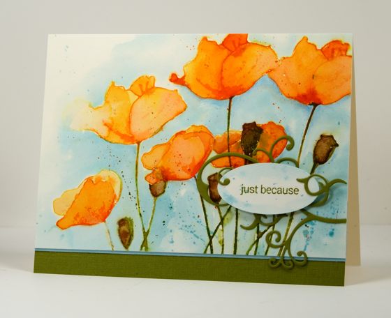
As you can see I haven’t finished experimenting with the poppy stamp just yet. I have another one after this one too and I noticed as I finished off this one that the watercolouring has got progressively looser in each design. In the first one, Pink Poppies I worked slowly with a fairly small brush, the second, Red Poppies, my brush work was looser but still contained by embossed borders. In this one I stayed mostly inside the outlines but pulled and pushed the colour around quickly with broader strokes. My next version is even looser. I worked with distress stains for this design. I inked the stamp with spiced marmalade and ripe persimmon stains on the petals and peeled paint on the stems and seed pods. I restamped the image after spritzing it with water. I didn’t re-ink because there was still plenty of stain left on the stamp. Then I did the same again. You can see the image on the left hand side is paler as the stain was more diluted by the time I stamped that one.
The stain sits on the hotpressed watercolour paper for a little while without soaking in which makes it possible to pull the colour into the petals and ‘paint’ them using the stamped stain. I do add more stain where I want it a little darker or dilute it with water to make it lighter. I painted the seed pods in the same way but added some vintage photo stain. Some colour does run in a direction you don’t want from time to time but I like a little bit of that on a loose watercolour. I added the blue background after the poppies were totally dry working with a water laden brush first then dropping tumbled glass stain and painting that around all the flowers. I added some splatters once the blue was dry.
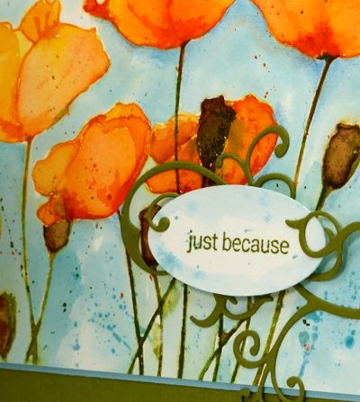
Although I was happy with the poppies over all, some of the stems and seedpods crossing over and overlapping with the lower poppies in the bottom right corner did get a bit messy. I didn’t want to crop them out completely and lose half my panel so I decided to add the sentiment over the top held in place with a pretty little die cut flourish. The flourish is attached using ‘stick it’ adhesive sheet and the sentiment oval is popped up on dimensional squares. The nice thing about ‘stick it’ adhesive sheets is that you have a few moments to adjust the positioning before it sticks permanently so I was able to position the flourish then lift the little curls I wanted to sit on top of the popped up oval before pressing all the flourish firmly onto the panel. (Edited to add: I noticed the next day that I had called this post Orange Tulips! I’ve changed it to poppies)
Supplies: Stamps: Blooming Garden, Snippets (PB) Creative Dies: flourish (PB) Inks: Peeled Paint, Spiced Marmalade, Ripe Persimmon, Vintage Photo, Tumbled Glass distress stains (Ranger) Cardstock: Fabriano 100% cotton hot pressed watercolour paper, Neenah Classic Crest Natural White 110lb smooth, blue and green cardstock Also: Stick it adhesive sheets, scrapbook adhesive dimensional squares
Imagine
Posted: March 15, 2015 Filed under: Dies, Watercolour | Tags: Fabriano Watercolour Paper, Kuretake Gansai Tambi watercolour paints, Penny Black creative dies 57 Comments
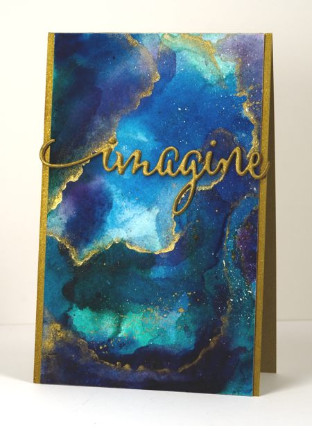
I am enjoying my new watercolour paints and have watched some recent watercolour videos by the very talented Sandy Allnock. She has been playing around with the same paints (Kuretake Gansai Tambi) and posted a video last week where she created a faux glass panel inspired by vase she saw. I used some of the same techniques and made a faux marble panel. I painted blues, greens and purples on a piece of watercolour paper and let them blend. I dried them with a heat tool then added more layers leaving some pale and others dark and intense. When I was happy with the colours I painted some thin lines of gold onto the panel and blended them out on one side with a very wet paint brush. This gave me a soft edge and a hard edge I also splattered some gold paint over parts of the panel. The piece on the card above is less than half the watercoloured panel so I have some more to play around with another day.
For the sentiment I stacked four diecuts of the word ‘imagine’ each with ‘stick it’ adhesive on the back to make them easier to stick together. The gold cardstock I used was slightly duller than the gold paint so I brightened it up with my gold wink of stella pen. I did the same with the sides of the card base so it would all match. I am thinking it might make a good graduation card.

Supplies
Creative Dies: Envision (PB)
Cardstock: Fabriano 100% cotton hot pressed watercolour paper, gold cardstock
Also: Kuretake Gansai Tambi watercolour paints 38, 50, 55, 56, 62, 66, 91 and gold wink of stella brush
Pink Poppies
Posted: March 9, 2015 Filed under: Blooming tags, Sprigs | Tags: Faber-Castell Albrecht Durer Watercolour pencils, Penny Black creative dies, Penny Black stamps 18 Comments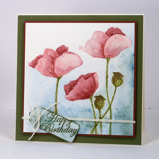
Last week I posted several loosely watercoloured cards. The poppies on today’s card were painted with more precision and there was no spritzing to make the colours blend and bleed. I worked on a watercolour block which I had splattered with a fine mist of masking fluid. The end result with such a fine mist could represent snow but I think it could pass for rain too. I have had snow fall on my daffodils and tulips but the poppies are pretty safe! Once the masking fluid was dry I inked the poppy image from ‘blooming garden‘ with memento angel pink and new sprout markers. The colours are fairly pale so I had an outline to work with but not so dark that it would be noticeable after I had added all the colour. For this one I used my watercolour pencils as paints. I do this by picking up colour from the lead of the pencil with a waterbrush then painting with it. For the poppies I used colour from three pink pencils (listed below), for the stems and seed heads two greens and a brown then a blue and a green for the background.
I didn’t want both of the tall poppies to look exactly the same so I altered the petals a bit on the left hand one. When I checked a photo of seed pods to choose my colours I saw many were quite round so I fattened mine up a little. When the poppies and seed heads had dried I drew some veins and ridges with the watercolour pencils.
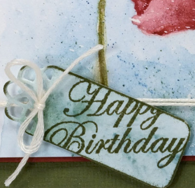
To create the little tag I painted a scrap of watercolour paper with the same colours I had used on the background of the main panel, die cut a ‘flower tag’, then stamped the sentiment from the ‘sprigs’ set across it. To complete the card I matted the panel with a narrow red mat, tied the tag on with embroidery floss, popped the panel up on a wider green mat and attached it to a cream card base.
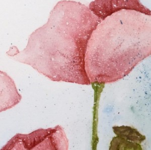
As you know I love doing the loose watery images but I also find it quite satisfying to work slowly to paint a more formal image.
Kathy Racoosin is doing a 30 day coloring challenge at present which inspired me to do pull out my pencils.
Supplies:
Stamps: Blooming Garden, Sprigs (PB)
Creative Dies: flower tags (PB)
Inks: Memento Angel Pink, New Sprout, Olive Grove markers (Tsukineko)
Cardstock: Fabriano 100% cotton hot pressed watercolour paper, Neenah Classic Crest Natural White 110lb smooth, pink and green cardstock
Also: Albrecht Durer watercolour pencils medium flesh 131, dark red 225, indian red 192, night green 155, pine green 267, olive green 173, moss green 168, apple green 170(Faber-Castell), Cream embroidery floss
Gentle Whisper
Posted: February 18, 2015 Filed under: Gentle Whisper, Geometrics | Tags: Penny Black creative dies, Penny Black stamps, Tsukineko Memento inks 5 Comments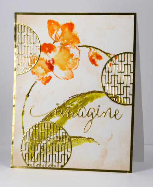
If you have browsed through the new Penny Black release you would have scene some lovely Asian motifs in both the stamps and the dies. In this card I was trying to create an Asian themed card by using the ‘geometrics’ die and the gorgeous large orchid stamp, ‘gentle whisper’. I began by stamping a very subtle background pattern using Memento Desert Sand ink and the ‘Oh Spring’ brush stroke stamp from years ago. I then inked the orchid stamp with markers, spritzed it, stamped on the watercolour panel and then spritzed the panel. I blended the colour here and there with a brush, adding a little more in a few places. To create the gold details and mat I cut up a couple of envelopes that had shiny gold linings. I stuck scrapbook adhesive sheets to the back of the gold paper then die cut my word and circle motifs. With the adhesive already attached I was able to adhere them easily onto the watercolour panel. I cut a gold mat to completely cover the front of my card base then attached the panel.
The stamp is quite large so I think I made this card a bit bigger than my usual A2. I hope you have been checking out all the wonderful projects on the PB blog lately. The designers are still showcasing the many new products from the new release, ‘Bring on the Happy’. Last week there was all sorts of clever paper cutting and piecing from the incredible Peet Roven. This week it’s all about the new creative dies.
Supplies:
Stamps: Gentle Whisper, Oh Spring!(PB)
Creative Dies: Envision, Geometrics(PB)
Inks:Cantaloupe, Tangelo, Olive Grove, Bamboo Leaves, Desert Sand Memento inks and markers(Imagine Craft/Tsukineko)
Cardstock: Fabriano hotpressed 100% cotton watercolour paper, Shiny gold paper, Neenah Natural White cardstock
Also: Scrapbook Adhesive sheets
Summer birthday
Posted: February 17, 2015 Filed under: Sprigs, Stamped Landscapes, Watercolour | Tags: Penny Black creative dies, Penny Black stamps, Ranger Distress inks 23 Comments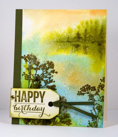
My husband and I both have February birthdays which meant hot summer days for the first 35 years of our lives. Now we celebrate in the bleak mid-winter!
For his birthday card this year I have gone with the warm tones of summer for inspiration. I managed better with this card than the anniversary card; I wrote in it and gave it to him before posting it here on the blog. To create this scene I started by flicking masking fluid onto my small watercolour block. Even though this isn’t a wintery scene some little flecks of white add interest and dimension to the scene. After the masking fluid dried I wet the whole panel and painted the trees and reflections in the distance, the sky and the water with brushes. In the foreground I stamped several stamps from the ‘sprigs’ set onto the wet paper and let them bleed into the surrounding area. When the paper dried a bit I stamped a couple more sprigs which stayed more distinct. I die cut a tag and splashed some of the same colour over it before adding a sentiment and ribbon.
Supplies:
Stamps: Sprigs , Sprinkles & Smiles (PB)
Creative Dies: Tagged (PB)
Inks: Dried marigold, forest moss, frayed burlap, crushed olive distress inks (Ranger) Versafine Spanish Moss (Imagine Crafts/Tsukineko)
Cardstock: Fabriano hot pressed watercolour paper, Olive green cardstock & ribbon
Watercoloured Sprigs
Posted: February 11, 2015 Filed under: Deco Frame, No Card Left Behind, Sprigs, Watercolour | Tags: Penny Black creative dies, Penny Black stamps, Tsukineko Memento inks 8 Comments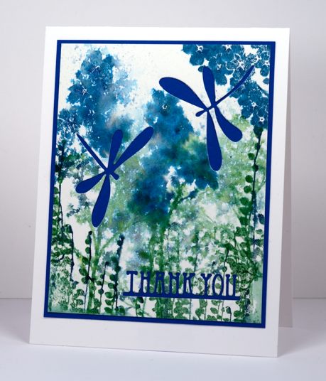
I had a card idea in my head yesterday and I did several trials and variations with the stamps from the transparent set ‘Sprigs’ but my original idea did not end up working. I set the experiments aside and designed a totally different card. Today when I looked at yesterday’s experiment I came up with the card you see above. The problem with the panel before I die cut dragonflies and a sentiment out was that is did not really have a focal point. The colours were pretty and some of the watercolour effects were pretty (others were messy) but it all looked too similar. By cutting the dragonflies to reveal the blue cardstock behind, the focus is taken away from the watercolour panel and transferred to the bold images and letters. I could have just as easily popped dragonflies on top but I like the cut-away look. The features I liked in the original panel are no longer trying to be the stars, they work better as back up. Next time you cast aside a stamped panel because it’s not working the way you thought consider whether it just needs to be in the background and let another element take centre stage.
To create the panel I inked up three of the ‘sprigs’ stamps with a mix of blues and greens. I inked each stamp with one colour using a large stamp pad then added another colour with a marker. I spritzed each stamp, stamped them on watercolour paper then, when I had stamped all the images, spritzed the paper.
I can’t always turn my experiments into finished cards, often the watercolour panels just get turned over so I can use the other side. Sometimes I wonder if the recipients of my cards ever see the backs of some of my panels, hopefully the adhesive holds and the rejected side stays hidden!
Supplies:
Stamps: Sprigs (PB)
Creative Dies: Deco Frame, Flutters (PB)
Inks: Nautical Blue, Teal Zeal, Cottage Ivy, Bamboo Leaves Memento ink (Imagine Craft/Tsukineko)
Cardstock: Fabriano hot pressed watercolour paper, Blue cardstock
Oodles of love
Posted: February 9, 2015 Filed under: CAS, One-Layer Simplicity challenge, Oodles of Love | Tags: CAS, One-Layer cards, Penny Black creative dies, Tsukineko Memento inks 10 Comments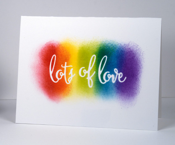
This one layer card is for the Clean and Simple challenge at Splitcoaststampers today to have some kind of rainbow connection on your card. It also works perfectly for this month’s One Layer Simplicity challenge “You Blend!”.
I used the ‘oodles of love’ die to cut a mask from masking paper. I stuck that directly on my card base and sponged a rainbow of colours over the top. I removed the mask to reveal crisp white words. That’s all there was to it, a clean and simple card that actually was simple; doesn’t always happen that way as you know!
Supplies
Creative Dies: Oodles of Love (PB)
Inks: Memento love letter, dandelion, pear tart, teal zeal, grape jelly (ImagineCrafts/Tsukineko)
Cardstock: Neenah Solar White












