
Matelasse cards & a winner
Posted: March 27, 2017 Filed under: Brusho, CAS, layered flower, Leaflets, the garden | Tags: Brusho, Fabriano Watercolour Paper, Penny Black creative dies 8 Comments

Fancy Fish
Posted: March 22, 2017 Filed under: Alcohol Ink, Fancy Fish | Tags: Penny Black creative dies, Ranger Alcohol Ink 7 Comments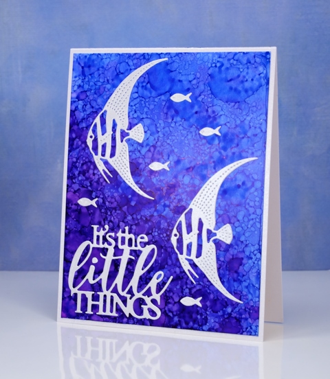
I have another alcohol ink background to share today. If you didn’t see the yesterday’s card you might want to click here (there’s a giveaway provided by The Foiled Fox so it’s worth a visit!) When I saw the new fancy fish dies from Penny Black, I immediately thought of the patterns possible with alcohol inks and blending solution. To create this kind of pattern I started with plenty of dark and light blue ink on my yupo paper then dropped some blending solution on a felt pad and pounced that all over the panel. The blending solution creates little bubble shapes in the ink. The felt pad also picks up blue ink from the yupo paper and prints it down again so more little bubbles.
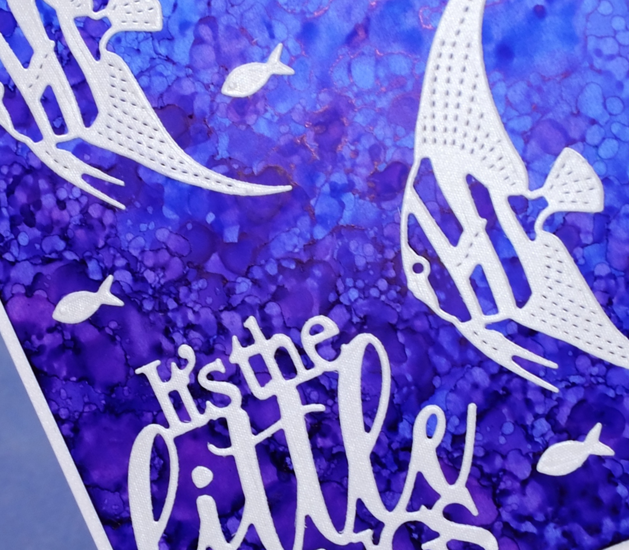
I die cut the fish and sentiment from a silvery grey envelope I had saved; it had a bit of texture and a little shimmer to it. The die set, Fancy Fish includes two detailed fish and a teeny tiny fish; I have a card tomorrow featuring the third fish.
Supplies
Dies: Fancy Fish, Dream big
Inks: indigo, pool alcohol inks (Ranger)
Paper: white yupo, neenah solar white, silver envelope
Silhouette blossoms & Foiled Fox Giveaway
Posted: March 21, 2017 Filed under: Alcohol Ink, Spring blossoms | Tags: Penny Black creative dies, Penny Black stamps, Ranger Alcohol Ink 59 Comments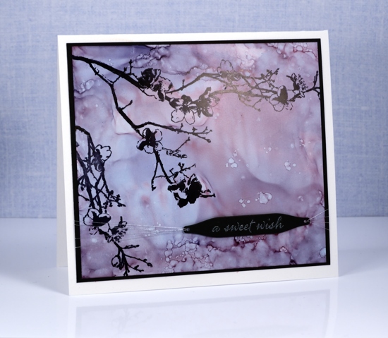
I am a guest of the wonderful Foiled Fox crew again today. To find out more about this silhouette blossom card you will need to pop over there. Once you are there you will want to browse through the lovely projects on their blog and wander the listings in their store.

Shauna from the Foiled Fox is offering one of my readers a $35 gift certificate from the Foiled Fox store this week. To enter the draw you need to check out their store then come back here to my blog and leave a comment letting me know what item you would put on your wishlist. You have until the end of Sunday March 26th EDT to let me know what you have your eye on. We will announce a winner next Monday.
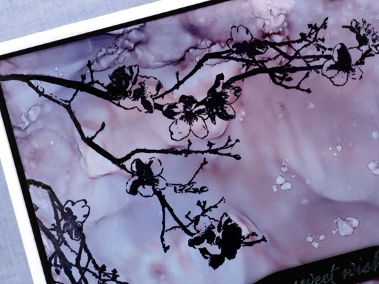
I have linked to the products I used below, you will find them all in the Foiled Fox store.
Supplies
Stamps: Spring blossoms, Happy snippets (PB)
Dies: gift card pocket set (PB)
Inks: stonewashed, cranberry & eggplant alcohol inks, Jet black archival ink(Ranger), versamark (Tsukineko)
Paper: neenah solar white cardstock, neenah epic black cardstock, white yupo paper
Also: Wow white pearl embossing powder, silver thread
Hand painted floral
Posted: March 17, 2017 Filed under: CAS, Hand lettered, Hand painted | Tags: Hand lettering, Penny Black creative dies 12 Comments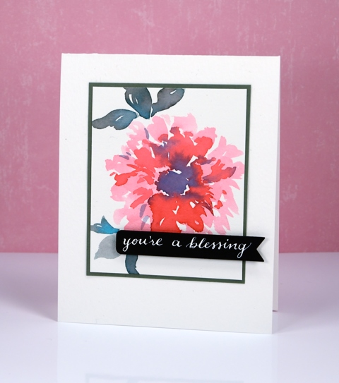
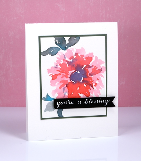
Today’s card features a hand painted flower and a hand lettered sentiment. I am open to suggestions as to what type of flower it is; it looks like it could be a dahlia, or perhaps a peony or pink cornflower. I am also a bit hazy on what I used to paint it – sorry – again! It was just a painting exercise that turned out looking like a real flower so I decided to turn it into a card. It could be distress stain or peerless watercolours. I matted the flower panel in a teal to match the leaves then popped a handlettered sentiment on a die cut tag.
Hope you are having a delightful day.
By the way The Foiled Fox is having a St Patrick’s Day sale this weekend, go check it out. Foiled Fox kindly sent me the Peerless watercolours that may or may not have been used on this card. They also sent me the beautiful nib holder that definitely was used to write that sentiment.
Hey You
Posted: March 13, 2017 Filed under: Brusho, burst of blooms | Tags: Brusho, Penny Black creative dies, Penny Black stamps 8 Comments
Does this remind you of batik fabric? Having created and purchased batik fabrics over the years that’s what I immediately thought of when I finished this panel. There were a few techinques in play to get this effect. Maybe you find it a little messy, or maybe bright and happy. The main technique is emboss resist so I will just mention for any Toronto readers I will be teaching my Watercolour Resist class in Toronto on April 8th, the details are on my Upcoming Classes page.
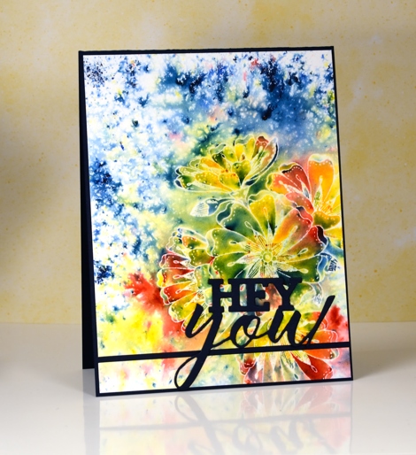
I started by embossing the ‘burst of blooms’ stamp in clear powder on hot pressed watercolour paper. Next I sprinkled red, yellow and blue brusho (colours listed below) and spritzed water from above. Once the paint had activated and the colours spread a little I dabbed them with a paper towel to remove excess liquid and dried with a heat tool .
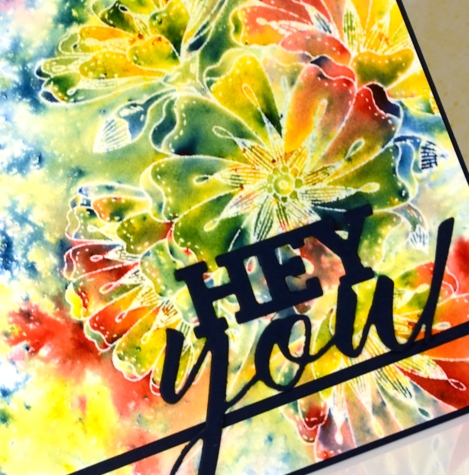
To mimic batik more closely I ironed the panel face down into a few pieces of printer paper to melt and remove the embossing powder but leave the white outlines. I mounted the panel on a navy card base but sliced a section off at the bottom to split the panel and make a line for the die cut sentiment to sit on. I haven’t used this card yet but I can make it a birthday, graduation or just hello card by adding the right words inside.
Supplies
Stamps: burst of blooms (PB)
Dies: you enjoy(PB)
Ink: versamark (Tsukineko)
Paint: lemon, prussian blue, scarlet brusho (Colourcraft)
Paper: hotpressed 100% cotton watercolour paper, Neenah patriot blue cardstock
Also: WOW clear gloss superfine embossing powder
Happy Bliss
Posted: February 28, 2017 Filed under: happy bliss, Peerless watercolours, Uncategorized | Tags: Peerless Transparent Watercolors, Penny Black creative dies, Penny Black stamps 6 Comments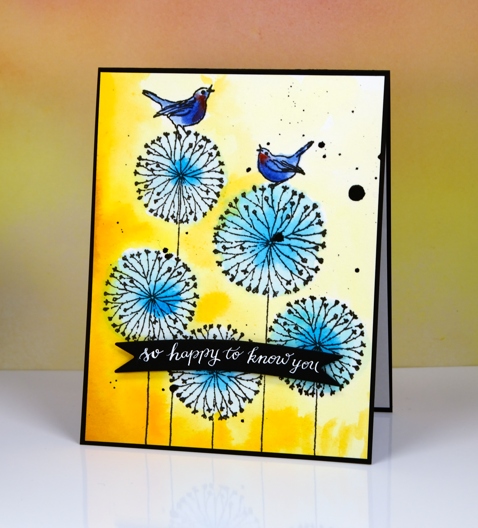
The colour scheme and style of today’s card is inspired by the amazingly talented and colour savvy Jill Foster. I painted the circle flowers in two blues and saw them sitting on the paper looking pale and weak. When I decided to mix things up with a yellow background they were happy again. I could imagine myself painting the flowers yellow and the sky blue but swapping things around was a bit of jump for me. Jill does these clever things all the time with beautiful results so maybe I will step out of my colour comfort zone more often.
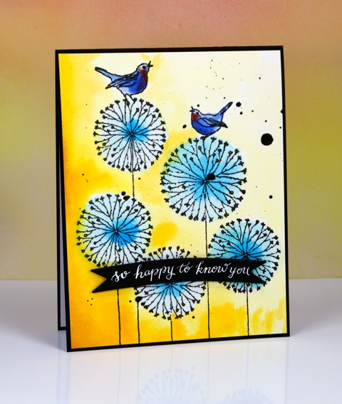
I used Peerless watercolour paints to paint the birds and flowers, then, when it was dry and a bit sad, I decided to dive back in with some orange and yellow peerless paint to fill in the background. I kept things dark on one side and light on the other (like yesterday’s card) which suggests a light source. To complete the card I splattered some black ink and added a handlettered sentiment on a die cut banner.
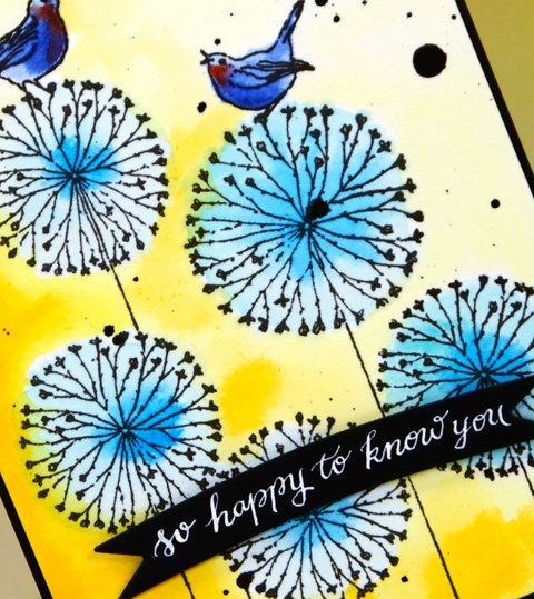
What you can’t see because I forgot to photograph it (and believe it or not I cannot find this card right now) is the die-cut circle flower inside the card.
Hope your day is bright!
Supplies
Stamps: Happy Bliss (PB)
Dies: Illuminate(inside the card), Triple Banner(PB)
Pens: Exclusive Calligraphy nib holder (Foiled Fox)
Paint: Peerless transparent watercolours
Papers: hot pressed watercolour paper, Neenah epic black cardstock
Inks: versafine onyx black ink for stamping (Tsukineko) DrPh Martins bleedproof white for calligraphy
Birthday Tulips
Posted: February 24, 2017 Filed under: First waltz | Tags: Penny Black creative dies, Penny Black stamps, sakura Koi watercolor brush pens 6 Comments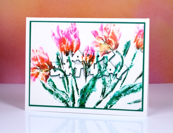
Today’s tulips wrap up my week of brushstroke projects using new stamps from Penny Black’s Bliss release. I have shared five different methods for adding colour, although I will admit the techniques using markers are quite similar. I have more projects with these stamps to share in the weeks to come and one more new brushstroke stamp yet to appear. I am also featuring a new set of markers today, new to me that is. I have been practising my brush lettering and modern calligraphy on and off for a while now and am always on the look out for brush pens. I purchased the Koi coloring brush pens for calligraphy but will probably end up using them for colouring and inking stamps as well. As you can see the colours are quite bright. I bought a set of 12 and found that it included mainly bright colours. The colour combination in the tulips is possibly not what I would have chosen if I’d had a few more pinks and oranges at my disposal.
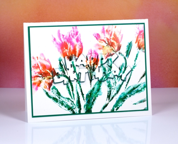
I stamped several panels while testing out the markers. This one, despite it’s brightness, is a second generation impression and the only one so far to be made into a card. The markers are really juicy, the colours are bright and I was able to spritz after stamping three or four times and still get good images. I inked the stamp, ‘first waltz’ in pink orange, green and black, spritzed it, added a few water drops to the watercolour panel, stamped off on another piece of paper then stamped on this panel. (got all that!?) The colours blended enough on the stamp that I didn’t do more blending with a paintbrush.
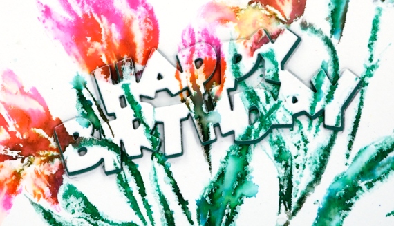
I decided the colours were so bold they deserved an equally bold sentiment. I cut the sentiment from the centre of the panel and out of green fun foam then popped them back in the panel together. I offset the top sentiment just a little to create the drop shadow effect and matted the panel in the same colour as the foam layer.
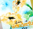
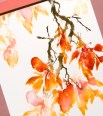
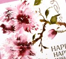
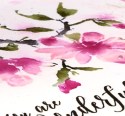
To see the other brushstroke cards featured this week check out the posts below.
Supplies
Stamps: First Waltz (PB)
Dies: Birthday (PB)
Pens or pencils: Koi colouring brush pens
Papers: hot pressed watercolour paper, green cardstock
Added extras: green fun foam
A Moment in Time
Posted: February 23, 2017 Filed under: A moment in time, Brusho | Tags: Brusho, Fabriano Watercolour Paper, Penny Black creative dies, Penny Black stamps 13 Comments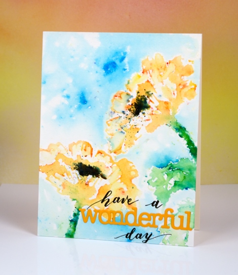
So far this week I have shared three new brushstroke stamps from Penny Black and three different techniques for ‘painting’ with them. I say painting because that really is what I do with brushstroke stamps; I choose a water soluble medium and apply colour in such a way as to create the look of watercolour painting. Today’s card was done using my ‘stamping with water’ technique. I put the pretty, new stamp, A Moment in Time, in my MISTI and painted water on it. As I applied the water with a paint brush I noticed it was beading rather than spreading over the rubber. I realised it was a brand new stamp and needed a little bit of prepping before I used it. I don’t always do this because sometimes the first coat of ink will do the prep for me. I keep a piece of fine sandpaper on hand (it is very fine and has been used many times so it does not damage the stamp at all) to rub gently across the surface of the rubber, then I simply clean with some stamp cleaner. Another way to prep the surface is to use an eraser to rub all over the stamp before cleaning with stamp cleaning solution.
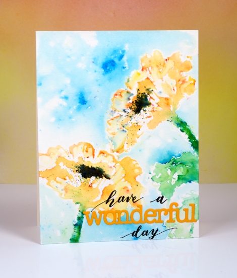
Once I had prepped the surface of the stamp I was able to coat it with water and stamp it on a piece of hot pressed watercolour paper. I could see the watery poppy image on my panel so it was simple to sprinkle brusho powder in the right place, gamboge over the flower head and leaf green over the stem. I watched and waited as the brusho activated then added more water to the stamp and stamped again. I moved my panel so I could stamp another poppy and followed the same procedure. Once the brusho powder stopped reacting I dried the panel with a heat tool, tapped off excess brusho powder and used a paint brush to fill in a few petals. I added a leaf using the same technique then a few droplets of water in the centre of the poppies and some black brusho where I had made it damp. I dried the whole panel before creating a sky by sprinkling some turquoise brusho then spritzing it. I wanted to protect the poppies from coming in contact with too much water so I painted water around the edges then pulled the turquoise colour into the water keeping some areas light while letting others be more intense.
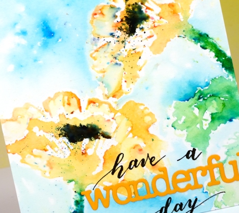
I finished the card off with the ‘wonderful’ die cut and some handlettering to complete my sentiment. I have received some lovely comments in the last week or so and I want you to know how much I appreciate them. I have read the requests for videos also and hope to get onto some as soon as my class prep is up to date. Thank you for visiting, commenting and making my day!
Supplies
Stamps: A moment in time (PB)
Pens: Fudenosuke brush pen hard tip (Tombow)
Paint: gamboge, leaf green, black & turquoise brusho (Colourcraft)
Die: Awesome (PB)
Paper: hot pressed watercolour paper (Fabriano) orange cardstock, neenah natural white cardstock
A new poppy to enjoy
Posted: February 16, 2017 Filed under: Dynamic | Tags: Faber-Castell Albrecht Durer Watercolour pencils, Penny Black creative dies, Penny Black stamps, WOW embossing powders 16 Comments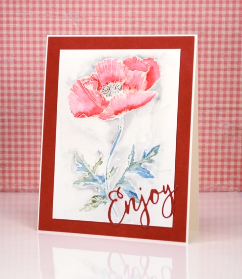
If you are familiar with Penny Black stamps you will know there are a lot of poppies to choose from. The one on my card above is a lovely new outline stamp called ‘dynamic’. I chose to heat emboss it in clear powder then colour with watercolour pencils. I used only five colours, varying the intensity of the red by adding more in the shadowed areas.(I also added a little sparkle to the petals with wink of stella) I used two greens for the stem and leaves, a black in the centre and a grey around the image.
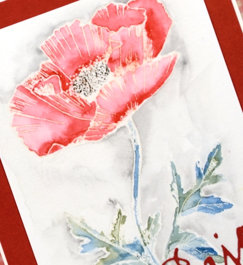
Once my colour was complete I let it dry then ironed the embossing out of the paper. To do this you place the panel face down on some printer paper and iron with no steam over the panel until the embossing has melted into the paper underneath. It still looks embossed but it is no longer raised or shiny. I ended up giving the panel a wide red frame and a die cut sentiment from the same cardstock as the frame. Don’t forget to check out all the new loveliness in the new Bliss release.
Supplies
Stamps: Dynamic (PB)
Dies: You enjoy(PB)
Ink: versamark (Tsukineko)
Pencils: 174, 199, 233, 225, 155 Albrecht Dürer watercolour pencils (Faber Castell)
Paper: hotpressed 100% cotton watercolour paper
Also: WOW clear embossing powder, wink of stella clear marker
Floral border
Posted: February 9, 2017 Filed under: Centerpiece, Stitched Edges | Tags: Fabriano Watercolour Paper, Penny Black creative dies, Penny Black stamps, Sakura Koi watercolour paints 18 Comments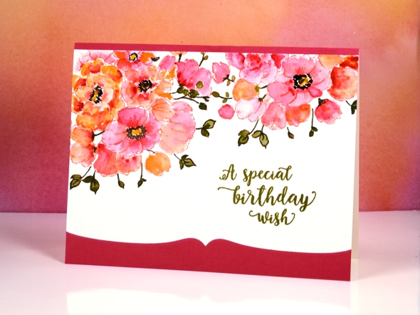
Between Christmas and New Year I did some major re-organising in my work room and changed the way I store my stamps. I am still working out a few details and wondering the best way to store my wood block stamps but other than that the new system seems to be working well. One benefit of doing some serious sorting was re-acquainting myself with my supplies. I pulled out a stamp from a few years ago and my Koi watercolour travel set to make this card.
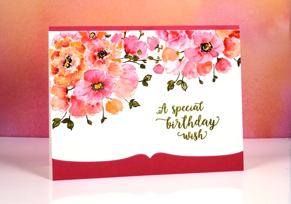
The stamp is a bouquet of flowers in a vase but as you can see I left the vase out of the picture and just worked with the flowers to create a border. With masking I could have positioned the flowers even more closely but I was hoping to finish this card fairly quickly so I just stamped the flower part of the stamp with the MISTI then moved my watercolour panel and stamped again. I used distress ink to stamp so I could blend it while painting. To keep it simple I used two colours of paint on the petals switching back and forth between a pink and a pale orange. I painted olive green into the leaves but then went around the edges and over the stems with a marker. To complete the flowers I painted black dots and yellow centres.
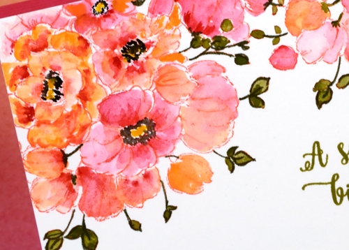
It really was a fairly quick panel to paint, the time consuming part ended up being the way I mounted it between a strip of pink and a die-cut edge of pink. I should have just attached it over the top of a pink panel but I made it less bulky but more fiddly by cutting both the watercolour panel and the pink cardstock with the edge die then aligning them on the card base. The Happy Little Stampers challenge this month is watercolour with an optional twist of die-cutting, so I’m popping over to add this one in.
As I write this I am sitting beside an amaryllis which looks like it might just burst out in bloom today. It is a gift from one of my artsy accomplices and it has been growing very steadily since the new year. It’s nice to have a real flower inside when all outside is snow and ice!
Supplies
Stamps: Centerpiece, words of kindness (PB)
Creative Dies: stitched edges (PB)
Inks: abandoned coral distress ink (Ranger) Olive grove memento marker, versafine Spanish moss (Tsukineko)
Cardstock: Fabriano 100% cotton hot pressed watercolour paper, Neenah Natural White 110lb cardstock, pink cardstock
Also: Koi watercolor field sketch travel kit (Sakura)












