
Hey You
Posted: March 13, 2017 Filed under: Brusho, burst of blooms | Tags: Brusho, Penny Black creative dies, Penny Black stamps 8 Comments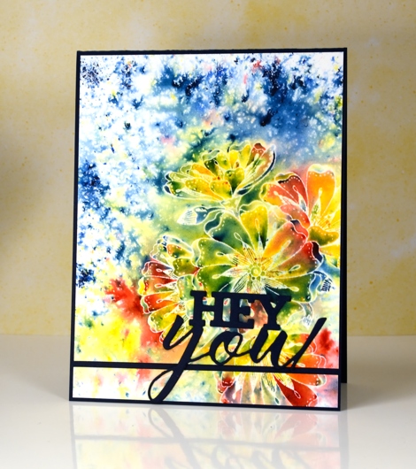
Does this remind you of batik fabric? Having created and purchased batik fabrics over the years that’s what I immediately thought of when I finished this panel. There were a few techinques in play to get this effect. Maybe you find it a little messy, or maybe bright and happy. The main technique is emboss resist so I will just mention for any Toronto readers I will be teaching my Watercolour Resist class in Toronto on April 8th, the details are on my Upcoming Classes page.
I started by embossing the ‘burst of blooms’ stamp in clear powder on hot pressed watercolour paper. Next I sprinkled red, yellow and blue brusho (colours listed below) and spritzed water from above. Once the paint had activated and the colours spread a little I dabbed them with a paper towel to remove excess liquid and dried with a heat tool .
To mimic batik more closely I ironed the panel face down into a few pieces of printer paper to melt and remove the embossing powder but leave the white outlines. I mounted the panel on a navy card base but sliced a section off at the bottom to split the panel and make a line for the die cut sentiment to sit on. I haven’t used this card yet but I can make it a birthday, graduation or just hello card by adding the right words inside.
Supplies
Stamps: burst of blooms (PB)
Dies: you enjoy(PB)
Ink: versamark (Tsukineko)
Paint: lemon, prussian blue, scarlet brusho (Colourcraft)
Paper: hotpressed 100% cotton watercolour paper, Neenah patriot blue cardstock
Also: WOW clear gloss superfine embossing powder


This is so soft and beautiful and yes It does remind me of batik fabric prints.
GORGEOUS!
Absolutely Batikish! Wish I lived close enough to cross the border and come to your classes. Your work is stunning!!
This is so energising Heather. I feel more positive from just looking at it. Brilliant! Well done.
This is really pretty and I love the Brusho colours you have used Heather, and what a great idea to iron away the clear embossing powder to give a smooth finish and such a clever idea to make a break in the top layer for your die cut sentiment to sit on. Fabulous! x
You and Brushos play together so nicely.
Such exciting color mixing. Beautifully vibrant! Thank you, once again.
POW! I love it when the mood of the card and the sentiment match up so perfectly. I will have to study that technique from your description of it. I love the effect.