
A little paint pouring
Posted: December 10, 2018 Filed under: paint pouring, YAY for you | Tags: My Favorite Things, Penny Black creative dies, Yupo Paper 10 Comments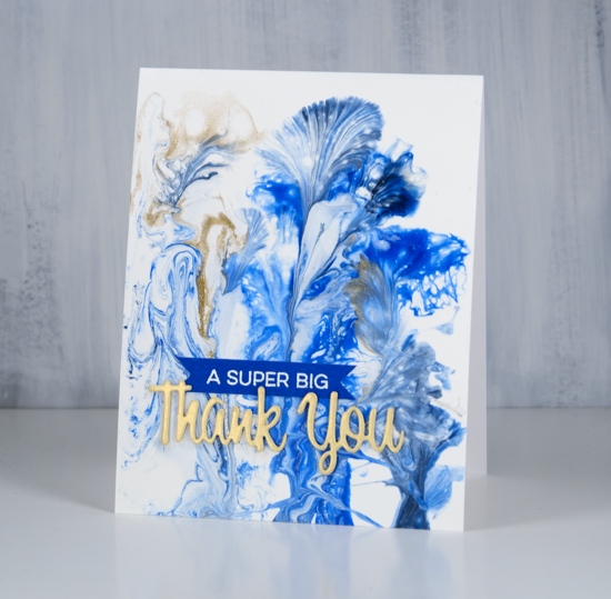
I did some paint pouring yesterday with some friends who had done it before and had skills they were willing to share. I was excited to go and try it but fairly certain it would just be a fun experiment rather than a new passion. Not so sure anymore!! It is very addictive, a bit like alcohol inks and the way they keep moving and doing magical things.
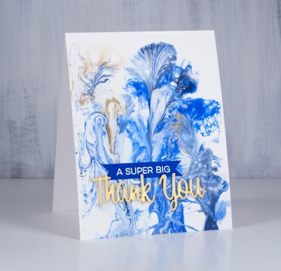
I did several pours on heavy yupo and a couple of little canvases. They take a while to dry so I have turned only one into a card so far. I won’t go into detail about the technique or supplies; I’m too much of a newbie. If you want to learn about paint pouring then look up Myriam’s Nature on youtube and prepare to give up the rest of your day being mesmerized by her beautiful panels. My base for this design was white paint then I dipped threads into blue paint and gold paint and dragged them across the panel to create these pretty patterns.
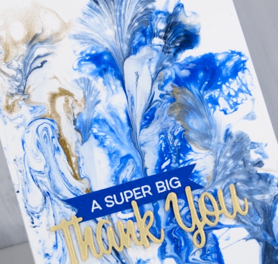
I’ve turned this panel into a thank you card with a Penny Black die and a MFT sentiment. I am so happy to be sending out thank yous to people who have donated to my Dressember campaign raising money to help fight human trafficking. I am excited that so many of my donations so far have come from people I know through card making, some I’ve met at classes, others read my blog. It is a privilege to be part of such a caring, giving community. Thank you for getting involved. If you would like to donate please visit my campaign page. If you would like to see if I’ve been wearing the dresses each day I’m posting on Pinterest and Instagram.
I will show you more of my paint pouring panels in future posts. Thanks for dropping by.
Supplies
Paper: heavy weight yupo

Stamp: YAY for you (MFT)

Die: wishes (PB)

More skies & dies
Posted: December 6, 2018 Filed under: berry flourish, Brusho, deer in tree, holly flourish, winter berry branch | Tags: Brusho, Penny Black creative dies, Penny Black stamps 4 Comments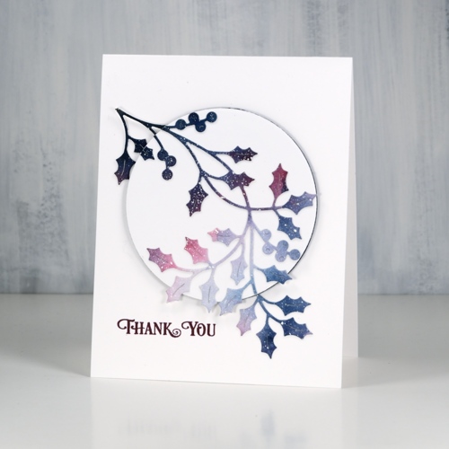
I have a few more simple Christmassy cards to share; these ones are kind of the opposite to the ones in the previous post. I had a large watercolour galaxy panel with white splatter (aka ‘stars’) all over it. I die cut three branches from the panel to pop up on three white card bases.
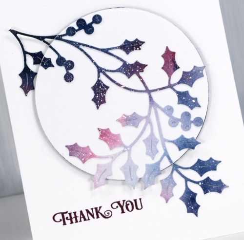
I realise now it would have been a good idea to take a photo of the panel before I cut it up. It was a panel I painted with brusho a while ago, a mix of blues and pinks, light in the centre and dark around the edges with white paint splattered over the whole thing. The holly is a PB die called ‘holly flourish’, the mistletoe is ‘berry flourish’.
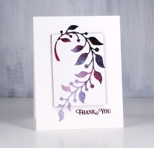
After I had die cut all three branches I chose a shape die a little smaller than each of the branches so some foliage would hang over the edge. I die cut a shape from neenah solar white cardstock and from coloured adhesive backed foam. The foam pieces that pop up the white panels are either burgandy or navy to co-ordinate with the paint colours.
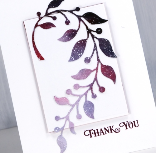
To assemble the cards I first glued the die cut to the white cardstock shape then snipped off and saved any bits hanging over the edge. Next I adhered the white panel to the foam and then all to the white card base. Once the popped up panel was in place I stuck the snipped off bits directly onto the card base lining them up with the rest of the die-cut.
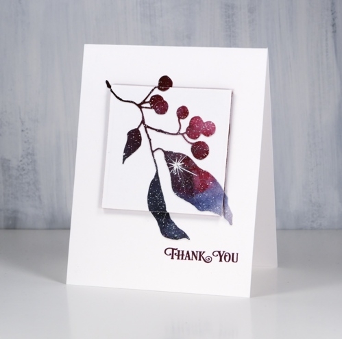
I made all these cards into thank yous. I’m hoping to need many as I am once again participating in Dressember, and will be sending hand made cards to all who donate to the campaign. If you are new to my blog you might not know that I have twice before taken on the challenge of wearing a dress every day in December as part of a worldwide campaign to raise funds for and awareness about the fight to end modern day slavery. If you are interested in donating I have set up a CAMPAIGN PAGE and I am posting photos on pinterest and instagram just so you can check up on me to make sure I’m wearing a dress each day! I have written a little more about Dressember on my other (sadly neglected) blog, Sentient.
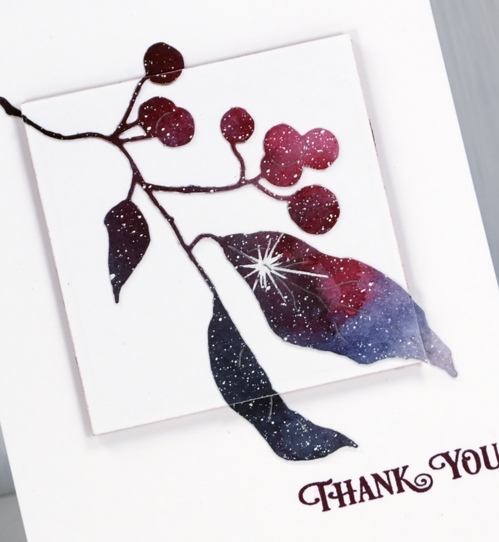
This last branch die is called ‘winter berry branch’ also from Penny Black. The sentiment is from the ‘banner sentiments’ set and is stamped in chianti versafine clair ink.
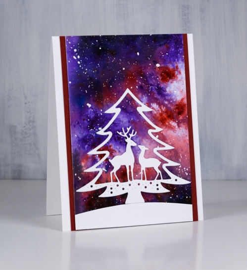
And now a bonus card made with my last watercolour sky piece. I matted it on two sides with burgandy cardstock then cut a snow bank and the ‘deer in tree’ die from neenah solar white cardstock. It is a pretty die but would the deer be standing in a tree? I think not!
Supplies
Stamps: banner sentiments (PB)

Dies: holly flourish, berry flourish, winter berry branch, deer in tree (PB)


Ink: chianti versafine clair ink

Cardstock: hot pressed watercolour paper, neenah solar white, burgandy cardstock


Paint: brusho, white gesso


Also: on point gule

Skies & dies
Posted: December 4, 2018 Filed under: Brusho, holiday hello, neighbourhood border, winter trees | Tags: Brusho, Penny Black creative dies 9 Comments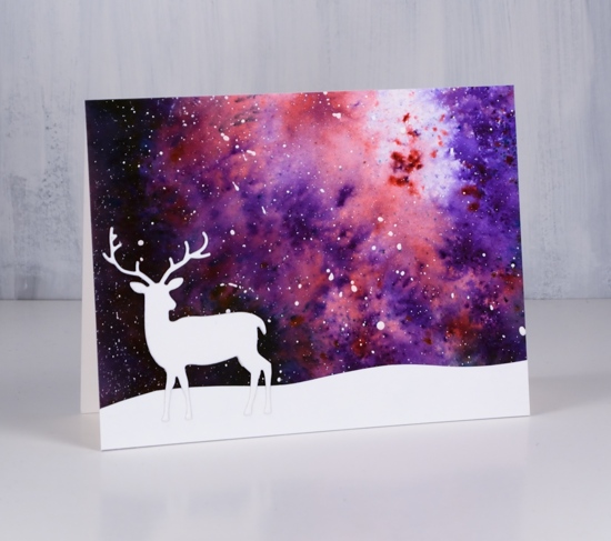
I have three simple cards to show you today, simple that is if you have some watercolour backgrounds sitting around as I often do. Even if you don’t it would not take too long to create a large multicoloured panel with brusho, distress stains or some other watercolour medium then when its dry splatter white paint over it to look like stars or snow.
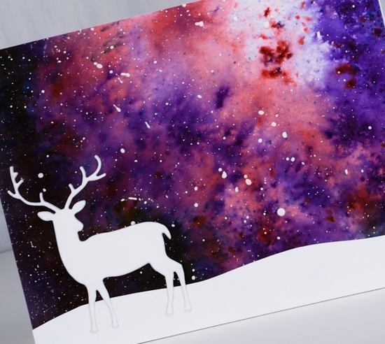
I trimmed my background panels then added a hand cut snow bank to the card above plus the deer from the Penny Black ‘holiday hello’ set. I know it is very minimal but I rather like the way the deer could be looking up into the vast sky.
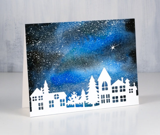
On the second card all I added to the star filled sky was the PB ‘neighborhood border’ die. All the die cuts are neenah solar white cardstock. For some I used liquid glue, others I attached using stick it adhesive.
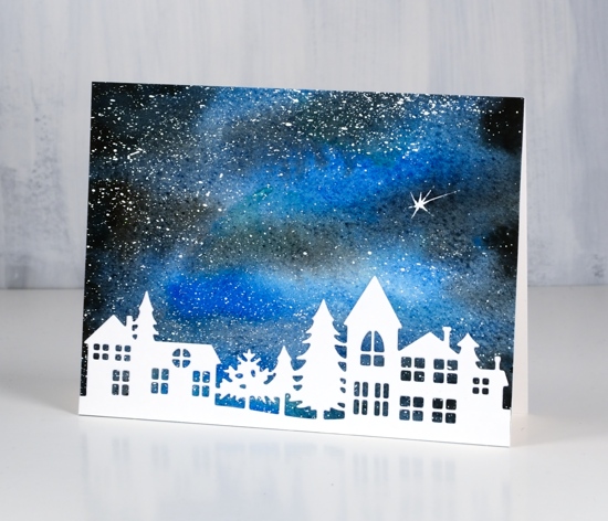
I added the shooting star when I created the watercolour sky with the same white paint.
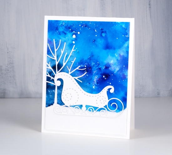
The background sky for this final card is the last scrap of a large panel I painted very randomly with turquoise and blue brusho. I tore a strip of white cardstock to create the snow bank, die cut a tree to tuck behind it and a sleigh to sit on top. The tree is the smaller one from the PB set, ‘winter trees’ and the sleigh is also from Penny Black.
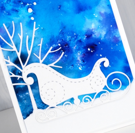
I’m going to leave these without sentiments for now; they might be handy to use as thank you cards after Christmas.
Supplies
Dies: winter trees, sleigh, neighborhood border, holiday hello (PB)


Cardstock: hot pressed watercolour paper, neenah solar white
Paint: brusho, white gesso
Also: stick it adhesive, on point gule

Winter Tree
Posted: November 28, 2018 Filed under: xmas poinsettia cut out | Tags: Penny Black creative dies, Penny Black stamps, Ranger Distress inks, Ranger Distress stains 15 Comments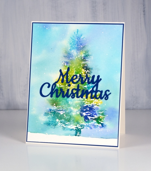
It is hard to believe I haven’t shared this beautiful tree stamp already. It is a large rubber cling stamp called winter tree and it looks snow laden when stamped. It is a very detailed tree but my treatment has it looking a little more impressionistic. To create the card above I lay the tree stamp on my cold pressed watercolour paper and positioned masking paper around the edges of the stamp. When I lifted the stamp there was a tree shaped space exposed.
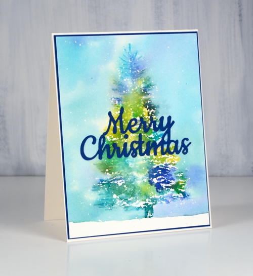
I splattered masking fluid over the panel so there were lots of drops in the shape of a tree. When I removed the masking paper I splattered a few more drops of masking fluid around the tree. I placed the panel and stamp in my stamp positioner and dotted distress stain on the stamp. For this tree I used mustard seed, mermaid lagoon, pine needles and blueprint sketch. I stamped a couple of colours at a time until the tree was completely stamped albeit in a loose and watery way. To fill in the background I wanted the same colours but more diluted so I put stain on my glass mat so I could pick it up with a paint brush.
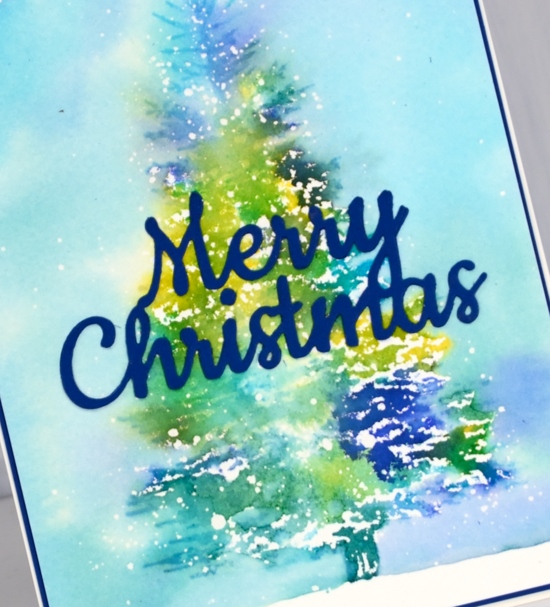
I painted around the tree with water touching the edges of the tree with the paintbrush so the colour would bleed into the sky. To fill the sky I picked up extra colour from my glass mat. When all the paint was dry I removed the masking fluid and added a die cut sentiment and a matching mat.
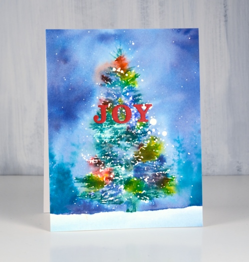
I followed the same process for the second card but used hot pressed watercolour paper and more colours of distress stain. I also stamped a few trees in the background using a tree from the ‘prancers‘ set and peacock feathers distress ink.
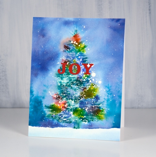
When snow completely covers our Christmas lights the colour does look a bit blurry shining through the snow. That’s what these cards remind me of.
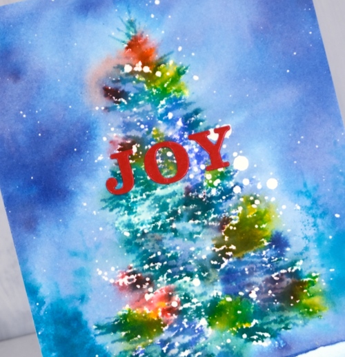
Not that there are any Christmas trees or lights up around here yet. There are members of this family with strong feelings about Christmas decorations!
Supplies
Stamps: winter tree, prancers

Stains: mustard seed, blue print sketch, peacock feathers, pine needles


Die: merry Christmas (PB)


Paper: cold pressed watercolour paper, deep blue cardstock


Tools: MISTI, T ruler, stick-it adhesive, glass mat


Pretty Paper Neighbourhood & a Wreath
Posted: November 16, 2018 Filed under: Alexandra Renke, neighbourhood border, starry night, whirl wreath | Tags: Alexandra Renke cardstock, Penny Black creative dies, Penny Black stamps, Ranger Distress inks, Tsukineko Versafine inks 6 Comments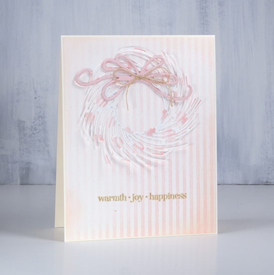
It’s all soft and subtle on the blog today. I have two projects featuring the beautiful Alexandra Renke cardstock the Foiled Fox recently started carrying in their store. The weight of the cardstock is somewhere between a good quality printer paper and a piece of cardstock. There is definitely enough weight to die cut nicely.
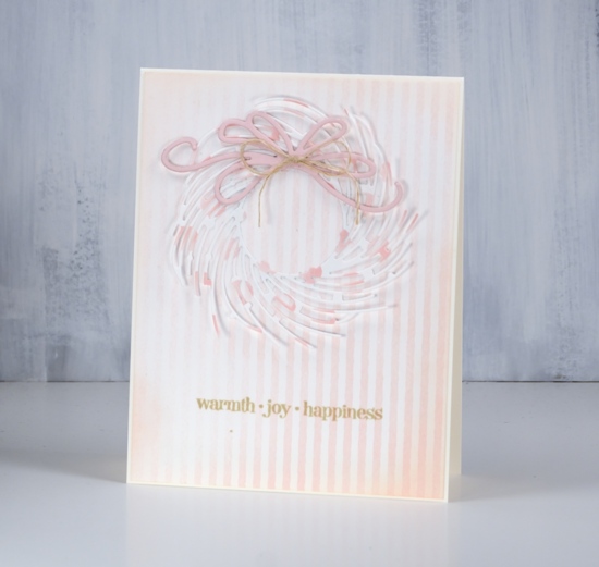
I chose the elegant ‘whirl wreath’ by Penny Black and cut one out of ‘pink dots’ cardstock. I attached it around the centre circle with adhesive but left the branches unattached ( so I will be careful putting it in a envelope) The background is ‘rose stripes’ which matches the pink dots perfectly. I cut the bow out of a piece of cardstock from my stash and layered a few together to give it some extra weight. I blended around the edge of the striped panel with tattered rose distress ink and attached everything to a cream cardbase.
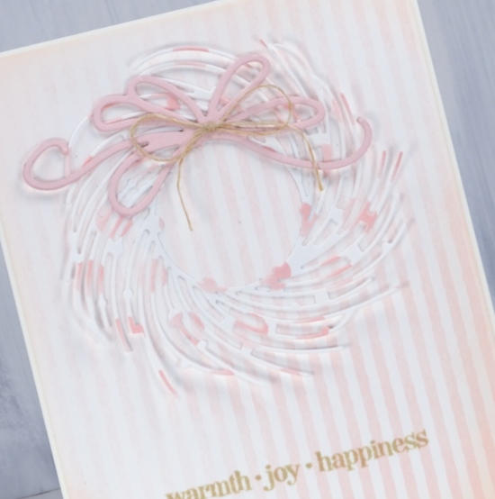
I chose to add a natural twine bow to the die cut bow then had to co-ordinate the sentiment with antique linen distress ink.
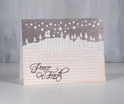
For my little neighbourhood card I use three patterns of Alexandra Renke cardstock, the rose stripes, gray stripes and medium mud watercolour. I know it is hard to see the details of the die cuts in my photo but in real life the pink striped neighbourhood is clear against two lines of gray striped trees in front of a gray mud starry sky.
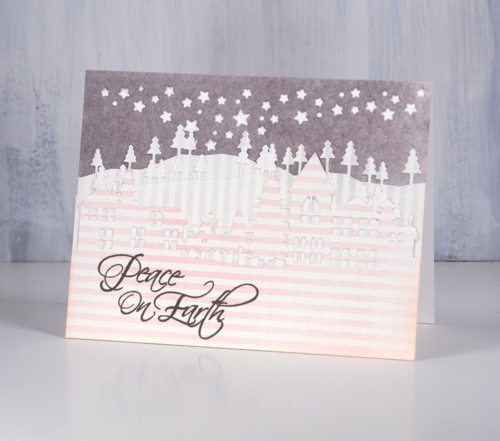
I have been wanting to try a white on white layered die cut scene and I probably still will but chose to try it with these pretty papers first. The neighbourhood is layered over two layers of trees cut with the ‘trees and hills’ dies which are layered over a gray piece cut with the starry sky night die attached directly to a white card base.
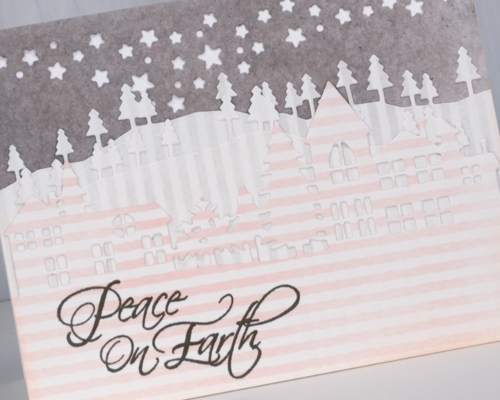
I featured some of the subtle colours and patterns from Alexandra Renke today but I do have some bold patterns and solids to share another day.
Have a great weekend.
Supplies
Stamps: Christmas sentiments, winter days (PB)


Dies: whirl wreath, neighbourhood border, starry night die, trees & hills die set (PB)


Cardstock: Alexandra Renke medium mud watercolor, gray stripes, rose stripes & Neenah solar white, cream, pink


Inks: tattered rose, antique linen distress ink, smokey gray versafine ink


Also: hemp twine
Deck the halls turnabout
Posted: November 14, 2018 Filed under: Deck the halls turnabout | Tags: Concord & 9th, Penny Black creative dies, Tsukineko Versafine inks, WOW embossing powders 6 Comments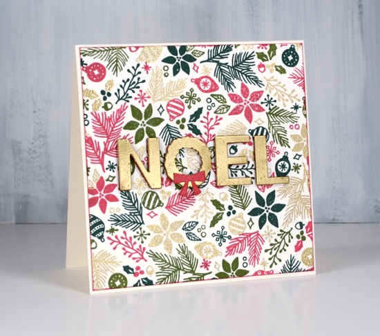
I’m on the Foiled Fox blog today, sharing these fun and festive cards made with the Concord & 9th ‘Deck the Halls’ turnabout stamp.
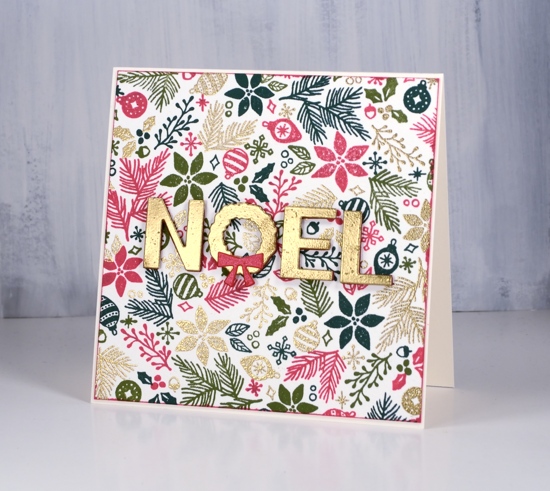
It is a cool trick to create a multicoloured background by turning your stamp 90 degrees each time but that is not the coolest thing I learnt in creating these cards. It was a happy accident resulting in an unexpected colour scheme that please me most.
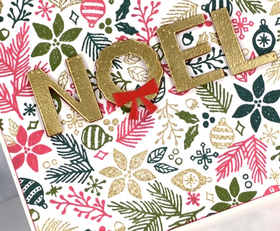
The beauty of the turnabout stamp is not so much the full background you create because you can do that with a background stamp. The turnabout stamp allows you to ink a different colour each turn and have four different colours even distributed across your finished panel. For the first card I was traditional in my colour choices and stamped with versamark so I could emboss in gold then the rest of my turns were versafine clair glamorous, shady lane and rainforest. The gold gives the panel a lovely pop and I ended up embossing my die cut sentiment with the same gold as I didn’t have cardstock that matched exactly. I popped up my sentiment on some red foam but you could get the same effect with a couple of layers of red cardstock. To frame the stamped panel I swiped the glamorous ink pad around the perimeter and attached the panel to a cream card base.
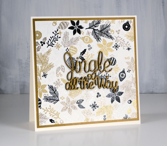
The second card features gold, platinum, white and black embossing. The white doesn’t show up in the photos but in real life it’s very pretty. I would never have chosen black as the fourth colour in this mix but I accidentally inked the stamp with my black nocturne stamp pad thinking I had picked up my versamark. I think the effect is bold and modern. I also added black foam under the gold sentiment to pop it up a bit.
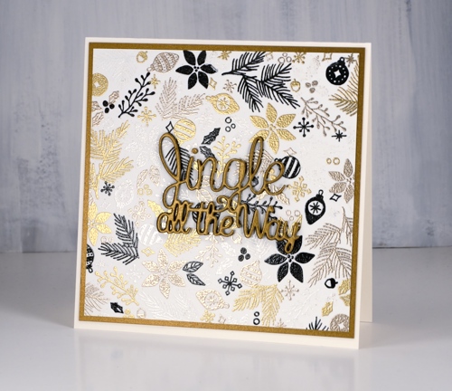
I often use black for silhouette stamping on a Christmas card but I think this might be the first time I have stamped little decorative motifs in black. What do you think? Would you include black in a multicolour Christmas panel?
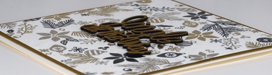
Make sure you pop over to the Foiled Fox blog for extra tips and details.
Supplies
Stamps: deck the halls turnabout (Concord & 9th)

Dies: jingle bells, wreath noel (Penny Black)


Paper: hot pressed watercolour, neenah cream, shimmer gold

Inks: versamark, versafine clair glamorous, shady lane, rain forest, nocturne


Embossing powder: gold metallic rich, platinum, clear, white


Also: black foam sheet, red foam sheet

Tools: MISTI
Simple and elegant poinsettias
Posted: November 5, 2018 Filed under: Christmas poinsettia, xmas poinsettia cut out | Tags: Alexandra Renke cardstock, Kuretake Zig clean color real brush markers, Penny Black creative dies, Penny Black stamps, WOW embossing powders 4 Comments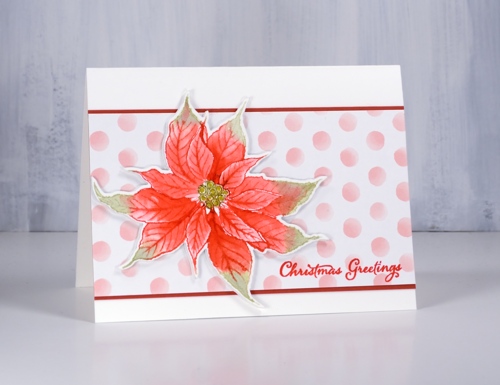
Today’s cards show two different looks from the Penny Black ‘Chrismtas poinsettia’ stamp. The first is simple distress ink colouring popped up on a fun polka dot background and the second is a bit more elegant with bold colouring inside a gold embossed image. I stamped this first poinsettia in festive berries and shabby shutters distress inks on hot pressed watercolour paper then blended the ink with water to fill the petals. If I needed extra ink for shadows and depth I picked it up from my glass mat which acted as a palette.
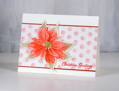
When I inked the stamp I wiped off the festive berries ink from the centre of the stamp so I could add peeled paint ink with a distress marker. After I had done all the blending I coloured the circles in the centre of the flower with a gold gel pen. My favourite part of the card though is the polka dot paper; it is so pretty. It is just one of a series of papers by Alexandra Renke. The Foiled Fox sent me some Alexandra Renke papers to try out and they are lovely. I will share more of them with you in the coming weeks. The weight is between paper and cardstock so it die cuts well but doesn’t add too much bulk when you layer it.
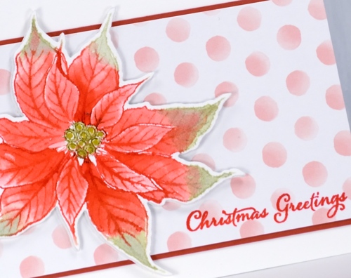
I cut my poinsettias out with the co-ordinating die but they wouldn’t be too hard to cut by hand, especially if you have fussy cutting skills (which I don’t). I matted the polka dot panel in red and added a sentiment from ‘festive snippets’ in versafine crimson red.
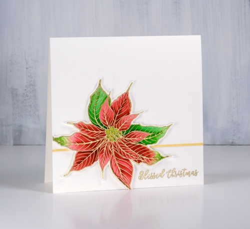
I embossed my second poinsettia in gold powder then coloured with zig clean color real brush markers. As I often do I used two reds and two greens, colouring first with the light marker then adding the darker colour at one end before blending with water to fill the petals.
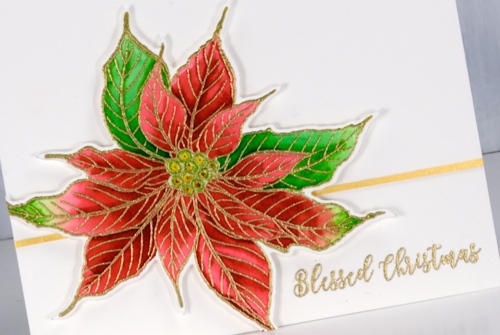
I applied adhesive to a strip of gold cardstock then trimmed it even narrower to position behind the popped up poinsettia. I embossed a sentiment in the same gold embossing powder used for the flower.
I am continuing to participate in Kathy Racoosin’s 30 Day colouring challenge. If you want some colouring inspiration pop over to her blog and check out her tutorials and link up. Let me know if you are participating.
Supplies
Stamps: Christmas poinsettia, festive snippets (PB)


Dies: xmas poinsettia cut out (PB)
Paper: hot pressed watercolour paper, Alexandra Renke pink dots, gold shimmer, red cardstock

Ink: festive berries, shabby shutters distress inks, , versamark, versafine crimson red


Markers: clean color real brush markers, peeled paint distress marker


Also: metallic gold rich embossing powder, glass mat
Stamping is for the birds part 2
Posted: October 31, 2018 Filed under: A Bright Tomorrow, gift card pocket, Peerless watercolours, winter lookout | Tags: Peerless Transparent Watercolors, Penny Black creative dies, Penny Black stamps, Tsukineko Versafine inks 5 Comments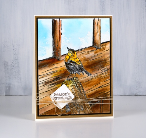
The second installment of my ‘stamping is for the birds‘ series features the Penny Black stamp ‘Winter lookout’ with a little bird on the outside looking in. I have seen a few other beautiful cards using this stamp and wish I had added a little foliage but there is always next time. Take a look at this gorgeous card by Susie Lessard.
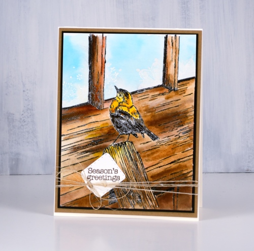
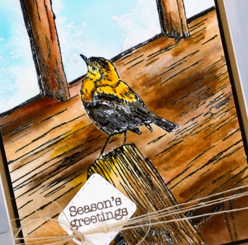
I stamped in versafine clair nocturne ink and embossed in clear powder then painted the bird and all the wood with my peerless watercolours. To create variation in the wood I painted with several browns and some warm mustard yellow as well. Once I had finished the woodwork I had to decide how I would do the window. I chose frosty patterns like we often get on our windows in winter so I used the delicate snowflake stamp from the PB set, ‘A bright tomorrow’ to emboss in clear powder. When I painted pale blue into the window area it resisted the snowflake shapes.
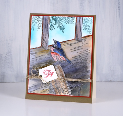
I tried a second colour scheme embossed in versafine smokey grey, featuring greys and blues and stamped some pine branches inside the windows as if garlands were hanging there.
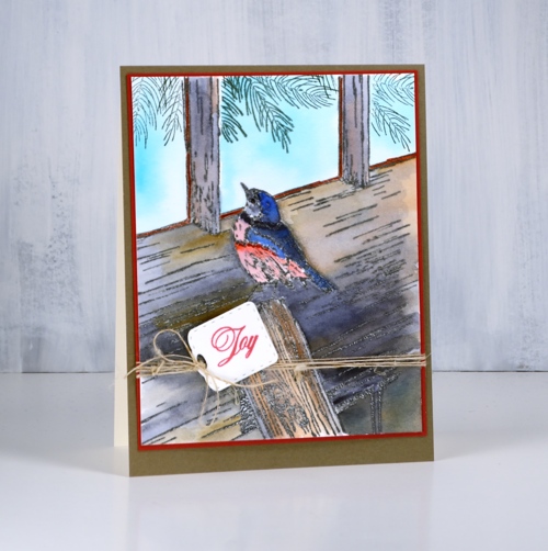
I finished both cards with co-ordinating mats and sentiments stamped on little tags from the ‘gift card pocket’ die set. I think I have only once made a gift card pocket but I often use the little tags and banner dies from the set. I added some finer details to both cards with black and brown markers once the painting was all finished as sometimes embossing does not preserve all the definition.
Supplies
Stamps: winter lookout, a bright tomorrow, festive snippets, joy of peace (PB)


Die: gift card pocket (PB)

Ink: versamark, nocturne versafine clair, morning mist versafine clair, northern pine memento


Paper: hot pressed watercolour, neenah cream, neenah black, kraft, red, olive green


Paint: peerless watercolours

Also: clear embossing powder, brown marker, black marker, twine
Stamping is for the birds part 1
Posted: October 30, 2018 Filed under: cheerful christmas, Peerless watercolours | Tags: Peerless Transparent Watercolors, Penny Black creative dies, Penny Black stamps 4 Comments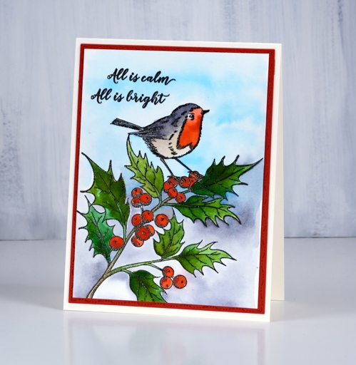
This week my blog is all about the bird stamps! It is a bit of a departure for me but there are some sweet birds flitting around my workroom so I decided to paint a few. This one from Penny Black is called ‘cheerful Christmas‘ and I’ve painted it with a robin in mind. The image is stamped in black, embossed in clear then painted with peerless watercolour paints. I kept my colour scheme fairly simple, a couple of greens for the leaves, a couple of reds for the berries and bird, a grey for the bird and background then some pale blue. I die cut the red mat with the elegant stitching dies from Penny Black and added a sentiment from the festive snippets set.
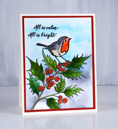
Peerless paints come in a very convenient format and provide beautiful blendable colour. I tend to forget them for a while and then binge on them with one project after another. They will be back with another bird tomorrow. You can see how I set up my peerless palette here
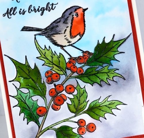
This little bird reminds me of a Ladybird book I had as a child called ‘The Wise Robin‘. I just had a hunt for it on our bookshelves and found it. The pictures in the book are all paintings and quite lovely. Then I did an online search for it and found it was published in 1950, sold for 2/6 but is listed for $72.51! I flicked through the book to remind myself of the story; the robin ends up in the house on the Christmas tree and delights the family with a song. Of course my experience when a bird has come into the house has never been delightful but that need not get in the way of a cute story!
Supplies
Stamps: Cheerful Christmas

Dies: elegant stitching

Paper: hot pressed watercolour, neenah cream, red
Ink: versafine clair nocturne
Paint: peerless watercolours
Also: clear embossing powder
A wreath two ways
Posted: October 24, 2018 Filed under: winter chirp | Tags: Fabriano Watercolour Paper, Peerless Transparent Watercolors, Penny Black creative dies, Penny Black stamps, WOW embossing powders 16 Comments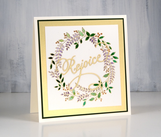
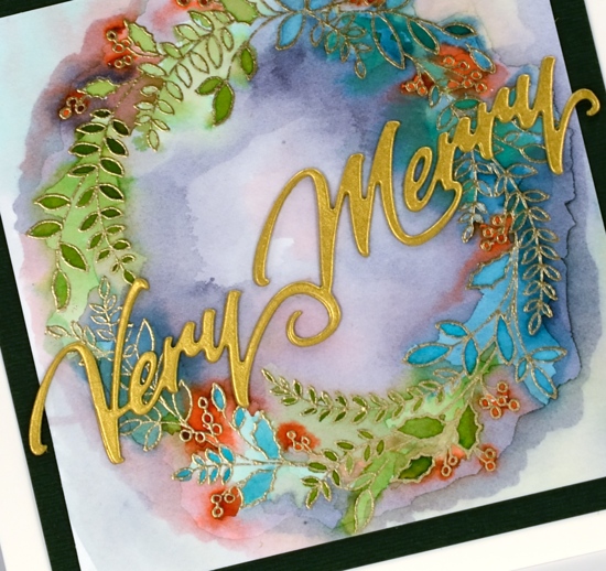
I have one wreath, ‘winter chirp’ from Penny Black, presented in two ways today. The first is neat and tidy, the other is loose and messy. I started with gold embossing and used similar colour schemes on each one.
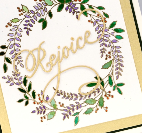
They are both painted with peerless watercolour paints, which I love. I stayed inside the lines on the first card and went all loose and freestyle on the second. I almost gave up on the second but as I kept adding colours it did look a little less like a mistake! I almost didn’t post the messy one but in real life it actually looks artsy and fun.
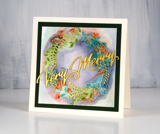
I chose gold cardstock for some stacked die cut sentiments, also from PB, so the sentiment and embossing would co-ordinate. I also matted with gold and green (yes it’s green, not black) cardstock on a cream cardbase.
I hesitate to ask but are you on the neat team or the artsy(messy) team?
Supplies
Stamp: winter chirp (PB)
.
Dies: very merry, rejoice (PB)


Ink: versamark
Paint: peerless watercolours
Paper: hot pressed watercolour paper, gold cardstock, green cardstock
Also: metallic gold rich embossing powder, double sided adhesive sheets












