Frosty
Posted: October 28, 2019 Filed under: Frosty's flakes | Tags: Faber-Castell Polychromos Colour Pencil, Penny Black stamps, WOW embossing powders 7 Comments
Before we talk about Frosty, I just want to say how much I am enjoying reading about your holiday traditions; thank you for commenting on my gingerbread post to tell me about them. Make sure you visit the Foiled Fox blog this week to read about some more holiday traditions and I will be sharing another tradition on Friday.
Now back to Frosty from the PB ‘Frosty’s Flakes set. I have not created a snowman card in a long, long time but after creating gingerbread on kraft cardstock and poinsettia cards on kraft cardstock (in a recent class) I thought why not try a snowman. I stamped in black this time which looks just as striking on kraft as white does. All the white elements are added with a white gel pen or white pencil.

I coloured the leaves in a green pencil, I used polychromos pencils but I imagine any dark green pencil will do. I did the berries, hat ribbon and scarf in red, nose in orange and hat in black. I was halfway through colouring the hat when I realised I needed a highlight strip to show the curve of the hat. I was able to leave a gap on one section but it looked odd where it didn’t continue across the whole hat. Sand eraser to the rescue! If you don’t have a sand eraser for sanding off little errors you should get one. It worked brilliantly on the coloured pencil but I have also used in on stray bits of ink or paint.

I finished all the pencil colouring without colouring the snowman at all. I decided to try some cross hatching with the white gel pen and I think it does the trick. White coloured pencil would probably work also. I protected Frosty with a post-it and splattered white gesso over the rest of the panel. I stamped a sentiment from the PB ‘thrill of hope’ set and die cut it with a tag die. The stitching around the card panel and tag is hand done with the white gel pen. I added a white pencil drop shadow on the sentiment, popped it up on dimensional tape with some twill tape to co-ordinate.
Making a snow man with the first snow might be a tradition for some but we have learned since coming to Canada that there are many types of snow and not all types are suitable for snowmen! In Australia if we had snow staying on the ground we would make a snowman however small and odd looking! I remember a time when I was a child my family drove up Mt Wellington in Hobart and there was snow at the top; we built a snow man on the bonnet (hood) of our car. It melted or fell off by the time we got back down the mountain.
Supplies
Holiday Traditions – Gingerbread
Posted: October 25, 2019 Filed under: cozy nights, Frosty's flakes, warm reception | Tags: Penny Black stamps, Ranger Distress inks, WOW embossing powders 30 Comments
Here in Canada Thanksgiving is behind us but in the US it is about a month away; Christmas is exactly two months away! With that in mind Shauna, from the Foiled Fox, and I have teamed up to host a ‘Holiday Traditions’ giveaway.

Like me you probably have some Thanksgiving or Christmas traditions, perhaps they were handed down to you or maybe something new you have recently come up with. Either way, we want to hear about them. For the next two weeks you can comment on a holiday tradition post on my blog or the Foiled Fox blog and be entered into a giveaway.

If you haven’t guessed already the first tradition I want to share with you is my gingerbread making tradition. We have been making gingerbread for years. It was not my mother’s Christmas baking tradition, she made yoyos (melting moments), Christmas cake and forcer biscuits (pressed butter cookies). I started making gingerbread when I lived in Australia and the recipe I use is from an Australian chef, Jill Dupleix. Now that we have three people in the family eating gluten free I make gf batches too, usually with a packet mix. I used to mix a gf gingerbread dough but the packet one saves me so much time which I can spend decorating instead. Decorating is the best part, well maybe equal best with eating!
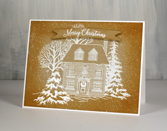
We make stars, hearts, trees, snowflakes, bells, gingerbread men, women and children but we also have a a set of Aussie animal cutters and, would you believe, a ‘gingerdead man’ which cuts out the person shape and then stamps a skeleton impression on the cookie! We have also made gingerbread houses and other structures over the years. If you click over to my other blog you can see gingerbread houses, a church and a tank from years gone by.
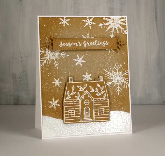
Making gingerbread cards was a bit quicker than the edible version. I used Neenah desert storm kraft cardstock and stamped on it in versamark then embossed with bright white opaque embossing powder. To create the snowy hill I cut a post-it note mask and sponged white delicata ink in a hill shape. The delicata was too delicate, not bold enough for a snow hill so I embossed with more white embossing powder.
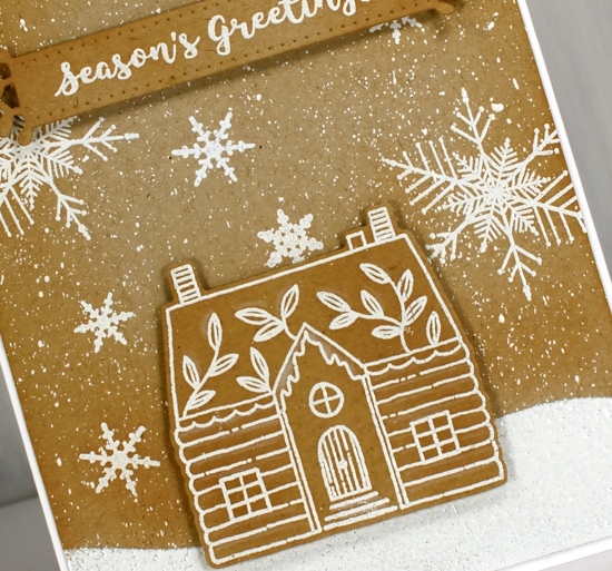
After completing all the stamping and embossing I blended tea dye distress ink around the edges of the panels to give everything a nice baked not burnt look. Believe me I have burnt plenty of batches over the years!
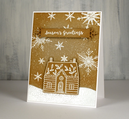
The last step was a sprinkling of icing sugar aka splatter of white gesso to complete the snowy look. All the stamps are from Penny Black and are linked below along with the other supplies.
Now it’s your turn. I would love to hear about some of your holiday traditions. What do you do for Thanksgiving or Christmas? It doesn’t have to be something you make; it could be a place you visit, a story you read, songs you sing, food you eat. Let me know in the comments and you’ll be entered in the giveaway. Make sure you visit the Foiled Fox blog also as there will be holiday tradition posts on both of our blogs during the next two weeks.
Supplies
Forests
Posted: October 24, 2019 Filed under: fragile branches, Stamped Landscapes, Winter tree | Tags: Penny Black stamps, Ranger Distress inks, Tsukineko Memento inks 21 Comments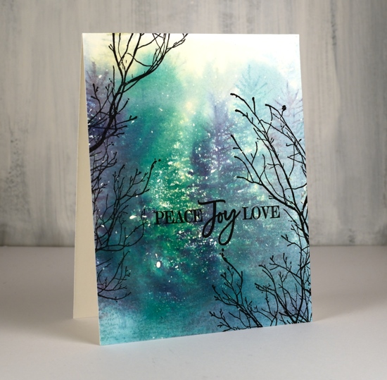
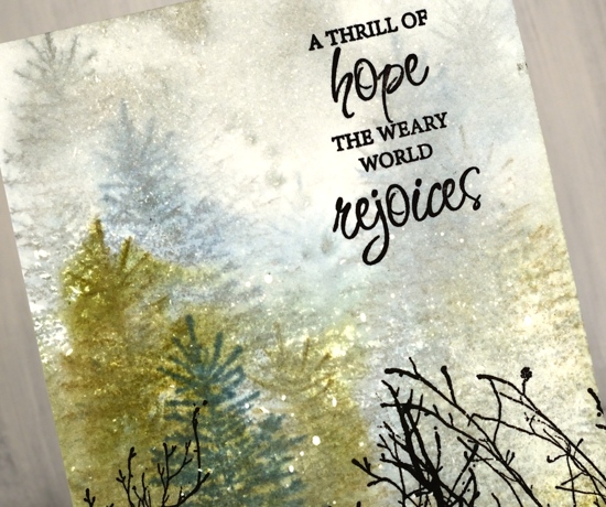
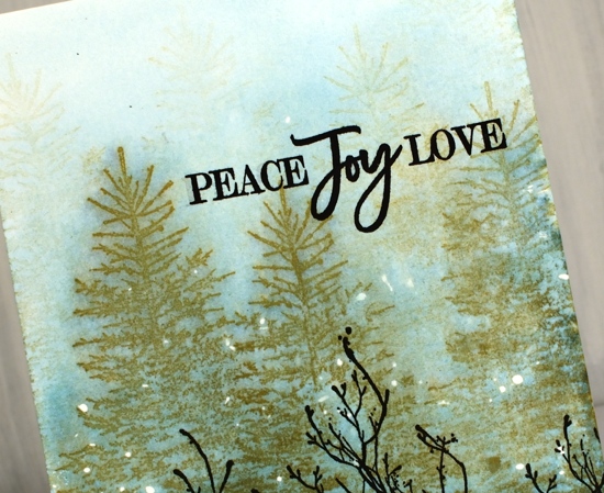
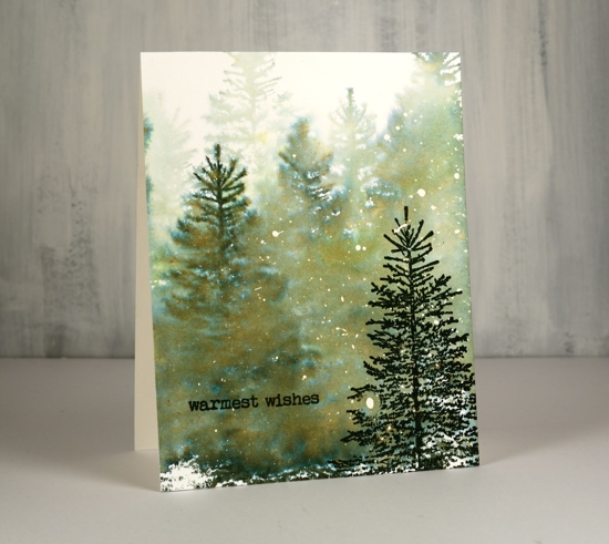
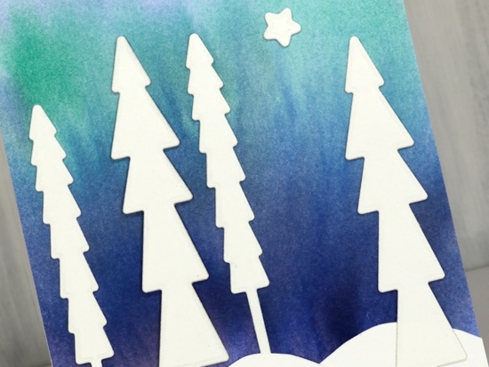
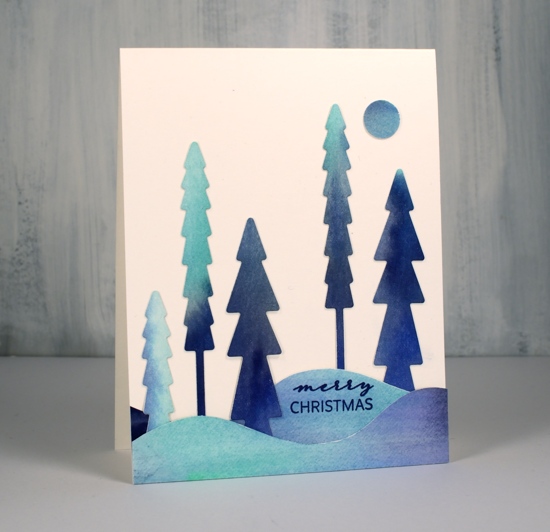
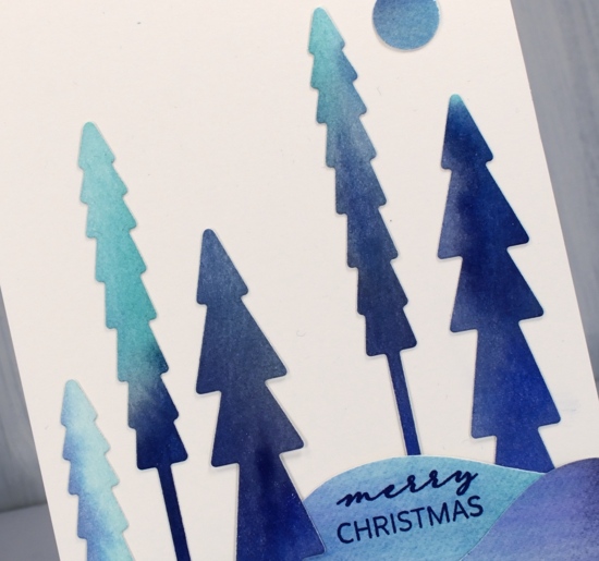
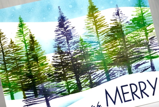
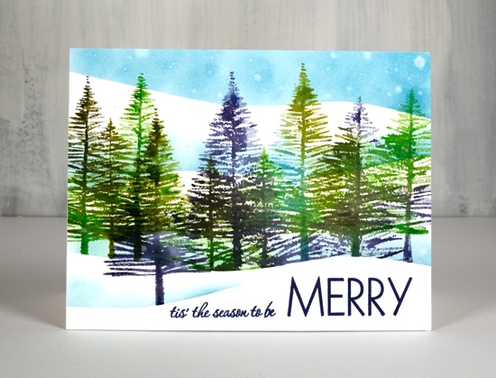
If you are new around here you might not know that I love tree stamps, tree scenes and wintry tree scenes in particular. ‘You can never have too many tree stamps’ are words I live by! So it will come as no surprise to see four different but similar tree cards today. All four are on hot pressed watercolour paper and all had masking fluid splattered on the panels before I began.
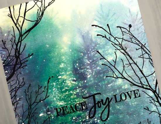
To create these first two cards I used the same method, stamping first, spritzing with water second. I stamped the PB ‘winter tree’ stamp in chipped saphpire, shabby shutters and pine needles distress inks then spritzed water generously over the panel so the colours bled into each other. Any where the ink and water was pooling too much I dabbed away with a paper towel. Once the panel was dry I stamped PB fragile branches around the edges to so it appeared that we were looking through to a clearing.
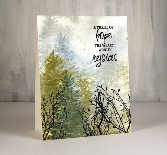
I used the same method for this card but used iced spruce, stormy sky and forest moss distress ink before spritzing with water. After the panel had dried a little but not totally I stamped a foreground tree in forest moss (or maybe a different ink, I’m not sure). After the panel was completely dry I added the fragile branches in black archival ink and in a stamp positioner so I could stamp a few times for a bold impression.
For these last two cards I used the same stamps but switched to a magic ink! Yes, it’s truly a magic ink; on the two cards below I used only one ink (other than the black for sentiment and fragile branches.) The dark green, pale blue, olive green and brown tones all come from the magic ‘northern pine’ memento ink from Tsukineko.
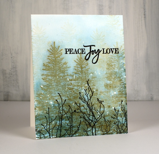
On the panel above I stamped the trees repeatedly in northern pine getting first, second and third generation images then I spritzed the panel so the ink would separate and bleed into the rest of the panel.
On the panel below I wet the panel first and then stamped the trees in northern pine memento ink. The result is blurrier images but beautiful blends of green, brown and blue.
Once the panel above was dry I stamped the tree again in northern pine ink in the right hand corner. One ink, one magic ink!
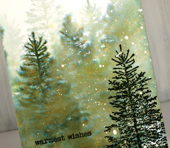
Once all the panels were totally dry I rubbed off the masking fluid to reveal the snow falling, you can use your fingers or an adhesive eraser. I added the sentiments from PB sets (linked below) in black archival ink.
Thanks for dropping by; make sure you come back tomorrow to see what the Foiled Fox and I have dreamed up for you.
Supplies
Winter Garden
Posted: October 21, 2019 Filed under: Penny Black, winter garden | Tags: Kuretake Zig clean color real brush markers, Penny Black stamps 2 Comments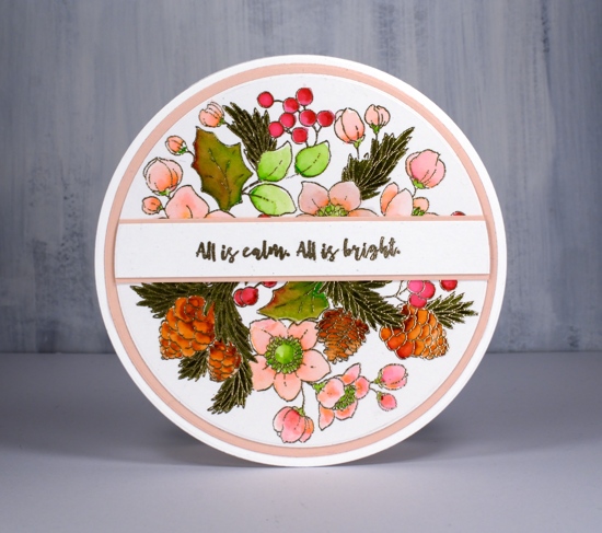
If you haven’t seen the incredible artistry of Peet Roeven you need to click over to her blog right now. Her attention to detail and precise fussy cutting is impressive. My card today is inspired by a recent card of Peet’s, mine is nowhere near as detailed as hers but I was able to show off this pretty ‘winter garden’ stamp in a circular setting just as she did. I never think of doing circle cards but the stamp is circular so it does make sense and Peet’s beautiful card nudged me to give it a try.
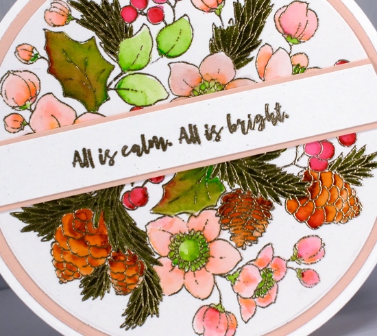
I worked on Koh-I-Noor Bristol Smooth Bright White Paper and embossed the image in platinum embossing powder. I was keen to see how the Zig clean color real brush pens worked on bristol as many artists prefer bristol to watercolour paper for the zig pens. The results were very pleasing the pens blend beautifully on bristol. I wanted pale pink flowers and tried light pink and tea rose then ended up using both for a blend from the slightly bolder pink to the paler tea rose. The berries I coloured with wine red, the rounded leaves with light green and the holly leaves with a blend of wine red and light green. I used brown for the pine cones and blended it with water for variation in depth. The needle leaves are olive green. The zig pens are very highly pigmented so a little goes a long way. I was able to colour the elements on the panel by applying a small about of ink then blending it to fill the space with a wet brush.
I die cut the image with a large circle die, used the next size up for the pale pink mat and the next size for two circles to form the card base. The back of the card base has a score line less than a centimeter (half inch) from the top so the card can be opened without the patterned panel having to bend at all. I also cut a very small margin off the bottom of the back panel so the card would stand upright on a small flat section. I embossed the sentiment from PB ‘Christmas Sentiments’ set, matted it then die cut with a circle die so it would line up with my circle panels.
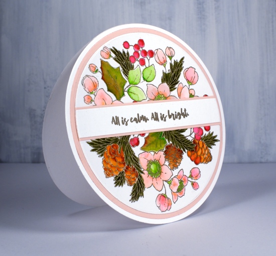
What is the most unusual shape you have used for a card? I have to admit it is just about always rectangles and squares for me.
Supplies

Ruby Trill
Posted: October 18, 2019 Filed under: ruby trill | Tags: Penny Black stamps, Ranger Distress inks, Ranger Distress stains 11 Comments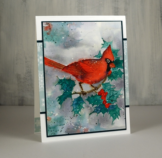
Let me introduce you to ‘ruby trill’ a cardinal stamp from PB; isn’t he a beauty? I wasn’t sure about my colour choices when I started painting these holly leaves but by the time I had finished the whole panel everything seemed to work together. I kept my colour range small as I often do. First I stamped the bird and branch with antique linen so I could do some no-line watercolour. Before painting I stamped some of the leaves with pine needles distress ink so that I could blend the green ink with water as well as add extra if needed. I worked one leaf at a time and also dropped in some blueprint sketch ink for added depth. This is where I doubted my choice; the blueprint sketch looked too blue and I wondered if I should start again. I decided to keep going and painted the berries in candy apple distress ink and the branch in gathered twigs.
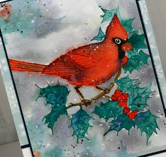
It wasn’t until I started painting the cardinal that the colours looked like they would work. I used the same candy apple distress ink to paint the cardinal but added shadows with the blueprint sketch and the gathered twigs inks. I know I keep saying this but the limited palette really does work! I added the brown on the tail and behind the wing and blue along the back and crest. As I had kept the stamp and watercolour panel in the stamp positioner I was able to ink the black area around the eye and stamp it before blending it with water and extra ink.
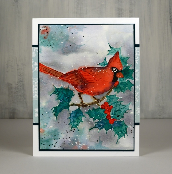
I had reference photos of cardinals on hand to check the colour of the legs and beak. Once all the painting had dried I re-stamped the body of the cardinal in candied apple to darken the details on the back and wings. At this point I had to decide whether I was adding a background or not. In the past I’ve ruined several focal images by adding a background around them. I decided I wanted a grey snowy look so I painted around holly with water and dropped in weathered wood distress stain as I went along. It was fiddly getting in and around the legs and leaves but it’s a loose cloudy look so no fussing about precision. While the background was still wet I inked just a few holly leaves and berries and pressed them onto the wet panel in a few places to look soft and shadowy. I dried everything before splattering some white paint over the whole panel and some black soot in the corners. Even though the mats look black in the photo they are actually teal and the little patterned strip behind is a PB snowflake paper in just the right grey/green colour.
Supplies
Peaceful forest
Posted: October 16, 2019 Filed under: Ink to Paper, Peaceful Forest dies | Tags: Ink to Paper, Ranger Distress inks 4 Comments
Before I begin to chatter on about today’s card I want to thank all of you who left a comment under my Thanksgiving post. It was so lovely to hear from you; I really enjoyed your messages.
As I mentioned the other day every year I create new snowy forest scenes, often then include starry skies or the northern lights. This first card features a very easy way to make a ‘northern lights’ background for die cut trees, houses, reindeer, etc.
I picked three distress inks, the originals not the oxides but you could use the oxides for a slightly different look. I rubbed a cracked pistachio mini inkpad across a third of the hot pressed watercolour panel, then a blueprint sketch mini across another third (with some overlap) and finally a chipped sapphire mini across the remaining area. The panel looked like it had been roughly shaded with crayons or pencils. I then spritzed the whole panel so the colours would move and blend and used a paintbrush in a couple of places so the coverage was complete. I left the panel to dry leaning against a bottle so the ink drained down in patterns to give the look of the northern lights. The funky trees are cut using ‘peaceful forest’ dies from Ink to Paper. The snow banks I cut from a piece of cardstock with a craft knife in one continuous curvy stroke. I cut my curve with equal amounts of cardstock on each side so I could layer them and have a foreground and background snowy hill.
On the second card I began the same way and created my tricolour panel then die cut five trees from it and a little round moon. Once again I cut the hills by hand with a craft knife then layered them before tucking in the little trees all around.
Pretty easy-peasy wouldn’t you say. Just pick a few distress colours that would blend nicely, swipe them across your panel and add water!
The cute little sentiments are also from ‘Ink to Paper’ and there is a stamp set that co-ordinates with the tree dies but you will have to wait for another day to see that.
Supplies

Happy Thanksgiving
Posted: October 13, 2019 Filed under: Uncategorized 18 Comments
The steadfast love of the LORD never ceases;
his mercies never come to an end;
they are new every morning;
great is your faithfulness.
Lamentations 3:22-23
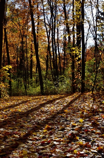
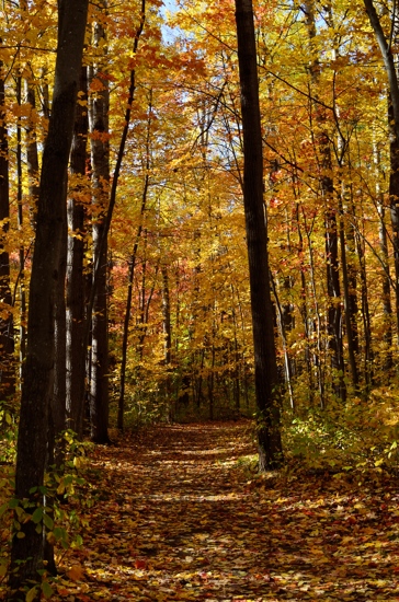
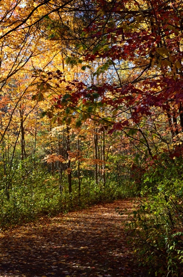
These were taken this Thanksgiving weekend during a walk with my husband not too far from our home. God’s artistry inspires and amazes me.
Snowy saplings
Posted: October 11, 2019 Filed under: saplings | Tags: Penny Black stamps, Ranger Distress inks, Tsukineko Versafine inks 6 Comments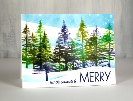
Every year I make some snowy forest scenes, with stamps that are old favourites and with new ones destined to be favourites. These trees are from a new PB set called ‘saplings’ and they are so easy to work with!. I placed my hot pressed watercolour panel in the stamp positioner and placed a hill shaped frisket film mask across the base of the panel where I wanted to preserve white space for the snow. I could probably have used a couple of layers of masking paper as I didn’t end up getting the panel very wet.
I inked one or two trees at a time with different combinations of the following distress inks: chipped sapphire, broken china, mowed lawn, peeled paint. Before I stamped I lightly spritzed the stamp so the colours would blend nicely. I moved the panel a couple of times and moved the stamps so I could get a decent row of trees at different heights. I sponged a bit of broken china ink along the top of the mask to create a shadow behind the snow bank then moved the mask to stamp a tree in front. I then moved the mask twice sponging both times to get another couple of snowy hill shadows to appear behind the trees and a blue sky.
To create the ‘snow’ in the sky I gently splattered and strategically dropped some water on the distress sponging. The distress inks react with water so after the droplets had sat for 30 seconds I dabbed them with a paper towel which left white watermarks. To finish off I linked two stamps from the PB ‘Merry Builder’ and stamped them in majestic blue versafine ink.
Despite the appearance of a snowy scene on the blog today I am happy to report it has been sandals weather this week. Yay!
Supplies
https://linkdeli.com/widget.js?1559654439292
Creamy poinsettias
Posted: October 9, 2019 Filed under: diamond cut, geometrix: rectangle die, Ink to Paper, jolly holly, layered poinsettia, Penny Black, scarlet season | Tags: Ink to Paper, Penny Black creative dies, Penny Black stamps 5 Comments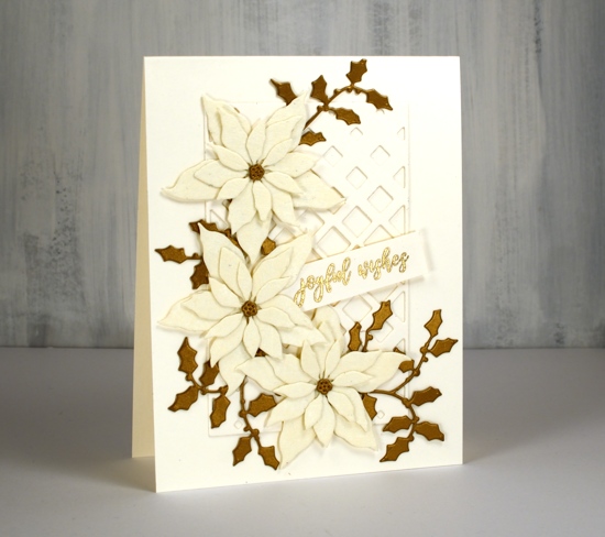
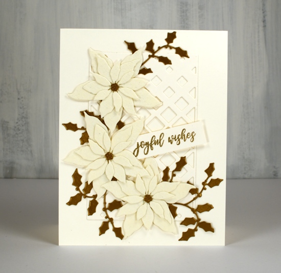
Lately I have been die-cutting poinsettias from all sorts of different cardstock. I have a poinsettia Christmas card class coming up so I’ve been playing around with lacy paper, shimmer paper, kraft paper and watercolour paper with plans to also cut up some pretty plaid paper. These two cards feature a lovely cardstock called ‘Ivory WorldWin twist’ which is a smooth ivory cardstock on one side a lace texture on the other side. I bought it at Crop A While, my local scrapbooking store. The lacy side is almost spiderwebby but in a delicate pretty way not a ‘look what’s behind the filing cabinet’ way.
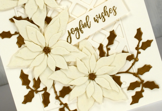
The card bases are neenah cream cardstock, and so is the sentiment strip and the PB ‘diamond cut’ behind the poinsettias. I used the PB ‘layered poinsettia die set’ for this trio of poinsettias; I like the size which makes it possible to fit three on a card front. (two more cards with these dies here and here) The PB jolly holly die cuts are a dark gold cardstock. I didn’t pop anything up on dimensional tape as it was getting pretty dimensional anyway with seven layers! That must be some kind of a record for me. I used glue for the flowers, narrow double sided tape for the diamond frame and stickit adhesive on the back of the holly.
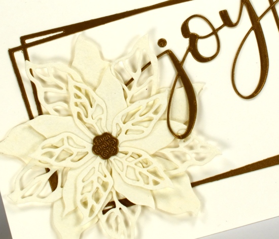
The second card features the same cardstocks but a new PB poinsettia stamp ‘scarlet season’ which has both solid and filigree flowers. I cut them once again from the lacy cardstock and layered them over a funky rectangle die from ‘Ink to Paper’ and added the PB ‘joy’.
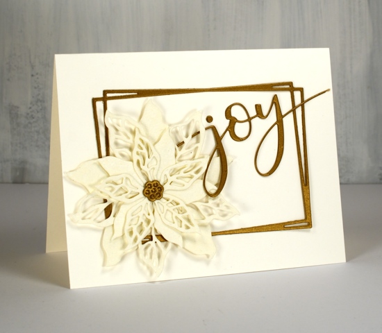
I’m not sure if it is the lacy paper or the colour combo but these cards have a bit of a retro look to them. I think these designs would be pretty with patterned vellum too.
As always the supplies are linked below; I have added a second affiliate with my Canadian readers in mind. The store is Scrap ‘n’ Stamp in BC. If you buy through my affiliate links from either Foiled Fox or Scrap ‘n’ Stamp there is no extra cost to you but I receive a commission. Thanks for dropping by today.
Supplies
Golden Delight
Posted: October 8, 2019 Filed under: Color Burst, golden delight | Tags: color burst, Penny Black creative dies, Penny Black stamps 5 Comments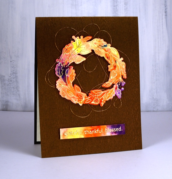
I decided to let the colorburst paint powders do the colouring for me on this cute little wreath from Penny Black. I embossed the wreath in gold on hot pressed watercolour paper and embossed the sentiment at the same time.
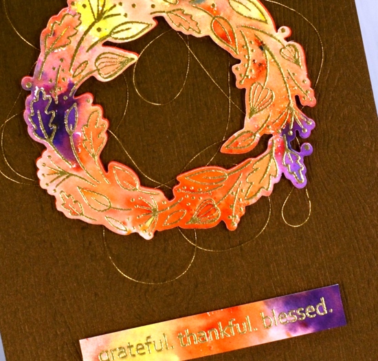
I sprinkled four colours of Ken Oliver’s colorburst powders over the embossing then spritzed with water and watched the colours emerge and spread. I helped them out a little with a paintbrush so paint filled every nook and cranny. Once the panel was dry I die cut the wreath and trimmed the sentiment to the right size then cut a wreath from adhesive backed foam also to pop up the watercoloured one. Before I attached the wreath to the card base I looped some gold embroidery thread back and forth around the wreath letting the adhesive hold it in place.
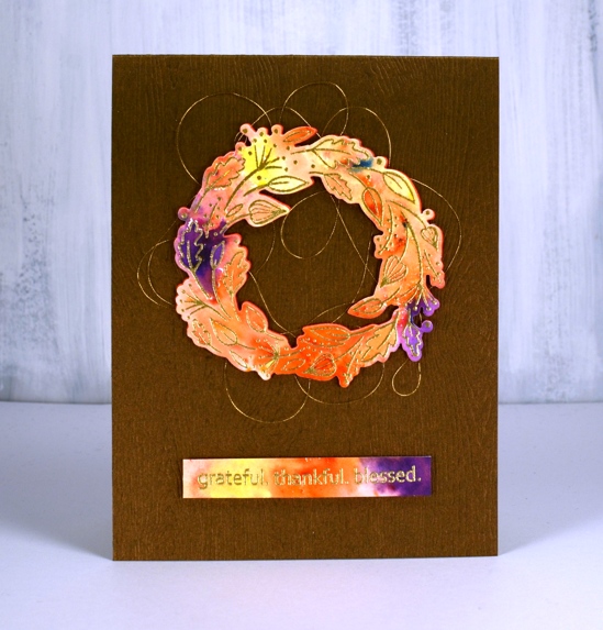
The woodgrained card base not only has texture it also has a little bronze shimmer to it. I bought it from my local scrapbooking store but you could get the same effect with a woodgrain embossing folder.
Feeling grateful, thankful and blessed to be part of this encouraging and inspiring community.
Supplies