
Cosy Cottage
Posted: August 4, 2015 Filed under: Christmas Cottage | Tags: Fabriano Watercolour Paper, Penny Black stamps, Ranger Distress inks 11 Comments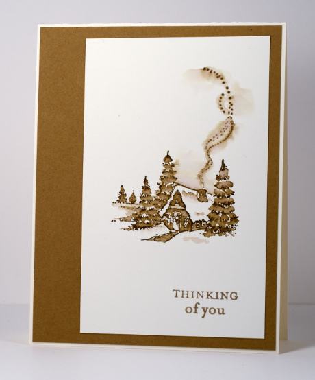
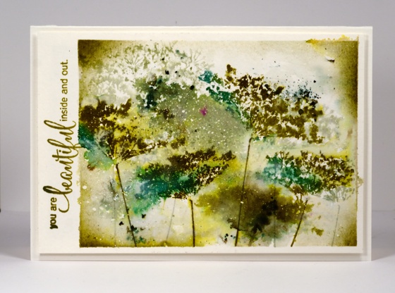
From January to June this year I was honoured to be a member of the Dirty Dozen at Splitcoaststampers. My term on the team is over now but I will forever be a Dirty Dozen Alumni which brings its own opportunities and privileges. Right now there are all sorts of challenges going on especially for fan club members. Alumni have dreamed up wonderful projects and multiple challenges are being released each day.
While I was a member of the Dirty Dozen I created projects with a different theme each month. This is one of the first cards I shared; the theme was “All Cooped Up”. I made it during the bleak midwinter, a far cry from our current hot midsummer! I stamped with one ink then pulled colour from the stamped image with a small paintbrush to fill in the trees, cottage and path. I kept it clean and simple when finishing the card by matching the ink colour exactly with a cardstock mat.
Supplies:
Stamps: Christmas Cottage, Enjoy Life (PB)
Inks: Vintage Photo Distress Stains (Ranger)
Cardstock: Fabriano 100% cotton hot pressed watercolour paper, Neenah Natural White 110lb card stock, Tan cardstock
Orange blooms
Posted: August 4, 2015 Filed under: CAS, Promenade, Softly | Tags: Penny Black stamps, Penny Black stencils, Ranger Distress stains 20 Comments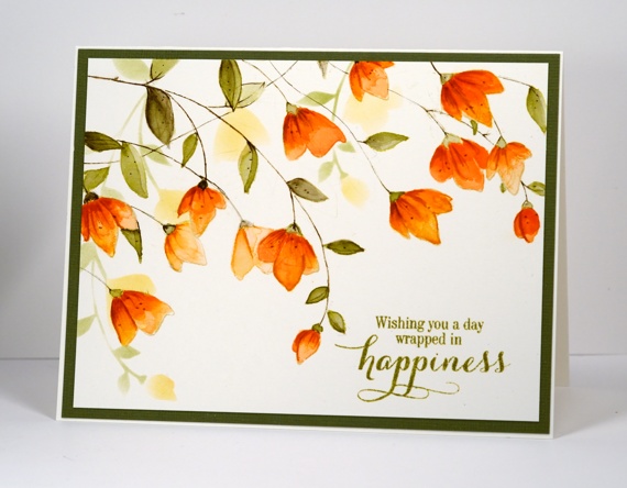
When I set out to create this card I knew I had stamped a similar layout with this stamp before but it wasn’t until the card was completed and I looked at the earlier card that I realised just how how similar! This one has a wee bit more going on and was painted with distress stains not watercolour pencils. I began by stamping the large ‘Softly’ stamp a couple of times. Each time I inked it I wiped off some of the antique linen ink so the two imprints would not interfere with each other too much. The antique linen ink is pale so I was able to paint inside the lines and have them disappear into the darker oranges and greens.
I had to repeat my mantra (walk away, just walk away) periodically through the making of this card because I was trying to follow the steps shown on this photo tutorial. I painted all the petals with a diluted wash of ‘dried marigold’ distress stain first. After it dried I added another layer keeping the colour undiluted. Once that dried I painted some darker areas with ‘spiced marmalade’, let it dry then finally added some ‘rusty hinge’. ( I have just discovered what a warm brown rusty hinge is; it works well with orange tones). After waiting once again for it to dry I added some details with the spiced marmalade and rusty hinge markers. I stuck with just ‘forest moss’ stain for the leaves but began by diluting for the first wash then increasing the intensity as I added shading.
When all the painting was finished I used the co-ordinating stencil ‘Promenade’ to sponge some background flowers before adding a sentiment and a green mat. This card is a little bigger than A2 (6.25″x4.75″) so I will need to hunt through my envelope supply to find a match.
Thank you so much for dropping by and for your kind comments. I have been interested to read about your opinions and experiences with the different watercolour powders I have been featuring.
Supplies:
Stamps: Softly, Sprinkles & Smiles (PB)
Stencils: Promenade (PB)
Inks: Spanish Moss Versafine (Tsukineko) Spiced Marmalade, Dried Marigold, Forest Moss, Rusty Hinge, Antique Linen distress products (Ranger)
Paper: Canson 100% cotton hot pressed watercolour paper, Green textured cardstock
Birthday Bister
Posted: August 3, 2015 Filed under: Bister, Footnotes, Soft Wings | Tags: Bister, Penny Black stamps, Ranger Distress stains 16 Comments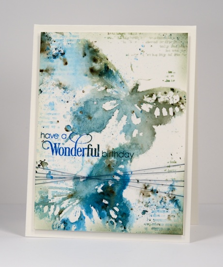
For my daughter’s 21st birthday card I chose blues, greens and the ‘soft wings’ butterfly stamp I always enjoy using. A reader commented a while back that bister and color burst work well with butterflies so it was time to try. I stamped the butterfly in a mix of distress stains which created a watery imprint I could add the blue and green bister powder to. I did multiple impressions then left them to dry while I added some texture around the rest of the panel. I used distress stain on the text stamp from ‘footnotes’ to add the patterns and did some splattering and spritzing with both stains and pearl-ex spray. Once the whole panel was dry I added the sentiment then trimmed and sponged some darker colour around the edges before adding some thread and popping up the panel on a watercolour paper card base.
Supplies:
Stamps: Sprinkles & Smiles, Soft Wings, Footnotes (PB)
Inks: Bundled Sage, Pine Needles, Evergreen Bough, Salty Ocean Distress Stains (Ranger) Deep Lagoon & Olympia Green Versafine inks (Tsukineko)
Paint Powder: Blue and Green Bister
Cardstock: Canson hot pressed 100%cotton watercolour paper
Also: home made interference blue pearl-ex spray, machine embroidery thread
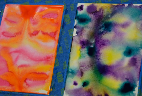
Color burst poppies
Posted: July 30, 2015 Filed under: Color Burst, poppy pair | Tags: color burst, Fabriano Watercolour Paper, Penny Black creative dies, Penny Black stamps 7 Comments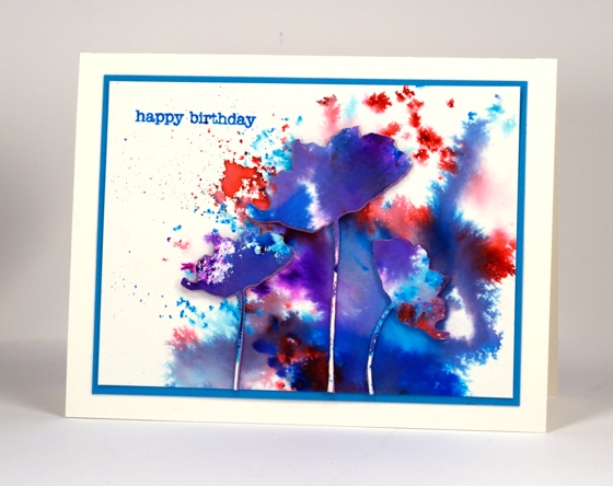
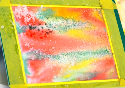
This watercolour powder experiment displays on one card some of the different effects you can get with color burst powders. Depending on how much water you add you can get fine dots of colour or very watery blends of colour. I sprinkled the powder on a piece of watercolour paper and spritzed lightly at one end but more generously at the other. The fine dots must have got hardly any water, the little irregular shapes a bit more water then the purple and blue areas were fairly saturated. All the purples and shades of blue came from only pink and blue powders.
I die cut poppies from the watercoloured panel and some from foam as well then attached them all together with stick it adhesive.
Supplies:
Stamps: Snippets (Penny Black)
Creative dies: Poppy Pair (Penny Black)
Inks: Color burst watercolour powders(Ken Oliver), Salty ocean distress (Ranger)
Cardstock: Fabriano cold pressed watercolour paper
Also: Stick it adhesive sheet (Ken Oliver)
Brusho in the garden
Posted: July 28, 2015 Filed under: Brusho | Tags: Brusho, Fabriano Watercolour Paper, Penny Black creative dies 6 Comments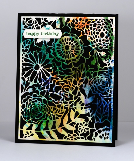
I tried out yet another watercolour powder recently when I got together with some arty crafty friends. Brusho seems to be similar to Color Burst and has a lovely range of bright colours. The panel featured on the card above was cut from one of my first experiments. I sprinkled green, blue, orange and yellow brusho powders on watercolour paper then spritzed and tilted the paper to let the colours blend a little. I did walk away (to eat chips) and let it dry alone. You can see some sections of the paper remained without colour.
The multicoloured panel seemed a good match for the intricate garden die I had not used before now. I tried backing it with green and white but the contrast of the black card base was the most effective.
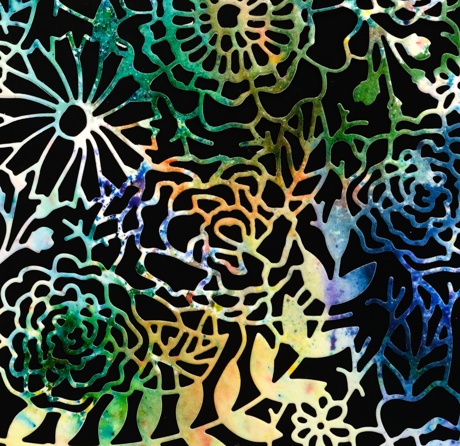
Supplies:
Stamps: Snippets (Penny Black)
Inks: Brusho watercolour powders
Cardstock: Fabriano cold pressed watercolour paper
Creative die: In the garden (Penny Black)
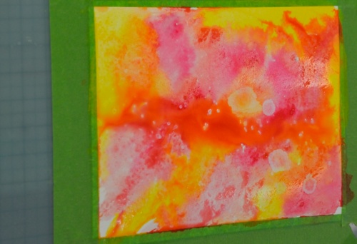
Bister Poinsettia
Posted: July 22, 2015 Filed under: Bister, Red Star | Tags: Bister, Penny Black stamps 16 Comments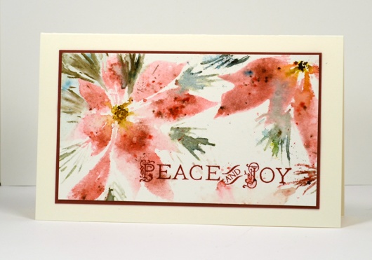
I’m not trying to stress you out about there being only 155 days until Christmas. Besides 155 is a lot of days and even though I have the best of intentions regarding Christmas shopping I never get it done before December. I just needed to try this stamp out with some bister because I thought the two would be happy together. I stamped the petals only in spun sugar distress stain to get a pale impression then sprinkled some red bister into the ink. It takes several re-stampings with water to get the colour to spread around the petals so I used the misti. I then moved onto the pine needles by stamping with bundled sage and dropping green bister. The centres of the flowers are yellow bister and black marker.
The panel started out bigger than this with a third shadowy flower at the bottom. I stamped the sentiment in crimson red versafine ink because the stamp has those nice little details and versafine does a great job with them. Versafine also takes longer to dry than dye ink so it is important to walk away, just walk away and let it dry! I didn’t. To my credit I managed to get the whole card stuck together without smudging the wet sentiment only to swipe my fingers right through it when I folded the card base in half at the end!
Hmmm…I quickly took it apart, trimmed off the smudged bit, restamped the sentiment and walked away.
Supplies:
Stamps: Red Star, Hanging Treasures (PB)
Inks: Spun Sugar, Bundled Sage, Mustard Seed, Black soot Distress Stains (Ranger) Crimson Red Versafine (Tsukineko)
Cardstock: Fabriano 100% cotton hot pressed watercolour paper, Neenah Natural White 110lb card stock, Red cardstock
Also: Bister powders
One stamp, two colours
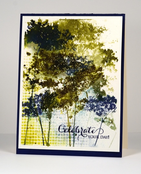
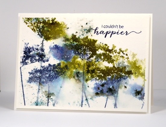
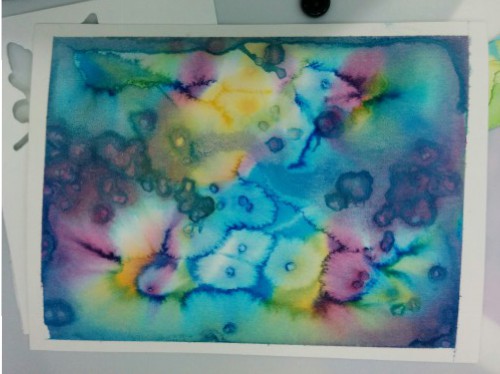
Posted: July 21, 2015 Filed under: Bister, Queen Anne's Lace, Watercolour | Tags: Bister, Penny Black stamps, Ranger Distress stains 16 Comments
Continuing my experiments with bistre paint powders, I pulled out one of my favourite stamps and limited myself to a blue and green colour scheme. Below are all the results of my fiddling around with colours, water, repetitive stamping and order of operations. All the panels were splattered with masking fluid which really added interest on the most watery panels. Where the stains pooled and bled into each other the little masked dots break up the solid colour. Each was taped to a board with painter’s tape which created a masked border that I retained on all but one card.
On the panel below I sprinkled both blue and green bister on dry watercolour paper then spritzed lightly, tilted it this way and that, then walked away. This is becoming my new watercolour mantra, ” Walk away, just walk away!” As I have said before it helps to have chips on hand to distract yourself from wanting to fiddle more with the painting that needs to dry. In this case I did not have chips but I did have four different panels to work on so as each one was set aside to dry I started the next. Once dry I stamped the Queen Anne’s Lace in a dark green and a mix of two blues to co-ordinate with the bister patterns. I stamped twice without re-inking in between so the lower images are a bit paler. I like the lacy airiness of the flowers on this one but it’s not my favourite.
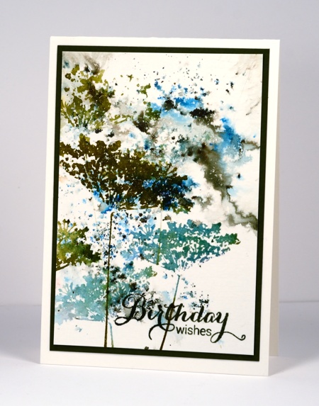
There was more water involved in the panel below and some painting and sponging too in order to frame the scene. I began by stamping in pale green on a slightly damp panel. You can see those first pale images in the background. I then switched to darker colours and dropped some bister into the stamping. To fill the white background I used a paintbrush to pull both stain and bister into the spaces. I tried to be careful not to lose the definition of the flowers. When it was totally dry (walk away, just walk away) I sponged a bit more colour in the corners. I like the shadowy images behind the stronger ones on this panel but it is not my favourite.
To be honest with you, below is the one that almost got tossed. I didn’t walk away and you can see all the murky green that resulted. I didn’.t want to give up however so I pulled out some scraps of dry wall tape I had used on another project and sprinkled bister powder over the tape, spritized water over the powders, let it dry a bit then sponged for more coverage. Not only does the grid add some interest, it leads the eye away from the murk. The other thing that saved this one is the mass of masking fluid flecks right in the centre adding light to the murk. You have probably guessed, not my favourite.
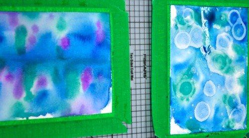
Which leaves us with this one. It has lots of blue, some nice bister bursts, both watery and defined stamping, some white flecks in appropriate places and I couldn’t be happier. Yes, it’s my favourite. Which one do you prefer?
Do you ever fiddle around with the same stamp and colours for several projects? It’s not quite making multiples but it is time efficient to use the supplies while they are all on the table.
Supplies:
Stamps: Queen Anne’s Lace, Happy Notes, Heartfelt, A Sweet Day (PB)
Inks: Bundled Sage, Forest Moss, Pine Needles, Crushed Olive, Chipped Sapphire, Evergreen Bough, Salty Ocean Distress Stains & Chipped Sapphire distress ink (Ranger) Spanish Moss, Majestic Blue & Olympia Green Versafine inks (Tsukineko)
Paint Powder: Blue and Green Bister
Cardstock: Canson cold pressed 100%cotton watercolour paper,
Also: Winsor & Newton masking fluid
Colour inspiration
Posted: July 20, 2015 Filed under: Watercolour | Tags: Kuretake Gansai Tambi watercolour paints, Ranger Distress stains 6 CommentsLast month I taught a class involving watercolour panels and die cut shapes. All the samples I demonstrated and all the cards and panels created by class members were different. I really enjoyed watching everyone choose colours to work with. I snapped a few photos as the paints dried.


I still have some panels waiting to be transformed into something new.
Poppy Painting
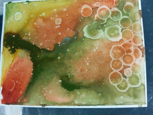
Posted: July 18, 2015 Filed under: Poppy Time | Tags: Bister, color burst, Fabriano Watercolour Paper, Kuretake Zig clean color real brush markers 14 Comments
More bister, this time in combination with color burst powder and zig clean color real brush pens. This panel of poppies was almost tossed because at one point it looked a mess. I stamped two poppies using a pink zig pen to ink the stamp. I filled the outline in using both the pen and some pink colour burst powder. I also painted the stems in green but it all looked a bit dull and I wasn’t sure how to add interest. I decided to lose some of the definition by spritzing the whole thing with water. The poppies bled in all directions and it really wasn’t an improvement at all! I set it aside and worked on something else while it dried. When I came back to it I decided to add another partial poppy as well as the bud and seed head. I painted loose leaf shapes and added green and blue bister powder around the bottom and top of the panel. To sharpen the poppy images a little I painted darker colours below the edges and added the veins back in.
Those poppies keep finding their way onto my cards; I don’t know how it happens…
Supplies:
Stamps: Poppy Time (Penny Black)
Inks: Color Burst & Bister watercolour powders
Cardstock: Fabriano cold pressed watercolour paper
Also: Zig clean color real brush markers
Flowers on circles
Posted: July 15, 2015 Filed under: CAS, Enamor | Tags: color burst, Penny Black stamps 6 Comments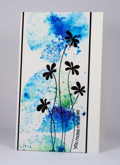
Before I made my previous card, the coloured balloon one, I did an experiment with leftover scraps of frisket film. Frisket film is masking paper for watercolour and other ‘wet’ mediums. I taught a class a couple of months back where we used a large circle cut from frisket film to mask the moon. I kept the negative scraps of film that I had cut many moons from. Just for fun I lay them on a piece of watercolour paper, overlapping here and there to create a random arrangement. With the film in place I dropped some blue and green color burst powders over the panel then spritzed with water. I used enough water to activate the powder but not so much that it ran everywhere. The result was the circles on the card above. I picked a simple outline stamp and coloured it in completely then added a sentiment which I curved to follow the stem of the flower.
These colours are much brighter than the bister and just as much fun. Can you tell I am really enjoying these paint powders?
Supplies:
Stamps: Snippets, Enamor (PB)
Inks: Versafine Onyx black (Tsukineko)
Cardstock: Neenah Epic Black 100lb smooth , Canson 100% cotton hot pressed watercolour paper
Also: Color Burst powder, Prismacolor Premier fine line marker, Grafix extra tack frisket film


