
More Glimpses
Posted: August 18, 2016 Filed under: CAS, Nature's Silhouettes, Stamped Landscapes, Woodland Beauty | Tags: Dr Ph Martin Hydrus watercolor paints, Penny Black stamps, Tsukineko Versafine inks 13 Comments
I have two more cards made from my experiments with new stamps on watercolour strips. Both today’s strips and yesterday’s were splattered with masking fluid before I started. For the deer card I also added a circle of masking tape before painting the sky in blue, purple, pink and yellow watercolour paint. I painted the horizon edge in blue and tilted the strip up so the paint flowed toward the moon, one colour blending into another

Once the sky dried I removed the masking fluid and tape then stamped the branches from ‘woodland beauty’ and the deer from ‘ nature’s silhouettes’ in black before painting some shadows in front of the deer’s legs.

I used a similar process for the single tree scene, painting the sky first while leaving some unpainted paper at the bottom to be the snowbanks. Once the sky dried I removed the masking fluid and positioned a post-it mask below the horizon and stamped the single tree from the ‘woodland beauty’ set over the mask. Once I removed the mask I painted shadows on the snow in the foreground and behind the tree.
The four little panels in today’s and yesterday’s posts are a taste of the new stamps and the types of scenes I expect to be creating over the next few months. I really enjoyed working small; have you tried it?
Supplies:
Stamps: Nature’s Silhouettes, Woodland Beauty, Joy Filled (PB)
Paints: Dr Ph Martin Hydrus watercolour paints
Inks: Versafine Onyx black ink (Tsukineko)
Cardstock: Fabriano 100% cotton hot pressed watercolour paper, Neenah epic black cardstock
Also: masking fluid, masking tape
Glimpses
Posted: August 17, 2016 Filed under: CAS, Into the sky, Nature's Silhouettes, Prancers | Tags: Brusho, Penny Black stamps, Ranger Distress stains, Tsukineko Versafine inks 24 Comments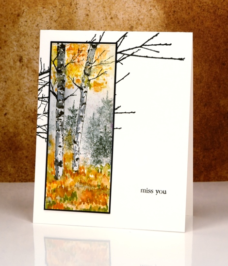
You have probably already caught up with the fact that Penny Black has two new collections of stamps and dies. When I first receive new stamps my head fills with ideas and designs to try and this time was no exception. I had a little pile of bookmark sized watercolour paper strips on my table so I decided to try some of my ideas on mini projects rather than full sized panels. That way I was able to play with a few stamps and several ideas in a short space of time. The strips I worked on have become the cards I’m sharing today and tomorrow. I have also had a chance to develop some of the designs into full sized panels. On the strip above I used an old favourite, the little tree stamp from the ‘Prancers’ set as background for the new birch trunk stamps.
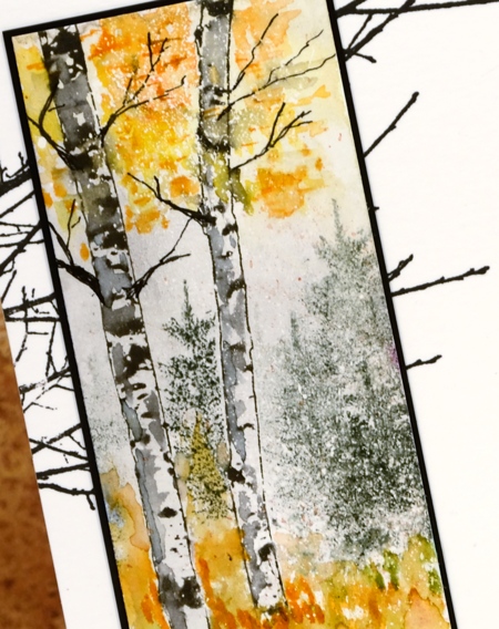
I stamped the two trunks from the new ‘Nature’s silhouettes’ transparent set on watercolour paper already covered in spots of masking fluid. I masked the trunks with post-its while I stamped the fir tree in the background then painted colour at the top and bottom of the panel with a combination of brusho and distress markers. I added some shadow and twigs to the trunks to make them look more tree like.
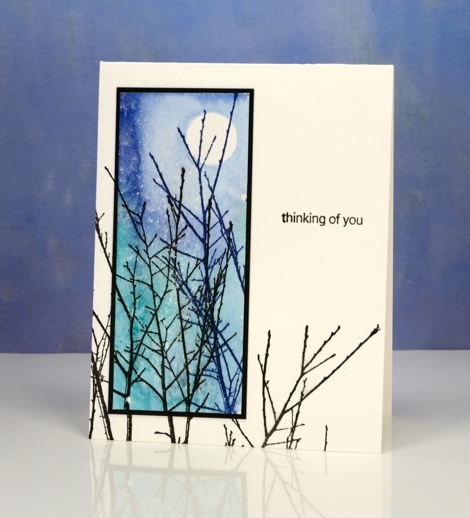
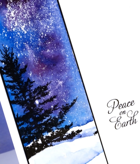
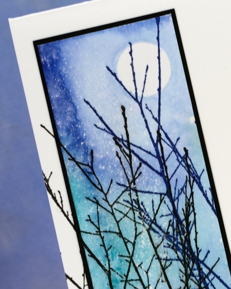
On my second mini panel I masked a moon with masking tape then used distress stains to paint a blue and green sky over the splatters of masking fluid. I turned this into a little scene by adding the ‘Into the Sky’ stamp in blue and black ink. I love this delicate stamp of branches and decided to stamp it on both the bases for today’s cards. It mimics the twiggy branches on the birch trees above and continues some of the upward reaching branches in the panel below.
Supplies:
Stamps: Nature’s Silhouettes, Prancers, Into the sky, Snippets (PB)
Paints: Brusho powders (Colourcraft)
Inks: Versafine Majestic Blue & Onyx black ink (Tsukineko) Black Soot, Rusty hinge, Spiced marmalade, Peeled paint distress markers, Evergreen Bough & Blueprint sketch distress stains (Ranger)
Cardstock: Fabriano 100% cotton hot pressed watercolour paper, Neenah epic black cardstock
Also: masking fluid, masking tape
Stacked die cuts
Posted: August 14, 2016 Filed under: Brusho, shall we dance | Tags: Brusho, Penny Black creative dies 9 Comments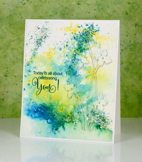
When I first tried this technique I did it the same way many did, by cutting multiples die cuts from cardstock and gluing them on top of each other. I now use a quicker method where I die-cut the image out of foam which replaces the stack of cardstock die cuts. I always find it a little tricky to stack the very fine stems and letters; the foam stretches a bit and the cardstock is very hard to line up. Despite these fiddly factors I managed to get it all in place to create this subtle floral design on another abstract watercoloured panel.
This was one of those panels where the brusho patterns turned out to be very pretty so I didn’t want to lose much by stamping over it or cropping. Raising a die cut image is a great solution when you want to preserve some pattern but still have a focal image.
Supplies:
Stamps: Sprinkles & Smiles (PB)
Die: Shall we dance
Paints: Brusho powders (Colourcraft)
Inks: Deep Lagoon ink (Tsukineko)
Cardstock: Fabriano 100% cotton hot pressed watercolour paper
Also: stick it adhesive sheet, adhesive backed fun foam
Round the watercolour world
Posted: August 8, 2016 Filed under: Brusho, love to travel, mini community, Watercolour | Tags: Brusho, Fabriano Watercolour Paper, Penny Black creative dies 5 Comments
I have more watercolour die cuts to share. This card has a much higher fiddliness factor than the previous ones and has convinced me that I should never video myself making a shaker card! Rather than trying to describe my trial and error process for making this shaker card I will just list the layers I used from little die cuts right down to the card base. The mini community and ‘the world’ were cut from brusho panels.
watercoloured ‘mini community’ & ‘love to travel’ die cuts with stick-it adhesive on the back
black cardstock panel
acetate
foam with circle die cut from centre
watercolour panel to be ‘the world’
card base

I saved the little die-cut bus and cars to put inside the shaker area with the glitter, sequins and micro beads. It wasn’t until I started shaking it that I realised the bus and cars would end up in countless pile ups!

Supplies:
Stamps: Sprinkles and Smiles (PB)
Die: Mini community Love to Travel (PB)
Paints: Brusho (Colourcraft)
Cardstock: Fabriano 100% cotton hot pressed watercolour paper, Neenah solar white, Neenah epic black
Also: stick it adhesive sheet, glitter, sequins, micro beads
Watercolour Fuchsias
Posted: August 5, 2016 Filed under: Fuchsia, Watercolour | Tags: Penny Black creative dies, Penny Black stamps, Tsukineko Versafine inks 10 Comments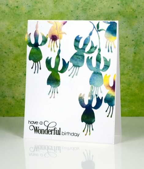
I’ve been cutting up watercolour panels again; it really is a great way to use up experiments or abandoned projects. Sometimes I have panels that were my ‘practice’ for something else or part of a class where I demonstrated a technique but then moved on. The colours in the panels are pretty but the pattern might be a bit random or unattractive. Using a die cut means I can cut from the sections where I really like what the colours are doing. These panels were painted with Gansai Tambi paints.
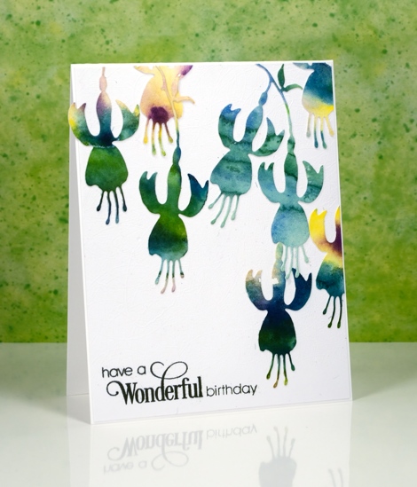
I put stick-it adhesive on the back then cut all these fuchsias from a couple of panels featuring the same blue green tones. I arranged them then attached them all to a white panel and then to a white card base. My photography didn’t pick up the texture on the white panel as it is quite subtle but it is a cute trick if you want to try it. The cutting base panel for my die-cutting machine is very well used all over so when a piece of cardstock is run through the machine the base transfers an intricate pattern of intersecting lines which creates subtly textured cardstock. I am going to include this card in the Casology ‘Watercolour’ challenge.

Supplies:
Stamps: Sprinkles and Smiles (PB)
Die:
Watercolour Dance
Posted: August 3, 2016 Filed under: Brusho, CAS, shall we dance, Watercolour | Tags: Brusho, Penny Black creative dies, Penny Black stamps 21 Comments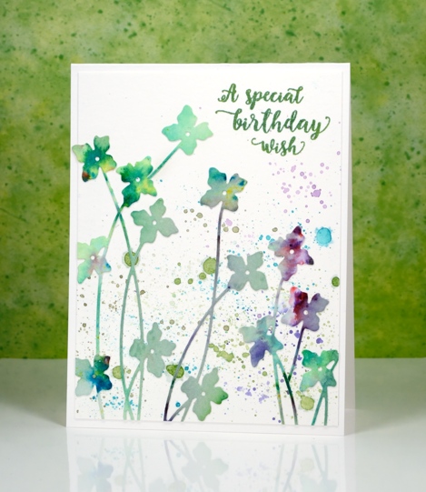
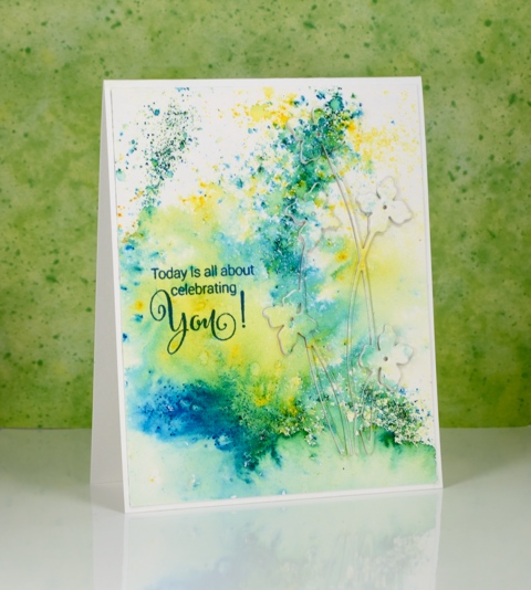
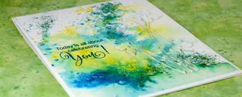
It’s really quite hot here at present and this card some how makes me feel a little cooler. It’s either the watery splatter or the cool blues and greens. I used up another abstract watercolour panel to make this card; there is quite a pile of painted or stamped panels sitting on my desk waiting to be turned into something. As you can probably guess this panel was mainly green but had a bit of purply pink on it. I am pretty sure it was done with brusho because there are little bits of other colours mixed in which is one of the nice features of brusho paint – the colours are not purely one pigment.
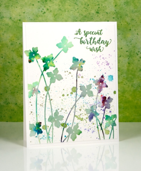
I used the new ‘shall we dance’ die from Penny Black to cut as many flowers as I could. I didn’t need them all to be complete die cuts as I wanted some tall and some short. Before I cut them I put ‘stick it’ adhesive on the back of the whole panel to make things easier later. Once I had all the flowers I could squeeze out of the panel I played around with positioning until I was happy. I did it all on a plain white panel assuming that I would keep the background blank and let the colours in the flowers pop. It would have been ok that way but I decided to use my watercolour pencils to try a little splatter in similar colours to the flowers. It may not be strictly white space any longer but it is pretty.
I am going to let this card play along with not one, but two challenges.
The CASology cue card is

and the CAS Mix Up challenge is

I read the fine print and discovered that if you didn’t have sprays then splatter is just fine so we’re in!
Supplies:
Stamps: Words of Kindness (PB)
Die: Shall we dance
Paints: Brusho powders (Colourcraft)
Inks: Cottage Ivy Memento ink (Tsukineko)
Cardstock: Fabriano 100% cotton hot pressed watercolour paper
Also: stick it adhesive sheet
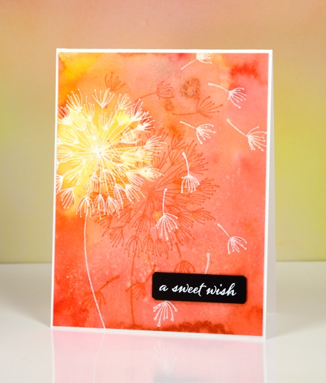
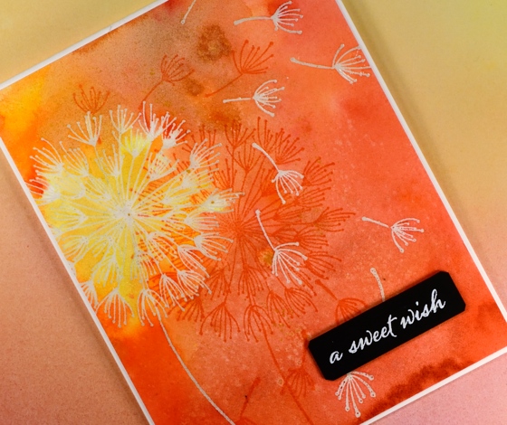
Dandee Wishes
Posted: August 2, 2016 Filed under: Brusho, Color Burst, Dandee | Tags: Brusho, color burst, liquid metals, Penny Black stamps, Tsukineko Versafine inks 20 Comments
This is the birthday card we gave our older daughter today.
I painted the panel a while ago but just turned it into a card for her birthday. Both this blue one and the orange one further down the page were emboss resist experiments. What is fun with emboss resist and watercolour powders is the variation and depth of colour changes from one side of an embossed line to another. To see an awesome example of this, check out Lindsey’s card.
For both colour schemes I embossed the dandee stamps in clear powder on watercolour paper. I sprinkled blue and green brusho powders on the one above then spritzed water to activate the powders. I used a paintbrush to do some colour moving but not much; most of the design is the magic of the paint.
The orange and yellow card was done in a similar fashion but I used colorburst powders and added some yellow gold liquid metal when I added water. There is a shimmery patch of colour as well as specks of gold in real life.
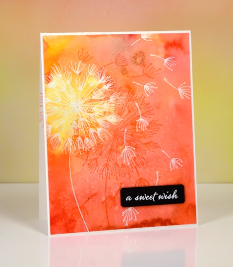
When I came back to the panels the other day I stamped the dandee stamps again over the panel in versafine inks and added popped up sentiments.
Thanks for dropping by.
Supplies:
Stamps: A Sweet Day, Dandee, Happy Snippets (PB)
Paints: Colorburst powders and Liquid Metals (Ken Oliver) Brusho powders (Colourcraft)
Inks: Versamark, Versafine Habanero, Deep Lagoon, Majestic Blue, Olympia Green(Tsukineko)
Cardstock: Fabriano 100% cotton hot pressed watercolour paper, Neenah epic black
Also: clear embossing powder, white embossing powder
Strange things are happening
Posted: August 1, 2016 Filed under: Field of Dreams, Zigs & zags | Tags: Kuretake Gansai Tambi watercolour paints, Penny Black creative dies, Penny Black stencils 9 Comments
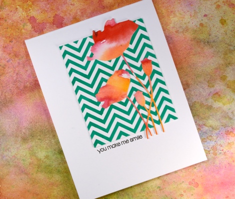
Strange indeed to see me enter a challenge, follow a sketch, use a chevron pattern and texture paste! I would not be surprised if you thought someone else had taken over my blog. There are two signs, however that this is my card, those watercoloured poppies might look familiar and the placement of that little sentiment is pretty standard for me also.
How did this happen? Well, I have been meaning to try adding texture to cards for a while so I picked up some molding paste and applied it through a couple of stencils. In this experiment I mixed liquid metal into the paste before spreading it through the ‘Zigs and Zags’ stencil from Penny Black. It didn’t end up with a metallic look but it took on the green of the ‘verdi gris’ liquid metal. It has been a while since I did a challenge other than One Layer Simplicity (new one is up today) so I checked a couple of my favourites and found the sketch on “Case this Sketch“.

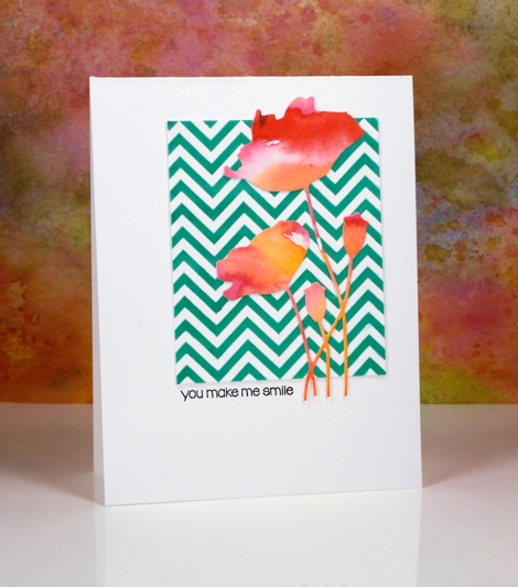
The die-cut poppies were sitting on my desk along with some other left over watercolour painted panels. (I will share projects featuring the other panels later this week.) This card really is an exercise in contrasts, the soft blends of the paint against the sharp corners of the zigzag, the pops of red over the stripes of green and the tiny black letters in the midst of a large expanse of white space.
As Joan Bardee would say:
MOOD WHEN DONE: Surprised but satisfied!
Supplies:
Stamps: Snippets (PB)
Dies: Field of Dreams (PB)
Stencil: Zigs & Zags (PB)
Inks: Versafine onyx black (Tsukineko)
Mediums: Molding paste (Golden) Verdi gris liquid metal (Ken Oliver) Watercolour paint (Kuretake Gansai Tambi)
Cardstock: Hot pressed Fabriano watercolour paper, Neenah solar white cardstock
Summer’s End
Posted: July 30, 2016 Filed under: Classes, Penny Black, Watercolour 4 Comments
No, I’m not heralding the end of summer, I’m showing a sneak peak of my next class. I teach monthly classes in Ottawa at a rented location and at Crop A While scrapbooking store. You can see the details for the classes I host on my Upcoming Classes page and find the dates and times for Crop A While on their events page.
I receive quite a few requests for online classes which I would love to provide at some stage. Be assured I will let you know here on the blog when I have some to offer you. While you wait I do have a few videos on my youtube channel.
Thank you for your interest and support; I have been so encouraged by the kind and generous comments left here on the blog and on my instagram page also. I am thrilled that you enjoy what you see here and love to hear when you try the techniques for yourself. I am always happy to answer questions if I can, so don’t hesitate to comment or use the contact me option to get in touch.
Colouring on silk
Posted: July 19, 2016 Filed under: Brusho, Delightful | Tags: Brusho, Penny Black stamps, Tsukineko Fabrico markers 20 Comments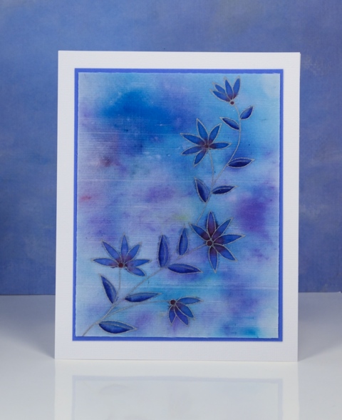
Recently I got together with some friends to do some artsy crafty playing. One of my friends inspired me to experiment rather than work on my ‘to do’ list as I usually do. We decided to stamp on a variety of fabrics with a variety of inks. This is one of my experiments using some silk left over from my bridesmaid’s blouses. I spritzed a piece of silk with water then sprinkled brusho over it. I kept spritzing and sprinkling the powder and watched the colours spread and blend. Once it dried it was paler as is often the case with watercolour and especially on fabric.
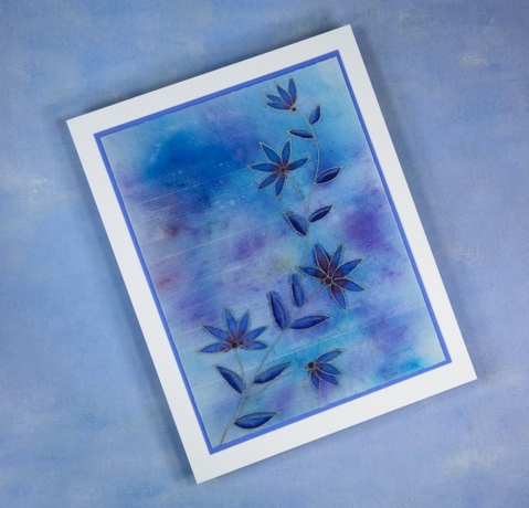
I stayed firmly within my comfort zone where colours were concerned and played with blues, purples and a touch of burgandy. I used the MISTI to stamp the ‘Delightful’ stamp in Encore silver ink as I didn’t know how many times I would need to stamp in order to get a good impression. Once the silver ink was dry I coloured the petals and leaves with fabrico markers from Tsukineko. The markers did a beautiful job both laying down colour and blending with each other. The colour did bleed outside the lines here and there; I will need to get used to how much ink and how close to the lines I need to colour.
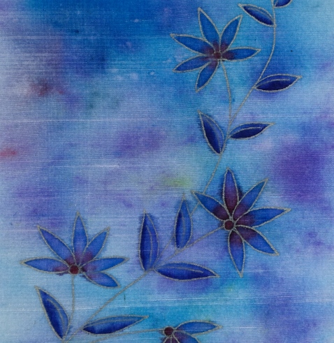
I enjoyed trying a different colouring medium and substrate and of course, joining in with the Daily Marker 30 day colouring challenge!
Supplies:
Stamps: Delightful (PB)
Inks: Encore Silver (Tsukineko)
Brusho: Turquoise, Ost. Blue, Ultramarine (Colourcraft)
Markers: Fabrico skymist, ultramarine, burgandy (Tsukineko)
Also: white silk, blue cardstock, white textured cardstock


