
Roses all over
Posted: January 30, 2018 Filed under: Bister, My Favorite Things, Roses all over, Shades | Tags: Bister, My Favorite Things, Penny Black creative dies 15 Comments
I pulled out my bister powders the other day; they were kind of pushed to the back of the watercolour shelf. They turned out to be a perfect match for this ‘roses all over’ stamp from My Favorite Things. Bister (and brusho and colorburst) does wonderful things when sprinkled over embossing because the powder gets trapped inside the ‘walls’ of embossing and keeps colours and shades separate. If you are not familiar with bister, you can read about it here. The colours are earthier than brusho and colorburst which is nice for a change.

Believe it or not this panel is painted with just red bister; all that lovely variety is from one colour. I embossed the watercolour panel with platinum embossing powder then sprinkled the red bister over it and spritzed with water. I watched to see if sections were filling with colour before spritzing or sprinkling a second time. Once there was enough powder I used a paint brush in just a few places to blend or spread the colour. I did not have to do much with the brush because MAGIC.

I found a cardstock that co-ordinated to mat the panel and create a banner for the sentiment. The banner die is from the PB ‘shades’ set and the sentiment embossed in platinum is from the PB ‘banner sentiments’ set.
Thanks for dropping by.
Supplies
Stamps: roses all over (MFT), banner sentiments(PB)


Die: shades (PB)

Ink: versamark
Paint: bister powder red
Cardstock: hot pressed watercolour, neenah natural white, red cardstock

Also: platinum embossing powder
Wildflowers
Posted: January 26, 2018 Filed under: wildflowers | Tags: Brusho, Darkroom Door stamps, Darkroom Door stencils, distress oxide inks 4 Comments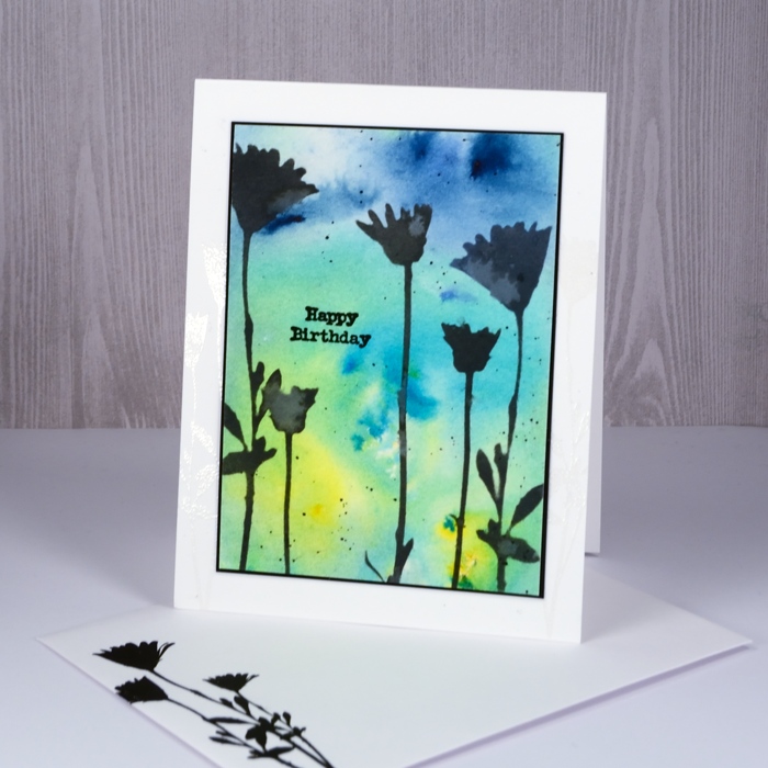
Happy Australia Day! What better to feature on the blog than a card made with Australia’s own Darkroom Door designs. The fact is though, by the time I get out of bed on Australia Day the festivities over there are practically over. I am currently sixteen hours behind my family on the east coast of NSW!
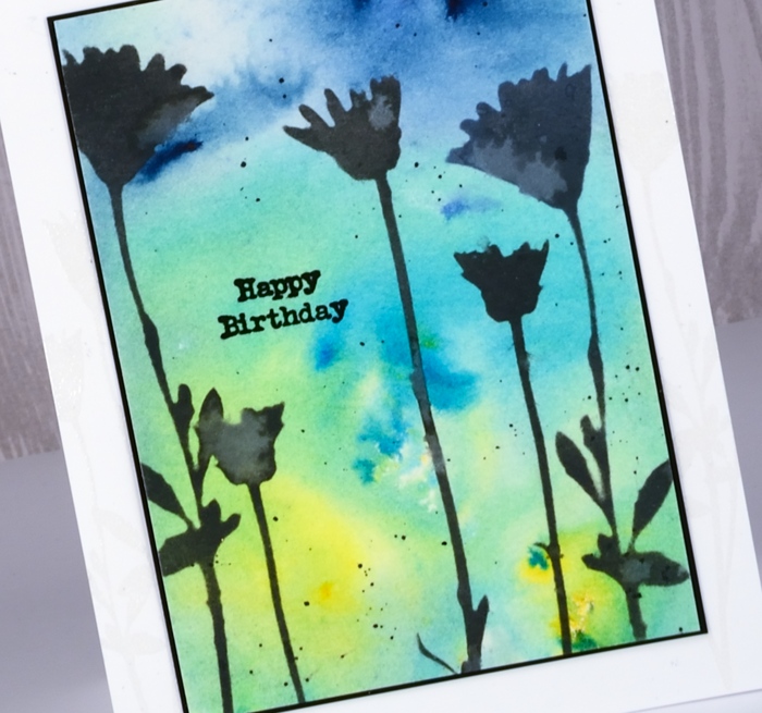
I’ve been pairing stencils with a few different things lately. For today’s card I sponged through the Darkroom Door stencil, wildflowers, with black soot distress oxide ink. You can see the watermarks on the stenciled flowers, a chalky white effect particularly obvious with the oxide inks. But before I did that I began by sprinkling brusho over a panel of watercolour paper. I spritzed with water and let the patterns happen. Once that was dry I sponged the black soot oxide through the stencil then splattered some droplets of water on top. I dabbed them up fairly quickly to create the watermarks.
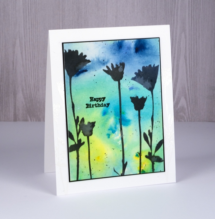
I cut a black mat to be a very narrow frame around the panel and added a black sentiment from the Darkroom Door Happy Birthday set.
Supplies
Stamps: happy birthday
Stencil: wildflowers
Paint: brusho paints sunburst lemon, leaf green, ost blue brusho
Ink: versafine onyx black, black soot distress oxide
Paper: hot pressed watercolour, solar white, epic black
Also: clear embossing powder
Circle of hearts
Posted: January 25, 2018 Filed under: hearts in circle | Tags: Brusho, Finetec artist mica watercolour paint, Penny Black creative dies 4 Comments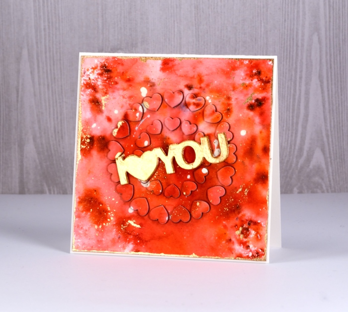
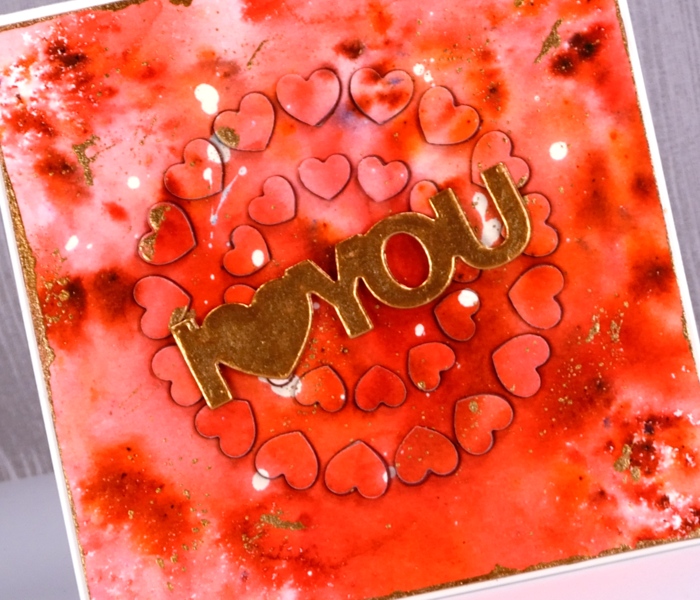
For today’s rather bold card I started, as I often do with a masking fluid splattered panel. I continued, as I often do by sprinkling brusho powder over the panel then spritzing with water to activate it. I do tend to be a ‘chap of one idea’ at times don’t I? (Can you place that quote from one of my favourite book series?) This time the brusho was rose red and terracotta. Once dry, I splattered gold finetec paint over the panel and let it dry. I removed the masking fluid, trimmed the panel to a square then painted the edges with gold paint.
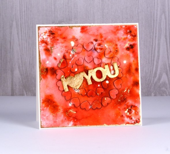
That was the easy part; after that the fiddliness factor rose considerably. I attached adhesive sheet to the back of the panel and die cut ‘hearts in circle’ from the centre of the panel and from a red adhesive backed foam sheet. I carefully saved the little hearts in formation on a piece of ‘press n seal’. I peeled the backing off the watercolour panel and attached it to the card front. Next I pressed the die cut adhesive backed foam hearts into each space in the die cut panel. Finally I peeled the backing off the die cut watercolour hearts and attached them on top of foam hearts. This was a little like completing a jigsaw puzzle.
Supplies



In my heart
Posted: January 24, 2018 Filed under: Tree heart, Triple Banner | Tags: Kuretake Gansai Tambi watercolour paints, Penny Black creative dies, Penny Black stamps, WOW embossing powders 4 Comments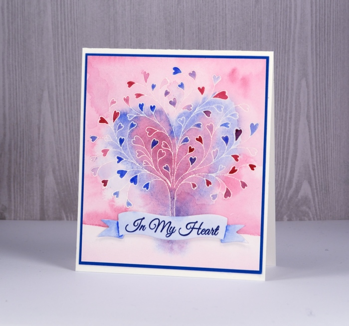
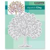
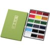
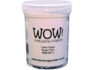
This stamp is called ‘tree-heart’ but I always think of it as a family tree. After all what better to have on a family tree but a whole bunch of hearts? I stamped the tree in versamark and embossed with clear powder on hot pressed watercolor paper. Next I painted water over the top section of panel and added pink and blue watercolour paints. Keeping it loose I painted a heart shape over tree with both pink and blue. I filled in the heart leaves with more intense pink and blue paint then painted diluted pink over base area.
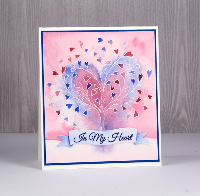
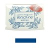
I grabbed a scrap of watercolour paper, painted diluted blue over it and stamped a sentiment from ‘happy hearts’ in versafine majestic blue ink. I die cut a banner to contain the sentiment and painted shadows on the ends of banner with blue paint.
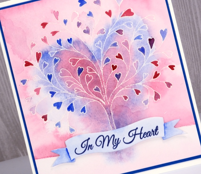
To finish I attached the banner to the tree panel with very low profile adhesive dots and matted the panel in blue cardstock before attaching to a white cardbase.
Supplies


Brusho Rose
Posted: January 23, 2018 Filed under: Rose | Tags: Brusho, Fabriano Watercolour Paper, Penny Black creative dies 12 Comments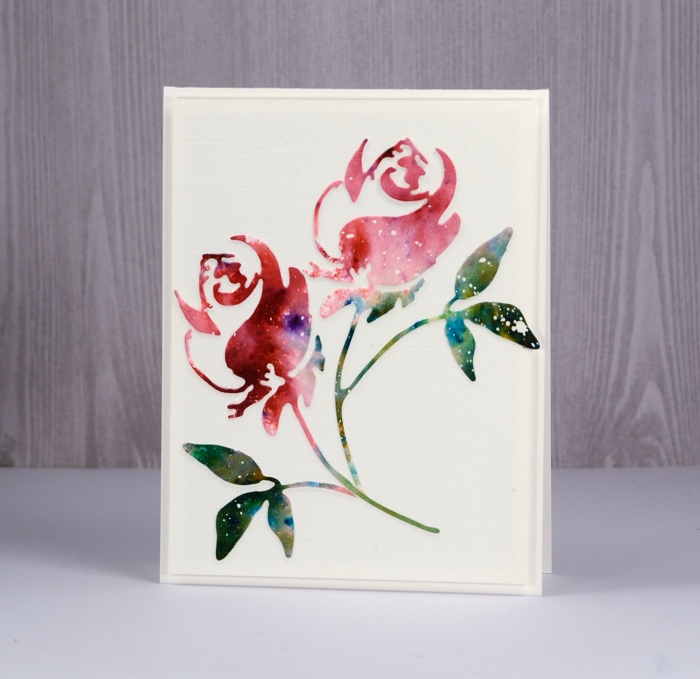
Ah, brusho, how I love thee! My cards on the Penny Black blog and here on my blog this week are all ‘love themed’ so it shouldn’t matter that it’s a paint that I’m in love with, should it? Brusho paint powders do such magical things I never tire of putting them to use.
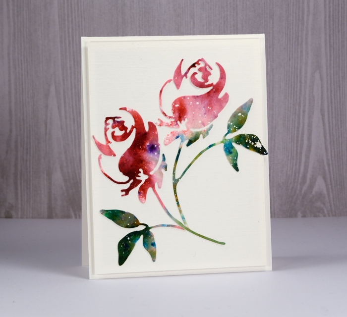
To create this simple card I started with a piece of hot pressed watercolour paper already splattered with masking fluid. I sprinkled rose red brusho on one end of the panel and a mix of leaf green and olive green brusho over the other end. I spritzed with water to activate the paint and added more water and moved the paint around to create a varied coverage. Once it was completely dry I die cut a couple of roses using the Penny Black ‘rose’ die. I kept one die-cut complete and trimmed the rose and leaves off the other to arrange separately on a panel of linen textured cardstock.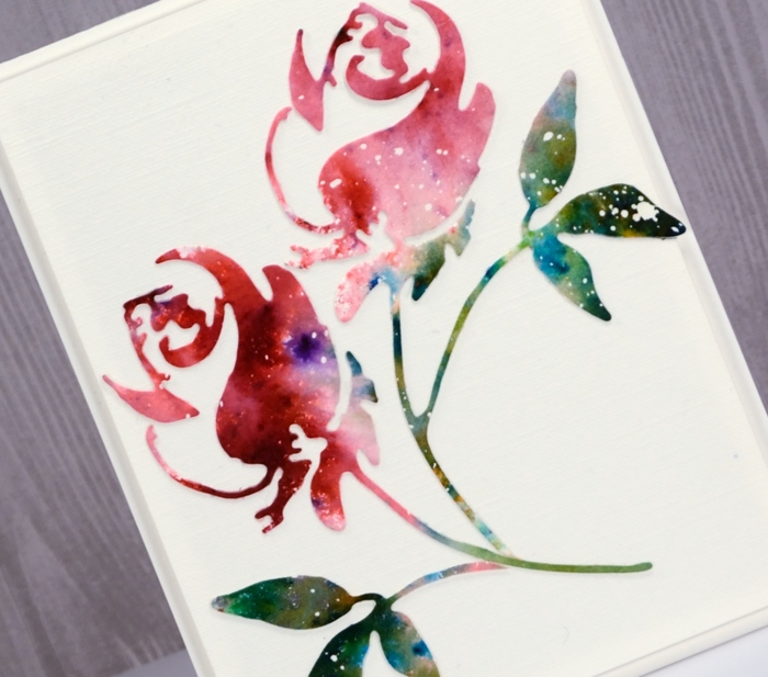
I popped up the panel on a natural white card base and left it sentiment free to keep my options open.
Supplies

Shimmer heart
Posted: January 22, 2018 Filed under: Sweetheart | Tags: Finetec artist mica watercolour paint, Penny Black stamps 16 Comments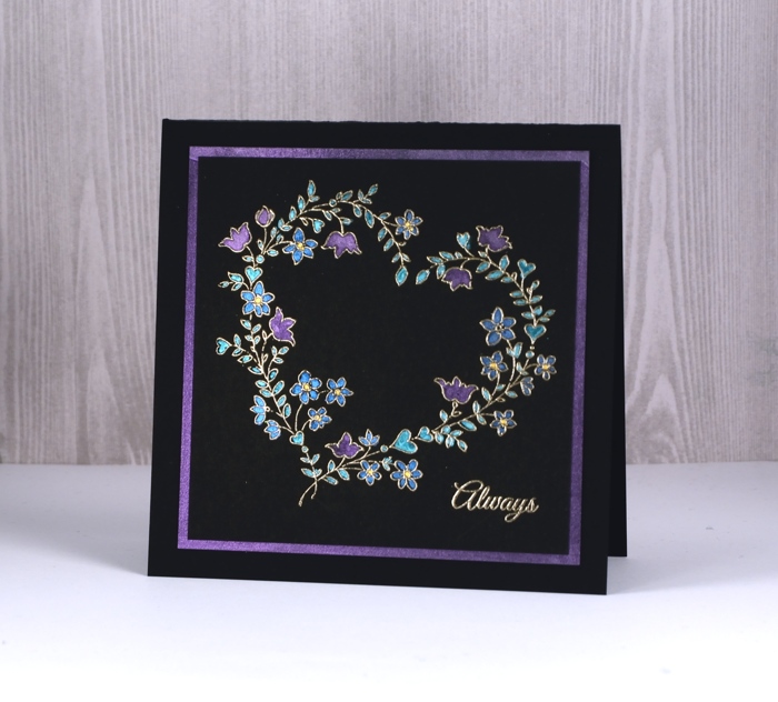
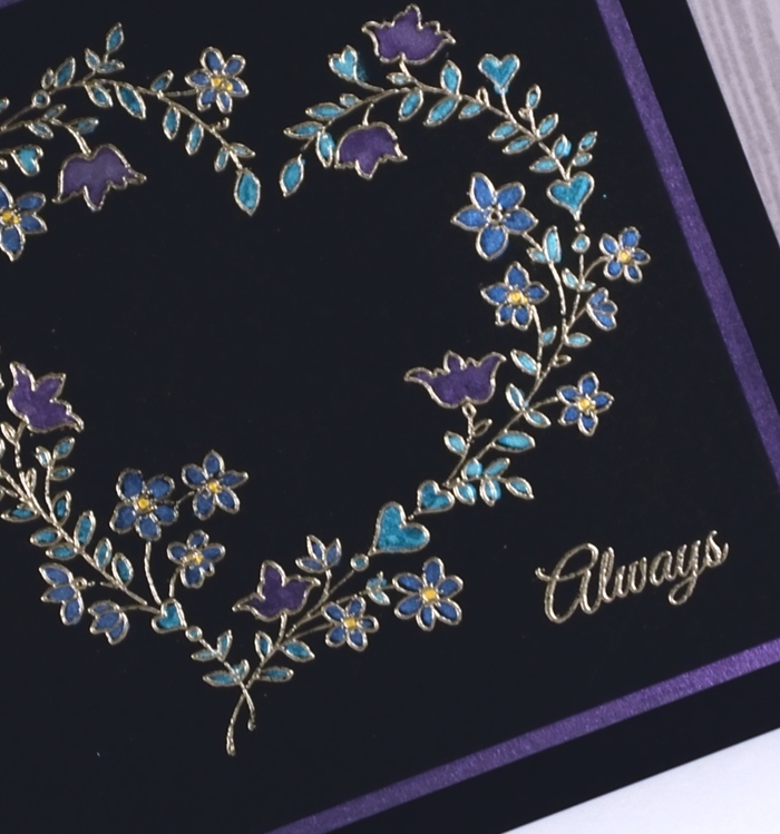
I don’t often stamp on directly on black but maybe I should more often, the effect is quite striking. I stamped the ‘sweetheart’ stamp and a sentiment in versamark on neenah epic black cardstock and embossed them in platinum embossing powder. I then used a small watercolour brush to fill all the hearts and flowers with finetec pearlescent paint. The finetec paints are watercolour so I added a drop of water to the colour and mixed it in the palette before painting.
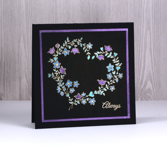
The effect is very shimmery, more so than is apparent in the photos. I wanted the same colour and amount of shimmer on the mat to frame the panel so ended up painting a border of pearlescent purple on a square of black cardstock to frame my panel before attaching both to a black card base.
Supplies

Another flower garden
Posted: January 20, 2018 Filed under: Flower garden | Tags: Darkroom Door stamps, sakura Koi watercolor brush pens, WOW embossing powders 10 Comments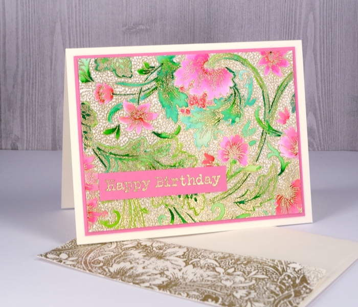
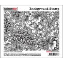
The ‘flower garden’ stamp from Darkroom Door performed so well with the random application of colorburst paint I tried it with a more controlled colouring method. I embossed this panel in gold then used Koi colouring brush pens. I decided to colour only the leaves and flowers and leave the tiny circle pattern filler uncoloured. Adding colour to gold embossing like this reminds me very much of Cloisonné which I saw on little trinkets as well as substantial, beautiful vases in China. I used two greens, a pink and a red to colour the design and kept blending with water to create soft gradation of colour.
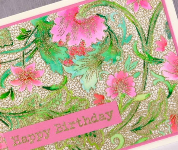
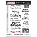
I matted the panel in pink and embossed a sentiment from the Darkroom Door ‘happy birthday’ set which includes sixteen ‘happy birthdays’ in different fonts and sizes! You might have noticed with both the flower garden cards I managed to add a stamped envelope too. I’m trying to get into the habit of creating a matching envelope while I have all the supplies out rather than thinking about it later but being too lazy to do it…
Supplies
stamps: flower garden, happy birthday
Ink: versamark
Paper: hot pressed watercolour, neenah natural white, pink cardstock
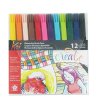
Markers: Koi coloring brush pens yellowgreen, green, red, pink
Also: WOW metallic rich gold embossing powder
Flower garden
Posted: January 18, 2018 Filed under: Flower garden | Tags: color burst, Darkroom Door stamps, WOW embossing powders 14 Comments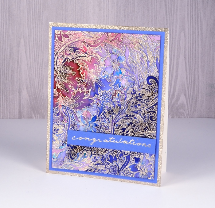
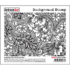
I was excited to see this stamp at Darkroom Door when I visited last year; I don’t remember ever noticing it before. It appealed at once and I’m happy to say this panel made me very happy. I embossed the large background stamp, ‘flower garden’ on hot pressed watercolour paper with platinum embossing powder (my current fave) then sprinkled two colours of colorburst paint powders lightly over the panel. A little goes a long way with colorburst and considering how much embossing there is I didn’t need much powder.
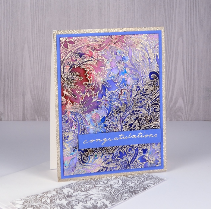
I spritzed the panel with water and watched it be magical. The two colours were indigo and alizarin crimson; the indigo gave me all the blues along with a tiny spot of green. The alizarin crimson gave me all the pinks and reds and the purples were a mix. I did do some blending with a paint brush just to make sure colour filled all the spaces. I diluted a few areas with water and pulled out some colour with a ‘thirsty brush’ to create some pale areas.

I tried a few different mat colours before picking blue then decided the white card base was a bit stark. To create a platinum border on the card base I ran my tape runner around the edges of the card front then embossed with the same platinum powder. I decided to write my own sentiment but the silver gel pen did not match the platinum embossing powder. I discovered that I could emboss the gel pen writing if I was really quick with the powder and didn’t let the ink dry for even a second. It might not surprise you to know today’s colours happen to be my favourites.
Supplies
stamps: flower garden
Ink: versamark
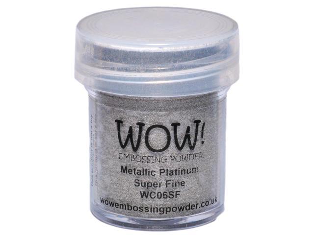
WOW metallic platinum superfine
Paint: Colorburst alizarin crimson & indigo
Paper: hot pressed watercolour, neenah solar white, blue cardstock
Vintage Rose
Posted: January 17, 2018 Filed under: Red blush, Textures | Tags: Brusho, Penny Black stamps, Ranger Distress inks, Tsukineko Versafine inks 8 Comments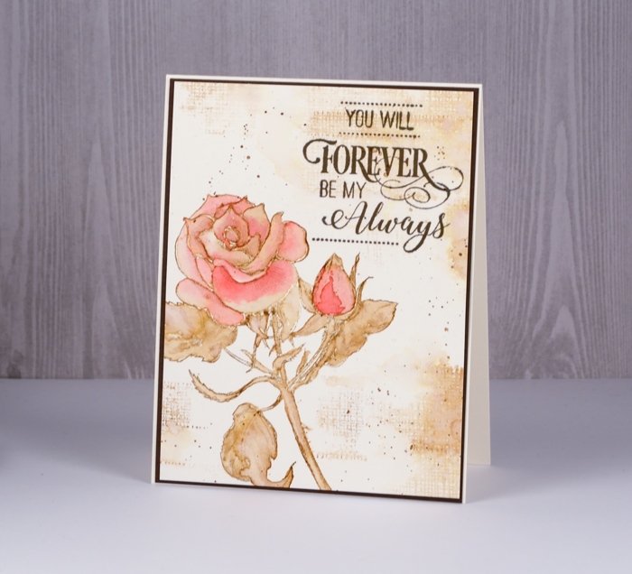
I am over on The Foiled Fox blog today sharing this vintage rose card. You have seen me work with this sort of colour scheme before; I enjoy painting with the ink from a stamped image. In this case the stamp is the Penny Black, ‘red blush’. Although I worked mainly in vintage photo distress ink, I did give it a red blush with some Ost. Red brusho watercolour paint. You can read my whole process over on the Foiled Fox blog. 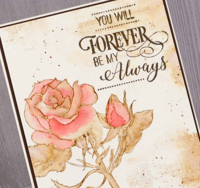
Supplies
Stamps: red blush, textures, forever & always
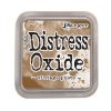
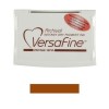
Inks: vintage photo distress ink, versafine vintage sepia
Paint: brusho
Paper: hot pressed watercolour paper, neenah natural white, brown cardstock
Ferns
Posted: January 16, 2018 Filed under: ferns, Leaves, Stencils | Tags: Darkroom Door stamps, Darkroom Door stencils, Ranger Distress inks, Tsukineko Stazon inks 4 Comments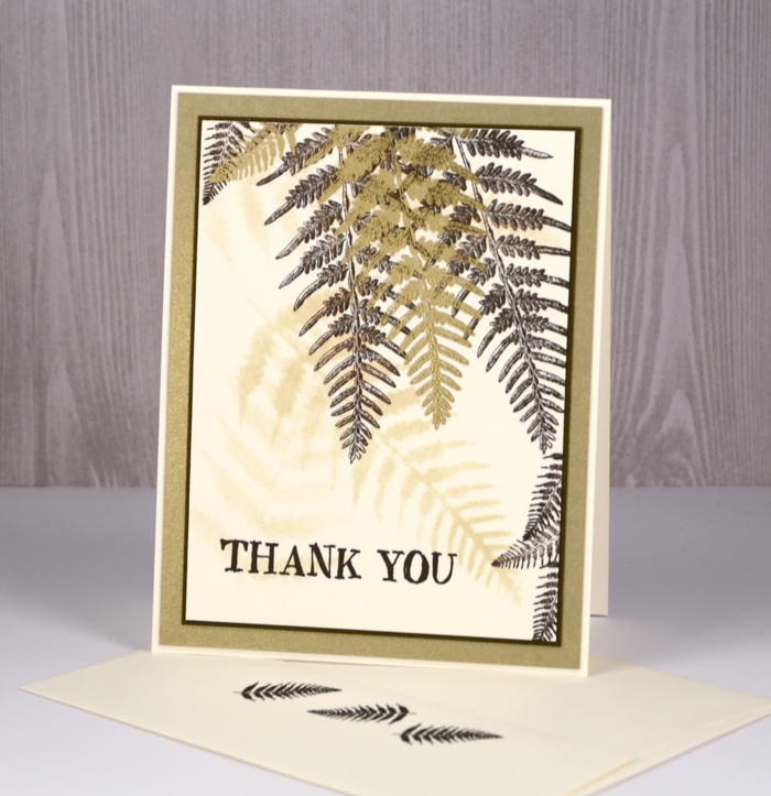
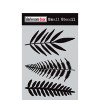
Darkroom Door has a wonderful range of stencils that co-ordinate with quite a few of their stamps. I used the ferns stencil to create a soft background for the fern stamps from the ‘leaves’ set. I used neenah natural white paper and sponged with the antique linen distress ink through the stencil. I did it three times to create a few soft background images.
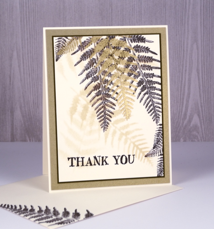
Over the top I stamped both the large and small ferns from the leaves set in stazon ganache ink. I have been pulling out the stazon inks whenever I’m working with the fine details of some of the Darkroom Door stamps. Initially I bought the stazon inks to pair up with my alcohol ink backgrounds but they are very good for fine detail stamping.
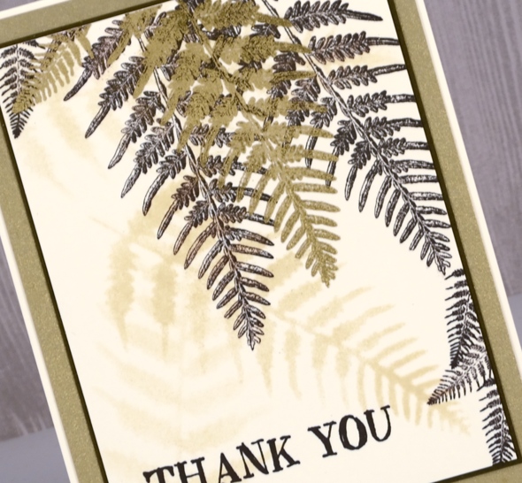
Once I had stamped quite a few ferns in ganache ink I stamped one large fern and one small in versamark then embossed them in gold. The sentiment and ferns on the envelope are stamped in stazon ganache. I added a narrow dark brown mat and a wider brushed gold mat also and attached it all to a natural white card base.
Supplies
Stamps: Leaves, Thank you

Stencil: ferns
Paper: neenah natural white, brushed gold, textured brown
Inks: antique linen distress, stazon ganache, versamark
Also: metallic gold rich embossing powder












