
Sunny Wishes
Posted: March 29, 2016 Filed under: Sunny Wishes | Tags: CAS, Penny Black stamps, Ranger Distress stains, Tsukineko Versafine inks 8 Comments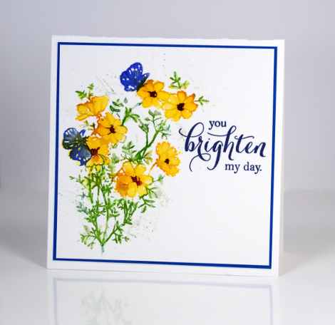
Sunny wishes is the name of the set I have featured today and also how I am feeling. Over the Easter weekend we experienced sun, rain, warmth and chilliness, but my wish is for sunshine!
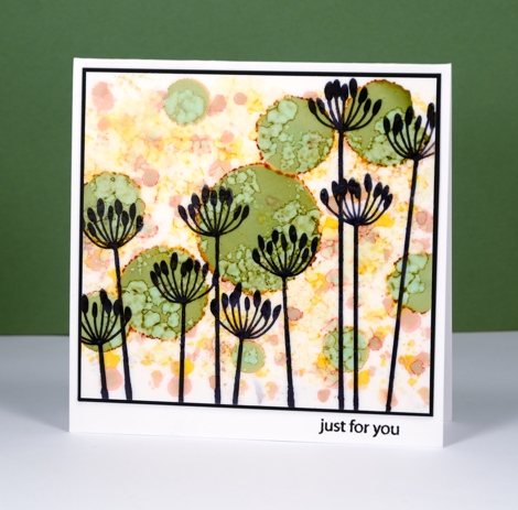
I have used the same stamp to create both cards today but have varied the technique and layout. For the card above I inked only the floral portion of the stamp with distress stains. With such a small image there was not much blending to do but I did fill the petals of the flowers by pulling stain from the outline and then added the darker centre with stain on a brush. To finish I added some green splatter and the coordinating sentiment and mat.
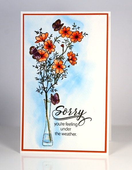
In the card above you can see the full image stamped in versafine onyx black. I painted blue around the image and in the vase with Dr Ph Martins Hydrus Watercolor Pthalo Blue and let it dry. I painted the flowers, butterflies and foliage with distress stain but you could easily use distress markers directly on the image and then blend the colour with a damp brush. To finish I once again added a sentiment and a coordinating mat.
Supplies:
Stamps: Sunny Wishes, Special thoughts (PB)
Inks: Versafine Onyx black & Majestic Blue (Tsukineko), Mowed Lawn, Vintage photo, Mustard seed, Dried Marigold, Barn Door, Forest Moss, Seedless Preserves, Blueprint Sketch, Aged Mahogany distress Stains (Ranger)
Paint: Dr Ph Martins Hydrus Watercolor Pthalo Blue
Cardstock: Fabriano 100% cotton cold pressed watercolour paper, blue cardstock, orange cardstock
Iris Shimmer
Posted: March 23, 2016 Filed under: Color Burst, Pure Iris | Tags: color burst, Fabriano Watercolour Paper, Penny Black stamps 19 Comments
I am having all sorts of fun with brushstroke stamps at present while teaching my March class. Not only have I been experimenting with all my floral brushstroke stamps and a range of mediums, I have been inspired by the creativity of the class members also.
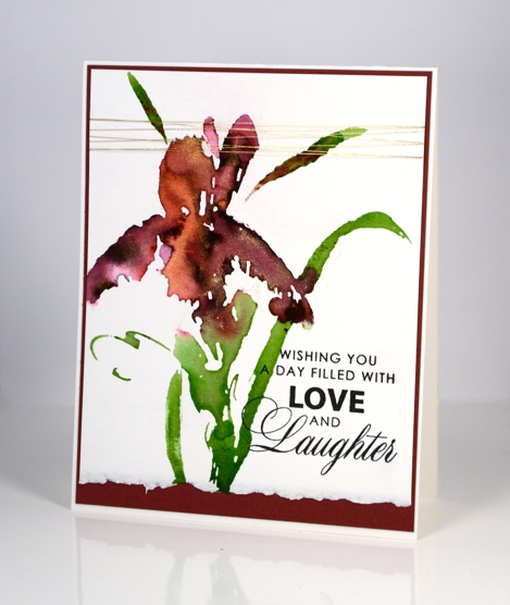
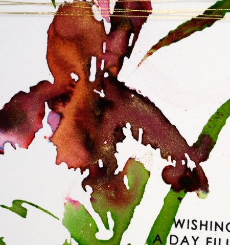
In my most recent class someone created a beautiful burgandy iris with the “pure iris” stamp and some merlot colorburst powder. Her petals could not have looked more life like! I tried the combo at home and added some pearl-ex spray and some yellow gold liquid metal. My camera did catch some shimmer in the photos so you can imagine how much there is in real life. I took a little video of it shimmering in the sunlight and posted it on instagram.
Supplies:
Stamps: Pure Iris, Special Wishes (PB)
Mediums: Colorburst powders, Liquid Metal (Ken Oliver) Versafine Onyx Black ink (Tsukineko)
Cardstock: Hot pressed Fabriano watercolour paper, Burgandy cardstock
Also: gold metallic thread
CAS Mix up Challenge
Posted: March 18, 2016 Filed under: CAS, Color Burst, Dies, Love Art | Tags: CAS, color burst, Penny Black creative dies, Penny Black stamps 11 Comments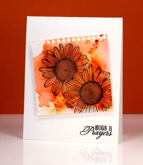
There is a new challenge on the block and it is definitely worth a look. It has been dreamed up by the very talented, Bonnie Klass and Loll Thompson and it’s called the CAS Mix up Challenge.
In their words:
Is CAS your style?? Do you love the look of clean and simple designs with lots of open space?? And have you seen all those fabulous mixed media techniques and products popping up all over and want to give them a try?? Then this is the challenge for you!
- stamping – no problem
- watercolour – absolutely
- my choice – a die cut
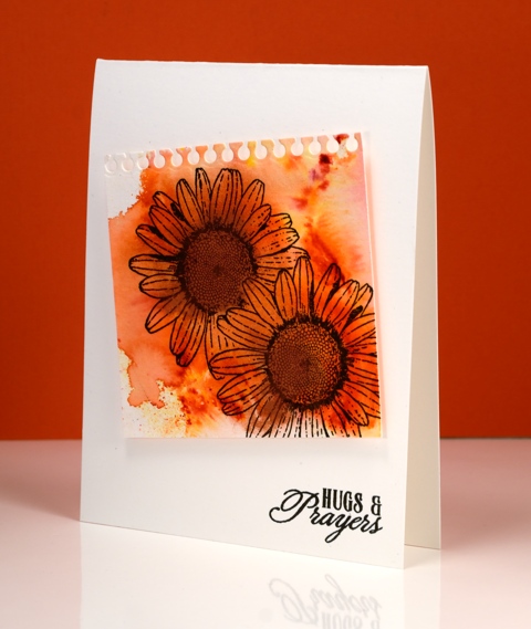
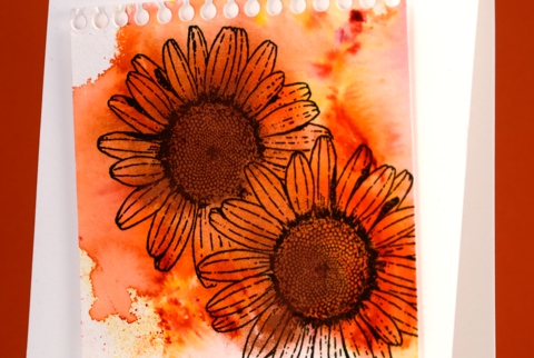
I splashed some water on my watercolour paper then added some Tangerine colourburst powder and some Copper liquid metal. I let the colour move and blend and tilted it to almost fill the paper then let it dry. I had to do a little fussy cutting to mask one daisy before I stamped the other but I seemed to have survived the ordeal. I used the notebook die from the ‘pocket full’ set to cut the top of the panel then popped it up on the card base before adding a sentiment. I tried to do the artistic-messy-thread-stuck-behind-the-panel trick but did not succeed. Maybe it was just as well because the challenge specified three elements not four!
Pop over to the challenge and check out the entries; it is a feast of inspiration.
Supplies:
Stamps: Love Art, Soar (PB)
Die: A Pocket full (PB)
Mediums: Colorburst powders, Liquid Metal (Ken Oliver) Versafine Onyx Black ink (Tsukineko)
Cardstock: Cold pressed Fabriano watercolour paper
Happy
Posted: March 17, 2016 Filed under: Alcohol Ink, CAS | Tags: CAS, Penny Black stamps, Ranger Alcohol Ink 15 Comments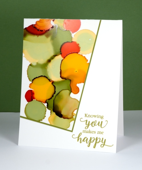
This new sentiment has appeared on a few of my cards already and will likely continue to do so. It is such a nice message and one I should send more often. This is one of my first alcohol ink experiments. I was just playing with the inks and ended up with an odd shape which did not immediately inspire me until I remembered this layout which is no doubt familiar to you; it is always popping up around the interwebs. I have been wanting to use if ever since I first saw it. I don’t know who first came up with the clever offset panel but I hope they feel proud whenever they see it on a card!
The inks I used were willow, pesto, poppyfield and honeycomb along with the blending fluid which lightened some of the colours. You can see both the pale and dark auras which appear around some of the inks. I am still using yupo paper for my creating, mainly because that is what I have and it works beautifully. I will get some glossy and photo paper to try out at some point. I have tried some doodling with my micron pens but nothing share-worthy yet.
Supplies:
Stamps: Sentiment Collection(PB)
Inks: Versafine Spanish Moss (Tsukineko)
Alcohol Ink: willow, pesto, poppyfield and honeycomb, alcohol blending solution (Ranger)
Paper: Yupo, Neenah Avon Brilliant White 110lb cardstock, green cardstock
Let Green March In!
Posted: March 14, 2016 Filed under: CAS, Nature's Paintbrushes, One-Layer Simplicity challenge | Tags: color burst, One-Layer cards, Penny Black stamps 11 Comments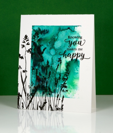
The One Layer Simplicity challenge is hosted by our very artistic team member Karen Dunbrook this month and she has challenged us to use green and one neutral tone on our one layer cards. I have a few of the new liquid metals from Ken Oliver so I thought I would try out the Verdi Gris along with some green colour burst powder.
I taped a wide margin on my watercolour paper card base, sprinkled green powder over the exposed area and spritzed with water. Once the colour was moving I added some of the verdi gris liquid metal mixed with some water. You cannot see the shimmer in my photo but it is pretty in real life. Once the panel had dried a little I splattered some water droplets which lightened the colour in a few spots. To finish it off I added the large ‘Nature’s Paintbrushes’ stamp and a sentiment in black. Making a one layer watercolour card can result in a buckled card base but ironing it fixes the problem and dries it at the same time if you happen to be a little impatient.
If you haven’t checked out this month’s challenge take a look and get inspired. It is fun to see all the different greens already featured in the submissions received.
Supplies:
Stamps: Nature’s Paintbrushes, Sentiment Collection(PB)
Mediums: Colorburst powders, Liquid Metal (Ken Oliver) Versafine Onyx Black ink (Tsukineko)
Cardstock: Cold pressed Fabriano watercolour paper
Well Done
Posted: March 10, 2016 Filed under: Alcohol Ink | Tags: Penny Black creative dies, Ranger Alcohol Ink 9 Comments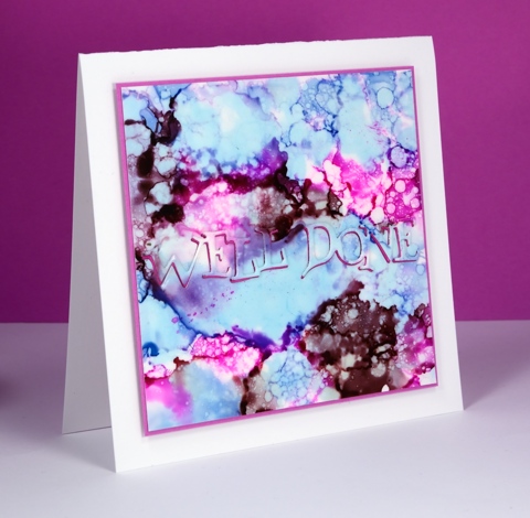
I am flitting back and forth between poppies and alcohol inks at present; I hope you don’t mind. Jane Clempson is continuing to create inspiring alcohol ink projects over on her blog so I have a list of techniques yet to try.
This one started out the same way many of my panels have with me dropping three colours randomly over the whole surface of the yupo paper. Once the colours settled and stopped jostling each other I started dropping blending solution here, there and everywhere. It made some pretty patterns but nothing I hadn’t tried before so I switched to splattering blending fluid over the panel with an old paintbrush. The droplets were smaller and more numerous and achieved the bubbly look you see here.
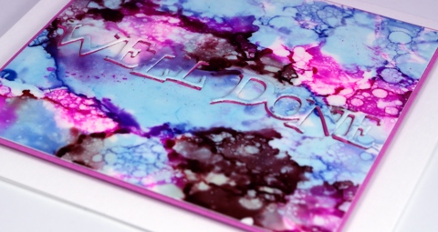
I was inspired to position my sentiment front and centre after seeing this card by Jane. I die cut the sentiment from both the patterned panel and a piece of pink fun foam (both with stick-it adhesive on the back) so I could position the fun foam in the space left by the die cut and then the inked die cut back on top of the fun foam. Looks simple described in print but in reality it drove me crazy working those fiddly little words into the fiddly little spaces with a fiddly little pair of tweezers! Cute effect though, don’t you think?
Supplies:
Dies: Well Done (PB)
Alcohol Ink: Stonewashed, Raspberry, Raisin & alcohol blending solution (Ranger)
Paper: Yupo, Neenah Solar White 110lb cardstock, Pink cardstock
Also: stick it adhesive, fun foam
Poppy Gems 3
Posted: March 9, 2016 Filed under: Poppy Gems | Tags: Penny Black stamps, Ranger Distress stains, Speedball elegant writer 10 Comments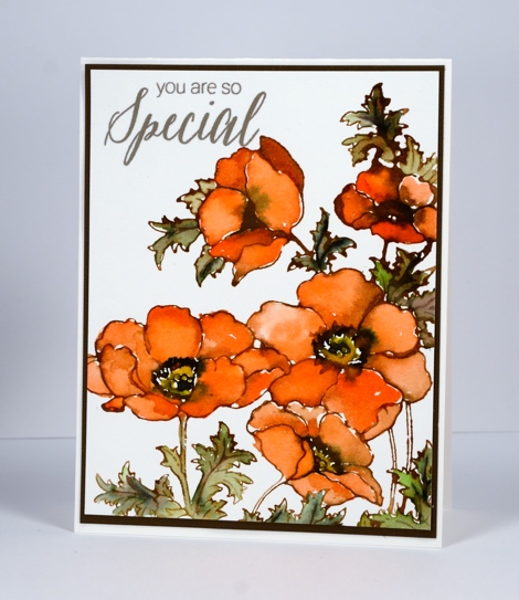
This is the third of my Poppy Gems cards; each design has been a little ‘cleaner’ than the last. The main difference on today’s card is the clean white background behind the orange blooms. I have stuck with the same layout each time which incorporates almost the whole large stamp. I think there is scope to mix it up for my next Poppy Gems offering.
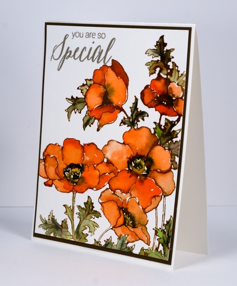
I stamped the whole image in Vintage photo distress ink which blends really easily with water or stains giving a slightly brown tone to all the added colour. I used the stains listed below to paint the flowers and leaves and added some elegant writer pen in the flower centres and on the veins of the leaves. Once again I added water to the elegant writer to get it to bleed and add some extra tones to the images.
Supplies:
Stamps: Poppy gems, Special Thoughts (PB)
Inks: Versafine Vintage Sepia (Tsukineko) Vintage photo distress ink, Ripe persimmon, Mowed Lawn, Mustard seed and Vintage photo distress stains (Ranger)
Cardstock: Fabriano 100% cotton hot pressed watercolour paper, brown cardstock
You Rock
Posted: March 8, 2016 Filed under: Alcohol Ink | Tags: Penny Black creative dies, Ranger Alcohol Ink 7 Comments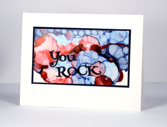
Oh these alcohol inks are so much fun! During an experimental session the other day I discovered I could blend over the top of a panel I did not like with blending solution which would not remove all the colour but would make it a soft blended background on which I could start a new design. The possibilities are seemingly endless.
This panel was done in two steps. I began by dropping two blues and a red on the yupo paper to create large circles. When the big circles had stopped mingling I used a Q-tip and some blending solution to add little circles over the top of it all. The finished effect reminds me of bokeh.
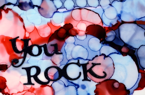
Although they might look black, the die cut sentiment and the mat are actually navy blue and the sentiment is embossed in clear powder to give it a glossy finish. I wouldn’t say I have settled on a favourite but I am liking these blues.
Supplies:
Dies: Well Done (PB)
Alcohol Ink: Denim, Stonewashed, Poppyfield, alcohol blending solution (Ranger)
Paper: Yupo, Neenah Solar White 110lb cardstock, Neenah patriot blue 100lb cardstock
Standing Ovation
Posted: March 7, 2016 Filed under: Alcohol Ink, Standing Ovation | Tags: Penny Black stamps, Ranger Alcohol Ink 13 Comments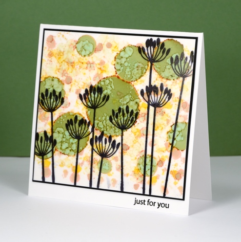
More alcohol ink fun to share today. The technique is similar to the one I shared last week but I mixed up the order a little on this one. You can see I have some pale colours in the background and bolder green circles in the foreground. I created the muted background first but putting a few drops of yellow and rust coloured alcohol ink on a felt applicator then dotting it all over the yupo panel. I then dropped the green ink to make larger circles; the green has a brown aura which matched nicely with my background. Once the green had stopped expanding I put some blending solution on a felt applicator and applied it all over the panel. The blending solution muted the background and created the cool blobby patterns on the green circles (you know, the ones that look like cells under a microscope!)
At this point I thought it looked a bit like a mass of flowers in a garden so I used the new ‘Standing Ovation’ stamp to add black silhouette images to the foreground. I matted in black and added a little sentiment on the white card base.
Supplies:
Stamps: Standing Ovation, Snippets (PB)
Inks: Archival jet black ink (Ranger) Versafine Onyx Black (Tsukineko)
Alcohol Ink: Rust, Willow, Honeycomb, alcohol blending solution (Ranger)
Paper: Yupo, Neenah Avon Brilliant White 110lb cardstock, Neenah epic black 100lb cardstock
Poppy Gems 2
Posted: March 4, 2016 Filed under: gift card pocket, Poppy Gems | Tags: Dr Ph Martin Hydrus watercolor paints, Faber-Castell Albrecht Durer Watercolour pencils, Penny Black creative dies, Penny Black stamps 20 Comments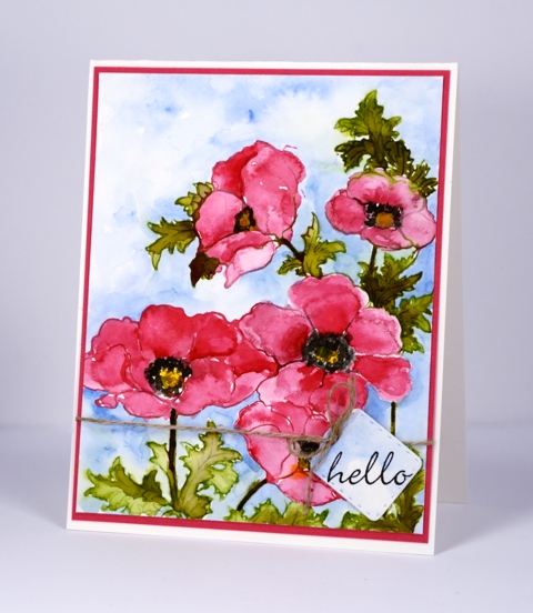
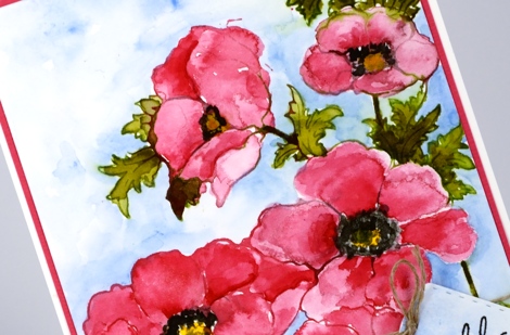
The Poppy Gems return today but in a more traditional colour scheme than last week’s card. I stamped with liquid watercolour paint on this panel, a technique not unlike what I often do with the distress stains. I used a paintbrush to apply the paint to the stamp then, after stamping, used water to blend the colour into the petals and leaves. In the centres and shadows on the flowers I layered colour to increase the intensity. The paints are Dr Ph Martin Hydrus watercolours which dry permanent. This feature was helpful when I decided to add a background weeks after completing the flowers. There was no chance I would make the pinks and greens bleed into the sky when I added blue with a watercolour pencil and waterbrush.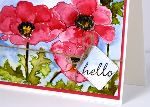
The little tag is a cut with the new die from Penny Black, ‘gift card pocket’ which comes with so much more than just the pocket die.
Thank you for dropping by today; I will be back soon with more alcohol ink adventure as well as another couple of cards made with the ‘Poppy Gems’ stamp. I hope you have a great weekend.
Supplies:
Stamps: Poppy gems, Perfect Pairing (PB)
Dies: gift card pocket (PB)
Inks: Versafine Onyx Black (Ranger)
Pencil: Albrecht Durer watercolour pencil sky blue 147(Faber-Castell)
Paints: Dr Ph Martin Hydrus Liquid Watercolours – Set 1
Cardstock: Fabriano 100% cotton hot pressed watercolour paper, pink cardstock
Also: linen thread


