
Shaded Canopy
Posted: May 2, 2016 Filed under: Shade Canopy, Stamped Landscapes | Tags: Fabriano Watercolour Paper, Penny Black stamps, Ranger Distress stains 3 Comments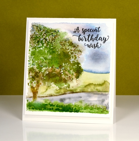
‘Shaded Canopy’ is another lovely (and versatile) stamp from the new ‘A Little Bit of Sunshine’ release. My scene today could be spring or summer depending on where you live. When I first moved to Canada I could not believe how bright green the summers were. Where I lived in Australia I was used to pale muted colours in summer because everything became very dry.
I used distress stains and inks for stamping and for painting the background leaving a space around the scene to frame it then popping up the panel on the same colour card base.
I am teaching a class this month in Ottawa where we will use this stamp to create four cards, one for each season.
Supplies:
Stamps: Shade Canopy, Words of Kindess(PB)
Inks: Forest Moss, Peeled Paint, Weathered Wood, Tumbled Glass, Mowed Lawn, Vintage Photo distress stains (Ranger)Versafine Onyx black (Tsukineko)
Cardstock: Fabriano 100% cotton hot pressed watercolour paper
One Layer Simplicity: Fruit Smoothie
Posted: May 1, 2016 Filed under: Elegance in Motion | Tags: Penny Black stamps, Ranger Distress inks 16 Comments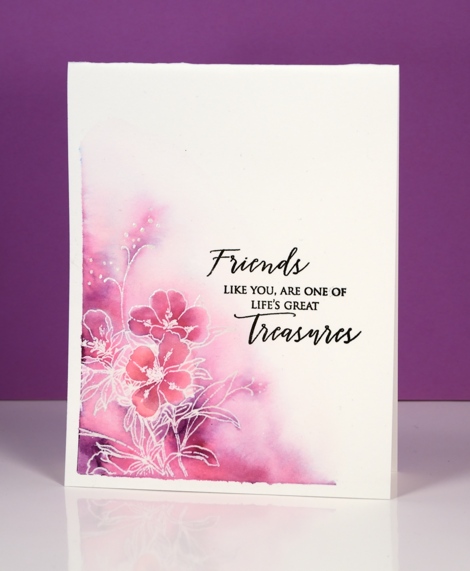
It is my turn to host the One Layer Simplicity challenge this month and I want you to make a fruit smoothie. Fruit smoothie inspired card that is, you can make an actual smoothie too, that is entirely up to you. There are two ways to go about this challenge, you can pull out your fruit stamps or your inks with fruity names. You know which inks they are: the Memento pear tart, the cantaloupe and the tangelo, the Distress picked raspberry and seedless preserves, the SU blackberry bliss and cherry cobbler or any one of the many inks named after fruit!
I chose inks with fruity names for my emboss resist card above. I taped two edges of watercolour paper with painter’s tape then stamped and embossed the new ‘elegance in motion’ stamp with clear powder. I then coloured with picked raspberry and seedless preserves distress markers and blended the ink with water. Once it was dry I removed the tape and ironed it. (one layer watercolour cards sometimes need to be ironed)
I have a sad and sorry fruit smoothie tale to share. I enjoy smoothies but rarely make them because my children do and often offer me some. One day I had all the right ingredients so I filled the jug and started blending with the stick blender. For some reason I turned away to do something else; the jug with stick blender in it did not tip over immediately, it stayed steady just to taunt me I guess, then it fell off the counter onto the floor. The berry coloured smoothie went far and wide. It was further up the walls than my height, it was on the kitchen windows and curtains, a cupboard door was open so it was all over the inside and contents of the cupboard and on the underneath of the drawer above that open cupboard. How on earth? I spent 1½ hours cleaning it up!
Don’t let my carelessness put you off entering our challenge; I’m sure you won’t make half the mess I did!
Supplies:
Stamps: Elegance in Motion, Treasured Sentiments (PB)
Inks: Picked raspberry, Seedless preserves (Ranger) Versamark (Tsukineko)
Cardstock: Hot pressed Fabriano watercolour paper
Also: clear embossing powder
Land and sea
Posted: April 30, 2016 Filed under: Alcohol Ink, Twirls | Tags: Penny Black stamps, Ranger Alcohol Ink, Yupo Paper 11 Comments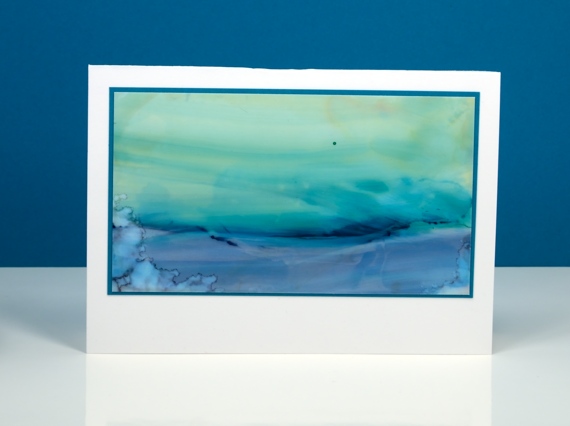
One of the techniques we been trying in my current alcohol inks class is the ‘landscape’ technique. I don’t think I could give you clear instruction on how I did these two scenes because it is still a lot of trial and error for me. The scene above involved some swiping the inks once they were on the yupo paper to get the horizontal sweeps of colour.
This one above features more lines of ink. When you lay down some ink then add some more beside it the second lot of ink pushes away first often creating a dark thick edge. These can end up looking like hills. Adding blending fluid into the ink you already have on your yupo washes it out somewhat creating paler areas. I am addicted to creating with alcohol inks right now so I will analyse my techniques a little more so my instructions might be clearer (and yes, I will try and make a video).
Believe it or not there is a video coming next week. I also noted the requests for videos on the roses and terraced lane cards. I’ll keep those in mind because I do appreciate my readers and their endless patience in waiting for video tutorials!
Supplies:
Stamps: Twirls (PB)
Alcohol Ink: stream, pool, stonewashed, currant, alcohol blending solution (Ranger) Jet Black archival ink
Paper: yupo paper, Neenah SolarWhite 110lb cardstock, Neenah Epic black 100lb cardstock
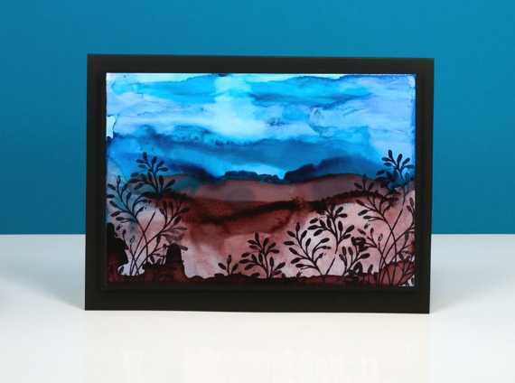
Terraced Lane
Posted: April 28, 2016 Filed under: Stamped Landscapes, Terraced Lane, Watercolour | Tags: Penny Black stamps, Ranger Distress stains, Speedball elegant writer, Tombow dual brush pens 13 Comments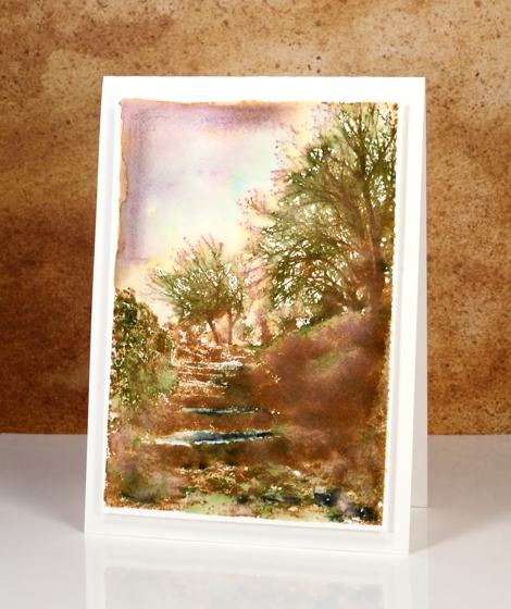
If you enjoy scenery stamps like I do there are a couple of beautiful designs in the new ‘A Little Bit of Sunshine’ release. This one, ‘Terraced Lane’ is a detailed stamp depicting both trees and steps. I will be trying this one in a range of colour schemes.
These two cards display two ways to approach such a detailed stamp. On the panel above I stamped first in vintage photo distress ink then added colour with a mowed lawn distress marker, the black elegant writer pen and a tiny bit of blue marker in the sky. I blended the green and black with water and a paintbrush to fill the scene with some colour then framed the top left corner free hand with vintage photo ink and some diluted black ink.
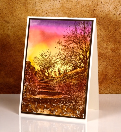
To create this sunset version I worked in the opposite order creating the background sunset with tombow dual brush pens first then once it was totally dry, I stamped the image in brown over the top. I finished the scene off by blending a few areas around the steps but left most of the stamping sharp.
Supplies:
Stamps: Terraced Lane (PB)
Inks: Mowed Lawn, Vintage Photo distress stains (Ranger) Elegant writer pen (Speedball) dark plum 679, rhodamine red 725, pink rose 703, light ochre 991 dual brush pens(Tombow)
Cardstock: Fabriano 100% cotton hot pressed watercolour paper, brown cardstock, Neenah natural white cardstock
Out to Sea
Posted: April 27, 2016 Filed under: Alcohol Ink, CAS, Out to sea | Tags: CAS, Penny Black creative dies, Ranger Alcohol Ink 15 Comments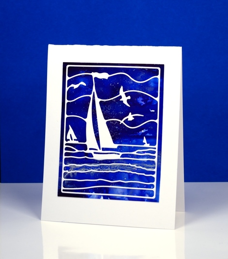
Is this not a stunning new die? I thought it was perfect to lay over my bright blue alcohol ink panel. Blue panels are the most challenging for me to photograph accurately. In real life there is more purple and the light blues are lighter. The speckled bits that conveniently look a bit like ocean spray or foam are silver accents. I created the panel by dropping some blue alcohol inks on yupo paper and blending. I added some silver alcohol ink and moved it around with extra blue ink and blending solution; the metallic inks don’t move much until another ink is added to them.
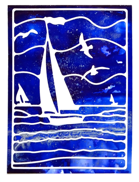
This die is also going to be beautiful over a watercoloured panel. If I am feeling patient and steady I might do the inlaid die technique but it really doesn’t need it; the overlay approach works just fine.
Supplies:
Die: Out to Sea(PB)
Alcohol Ink: denim, indigo, silver, alcohol blending solution (Ranger)
Paper: yupo paper, Neenah SolarWhite 110lb cardstock
Scented Beauty
Posted: April 26, 2016 Filed under: Scented Beauty | Tags: Penny Black stamps, Ranger Distress stains 12 Comments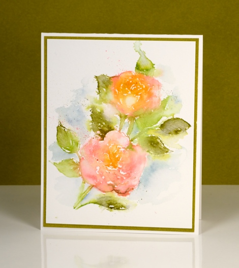
These pretty roses are part of the new release from Penny Black, A Little Bit of Sunshine’. I have played with them several times already trying different colour schemes and mediums. These soft pink and apricot roses were inked with distress stains, one of my favourite and most used techniques. I apply the stains directly to the stamp which means there is generally more liquid on the stamp than necessary but this is what creates the loose painterly style image. Once I have stamped the image I use water and a paintbrush to blend any areas that are too sharp and look out of place with the softer edges. The leaves were inked with two green stains and the background colour, also a stain, I painted after finishing the roses.
There are a couple more cards made with this stamp on the PB blog here along with details of how to win some stamps from the new release.
Supplies:
Stamps: Scented Beauty (PB)
Inks: Mowed Lawn, Dried Marigold, Forest Moss, Worn Lipstick, Weathered wood distress stains (Ranger)
Cardstock: Fabriano 100% cotton hot pressed watercolour paper, olive green cardstock
Irises and blue
Posted: April 24, 2016 Filed under: Alcohol Ink, CAS, Love Art | Tags: CAS, Penny Black stamps, Ranger Alcohol Ink 13 Comments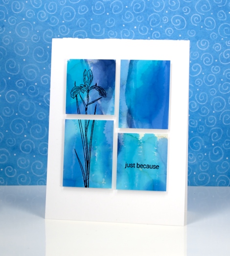
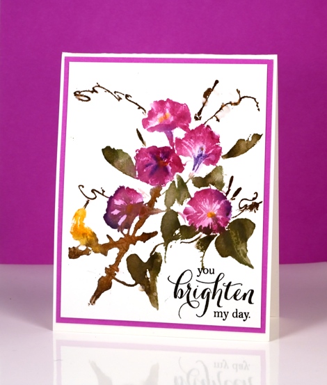
I am enjoying teaching a batch of Alcohol Ink classes at present and we have been having so much fun. The depth and impact of alcohol ink colour is quite something. I chose to use these two similar colour panels as background for iris stamps from the Love Art transparent set.
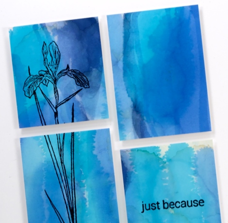
I blended a few blue alcohol inks on photo paper for these two panels. The circle pattern on the one below was achieved using a stencil. I dabbed through the stencil with blending solution to remove colour but also printed the stencil back onto the paper once it was covered in pale blue ink.
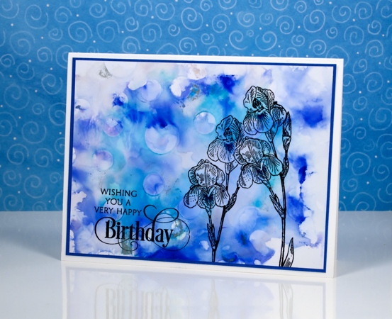
The sentiments and flowers are stamped in jet black archival ink.

I am just going to squeak this stencilled card into the second challenge at CAS Mix Up; there are twelve whole hours left to participate. The challenge this month is below; I used alcohol inks as my choice.

Supplies:
Stamps: Love Art, Special Thoughts, Snippets(PB)
Inks: Jet Black Archival (Ranger)
Alcohol Ink: pool, denim, indigo, alcohol blending solution (Ranger)
Paper: Kirkland photo paper, Neenah SolarWhite 110lb cardstock, Blue cardstock
Pop, Pop!
Posted: April 13, 2016 Filed under: Pop pop poppy | Tags: color burst, Faber-Castell Albrecht Durer Watercolour pencils, Penny Black stamps, Ranger Distress stains 16 Comments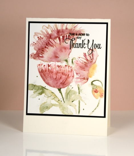
I am sharing some more experimentation with brushstroke stamps today. This one is called Pop, Pop, Poppy and you can see I didn’t really mix up the layout at all but the medium was different for all three cards. The top card was stamped in a pale dye ink then coloured with watercolour pencils.
The blue leafed version above was stamped with distress stains and the bright pops of colour below were achieved by dropping colorburst powder onto water-stamping.
The bright one above, although messy, ended up being my favourite. Which do you prefer?
Supplies:
Stamps: Pop, pop, poppy (PB)
Mediums: Dandelion Memento ink, Versafine onyx black (Tsukineko) Worn Lipstick, Chipped Sapphire, Weathered wood distress stains (Ranger) Colorburst powders (Ken Oliver)
Cardstock: Fabriano 100% cotton hot & cold pressed watercolour paper, Neenah Epic Black cardstock
Timely bookmarks
Posted: April 12, 2016 Filed under: Bejeweled, The Unfolding | Tags: Penny Black creative dies, Penny Black stamps, Ranger Distress stains 13 Comments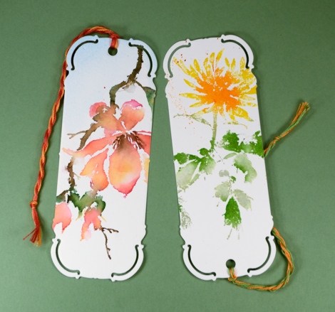
This week the design team at Penny Black are sharing some book mark designs cut using the elegant ‘bookmark’ die. I guess it’s no surprise that I decided to cut my bookmarks out of watercoloured panels, the orange and green one shows a portion of the ‘Bejeweled’ image.
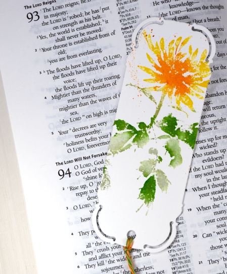
The pink and orange one below features ‘The Unfolding’ which just might be my favourite stamp from the last release. I used distress stains for both images, inking with the lighter stains first, then the darker ones over the top. I sometimes add a spritz of water if the stains were not so juicy it helps the colours blend softly into each other. Once I have stamped the image I do further blending on the paper with a paintbrush. And of course there is the small matter of splatter added at the end if desired.
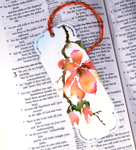
The die punches the little hole for the cord so I twisted some matching colours of embroidery floss and threaded them through. A book mark project is quiet timely actually as I have stepped up my reading over the past few months. I have a few books on the go right now and am enjoying some audio books also.
Have you read or listened to any good books lately? Do you read more than one at a time? Do you reread favourites? I just finished reading ‘The Invention of Wings’ by Sue Monk Kidd and ‘A Homemade Life’ by Molly Wizenburg. I’m also rereading the Mitford series by Jan Karon.
Supplies:
Stamps: The Unfolding, Bejeweled (PB)
Dies: Bookmark (PB)
Inks: Mowed Lawn, Bundled Sage, Vintage photo, Mustard seed, Spiced Marmalade, Worn Lipstick, Dried Marigold distress Stains (Ranger)
Paint: Phthalo blue Dr Ph. Martin Hydrus
Cardstock: Fabriano 100% cotton hot pressed watercolour paper
Also: Embroidery thread
Colour choices
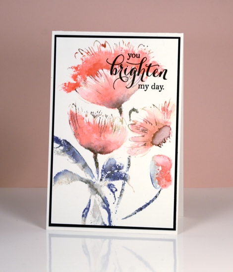
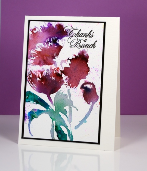
Posted: April 6, 2016 Filed under: Trumpet Song | Tags: Penny Black stamps, Tsukineko Memento inks 5 Comments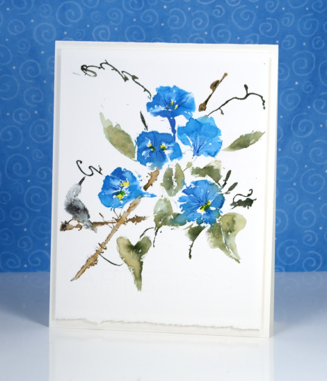
I have been stamping with the same group of stamps over the last few weeks, switching up the colour schemes and the techniques. It has been fun to see the way colour, style and technique can create a different mood. I used memento markers for both cards featured today and varied the technique only a little. The top card was done in one impression applying all the colours to the stamp before spritzing and stamping. I used a paint brush to blend after stamping on both images. On the card below I worked one colour at a time with the help of the MISTI and built up the colour gradually. There isn’t a lot of difference in the results but I think the top one is more delicate and light (not just in colour) and the one below bolder. I left the top one without a sentiment but can think it could be used for something celebratory just as easily as something more reflective.
This one was too bright to be a reflective card and I accentuated the purple with a mat so a ‘bright’ sentiment seemed a good match. I didn’t mat the top card but kept the deckled edge from the watercolour paper and popped the panel up on foam.
By the way Susan has a new challenge happening on One Layer Simplicity this month and the theme is from one of my all time favourite movies.
Supplies:
Stamps: Trumpet Song, Special Thoughts (PB)
Inks: Dandelion, Cantaloupe, Bahama Blue, Danube Blue, Pistachio, Northern Pine, Rich Cocoa, Espresso Truffle, Tuxedo Black, London Fog, Lilac Posies, Grape Jelly, Olive Grove Memento Markers, Versafine onyx black (Tsukineko)
Cardstock: Fabriano 100% cotton hot pressed watercolour paper, fuschia fantasies cardstock


