
Pop, Pop!
Posted: April 13, 2016 Filed under: Pop pop poppy | Tags: color burst, Faber-Castell Albrecht Durer Watercolour pencils, Penny Black stamps, Ranger Distress stains 16 Comments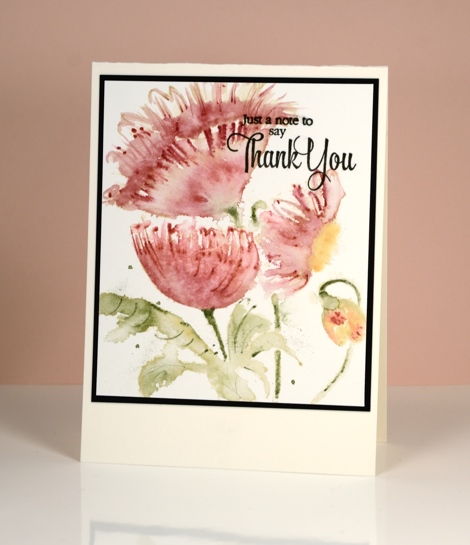
I am sharing some more experimentation with brushstroke stamps today. This one is called Pop, Pop, Poppy and you can see I didn’t really mix up the layout at all but the medium was different for all three cards. The top card was stamped in a pale dye ink then coloured with watercolour pencils.
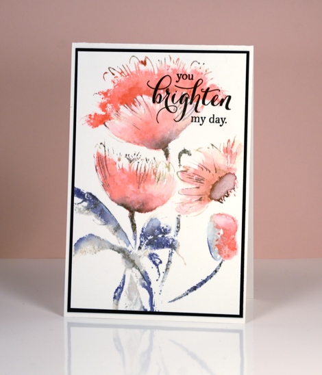
The blue leafed version above was stamped with distress stains and the bright pops of colour below were achieved by dropping colorburst powder onto water-stamping.
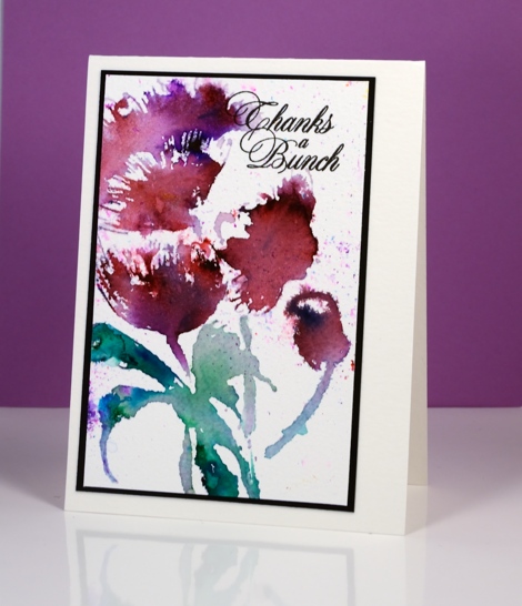
The bright one above, although messy, ended up being my favourite. Which do you prefer?
Supplies:
Stamps: Pop, pop, poppy (PB)
Mediums: Dandelion Memento ink, Versafine onyx black (Tsukineko) Worn Lipstick, Chipped Sapphire, Weathered wood distress stains (Ranger) Colorburst powders (Ken Oliver)
Cardstock: Fabriano 100% cotton hot & cold pressed watercolour paper, Neenah Epic Black cardstock


As if I could pick a favorite….
That said, the Colorburst is the one most inspiring to give it a try.
Thank you for sharing, Heather.
Beautiful cards.
Joanna
They are all beautiful Heather and vary in intensity of colour but I think I especially love the middle one using the distress stains, but the last one comes a close second with the vibrant colours of the colourburst powders. x
All so beautiful Love your cards. Edna
I’m drawn to number 1, no number 2. They are all beautiful great job.
In the middle is my favorite… make me drop on the floor !!!
It’s fun to see all the different techniques you used for the same design. My favorite is the first one. Love the soft colors!
I vote for Coloburst! Lovely Heather!
Take care and STAY POSITIVE!
I really appreciate seeing the contrast in the three coloring methods…I do believe the first one with the pencil enhancement is my favorite..it is so beautiful in its realism.
I like them all, of course, but the brusho is something I wouldn’t have thought to try!
Each is beautiful in its own way, but I like the Brusho card the best. Guess I might try that and even add pencil to that one too! Thanks for sharing the ideas – so much inspiration!
Paper Hugs,
Jan
I think I prefer the last one, too. Partly because the colour is more intense, but also the shapes are more “organic.”
All are gorgeous, bit my fav is the blue leafed flowers!
Wow, these are all very fine! I’m with you, though, the third one does end up being my favourite, too.
It is always amazing to see what you do with one stamp! They are each beautiful but so different…my favorite of these three is the last…it is similar to Iris Shimmer, my very favorite Colorburst flower! I have been practicing Colorburst backgrounds and liking them but have not felt successful with the florals. Did you apply the “metals” onto the rubber with a brush?…and then spritz with perfect pearls? Was that one stamping or multiple (MISTI) layers??? I am having a blast practicing, tho!…and loving the process. 🙂 Wishing you the very Best!
All so beautiful, love these brushstroke stamps, can’t pick a fav