
Tea time?
Posted: March 19, 2018 Filed under: Cup of tea | Tags: Darkroom Door stamps, Tombow dual brush pens, WOW embossing powders 3 Comments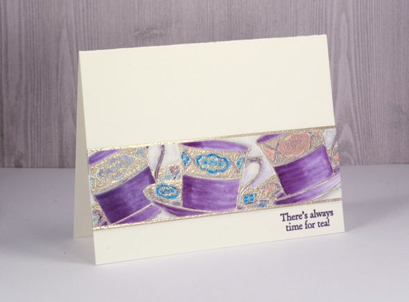
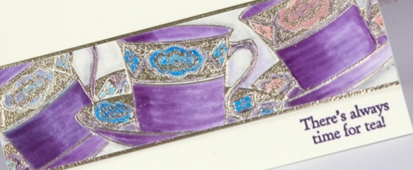
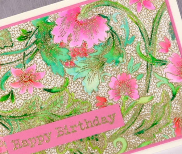
This card was practically complete weeks ago including a handlettered sentiment written with pen and ink. Unfortunately after leaving the ink to dry overnight I brushed my hand across the lettering only to see it smudge across my one layer card! I cut the strip of teacups out of the ruined card front and set them aside as I had other projects to complete. When I pulled them out again I decided to create an embossed mat to frame the teacups top and bottom then stuck the teacup panel on the embossed panel and then onto a new cardfront. I added a sentiment from the ‘cup of tea’ stamp set and finally finished my card.
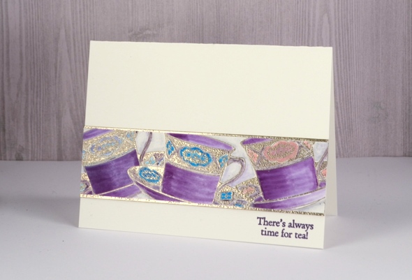
The teacups are stamped in versamark and embossed in platinum powder. After embossing one cup, I stamped and cut a tea cup mask, positioned it over the first cup then stamped a second and a third cup. I did all the colouring with tombow markers. When finishing the card a while later I tried my new versafine clair ‘monarch’ ink. I have always been happy with my versafine inks so I wondered what might be different about the new versafine clair inks. I have bought five colours to start with and so far I am very impressed with the sharp detailed stamping and no need for a second impression.
And by the way if you like a little sparkle, perhaps with embossing powder or something bolder, please check out the ‘Sparkle With Us’ challenge I’m hosting with The Foiled Fox. We’ve stretched it out for a wee bit longer so you still have a couple of days to join in.

Supplies
Stamps: Cup of tea

Inks: versamark, monarch versafine clair

Tombow markers: 679, 772, 515, 451, N75, N00


Paper: hot pressed watercolour paper

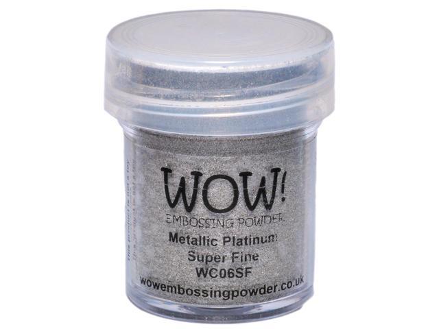
Also: WOW metallic platinum embossing powder

Sparkle With Us challenge
Posted: March 1, 2018 Filed under: Challenges, Gilding Flakes, Swirling Wings, The Foiled Fox, Triple Banner | Tags: Gilding, Penny Black creative dies, WOW embossing powders 4 Comments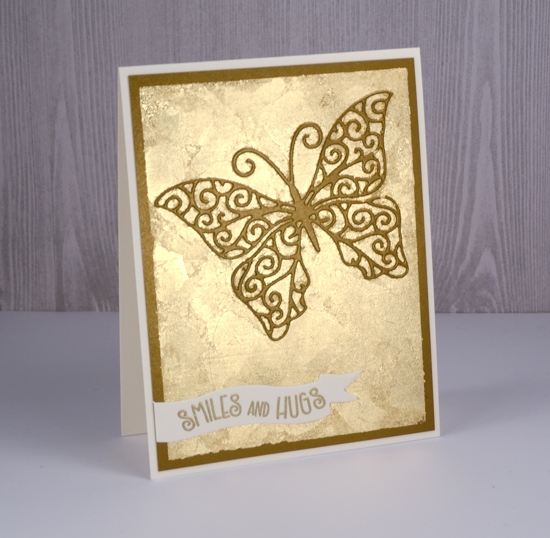
It’s time to put on your sparkly shoes, my friends, or at least your sparkly embellishments! I have teamed up with The Foiled Fox for a sparkly challenge that starts now.
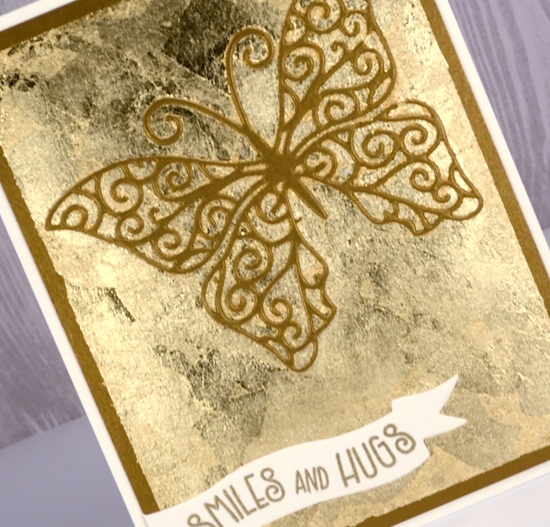
I might have got a little bit carried away in choosing sparkly elements for my card. There is not much that doesn’t sparkle on this one. You can follow my lead and pull out all the sparkle or you can choose to feature just a little sparkle. Either approach will qualify you to enter the ‘Sparkle With Us’ challenge.
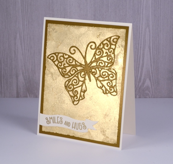
I used some lovely shimmer cardstock from The Foiled Fox and a whole bunch of gilding flakes. I know they can end up all over the place but I love the textured look of gilding flakes. Because there is some creasing and overlapping there is a lot of variation in the gold of the flakes. I also used gold embossing powder for my gold on gold on gold sparkly card. There are some step by step photos on the Foiled Fox blog so make sure you click on over.
I am excited to share some more sparkly inspiration over the next few weeks and hope to see your creations in the challenge gallery: you can get there by clicking the frog below.


Sparkly Supplies
Stamps: Penny Black banner sentiments set

Dies: swirling wings, triple banner die set


Cardstock: shimmer antique gold, neenah natural white,
![]()

Also: stick it adhesive, gold gilding flakes, gold embossing powder


Peacock Feathers
Posted: February 27, 2018 Filed under: Botanical Script, Brusho, Feathers | Tags: Brusho, Darkroom Door stamps, Koi coloring brush pens, Kuretake Zig clean color real brush markers, Tsukineko Versafine inks, WOW embossing powders 4 Comments
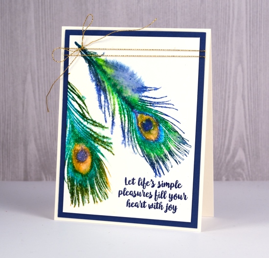
I decided to try a couple of methods for colouring a peacock feather stamp, my first experiment with the ‘Feathers’ set from Darkroom Door. I look forward to trying all of them eventually but the gorgeous colours of the peacock feather prompted me to pick that one first.The colouring on this first card was zig clean colour real brush markers directly on the stamp. I used the stamping platform so I could add one colour at a time. I blended the centre a little with a brush to get solid colour then spritzed the stamp with interference gold pearl-ex spray and stamped over the marker image. This gave everything a little shimmer and blended the colours into each other a bit. My pearl-ex spray is homemade; I add a small amount (about 1/8 tsp into a small spritzer filled with water). I stamped ‘thanks’ over the feather with majestic blue versafine then embossed with clear powder. The border panel looks black but is actually blue to co-ordinate with the centre of the feather and the sentiment.

My second colouring method was brusho. I spritzed the stamp with the same gold pearl-ex spray then stamped on hot pressed watercolour paper. I dropped a tiny amount of ultramarine brusho at the top of the feather, also a little turquoise then olive green down the shaft of the feather then stamped again to activate the brusho with pearl-ex spray. I embossed a birthday sentiment in gold and framed the panel in gold shimmer cardstock.

My final colouring method was with Sakura Koi colouring brush pens. I kept the stamp in the stamping platform so I could ink then stamp a colour at a time. The Sakura pens are very bright so I thought they were a good match for the gorgeous colours of peacock feathers.
Once again I stamped the colours one or two at a time so I could keep the centre of the feather distinct. Once I had stamped both feathers I spritzed the gold pearl-ex spray over the whole panel which ended up doing two things: the barbs softened to look a little ‘hairy’ and the droplets of spray created a pattern of watermarks over the ‘eye’ of the feather.
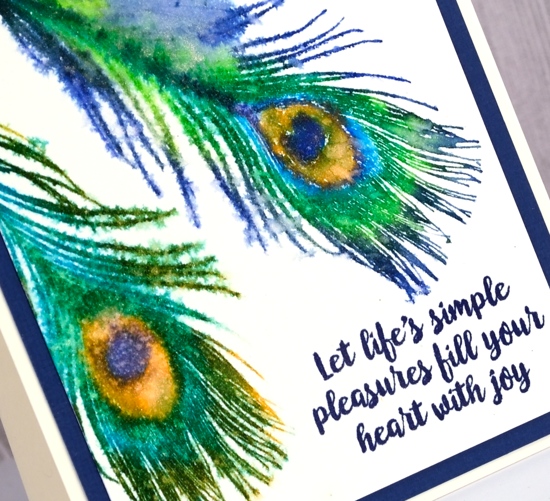
I ended up using majestic blue versafine ink again to add a sentiment from ‘botanical script’ set and cut a mat in the same colour. This card also has a slight shimmer to it so I added a gold cord for a finishing touch.
Supplies
Stamps: Happy Birthday, Thank you, Feathers, Botanical Script


Inks: Versamark, Majestic Blue Versafine


Markers: Zig clean color real brush markers, Koi Coloring Brush Pens


Paint: Brusho (ultramarine, turquoise, olive green)


Paper: hot pressed watercolour paper, blue cardstock, gold shimmer cardstock

Also: stamping platform, gold embossing powder, clear embossing powder, gold cord, pearl-ex interference gold spray

![]()
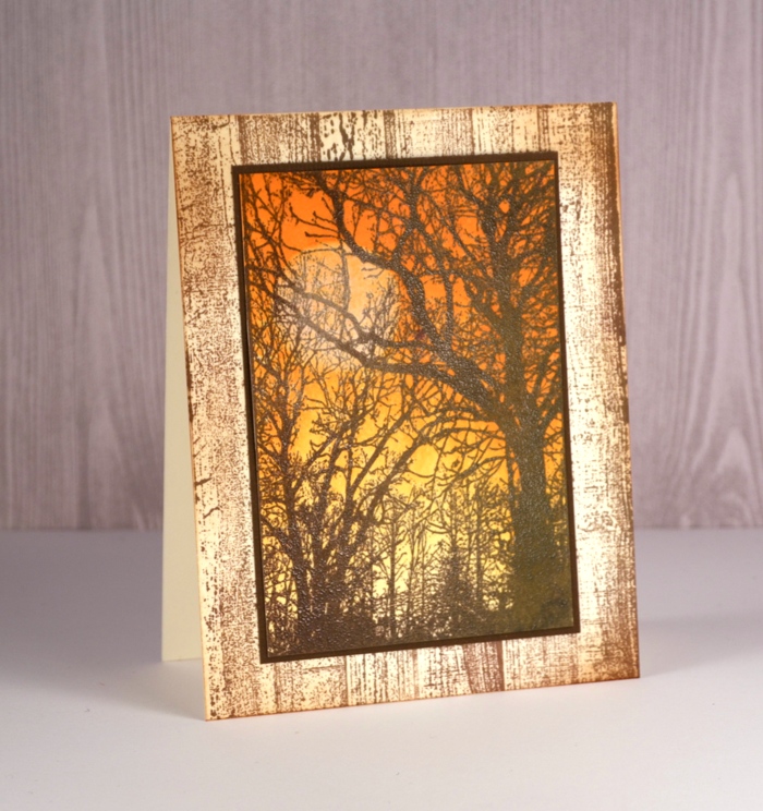
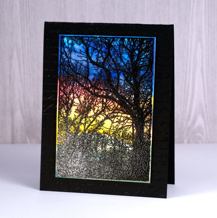
Woodlands
Posted: February 20, 2018 Filed under: French Script, Woodgrain, Woodlands | Tags: color burst, Darkroom Door stamps, Ranger Distress inks, Tsukineko Versafine inks, WOW embossing powders 4 Comments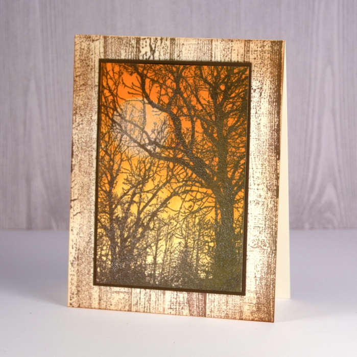
I had a lovely time with this new photo stamp from Darkroom Door. It’s called Woodlands and was perfect for creating an autumn scene, a winter scene and a sunset. Step by step instructions and a complete list of supplies are available on the Darkroom Door blog
The autumn scene involved brayering and distress inks.
The sunset features the bright hues of colorburst powders over embossing.
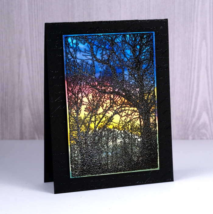
The winter scene below, which might be my favourite, was painted with distress inks.
I used a cool technique with a stamp positioner to get a layer of snow on the branches; if you’re interested pop over to Darkroom Door and check it out.
Floral medley
Posted: February 16, 2018 Filed under: floral medley | Tags: Faber-Castell Albrecht Durer Watercolour pencils, Penny Black stamps, WOW embossing powders 7 Comments
Sweet Spring has arrived, on the Penny Black blog that is! Sweet Spring is Penny Black’s brand new release and as you can imagine it’s full of flowers. I’ve been having fun using some of my favourite techniques to colour those flowers so let’s take a look at today’s blooms. This big stamp is called ‘flower medley’ and I’ve paired it with a new sentiment from the ‘grateful heart’ set. (list and links below)
I embossed the flower medley stamp on hot pressed watercolour paper with white powder then used my watercolour pencils to paint in and around all the leaves and flowers. The embossing keeps everything contained so I was able to pick up colour from my pencils with a waterbrush, paint a petal or leaf then drop in more of the same colour for some depth or a different colour to create some blended areas. Once all the flowers and leaves were coloured I painted around them all with a grey watercolour pencil.
Next I used a trick I occasionally employ to flatten my watercoloured panels. I turned on my minc, popped the panel inside a folded piece of computer paper and ran it through the minc on a low heat setting. It ironed my panel nicely but also melted and removed some of the embossing. If I had used an embossing powder with some colour or shine then I wouldn’t have wanted it to disappear but clear or white embossing just masks the white paper underneath so melting it off didn’t change my design at all. The panel ended up very smooth so I was able to overlap the floral design with a sentiment stamped in versafine smokey gray ink. I matted the panel with co-ordinating pink cardstock and then added it to a square cream card base.
Now click on over to the Penny Black blog for the full reveal and a giveaway!
Supplies
Stamps


Inks: versamark, versafine smokey gray

Pencils: Faber-Castell Albrecht Dürer watercolour pencils
Paper: hot pressed watercolour paper, pink cardstock
Also: opaque white embossing powder, minc foil applicator


In my heart
Posted: January 24, 2018 Filed under: Tree heart, Triple Banner | Tags: Kuretake Gansai Tambi watercolour paints, Penny Black creative dies, Penny Black stamps, WOW embossing powders 4 Comments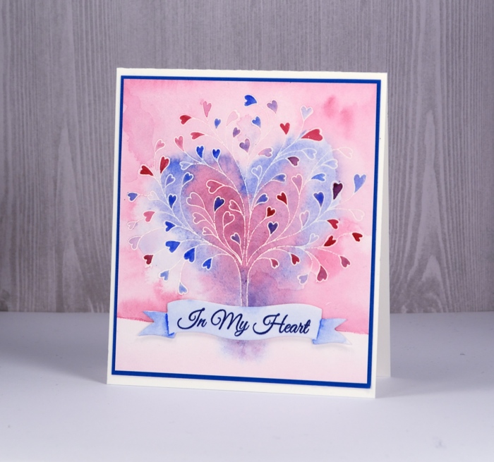
This stamp is called ‘tree-heart’ but I always think of it as a family tree. After all what better to have on a family tree but a whole bunch of hearts? I stamped the tree in versamark and embossed with clear powder on hot pressed watercolor paper. Next I painted water over the top section of panel and added pink and blue watercolour paints. Keeping it loose I painted a heart shape over tree with both pink and blue. I filled in the heart leaves with more intense pink and blue paint then painted diluted pink over base area.
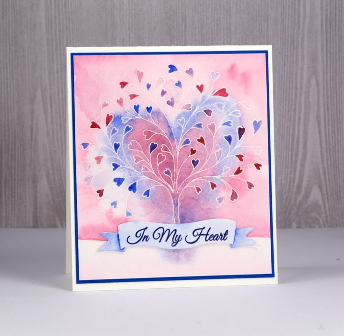
I grabbed a scrap of watercolour paper, painted diluted blue over it and stamped a sentiment from ‘happy hearts’ in versafine majestic blue ink. I die cut a banner to contain the sentiment and painted shadows on the ends of banner with blue paint.
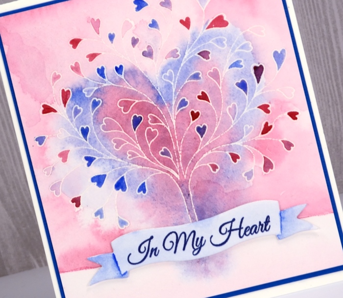
To finish I attached the banner to the tree panel with very low profile adhesive dots and matted the panel in blue cardstock before attaching to a white cardbase.
Supplies


Another flower garden
Posted: January 20, 2018 Filed under: Flower garden | Tags: Darkroom Door stamps, sakura Koi watercolor brush pens, WOW embossing powders 10 Comments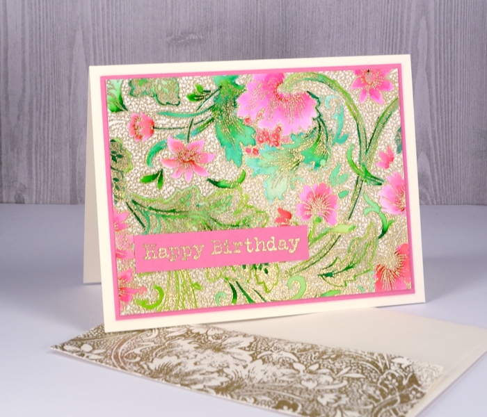
The ‘flower garden’ stamp from Darkroom Door performed so well with the random application of colorburst paint I tried it with a more controlled colouring method. I embossed this panel in gold then used Koi colouring brush pens. I decided to colour only the leaves and flowers and leave the tiny circle pattern filler uncoloured. Adding colour to gold embossing like this reminds me very much of Cloisonné which I saw on little trinkets as well as substantial, beautiful vases in China. I used two greens, a pink and a red to colour the design and kept blending with water to create soft gradation of colour.
I matted the panel in pink and embossed a sentiment from the Darkroom Door ‘happy birthday’ set which includes sixteen ‘happy birthdays’ in different fonts and sizes! You might have noticed with both the flower garden cards I managed to add a stamped envelope too. I’m trying to get into the habit of creating a matching envelope while I have all the supplies out rather than thinking about it later but being too lazy to do it…
Supplies
stamps: flower garden, happy birthday


Ink: versamark

Paper: hot pressed watercolour, neenah natural white, pink cardstock

Markers: Koi coloring brush pens yellowgreen, green, red, pink
Also: WOW metallic rich gold embossing powder
Flower garden
Posted: January 18, 2018 Filed under: Flower garden | Tags: color burst, Darkroom Door stamps, WOW embossing powders 14 Comments
I was excited to see this stamp at Darkroom Door when I visited last year; I don’t remember ever noticing it before. It appealed at once and I’m happy to say this panel made me very happy. I embossed the large background stamp, ‘flower garden’ on hot pressed watercolour paper with platinum embossing powder (my current fave) then sprinkled two colours of colorburst paint powders lightly over the panel. A little goes a long way with colorburst and considering how much embossing there is I didn’t need much powder.
I spritzed the panel with water and watched it be magical. The two colours were indigo and alizarin crimson; the indigo gave me all the blues along with a tiny spot of green. The alizarin crimson gave me all the pinks and reds and the purples were a mix. I did do some blending with a paint brush just to make sure colour filled all the spaces. I diluted a few areas with water and pulled out some colour with a ‘thirsty brush’ to create some pale areas.

I tried a few different mat colours before picking blue then decided the white card base was a bit stark. To create a platinum border on the card base I ran my tape runner around the edges of the card front then embossed with the same platinum powder. I decided to write my own sentiment but the silver gel pen did not match the platinum embossing powder. I discovered that I could emboss the gel pen writing if I was really quick with the powder and didn’t let the ink dry for even a second. It might not surprise you to know today’s colours happen to be my favourites.
Supplies
stamps: flower garden

Ink: versamark
WOW metallic platinum superfine
Paint: Colorburst alizarin crimson & indigo


Paper: hot pressed watercolour, neenah solar white, blue cardstock


A blessed gift
Posted: January 2, 2018 Filed under: Berry speckled | Tags: Penny Black stamps, Ranger Distress inks, Ranger Distress stains, WOW embossing powders 3 Comments
On the ninth day of Christmas I am returning to the blog. I’ve been enjoying some time with family and friends, relaxing, reading but I have not been creating cards! This panel started out as a practice for another project but I ended up turning it into a card anyway. I began with a panel of hot pressed watercolour paper with masking fluid splattered over it. I used a stamp positioner to stamp the different coloured elements of the berry branch in distress inks then embossed over the image with embossing powder. Unfortunately when you put embossing powder over masking fluid it sticks so the panel became very textured and very speckled with ‘snow’. I painted weathered wood distress stain over the background added a sentiment but was not able to remove much of the masking fluid as I had ‘glued’ it there with heat embossing!
As this was a practice panel I changed my order of operations when I made the next card, stamping and embossing first then splattering masking fluid second. I hope your 2018 is off to a great start. I have been busy keeping up with Dressember details which I will post more about later but I’ll just add a quick thank you here to all who have donated to this worthy cause; you have really encouraged me.
Supplies
Stamps: berry speckled, peace & love


Inks: versamark, crimson red versamark, weathered wood distress stain


Distress Markers: festive berries, gathered twig, barn door, forest moss


Paper: Neenah solar white cardstock, hot pressed watercolour paper, neenah red pepper cardstock
Also: stamping platform, masking fluid, WOW clear gloss superfine embossing powder


Berry bramble
Posted: December 15, 2017 Filed under: Berry bramble | Tags: Penny Black stamps, Ranger Distress inks, Ranger Distress stains, WOW embossing powders 12 Comments
Sometimes it is fun to rediscover and incorporate some techniques you haven’t used for a while. I love to splatter masking fluid over watercolour paper to create the look of falling snow but sometimes I don’t think about it in advance or just don’t want to wait long enough for the masking fluid to dry. Salt to the rescue! While salt does not create bright white dots it does make lighter areas and pretty patterns that look a little like snow or fairy lights.
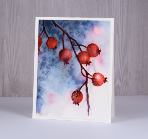
You can see some pale pink and brown pattern in the background of the scene; to create this I wet the whole panel, inked the stamp with festive berries and ground espresso distress markers and stamped it onto the damp paper. I dabbed at the inky impression immediately with a paper towel so I would have soft shapes that would not overpower the foreground image.After drying the panel completely I put it in my stamping platform for all the berry work. First I inked and stamped the whole stamp with festive berries distress ink.
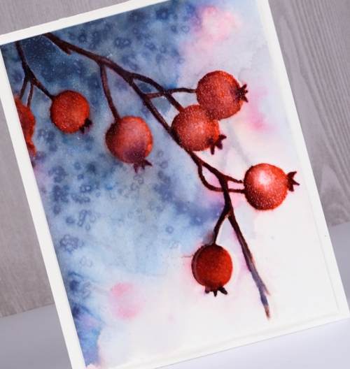
Next I switched to markers and added shading to the berries and darker colours to the twigs and calyx. (yes, of course I had to look that up!) I used barn door and aged mahogany to add depth and shadow to the berries. I used chipped sapphire and ground espresso to darken the stems and calyx. After I had added colour I used a small paint brush and water to blend the stamped colour. Once the panel dried I embossed the berries with versamark and clear powder which gave them a frosty, shiny look. The embossing made them waterproof so I was able to add weathered wood stain to the panel without diluting the berries. I kept the stain dark on the left and diluted it with water on the right then sprinkled salt to created the speckled effect. I decided not to add a sentiment yet as I think this one might be a winter birthday card not a Christmas card. I popped up the whole panel on some foam and added it to a natural white card base.
Supplies
Stamps: berry bramble

Inks: festive berries distress ink, versamark

Distress markers: barn door, chipped sapphire, aged mahogany, ground espresso


Distress stain: stormy sky

Hot pressed watercolour paper
Also: Tonic stamping platform, WOW clear gloss superfine embossing powder, salt


