
Ferns
Posted: July 20, 2017 Filed under: Alcohol Ink, CAS, Wilderness Vol.2 | Tags: Darkroom Door stamps, Ranger Alcohol Ink, Tsukineko Stazon inks, Tsukineko Versafine inks 5 Comments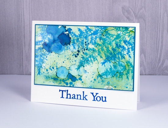
Here ends a week without internet at home! I think some internet free time is definitely a good thing but I’d rather it be planned than thrust upon me. One happy outcome is the stack of edited photos I have ready to slot into blog posts.
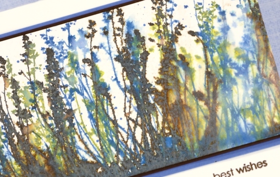
This one is an alcohol ink on yupo panel. The abstract panel has been sitting in my ‘pile of possibility’ for some time so I don’t remember which colours of ink I used. Just guessing though, I would say pool and juniper but I might be wrong about juniper. There’s a blue and a green for sure, possibly two blues. I used opaque yupo paper but it is still worthwhile to back it with white cardstock to keep the colours bright so I did that before matting it with teal.
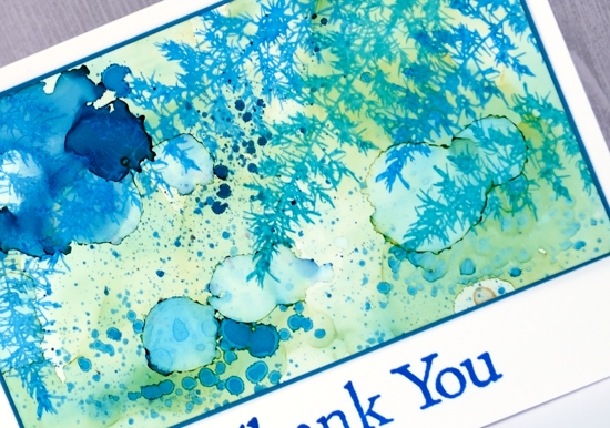
I stamped the fern from Darkroom Door’s Wilderness Vol 2 set. It is a lovely delicate image. I used stazon ink on the yupo and it spread ever so slightly but as you can see not enough to lose the fine detail of the stamp. At first I didn’t have a sentiment but the white space below the panel did look a bit empty so I added a simple thank you. Stamps and inks are linked below.
Supplies:
Stamps: wilderness vol 2, thank you (Darkroom Door)
Inks: pool & juniper alcohol inks (Ranger) blue Hawaii stazon, deep lagoon versafine (Tsukineko)
Papers: opaque yupo, neenah solar white cardstock, teal cardstock
Lustrous
Posted: July 4, 2017 Filed under: Lustrous | Tags: Penny Black stamps, Ranger Distress inks, Tsukineko Versafine inks 9 Comments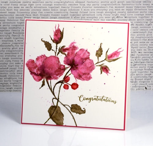
Thank you for your lovely feedback about yesterday’s flower lanterns. Today’s card features a different stamp from the Penny Black ‘Poetic’ release but a similar technique. Although I love working with distress stains, at times I go for the markers instead because I can apply colour to smaller sections with more accuracy. I used markers today beginning with a picked raspberry distress marker for the petals and buds and stamped on hot pressed watercolour paper using a stamp positioning tool. I blended the raspberry ink with water, let it dry then stamped again with raspberry but only where I wanted darker shading. To add even darker areas I painted seedless preserves distress stain directly on the roses and buds.
Once the roses were dry I switched to forest moss distress marker and inked the stems and leaves. After stamping I once again blended with water and added extra ink for definition and shading. Finally I stamped the rosehips with candied apple distress ink and blended them.
After completing one complete stamped image I decided to add more roses but this time leave out the rosehips and leaves. A stamp positioner makes this straightforward as I was able to ink only the parts I wanted to stamp and again build up my colour and shading in the same way as for the first roses.
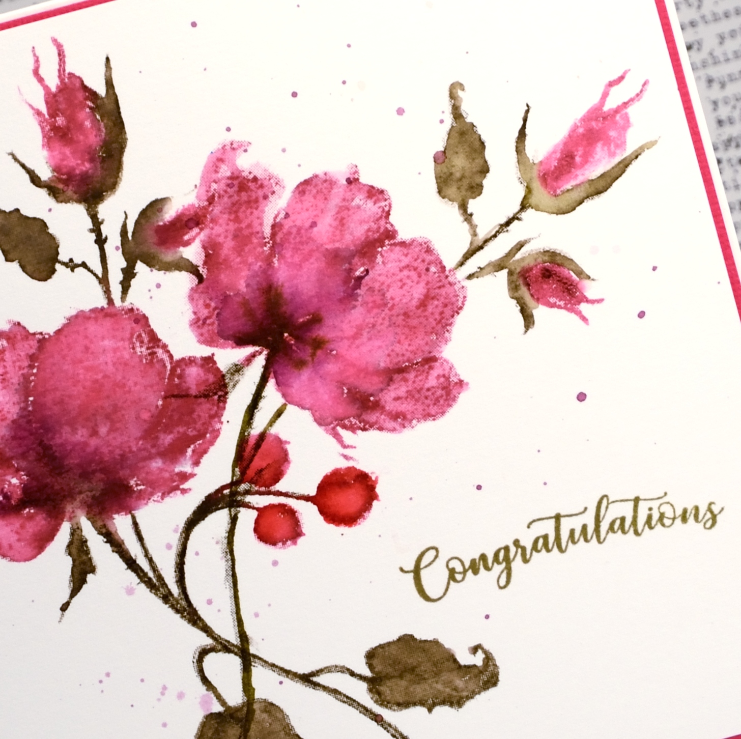
To finish the panel I splattered a mix of picked raspberry and seedless preserves ink over the panel then added a sentiment. I have mentioned before how important colour matching is to me and I wanted a forest moss coloured sentiment but I wanted to use the crisper versafine pigment ink to achieve it. Using the stamp positioner yet again I stamped congratulations in Spanish moss versafine then over the top in vintage sepia versafine and ended up with just the right shade of green.
I will be back tomorrow with some more brushstroke beauty from Penny Black’s Poetic release
Supplies
Stamps: lustrous, banner sentiments (PB)
Inks: picked raspberry, seedless preserves, forest moss, candied apple distress markers and stains (Ranger) Spanish moss & vintage sepia versafine ink (Tsukineko)
Paper: hot pressed watercolour paper, pink cardstock
Morning glory emboss resist
Posted: June 27, 2017 Filed under: flower medley | Tags: Faber-Castell Albrecht Durer Watercolour pencils, Nuvo crystal drops, Penny Black stamps, Tsukineko Versafine inks, WOW embossing powders 4 Comments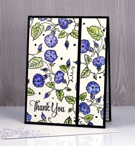
Yes, it’s another emboss resist card, this time a delicate, ‘stay inside the lines’ one. I embossed the morning glory stamp from the transparent flower medley set with clear powder over black ink. I coloured with watercolour pencils, a blue and a purple for the flowers and a couple of greens for the leaves.
When I trimmed my panel I decided it need a little something in between the flowers so added some black nuvo crystal drops here and there in different sizes. Within minutes I managed to put something down on top of the panel which smeared some of the black drops! I let it finish drying then trimmed it and separated the two sections on a black card base. Now when I use nuvo crystal drops I take my panel and place it on the other side of the room where I am less likely to dump something on top of it.
Just in case you missed my last few posts I am embossing all the things at present because I have a challenge happening with The Foiled Fox right now and I would love you to get involved. You have three more days to add your emboss resist card to our link up. Hope to see it there soon.

Supplies
Stamps: flower medley, delicate flowers
Paper: hot pressed watercolour paper, epic black neenah cardstock
Inks: onyx black versafine,
Paints: Albrecht Dürer watercolour pencils (Faber Castell)
Also: ebony nuvo crystal drops, clear embossing powder
Lustrous roses
Posted: June 2, 2017 Filed under: Lustrous | Tags: Penny Black stamps, Ranger Distress stains, Tsukineko Versafine inks 8 Comments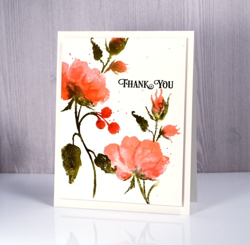
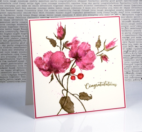
I am featuring another of the new floral stamps from Penny Black’s Poetic release on today’s cards. This pretty rose stamp is called lustrous. I used the same technique to create these panels as I did for my blue daisies yesterday. I worked with distress stains and a MISTI to add one colour at a time to hot pressed watercolour paper. On the card above I started with spun sugar stain, then worn lipstick and finally some abandoned coral on the petals and buds. The leaves and stems are once again forest moss because I always reach for forest moss for foliage. I did the rosehips in coral and festive berries to make them darker than the petals.

On the birthday card above I started with scattered straw instead of spun sugar stain so the undertone would be more yellow and the end result more apricot than pink. The very pale print on the anniversary card below is second generation stamping using the stain left on the stamp after creating one of the panels above. I just spritzed lightly then stamped again.
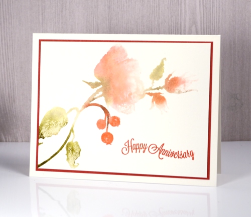
It is not surprising that my first panels with new brushstroke stamps are done with distress stains. I love the way the stains blend on the hot pressed paper. The sentiments are all from the banner sentiments set. True to my new resolution I stamped envelopes at the same time as the panels and these three cards are already packaged and ready for the craft market on June 17!
Supplies:
Stamps: lustrous, banner sentiments
Inks: onyx black, satin red versafine inks (Tsukineko), versafine ink spun sugar, worn lipstick, abandoned coral, festive berries, scattered straw, forest moss distress stains (Ranger)
Paper: hot pressed watercolour paper, red cardstock
Burst of Bister
Posted: May 12, 2017 Filed under: Bister, CAS | Tags: Bister, Penny Black stamps, Tsukineko Versafine inks 8 Comments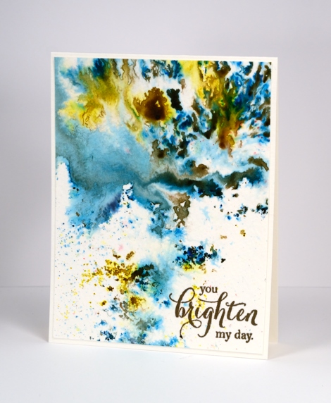
It’s been all about the colorburst and brusho powders with me lately so I thought it was past time to share the other watercolour powder in my life, bister. The concept is the same with bister; you add water and colour bursts out. The colours in the bister range are more earthy than the other brands and the crystals are, on the whole, coarser. The effects are just as magical as you can see on this panel.
I think this panel is from my initial experimenting with watercolour powders. I really liked how the colours moved on the cold pressed watercolour paper but for a long time I didn’t have a plan for the abstract panel. Eventually I realised it didn’t need a plan; it was a stand alone! I added a sentiment and popped up the panel on foam to give it a ‘shadow frame’ and that is the card. This panel shows the versatility of watercolour powders quite well. By varying the amount of water added you can get small intensely coloured shapes which I think look a bit like mosaics, you can get soft washes and some patterning in between the two extremes.
Supplies
Stamps: special thoughts (Penny Black)
Paint: Bister paint powders
Ink: Versafine vintage sepia (Tsukineko)
Paper: cold pressed watercolour paper
The distress oxide trials – Overstamping
Posted: May 8, 2017 Filed under: Feathery | Tags: distress oxide inks, Penny Black stamps, Tsukineko Versafine inks 7 Comments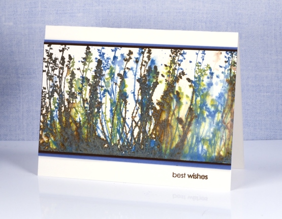
Today’s misty muted scene is brought to you by ‘The Distress Oxide Trials’. This one was one of my early experiments involving stamping over stamping. The effect might be a bit messy for some but I like the way lighter colours over darker colours give something of a skeletal look. I used the ‘feathery’ stamp and inked it with peeled paint first, spritzed then stamped, did the same with vintage photo, and finished with broken china.
You can see the blue over the brown shows up as a x-ray type image. On the right hand side there was an area without much brown so I decided to soften it even more with water to create the look of light coming through.
To finish the card I matted with both brown and blue cardstock then added a sentiment in brown.
Supplies:
Stamps: Feathery, snippets (Penny Black)
Inks: vintage photo, peeled paint, broken china distress oxide inks (Ranger) versafine vintage sepia (Tsukineko)
Paper: hot pressed watercolour paper, blue cardstock, brown cardstock
The distress oxide trials
Posted: April 28, 2017 Filed under: Flower Frolic, Penny Black, stitched flowers, Tagged | Tags: distress oxide inks, Penny Black creative dies, Penny Black stamps, Tsukineko Versafine inks 14 Comments
The trials have begun. Shauna at The Foiled Fox sent me some distress oxide inks to try. I have been intrigued by the videos and projects I’ve seen around the place so was keen to play with them myself. I started by mixing some diluted ink on a craft mat then swiped different papers through it. I chose bristol cardstock, hot pressed watercolour paper and neenah solar white 110lb cardstock.
The card above features the bristol cardstock. It picked up the colour well, the inks blended and the watermarks from splattering made nice light patches with dark edges. I used two main colours, a pink and a blue (what a surprise!) then I splattered a little yellow at the end of my experimenting.
The panel below is made from the hot pressed watercolour piece. The results were very similar but the blending was even smoother between the colours.
I chose not to make a card from the sample on neenah solar white. It worked but the colours did not blend or spread as nicely in my opinion. These are just the beginning of my experiments of course and only three colours but there is more to come. The inks blended just as beautifully as the original distress inks but dry opaque or semi opaque, perfect for a solid background.
Supplies:
Stamps: delicate flowers, stitched flowers, happy snippets
Dies: flower frolic, tagged
Inks: faded jeans, worn lipstick, fossilized amber distress oxide inks (Ranger) versafine majestic blue (Tsukineko)
Papers: hot pressed watercolour paper, bristol paper, stardream blue cardstock, black cardstock
Flower medley
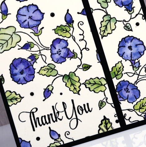
Posted: April 18, 2017 Filed under: birds and banners, flower medley | Tags: Nuvo crystal drops, Peerless Transparent Watercolors, Penny Black creative dies, Penny Black stamps, Tsukineko Versafine inks, WOW embossing powders 4 Comments
I’m sharing another card today made with products from the new Penny Black release ‘Celebrate.’ The flowers featured on today’s card were made with just one of the stamps from the new transparent set ‘flower medley’. I stamped it all over a piece of watercolour paper with black versafine ink then embossed in clear powder. I used my peerless watercolours to fill in all the flowers, buds and leaves.
The fancy little banner you see is a diecut from the new set, ‘birds & banners’ which has a co-ordinating stamp set of nineteen sentiments. I embossed one in white on the banner then popped it up over the floral panel.
When I had put the card together on the black card base I decided it needed little dots of black ebony nuvo crystal drops to fill in a few spaces and look cute!
Supplies
Stamps: flower medley, banner sentiments
Dies: birds and banners
Paper: hot pressed watercolour paper, epic black neenah cardstock
Inks: onyx black versafine, versamark (Tsukineko)
Paints: peerless transparent watercolours
Also: ebony nuvo crystal drops, clear embossing powder, white embossing powder
Full of glee
Posted: April 17, 2017 Filed under: full of glee | Tags: Penny Black stamps, Ranger Distress inks, Ranger Distress stains, Tsukineko Versafine inks 6 Comments
There is a lovely new batch of stamps and dies available from Penny Black; you can check out the catalogue here. My card today features a couple of the new stamps, full of glee and a scripture verse from the hope shines set.
I used my stamp positioner to stamp the ‘full of glee’ image on hot pressed watercolour paper. I started by inking only the pink petals with a Victorian velvet distress stain. I stamped that much, cleaned off the stain and inked the smaller flower in dusty concord, stamped, cleaned and moved onto the leaves and stems in peeled paint stain. Once the whole image was stamped I used a small watercolour brush and water to blend colour from the stamped image into the petals and leaves to fill them. If there was not enough colour I added some stain with the paint brush.
I let all the painting dry before adding scattered straw stain to the centre of the flower. To create the background I inked the full of glee stamp with tea dye distress ink and pressed it down randomly around the image then did the same with the text stamp from the footnotes set. I blended some of the ink with a damp paintbrush and added some splatter as well.
I finished the panel off with the sentiment stamped in versafine vintage sepia ink. I often switch to versafine ink when doing my sentiments as it is a pigment ink which gives a nice sharp print and sits on the paper rather than sinking into it as dye inks tend to do. I matted the panel and attached it to a natural coloured card base.
Supplies
Stamps: full of glee, hope shines, footnotes
Inks: scattered straw, peeled paint, Victorian velvet, dusty concord distress stains, tea dye distress ink (Ranger) versafine vintage sepia (Tsukineko)
Paper: hot pressed watercolour paper, brown cardstock
Bible journalling
Posted: March 24, 2017 Filed under: Bible journaling, Fragrant Flowers | Tags: Bible journaling, Faber-Castell Albrecht Durer Watercolour pencils, Penny Black stamps, Tsukineko Versafine inks 9 Comments
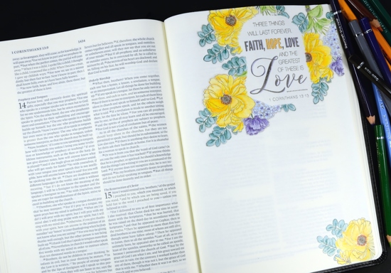
I have recently started some bible journalling. When I first saw the trend I decided I wouldn’t venture down that path but a couple of things changed my mind. The pastor of our church challenged us to read through the New Testament this year, a challenge I am enjoying and even managing to keep up with! I started jotting things down in a notebook as I read. Also I began taking notes during the sermons more carefully; there is usually an outline on the back of the weekly bulletin provided for notes. The problem was, even after I took the notes I brought them home and they piled up and eventually I tossed them out. Rather than continue that practice I decided to buy an interleaved bible which has a blank page after every printed page, and transfer my notes into that. I have been doing it for a month or so and it makes a difference for me to read the bible passage, hear the sermon, take notes, then come home and read through it all again as I add notes to my journalling bible. Most of the pages I’ve written on do not include colour illustration but I enjoy having the option of lettering, writing, drawing or stamping on the blank pages. The page I am sharing today has plenty of blank space left for notes on the passage highlighted in the stamped verse.
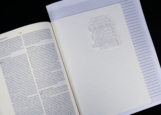
Now onto my process. I printed out a lined page to both guide my stamping and protect the page underneath.
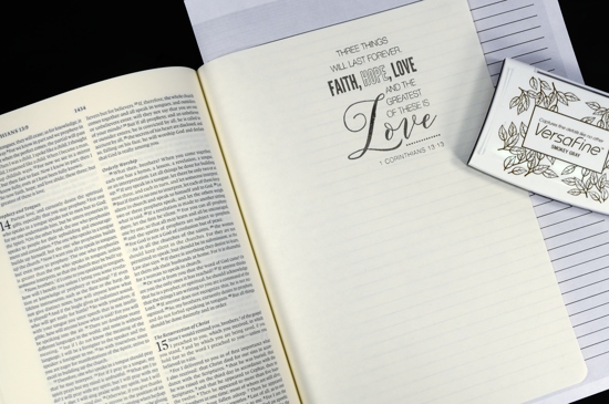
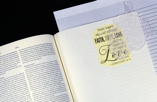
I stamped the 1 Corinthians verse from the set, ‘Faith’, in versafine smokey gray on the blank bible page and and on a post-it note to use as a mask.
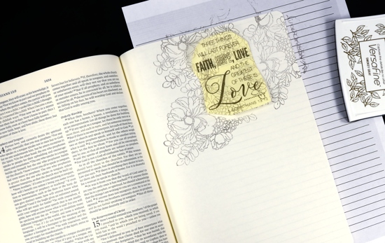
With the mask in place I stamped the floral bouquet from the ‘Fragrant Flowers’ set, also in smokey grey but a second generation impression. I did this three times to surround the verse.
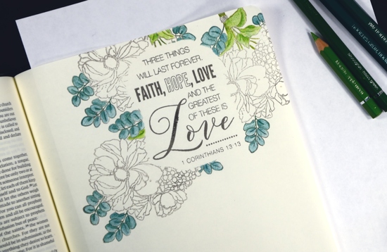
I decided to use my Albrecht Dürer watercolour pencils to colour my page but kept them dry. (you can click on the photo to view larger version) There are two types of leaves on the floral stamp so I chose two pairs of green pencils, yellow greens (apple green 170, moss green 168) and blue greens (Hookers Green 159, Juniper Green 165) I coloured with the lighter hue first then added shadow and definition with the darker.
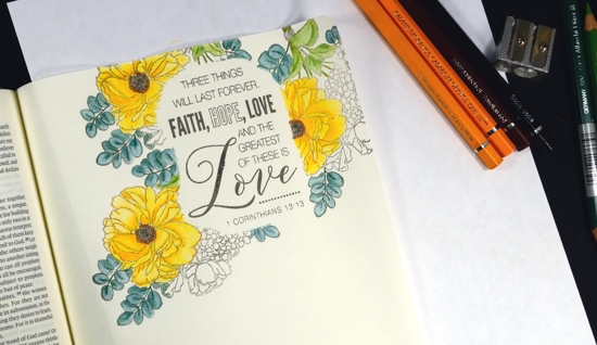
For the yellow flowers I chose two oranges and coloured all the petals with canary yellow (108) then added shading with cadmium orange (111). In the centre of the flowers I switched to browns (Venetian red 190, sepia 175)
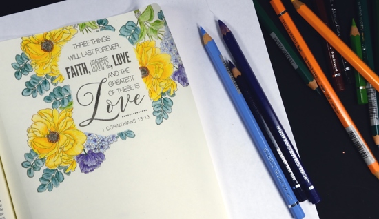
Purple and yellow are complementary colours so I chose blues and purples for the remaining flowers knowing it would give some visual impact to the page. (blue violet 137,Delft blue 141, sky blue 146)
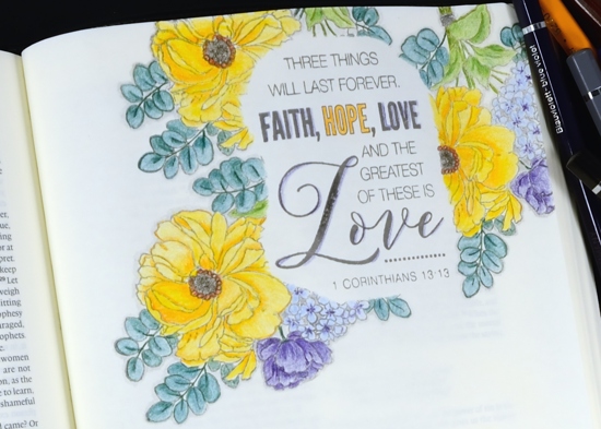
Once all my colouring was done I shaded around the edges of all the leaves and flowers with cold grey IV 233 and added some colour around a few of the letters in the verse.
I balanced out the page with a section of the stamp coloured in the lower corner and will add journalling to the page some time in the future.
Supplies
Stamps: Faith, Fragrant Flowers (PB)
Inks: versafine smokey gray (tsukineko)
Pencils: Albrecht Dürer watercolour pencils (Faber-Castell)
Bible: ESV journaling bible interleaved (Crossways)


