
Simply irresistible challenge reminder
Posted: June 23, 2017 Filed under: Flower sparks | Tags: Kuretake Gansai Tambi watercolour paints, Penny Black stamps 8 Comments
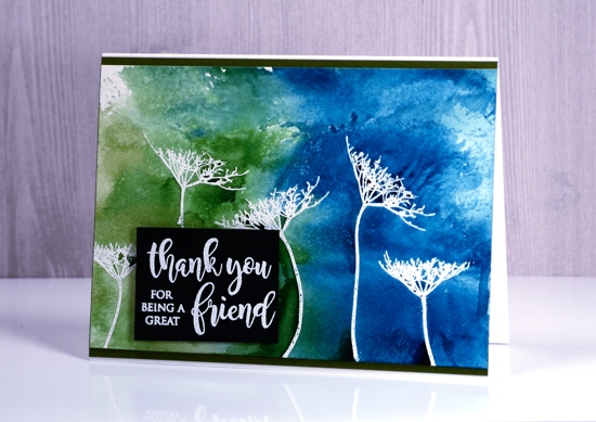
Today I have a couple more emboss resist projects to remind you we would love to see your projects on the Simply Irresistible Challenge. The Foiled Fox and I have teamed up (as we like to do these days) to issue you with a card challenge. You just need to make a card featuring the emboss resist technique, load it up on your own blog or social media platform then link it on our challenge page.
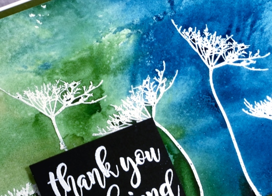
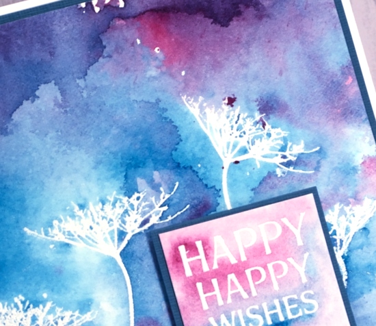
I embossed the Queen Anne’s Lace stamps on hot pressed watercolour paper for today’s cards then painted over the panels with gansai tambi watercolour paints. As you can see in the close ups, the paint resists the embossing and pools darker in some of the enclosed spaces or against the embossed stems. It is such a cool technique.
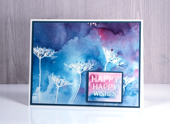
I played with two colour schemes, my tried and true blue/pink combo and a deeper blue/green one. The gansai tambi paints can be a bit opaque if not diluted enough so I used sufficient water for them to run over the embossing and resist it, not cover it.

Supplies
Stamps: happy wishes, flower sparks (PB)
Inks: versamark (Tsukineko)
Paints: gansai tambi (Kuretake)
Paper: hot pressed watercolour paper, white and black cardstock (Neenah) blue and green cardstock
Also: opaque white embossing powder (WOW)
Playful Emboss Resist
Posted: June 22, 2017 Filed under: Playful | Tags: Brusho, Fabriano Watercolour Paper, Kuretake Gansai Tambi watercolour paints, liquid metals, Penny Black creative dies, Penny Black stamps 12 Comments
I’m still playing with the emboss resist technique, hoping to inspire you to get involved in the Simply Irresistible challenge the Foiled Fox and I have happening right now.
The three cards I’m sharing today were made from panels left over after teaching a class a few months ago. I used gansai tambi paints on the top card and the middle card. On the top card I added gold shimmer to both the flowers and the petals with some Ken Oliver liquid metal.
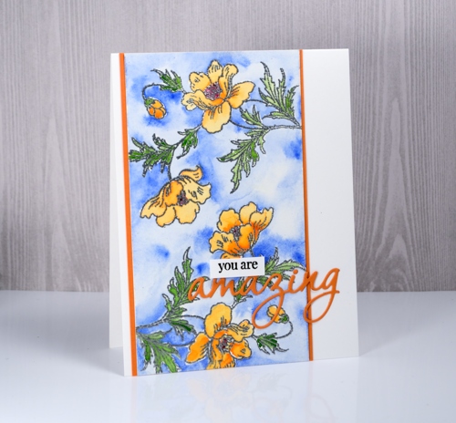
On the card below I used brusho paints, a red and a green, sprinkled over the embossed panel then activated carefully with water. In places the green and red blended creating some brown/orange tones.

I hope there are a few ideas here that might inspire you to do some emboss resist card making then link it up on The Foiled Fox blog.

Supplies
Stamps: playful, snippets
Dies: omg
Inks: versamark, versafine onyx black
Embossing powder: clear, white and silver WOW embossing powders
Paint: gansai tambi watercolours, brusho crystals, gold liquid metal (Ken Oliver)
Turquoise birthday
Posted: June 19, 2017 Filed under: Felicity | Tags: Brusho, Penny Black creative dies, Penny Black stamps 5 Comments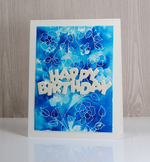
I am back with the same stamp featured in my previous post, ‘Felicity’ from Penny Black. I wanted to show you another look incorporating the emboss resist technique. I embossed the stamp in white powder on hot pressed watercolour paper then chose turquoise brusho powder to add the colour over the top. I sprinkled brusho then spritzed water and tilted my panel to get the colour to move. I alternated between sprinkling and spritzing until there was enough colour on the panel then used a paint brush to fill the large surrounding areas with turquoise paint. I love the way some spaces captured deep colour and others remained almost white. That is the beauty of combining the emboss resist technique with brusho.
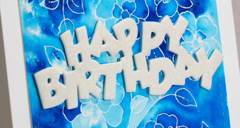
To finish off this card I added a sentiment die cut from foam then coloured it with clear wink of stella to make it sparkle.
I hope you will be inspired to pull out some embossing powder for the emboss resist challenge I am co-hosting with The Foiled Fox.
I’m looking forward to seeing what you come up with.
Supplies
Stamps: Felicity (PB)
Dies: Dies: birthday (PB)
Paper: hot pressed watercolour paper, Neenah solar white cardstock
Inks: versamark (Tsukineko)
Also: white embossing powder, clear wink of stella
Market news and a gilded card
Posted: June 14, 2017 Filed under: Gilding Flakes, Hypnotic | Tags: Gilding, Penny Black stamps, Penny Black stencils 5 Comments
I know there hasn’t been much popping up here on the blog lately. My excuse is definitely craft market preparations. If you are a local please come and check out CraftFest 2017 this weekend. The market will be held on Albert Island which is not far from the War Museum. There will be close to sixty vendors on Saturday and you will find me at the Paper Duet booth with The Crafty Cigale and guest artist, Connie Schulz. We will have cards for all reasons and seasons along with bookmarks, gift tags and wine tags. I would suggest parking at or near the War Museum then walking the short distance across the bridge to Albert Island. Directions.

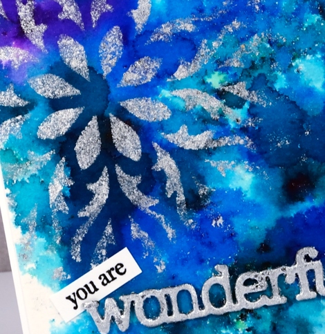
My recent gilded cards will all be on sale at the market including this bright blue and silver one. I used a Penny Black stencil and the Tsukineko Essential Glue pad. I sponged the glue onto a panel painted with colorburst powders. After removing the stencil I added silver gilding flakes.
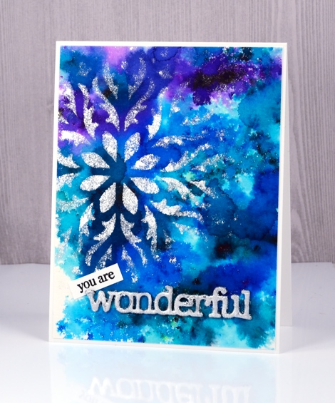
I used the same technique mentioned in my previous post to create a gilded sentiment and tucked a little stamped ‘you are’ in behind the silvery die cut ‘wonderful’.
I will be back on Friday with an exciting post the Foiled Fox and I have dreamed up. Make sure you check back in.
Supplies
Stencil: hypnotic (PB)
Dies: awesome (PB)
Paint: colorburst powders
Adhesives: essential glue pad (Tsukineko), Stick it adhesive
Shiny things: Nuvo silver bullion gilding flakes
Cardstock: hot pressed watercolour paper, Neenah solar white cardstock
Also: adhesive backed foam
Gilded butterflies
Posted: June 9, 2017 Filed under: butterfly charmer, Gilding Flakes | Tags: Nuvo gilding flakes, Penny Black creative dies, Penny Black stamps 4 Comments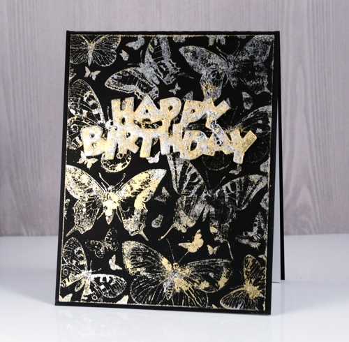
I’ve been gilding again! This time for a guest post on the Foiled Fox blog. These lovely gilding flakes came from the Foiled Fox and I think they are so very pretty. I have shared two techniques for applying the flakes so far (here and here).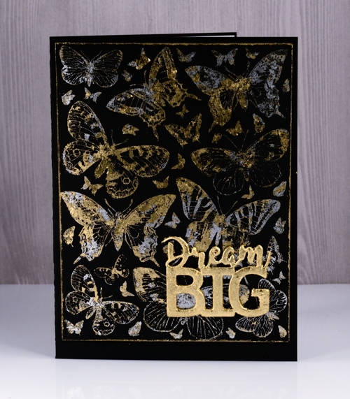
For today’s cards I used another technique and I was pleasantly surprised to see how well it worked. I used a glue pad to stamp the large butterfly charmer stamp on black cardstock. After stamping I let the glue sit and change colour before pressing the flakes onto it. I used both gold and silver flakes.
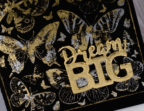
I had fun gilding the sentiments too. I cut both from adhesive backed foam and pressed the gilding flakes directly onto the adhesive side then smoothed them all over and into the nooks and crannies. I then stuck the gilded die cut sentiments onto my butterfly panels.
For more details on my process please visit the Foiled Fox blog. The supplies I used are linked below.
Supplies
Stamp: butterfly charmer (PB)
Dies: birthday, dream big (PB)
Adhesives: essential glue pad (Tsukineko), Stick it adhesive
Shiny things: Nuvo silver bullion gilding flakes, Nuvo radiant gold bullion gilding flakes
Cardstock: Neenah epic black cardstock
Also: adhesive backed foam
Lustrous roses
Posted: June 2, 2017 Filed under: Lustrous | Tags: Penny Black stamps, Ranger Distress stains, Tsukineko Versafine inks 8 Comments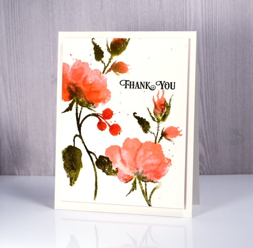
I am featuring another of the new floral stamps from Penny Black’s Poetic release on today’s cards. This pretty rose stamp is called lustrous. I used the same technique to create these panels as I did for my blue daisies yesterday. I worked with distress stains and a MISTI to add one colour at a time to hot pressed watercolour paper. On the card above I started with spun sugar stain, then worn lipstick and finally some abandoned coral on the petals and buds. The leaves and stems are once again forest moss because I always reach for forest moss for foliage. I did the rosehips in coral and festive berries to make them darker than the petals.

On the birthday card above I started with scattered straw instead of spun sugar stain so the undertone would be more yellow and the end result more apricot than pink. The very pale print on the anniversary card below is second generation stamping using the stain left on the stamp after creating one of the panels above. I just spritzed lightly then stamped again.
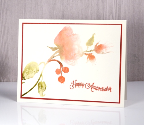
It is not surprising that my first panels with new brushstroke stamps are done with distress stains. I love the way the stains blend on the hot pressed paper. The sentiments are all from the banner sentiments set. True to my new resolution I stamped envelopes at the same time as the panels and these three cards are already packaged and ready for the craft market on June 17!
Supplies:
Stamps: lustrous, banner sentiments
Inks: onyx black, satin red versafine inks (Tsukineko), versafine ink spun sugar, worn lipstick, abandoned coral, festive berries, scattered straw, forest moss distress stains (Ranger)
Paper: hot pressed watercolour paper, red cardstock
Dancing Daisies
Posted: June 1, 2017 Filed under: dancing daisies | Tags: Fabriano Watercolour Paper, Finetec artist mica watercolour paint, Penny Black stamps, Ranger Distress stains 10 Comments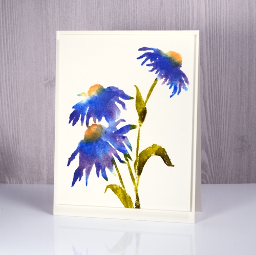
It’s been a bit quiet here on the blog lately. I’m spending my time on the less exciting tasks of stamping matching envelopes, stamping my new name stamp on the back of cards and packaging up said cards for the upcoming craft market on June 17. I have made a new resolution to stamp a matching envelope at the same time as I make the card. It is a bit time consuming pulling out the stamps and inks to try and match what I made weeks or months ago. I know I don’t have to have matching envelopes but they are pretty.
Stamps from Penny Black’s new ‘Poetic’ release arrived in my mail box last week so I have been itching to create with them. This new cling stamp, Dancing Daisies, should possibly be yellow, or pink, or orange if you are looking for realism but I really wanted it in blue. I wanted a particular blue what’s more and as I didn’t have an ink that colour I stamped with three different distress stains to get the blue you see in the centre of the daisy above, right next to the yellow. I inked part of the petals with salty ocean distress stain first and stamped that, then switched to dusty concord and finally added blueprint sketch. I cleaned the stamp between applications so I didn’t contaminate the dauber on the distress stains. I used dried marigold and scattered straw on the flower centres and forest moss and crushed olive stains on the stems and leaves.
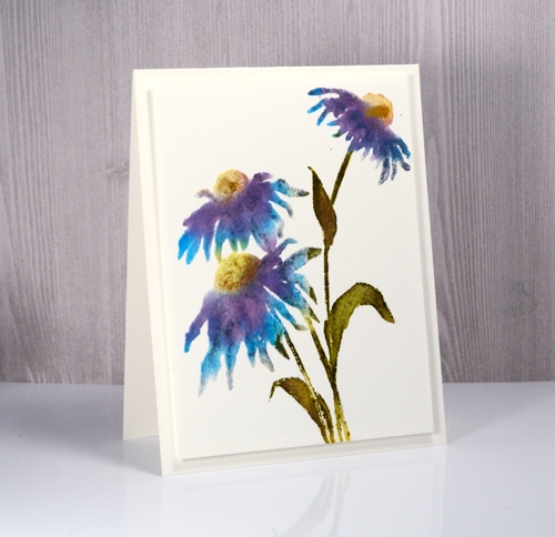
My second attempt is a little different as I used some of the same colour stsains but also pulled out my pearlescent finetec paints and painted some directly on the stamp and the panel, blue on the petals, green on the leaves and gold on the flower centres. It is hard to see in the photo but there is definitely some shimmer happening.
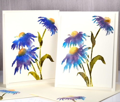
Both panels were stamped on hot pressed watercolour paper with the help of the MISTI so I could add the colours one at a time.
Supplies:
Stamps: dancing daisies
Inks: salty ocean, dusty concord, blueprint sketch, crushed olive, forest moss, dried marigold, scattered straw distress stains (Ranger)
Paint: finetec pearlescent paints
Paper: hot pressed watercolour paper
Brusho Balloons
Posted: May 15, 2017 Filed under: CAS, stencil cut, Uplifting | Tags: Brusho, Penny Black creative dies, Penny Black stamps 8 Comments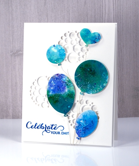
I have another card that utilises brusho experiments. If you have delved into the magic of brusho you probably have a pile of pretty brusho panels you don’t know quite what to do with. Experimenting with brusho is a bit addictive so it is rather easy to keep trying colour combinations with no project goal in mind. I decided to put a scrap of green, blue and purple brusho ‘mosaic’ to use as balloons. By brusho mosaic I mean the effect I get when I spritz over the sprinkled brusho only enough to activate it but not send it flowing all over the paper.
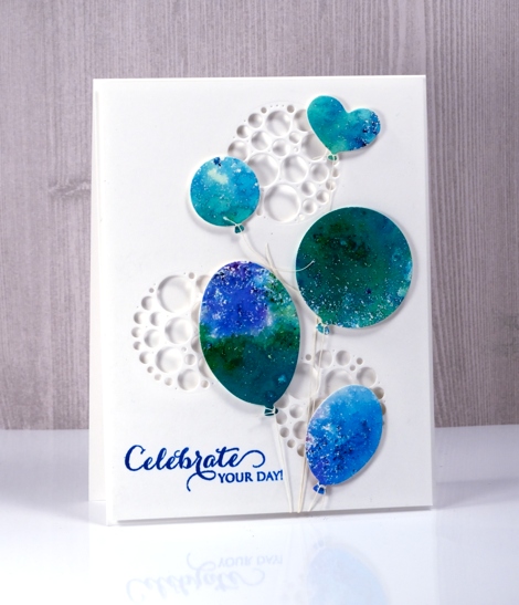
I used the ‘uplifting’ dies from Penny Black to cut out five balloons then added adhesive backed foam to each one. I cut circles of circles out of a panel of neenah solar white cardstock to create a background panel then cut circles from a piece of foam to position behind the panel so shadows would show inside the circles. The circles of circles are part of a new PB die set ‘stencil cut’.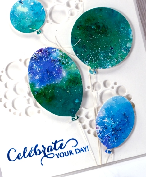
I tied a linen thread to each balloon and tucked the other ends under the background panel. The thread tying took me close to my fiddliness factor limit but I persevered and assembled the layers and added a sentiment. This happy card would work for any celebration so I am adding it to the Casology challenge this week ‘Commencement’.
Supplies
Stamps: A sweet day (PB)
Dies: uplifting, stencil cut (PB)
Paint: brusho crystals (Colourcraft)
Also: linen thread, fun foam
Burst of Bister
Posted: May 12, 2017 Filed under: Bister, CAS | Tags: Bister, Penny Black stamps, Tsukineko Versafine inks 8 Comments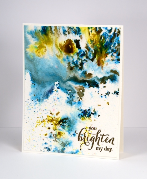
It’s been all about the colorburst and brusho powders with me lately so I thought it was past time to share the other watercolour powder in my life, bister. The concept is the same with bister; you add water and colour bursts out. The colours in the bister range are more earthy than the other brands and the crystals are, on the whole, coarser. The effects are just as magical as you can see on this panel.
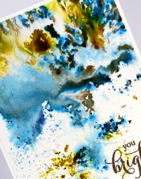
I think this panel is from my initial experimenting with watercolour powders. I really liked how the colours moved on the cold pressed watercolour paper but for a long time I didn’t have a plan for the abstract panel. Eventually I realised it didn’t need a plan; it was a stand alone! I added a sentiment and popped up the panel on foam to give it a ‘shadow frame’ and that is the card. This panel shows the versatility of watercolour powders quite well. By varying the amount of water added you can get small intensely coloured shapes which I think look a bit like mosaics, you can get soft washes and some patterning in between the two extremes.
Supplies
Stamps: special thoughts (Penny Black)
Paint: Bister paint powders
Ink: Versafine vintage sepia (Tsukineko)
Paper: cold pressed watercolour paper
The distress oxide trials – Overstamping
Posted: May 8, 2017 Filed under: Feathery | Tags: distress oxide inks, Penny Black stamps, Tsukineko Versafine inks 7 Comments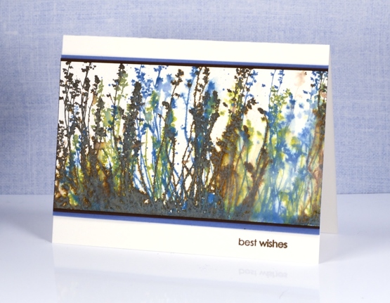
Today’s misty muted scene is brought to you by ‘The Distress Oxide Trials’. This one was one of my early experiments involving stamping over stamping. The effect might be a bit messy for some but I like the way lighter colours over darker colours give something of a skeletal look. I used the ‘feathery’ stamp and inked it with peeled paint first, spritzed then stamped, did the same with vintage photo, and finished with broken china.
You can see the blue over the brown shows up as a x-ray type image. On the right hand side there was an area without much brown so I decided to soften it even more with water to create the look of light coming through.
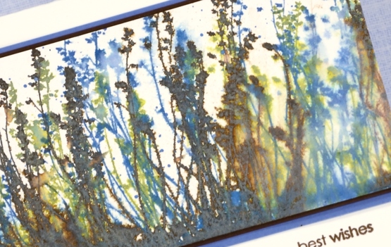
To finish the card I matted with both brown and blue cardstock then added a sentiment in brown.
Supplies:
Stamps: Feathery, snippets (Penny Black)
Inks: vintage photo, peeled paint, broken china distress oxide inks (Ranger) versafine vintage sepia (Tsukineko)
Paper: hot pressed watercolour paper, blue cardstock, brown cardstock












