
Distress Oxide background
Posted: August 8, 2017 Filed under: Butterfly trio, Sweet Perfume | Tags: distress oxide inks, Penny Black creative dies, Penny Black stamps, WOW embossing powders 8 Comments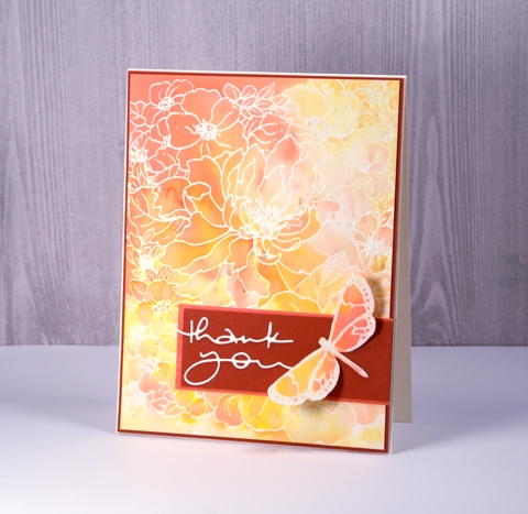
I’ve been playing with distress oxide inks again and its all because of the wonderful folk at the Foiled Fox. I loved the first 12 colours released but when I saw salty ocean, peacock feathers and seedless preserves in the second release I was pretty happy. I am guest blogging over on the Foiled Fox blog today with all the details about this card.
Our family has been enjoying a visit from my sister-in-law, Dale for a few weeks. She came from Australia via Alaska and we have had the chance to do a few little trips around Ontario and Quebec while she’s been here. One afternoon while we were home I was downstairs in my workroom trying to nail this card. I loved the soft blends in the background but deciding on features for the foreground was not happening. Dale came down to see what I was doing and we ended up collaborating to complete the card.

Supplies
Stamps:Sweet Perfume, Butterfly Trio (PB)
Die: Many Thanks (PB)
Inks: spiced marmalade, abandoned coral, wild honey distress oxide inks (Ranger) versamark (Tsukineko)
Papers: hot pressed watercolour paper, Neenah natural white cardstock, brick red cardstock
Also: clear embossing powder (WOW)
Beautiful tree
Posted: July 31, 2017 Filed under: Shade Canopy | Tags: distress oxide inks, Fabriano Watercolour Paper, Penny Black stamps 6 Comments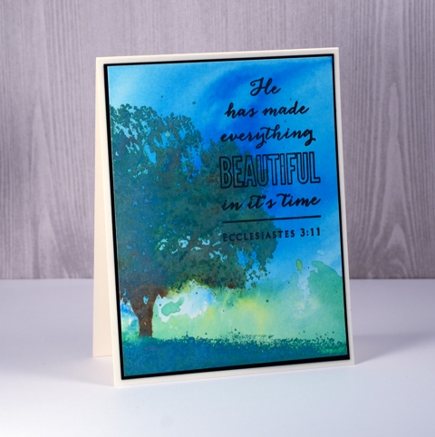
The newest distress oxide inks are in the house (thank you Foiled Fox) so I decided to do some stamping with them along with a basic background. So far in my experiments with distress oxides and my recent class I have used distress oxides to create dramatic and rich backgrounds. In using them for stamping I had to think about what characteristics of the ink I wanted to take advantage of.
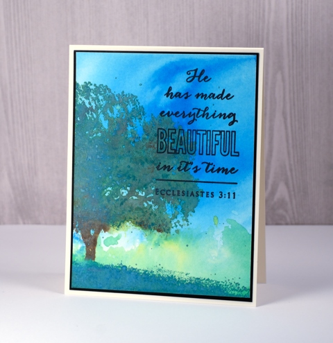
I began by making a background. I pressed the salty ocean ink on my impermeable craft mat, added water then swiped my watercolour panel through it. I dried that completely then did a similar thing with lucky clover and twisted citron inks. Next I pulled out the MISTI so I could stamp the tree colour by colour. I inked the foliage in lucky clover, stamped, peeled paint, stamped, spritzed to let it blend then inked the trunk and a few areas within the foliage with vintage photo and stamped that. To get a nice blend I kept stamping patches of colour here and there with the help of the misti. What I didn’t end up liking was how pale and ‘oxidised’ the foliage became. It got the chalky look where I wanted more bold colour. The fix for this I felt, would be to add undiluted ink over the top so I dried everything and stamped more lucky clover and peeled paint over the top of the blended colour. There is still plenty of chalky oxidised colour but also some darker areas.
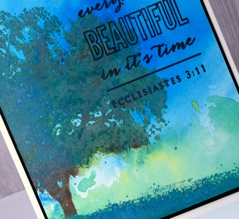
Only the grass remained to be stamped so I picked ‘lucky clover’ on account of its name and stamped that across the bottom of the panel. I kept the stamp in place but moved my paper to extend the grass from one side to the other. The overall effect is more like a tree painted in acrylic over a watercolour sky. Rather than switch to my usual versafine for the sentiment I kept it all in the DiOx family and used black soot then framed the panel in black and attached it to my cream card base.
Supplies:
Stamps: Shade Canopy, Faith (PB)
Inks: salty ocean, lucky clover, peeled paint, twisted citron, vintage photo, black soot distress oxide inks (Ranger)
Cardstock: Fabriano 100% cotton hot pressed watercolour paper
Red flowers
Posted: July 26, 2017 Filed under: Bliss, light touch | Tags: Penny Black stamps, Ranger Distress stains, Tsukineko Versafine inks 5 Comments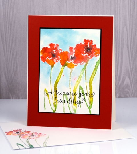
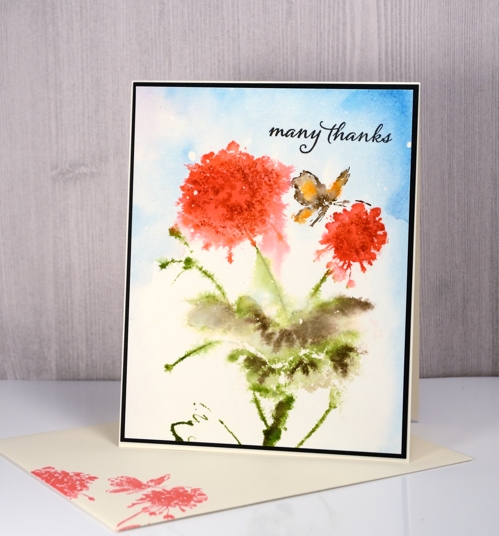
I planted red and white flowers in tubs for my front door and back door this year and the impatiens at the front door have bloomed up a storm. The petunias at the back are doing well too but I think the constant rain earlier in the summer knocked them about a bit. I used distress stains to stamp the flowers on today’s cards and let the colours blend together on the stamp for some softness in the images.
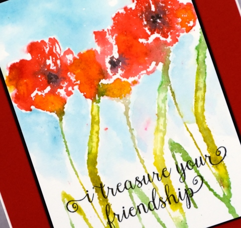
On the card above I painted the background around the images after stamping; on the card below I painted a blue sky first then stamped over the top. To achieve extra definition on my butterfly and petals I used a stamp positioner so I could add details after the first loose watery stamping had dried.
Supplies:
Stamps: bliss, light touch, happy snippets, special thoughts (Penny Black)
Inks: distress stains (Ranger) versafine onyx black (Tsukineko)
Cardstock: hot pressed watercolour paper, black, red and natural cardstock
Bliss birds
Posted: July 22, 2017 Filed under: happy bliss, Tagged | Tags: distress oxide inks, Fabriano Watercolour Paper, Hand lettering, Penny Black creative dies, Penny Black stamps 7 Comments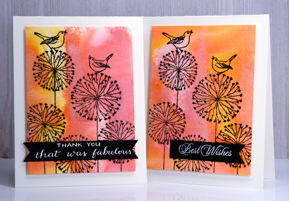
I have a couple of distress oxide backgrounds to share today, topped with a whimsical line stamp from Penny Black. To create the backgrounds I applied spiced marmalade and worn lipstick diox inks to watercolour paper then spritzed them enough to make the colours blend but not so much as to flood the colour off the page.
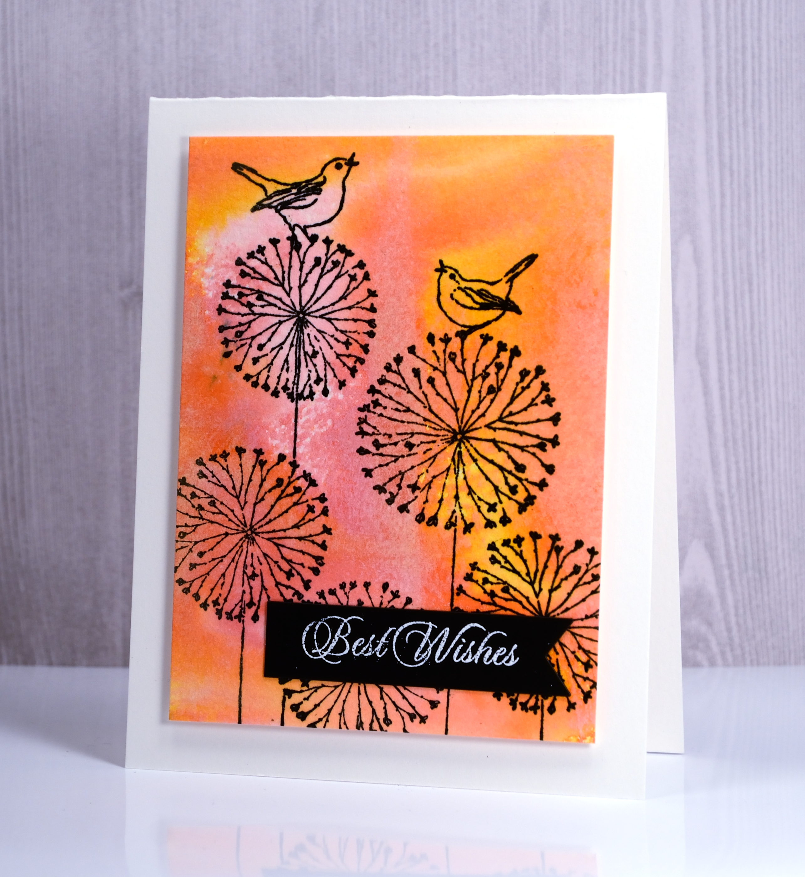
I stamped the ‘happy bliss’ stamp in versafine onyx black ink over the coloured background and popped up the panels on white card bases. I die cut the little black banners and added a stamped sentiment on one and a handlettered phrase on the other.
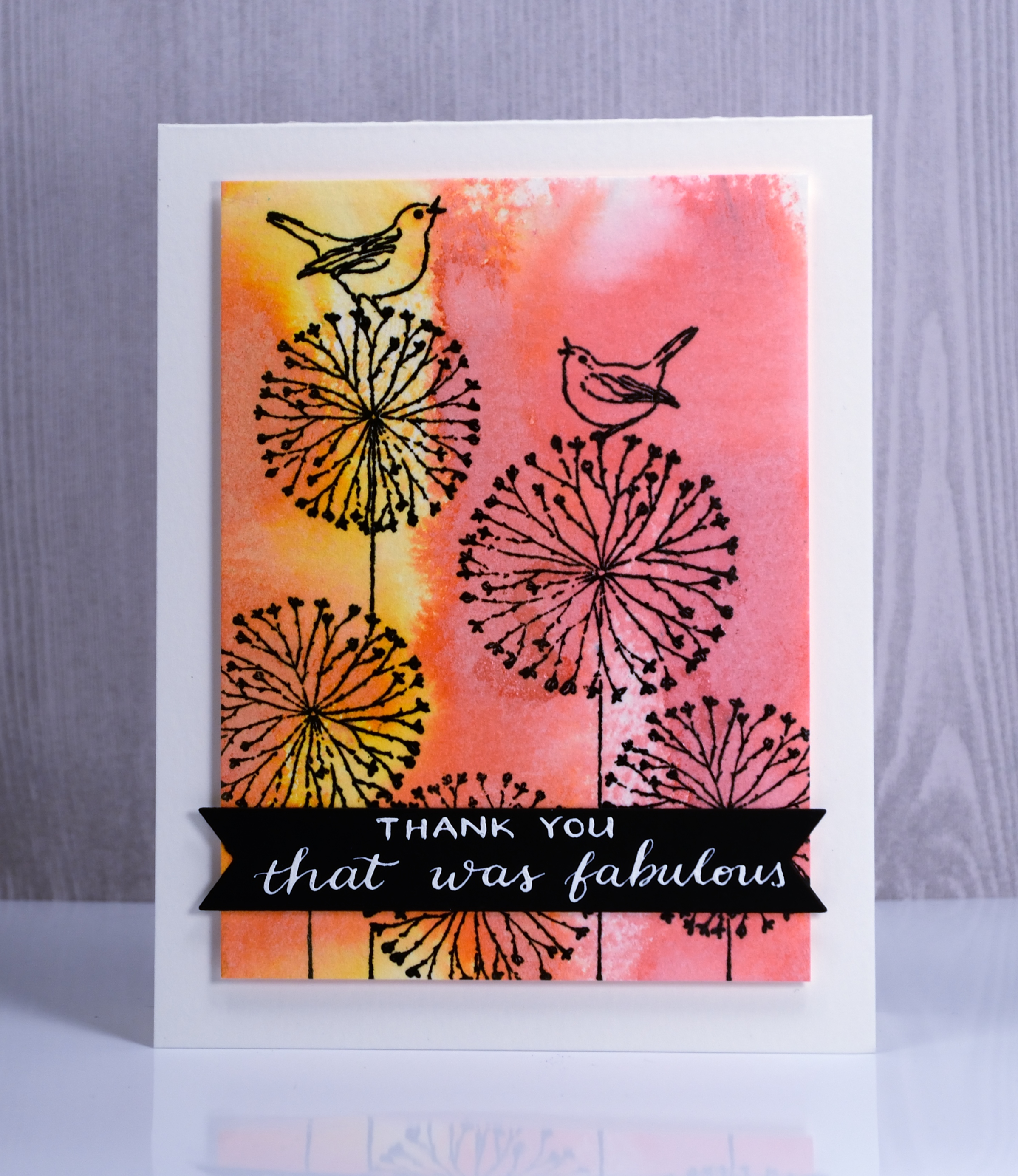
Hope you are having a fabulous day.
Supplies
Stamps: Happy Bliss (PB)
Dies: Tagged, Shades (PB)
Pens: Exclusive Calligraphy nib holder (Foiled Fox)
Ink: Spiced marmalade & worn lipstick distress oxide inks (Ranger) Versafine onyx black ink (Tsukineko)
Papers: hot pressed watercolour paper, Neenah epic black and solar white cardstock
Ink: DrPh Martins bleedproof white for calligraphy
Daisy thank you
Posted: July 6, 2017 Filed under: dancing daisies, Feathery, thank you squares | Tags: Penny Black creative dies, Penny Black stamps, Ranger Distress stains 5 Comments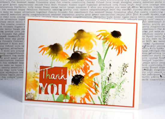
I have summer flowers to share again today. The autumn card I posted yesterday won’t be needed for months. I want way more summer before I see autumn leaves! I used distress stains not markers for today’s card so the images are looser and less defined.
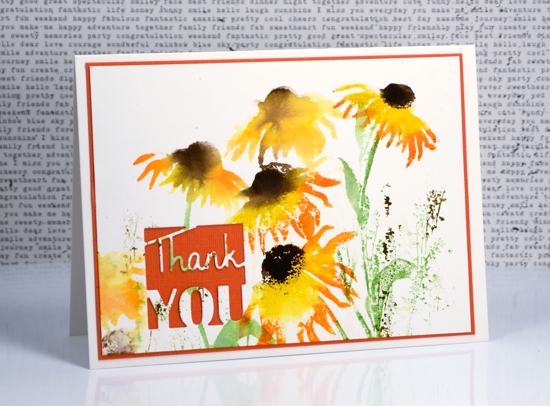
I still worked with a stamp positioner so I could add a colour at a time. I began by inking the petals in scattered straw distress stain, stamped then inked more of the petals in spiced marmalade, spritzed the stamp and finally while the petals were still damp in places I added ground espresso for the flower centres. I inked and stamped the stems and leaves in mowed lawn distress stain. When the daisies were dry I stamped some extra grasses with the ‘feathery’ stamp in forest moss and mowed lawn distress stain.
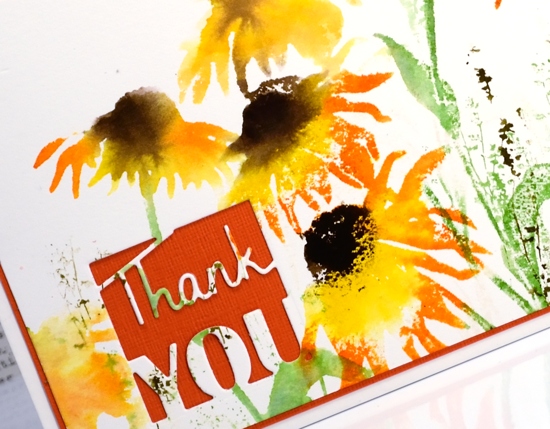
I was undecided about adding ribbon or a sentiment until I remembered this clever little die that cuts the negative space around the word ‘Thank you’ but does not separate it from the panel. It just added the interest I needed while showing more of the orange card stock I matted the panel with.
Supplies
Stamp: dancing daisies,Feathery (PB)
Die: Thank you squares (PB)
Inks: scattered straw, spiced marmalade, ground espresso, mowed lawn, forest moss distress stains
Paper: hot pressed watercolour paper, orange cardstock
Poetic
Posted: July 5, 2017 Filed under: poetic | Tags: Brusho, Penny Black creative dies, Penny Black stamps, Tsukineko Memento inks 6 Comments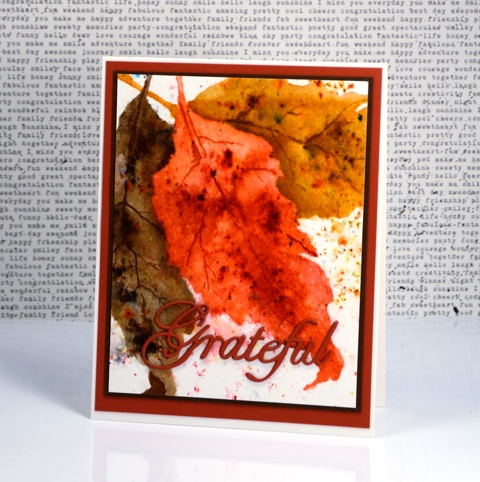
I think brusho paints are the perfect medium for autumn leaves. The variation in colour from even one little tub of brusho reminds me of the beautiful variation in autumn leaves. Brusho can be blended for smooth transitions from light to dark or left unblended which ends up looking like the blemishes found on many leaves. When deciding how to paint the new leaf stamp, Poetic, I knew brusho would help me achieve the look I wanted.
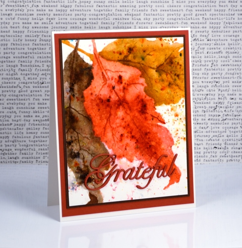
I started by stamping the leaf three times on hot pressed watercolour paper in Morocco memento ink. I overlapped the leaves but without re-inking the stamp so I ended up with one dark leaf (foreground) and two paler leaves as my guides for painting. I painted the leaves from left to right adding one colour of brusho to one leaf at a time. I sprinkled dark brown on the first leaf and used a waterbrush to blend it out to the edges of the leaf keeping some areas variegated. I dried the leaf completely before starting on the second one with terracotta brusho and following the same process. Again I dried the panel completely before doing the final leaf in sandstone.
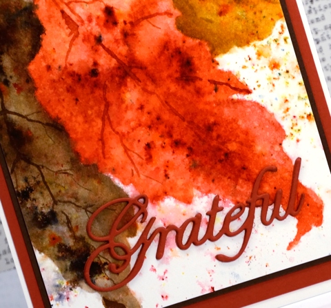
After I had painted all the leaves I sprinkled a little of each colour of brusho over the corresponding leaf and spritzed with water from above. The result was some extra texture on the leaves and some colourful splatter over the edges. To add realism I used a fine brush to paint some veins on the leaves. Finally I created a stacked die cut of the word Grateful and matted in dark brown and the same rust as for the die cut.
Supplies
Stamp: Poetic (PB)
Die: words of gratitude (PB)
Cardstock: hot pressed watercolour paper, natural white cardstock (Neenah) dark brown and rust cardstock
Ink: Morocco memento ink (Tsukineko)
Paint: dark brown, terracotta, sandstone brusho (Colourcraft)
Lustrous
Posted: July 4, 2017 Filed under: Lustrous | Tags: Penny Black stamps, Ranger Distress inks, Tsukineko Versafine inks 9 Comments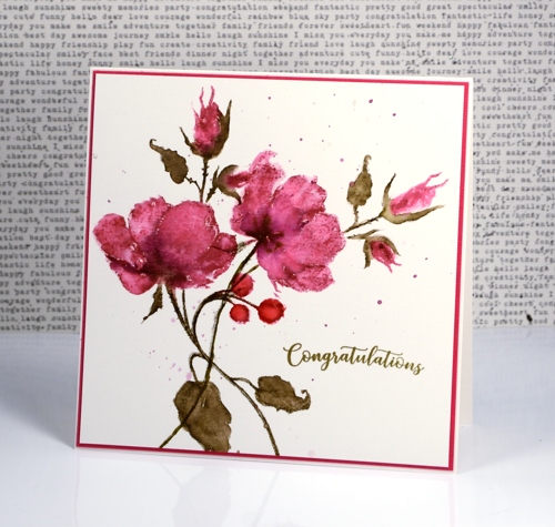
Thank you for your lovely feedback about yesterday’s flower lanterns. Today’s card features a different stamp from the Penny Black ‘Poetic’ release but a similar technique. Although I love working with distress stains, at times I go for the markers instead because I can apply colour to smaller sections with more accuracy. I used markers today beginning with a picked raspberry distress marker for the petals and buds and stamped on hot pressed watercolour paper using a stamp positioning tool. I blended the raspberry ink with water, let it dry then stamped again with raspberry but only where I wanted darker shading. To add even darker areas I painted seedless preserves distress stain directly on the roses and buds.
Once the roses were dry I switched to forest moss distress marker and inked the stems and leaves. After stamping I once again blended with water and added extra ink for definition and shading. Finally I stamped the rosehips with candied apple distress ink and blended them.
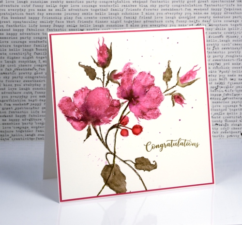
After completing one complete stamped image I decided to add more roses but this time leave out the rosehips and leaves. A stamp positioner makes this straightforward as I was able to ink only the parts I wanted to stamp and again build up my colour and shading in the same way as for the first roses.
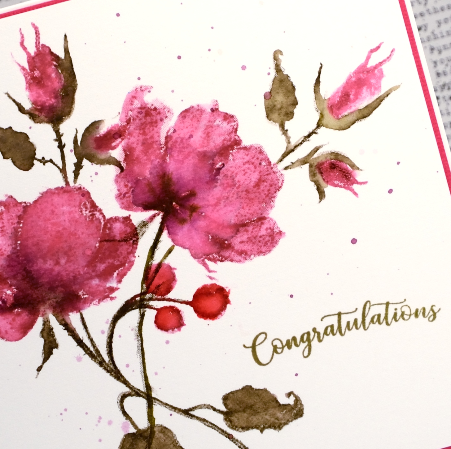
To finish the panel I splattered a mix of picked raspberry and seedless preserves ink over the panel then added a sentiment. I have mentioned before how important colour matching is to me and I wanted a forest moss coloured sentiment but I wanted to use the crisper versafine pigment ink to achieve it. Using the stamp positioner yet again I stamped congratulations in Spanish moss versafine then over the top in vintage sepia versafine and ended up with just the right shade of green.
I will be back tomorrow with some more brushstroke beauty from Penny Black’s Poetic release
Supplies
Stamps: lustrous, banner sentiments (PB)
Inks: picked raspberry, seedless preserves, forest moss, candied apple distress markers and stains (Ranger) Spanish moss & vintage sepia versafine ink (Tsukineko)
Paper: hot pressed watercolour paper, pink cardstock
Lanterns
Posted: July 3, 2017 Filed under: Flower lanterns | Tags: CAS, Fabriano Watercolour Paper, Penny Black stamps, Ranger Distress inks 8 Comments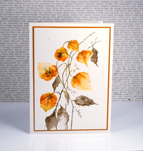
Flower lanterns is a new brushstroke stamp from Penny Black. I happen to have some dried flower lanterns in my craft room so I was able to keep my colours fairly accurate on this one. I love how delicate they look and enjoy the fact that most of my dried ones have kept their shape and colour for a few years now.
I painted these with the help of a stamp positioner to enable me to build up colour one step at a time. I started by stamping the flower heads in wild honey distress ink applied with a marker. This gave me a pale print of all the lanterns as a base for stamping and painting more colour. I continued to use distress markers to add spiced marmalade and rusty hinge ink. I stamped sections then blended with a damp brush slowly but surely adding colour until the lanterns took form. I switched to forest moss distress marker for the stems and leaves and also drew some veins onto the lanterns.
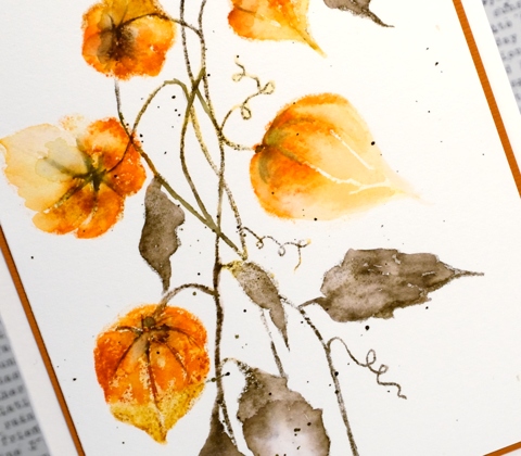
I finished with some splatter of forest moss ink over the panel and a rust coloured mat to frame it.
Supplies
Stamp: flower lantern
Inks: wild honey, spiced marmalade, rusty hinge, forest moss distress markers
Paper: hot pressed watercolour paper, rust cardstock
Happy Canada Day
Posted: July 1, 2017 Filed under: Felicity | Tags: Brusho, Fabriano Watercolour Paper, Penny Black creative dies, Penny Black stamps, WOW embossing powders 8 Comments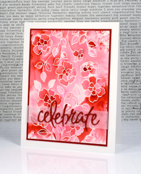
Supplies
Stamps: Felicity (PB)
Dies: Dies: celebrations (PB)
Paper: hot pressed watercolour paper, Neenah solar white and red pepper cardstock, vellum
Inks: versamark (Tsukineko)
Also: white embossing powder, clear wink of stella
Morning glory emboss resist
Posted: June 27, 2017 Filed under: flower medley | Tags: Faber-Castell Albrecht Durer Watercolour pencils, Nuvo crystal drops, Penny Black stamps, Tsukineko Versafine inks, WOW embossing powders 4 Comments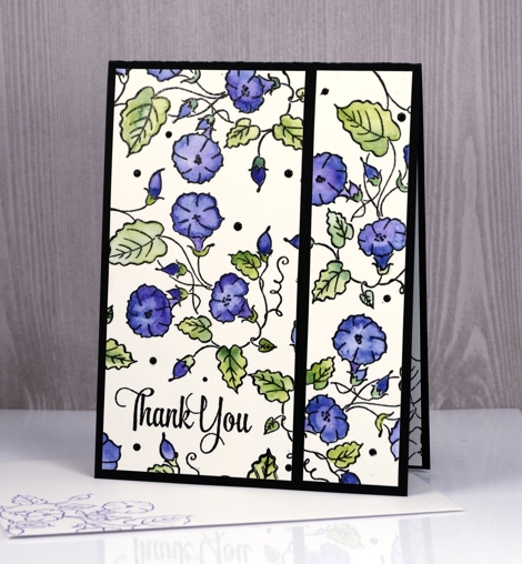
Yes, it’s another emboss resist card, this time a delicate, ‘stay inside the lines’ one. I embossed the morning glory stamp from the transparent flower medley set with clear powder over black ink. I coloured with watercolour pencils, a blue and a purple for the flowers and a couple of greens for the leaves.
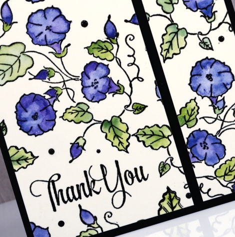
When I trimmed my panel I decided it need a little something in between the flowers so added some black nuvo crystal drops here and there in different sizes. Within minutes I managed to put something down on top of the panel which smeared some of the black drops! I let it finish drying then trimmed it and separated the two sections on a black card base. Now when I use nuvo crystal drops I take my panel and place it on the other side of the room where I am less likely to dump something on top of it.
Just in case you missed my last few posts I am embossing all the things at present because I have a challenge happening with The Foiled Fox right now and I would love you to get involved. You have three more days to add your emboss resist card to our link up. Hope to see it there soon.
Supplies
Stamps: flower medley, delicate flowers
Paper: hot pressed watercolour paper, epic black neenah cardstock
Inks: onyx black versafine,
Paints: Albrecht Dürer watercolour pencils (Faber Castell)
Also: ebony nuvo crystal drops, clear embossing powder












