
Butterfly Heart
Posted: January 16, 2017 Filed under: butterfly heart pop out, CAS | Tags: Peerless Transparent Watercolors, Penny Black creative dies 7 Comments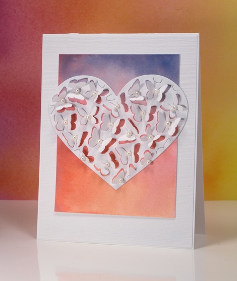
If you have visited the Penny Black blog lately you will know about the new Follow Your Heart release, if not I will be sharing some of new dies and stamps over there and here on my blog this week. Because the butterfly heart pop out die only partially cuts the butterflies you can fold up the wings to reveal whatever is underneath. I tossed up whether to cut the heart out of the watercolour panel or white but decided to have the watercolour panel peeping through the wings and framing the heart. I painted the gradated panel with yellow, pink then blue blending each colour into the one beside it. I attached the coloured panel to a linen textured white panel and cut the heart out of the same textured white cardstock.
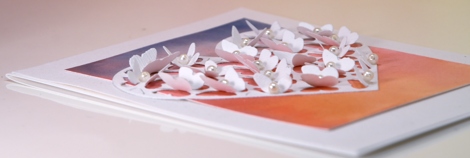
I bent all the butterfly wings up before gluing the heart onto the watercolour panel so I wouldn’t accidentally glue any wings flat. Once the heart was firmly attached I glued a seed pearl in the centre of each butterfly and attached the whole panel to a white card base. If I were to mail this one I would probably need a box-type envelope so I think it might end up being a hand delivered card.
Supplies:
Die: Butterfly Heart Pop Out (PB)
Paints: Peerless watercolors
Cardstock: hot pressed watercolour paper, neenah solar white, textured white
Also: white seed pearls
Forest – Casology 231
Posted: January 11, 2017 Filed under: tall trees | Tags: Penny Black creative dies, Penny Black stamps 29 Comments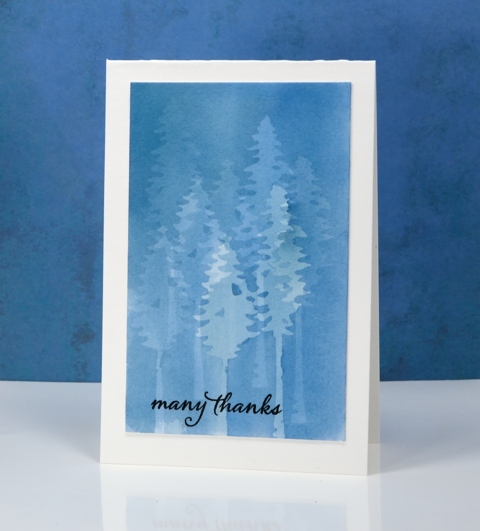
My subtle forest is an experiment in masking. I painted the panel a month back and it was sitting in the pile of possibilities. When I saw what the Casology challenge theme was this week I thought of this panel straight away. To paint this misty forest I use the PB ‘tall trees’ dies to cut masks from frisket film. Frisket film is a removable plastic film used for masking when painting and drawing. I positioned the two tree masks then painted a pale blue wash over the trees, let it dry then repositioned the masks. I repeated this process numerous times to create my forest. With each wash the panel became a darker shade of blue and the previously masked trees received some colour also. Having two different tree dies added a little bit of shape and height variety.
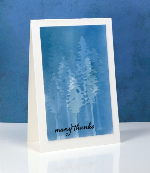
I’m sorry once again that I can’t remember which paint I used. I don’t think it matters too much; I would use any of my watercolour mediums and keep it fairly diluted so I could keep adding layers. I was careful to let it dry thoroughly between each addition of paint so there would be no blurry edges. I also pressed the frisket masks down very carefully so the paint wouldn’t creep under the edges. I finished the card simply by adding a black sentiment and a natural coloured card base.
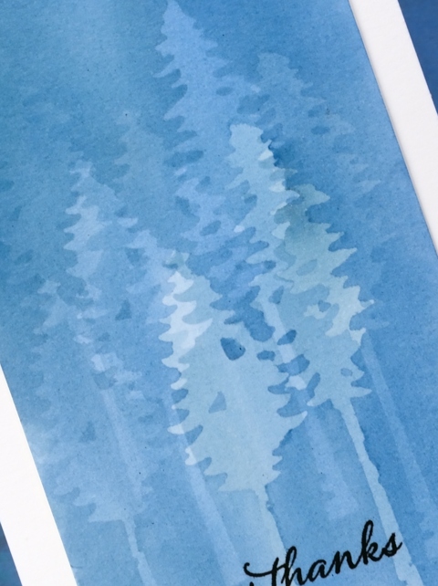
It’s an interesting technique which I haven’t finished playing with…
My blue forest works for the City Crafter challenge this week too.
Supplies
Stamps: Happy Snippets (PB)
Dies: Tall Trees (PB)
Ink: Versafine onyx black ink (Tsukineko)
Paper: hot pressed watercolour paper
Paint: watercolour paint of some kind??
Also: grafix frisket film extra tac
Batik style background
Posted: December 29, 2016 Filed under: heart string, Peacock Feather | Tags: Brusho, Penny Black creative dies, Penny Black stamps, WOW embossing powders 4 Comments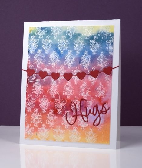
The emboss resist method creates pretty backgrounds especially when painted in a rainbow of colour. I used three primary colours overlapping them to end up with the yellow, orange, red, purple, blue and green. I stamped the peacock feather pattern in versamark and embossed in clear powder on watercolour paper and the slight texture of the watercolour paper combined with the very fine detail of the stamp meant that I did not get a perfect impression. Once I added the colour over the top I noticed that it looks very much like a batik fabric print.
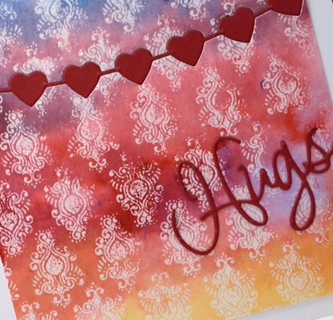
I trimmed the panel then used the heart string die to cut the piece in two. With the same die I cut a string of red hearts then attached the panel to a card base inlaying the red hearts but attaching the die cut word on top of the panel.
Supplies
Stamps: Peacock Feather (PB)
Dies: heart string, love expression (PB)
Ink: versamark (Tsukineko)
Paint: yellow, prussian blue, crimson brusho (Colourcraft)
Paper: hotpressed 100% cotton watercolour paper, red cardstock, Neenah solar white cardstock
Also: WOW clear embossing powder
Joy
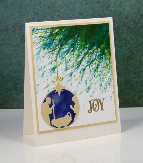
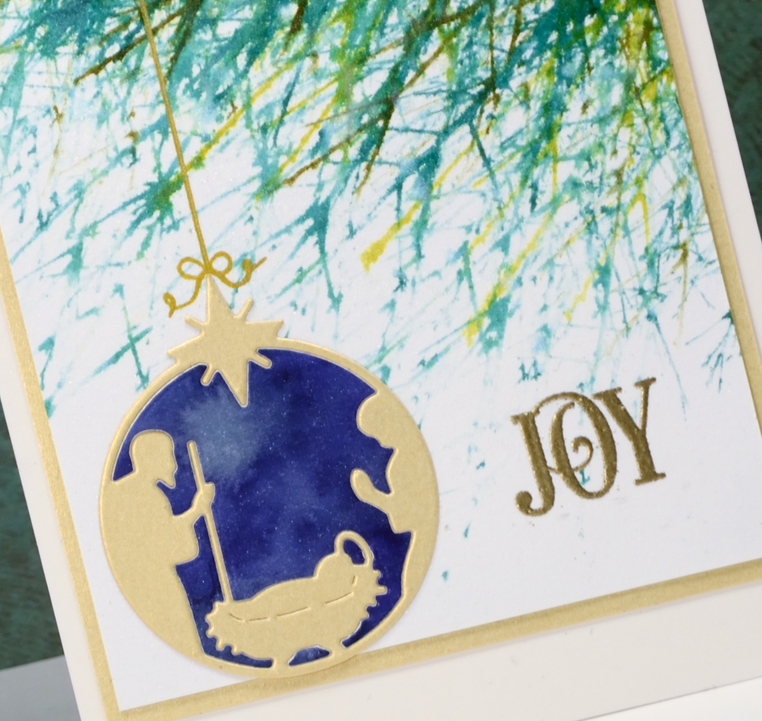
Posted: December 24, 2016 Filed under: Into the sky, manger | Tags: color burst, liquid metals, Penny Black creative dies, Penny Black stamps, Ranger Distress stains, WOW embossing powders 13 Comments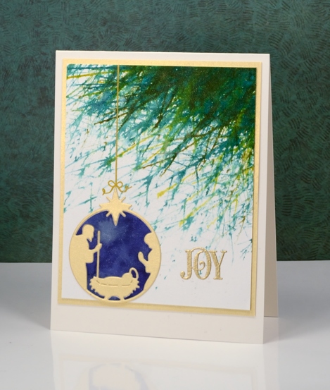
Joy to the world! The Lord is come;
Let earth receive her King;
Let every heart prepare him room,
And heaven and nature sing.
No more let sins and sorrows grow,
Nor thorns infest the ground;
He comes to make his blessings flow
Far as the curse is found.
He rules the world with truth and grace,
And makes the nations prove
The glories of his righteousness,
And wonders of his love,
And wonders of his love,
And wonders, wonders, of his love.
Supplies
Stamps: Into the sky, Joy filled (PB)
Die: manger (PB)
Paints: indigo, terre verte colorburst & Platinum liquid metal(Ken Oliver)
Ink: Encore gold ink(Tsukineko) evergreen bough, pine needles, crushed olive, forest moss distress stains ( Ranger)
Paper: hot pressed Fabriano watercolour paper, shimmer gold paper
Also: metallic rich embossing powder (WOW)
You warm my heart
Posted: December 22, 2016 Filed under: CAS, crystal trio, What's in your cup | Tags: Brusho, Penny Black creative dies, Penny Black stamps 4 Comments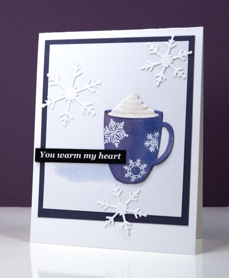
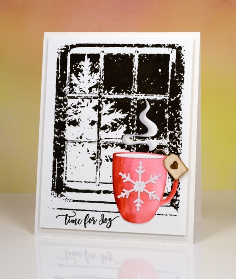
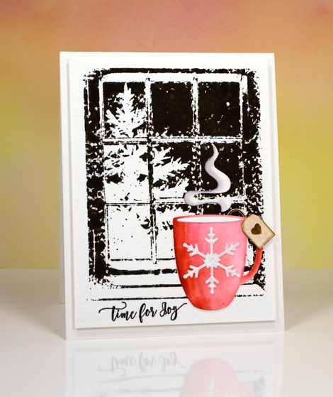
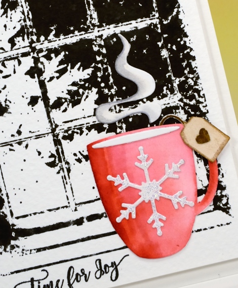
This message is definitely for you my blog readers; you really do warm my heart with all the kind encouragement you leave in the comments. I have been working on a Valentine themed class for January 2017 and the cute little die-cut cup is one of the stars of the new class. I settled on classic red & white for the Valentine class but not before painting quite a few cups in other colours. This little blue cup with its snowflakes is just right for a day which started with snowfall and ended with a blue sky.
I die cut the cup out of watercolour paper then painted it with blue brusho watercolour paint. To give the cup some shape I painted some purple over the blue on the left hand side. Once it was dry I embossed the snowflakes over the top and added the whipped cream die cut piece. I attached the cup to a textured white panel and painted a pale shadow beside the cup then added snowflakes, a sentiment and a purple mat to frame it.
I’ve been making gingerbread today following my usual pattern of burning the first tray and half the second before settling on a shorter cooking time.
Supplies
Stamps: season’s gifts (PB) note: I printed the sentiment on my computer; it’s not a stamp
Dies: crystal trio, what’s in your cup (PB)
Inks: versamark (Tsukineko)
Paper: hot pressed watercolour papers (Fabriano),white linen textured cardstock, purple cardstock, black cardstock
Also: brusho watercolour crystals (Colourcraft), white embossing powder
Stockings were hung
Posted: November 3, 2016 Filed under: Brick wall, Christmas stockings, Diamond pattern, Textures, Winter lantern | Tags: Penny Black creative dies, Penny Black stamps, Ranger Distress inks, Speedball elegant writer 8 Comments
…by the chimney with care. This is the last of my Winter Warmth series and the one that almost didn’t make the cut because I misjudged the size of the stocking! I created the whole background panel then pulled out the die to add the stocking only to find it was a tad larger than I’d remembered. My children assured me some stockings are so large they cover half the fireplace so I continued with the design.
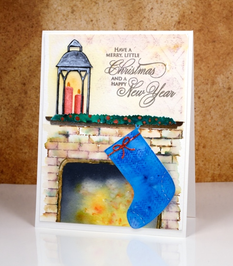
I created the background by stamping on cold pressed watercolour paper with distress inks. I first masked a space where the fireplace would be and a positioned a post-it across the panel where the mantel would end up. I stamped the brick wall stamp in brown and added darker tones with an elegant writer before blending with water. Above the mantel I stamped ‘diamond pattern and softened it with water. When I removed the post-it from the fireplace I used yellow, orange and black brusho to paint my ‘fire’. The lantern was done in two pieces just like I did on the ‘lakeside card‘ and yellow ink was added on the panel behind to make it glow.
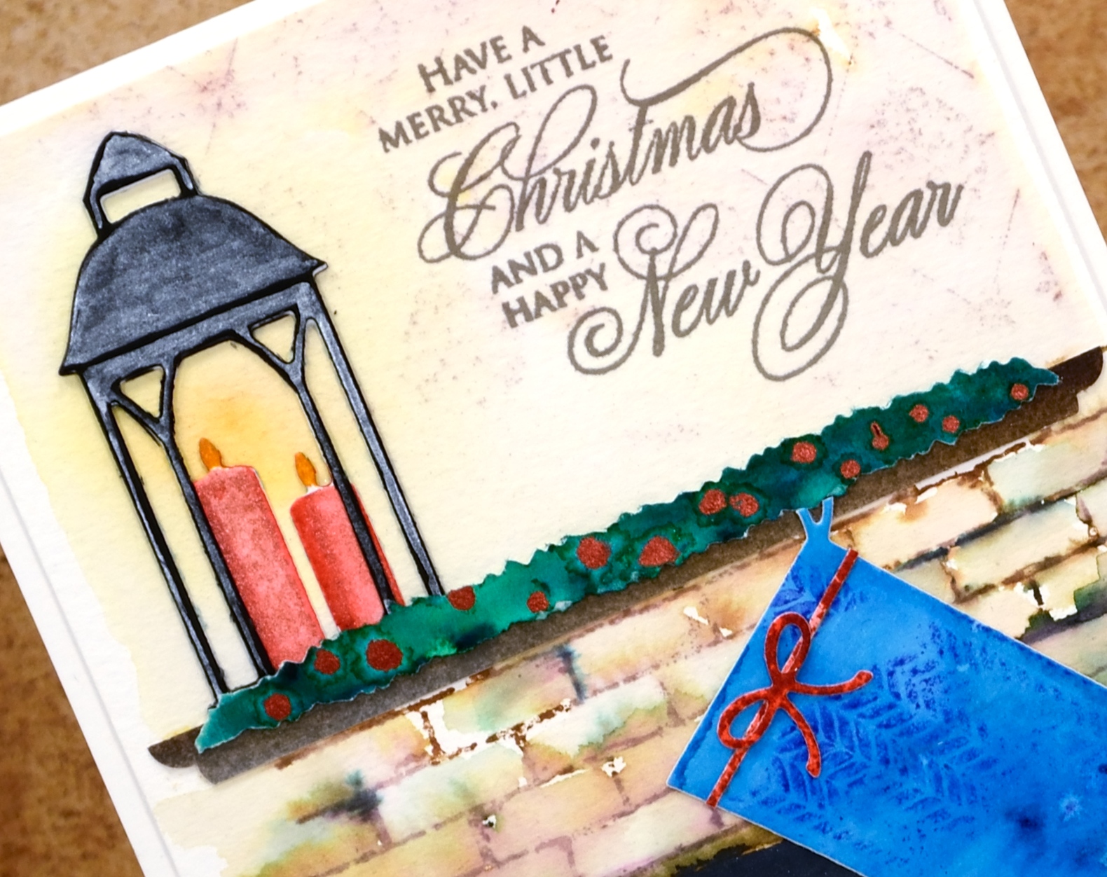
The swag over the mantel is a strip of watercolour paper painted with green brusho then dotted with siren smooches ink. I attached it over a strip of painted brown paper cut to look like a mantelpiece. The stocking was cut with one of the ‘Christmas Stocking’ dies then stamped with a texture stamp so it looked like fabric. This one had a higher fiddliness factor than most of my cards which increased my respect for those of you who create far more intricate die-cut cards on a regular basis.
Thanks for visiting this week as I shared my Winter Warmth cards. I’ll be back next week with some more snowscapes.
Supplies
Stamps: brick wall, textures, diamond pattern, season’s gifts (PB)
Dies: winter lantern, Christmas stockings, little ornaments (PB)
Ink: vintage photo, fired brick, blueprint sketch, scattered straw, spiced marmalade distress inks (Ranger)
Paper: hot pressed watercolour paper, cold pressed watercolour paper, black cardstock
Paint: scarlet, ost blue, yellow, gamboge, black, dark brown, emerald green brusho powder, Finetec Artist Mica watercolour paint
Also: elegant writer pen, siren smooches ink
Baby, it’s cold outside
Posted: November 2, 2016 Filed under: Frosty day, What's in your cup | Tags: Fabriano Watercolour Paper, Penny Black creative dies, Penny Black stamps, Ranger Distress inks, WOW embossing powders 7 Comments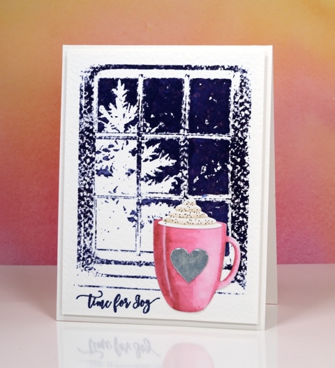
I’m continuing my ‘Winter Warmth’ feature with a cup of hot chocolate and a steaming cup of tea. I had fun creating a couple more scenes with simple watercolour backgrounds and die cut focal images in the foreground. On today’s cards the background is rough watercolour paper so the ‘frosty day’ stamped images were speckled all over until I used a wet paintbrush to blend the ink over the sky area.
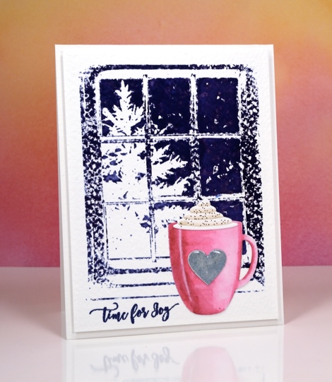
I die-cut the cup using the ‘what’s in your cup?’ die set. This set comes with the cup, cream, steam, teabag plus more detail pieces. I cut the pieces out of hot pressed watercolour paper, coloured them with distress markers and blended the colour with water.
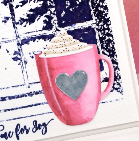
I added a silver heart, cream and cinnamon to the pink cup then attached them all to the background panel. Because the die set comes with all the cute little extras I decided to make a second card this time with a cup of tea.
I stamped the background in black soot distress ink for this card and once again blended the sky area but left the rest textured.
I coloured the cup with red distress inks then added a sparkly embossed snowflake, a teabag tag and some rising steam.
I have one more ‘winter warmth’ card to share tomorrow.
Supplies
Stamps: frosty day, festive snippets
Dies: what’s in your cup?
Ink: Chipped sapphire, black soot, festive berries, old paper, gathered twigs, picked raspberry, vintage photo, hickory smoke distress inks/markers (Ranger) Versamark, versafine majestic blue, imperial purple & onyx black (Tsukineko)
Paper: hot pressed watercolour paper, rough watercolour paper
Paint: Finetec Artist Mica watercolour paint
Also: Clear gloss embossing powder, Clear sparkle embossing powder
Let it snow
Posted: October 31, 2016 Filed under: Skis 'n' sled, Woodland Beauty | Tags: Penny Black creative dies, Penny Black stamps, Ranger Distress inks, Tsukineko Memento inks 11 Comments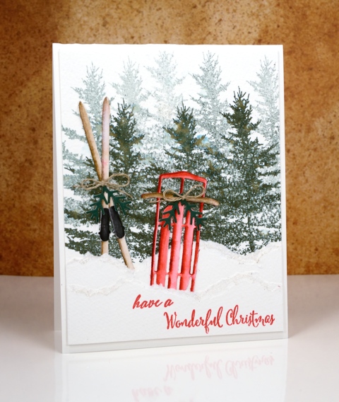
I am writing this post from sunny warm Australia while my Ottawa family is sending me photos of the snow that has already fallen. I have a series of ‘Winter Warmth’ posts this week featuring dies and stamps from the latest Penny Black releases. I chose to pair watercoloured die-cuts with watercoloured backgrounds to make some indoor and outdoor winter scenes. You might think that sledding or skiing is not a particularly ‘warm’ activity but consider the trudge up the hill with the sled or the energy expended cross-country skiing; you can end up quite heated!
I created my background forest on cold pressed watercolour paper by doing first and second generation stamping with memento northern pine ink. I then tore a few snow banks from the same paper and layered them in front of the trees.
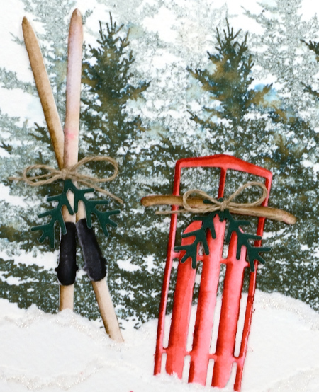
I die-cut the sled and skis from hot pressed watercolour paper then coloured them with distress markers, blending with water to get shadows and dimension. I added some die-cut greenery and a little twine bow to both the skis and the sled then tucked them in behind the torn paper snow banks. I added some clear wink of stella to the torn edges to make the snow banks glisten a little.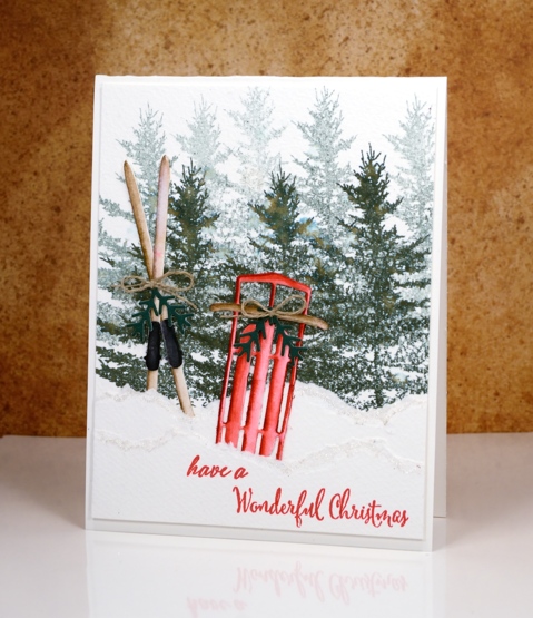
Supplies
Stamps: woodland beauty, festive snippets
Dies: Sled ‘n’ skies, winter lantern
Inks: memento northern pine, tuxedo black (Tsukineko), festive berries, gathered twigs distress markers (Ranger)
Paper: hot and cold pressed watercolour papers (Fabriano), green cardstock
Also: clear wink of stella, linen twine
Holly Stencilling
Posted: October 27, 2016 Filed under: CAS, Holly medley | Tags: Brusho, Penny Black creative dies, Penny Black stencils 4 Comments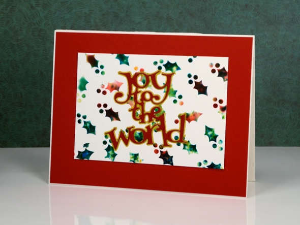
I have a couple more stencilled and watercoloured cards to share today. I used the same technique to create these panels as I did to make the ‘stained glass‘ panel shared earlier in the week.
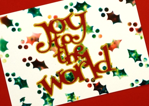
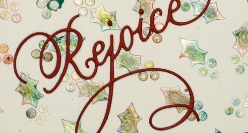
I began with the stencil taped to a piece of watercolour paper then spread molding paste over the stencil to fill all the little holly leaves and berries. While the paste was still wet I sprinkled brusho powder over the stencil then spritzed lightly with water. The water activates the brusho which spreads, blends and soaks into the paste. I removed the stencil and let the paste dry for quite a while before handling it. On the panel below I used a pearl paste instead of white to achieve a shimmery appearance. Water and colour did seep under the stencil in a couple of places but I trimmed the panel to utilise the best portion.
I finished the cards with die-cut sentiments and mats. To make the ‘Joy to the world’ sentiment pop I traced around it with a gold gel pen. You can see in the photo below the shimmer from the pearl paste. When I sprinkled the brusho over and spritzed, it really did not look good; it was more of a dirty mustard colour. Once it dried, though it looked pearly with shades of yellow, green and gold peeping through.
I apologize if I did not answer your questions about the last post; I’ve been travelling around a bit this week and visiting family in Canberra and Newcastle. When the choice was computer time or duplo with my delightful three year old great nephew, well really, there was no choice!
Supplies
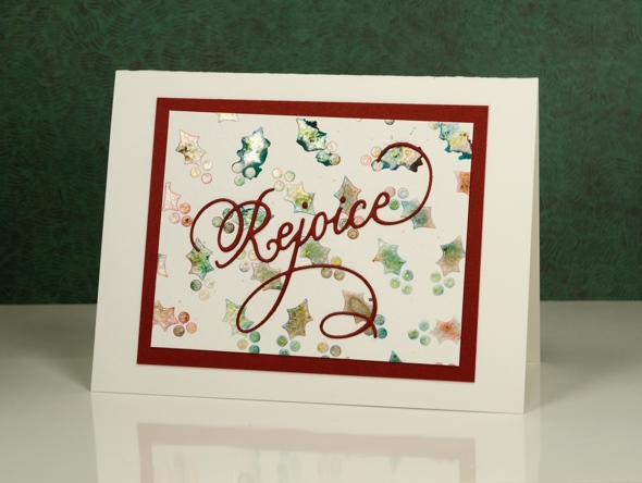
Dies: Joy to the World, Rejoice(PB)
Stencil: Holly Medley (PB)
Paints: Red and green Brusho (Colourcraft)
Paper: Fabriano watercolour paper, red cardstock
Also: molding paste, texture luxe pearl paste, gold gel pen
Peerless skies
Posted: October 11, 2016 Filed under: Chapels, Woodland Beauty | Tags: Peerless Transparent Watercolors, Penny Black creative dies, Penny Black stamps, WOW embossing powders 8 Comments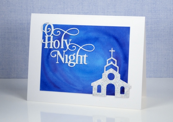
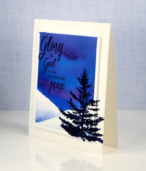
Yesterday I posted the first card painted with my new Peerless Watercolour paints along with a video showing how I organized my paints into a palette. The cards I have today feature deep blue skies also painted with Peerless watercolours.
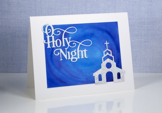
Peerless watercolours are unusual as the paint is concentrated in a dry sheet of cardstock. To use it you have to add water to the cardstock. I am only just beginning to use mine but I am already impressed by the intensity of the colour and the ease with which they blend. For both these cards I used a mix of blues and purples and blended them on the watercolour panel. I was happy with the mix of colour as I painted but was even more impressed when I returned to the panels after they had dried and saw how they colours had continued to blend resulting in soft smooth variations.
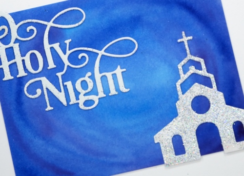
I kept the design simple as far as elements were concerned but fancy when it came to texture and sparkle. I embossed both the sentiment and church with WOW Diamond white embossing glitter giving a second coat to the church for maximum bling. I can’t imagine the circumstances under which a church would be so sparkly but it looked so pretty against that sky I had to let it bling!
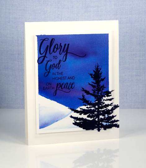
I was far more traditional with this card adding a sentiment and tree in black ink.
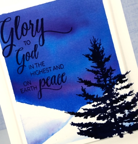
I added a little interest by stamping the tree on both the card base and the feature panel which is popped up on a layer of foam.
I received my peerless watercolour paints from the kind people at The Foiled Fox online store. The store has a wonderful mix of art, paper craft and calligraphy supplies and in my opinion they are carrying all the cool stuff! They also have a blog showcasing their own design team and guests from around the world.
Supplies
Stamps: Woodland beauty, Holy Night (PB)
Dies: Chapels, O Holy Night
Ink: Versafine onyx black (Tsukineko)
Paint: Peerless watercolours
Paper: hot pressed Fabriano watercolour paper
Also: WOW diamond white embossing glitter


