
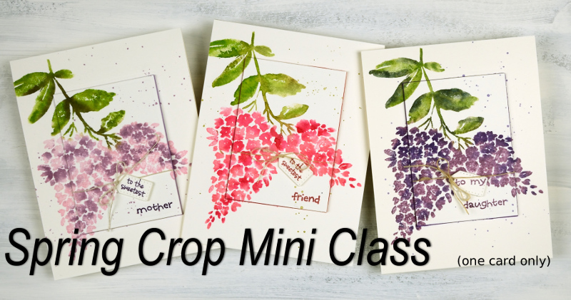
Classes here and there
Posted: April 2, 2018 Filed under: Classes, Darkroom Door, Penny Black | Tags: Classes Leave a commentIf you live in the Ottawa or Toronto area this post is for you. I’d like to draw your attention to my upcoming classes page. I teach art and card making classes each month in Ottawa, a few times a year in Toronto and occasionally in other places. All my classes are listed on my Upcoming classes page but I thought I would mention them here on the blog and highlight one you won’t find listed on my class page.
On April 7 I will be in Toronto teaching a Coloured Pencil Technique class

and my Watercolour Wings class.

In Ottawa on April 12, 13, 14(already full) & 16 and in Toronto on May 26th I am excited to be teaching my Galaxy Art class.

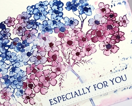
In Ottawa on May 10, 11, 12 & 14 and in Toronto on May 26 I will be celebrating spring with my Floral Focus class.

You will find all the details on my Upcoming Classes page. You can sign up for most classes through the links on the class page but to attend the ones held at Crop A While in Ottawa you will need to contact the store directly. Crop A While scrapbooking store is hosting a “Hello Spring Super Crop” on April 28 where I will be teaching a mini class (one card). To register for the crop and my mini class you will need to contact Crop A While. If you have any questions please use the contact me link.
Bodacious brusho
Posted: April 2, 2018 Filed under: bodacious, Brusho, CAS | Tags: Brusho, Penny Black creative dies, Penny Black stamps 8 Comments
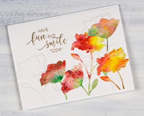
This week I have a couple of painted die cut cards to share. To create this one I first sprinkled leaf green, sunburst yellow and rose red brusho over a piece of hot pressed watercolour paper and spritzed with water to activate the paint. The colours did blend together a little but I was able to keep some distinct red, yellow and green areas. Once dry I used the ‘bodacious’ die from Penny Black to cut several flowers. I also cut white flowers with the same die. When creating my layout I glued down a few white diecut flowers first then coloured ones over the top. I trimmed stems and buds so I could arrange the flowers at different heights and facing different directions.
I embossed a sentiment from the ‘smile today’ set in platinum, trimmed the white background panel and attached it to a white card base.
Supplies
Stamps: smile today!

Die: bodacious

Paper: hot pressed watercolour, neenah solar white, white linen texture paper


Paint: leaf green, sunburst yellow, rose red brusho

Also: platinum embossing powder

Tulip Sympathy card
Posted: March 29, 2018 Filed under: Alcohol Ink, Tulips | Tags: Darkroom Door stamps, Ranger Alcohol Ink 1 Comment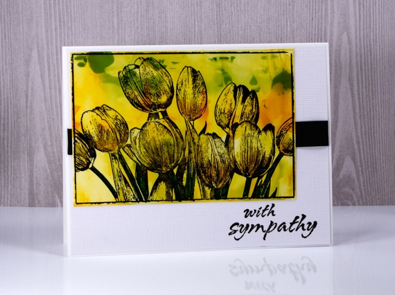
I have used an alcohol ink background to add colour to this tulip card. Deciding on a colour scheme and image for a sympathy card can be difficult but flowers are given and appreciated at times of joy as well as sadness. Out of interest I looked up what meaning if any, has been assigned to yellow tulips. Apparently the meaning has changed over time but yellow tulips now stand for hope and cheerful thoughts.
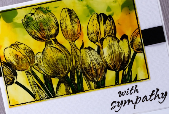
To create the yellow, orange and green panel I dropped alcohol inks on a craft mat then swiped photo paper through the colours. Sometimes it is necessary to swipe several times or add a bit of rubbing alcohol to get coverage over the whole panel. I inked the Darkroom Door tulip stamp with jet black stazon ink then pressed the photo paper panel down onto the stamp. To finish the card I wrapped some black ribbon around a textured white mat and added a sentiment also in black.
Supplies
Stamps: tulips, bright blossoms vol 2 (DD)


Ink: alcohol inks by Ranger, jet black stazon


Paper: neenah solar white, photo paper, textured white paper

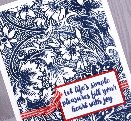
Classic garden
Posted: March 27, 2018 Filed under: Flower garden | Tags: Darkroom Door stamps, Ranger Distress inks 3 Comments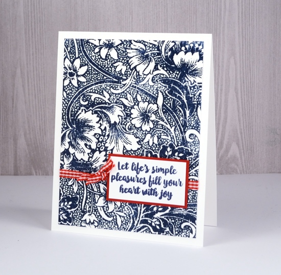
A few weeks back I created two fairly glamorous cards with this fancy stamp, glamorous because of the platinum and gold embossing I paired with the very detailed stamp. Today’s card is simply stamped in one colour and embellished with another colour creating this classic navy, red and white combo.
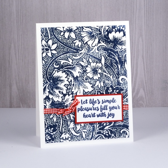
I stamped on neenah solar white cardstock in chipped sapphire distress ink; it is a very detailed stamp so using a stamping platform helped me get good coverage.
Quite a versatile stamp I think…
Supplies
Stamps: flower garden, botanical script

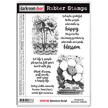
Ink: chipped sapphire distress ink

Paper: neenah solar white, textured red
Also: stamping platform, red & white gingham ribbon

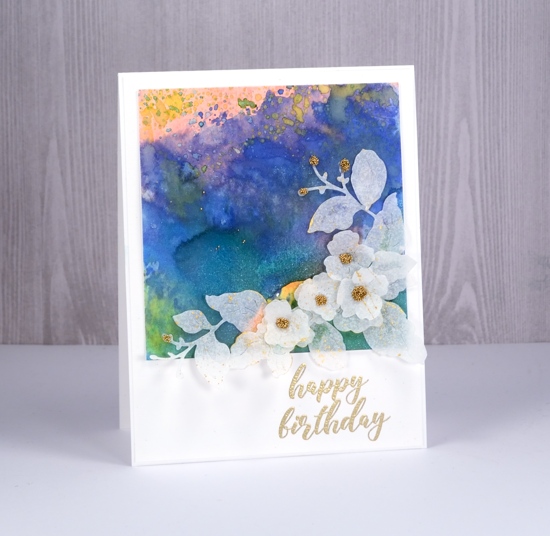
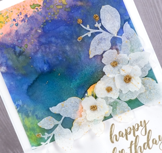
Wings & things
Posted: March 23, 2018 Filed under: Wildflowers Vol 1, Wings | Tags: Darkroom Door stamps, liquid metals, Ranger Distress inks 11 Comments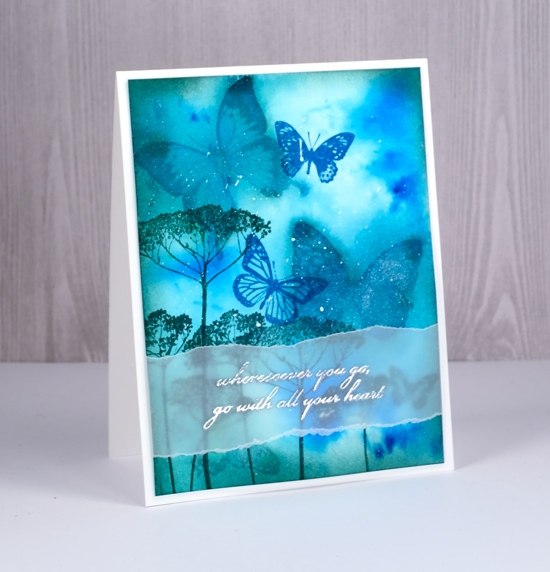
This is one of those cards that just evolved. I’ve had the butterfly stamps at hand while teaching a class with them. I did not have a definite plan; in fact, you may be surprised to hear it started with three butterflies stamped in rusty hinge distress ink. The panel sat around for a while then I decided to paint turquoise brusho and metallic sky liquid metal inside each of the brown butterfly outlines. I didn’t love that so I spritzed interference blue pearl-ex spray over all three butterflies to make the colour bleed into the surrounding area. Still not right, so I employed a technique one of my friends calls ‘drowning’ and spritzed the panel thoroughly. The result was a sparkly blue panel with muted butterflies now looking like background images.
I used pine needles and mermaid lagoon distress inks to stamp foreground images, more butterflies and some flowers. I framed the panel by sponging pine needles ink around the edges then splattered a little white gesso over it. As often happens with my cards I started thinking about a sentiment once there was no room left for one. Vellum to the rescue with an phrase embossed in silver.
Supplies
Stamps: wildflowers vol 1, wings


Inks: rusty hinge, mermaid lagoon distress ink, pine needles, versamark


Paper: hot pressed watercolour paper, vellum, neenah solar white cardstock


Paint: turquoise brusho, white gesso, metallic sky liquid metal


Also: silver embossing powder, interference blue pearl-ex powder mixed with water in a mister

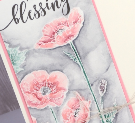
Poppy blessing
Posted: March 21, 2018 Filed under: Parade of flowers | Tags: Faber-Castell Albrecht Durer Watercolour pencils, Penny Black stamps, WOW embossing powders 4 Comments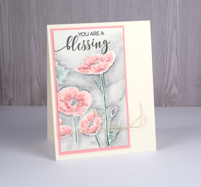
This is the second card I’ve posted featuring the ‘parade of flowers’ stamp from Penny Black. To create this one I used just a section of the stamped image and worked with the emboss resist method. I stamped in versamark and embossed in clear powder on hot pressed watercolour paper.
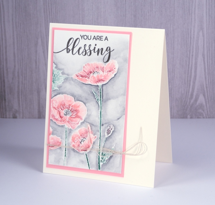
The painting is all done with watercolour pencils. I use a waterbrush or wet paintbrush to pick up colour from the pencils. I used 2-3 pinks to fill the flowers, a green for the stems, a brown for the seed pod and black for the poppy centre. I painted the background with a grey watercolour pencil, added a sentiment in versafine smokey gray ink, a pink mat and a little twist of twine.
Happy Spring!
Supplies
Stamps: parade of flowers, choose happy


Inks: versamark, versafine smokey gray


Pencils: Faber-Castell Albrecht Dürer watercolour pencils
Paper: hot pressed watercolour paper, pink cardstock

Also: clear embossing powder, twine
Tea time?
Posted: March 19, 2018 Filed under: Cup of tea | Tags: Darkroom Door stamps, Tombow dual brush pens, WOW embossing powders 3 Comments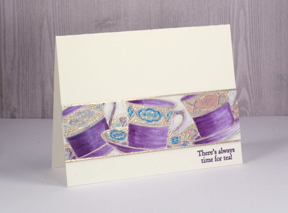
This card was practically complete weeks ago including a handlettered sentiment written with pen and ink. Unfortunately after leaving the ink to dry overnight I brushed my hand across the lettering only to see it smudge across my one layer card! I cut the strip of teacups out of the ruined card front and set them aside as I had other projects to complete. When I pulled them out again I decided to create an embossed mat to frame the teacups top and bottom then stuck the teacup panel on the embossed panel and then onto a new cardfront. I added a sentiment from the ‘cup of tea’ stamp set and finally finished my card.
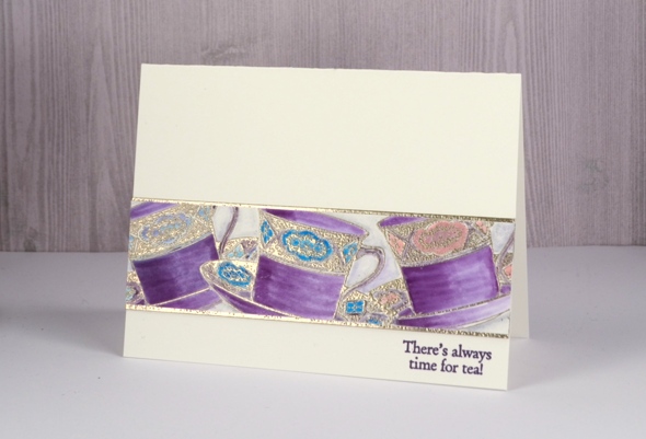
The teacups are stamped in versamark and embossed in platinum powder. After embossing one cup, I stamped and cut a tea cup mask, positioned it over the first cup then stamped a second and a third cup. I did all the colouring with tombow markers. When finishing the card a while later I tried my new versafine clair ‘monarch’ ink. I have always been happy with my versafine inks so I wondered what might be different about the new versafine clair inks. I have bought five colours to start with and so far I am very impressed with the sharp detailed stamping and no need for a second impression.
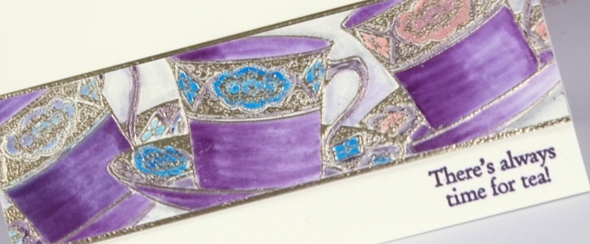
And by the way if you like a little sparkle, perhaps with embossing powder or something bolder, please check out the ‘Sparkle With Us’ challenge I’m hosting with The Foiled Fox. We’ve stretched it out for a wee bit longer so you still have a couple of days to join in.

Supplies
Stamps: Cup of tea

Inks: versamark, monarch versafine clair
Tombow markers: 679, 772, 515, 451, N75, N00


Paper: hot pressed watercolour paper
Also: WOW metallic platinum embossing powder

Floral Arrangement
Posted: March 15, 2018 Filed under: floral arrangement | Tags: distress oxide inks, liquid metals, Penny Black creative dies, Penny Black stamps 11 Comments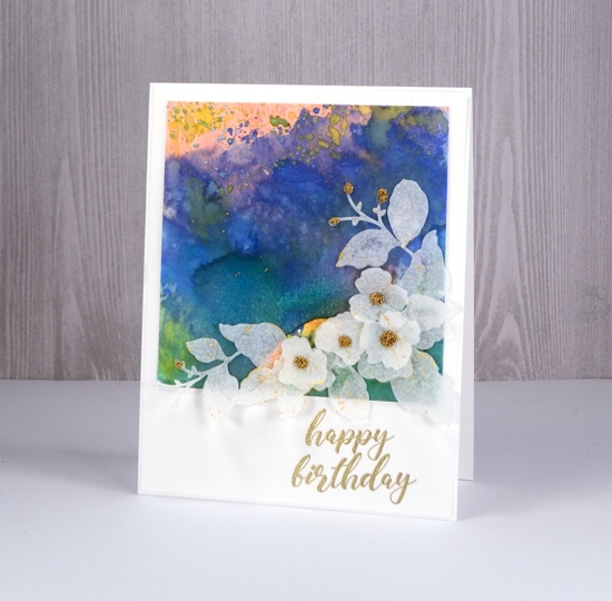
I have a burst of colour and some sprinklings of sparkle to share today. I am enjoying the entries in the ‘Sparkle With Us‘ challenge but I would love to see more. There are still five days left to add your sparkly project to the gallery, just click over to see all the details.
I used some new and some older distress oxide inks to create my colourful background. My paper is hot pressed watercolour and my technique was pressing the oxide pad on a craft mat, spritzing with water then swiping my paper through the ink. I did this numerous times but always dried the panel between swipes, that way I was able to build up layers and pockets of colour. After I had added my last layer of oxide ink I put some diluted liquid metal (metallic sky) on my craft mat and swiped the panel through that; the result was some blue shimmer over the blue painted area.
To create my spray of flowers I used the Penny Black ‘floral arrangement’ die to cut three flower sprays from ‘parchment’ patterned vellum, one of the designs in the grafix assorted vellum pad. I snipped the die cut flowers to create a layered arrangement of small flowers and leaves. The die does cut a larger flower, but I didn’t use it on this card. I put all my die cuts in a box and splattered gold paint from the gansai tambi starry colors set over them. After they dried I attached the leaves and flowers on my panel and I added a drop of glue to some of the flowers and sprinkled gold micro beads onto the glue. I co-ordinated the sentiment with the beads by embossing it in gold. All the supplies are listed below.
Do you think I might be able to label this one mixed media?
Supplies
Stamp: smile today

Die: floral arrangement

Inks: tattered rose, candied apple, blueprint sketch, fossilized amber distress oxide, versamark


Paper: hot pressed watercolour paper, parchment patterned vellum, neenah solar white

Paint: gansai tambi starry colors, metallic sky liquid metal


Also: On point glue, gold micro beads, gold embossing powder


Foiled hexagons
Posted: March 13, 2018 Filed under: Alcohol Ink, Challenges | Tags: Ranger Alcohol Ink 5 Comments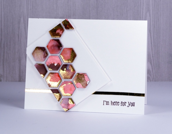
Let’s do a little more sparkling! I am sharing this card on The Foiled Fox blog today for the ‘Sparkle With Us’ challenge we are hosting. We would love you to join in.
This card looks a little different from my usual. My inspiration came from one of my talented crafty friends, both the technique and the style. She was inspired by one of my online crafty friends. Inspiration abounds and sometimes foiled hexagons are the result.
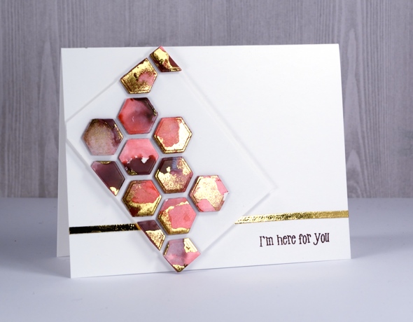
In real life the sparkle and pink ink look lovely together; I had to take two photos so you could see all the sparkle but neither photo does the foil the justice it deserves. To see how I ended up with the gold highlights on my alcohol ink panel click over to The Foiled Fox blog.
To see some sparkly inspiration or add your own click the link below

Supplies
Stamps: happy snippets

Die: tagged (PB) or star cover plate (Neat & Tangled)


Alcohol Inks: currant & flamingo


Also: minc, gold foil


Exquisite
Posted: March 9, 2018 Filed under: birds and banners, exquisite, Script | Tags: Penny Black creative dies, Penny Black stamps, Ranger Distress stains 7 Comments
My final springy card for this week features this lovely big flower in two of my favourite distress stains, chipped sapphire and seedless preserves. I stamped this one on cold pressed watercolour paper so once again having the panel in a stamp positioner helped me get a good impression. I inked first with chipped sapphire over parts of the flower, stamped, wiped off the stamp and inked sections again but this time with seedless preserves. I ended up with some blue flowers, some pink and some a purple mix.
I blended the petals of all the flowers with a damp brush and let them all dry. I was going to leave all the centres white but it didn’t look right so I ended up painting them all darker with undiluted stain. To create a soft textured background I dropped a few drops of water around the flower then partially stamped the script stamp in the same ink stains. I dabbed out some ink with a paper towel and added some splatter as well. To frame the whole panel I ran the seedless preserves dauber around the edges then softened the colour with a damp brush.
To complete the card I stamped a sentiment on a fancy little die cut banner and popped it up over the stem of the flower.
Supplies
Stamps: exquisite, script, banner sentiment (Penny Black)


Die: birds & banners

Inks: chipped sapphire & seedless preserves distress stains, majestic blue versafine ink


Paper: cold & hot pressed watercolour paper


